Skip to Content Skip to Search Go to Top Navigation Go to Side Menu


"Colour-Systems" Project


Colour System Project


Wednesday, May 9, 2018

January 30th

Hi all,

Sunny morning, the colours are back!  pilz

Colour systems are created from very different starting points and urgencies, often related to a specific application and context. Some are based on observations, others on textual theories or visions. They can be technical, poetical, philosophical, tactical or speculative, they can be developed “for home use” or for a large audience or group of users. They are both political and personal, and almost always related to ideology.

Here’s the story about a fake art movement SPECTRA. Also all the other bulletins in that section (from ‘Umberto Eco: THE COLORS WE SEE’ till ‘James Langdon: NOW IN COLOUR’) are on colour-related  topics.

The  question is to develop a new colour system. A colour system that comes from your own, subjective starting point. Medium, scale, application, etc. is up to you. It would be interesting too if you all develop a colour and  a visual, graph-like representation as part of your colour system,

This was how the project started and ended with the publication of all process documentations which you can read if you scroll down.


April 4th

But before you do,


Look at all the colours we created, silkscreened with Kees Maas as part of this project and glued on the Rietveld Billboard. The next day it was a sunny day..


Builboard_Colours2


– All Color Names–
–Night Sky Violence, Walking on Light Tears, Sancho Panza, Lost-Diving-Mask-Green, Sickatoum, Sea Bird Blue Goes Dancing, Retired Rosy Brown, Flu Blue, Lost in Some Wax That Game Out Of Shrek’s Ear Green, Uta Grass, Hope Empty, Lizzard Wizzard, Capitalistic Pink, Maria Markan, I’ve Got Leaves In My Eyes, Tolerant White, Dragon’s Egg, Daniel’s Jeans, Adolescent Moss, Glass White / Glaswit, Don’t Be Blue Boo –


WORK IN PROGRESS

 
(more…)

A Letter of Rejoice


Monday, May 7, 2018

During the research of Isaac Newtons colour-wheel I had the image of colour being spread into flakes, much like flakes in the paint of cars. Another thing is also the separation of the colours within the prism that is projected by Newton. These to points gave life to the idea of the book: A letter of rejoice.

 
Screen Shot 2018-04-03 at 14.49.44

 
The colours of cars come in every shape and form just like the rainbow. With the paint from cars as a starting point I went out in public trying to gather as many photos of car colours. With no system in what pictures of cars I took I quickly gathered +70 pictures of different car colours. Looking through the pictures on a laptop one thing was clear. The reflection of the sun changes the colour of the car. A black metallic will turn into a less black and a bit more dark blue.

 
Screen Shot 2018-04-03 at 14.51.33 Screen Shot 2018-04-03 at 14.51.53

 
The reason for the dramatic change in this case is because of the blue sky reflecting in the paint. This was the case with some of the colours. Some will stay true to their original colour while some change significantly. In order to create a system I had to select the images of cars that were relative to each other and remove them from the collection. Reason being to create a book that isn’t boring to look through. Reading a book where at least 50% of the images are difficult to distinguish from each other can be, quite frankly, boring. Another reason for some of the images being removed is because of the main inspiration which was a catalogue from 1982 by Porsche (911 G (1982) – COLOUR CHARTS AND PAINT COLOURS).

 
Screen Shot 2018-04-03 at 14.52.14Screen Shot 2018-04-03 at 14.52.29

 
In the catalogue the colours are far from similar. This is to make it easier for the buyer to choose a colour for the car they want to order.
Using the Porsche catalogue as a template for the project I sculpted my own “German” catalogue. For this I used Adobe Illustrator. Anyone can set up an illustrator page like the catalogue from Porsche. Its just like copy paste. However the real obstacle was to name every colour in the book. In order for the text to become alive and for the reader wanting to read on wards the text needed to be related to what I felt when I see the specific colour. The text attached to each picture but in total it creates a story and that’s what I wanted to create. A story with no end nor beginning. If the pictures were to be switched around the story would still be the same because of the nonlinear course of the text. One restrain that I wanted to keep from the Porsche catalogue was that the text shouldn’t be any longer than a few sentences. A lot can be said with just a few words. A lot can be felt with just a few words. A lot can be misunderstood with just a few words.

Screen Shot 2018-04-03 at 14.52.54 Screen Shot 2018-04-03 at 14.53.09

design theory process compressed (1)

Layout became like so:
flakes of colour pdf compressed

The draft for the catalogue looked like so:

flakes of colour sample flakse of colour sample 2

This draft is very close to what I would imagine the catalogue looking like back in 1982. Or at least my interpretation of what it could look like. However it is also very plain and it doesn’t have any flare to it. When making a book the outside has to reflect whats on the inside. It was therefore back to the drawing board.

Screen-Shot-2018_1400
Using Adobe Illustrator CS6 to set up the pages

A few problems were to be considered when I was changing the catalogue into a book. What page size, matte or shiny paper, the printing setup etc. All these problems are something that can be difficult to choose from but once you narrow it down to what you want it look like it is fairly simple. I went for A3 paper, so I could fold the A3 and have two A4 pages on one A3 page, and a different setup with the order. The reason being that the pages with images now could be on shiny paper while the text pages could be on matte paper.
The experience of going through a book like this is a lot more enjoyable.
Rather than having to flip the pages upwards its now the normal way. It also changes the characteristics of the book it self. Before it was leaning more towards the original catalogue from Porsche where as now its something on its own. The departure from the catalogue is a great improvement.


letter of rejoice 1 letter of rejoice 2

letter of rejoice 3 letter of rejoice 4


Orders can be done on my instagram account @carlottolinde


chasing after something unclear


Sunday, May 6, 2018

good

At first I thought of two spheres, one based on pigment, and one based on light. The spheres would hold all colours, but on the outside, the pigment-based sphere would be black and the light-based sphere would be white. It was kind of an immediate response to the three-dimensional colours system shapes I saw during our presentation on already existing colour systems. A lot of artists and taxonomists from this presentation had decided on a certain shape either two or three dimensional, which would hold all, or at least all (for them) relevant colours. These two spheres I had in mind were maybe an ode to the two things I believe decide colour; the pigment an object contains from itself, and the light that makes it possible to receive the colour by the eye. The pigment-sphere is black, with a white center (all other colours exist somewhere in between the white and the black), because this creates a bigger arera of black in opposition to white, just like the more pigment something contains, the darker the colour gets. The same goes for the white sphere, as more light will eventually create white, and no light at all will create complete darkness (black).

But far before I started working with this idea, even before I completely thought it through, I started to doubt. Because, if light and pigment completely depend on each other, than what reason is there to “pin down” colours, in a system? Of course I could create a scale model, animated version or a couple of drawings of these spheres to show what the colours inside are like and how they work, but what would be the use of that if anyone seeing it in a different room, with different light would receive it completely different?

I wasn’t sure how to continue now, as the word “system” felt like I had to make something clear, or at least something that can make sense and be repeated in multiple situations, which I thought wasn’t really possible with something and changeble as colour. It took me a while to realize that I should just start working with colour, and not worry too much about it making perfect sense. But as soon as I realized, I got sick and didn’t do much more than lay in bed. This, in combination with the feeling that colours mostly depend on how our eyes perceive them, made me want to approach the assignment in an unconcious way. A couple of nights I slept with a different colour light in my room. Afterwards I tried to capture what my dream was that night, and if there was any noticeable difference from the night before. Though I remembered the dreams well, it was surprisingly difficult to pin them down. I wanted to show the general feeling of the dream, and no specific details or story lines. I wanted to capture them in a simple way, in which the sense and atmosphere of the dream is immediately there and clear to anyone.

I noticed that sleeping a shorter amount of time had a different influence on the dream than sleeping the entire night. If i only slept an hour or two with the coloured light on, I could clearly remember the first random associations mix up with the usual memories and thoughts I have when I’m awake. To put it differently: I felt myself fall asleep, and I felt myself sleep, and then I felt myself dream and then I felt how an alarm clock woke me up and brought me back to the logical world. Within those few hours, there was not enough time to form coherent, “full” dreams. I dreamed in feelings and associations, not about stories or places or people. I think the lights had some effect, in the short term.


yellow light  Yellow light, 8 hours, no clear difference from my usual dreams, except that everything was darker, This corresponds to an old dream I have each time the morning sun shines into my eyes: That my eyes don’t work and there is a black spot in the middle of my eyesight.

geel 5


green light Green light, three hours. Some images I had with this one were of dark wood furniture and music instruments.

groen


light blue light Light blue light, 1 hour (maybe shorter). This one had very clear images, as I was still half-awake. I woke up pretty soon too, so that I remembered them very well.

lichtblauw


red light Red light, 8 hours.

rood 2


purple light Pink/purple light. 2 hours. I dreamed about textures and places, no clear story lines involved.

roze


dark blue light Dark blue. I don’t remember how long I slept. I dreamed about people crossing a busy highway in the dark, so there were a lot of orange headlights.

blauw


I really liked the coloured light and the many effects it had on the colours I was used to, so I wanted to do a little more on it and show what a power the light has. I had two coloured lamps change constantly while painting, so that the way I choose the colours wasn’t like usual. Thinking about it, maybe it were better if I had painted something realistic, so that the choices I made had more of a purpose. The painting then would also “make sense” in one light, but not in the other.


blue light painting green light painting

orange light paintingpink light painting

purple light paintingwhite light painting


In the end, I still feel quite confused about what I did in this assignment.
By focusing on the things that go around unconsciously in my head, I can never be sure if I have “catched” what I was chasing after.


Camouflage


Sunday, May 6, 2018

We started this project by choosing a color and trying to find a match in our surroundings. And instead of searching for the solid color objects have, I started to look at the colors that were reflected in certain objects and how the colors change in the shadow. So when we were asked to make a color system I started thinking about working with reflecting colors. But after researching the CIE-1931-system and reading about all the other really mathematical systems I got a little bit confused.

8.-Liz-West-Our-Colour-Reflection-2016.-Image-Credit-Hannah-Devereux-660x400

A color system was now in my head something that was very structured, had a mathematical origin, even and could be presented in graphs. So when I was working with the reflection of color I soon got stuck on trying to systematize this. First, I did some visual research on the different ways materials reflect color. I did this so I could maybe make my own objects which would reflect the color. But I didn’t see how to make this into a system. I thought maybe using different gradients and different materials to get various color reflections, but I didn’t really think this was a real system.

static1.squarespace So I moved on…

This is the moment when I got really stuck. First, I just tried to research a lot of different color systems and came up with a few ideas, but never really worked them out. So when I was talking with a classmate about his color system I mentioned the idea of using google maps to get an overview and then I thought why don’t I use google maps for my color system, because for the first time I had the feeling I could approach this in a systematic way. There was already a lot given in Google Maps, almost everything is already visualized and there’s also already some sort of system, countries are divided by regions and cities by neighborhoods and so on. So I could make a color system out of this. Maybe measuring the green in different capitals, by taking screensavers of google maps and pixelate the capitals in color graphs and look at the graduation of the green. So I opened google maps, and Photoshop and started to take some screensavers and pixelating them.

1616 kopie7 kopie 3715 kopie153 kopie3

But when I was working with this, it felt so easy to just make a graph of the green in capitals and only making a screen shot and pixelating it. So now when I made screenshots in google maps and edited them in Photoshop I slowly started to let go of the idea that it had to be confined in this systematic approach.

9-kopie-29

This was I think the first time there was some freedom for me in the assignment. So I just played around with the pictures, editing them in Photoshop.Although I still felt that what came out didn’t really made sense, I tried to ignore this feeling for a while and just see what happened. What came out of editing these photo’s more freely were all kinds of camouflages of the city. For the first time in the project I gave myself the space to explore what will happen in the making and this at least created something to react to. Now I had these pictures, I had to find a way to bring them together in a next step. The most obvious way to do this is to make a booklet and this is what I did.

Screen Shot 2018-05-18 at 17.22.51

DSC_0431

But I knew this wasn’t the best way to present it. Not only because it was a badly published booklet, but the pictures also needed something extra to make them work. Now they’re just plain pictures in a book without getting a clear notion of what they represent. I had a talk with Matthias and we both agreed that maybe the best format for this is to bring it back into the city, to give the pictures a context. So what I’m now going to do is making posters and put them up in the city and photograph them.

In the end, I think I learned that I should have given myself the freedom to let go of this rigid idea of a system and to try out things earlier. Because when I did this it became more fun to do and there was also more room for other possibilities.

DSC_0419

The Pursuit Of Completeness


Sunday, May 6, 2018


ColourCard-4


Once in a time, lived a young hero who found himself on a quest: the pursuit of completeness. He traveled across the lands, west and east, observing cultures and reading the ancient texts. He discovered so much on his journey, and came across many wise sages who offered him mysterious advice. And yet, the hero found that the more knowledge he gained, the more distant his goal seemed to become. At certain moments the target would completely disappear and he would be left raw and dizzy, lost. In these moments he would cling even more desperately to the words of the wise-men, reading, researching, searching obsessively until his vision would once again appear in the distance. But it was hopeless, it hovered like a mirage on the horizon, never any closer no matter how fast he ran towards it.
On a particular night, exhausted and alone, stuck but stubbornly holding onto hope, the hero fell into an unexpectedly peaceful sleep. It was as if his body was floating gently on a warm sea, and, in the eye of his dreaming mind, an image appeared: A full rainbow across a grey landscape. It was so dazzlingly crisp and clear, so bright and vivid. The air was still and perfectly silent and in that moment the hero knew that he had received the sign that he had so desperately been needing. He woke up with the new day, crying tears of joy and gratitude. His quest was far from being over, in fact he was certain that the hardest challenges were yet to come but, finally, he had clarity and direction. He would leave his texts behind, all his pointless, distracting knowledge and set out on his own path.

The next night, as the hero was sleeping, he dreamed of the devil and of fear. The dream was bathed in a red glow and the devil knocked on his door. Terrified, the hero resisted but then a calmness came to him. He opened the door and invited the devil in and together they sat down for a meal.

The following night, the hero dreamed of a woman of the night in an orange dress and a fight against yellow men, a dream of guilt and shame but also of an incredible strength and willpower.

The night after that, he dreamed a beautiful dream of the woman he loved. Lost together in the night, in an empty world, they mourned the loss of all those they had once loved but, gazing into each others eyes, saw the eyes of their parents and friends and past lovers and they smiled in their hearts.


ColourCard-1     ColourCard-2     ColourCard-3


The hero could feel it in his body. Finally it had come! Life was guiding him. So strange and peculiar these dreams, so profound the significance of these colours! The full spectrum of life, in the full spectrum of the rainbow. Now he understood red, orange, yellow and green with an understanding beyond words. Oh silly, silly words he laughed. It was all in the colours, it was all in life always. The hero fell asleep that night full of anticipation, but the blue dream did not come. Nor did it come the next night, or any of the nights that week. No blue, indigo or violet dreams. He started to worry, he had made such incredible progress. He was almost there but now he could feel himself slipping away again. Weeks went by and the hero had no dreams. The colours which had once seemed so vivid now seemed dull and meaningless. Life seemed dull and meaningless and the hero mourned the loss of those clear, bright eyes he had once looked through. Weak and confused, he reached again for his books. He was desperate to understand and so desparate to feel that beautiful way once again. But, remembering how certain he had been of their futility, he put them away again.

Gathering up strength, the hero resolved to set himself out into the world to search for the answer. If the colours would not come to him, he would go and pull them out of whatever situations he found himself in! He would do whatever it took. He started with painting the dreams he had had. And then he painted paintings with all the colours of the rainbow, trying to understand what they had meant to him and how they were in relation to each other. He came to some interesting, intuitive understandings. It seemed that the first four colours existed on the foreground plane and the blues and purple in the background plane. The further he explored this, the more obvious it became to him that there was a divide. There was the realm of human emotional experience, of textured and colorful personality, all belonging more to the material world and then there was the realm of the spiritual, the land of the soul which belonged to a mystical, divine world. Yet how to split this mystical world up into blue, indigo and violet, he could not yet work out. He needed some kind of way to access them.
Remembering his earlier dreams, the hero went in search of the devil. Let me find the adventure that will take me through the full spectrum, he thought. He kept his ears and eyes open and wandered the land. After weeks of following symbols and signs he found himself, one dark night, approaching a huge and abandoned church. He heard a terrible, hypnotic chanting inside. He quietly pushed open the door and looked inside. There was a huge crowd of all terrifying, evil beings; men with knives and guns, gangsters and crooks, giants and witches and demons. They did not notice him as he crept inside. He was scared but calm in his determination. He looked to the front of the church and saw, standing by the altar, a man leading the chant. The hero’s ears singled out the man’s voice and he was gripped by an incredible torment. The voice was so

big, powerful and so direct. It felt like it was calling him directly. He was filled with fear and immediately regretted his ever having come here. He wanted to turn and leave but the voice was so beautiful and hypnotic that he could not. He was trapped in indecision but then the calm voice of his red dream came back to him, ‘open the door and let him in, offer him something to eat and drink’. He watched himself as he pushed his way to the front of the crowd to stand in front of the devil. The devil slowly turned his fiery eyes upon the hero and as he did this the hero felt his body fill up and he stood taller and he felt amazing and powerful and he lifted up off the floor and reached out his arms and roared. The crowd of people roared back and he flew up higher and higher spreading himself out more and more until, all of a sudden, he came crashing down to the ground. He felt a sharp sensation in his face, it took him a second to realize what had happened and then he got up and started laughing at himself. Walking back through the crowd, his nose bleeding, he laughed because it seemed so funny how seriously he had been taking it all.


ColourCard-5 Tarot7-1


Beccio


Thursday, May 3, 2018

After studying and researching on William Benson cube colour system, based on a geometrical approach to the harmonious use of design colours, we had the announcement of creating our own colour system.

I looked to my predecessors and so, I decided to create a colour system based on a personal approach and a personal use. As a starting point I tried to figure out elements and interests of my life that could be and not be related to a colour system.

The thing that interested me the most between all the ideas I had sketched down was wind. I was really intrigued how to combine such a powerful element as wind to a colour system. The similarities between this two element is the representation of both of them.
The diagram of the wind (Wind Rose) is used in order to know which directions the 8 major winds (and sometimes 8 half winds and 16 quarter winds) blew within the planet. In fact there’s no difference between cardinal directions and the winds which blew from the same points. Wind roses use 16 cardinal directions, such as north (N), NNE, NE, etc., although they may be subdivided into as many as 32 directions, so that creates a distinction between the degrees of each cardinal point ( North corresponds to 0°/360°, East to 90° exc.)

circle rosa dei venti R

At the beginning I tried to give more of a strict or scientific approach to the work and to create something actually handy. In fact many airport, such as Amsterdam have records of how the wind had blew during the years. The diagram below demonstrate how the wind rose for Amsterdam shows how many hours per year the wind blows from the indicated direction. Example SW: Wind is blowing from South-West (SW) to North-East (NE).

My idea was to create a system based on how the wind blows in the city of Amsterdam, during a period of time, I wanted to actually use the records from the airport so to relate each cardinal point to a colour.

amsterdam rose wind

After reflecting on my idea for a while I realize that I was unsatisfied and things such as the difficulty of reaching the records and a big lack of interest and real personal approach on the theme were influencing my working process.
I started to reflect again on the idea that I have of wind and how I feel about it and after a while I found the perfect way to combine my interests to the work.
Wind is really almighty element that influence our existence, something that never stop blowing and will never stop. So I had to put this power in to my work and include it in to it.

I decided to work with coloured smoke emitter, and to bring my colour system where it belongs.
My initial idea started when I went to the beach and under the “eyes” of the camera I positioned 4 coloured smoke emitter on the sand. One for each cardinal point and then turned them on.
Since the regulation of the Netherlands doesn’t allowed smoke emitters with an high percentage of gunpowder, as expected due to the power of the wind, the emitters in my possession barely worked (result in the picture below).

Screen Shot 2018-05-06 at 17.18.43


The attempting of creating a land art piece, worked quite bad, consequently to solve the problem the solution was to work with the idea of the wind as an untouchable and floating element.
I decided then to create a performance in the spray-painting room of the main Rietveld Academie building, a really loud place caused by the ventilation of the room that reminds me a lot of the sound of the wind or how loud the wind can be.
click here for the performance.

Color Swatch


Tuesday, April 10, 2018


Screen Shot 2018-04-10 at 23.12.43 Screen Shot 2018-04-10 at 23.12.37 Screen Shot 2018-04-10 at 23.12.31Screen Shot 2018-04-10 at 23.12.26

We were asked to make a colour system.
And in the first phase of assignments, we were asked to go over medieval colour systems that made no sense. I’m not a mathematician.
I even once wrote an article about how little of a mathematician I am.
That’s how little of a mathematician I am. Or am not.
The word system really bugged me.
I thought it had to have a religious structure that made sense and was clever at the same time.
Then I thought, no, It’s okay, it can be anything;
because this is Rietveld and you can get away with a lot.
But then my mind went back to it having to be a system.
System. Mechanism. Complex. Arrangement. Order.
ORDER. Structure. Network. Institution. Rigorous. Mathematical. Detailed. Exact. Accurate. Meticulous. Diligent.
These were some of the words that kept hitting my brain. Some Icelandic ones as well.
Then I thought again, no, this is Rietveld. Everything will be okay.
It can be anything.
Once I calmed myself down, after a week or so,

I thought of a painting I’d wanted to make for a long time. I had never actually made it but the idea of it was in my head.

The idea was to collect every single swatch from a paint colour swatch board in a store like GAMMA or Praxis, and exhibit it.

color swatch wall installation

From that idea, came this one: I took all the colours swatches from the wall at GAMMA, or at least I am pretty sure I took every single one… It was very confusing and I almost went blind while doing it because they were SO many.


After that I had around 500 swatches.
So my next thought was to arrange all of the swatches by preferance.
I played a game with my friend where she handed me a colour swatch and I had to choose
if I liked it, hated it or thought it was “okay”.

The ones I loved went to the top, the ones I thought were okay went in the middle and the ones I hated went to the bottom. Then I layed them down next to each other, forming a rectangle. It was fun, it was fast, but I wasn’t sure what to do with it. It made an interesting mosaic.

[Insert VIDEO HERE]

FullSizeRender5_950 photo-compositie_950


This idea of arranging colours by my own beauty preferances,
came from another idea I had at the beginning of the assignment.
I drew this picture, below, of colors I liked at the top and the ones I didn’t like at the bottom.


bookscreenshot


Then, these two ideas formed into one.
I painted different kinds of colour combinations that I liked, hated.
Matthias, my mentor, had shown me this book by Sanzo Wada (1883-1967), it is a really thick book with billions of beautiful color combinations. I was very intrigued by it and it made sense now what I should make, my own preferance of color combinations, in the form of a swatch stick.

IMG_4962_950color_waaier_950

So, that’s what I did….
I painted on transparent building plastic because it’s smooth
like a baby’s bottom and it is see through
so when I had painted, I could pile them up
and from there they would form all kinds of different paintings&combinations.

FullSizeRender1_950FullSizeRender2_950

My forms are mildly inspired by Hans/Jean Arp’s paintings and sculptures,
but sometimes I just did what ever, and sometimes the
bigger the colours are the more I loved or hated them.
Depending on my mood.
Here you can see Hans/Jean Arp’s form’s stacked on top of each other
forming a composition.

Jean Arp
Meanwhile having this assignment in my head I thought A LOT about colour
combinations, more than I’m used to. It was nice..


05:24 Colour System


Tuesday, April 3, 2018

Light is paramount for us to see any colour in the first place, so I began creating my colour system with this fundamental thought in mind. I started with our obvious source of light, the sun, noticing the subtle changes in light from sunrise to sunset and how it effects the appearance of colour. I wanted to record this somehow, but then I began thinking about the importance of artificial light and thought it would be necessary to include it in my system. The first source of light I turn on when the sun begins to set is a filament lamp on my desk, from there I began thinking of solution of how I can combine these two essential sources of light and the ways in which they effect one another as the day progresses. I wanted to keep it as simple as possible so I took a white (white to ensure that the interference between the natural and artificial light was clearly visible) piece of paper slightly larger than A4 in size as a surface to reflect the light off of. I placed the paper on my window, positioned the filament lamp above and a camera directly in front of the paper, the time I completed this set up was just before sunset and is when I documented the first image. I was unsure if anything would be captured when photographing the paper, perhaps just a light to dark gradient but unexpectedly I was amazed to see how the colours in the image almost exactly resembled the colours in the sky at that moment in time. I decided I wanted to record the progress of how the light emitted from the sky and the filament lamp interact on this white surface from sunrise to sunset. I waited until the weather was forecasted a day with few clouds and from when the sun came up I took a photo every two hours until the sun set, producing a timeline of photos. After repeating this twice more and observing the sky enough I concluded that my final colour system was not going to be series of images showing a timeline, I found the certain hours which I thought were of most importance to take the images showing the interaction between the two lights on the paper.Sunrise, Noon, Sunset, 15 minutes after Sunset and Midnight.

1 Sunrise 3 Sunset 7:47, 17:58

2-Noon 5 Midnight 12:00, 17:12

4 After Sunset 00:00


COLORBLIND PHOTOSHOP


Tuesday, April 3, 2018

COLORBLIND PHOTOSHOP

To a lesson of color

from the German Zur Farbenlehre

Goethe focused his notion of colour on the spontaneous sensory experience. His theory is based on how colors are perceived by human brain. He’s not looking for a material definition as Newton did.

He did a lot of experiment, describing phenomena such as coloured shadows, refraction and chromatic aberration.

After some observation, he deducted that Newton’s theory was missing something about colours. He didn’t see darkness as an absence of light but rather at polar to and interacting to the light; colour is a result of interactions between light and darkness.

Goethe’s studies began with the experiments which examined the effects of turbid media such as air, dust, and moisture on the perception of light. He observed that light seen through a turbid medium appears to us yellow. He took the example of the sun seen through the atmosphere: when you look at the sun rising it appears yellow red, the particles there are, the more the sun is red. Otherwise, when we look at the sky we actually look at the darkness of the space. The blue of the space are the particles from the atmosphere reflecting the sunlight, so we have light on obscurity ( more the layer of particles is thin more the sky is dark blue).

From this starting point, Goethe developed his theory on the polarity of colors: real close from the light there is yellow then red, and real close from the darkness there is blue then green. He also concluded that colour is a dynamic process from his experience with a moving prism. He founded a spectra different from Newton, adding: cyan, yellow and magenta.

Goethe also include aesthetic qualities in his colour wheel under the title “allegorical, symbolic, mystic use of colour”:

cercle-chromatique goethe

red is beautiful,orange is noble, violet is unnecessary, yellow is good, green id useful and blue is common. These six qualities were assigned to four categories of human cognition: the rational (red/orange), the intellectual (yellow/green), the sensual (green/blue) and the imagination (red/ violet).

Goethe also made the “rose of temperaments”, an earlier study (1798/99) by him and Schiller, matching twelve colours to human occupations or their character traits (tyrants, heroes, adventurers, hedonists, lovers, poets, public speakers, historians, teachers, philosophers, pedants, rulers), grouped in the four temperaments: melancholic, choleric, sanguine and phlegmatic.

Goethe_Schiller_Die_Temperamentenrose


Should your glance on mornings lovely

Lift to drink the heaven’s blue

Or when sun, veiled by sirocco,

Royal red sinks out of view –

Give to Nature praise and honor.

Blithe of heart and sound of eye,

Knowing for the world of colour

Where its broad foundations lie.

—Goethe

watch this movie about light, darknes and colours


A little story about Daltonism
Early in the 18th century, Isaac Newton discovered color spectrum through his experience with a prism.normal + vison ++

During his experiences, he discovered that human eye is not capable to distinguish the combination of colors: thus at the intersection of a green and a blue light beams, the human eye perceive cyan.
Then in 1801, the doctor and physician, Thomas Young expose his theory of the trichromatic vision: three colors must be enough to recreate all the colors. In addition, when those colors are mixed in the same proportion, it gives white. Thereby he explains human color perception by the action of three retinal nerves which are excited respectively by red, green and purple. Disorders of the colored vision result from the malfunction of one of these nerves. He also shows that accommodation is ensured by the deformation of the crystalline.

This theory is confirmed by the Scottish physicist James Clerk Maxwell (1831-1879). He publishes a series of research on color perception and color blindness.
The scientific name of the anomaly is “dyschromatopsia“, but it is generally known as “Daltonism“, a term created by the physicist Pierre Prévost after the name of its discoverer: the English chemist John Dalton. The latter published the first scientific article on this subject in 1798, “Special Facts About the Vision of Colors” in a communication to the Manchester Literary and Philosophical Society, following the realization of his own disability at perceive colors. He had also noticed that his brother had the same abnormalities, without concluding as to a possible genetic origin. It is only two centuries later, in 1986, that Jeremy Nathans locates the genes responsible for color vision and publishes this discovery in his treatise “Nathans, J., Thomas, D., Hogness, DS Molecular genetics of the human vision of colors: the genes coding for blue, green and red pigments, Science 232: 193-202, 1986 »

dantonisme

Thus humanity with the apparition of electronic devices searched for a color system for screens based on his owm perception of colors. The RGB system appears for electronic devices. Indeed, RGB is a device-dependent color model: different devices detect or reproduce a given RGB value differently, since the color elements (such as phosphors or dyes) and their response to the individual R, G, and B levels vary from manufacturer to manufacturer, or even in the same device over time. But still, even if RGB is based on human perception, computer are not working the same as the human eyes.
From this research, I asked myself: what if Photoshop was colorblind? My starting point for the project was photos of colorful flower, that I modified on Photoshop with different mechanism. I based my project on the six differences types of colorblindness depending on which sensors (cones) red, green or blue is touched by the illness and if it’s missing or just dysfunctional.
Applied to the RVB system, if a cone is missing I deleted all the layer corresponding to the color missing cone on Photoshop and if it was only dysfunctional I was only playing with the value of the layer. As if it was “more or less colorblind”. All the experience was a game with the different RVB layers, showing how different a computer and a brain with a missing or dysfunctional sensor or not going to recreate or perceive the same colors even if RVB is a color system based on human perception. It appears to me that the computer was more powerful in a way because it was capable to make up a lot more of colors than humans with different type of colorblindness.

 originals

 Capture2_1


final works


_V0A6105test3 copie 5 _V0A6074test2 7
_V0A6096 V0B0R100 test 4 _V0A6088 test_1 3
_V0A6079 200V 220B -150R test  2 _V0A6078test 1

changing colors of fruits


Tuesday, April 3, 2018

Color is very important to me. But my fascination of colors has been more unconscious, even though i haven’t thought consciously about choosing colors, it has been playing a big role in my work.
When i started my research into colors i noticed that what i found very interesting about colors, is usually how almost every color is to be found in nature. I am fascinated by how nature is always changing, and by that also changing colors. I started to research into how food changes over time. I find it interesting how the perception of the color, tells us about the ripeness and by that also the taste. As an example, we never buy brown bananas, we usually always try to find the red or yellow mango, trying to avoid the green. it is a knowledge that we unconsciously choose from. Even though that we all know a Banana should be yellow to be ripe, we still have very different ideas on which color is the most perfect for a certain type of fruit. Personally i think that bananas are perfect when they are still green. What i also find compelling is how, the fruit peel has another color than the inside of the fruit. By that the peel somehow is an expression on how the inside is feeling. I find this as a way of the fruit expression itself in the form of colors.

I find it very interesting how food can change to much during time, not only in the same tones of one color, but completely different colors. Milk as an example can go from being white to green, when rotting. In this case, the green color would be a very clear sign that the product would be too old. On the other hand, when a mango is green, it would also be a clear sign that it is not ripened yet.

As a first step of creating my own system, I bought different fruit and vegetables, and placed them in the corner of my kitchen. Here i photographed them each day for a week, and studied how they changed color. Unfortunately, the problem was that the lighting on the fruit in every picture were very different, and by that completely changed the colors in the photographs. I therefore had to redo the whole process again, to make sure that the results could be used for a system. I then build a small photo studio, so i would be sure that the light would be the same, and wouldn’t change the color of the fruit. I bought new fruits and photographed the fruit in the studio for 2 weeks, to see how the colors evolved. I collected 14 pictures of each fruit, but i chose only to use the first weeks pictures.

 
Screen Shot 2018-04-03 at 08.32.33

 
I used the photos to make a digitally color scheme, and i wanted to use the exact same colors as the one on the pictures by using photoshop. After deciding that i wanted to make a color system based on how fruits changes colors, i was looking for a medium to present the final system. I chose to use stickers, because i wanted to somehow bring the project back to where it all started. I thought of fruit stickers, and on how they are always used in a way of advertising. By making one colored stickers, i feel that the sticker as a medium is taken away from being commercial to being something different.

 
yellow-strokes_1200 red-strokes_1200

 
Unfortunately my printer wouldn’t take the sticker sheets, so i had to make the colors by hand. I printed out the digitally made color schemes from the photos, and made color test from them, and painted sticker sheets with gouache paint. Of course by using this method you will not get the exact same colors as digitally, but now i feel that it is a blessing in disguise, that the printer did not work. Now the colors of the sheets has more debts than when printed digitally, and also i like that none of the colors are exactly the same, and in nature it is not either.

 
color-circles_1200

 
I still have the feeling that the system is not completely finished. I am still thinking about how i can make the final step. But I think that I have to take both the fruits and the stickers back to the supermarket, where it all started. I really enjoyed the process of following something change. When i took the pictures, i didn’t recognize that the colors was changing, but when comparing the pictures, it was very easy to see the change in color.


Gaze Order of the Shades Harmonium


Monday, April 2, 2018


Everything around us has a color, from the ground we walk on to the sky above, the world we see is anything but black and white, never achromatic. Some people prefer to wear black clothes while others feel them selfs most comfortable in white, empty spaces. Red light automatically makes us cautious, while green lets us know that it is ok to go. Could the colors you see actually influence the way you feel and the decisions you make in your life? In fact colors can represent many different feelings, moods, and concepts. There is reason why people have certain favourite colors or why some shades become color of the season in fashion. By looking deeply at the colors of the things a person is choosing in their everyday lives, a cognitive perspective could help to understand the reason of this occurrence. Colors are one of the many things that play a part in our daily lives, whether we realize it or not.

colorbottles_1200
nail colour analysis

The starting point for my color project was observing my own personal color choices. I made an attempt to look consciously at my closest, most colourfull surroundings –my wardrobe, my make-up kit and my personal belongings. I was inspired by color analysis, also called skin tone color matching, personal color or seasonal color. It is the process of finding colors of clothing and makeup to match a person’s skin complexion, eye color, and hair color in cosmetics and fashion industry. The goal is to determine the colors that suit best persons natural coloring and it was popular in 1980. My aim was to simply observe how often I would choose certain shade over the other, so to determine it’s importance in my personal color system. The colors that I like to wear most are from variety of pink-purple-blue. I do tend to avoid red items, as I associate it with aggression, except for classic red nails. Interestingly in my paintings and drawings I use a lot of red, usually combined with contrasting blue. When I’m sad I tend to surround myself with gray and brown. In general observing people’s behaviour in context of colors we can agree that colors are communication as well as they have direct influence on us. Many examples show that when people see certain colors they feel different emotions. Bright colors portray happiness and excitement, dark colors are more somber and sad, and those in between trigger all kinds of activity within a person’s mind and body.

DSC_0735 copyDSC_0740

wardrobe colours

 When you look at an object, the “color” of that object that you see is actually the wave length of the light reflecting off of the object itself. Color as feature of our vision don’t exist without light. From what we know, the primary colors are, red, yellow and blue. Followed by secondary colors and then more complex color mixtures including green, purple, orange, black, grey. Red expresses passion and draws attention to itself, positive and negative, and it has also been known to cause a rise in a person’s blood pressure. Yellow is the color of happiness, but if it is seen in too large of quantities it can have an ill tempered effect. Blue is the most popular color of mens wear, it is calming and basic and shows to lower blood pressure. Green reminds us of nature and tranquility, purple represents royalty, orange is often very friendly, and white is the color of cleanliness and purity. On the darker side of the spectrum is black which we see as depressing and bold and even grey that can make one have a feeling of loss and sadness. The other significant aspect of colors I focused during my research for the project was color combination and contrast. As I discovered color where never to be alone, there no such thing in nature as perception of a single color without influence of other shades. They can be contrasting or complementary or may appear to change a tone of each other when they are together. A very good example of this phenomenon is glitter. Glitter describes an assortment of small, colourful, reflective particles that comes in a variety of shapes. Glitter particles reflect light at different angles, causing the surface to sparkle or shimmer. Since prehistoric times, glitter has been made and used as decoration, from many different materials including stones such as malachite, galena, and mica, as well as insects and glass or nowadays from plastic.

Screen Shot 2018-05-09 at 16.11.34

So it it something that appears somehow consistent but hard to describe as one single colors, more like seeing few colurs at the same time. Something like this may occur in synesthetic experience when sensorial perception can link a colur to a smell or a word. Also people having hallucinations whether caused by substance or medical condition can have problems with describing a color or seeing a single color at once.

box_book_stones_9006B9E55CE-7BE1-416F-9CCE-B7AB6C149792

14 stones, 12 colours

In my color sytem I decided to extract 12 colors as a basic set of shades of nature. Instead of white and black I introduce metallic colors of gold and silver. A metallic color is a color that appears to be that of a polished metal. The visual sensation usually associated with metals is its metallic shine. This cannot be reproduced by a simple solid color, because the shiny effect is due to the material’s brightness varying with the surface angle to the light source. In addition, there is no mechanism for showing metallic or fluorescent colors on a computer without resorting to rendering software which simulates the action of light on a shiny surface. Consequently in art would normally use a metallic paint that glitters like a real metal. I think it is a great emphasize of unique and variable nature of colors. Metallics are both light and shadow at the same time. By applying seemingly synthetic medium of color to the organic surface of stoned a specimen of colour system is created. A circle of colors is closed and harmonious. The shades remain unnamed as they are intuitively recognised. Together as a part of the project I created an abstract acrylic painting, which tries to represent full range of shades.It is an expressive palette of colours that are dripping, smudging and shining. It it a vibrant landscape with it’s only inhabitants – colours. Created this painting as an exercise for perception of colors and becoming color sensitive.


painting_900

Untitled, 2018, 80x90cm, Acrylic and spray paint on cardboard

As well as photo book with silver/gold covers that can reflect the photographs in a various tones. It is a publication with no text, just blurred, abstract photographs that focus on the colours in my surrounding.  To experience the colour with metallic reflection I flip the cover to overlap the page.

CFB87241-6C91-4896-92F2-5C017EC798E6F2D8C4B0-129F-4456-96C9-D7403DA3B7C7

B8CFC5E7-EEF9-4116-AB5D-1879C3C5CE7F

Systematically Confused


Monday, April 2, 2018

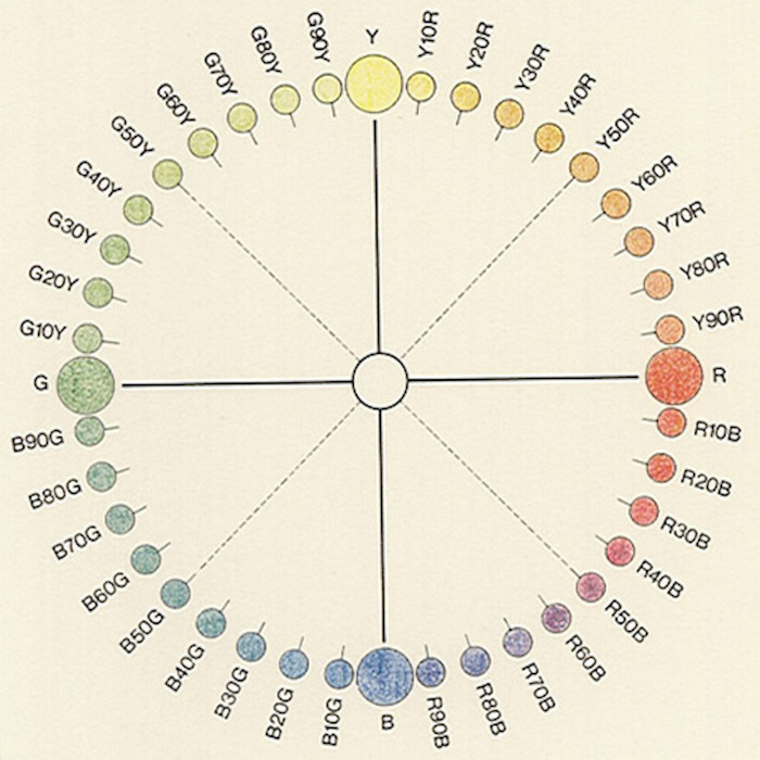
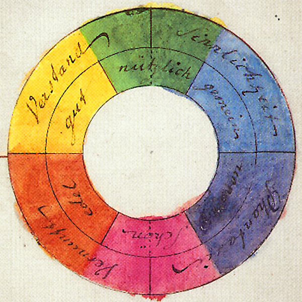
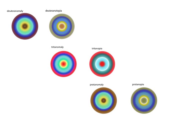
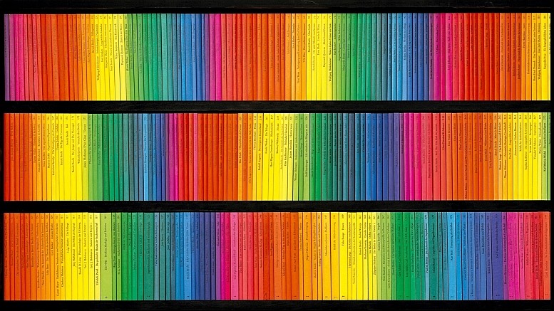
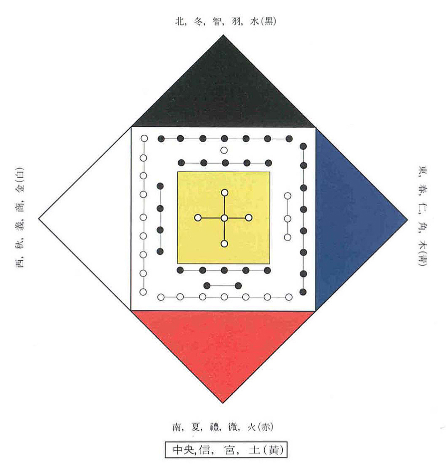
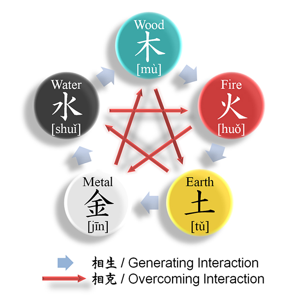
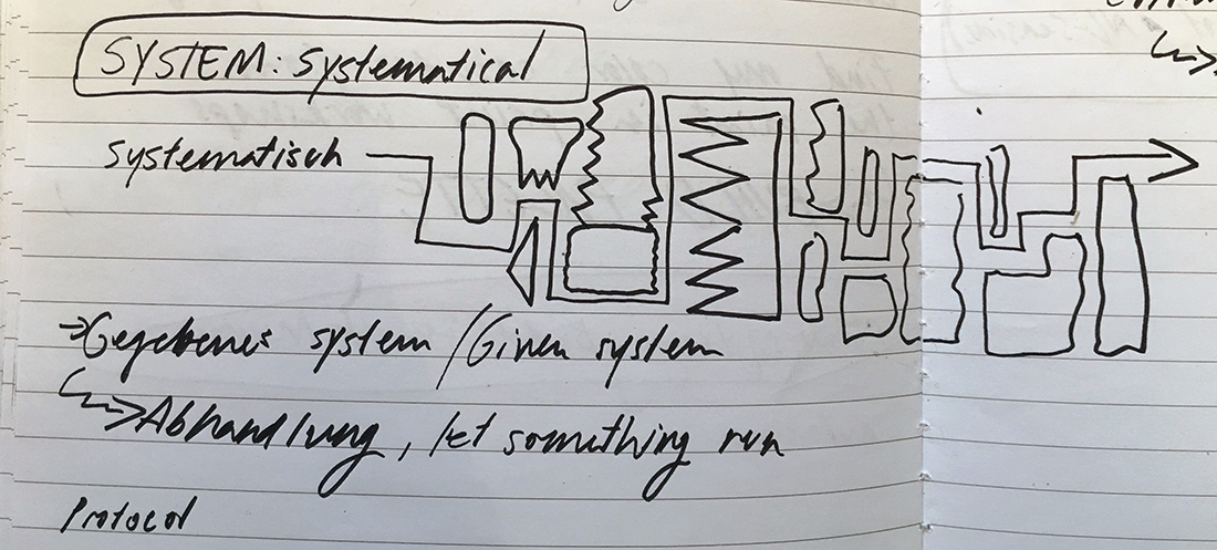
After I made my research on Michel Albert-Vanels innovative colour-system which pushed processes related to colour forward, I had a very scientific image on colour-systems.
After the announcement of creating our own colour-system, I remained being caught in a very theoretical and scientific image of the function of a colour-system.

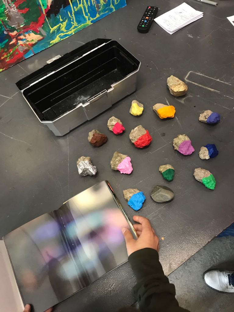
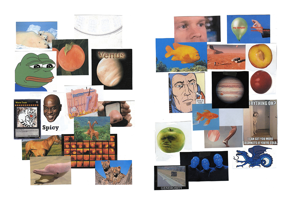
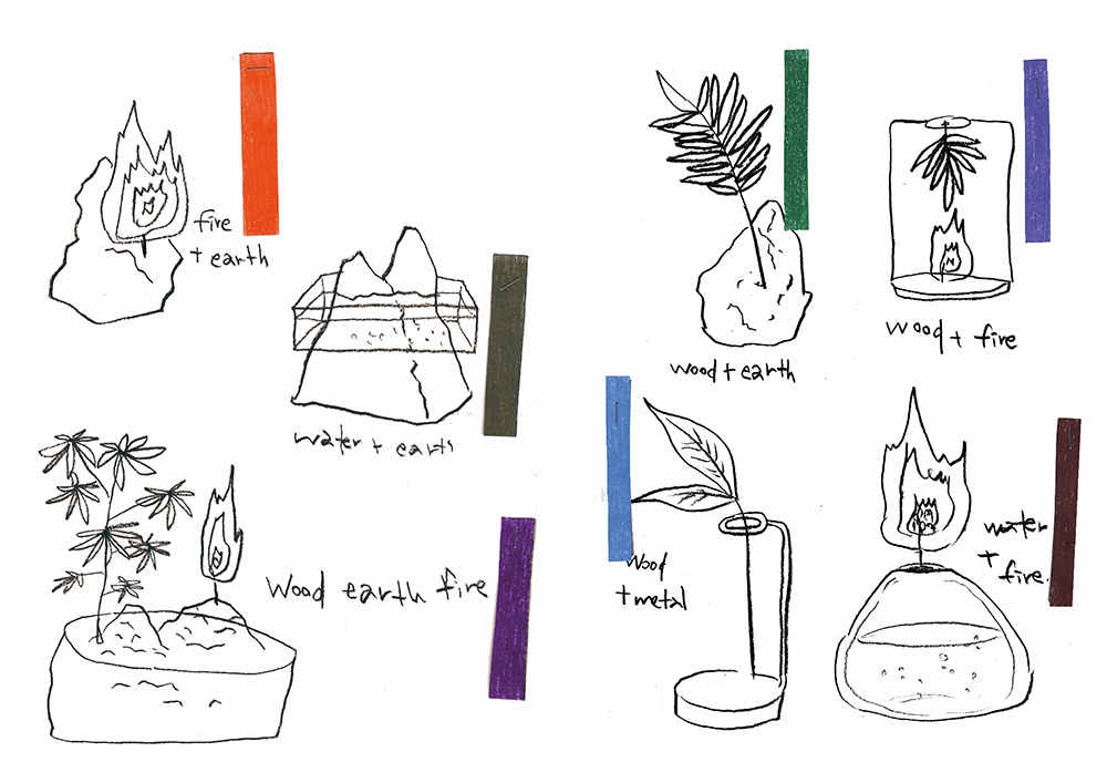
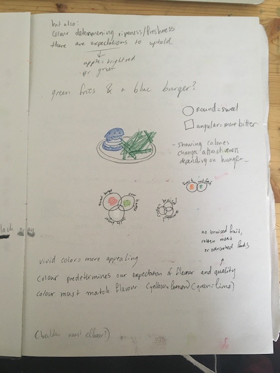
When I look through my notes, I see a lot of short-living attempts of different approaches to the assignment.

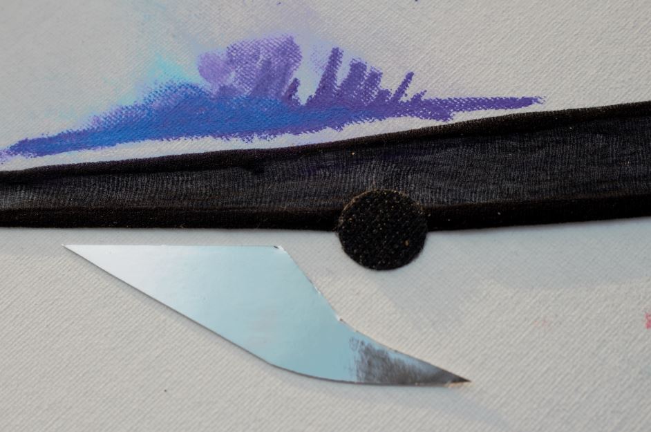
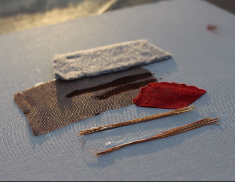
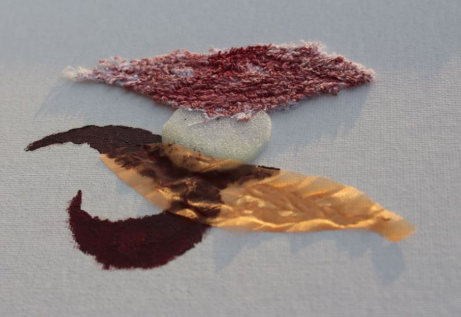
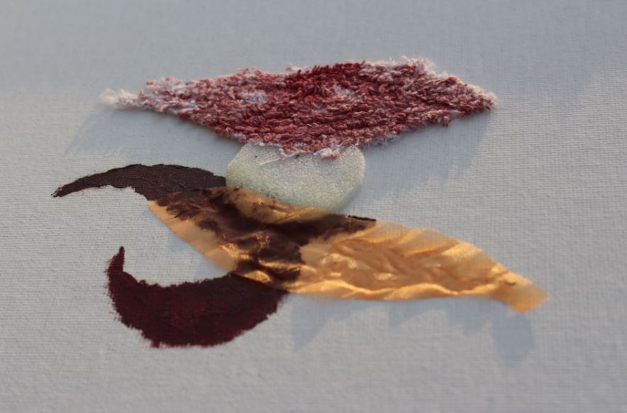
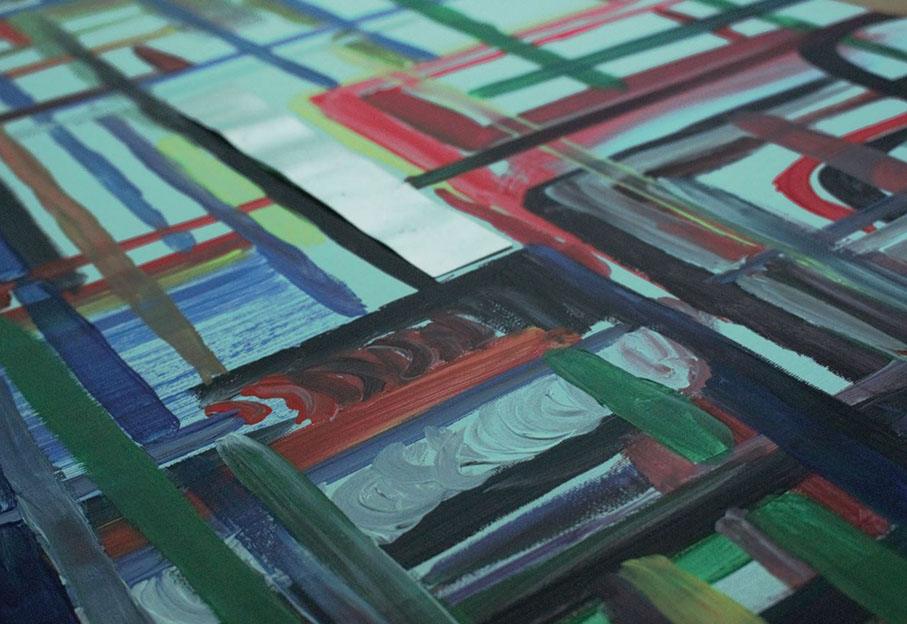
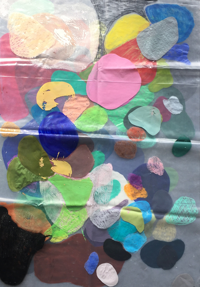
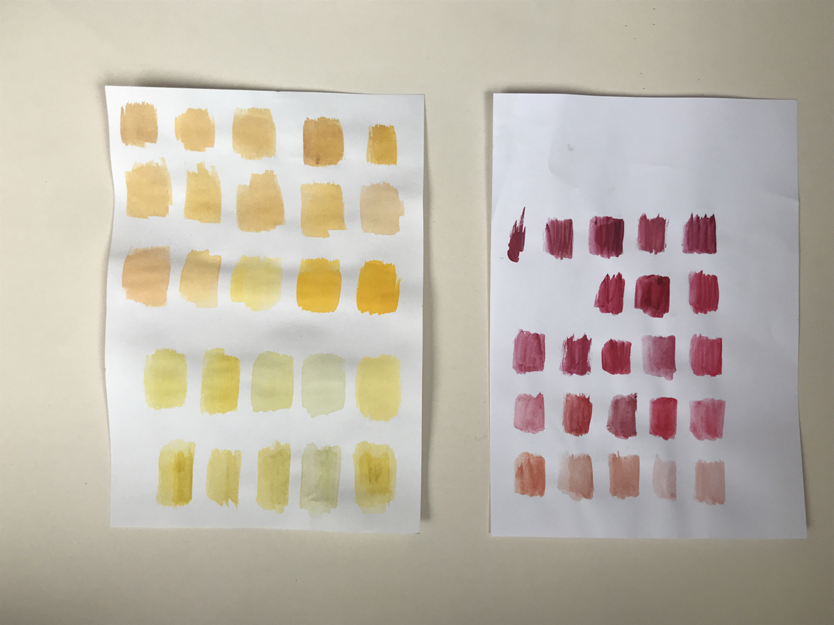
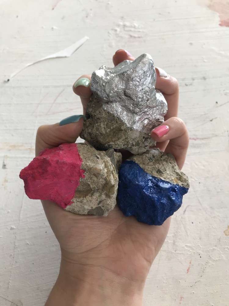
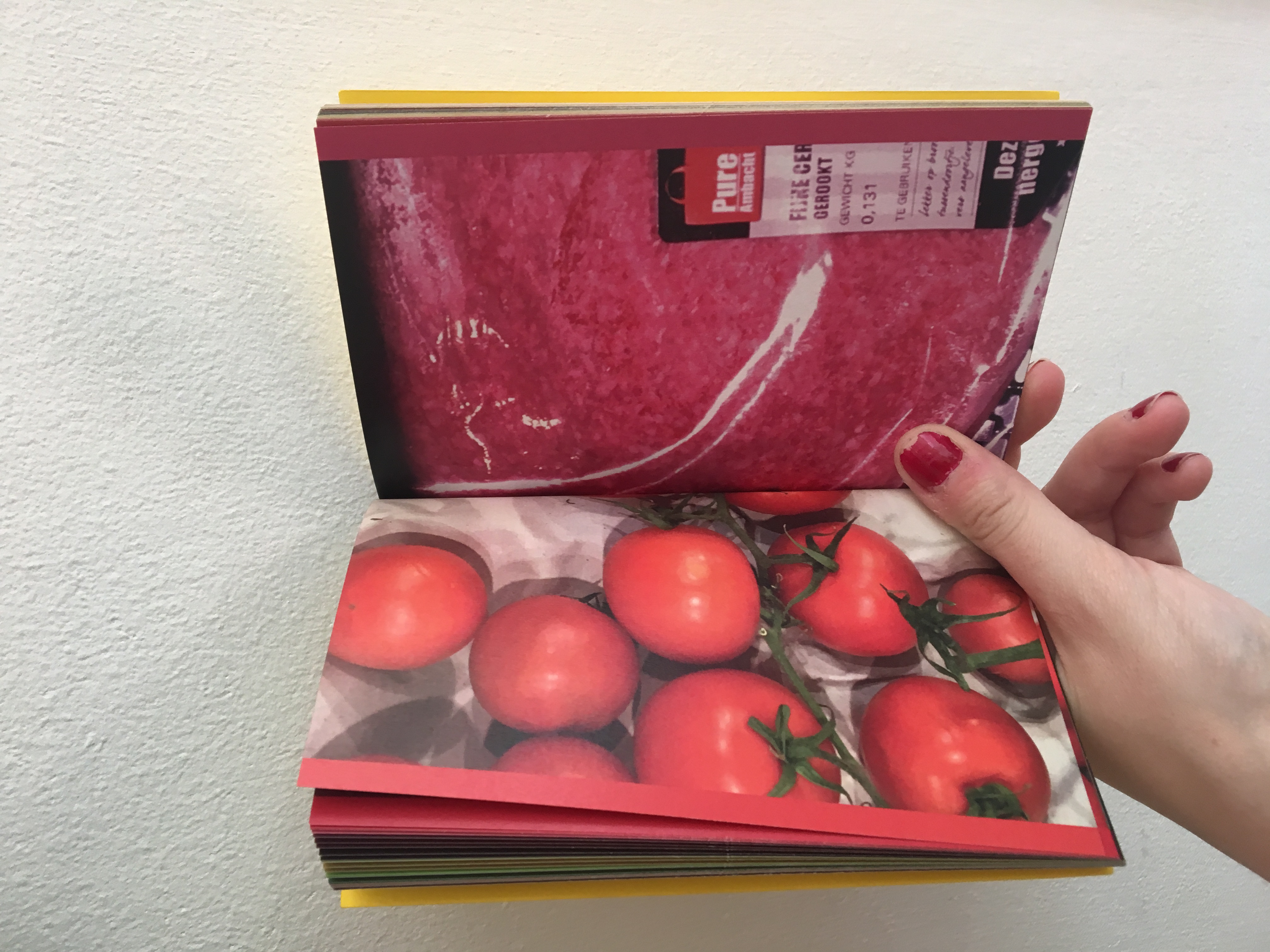
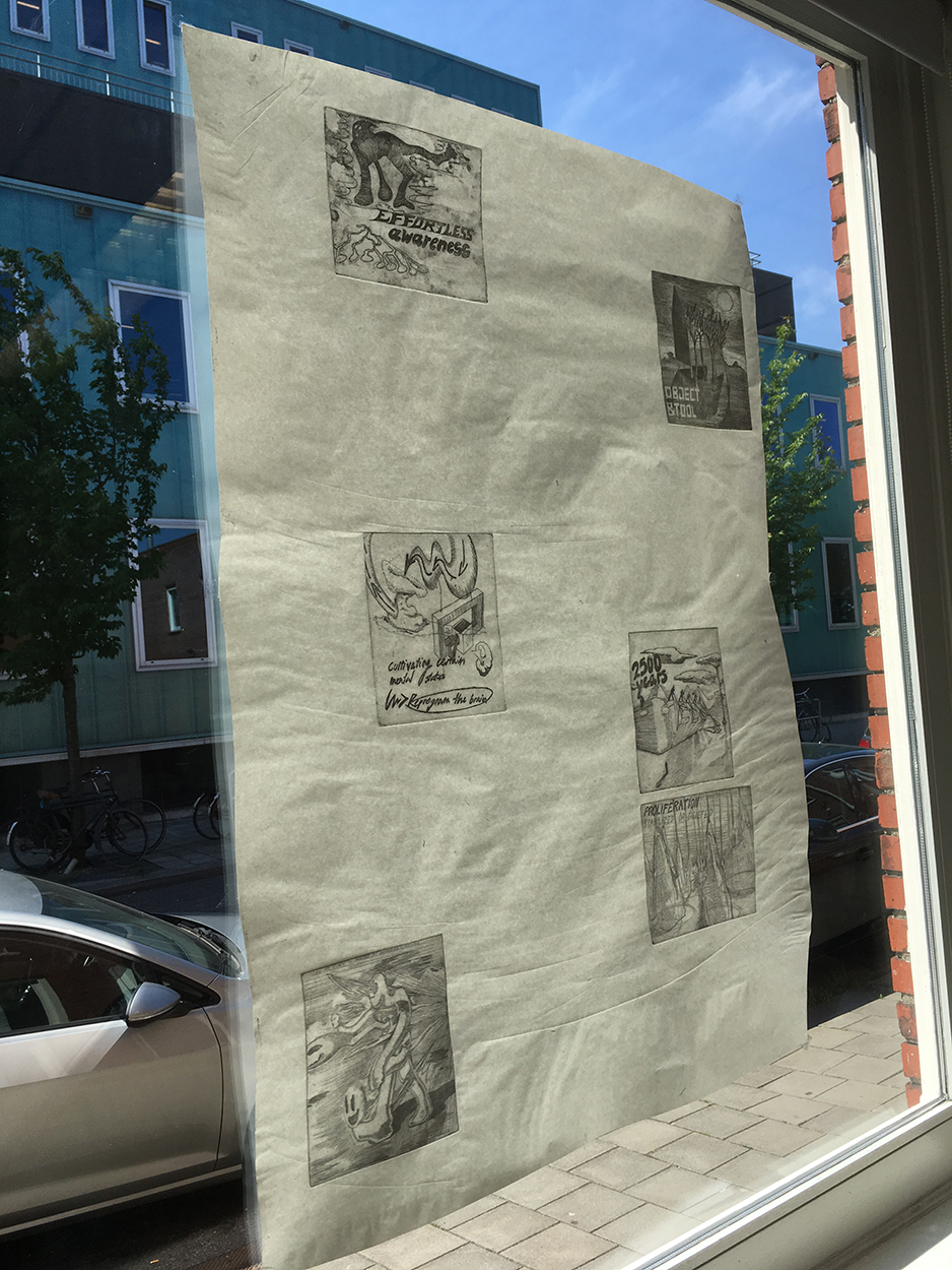
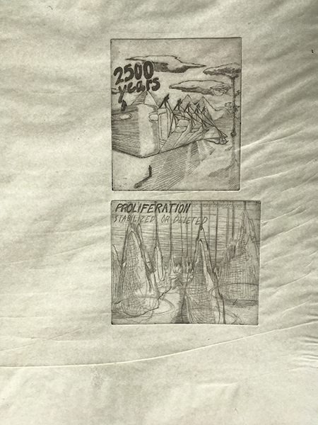
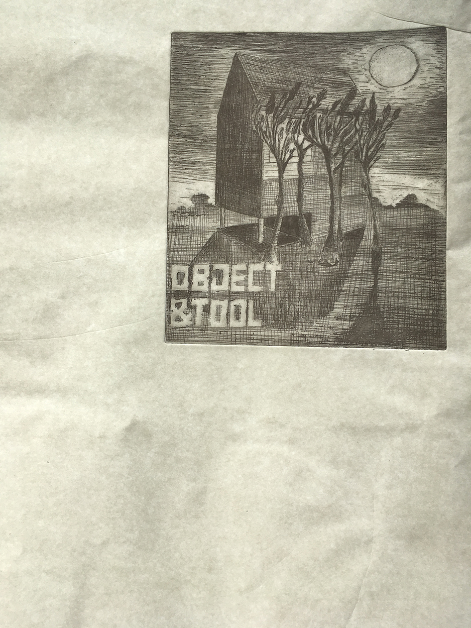
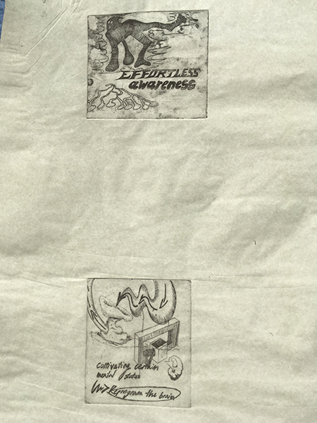
First, it was mostly notes from already existing colour-systems, which should inspire my own one. The first idea was, to connect our free longterm assignment in mixed media with the colour system and looking back, I should have stayed with this idea. In our mixed-media assignment, we work with texts as a starting point. The text I’ve chosen is an excerpt of a dialogue between two friends: Wolf Singer, a distinguished neuroscientist and Matthieu Ricard which left a career as a molecular biologist to become a Buddhist monk. In their dialogue they discuss meditation-practice and it’s direct influence to the human brain.

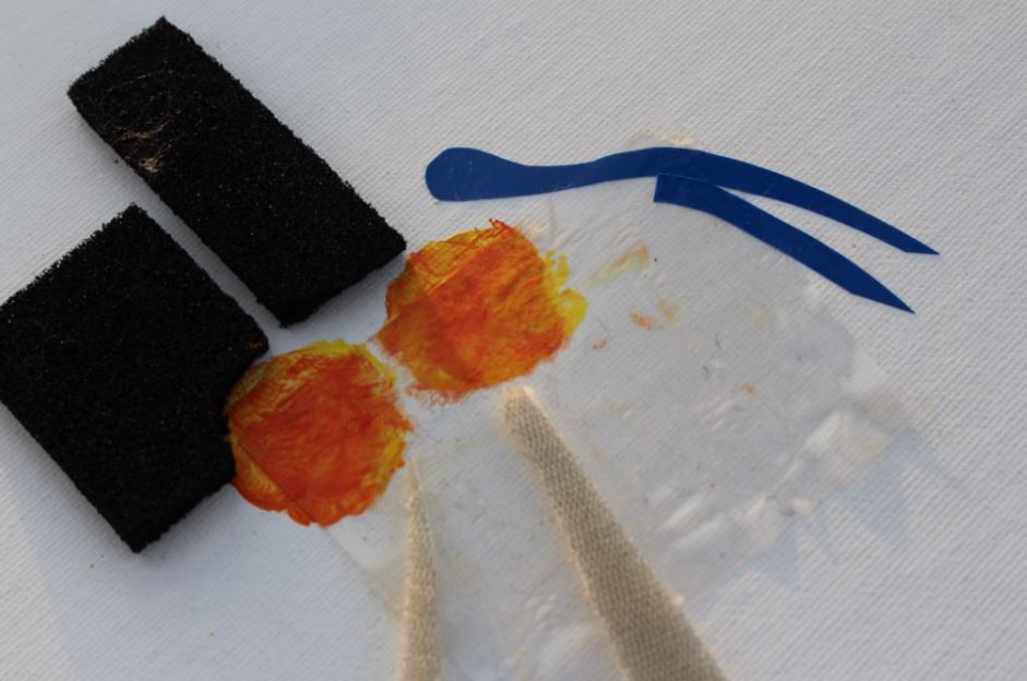
I’ve started with the idea of making a series of etchings and silkscreen-prints on the topic.

plan_b1
plan_b2
plan_b3
plan_b4

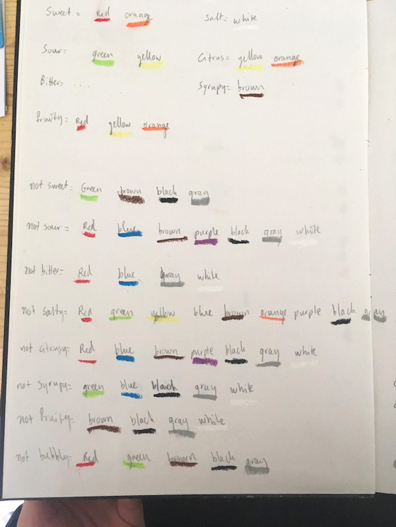
I thought, it might be handy to break down this dense and complex article with the help of colour by, for example giving both of the positions – Singer and Ricard a certain color. So their points and positions are expressed in a certain colour tone of the print.

That would have created automatically a colour palette which is linked to their positions and a mix of new colours when, for example, they agreed on a point, so that both of their positions come together as one.

I wasn’t fully convinced of this idea and missed the systematical approach to it, which I thought is the centre of a colour system. To select some colours for both of the speakers was more of a colour-palette, rather than a system, through which I could „run“ these prints and which would automatically create a colour-composition.

This wasn’t the last idea which started to crackle when I was thinking about systems and probably it was this image of a programmed application like on a computer, which was standing in my way for a long time.

systematical_illustration

Soon, I realized, I could look for a Buddhist and neuroscientist colour-system and bring them in a next step together. But how would this look in the end? what would be the product and the outcome of this idea? I remained helpless and moved on from idea to idea until I rediscovered these promising systematics in music.

I’ve heard about micro-tuning systems a while ago in connetion with the Finnish DJ and producer Aleksi Perälä.

Perälä and his long-time friend and collaborator Grant Wilson-Claridge developed a musical tuning system, the „colundi sequence“. Despite that, Colundi has the character of a spiritual entity, which makes Perälä refering to it as the creator of the music he is producing.wp-content/uploads/2018/04/Schermafbeelding-2018-05-23-om-11.20.23.png

It remains a mystery for most of the people, including the journalist from the article I’ve read about it, what the „Colundi Sequence“ actually is, but what was very inspiring to me is it’s origin:

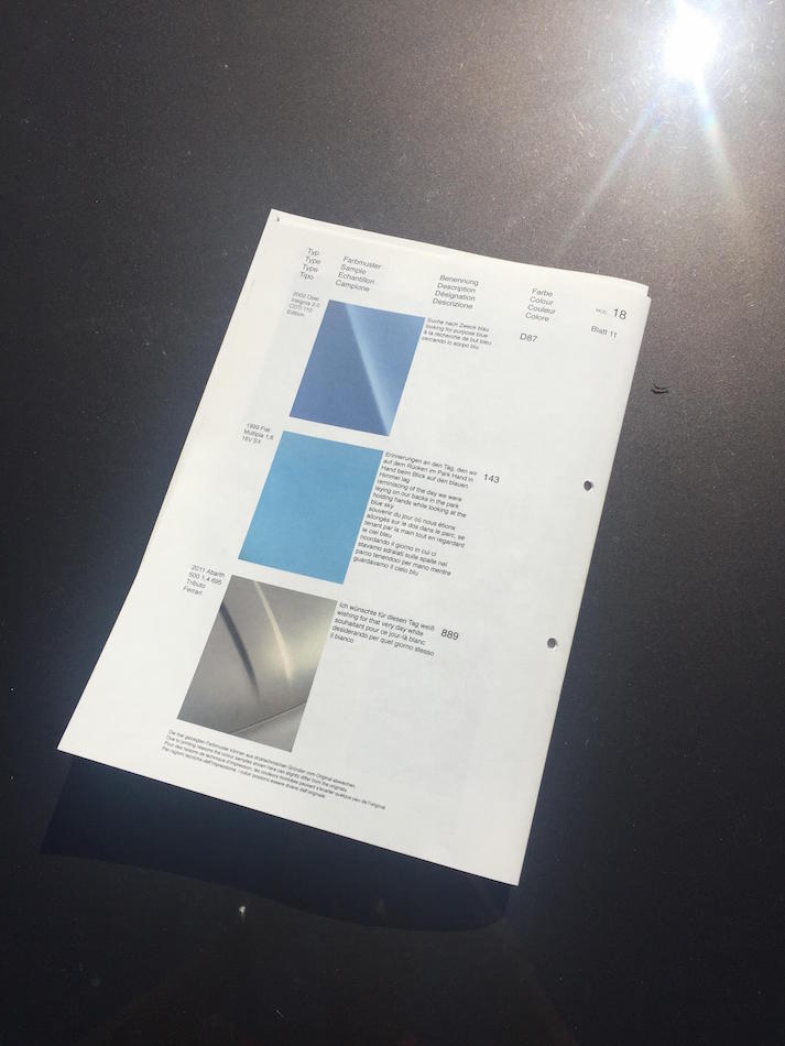
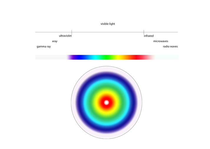
As we know, most western music is based on the 12-tone tuning system. All of these tones have a certain frequency in Hz, based on harmony.

Like other artists did before, Perälä started developing his own tuning systems in his music which resulted in the Colundi scale, a sequence, which is not a tuning system, according to Perälä.

The Colundi scale „is a sequence based on specific frequencies, often not related to each other in a traditional musical way“.

Grant Wilson-Claridge, Perälä’s friend which was mentioned before, came up with the frequencies for the colundi sequence.

“via experimentation and philosophy, each relating to a specific human bio-resonance, or psychology, traditional mysticism or belief, physics, astronomy, math, chemistry.” he told the music magazine „the wire“.

What he meant by that becomes more clear in one of his Facebook-posts:

“E.g. 90-111Hz – Beta Endorphin range. 126.22Hz – 32nd octave of Earth year, The Frequency Of The Sun, Color=Green, Tempo=118.3 BPM, centering of magic, Hara (chakra).” So the frequencies all have a specific origin in something natural.

This approach highly inspired me to do a colour system, which is based on specific frequencies, which then would be transformed into colours.

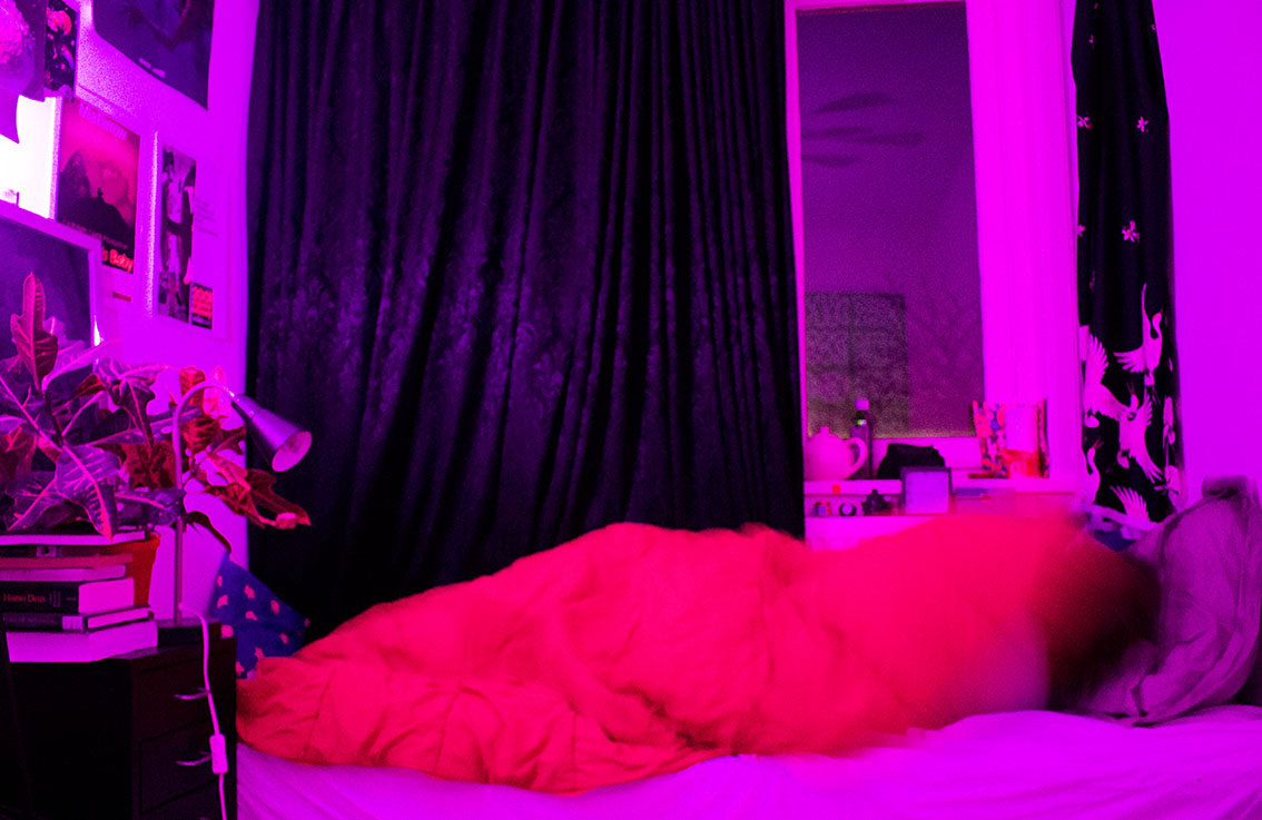
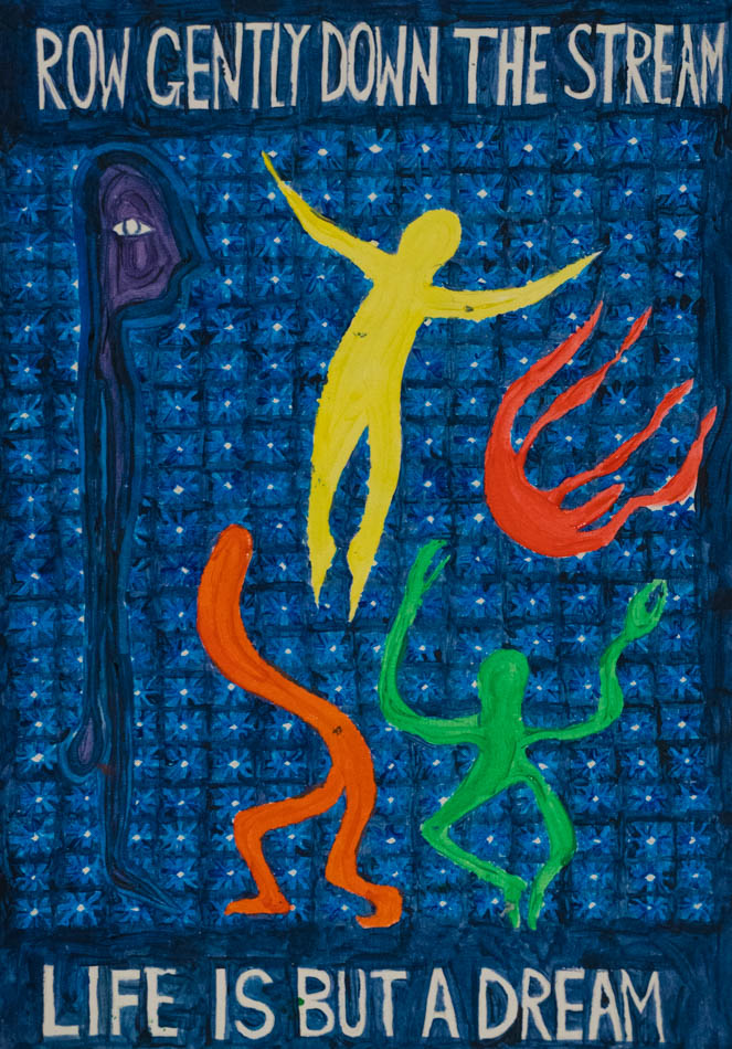
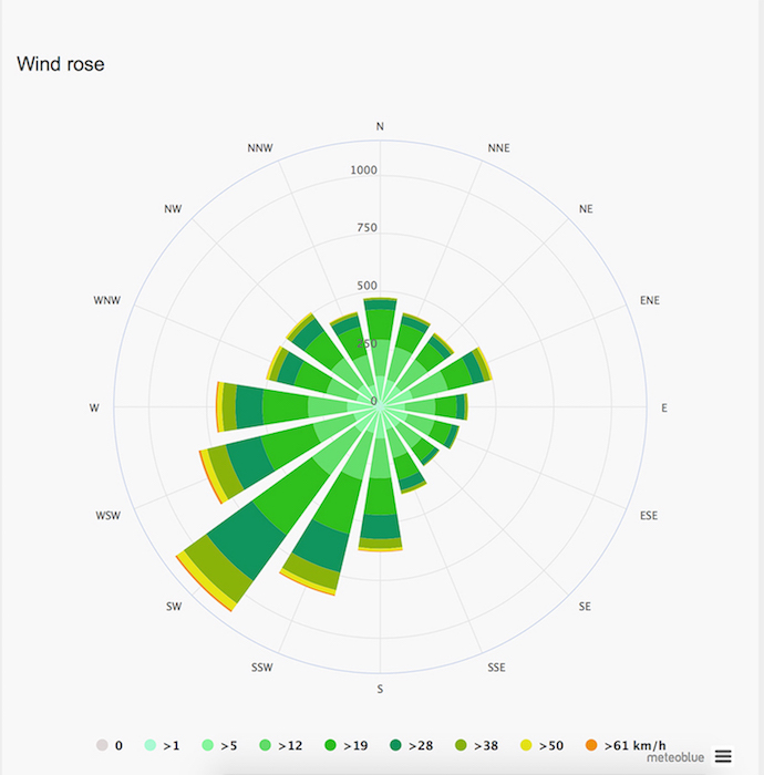
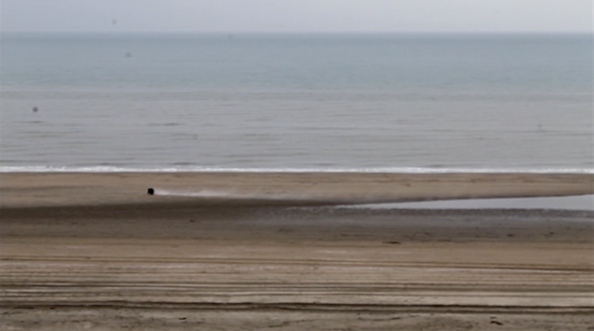
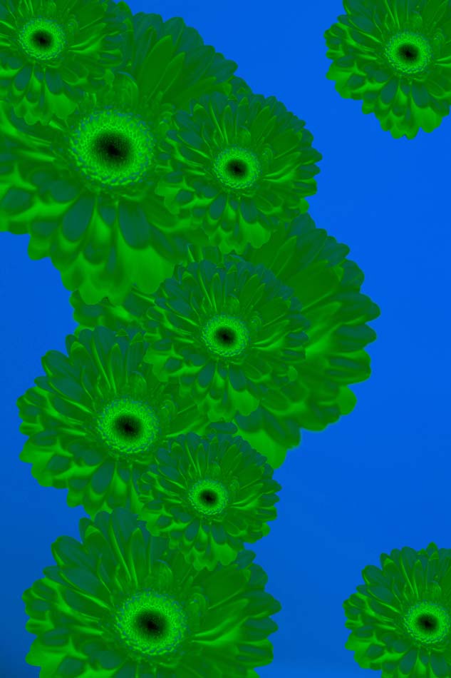
Around this time, the idea of creating a video came up, in which I would involve certain narratives, which carry the colour of their frequency, so there would be the ocean and the frequency of it’s currents as a narrative, as well as other positions like myself and the frequency of my heart-beat.

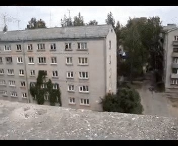
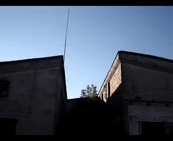
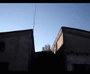
On the search of different narratives, I rediscovered a Youtube-Video, I used to watch very often as a child.

It is one of the first Freerunning-Videos I’ve seen, where Latvian Traceur (Word for people practicing parkour and freerunning) Oleg Vorslav climbs up buildings, flips walls down and jumps from roof to roof.

This video was probably one of my first experiences using youtube regularly as an archive. I was watching this video over and over again with my friends and it was very exciting to rediscover it after so many years.

I knew, I wanted Oleg Vorslav as one of the narratives, so I started to cut out short excerpts from the video to use them for mine.

Oleg_on_the_roofOleg_roofjump

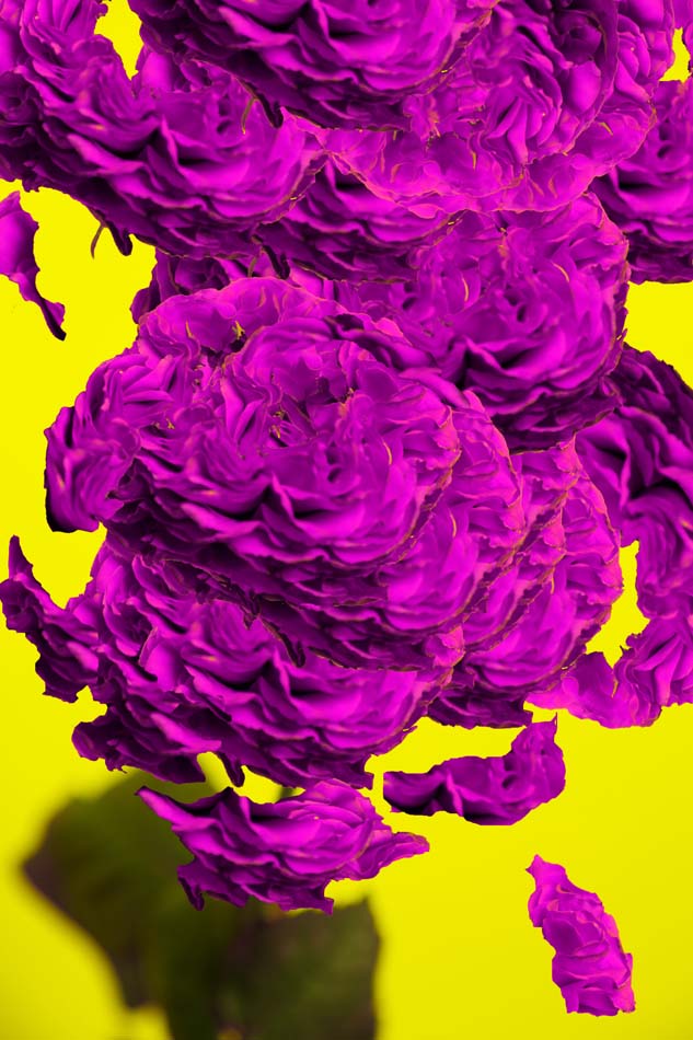
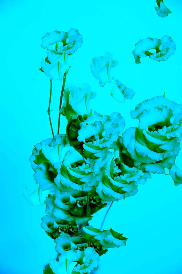
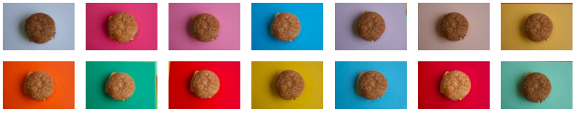
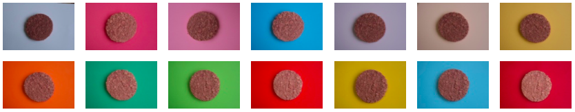
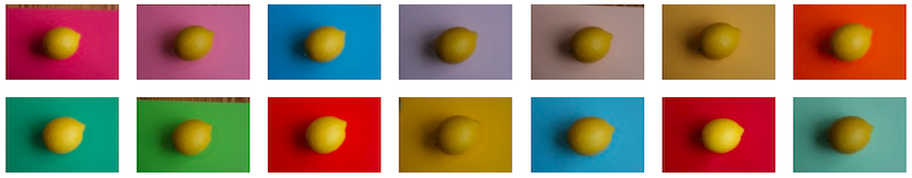
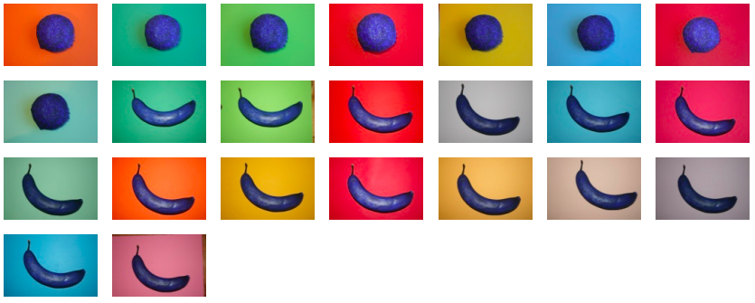
I also started to go through my own video-archive and discovered alot of interesting material associated to colour. At the same time I didn’t know how to continue with my idea of frequencies and this system started to stand more in my way, rather than being a rich addition to the process, what made me decide to drop this idea and naroow it down to it’s essence: producing a video – in anyway.

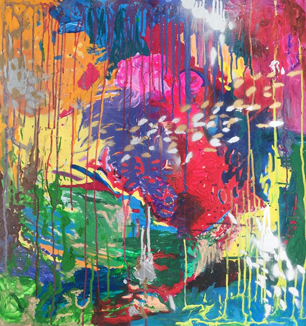
During the whole process, I had a very thoughtful and conceptual approach to the project which often became an obstacle. At this point of the work, I had a need of a more free and spontaneous approach, so I started soon to edit the video and combine it with animations. I made my decisions quickly and intuitive, which opened up more possibilities for me.

Slowly, a system developed itself, where animations and moving images guide each other through the video, from colour to colour.

Get the Flash Player to see this content.

Looking back to this process, it was very much about handling disturbing thoughts and bringing me back to motivation in any situation or stage of struggling. In the end, I realized, that I could have trusted more into my own ideas and directions which I was attracted to.

I’m still a bit confused about the video I did, because I can’t really explain what it is and where it comes from. It’s been the first time, where I had to act on my gut-feelings out of emergency and tie-pressure, which was a unique experience. Under circumstances like this, great things have been discovered, so maybe we should appreciate stress and time pressure more as an opportunity to make us explore new grounds of our creative process.


Golden Ratio Colour System


Monday, April 2, 2018

As you look at previous colour systems in history, you can see that most of the colour systems are based on a geometrical shape or a figure. The reason behind that is having a geometrical shape as a base helps you to locate colours in a logical way because of their symetrycal shapes and perfectness.

228724823-golden-ratio-wallpaper

Many people used spheres,cubes and pyramids for many diffrent colour systems, But nobody used a special shape as golden ratio. What makes golden ratio this special ?


The golden ratio is a mathematical principle that you might also hear referred to as the golden mean, the golden section, the golden spiral, divine proportion, or Phi. Phi, a bit like Pi, is an irrational number. It is valued at approximately 1.618. As a ratio, it would be expressed as 1:1.618. A rectangle that conforms to the golden ratio would have shorter sides equivalent to 1 and longer sides equivalent to 1.618.

The question is, then, why (or indeed why not) do we find the proportion delivered by an obscure mathematical theory aesthetically appealing?

For a start, the golden ratio tends to crop up with surprising frequency within the natural world: from leaf and seed arrangements to aluminium alloy crystal structures. And it would seem that much of the mysticism surrounding the aesthetic properties of the golden ratio are divined from its natural occurrences.


Even if you do find the golden ratio attractive, finding an explanation for its appeal, beyond the vague assertion that its prevalence in nature gives it some kind of mystical property, is hard to find. I’m inclined to suggest that its mythic qualities enhance its attraction. If something is supposed to represent aesthetic perfection and no other reason supports the theory other than its repeated appearance in nature, it becomes a self-fulfilling prophecy.

c9762bd955f9a16fc039ff3da1c7701e


However, Prof Adrian Bejan, of Duke’s Pratt School of Engineering, has posited a theory pertaining to our preference for the golden ratio that is rooted in his research around the idea of ‘flow,’ and how nature’s designs evolve to enable ever-increasing efficiency of movement. In the case of the golden ratio, it stems from an animal’s need to scan the horizon and quickly apprise it of information. Supposedly the most efficient form for doing this is a rectangle that is approximately one-and-half times as wide as it is tall. This amounts, roughly, to the golden ratio. According to Prof. Bejan: ‘Animal vision should be configured in a way that seeing and scanning should be the fastest and the easiest. And when the proportions allow this to be done, it should be a source of pleasure because of its past evolutionary associations with finding food or a mate.’

The Golden ratio color system is unlimited and can be expanded as required. But in any case, at the beginning of the system there is White and at the end there is black. Between black and White you can see every colour in rainbow orderly located on top of the meridians. There is a fiction in the Golden ratio color system. Each color provides a transition between tones that causes effect on the next color.

tuna colour system


YES/NO COLOR SYSTEM


Monday, April 2, 2018

When first introduced the idea of creating a color system, a small panic appeared in me. After studying ‘theory of color’ in my previous studies, I was afraid that it would turn into a theoretical and precise boring system, where the colors are mixed based on a strict formula, very far away from my interests.
What is then what is so interesting about color for me? What will make me excited or what do I need to create a color system for?
After a long process of reflecting, I decide to take a step out and look at color differently and alienate it from any system that I have studied before.
Reflecting on my need, I’ve always looked at color in food, due to my intolerance to sugar, some food is forbidden, meaning, some colors are forbidden. For example, when my friends ask me, what vegetables can you eat? I say, only greens, so it’s easier for them to remember that tomatoes or paprika or others are not good for me.
Thanks to this I started collecting images from the supermarkets, walking around and seeing the difference between what I can eat and what I can’t. All the bright colors from the fruits and some vegetables, were forbidden of course, and all the not so hysterical colors from the rice, beans, meat were fine.

IMG_8729 IMG_8728 IMG_8727

Now the challenge was, what do I do with this pictures?
Something like a guide, a small booklet I could carry around, and I could give to my close friends, similar to a little Bible.
I always carry a small notebook that fits my pockets, so I decide to take that format and create a two sided booklet, where one side has all the food I can eat, and on the other side it has all the food I can’t.
I took the decision to add a small color mark on the side of each page with the exact color, creating a small gradient on the side of the booklet. On both sides, it starts with light colors, and goes to yellow, orange, red, green, brown and darker. The order of the gradient has been influenced by the harmony between colors in the Coloroid system I wrote previously about.


fructosemia4 yes                        fructosemia3 no
Because it’s a double sided publication, the gradient is on both sides, and always both pages contrast with each other, one being the yes and one the no.

IMG_0913 IMG_0912


7122 The book that inspired me is 9,5 x 15,cm, single pages and glued. The design of it is taken from the notebook ‘Notizen, edition suhrkamp’. (click on both images to access more information about the edition Suhrkamp)

7Teaser

These are the rest of books that this publisher has created and this as well was a part of the inspiration for the harmony in the gradient.


IMG_9375        IMG_9378

It has a yellow cover first, because of the inspiration I took the book from, and as well because of the color of the lemons, which is the only fruit that I can eat. In the presentation I decided to include some lemons that ill hold the book standing and as well camouflage it and integrate it in the space so it’s not flat.
I am very satisfied with the result as well as happy about how much I learnt about book binding, and the paper. For example, how important it is the direction of the fibers of the paper when you print so the corners of the paper don’t bend. Since it was a very precise color scheme, it had to have specific bleed marks and cut marks that I never used before.

Exploring White Light


Monday, April 2, 2018

There’s more then just a simple white, the daylight is very different from the morning to the evening, there is warm white light and more cold to very blue light. This warmth in light is defined in the Kelvin scale. Buying a light bulb you can decide the color temperature. What interested me was how light is used in different spaces. Therefore I searched in the internet for extreme examples of light. That’s how they look next to each other:

Example

Even what we think of as white can be different. Some people are very aware of these differences for most of us light is just there and we don’t really care about it. Even if flickering LED’s in offices produce physical stress or candlelight can make someone look more attractive. In my color system I want to make these differences visible. I made a list of places that possibly show them:

Museums, Libraries, maybe private kitchens or restaurant kitchen and offices. I wanted to visit three of each to be able to compare them.

Public spaces are often aware of the kind of atmosphere they want to create. A library wants to be inviting, a museum wants to direct the visitor to the artworks and in other places it could be more about having enough light and not so much about the atmosphere.
I took my camera and started photographing my first stop was not on the list, but close to Rietveld. A parking lot. I saw a lot of flickering LED lights, green lights from the electronic car chargers and blue lights in the elevators. It was day but by night is must feel a bit scary there. Next to photos of light the photos became more and more architectural.

Parking Lot

The architecture of the places continued to play a role in the next pictures too. In the Eye Museum it was dark with a lot of projections and also purple light. That was the point where it went away from only the spectrum of white lights. The purple light was nicely cut by the edges of the building and created beautiful shadows.

>Purple Edge

To stick to my list I went to three different libraries. With a lot of warm and yellowish light. The photos I chose in the end where mostly from the central library.
In the end I did not visit all the places but I had a feeling of continuing the collecting without any direction, so I wanted to have a format to put them before taking more pictures. I chose the Leporello. With not much experience in book binding I wanted to try a new format that’s easy to teach myself. The part where I struggled the most was still to come. Making the selection of my photos and arranging them.

Example

I printed the photos out, cut them in the middle and rearranged them. I wanted to select them by a similar place or color, but when I printed them out I found it more interesting to combine the different ones. Now it was a bit like puzzling the photos together and making two rows for each side of the Leporello. Some of the photos from really different places fitted very nicely together. I was happy about the selection, and didn’t want to compromise them more. From the printed photos I went back to the computer and fitted the photos on A3 sheets, so each photo was about a size of 15cmx 21cm. What I realized after the printing is that in this size the photos not really matched the format any more. I still wanted to see how they looked as a finished thing. So I started putting everything together.

Front

Leporello

Looking back on it now, the Leporello is a step in the process. I found it difficult to find the right frame for it and to make the step after having a selection of photos. I put the Project to the side, because I did not have an idea how to change it. Since I started writing down the process I think about continuing with the color system. I thought to make more pictures that have green, blue and red light. Which are on top of each other white light. I thought about my presentation of the discovery of Maxwell and tried to split one of the photos I liked most into the three basic colors. I printed it on transparent sheets and hold them into the light. The result I liked a lot and I thought to use them as a cover for a new booklet. Maybe not a Leporello and probably a bigger size. The next step is to take my camera and add the missing photos to the selection. What I learned from the last time is to be more selective about the photos and what I missed was to have a specific eye on what photos I’m looking for. To make the book look more finished I want to visit the bookbinding workshop instead of DIYing everything.

FEWWM! – more than just colours


Monday, April 2, 2018

12

When I started my research on colours, I wondered about certain colours that feel special to me and why. It seems that the way I perceive colours is rather deeply emotional response that sometimes tends to be irrational. Yet, power of colours rules my everyday choice from the food I eat to the clothes I wear.

Somehow I was naturally drawn to the traditional Korean colour symbolism and East Asian colour theory as it used to affect my decision a lot in my childhood. I wore yellow clothes on the day of the exam, and I slept in red pajama when I got scared of ghost. I admit that it was rather superstitious at that time, but still, I give special significance to colours in a random, but emotional way.

My first approach to this project was to bring an East Asian perspective on colours.

A week before the project had been started, we researched about 20 existing colour systems and presented them to the class. While watching the colour studies developed by philosophers, psychologists and artists from Western countries, I got really curious about how East Asian point of view on this matter would be different. I took the traditional Korean colour spectrum, also known as Obangsaek as a starting point of my research.

 image no.2

Obangsaek is the colour scheme of the five Korean traditional colours of blue, red, yellow, white and black, and each colour is related to certain elements in the world, including various virtues, emotions, and even the celestial motions.

Our ancestors used these colours to make decisions because following the Obangsaek was equal to following the way of nature.

I  found that the five colours are also associated with the five elements (or the Five phases; water, fire, wood, metal and earth) in Yin Yang , which are the core concepts of Chinese cosmology.

Wu_Xing

Blue: wood

Red: fire

Yellow: earth

White: metal

Black: water


I got fascinated by this cosmology as it sees the world as an organic whole where everything can be grouped into the five categories according to its nature.

In the table below, you can get brief examples of how it works.

22

Next idea was to make a series of image collages just to experiment the idea with visual elements.

imge no.5-1

image no.5-2

My interpretation of this idea was to show the connection between the colours and the elements and, by extension, the world we live. Then, I decided to make three dimensional objects using the five elements as materials because I thought it would be great if I relate the colours to something material in our everyday life.

After creating a concept for my system, I wrote a short introduction to it.

——————————————————-

In Korea, traditional colour symbolism is based upon the five elements and the five basic colours (blue, white, red, black and yellow). These five colours reflect the traditional principle of Yinyang (umbral and bright) and Wuxing (Five Phases: water, fire, wood, metal, and earth) which are the core concepts of traditional Chinese cosmology.

This cosmology perceives the universe as an organic whole, in which the spiritual, natural, and human worlds are ordered into a single, infinitely interconnected system.

It groups phenomena into the five categories, in which relationships are held to be relatively regular and predictable. Eventually, all things in the universe are categorized and correlated, and everything affects everything else.

Entities, processes, and classes of phenomena found in the human world (the human body, behavior, morality, and historical change) are set according to various entities, processes, and classes of phenomena in nature (time, space, the movements of heavenly bodies, seasonal change, plants and animals, etc.).

FEWWM is a new colour system invented by myself. It is rooted in the existing idea of Wuxing and Obangsaek (Korean traditional colour spectrum).

FEWWM, however, differs from the traditional East Asian colour theory in that it has a three-dimensional material feature.

Using found objects, I created a series of sculptures in correspondence to the five elements; wood, fire, earth, metal and water.

Possible colour mixtures are represented in a form of two mixed materials and the colour of the background indicates what a combination of two produces.

FEWWM expands its range into objects of our daily life, spreading the idea of the correlation of all.

——————————————————-

image no.6

By making these drawings, I tried to merge two different elements into one object and show how the combination of colours could be represented in this system. Then I collected the materials around my neighborhood and started to make a series of objects. Then, I photographed them to show our class mentor as the original sculptures are extremely fragile to carry.

??


??

I struggled a lot to come up with an ideal way to present my system, and my initial thought of the final result was to put a fabric mat with a diagram like below on the floor and place the small objects according to the position of the five elements.

7EB37F2A-A2C5-4CAB-83E9-C1DEFCDC490E

However, I could not be satisfied with the idea as I felt something was still missing. That was the moment where I took one step back to the photographs and decided to bring colours back to my system.

Thinking about a way to invite colours to photograph, the background seemed to be an interesting material for me to work with colours (like Joel Meyerwitz’s photographs of objects). I tried different colour paper and took photos of them. The result was amazing; the photographs really capture the synergy between the objects and colours. When I first saw the photographs, I got absolutely convinced that I should make a publication with them.

13151617

14

I took the first letters of each element and named it ‘FEWWM’. I like it when it is with exclamation points (!) because then it looks like a sound effect (FEWWM!). For the covers, I made a drawing of fire, earth, wood, water and metal. I used grayish colours for the covers since the inside was pretty full of colours. have a look…(click here)


I found that the way I write down the five elements keeps changing in the publication. Sometimes it is fire, earth, wood, water and metal, but sometimes it is wood, fire, earth, metal and water. Also, I was not aware of the fact that prints on this kind of paper get more finger prints and scratches. However, I really liked the assignment and result. From the oriental cosmology to printing/binding technics, I have learned so many things and had a lot of fun doing it. It was also a great opportunity to introduce Korean and East Asian culture to the school project.

FEWWM is a complete colour system as itself, but there is a lot to explore.

For the next step, I am thinking about making sculptures with more than three different materials referring to mixtures of three or four colours. There are as many as possibilities there are colours.


??

Food color perception


Monday, April 2, 2018

You know how, when you have a bag of sweets, the yellow one is going to taste sour like a lemon, the green one tart like a green apple and the red one will taste the sweetest, like a strawberry.

Have you ever had a blue sweet? They do exist but often don’t represent a certain familiar kind of food. The blue is “odd-tasting”, the blue one is often considered the least tasty of these four colors or at least the least familiar. This is because we are used to associating dark colors, like black and blue, with rotten foods.

Different research over time has proven that color can affect the (sense of) taste of different kinds of food. Even if the food doesn’t actually taste sour but is yellow, our brain will respond to that colour and tell you that this food tastes sour.

“we taste with our eyes long before we taste with our mouths”. Here is a short video of an intelligent looking man telling you more about this phenomenon.

I know there are a lot of interesting turns on this “color” theme but this topic of color in connection to taste and/or the expectation of taste  is one I found particularly interesting because apparently we can change each others senses of what we see just by changing a colour which is pretty spectacular!

So; I did some research and wrote the basics of what I found down in my notebook.

Notebook1 Notebook2

Certain colors stand for certain tastes as well as the perception of the freshness and/or ripeness of the foods we see. Our brain creates this link between color and taste and/or smell and also just the expectations of the taste of certain foods.

For example; we expect a red apple to taste more sweet in comparison to a green apple that would have a way more sour taste (which is ok because we know that red is sweet and green is sour).

I wanted to somehow capture this occurrence and I figured that the best way to let the colours speak would be on a photograph because this way the look of the food (where you say “this shape looks like a banana”, or “this shape looks like a lemon”) is the only thing determining your expectations of the food and not the smell, consistency etc which I felt would not make my point stronger.

The next step was to take pictures of a banana, a cooked stake and a tomato, putting them on a differently-coloured background in each picture.


Bananas 1

Steak 1

Tomaat 1

I didn’t feel this worked at all. Looking at these pictures, my perception of the food didn’t change. It looked flat and the only thing that came up with me was how much the bananas looked like an Andy Warhol print.

Andy bananas

So then I read about this one study (click “download” in the link. p.22 of the downloaded file) that took place in the 1970’s where investigators had put participants in a room with a colored light and a plate containing cooked meat and fries. Because of the dimmed colored light the participant wouldn’t really be able to determine the color of the food.

Once they had half way finished the plate the light in the room would slowly go back to a normal color which revealed that the meat was blue and the fries were green. As a reaction to this, a lot of participants refused to finish the plate and/or immediately felt sick.

I think this was a strong investigation because it shows very clearly that the color of the food is very important to our brain. It has to work. Our banana simply has to be yellow and our apple red or green, otherwise your brain will definitely warn you not to eat it and it will look way less attractive to eat.

Notebook3

Some extra ideas that came up

So I figured this was what I did wrong with the banana.

This is where the idea of colouring the actual food lured me in. It made total sense that when it would work in this study, it might also work on my photograph.

This way the shape of the food would not cooperate with the color it had which might not work for our brains.

I chose new foods that have a clear taste in our head. So a lemon, a hamburger, a vegan burger and a banana.


Bananen 2 Burgers 1Vega 1 Citroen 1

And then I painted them which made me decide to let the vegan burger go because this was near to impossible to do and it didn’t have the look that I wanted it to have.


Geschilderd boven 1 Geschilderd boven 2

I took these photo’s from above (see above) and thought it was too clean which food isn’t. To me, making the pictures from above made the images look flat, less like real (eatable) foods but rather like something fake, non-existing.

This is why I decided to take the next pictures from the side rather than the top, like the food would be laying in front of you when you look at the image. I used two different background colors for two reasons; To further convey a spacious effect (rather than flat) and to experiment further with the color perception at the same time. The latter conveyed by trying to make the changing perception with different colors more clear in one single image. You could put your hand on the top part of the image and the experience would be different than when you would cover the bottom part, just like it would be different looking at the image and the colors as one whole.

Geschilderd 3D

Then I would have to make a next, maybe final, step. What images/image should I use as my final work or should I just continue experimenting until the end result will automatically present itself to me?

Should it be a book? A print? A collage? Everything? A lot of times a photo (series) is displayed in a frame on a wall and maybe also sold in a booklet or on postcards on the side. Is that how it should be with this work? And if I would put work on the wall. Would that be one photo or a series of photos and how would that work since all the works have different colors with the possible result that the colors don’t go well together on the wall.

There are a lot of possibilities but for now I found one way to present the final work I was particularly happy with because of the overall composition of the images I was content with made above but also, to be honest, kind of based on intuition and the general feeling some of the pictures gave me.

I think that, in general, the pictures are very well able to work by themselves but I also think that the images have the ability to amplify/strengthen the general notion of this work, the changing perception of food depending on color.


So in this instance I chose, as perhaps a final work (for now), a collage of different images working by themselves, together.


Eind 1


Log in
subscribe