Skip to Content Skip to Search Go to Top Navigation Go to Side Menu


"glass" Category


aerial forms


Wednesday, December 5, 2018

I firstly liked this book because of its simplicity
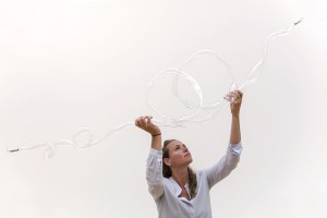
I was mostly attracted by the cover, a roll hanging on by a thread attached to a thin layer slightly curved. It could have been a jewel or an installation, all I could see was the beauty of the gesture.
It took me some time to find a book, I was going through the library and the bookshelves but I think I already saw this book once or twice, I was still, unable to see it.
I was despite me, looking for something specific, Something more colorful, more filled Something that could strike me instantly. I was really frustrated, I decided to leave the library and come again the next day when eventually I could be more open minded, then I found it.
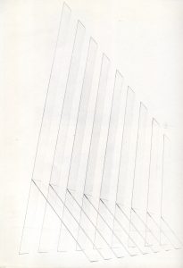
The book in its shape and its composition gets me back to the finesse of the glass and its conception. Composition of thin intersected lines initiating a meditative relationship,
The grain of the image becomes part of the aerial forms.
The space remains, allow the eyes to contemplate the shapes.
The blank spaces on the pages exist as much, to me than those structures; that’s one of the main things that I like about this piece, including a space through the page.
It brings me back to the work of the Japanese architect Junya Ishigami and the plans he realized for Church of the valley, through his drawing you can find similar ideas;
Inscription in the landscape
Inclusion of the earth
Dialogue with nature
There is also something happening in terms of managing the materials between
Raw material, minimalism and delicacy of the glass
I see the transformation through the pages,
The light is perceptible,
The shapes merges together,
Intermingle,
To create architectural shapes
Superposition of thin layers on off white paper


.

Fulvio Bianconi Pezzato Vase


Saturday, October 27, 2018

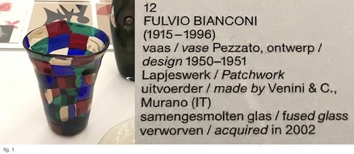
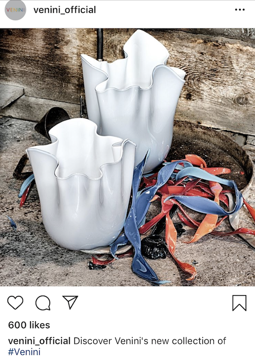
The starting point of my research was Fulvio Bianconi’s Pezzato Vase. The Vase that displayed in the Stedelijk Base (fig. 1) was designed in 1950-1951 and acquired by the Museum in 2002 from the artist Tomas Rajlich. The Pezzati series [Pezza (it.) – patch] was designed between 1950-1954 and produced by Venini & C., a Murano glass manufacturer.

Pezzato Vase at Stedelijk Base


I started my research by looking up books about Bianconi in “WorldCat”, an Internet-based books catalog that contains combined data from thousands of libraries around the world. Most of the relevant books about the artist that I could trace in Amsterdam were either in the Stedelijk Library or the OBA (Amsterdam public library). Besides, I searched in the Stedelijk library internet database, and with the help of its librarian, I could find a few more catalogs and books that did not come up in WorldCat. I also checked in the Rietveld library search engine, but unfortunately, no result came up. Most of these searches brought up relatively focused information about Bianconi and Venini & C.

Later I started to search about Bianconi by going through the glass and crystal books collections, both at the OBA and at the Rietveld Library. Those searches brought up less specific types of books, either about design in general or glassworks.

The physical materials I found can be divided into several categories:

Exhibition Brochures

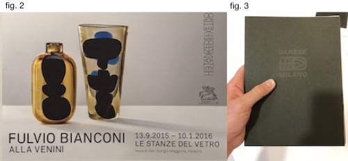
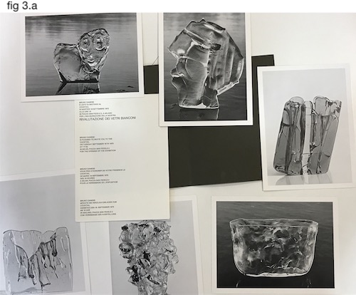
The Stedelijk library has two original Bianconi’s exhibition brochure: one from 2015 at Le Stanze del Vetro (fig.2), and the other from 1975 at Gallery Danese in Milano (fig. 3). The Danese’s brochure is the oldest physical material about Bianconi I could find in Amsterdam. It’s an envelope that contains six large postcards of the artist work and innovation to the opening in September 1975 (fig.3.a).

Exhibitions Br.

2a

Venini

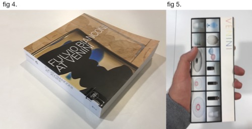
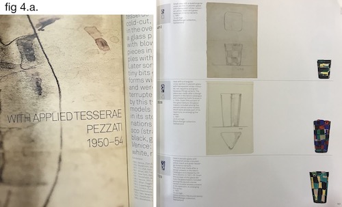
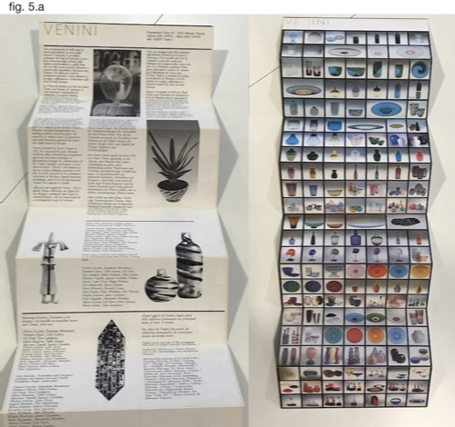
The book (fig. 4) and the Brochure (fig 5.) are both directly related to Bianconi’s work at Venini. The book consists of information about Bianconi’s life, but its central part presents Bianconi’s designs throughout several decades. The designs are divided by series of production (one of them , for example, is the “Pezzati”), and the objects displayed next to their drafts and numbered as in a catalog (fig. 4.a.). The Venini Brochure function both provide information about the company and service as a poster (fig. 5.a). Although it doesn’t revolve around Bianconi’s body of work, some of his designs can be identified on the poster (such as the Fazzoletto series).

3

3a

3b

Private Collectors

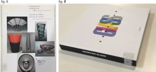
I also found information about Bianconi’s designs at private collectors book. The first one is Losch collection (fig. 6), a private collection that focuses on Italian and Finish Glass. The other book presents Nancy Olnick and Giorgio Spanu Venetian glass collection. Both books are not exclusively focused on Bianconi’s works and display an assortment of his designs alongside the designs of his Italian colleagues at Venini.

4

Glass

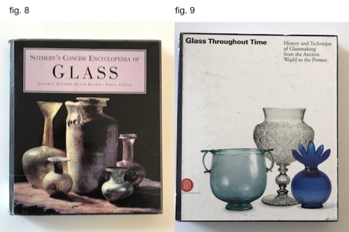
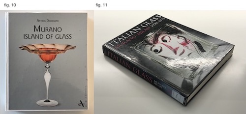
After going through all the books found with the help of the Libraries’ database, I checked if I could find information about Bianconi in books about glass in general. I searched in the OBA collection about Glass and Krystal, that are categorized on shelf number 775.6. Three of the books (fig. 8, 9 & 10) consists of very little data about Bianconi, while one of the consists a more in-depth look into his body of work (fig. 11).

5

6

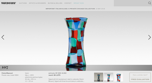
Searching online brought up other results. Searching “Fulvio Bianconi” in Google provided around 90,000 results, and adding the word “Pezzato” narrowed the results to 12,500. The internet-based results concern mainly commercial aspects regarding the designer works and present rather little data about his life and body of work.

Many websites either sell Bianconi’s designs or providing data about future auctions and previous auctions results. The site varies from e-bay to Sotheby’s and online auction houses.

7


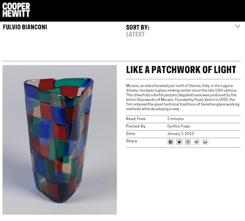
Other websites, more “institutional” ones, deliver basic information about the designer works and his life. First, the designer’s official site contains his biography and a small picture gallery of his glass and graphic works. In Venini & C., official website this information can also be found. Modern art and design museums such as the MoMA, Stedelijk Museum, Museum Boijmans, the Cooper Hewitt and the Metropolitan provide limited information about the designer works in each of the institutions own design collection.

8

Limited data about the designer can also be found in social media. The designers have around 900 pictures that contain his name tag on Instagram. In addition, in Venini official instagram account some go his designs can be traced. The designer has a facebook fan page that is currently not active.

9

Compared to the information found in books, the one found online is not as thick and much more general. In books, we can see extensive data relating to historical contexts, manufacturing processes, and the designer’s biography and full body of work. The information that can be found online Is mainly revolving around the commercial aspects of the designer’s works, focusing on his popular and “more profitable” production series.

A visit in Pieke Bergmans studio


Saturday, December 10, 2016


At the moment you are exhibiting in the Stedelijk Museum in Amsterdam with your installation Phenomeneon. Now I am really excited being here in your studio in Amsterdam to talk about your projects and you as an artist.
 

piekebergmansstudio2


There is surprisingly much space in here. In what kind of room are we?

It is an old factory building. We actually just moved into this studio a few weeks ago. So we are still in progress about rearranging the space, like removing the ceiling and creating small office rooms. There are not a lot of my works here yet but I can show you around…


The Phenomeneon project gets a lot of admiration with its mesmerizing appearance. I am really interested in the production process and the applied techniques. Could you tell me more about it?

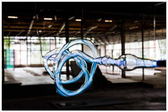
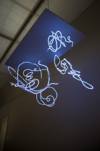
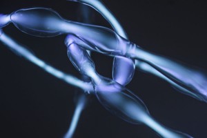
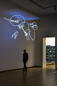
Yes, sure. Not everyone realizes that light in this case is gas. People think it is a really new technique, but it is actually an old one. I do like light a lot. It is a very beautiful material to work with and I discovered many different effects. People are getting so much information nowadays it is hard to get their attention. But in this case I think it is a perfect combination of technique and mystery.
 

Phenomeneon-Cloud-Pieke-Bergmans-2016-photo-Mirjam-Bleeker-12-400x600 Phenomeneon-Cloud-Pieke-Bergmans-2016-photo-Mirjam-Bleeker-1-900x600


When you mention the mystery it makes me think about the moment when walking closer to the installation and realizing that the neon light moves through the organically shaped glass. The light runs through it and you start to follow its way.

Exactly! That makes it feel alive.


Are the organic shapes made to play with the intensity of the light?

The intensity of the light is defined by the width and length of the glass. In the end it is just playing. Its like a three dimensional painting. Like when you have a brush and you choose the pressure of your brushstroke.


I can really see how playful you shaped the glass. Are there any other factors affecting the form?

Yes. The installation consists of seven separate parts. It was difficult to do because they are all handmade and quite big. The biggest one is almost six meters.
 

Phenomeneon-Cloud-Pieke-Bergmans-2016-photo-Mirjam-Bleeker-7-900x600 Phenomeneon-Cloud-Pieke-Bergmans-2016-photo-Mirjam-Bleeker-15-400x600


You cannot see where they are connected which gives the impression of one very long piece and makes me question the process.

It starts sometimes with a simple observation. I was questioning why neon light is always a straight tube. Most people saw the shape as a limitation, for me it is more a possibility. With the understanding of the technique I could have come up with so many ideas about the design. One reason for the process and especially the shapes of this project is that I am a person that is always interested in setting things free.


How is that combinable with your background as a product designer? I can imagine in this area the focus is more on creating something specific.

Yes. It is mostly about creating something perfect. I basically didn’t believe in that concept. That is why I turn nowadays much more to art. I try to stretch the borders within the functionality. But now I am also more free about creating something that has nothing to do with functionality even if I started from this ‘other world’.


Do you have an idea of an aesthetic that deeply touches you — an idea of personal beauty in ‘your world’?

Yes and that’s only for myself. I have no idea what the public thinks. I am not commercial in that sense. I don’t do works someone else wants. I think it is a power within the simplicity. Like this table over there. Its so simple but at the same time it is fragile and the surface a bit wobbly. You are wondering if it collapses or not. So it is also about the balance. I am looking for this tension. I like to use things that already exist in my environment and I take them out of their context. If I work with big companies then often lots of things are possible. All the equipment is available. It happens fast that things are getting too complex. Then it looses its quality. I am striving for purity and simplicity.


Do you think mass-produced objects have less individual quality?

Oh, I don’t think there is such thing in mass-production. Every object is exactly the same. The best design is multiplied: ‘the Golden Mean'[x]. I don’t want to judge mass production because its designed for optimal purpose. But if you study nature, then everything is unique. You can not find one olive tree that is the same. Not one animal or human. We are all different. Thats why I create production lines that produces unique objects. It would be great if people would spend a tiny little moment to witness these individual unique differences. It is hard to make people feel something or even make them wonder.

When I was studying I really admired a lot of designers or artists for their capability and their way of looking at things. I also really understood that it was not my way. But when you are young you are not really sure about your way. That is sometimes a bit confusing. So you have to find your own strength, your true fascination. And after some time by simply doing you feel more and more secure and comfortable in choosing what you want to do. At the end it is about experience I would say.


I read an article where you said you take already existing working processes and change them to give materials space to let them expand in their natural way. What is your fundamental inspiration concerning your working process?

If I compare my own mind to nature I am a bit disappointed. Because whatever nature is doing in terms of gravity or elasticity or any other effects basically — I could have never come up with this. The result is so much better than everything I could have ever designed. So I just started going into the direction of letting things happen. But of course in a quite distinguished research. I have to do it over and over again until I understand why and what happens when. And then I pick out something to focus on.


Do you have plans for further projects based on the idea of Phenomeneon?

Yes, for sure because now we developed the techniques and finally we can start to play. Basically I am looking forward to the opportunities in the future. To be able making more things happen within the world of Phenomeneon. If you discovered something you are really fascinated about, I think it is important that you spend some time in making more pieces because mostly they get better and better.


Check out Pieke Bergmans official website for more information.


Personal Mass


Tuesday, May 12, 2015

I decided to visit a glass factory, I met Just who controls the machines that generates 200.000 beer bottles per 8 hours. I wanted to see the mass production of daily glass objects, wine glass, beer bottles etc. The contrast between the two images that glass has: The cheap, functional mass product and the crafted, expensive, complicated, cultural acknowledged glass, was clearly visible in the factory visiting the production part and the craftsman department. Both in the same factory, two completely different stories.
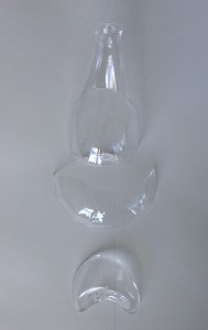
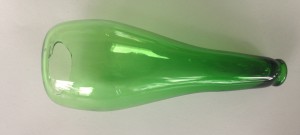
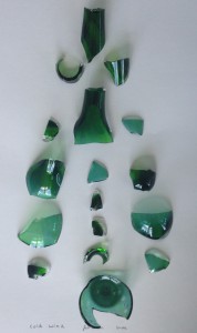
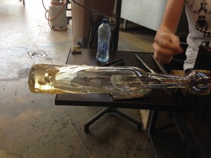
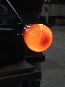
I decided to learn to make my own hand crafted beer bottle to combine the cheap image of a beer bottle with the expensive one of crafted glass. This process was longer, intenser, more impossible and way more difficult then I ever thought. In the end this process, of searching for  methods getting to know the material (a little bit) and working together with all the elements that need to be just right in order for the glass to do what you want it to do, took over the functionality of the bottle.
You work in service of the glass, if not it will master you. I had to adept towards what the glass needed, the time, the pressure, temperature. I could wish for all that I wanted but there was only one way to go. The focused and calm research of the glass. It feels silly or a bit like a cliche, but the glass forced me to work in a way which I often try but where I also often fail, it made me really be in the process.


Measuring the bottle  Blow a bubble Take glass two times

Blow

Shape it Glass to thin at the bottom Broke when putting in cool down oven Blow a bubble

                                     Take glass two times

Blow

Bubble a bit small

IMG_1144

Shape it

When putting in the oven    Broke

Blow a bubble     Take glass two times   Really hot Blow   Bubble a bit small     Shape it     Put in oven  Heavy

Blow a bubble        Shape it         Really thin glass      Broke when putting in the oven


Get a piece of colored glass    Blow a bubble     Take glass two times


IMG_1149

Shape

                             Blow

                                                   Shape
Bottom to thin
Broke when putting in the oven

Get two pieces of colored glass  Mix them Blow a bubble   Take glass two times

Shape

Blow

Shape

IMG_1143

Open cold wind

Glass cools down

Falls off

Broke


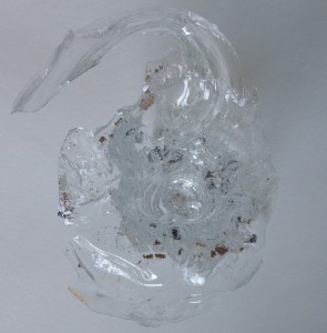
Make shape in sand  Make sand wet Poor glass into shape  Sand to wet starts to boil  Making a glass volcano

IMG_1145

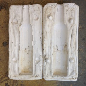
Making a mold from plaster  Get glass  Blow a bubble More glass                 Blow  More glass  Blow  More glass

                                                                                                 Blow

Turn a lot

Shape a bit Wait for perfect temperature Open mold Let the mass sink perfect timing closing the mold

Press mold as tight as possible

IMG_1330

Blow

Blow

Blow

Blow

Blow

Press

Open mold Take out the glass

Cool a bit

Make a cutting line Glass to cool for cutting line Broke

Fall down Transfer to cool down oven asap

IMG_1337

Blow Turn a lot  Shape a bit Wait for perfect temperature

Open mold Let the mass sink Perfect timing closing the mold

Press mold as tight as possible

Blow

Blow

Blow

Blow

Blow

PPPPPPPFFFFFFFFF

Press Open mold                 To little glass and to cool                     Take out the glass

Cool a bit and Transfer to cool down oven asap

Get colored glass Making a mold form plaster Blow a bubble

Get more glass Blow   More glass Blow   More glass  Blow    More glass

                                                                  Wait

IMG_0024

turn a lot Shape a bit Wait for perfect temperature Open mold Guide mass of glass bubble into mold Let the mass sink Way to hot and to much glass Drops quickly to the bottom Try to safe glass by pulling the pipe all the up                Pressing the mold

Blowing

Pressing

Blowing

pressing

Glass goes trough the sides of the mold Open mold Glass still soft

11231705_10152962643988931_110610957932174378_n

Rest glass on floor get gloves Pick up glass  Bring to cool oven


Stedelijk Design Show 2015 /Relevant Highlights


Monday, December 1, 2014


16 Rietveld Basic Year students visited the Amsterdam Stedelijk Museum to examine the items in the permanent survey of the design collection.

Does the Stedelijk exhibit all these design items simply because they are in their depot.

Do the collection criteria still have any significance today.

Do these design items have any relevance for us, our life or work,now? Is it possible to make a clear statement about that.

If you click on the image a caption will appear –just as a in a real museum– presenting information and a personal reflection on why that item is considered relevant. You can review the whole exhibition in pop-up mode.


click on images to visit the exhibit

Gijs_Bakker_Waterman_2_Cropped

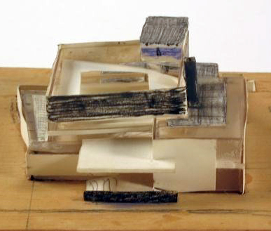
modelWieke_stool_SM

PatrickJouinWelcome-To-The-StoreBeowatch_SM2

tafel-stoelunfolded

DSC_0321 Schuitema_300

superstudio_gherpe_flippedVaclavCigler_headband

cow-chair_flipped Paulina_glass


“Ultima Thule” Tapio Wirkkala


Friday, March 8, 2013

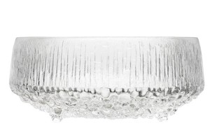
A dinner service “Ultima Thule” made by Finnish designer Tapio Wirkkala in 1968 was the most attractive object in design part of the Stedelijk museum. Tapio was a post-modern designer/sculptor. He was designing jewelery, ceramics, furniture for mass production, individual sculptures. One of his most famous design is for example a Finlandic vodka bottle.The dinner service was designed for the IIttala, a popular shop which collects Scadinavian designs of products for living, dining, decorating and giving. Tapio designed more than 400 different art glass objects and glassware series for iittala. The old term “Ultima Thule” meant the most northern, most demanding and at the same time most venerated place in the world. Tapio Wirkkala was directly inspired but the Arctic mystique, Finland’s wintry landscape and glassclear ice. The glasses was intended to represent the dripping and refreezing ice drops from the glacial landscapes of Finland. The technique for making these beautiful objects is called the ice glass technique, and Wirkkala himself was involved in developing and perfecting it over a period of many years. This techniqueis is achieved by blowing the glass into a wooden mold. The trick is to know when to stop blowing as the colours and patterns change as the hot glass burns the wooden surface of the mold as it begins to cool. For me personally the service looks like it was left for the whole summer night in the garden and  covered it the morning with a dew underneath. It gives me immediately the impression of having a water on my hands and the smell of a beautiful summer morning, feels like holidays.  The piece reminds me also of the work by Hans Haacke “condensation cube”. “Ultima  Thule” I can also relate to my grand mother’s desert plates. They were not exact same copies of the Wirkkala’s piece. They had more linear structure but the surface of the glass feelt the same when you touch both the objects. In my opinion it is definitely one of the best glass designs made in 19th century.

We sense volume before we can articulate it


Friday, October 19, 2012


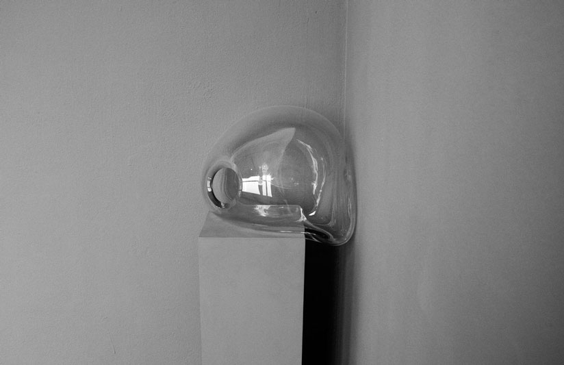
Marie De Bruyn makes monumental objects out of hand blown glass alongside video work and wooden constructions resulting in hybrid installations. Apart from the making process she is interested in integrating objects in a specific setting, creating atmospheres where the viewer can engage in a physical relation towards the objects and their surrounding space. Similar to Brancusi’s sculptural permutations – arranging and re-arranging the space in between his sculptures – the placing of an object is as important as the object itself.

Her work is about the relation between the perception of inner and outer. ‘How do we deal with our (surrounding) space? How do we position ourselves towards ourselves, the people around us, and the objects taking place in a given situation?’ The theses then discusses the function of the surrounding in the work of Dan Graham and those of body and space in the work of Richard Serra


Download thesis : We sence volume before we can articulate it [in dutch]

[images of Marie de Bruyn's graduation show


Heavenly Glass


Monday, November 28, 2011


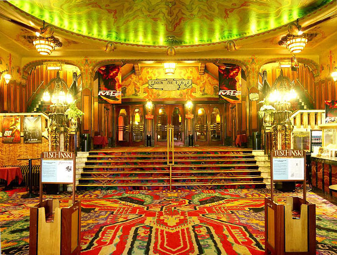
The first time I went to the Tuschinksi theater I must have been somewhat around 10 years old. It made a huge impression on me, between all the ugly stores and cheap restaurants, a beautiful building with butterfly cocoons and metal trees.

Remembering this I decided to rediscover this building when we got the assignment on the “Wendingen” magazines.

So with my camera I went there, the building was still as impressive (looking a bit smaller though) and from the entrance to the loge it was a real joy. There is so much detail at first it looks like scribbling, but after a while I could focus on individual parts  of the interior. Behind the bar there are three heads, enlisted by glass birds in blue and yellow. The walls mostly covered by paintings and endless woodwork. And the many lamps, in all possible shapes. Mostly they look like stylized insects.

But when I asked a lady if she maybe had some information on the theater and the lamps and glass-work specifically, she told me no. Also, sadly, I could not go past the entrance hall. Luckily I was allowed to take some pictures [x].

(more…)

GRANDMASTER FLASH OF DUTCH DESIGN


Monday, March 7, 2011

This description appeared in my research on the Amsterdam residential graphic designer/teacher Karel Martens.

His name was stored in my memory, but I didn’t know anything about him, probably because I’m Danish and just moved here. I guess every Dutch person would or should know him or at least his works, in fact even touched them. He designed coins, stamps, phone cards and signs.

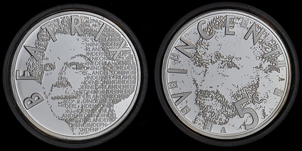
€ 5 (Queen) Beatrix and Vincent (van Gogh) coins

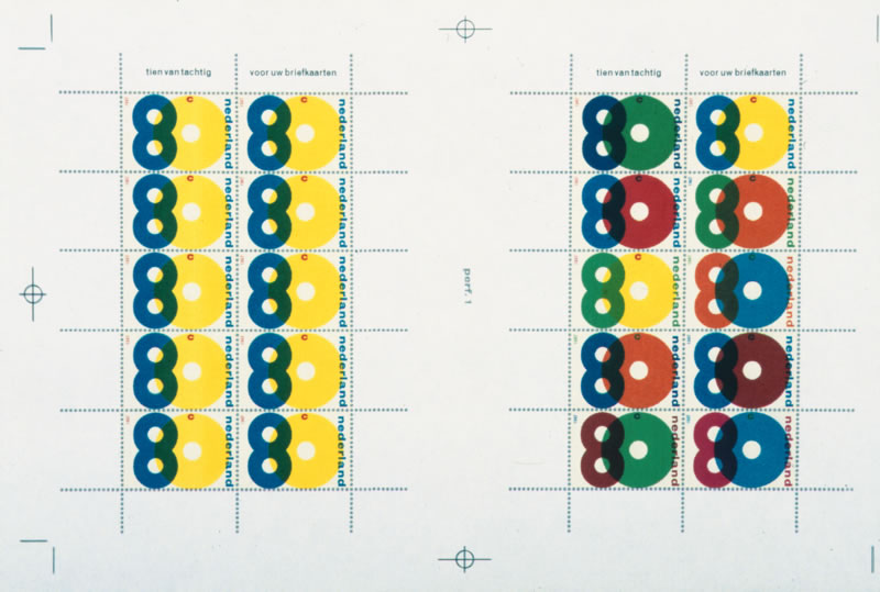
His style is very clean I would say; clear colours overlapping each other and forming a new colour. But what I really found interesting about his works is his way of translating a language or information into form or grid; his own new language.

proposal for a festive sheet of good-will stamps. The design was never executed

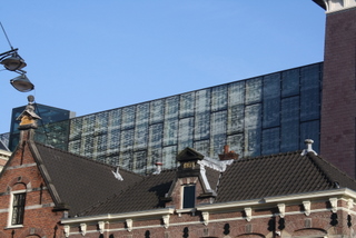
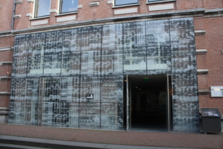
A good example of that is the façade he did of the philharmonic in Haarlem. It is situated in front of the big old church St. Bavo. I found some pictures on the Internet, but they didn’t give me the right impression, so I went to Haarlem to see it in real life.

The philharmonic building itself is very old, but as part of its recent restauration he designed this modern glass façade around the entrance and on a piece of wall high in the air.

Philharmonie in Haarlem

l: the view of the glass facade from the church / r: glass facade entrance

(more…)

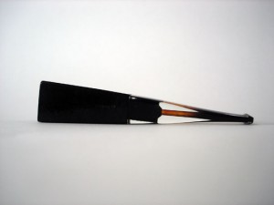
Shape beyond functionality


Wednesday, March 3, 2010

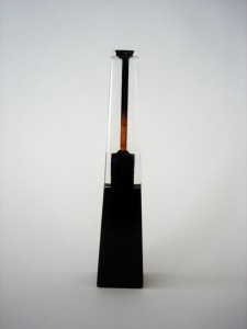
Shapes contain shapes.

This pipe is a monument.

The company designed the pipe to be feminine. An infinite triangle, with an elitist and delicate exterior shape, but at the same time graphic and geometric. Frail but strong.

A woman.

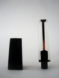
The pipe contains more shapes in the shape. Pipoo 8 has three shapes. The lower dark trapezium made of briar, the transparent upper part made of acrylic and a black plastic cylinder.

We can admire her. How two different materials become unified shapes that contain inside the black cylinder, making a unity of one strict object. There is no possibility to change it, I must accept how it is.

About 15 cm long, it can become part of your body but you can also compare it to a Bic, looking like something alien.

It’s gorgeous.

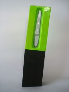
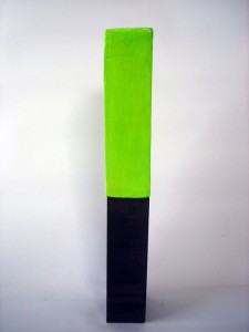
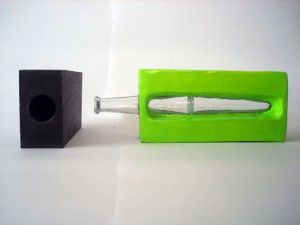
This is not a vase. It is Carnival.

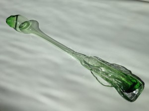
The vase contains more shapes in a shape. It has three shapes. A wooden rectangular with sharp edges leaning 8 degrees towards the right. A fluorescent green rectangular with rounded corners made out of cardboard, whereas its centre has a phallic transparent glass.

Mike Kelley once said: “With my work I not only want to reach the most educated viewer, but the most lazy viewer as well”.

About 44 centimeters high. Screaming for attention. One cannot avoid the sight of this illuminating green situation.
It’s a glossy disaster.
The ‘Wiener Werkstätte’ and the concept ‘Gesamtkunstwerk’


Wednesday, October 14, 2009

At the beginning of the 20th century Josef Hoffmann, Kolo Moser and the industrialist Fritz Werndorfer founded the ‘Wiener Werkstätte’. In order to protect traditional handicraft from mass-production they designed exclusive handmade everyday objects and gave them the aura of art. At the same time they tried to find an alternative to old representative art forms favored by the rulers of Austria which shaped the picture of Vienna at this time. When they started to design architecture which they filled with their handmade furniture and their handmade objects their work became a concept that led to an idea of a different society based on pure aesthetics: they tried to create a ‘Gesamtkunstwerk’.

Under which circumstances could such a concept develop? The design of the ‘Wiener Werkstätte’ is still very modern and popular while the concept of the ‘Gesamtkunstwerk’ is not relevant anymore. But why? Do we need a similar utopia today? If one wants to get an idea ‘why’ one has to take a closer look at the development of the concept ‘Gesamtkunstwerk’ in relation to its historic background.

Wiener_Werkstätte


Log in
subscribe