Skip to Content Skip to Search Go to Top Navigation Go to Side Menu


"Design in the Stedelijk 2" Category


Stedelijk Design Show 2013 /Proposed Highlights


Monday, April 8, 2013

19 Rietveld Foundation Year students visited the "Stedelijk Collection Highlights /Design". Marveling at the many masterpieces, commenting on the applied or autonomous character of pieces in this highlight presentation, they arrived at the last part of this "depot salon", wondering what contemporary design would have in store for them and how it would look like. To their regret the presented selection faded out without any opinion on the latest developments in design; social engagement or neo crafts
Researching contemporary design we propose this "2013 Supplementary" as a possible continuation, an imaginary online next exhibition space.

click on images to visit the exhibit


selected designers are: Mark van der Gronden /site • Daan Roosegaarde /site • Tauba Auerbach /site • James Dyson /site • Ferruccio Laviani /site • Mediamatic /site • Leonid Tishkov /site • Jonathan Ive /site • Liliana Ovalle /site • People People /site • Nucleo /site • Faltazi Lab /site • Michelle Weinberg /site


Lost (Wave)


Tuesday, April 2, 2013


I choose Madeleine Bosscher’s work at the Stedelijk. She’s a dutch artist from Utrecht, born in 1942. The work’s title is “Golf (Wave)”, it was made in 1971 and was acquired by the Stedelijk the same year. The work is made with cellophane square pieces which she piles on top of each other, they are tied in knots and form a square with a “wave” or a bulge at the top. The cellophane looks like it has aged with time, it’s originally a clear material but in the Stedelijk it has this brown-ish tone. Finally it is concealed in a glass square. I was immediately drawn to it when I saw Bosscher’s work. I guess her choice of material really interests me, also since I like working with similar “man made” materials. Overall, I also think it’s just a really beautiful piece of artwork and unlike anything in the Design aisle at the Stedelijk, which also makes me wonder why it was placed there, among ceramic vases and modern jewelry design.

Madeleine Bosscher’s monumental structures and simple techniques show repetition, light and shade, her choice of material allows optimal luster, brilliance and reflection in imagining. Experimenting with plastics or actually a number of materials without “properties” and “anonymous”. She sees it as a challenge to use “poor” materials, such as polyethylene, cellophane and plastic film.

Upon further research she is unreachable to me. I can’t really find anything about her. I did learn that she used to teach here, at the Rietveld, between 1995 – 1996. I learned where she used to study, teach and some exhibitions she took part of but not much more. I find this in a way, very attractive but in a quite mysterious way. This name is included in the NOA because of the importance for the history of Dutch design. Yet, more details are unknown.

A massive disappointment. I did however find a photo of a very similar piece from the one I chose at the Stedelijk, Golf (Wave), also made by her. A beautiful picture and I can imagine it being even more beautiful in real life. This one is also quite larger then the one at Stedelijk, which makes me more eager to want to see it.


"Five Waves" (180x220 cm, detail), 1973, The Netherlands, Exhibited at the Museum: "Structure of textiles", 1976-1977, Amsterdam. Material: cellophane, technique: smyrna nodes in different lengths

Why can’t I find anything else? I could have chosen anything at the Stedelijk but for some great reason I choose her work, but I  wouldn’t have had it any other way. I did come across a small article though, about this above piece in which I read and learned that she held some similarities with Japanese textile artists, which I thought was very interesting and suiting for her work.
“Her way of working has surprisingly many similarities with that of the Japanese textile artists, not so much in terms of the material, as in the mentality and atmosphere that go out of her work.”


Example: A Kimono, early 1850’s 

Recently when I’ve been browsing through books or the internet I’ve come across many artists using her type of material. For example here is work of artist Karla Black using cellophane.

Necessity, 2012, cellophane, sellotape, paint, body moisturisers and cosmetics
I hope that artist come across Madeleine Bosscher and take inspiration from her. I know I have.


Opposites attracts and influences


Sunday, March 31, 2013

Ettore Sottsass designed this lamp in 1981 for the Memphis Milano Collection and it got its name after the great Indian emperor Ashoka. Fascinated in ancient cultures, he travelled in 1961 to India, which profoundly affected him. However, there is nothing that precisely reminds me of Ashoka in the lamp, neither in colors, form nor material.

Portrait of the emperor Ashoka and an Ashoka temple in India.


With deeper investigation I found out that ashoka translates from Sanskrit into English as “without sorrow”. The emperor Ashoka was revered by many as a leader supporting big changes. After years of rationalism, Sottsass along with Memphis Group were rebels. The style they brought up was seen to be perfectly in tune with the early 80’s post-punk culture, without a doubt a distinction of the often-obscure theories of postmodernists. This brings me to the feeling of Sottsass as a punk, reining the future without sorrow for the past and incorporating art into design.

What further strikes me is the significant playfulness that follows his designs and thinking. A good description of his works is “a shotgun wedding between Bauhaus and Fisher Price”. It shares a common interest with toys such as testing out, trying, building as in children’s mind and color palette.


Fisher-Price advertising and Ettore Sottsass Flavia vases


Duplo lego and Ettore Sottsass Casablanca Sideboard


The name Ettore Sottsass was unknown to me, until some months ago. I was star-struck by his philosophy and work. Coming from Sweden where popular design often is characterized as being very minimal and serious, I was experiencing the complete opposite. It was playful, bold and colorful. He totally distracts me with his colors, what he calls “gas station colors”. Maybe my attention is drawn to the object thanks to the distinct primary color used; there is something pure and genuine about them. To Sottsass these colors are the ones he used as a kid, learning to draw. Freedom and rejection of prejudices is supposed to be a reason why he uses them. There is always an extra effort to be able to combine or even use color. What he expressed in 2007 becomes especially interesting since my wardrobe exclusively consists of black and different shades of gray:

“It’s a shame, but yes, color is still something unpopular. The predominant shades are white, black, beige … I think the reason is that it is just easier. If you go all dressed in black its very easy.”

Sottsass was, besides working solely colorful, well known investigating in combining different materials, from cheap materials such as laminate to richer ones – brass and marble. This creates a conflict for possible new life or at least raises questions about it.


Furthermore, from my point of view, it is important to notice that the lamp (plus almost all of his other works) seems to widen the users’ idea of function in every day life. Instead of taking the obvious and primary functionality of an object for granted, in this case, a source of light, Sottsass deliberately add another dimension into the object. By taking away the familiar he surprises and asks for participation and sensation. He gives the object an aura and hence creates a presence to which I am confronted to and that makes me feel alive. One noteworthy quote from Sottsass is when he explains his view on function:

“All the objects I have designed are ‘functional’. They can always be of use. What matters is that the one who uses them must be able to use them. (…) Everyone has different ‘function’ or necessities. (…) Maybe a young man wants to put his rolls in a container, whereas a young woman wants to put all her books there. I don’t know. There is no generic function. Function is life. I cannot foresee function. The furniture I have designed has always been functional. However, one needs to know what it is for.”

I would define my sentiment regarding Ettore Sottsass’s work as an ‘opposite attraction’. Opposite, because originally, my personality and work do not reflect at first sight his point of view. Attraction, because he has and will inspire me to break up predefined rules, experiment techniques and challenge mentalities in my personal work.


Color in Relation to our Lives


Friday, March 29, 2013

A bright pink page of the book drew me to it. It was lying in a showcase in the Stedelijk Museum amongst many other objects and flyers, but the brightness of the opened page made the book stand out. On the left page you could see a picture of an Indian girl sitting behind a table. On the table in between her hands was a small heap of bright pink powder, almost the same color as the bindi on her forehead. The page on the right was a page of bright pink textile.

This book (put together by Nikki Gonnissen and Thomas Widdershoven) shows works and gives a feel of the work by Fransje Killaars, a dutch artist who graduated from the Rijksacadamie in 1984. In the beginning of her career she mainly made paintings, but it is her later work, her textiles, which attracts me most.

I read in an article about Fransje Killaars that she is fascinated by the power of color, the relationship between people and textiles and the way textiles are bound up in daily life. I was able to take a closer look at the book in the library of the Stedelijk Museum and I was surprised to see how much more attractive Fransje Killaar’s work is portrayed in that book than for example the images on Google search. It was then that I realized that like Fransje Killaars I was not only fascinated by the power of color, but especially the combination of colors in our daily lives. Seeing Fransje Killaars’ textiles transforming an old attic

space into a bohemian paradise,
or seeing her carpets thrown over a washing line hung amongst palms

seems to play much more on the imagination rather than seeing the fabrics placed in the middle of a white clean gallery space.

In a gallery space the work is merely about colors; about the contrast between them and the brightness that a color can have. Yet for me the excitement comes when you find bright colors in someone’s kitchen, when colors pop up amongst plants, how sunlight can give a color different shades and all colors on the knit sweaters of the Rietveld students in the winter.


I caught myself playing around with this fascination on my guilty pleasure.

Instagram

I try to eat an orange every day, but before I get to peeling it I like to take a picture of the bright orange against the clothing I am wearing that day. I have realized that by doing so I put a frame around a moment or literally make a snapshot of the moment. It may be only esthetics, but for me it is quite a luxury that you can find such esthetics in everyday life.
The combination of color and the sense of touch is another element, which I find rather appealing. Holding the skin of an orange against a green, wool knit sweater, running your hands over a an orange shag rug or a purple suede dress is often much more exciting than looking at the same colors on a 2d canvas. Do not get me wrong; I have nothing against the great color field painters, who can use colors in a fragile and moving way. These painters succeed in translating emotions into color, into paint, but when it comes to the exuberance of a color or the contrast between them I think this can be best portrayed in a more hands on manner.

The brightness and the vividness of the use in colors in Fransje Killaar’s textiles seem to be more about the celebration of life, about the joy that a blotch of color can add to every day scenery. The use of color in her work is about the beauty of variety. It is not without reason that a mixture of joyful and interesting people is referred to as colorful. The pink page in the book was what had grasped my attention, but the comparison made with the girl holding the same color pink in between her hands and a trace of the color left as a dot in between her eyes is what made me linger and look at it more carefully.

Storytelling as a craft


Thursday, March 28, 2013

Grayson Perry is an English artist and his work is really broad. He makes vases, videos, documentaries, graphic novels and curator. He made Claire – his alter-ego – into an icon. Together with fashion students he designed incredible creations for Claire.

At the exhibition I saw this work: Strangely Familiar, which is a vase with pornographic images within the background images of the suburbs. Not something you immediately connect with pottery, that’s what makes it so interesting to look at. The vases itself tells a story, the vase serves as a stage, Although they have this fragile look they tell radical stories.


In England it produced strong reactions. Many critics didn’t take his work serious, it is primarily the form he choose that was shocking. Ceramics and decorations have a reverential status in England. Associated with good taste, educated public. What Grayson Perry tells us with his vases is the opposite of what we like to see as civilized or good taste. We would like to see ourselves as civilized people in Western society, but he shows us that we in essential aren’t civilized people at all.

Stedelijk catalogue

I really don’t understand that they make such a problem about the images on the vases. You have to see it in the context. I think it just makes it stronger. It seem they only focus on the vases, they threat it very narrow minded if you ask me.


(more…)

Josef Hoffmann – Rundes Modell


Wednesday, March 20, 2013

In 1906 an exhibition with the name of ‘Der gedeckte Tisch’ (The Laid Table) took place in Vienna. Artists from the Wiener Werkstätte (Vienna Workshops), including Josef Hoffmann, displayed their designs for crockery, glassware and cutlery on thematic tables. From the tablecloths to the table decoration with fresh flowers, everything was innovative. They even dyed the macaroni black and white for the occasion. Two sets of cutlery by Hoffmann, a flat design and a round one, caused a commotion. Visitors to the exhibition wondered if it was even possible to eat with them and, more importantly, was it possible to dine correctly, in the ‘English style’, with these designs? That’s why I chose this item. They were accustomed to cutlery that was more elegant and less solid-looking. Progressive contemporaries saw the spirit of the modern age in the streamlined look of the ‘round design’, with its sturdy, rounded forms, and they ordered silver sets, or silver-plated ones, from the workshops.

Valkea vuori ( Witte berg) , 1970 by Rut Bryk


Wednesday, March 20, 2013


I have chosen this item here by the artist Rut Bryk . I found this piece of art of I may call it so very intriguing , it caught my attention and interest right away . It drew me to take a closer look at it , to really notice and examine the details and the amount of concentration and patience that has been put in it for it to be what it is now . While examing the details , I came to notice the introverted and extraverted parts aswell as the flat surfaced ones . The extraverted parts are pyramid shaped and the introverted ones are the negative shape of a pyramid . The placing and different sizes of the cubes within this whole item seemed as if they have been decisively  placed , I can see a lot of desition has been made . The different heights adds another layer to it aswell .

In Bryk’s biography I have read that she has designed a lot of her works with geometric inspiration and experiments with surfaces which comes into relation with architecture . These aspects are quite visible in Valkea vuori  , geometric forms are present aswell surface manipulation that crosses the path of architecture . The combination of these two things work very well here in this piece of art .

Grayson Perry


Tuesday, March 19, 2013


Grayson Perry, Floating World 2011 /front and back


At first sight Perry’s pots are old classic vases decorated with figures. They look attractive, full of colors, pictures, inscriptions and decorations. They deal with autobiographical themes and society critics, designed with irony and full of disturbing details. He likes to play with the combination of innocent, handmade decorative pots and these shocking images.
Perry’s work refers to several ceramic traditions, including Greek and Japanese pottery. He has said, “I like the whole iconography  of pottery: no matter how brash a statement I make, on a pot it will always have certain humility …” Most of them have a surface composed of varied techniques:  glazing, incision, embossing, and the use of photographic transfers which requires several firings. It has been said that these methods are not used for decorative effect but to give meaning. Perry challenges the idea, saying that pottery is merely decorative or utilitarian and cannot express ideas.

But the fact is that his vases don’t seem to be utilitarian. They are not made for receiving flower, they are made to softly and critically scream at society. We could put flowers in it but it will only soften more the ideas.  For me those vases are not made to receive flowers but for saying something in an “acceptable” way with just the touch of irony needed.

The item I choose is not so much an autobiographical work unlike most of his work. I read it like a bitter opinion of the world as it is now.

At first, I was attracted by this vase because I liked the contradiction well set between this ancient Greec vase and this very contemporary life stories depicted on it.

I came to look at it again half an hour later and I was not sure anymore, something was disturbing me a lot about this vase. Not because of violence and sexual scene like in the vase next to it. In a less explicit way but still, the feelings were the same. Maybe it was even more disturbing because I could feel it but yet I didn’t know exactly why. There was no logical explanation as: “Oh I feel so bad because here I see an open body”
I also like very much his “explicit” work because I understand why I am repulsed and so I am less confused.

Grayson Perry used to develops images and text that represented his experience in terms of "explicit scenes of sexual perversion – sadomasochism, bondage, transvestism" mainly on pot, because the innocent pot is more adequate to express those scene then a video.


The colors attracted my intention, I disliked them immediately: they made me feel quite nauseous.
The background (earth?) look like it is disappearing because of his very soft yellow. The cars are really shiny, painted with shiny (mirror) metallic-blue enamel. The contrast is strong but the artist found the perfect solution: the blue of cars is a very clear one. The people are very small, floating around the vase as if it was a globe. They are many and everywhere. Like the background, people look like they are disappearing. Fading away. They are everywhere but without real presence. The cars on the other hand are shining and imposing. They are also all crashed.
On Japanese and Greek vases, the figure of men and nature are the most important. You can see the amazing story of Icarus, a men reading or a beautiful representation of nature. Those vases are here to glorify Men and their surroundings. Grayson Perry does the exact contrary resulting in a genial social critic.
On his vase, first you see those shining but crashed cars (materialistic possessions soon transformed into trash).Then, all those men floating around (They sure are a lot but they are not glorified as individuals) and, finally, this yellow-faddin’away background which could be interpreted as nature/surrounding. Something else is referring to nature but, the nature that men have chosen : The palm tree, and anyway, it is behind crashed by a car. What an irony!

The last reason why I like this item, this vase, is because of the panel of cultures Grayson Perry refers to.
First I recognized the Japanese vase shape. Then, I remembered that Greeks also used those kinds of storytelling vases but with a lightly different shape.

The drawings on the vase are recognizable as contemporary and from the Western part of the world mainly by the use of symbols , items and objects.
And I felt a South American sensitivity. It is not so clear on the item I choose but in some others of his works, the way of using colors and to compose seams inspired from the Mexican frescos and South America way of organizing item and the way of using colors.


Lucellino by Ingo Maurer


Tuesday, March 12, 2013


Lucellino by Ingo Maurer


Two words that probably describe Maurer’s designs the best are whimsical and magical. His works always seem to have a narrative about them and a certain ability to draw you in. Facing Maurer’s designs it is easy to forget that the object you are encountering is a lamp or a lighting device / installation. The infinite imagination present in Maurer’s work is not the solely thing he should be praised for. Maybe even more the ability to create such work and still keep it as simple and minimalistic as possible, always trying to reduce the material usage to the bare necessity. What makes it possible for Maurer to create in this manner, is also the fact that he was a pioneer in applying contemporary discoveries in light technology to his designs. First with the introduction of the halogen bulb and later the LED as well.
Ingo Maurer’s work is thus characterized with a wit, humor and easiness only a light magician like him can achieve.
Ingo Maurer [born May 12 1932 in Reichenau Germany] is an industrial designer who devoted his career to light, light design and light installations.


One of the examples of such wittiness is certainly his work Lucellino, the standing lamp from 1992. The usage of the material is visibly scarce, yet only a bulb, a wire, a metal stem and a pair of goose feather wings are enough to create this almost alive-like lamp creature.

Seeing Lucellino in the Stedelijk it was evident that it will be my item of choice, as I, myself, have always been inexplicably attracted to light and light emitting bodies.
What also attracted me to Lucellino was its animalistic quality of embodying a bird-like creature (hence the name – luce = light, ucellino = small bird ) which made it easy for me to connect with this object.

Its playful charm makes it more than just a lamp but rather an object that almost has an intelligence of its own.

Studio Gonnissen en Widdershoven: Fransje Killaars (1997)


Monday, March 11, 2013

Fransje Killaars is a Dutch artist who graduated from the Rijksakademie in 1984. She started with a lot of paintings, but is now well known for her installations of brightly colored textiles. Both the paintings and textiles share the importance of use of color. She is fascinated by the power of color, the relationship between people and textiles and the way textiles are bound up with daily life. Her artwork is characterized by her use of fields of bright colors placed next to or on top of each other. The colors hardly ever blend together.
The book was put together by Nikki Gonnissen and Thomas Widdershoven. It is composed of pictures and different pieces of bright textile. When Fransje went to India and visited the different textile workplaces the bright colors inspired her and convinced her to work more with textile. Her trip there directly lead to this work, where she filled an attic space with bright hand woven carpets.


I picked this book because I was attracted by the bright colors. The format of the book brings out Fransje Killaars’ style very well. By adding a page of colored fabric in between pictures of her installations it gives the audience a sense of the touch and the brightness of the carpets in the room. The pictures in the book are also pictures of the textiles in more every day environments rather than a lot of the pictures which you see when you Google the artist. I find the pictures in a more natural environment far more interesting than in a gallery space, which I believe brings more justice to her work because she is interested in the way textiles are bound up in daily life.

I personally love the physical use of color for example in everyday objects, clothing or textiles, especially bright, hard colors more than pale or pastels. I am also very attracted to the contrast between the colors, which Fransje Killaars also uses in her work. As you can see the bright shades are placed next to each other, striped or polka dotted. This emphasizes the difference and variety of the colors, rather than blending them together. This in combination with texture is even more appealing to me. Being able to hold the color and attach the sense of touch to it, moving them around and placing them next to new colors I find very exciting and this is exactly what Fransje seems to be doing in her textile works.


The Landscape of Weaving Posters


Monday, March 11, 2013

Hendrikus Theodorus Wijdeveld is a well-known architect and artist. He started his independent architectural life from 1913. During that time, Wijdeveld was one of the members of  ‘Architecture et Amicitia’ which consisted of young architects. They played an important role in art, architecture and design in The Netherlands. H. Th. Wijdeveld was not only active in architecture, he was also engaged in interior design, typography and graphic design. Being inspired and influenced by architect Cuypers’s neo Gothic style, H. Th. Wijdeveld combined art-deco, typography and architecture into a publication, a stage for artists which I will introduce in following paragraph. He traveled to other countries and created an international network with other artists, therefore, the cultural movements in other countries significantly connected with his works. It made his creative life considerably various and versatile.


W.M. Dudok, Wendingen cover No.8, 1924 -•- De Stijl Magazine No.7, 1917

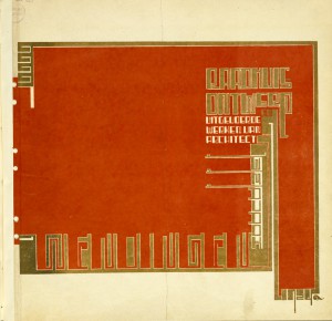
Between 1918 to 1932, this art group wanted to create a platform to discuss contemporary architecture and applied arts. They published the specific magazine named “Wendingen”. This poster is one of the covers of magazine. He combined the architecture, typography and decorative art on this cover. “Wendingen” also showed their adoration of decorative art. This magazine was an influential publication juxtaposed with the other one published by De Stijl.


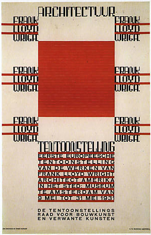
Poster for the first exhibit of works of Frank Lloyd Wright in The Stedelijk Museum Amsterdam 1931

I choose this item/poster because i was attracted by its “pattern”. It’s a little bit difficult for me to understand the information of poster. It doesn’t bother me at all. The decorative typesetting associated with architecture reminds me of textiles pattern. I would like to spend some time staring at this “painting” rather than searching information. However, i still can’t comprehend what has been shown on the poster. The combination of typography with architecture is a new language for me. It is the reason i chose this item.

What is the essential point that a poster should possess? Some posters carry only information that viewers can easily record, but viewers experience no more than the information itself. Some posters are shouting out in a visual way. They can attract people’s attention much more, even though the posters are false examples in terms of commercial strategy. The artists and poster designers have been searching for a wider range of possibilities between this objectives since poster art appeared.  This poster “Competition for the League of Nations building, 1927” achieves an interesting balance between sensitive art-deco and sans-serif capitals which are rational reading-friendly.

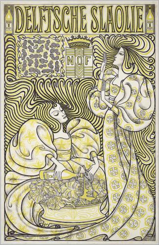
Tracing back the background of this poster, the development of poster art in the Netherlands was more independent and domestic comparing with other big cites, for example, Paris, Berlin and London. Because of the smaller scale of the society structure, the commerce posters were squeezed in the tiny shop windows on narrowly snaking streets, that viewers should catch at short distance. Jan Toorop’s lithograph below is a good example of that.


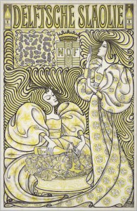
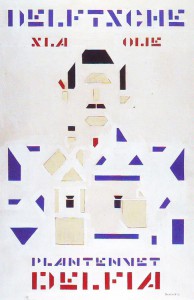
Jan Toorop /‘Delft Salad Oil’ 1893 -•- Bart van der Leck, Delfia Vegetable Oil 1919

Comparing with other countries where commercial posters were flourishing and kept appearing, the advertising posters were trapped in the small scale and didn’t leave a significant impact. The artists didn’t regard the poster art as the main art form especially the commercial posters. One reason is because of the Calvinistic background. To some Dutch artists and designers, the art works connecting with ”money” were dirty and sinful. They insisted to stay uncompromising on capitalism and commerce. They opened the other battle field for discussing and made it an art of taken out every materialistic element, simple truly aesthetics. At the same time, because of the faster industrial development, mechanical techniques were created. Some artists and designers combined the simple form and mechanical repetitive words into making a stronger power more shouting. This movement did change some cultural and political posters that artists paid more attention.


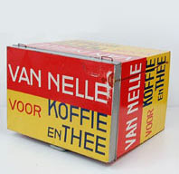
Jac. Jongert /Van Nelle 1924

The debate continued when the WW1 started. The Netherlands was neutral and locked behind the front line. The debate became a place in which some artists hided as the safest position, including their works. Although they turned their face back from cruel war, WW1 left an enormous impact that no one in society and economy could escape from. One art group started to organize and wanted to bring a new realm of art to their modern world. The publication they published named “De Stijl”. They carried the part of purify spirit from the past and gave it a more mathematics functional meaning. They also connected with constructivism, creating the harmony of materialism spirit.
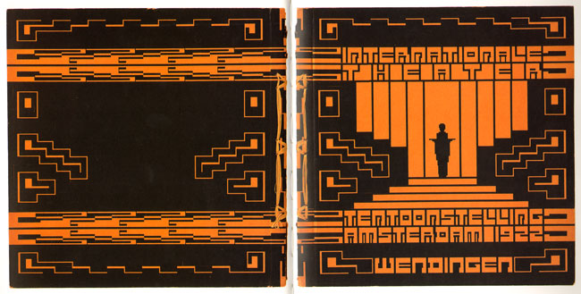

Wendingen, 1918

In the same time, 1917, another magazine, called “Wendingen”, was published by Architectura & Amicitia, representing a group of united architect designers and artists who took an important role in Dutch art at that time. They showed their love of Art-deco, combining architecture approach to typography. These two groups formed important movements in the society at that time. During that era, most artists and designers were trying to provide new modern approach to break the previous society pattern.

The “Wendingen-style” which drew part of the art-Deco tradition from the nineteen century seemed old fashion and alienated for public. Digging into the rule of “Wendingen style” that was built up by Hendrikus Theodorus Wijdeveld, we know it created an elaborate composition of angular type as architecture construction with some art nouveau manner called “the Amsterdam School”. Stern rectangle tittles jump out of the ornamental borders with sanserif letters in the rest of the text. Hand-drawn illustration is placed on the edge of the posters. The fusion of old aesthetic and modern innovation, rationality and sensibility, stern and poetry arranges an interesting composition on this one poster.

In my opinion, the influence from Wendingen is not just a “style”, is the open attitude about “fusion”. ‘Wendingen meaning “turns” or “change”, and Wijdeveld became the new review’s editor-in-chief and “art director”. Unlike De Stijl, publication which began almost simultaneously (one week earlier), Wendingen did not publish manifestos or polemics. Without precise manifesto or rule intervening like an army, it broadly contains various subjects, including paintings, sculpture, theater, commerce issue, cultural discussion and vice versa. It gradually became a platform for ‘young artists’. Although the “Wendingen-style” posters still have strict construction and specific gesture, the way they arranged the layout and the type combined, provided the innovative open manner which saved the “old good time” in the same time. No matter how the viewers interpret this typography, in the other way, the posters become a shout with the crunch of rectangle. It’s cultural-cross. For me, the poster shouldn’t only express rational information. It has to represent the clear gesture from artists and provide the flexible space for different interpretation from different audience. We aren’t forced to be filled with the emotion from creators.

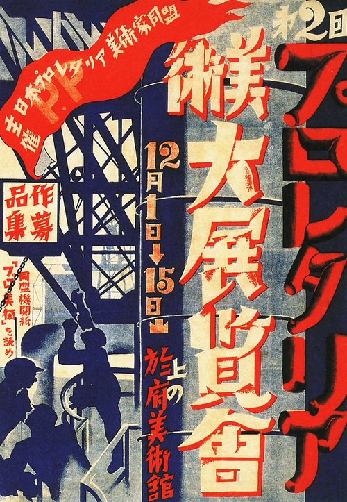
Take some Asian posters as example. This Japanese political poster (below) was born from the restless society in 30’s in Japan. They used the language in a way that we couldn’t entirely understand information. The typography becomes a pattern that shows the atmosphere itself. I can feel this shouting crossing the gap of culture.


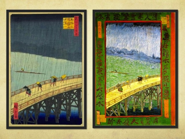
Japan Proletarian Artists Fed. 1929 -•- Hiroshige Utagawa, Shinohashi Bridge 1857

The painting above (right) is a famous landscape painting from 1857. the frame is a poem, becoming a decorative border.  Keeping us far with the frame make us more calm, as an outside observer, than left one. The poem works not just because of meaning, but because  its position.


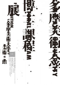
Alphabet from Paul Schuitema 1967 / Koichi Sato, Tama Art Universit 2007

another nice video of designer Paul Schuitema

Look at later eastern typographical poster and western typography above. I could see the influence from the era of Wendingen and De Stijl still has lots to do with it. The influence is not only shown in a visual way, but also in the manner. When a poster is entirely composed of words, the way they arrange the title has lots to do with the function and emotion. Words express the meaning themselves and feeling and the composition expresses feeling at the same time. It considerably provided “typing” with a chance to break the boundary. The posters above values the clear information and decorative element which give us a flexible space for interpretation. We know the event and can “feel” what they are thinking about at the same time.

In my opinion, it is also an important reason for why this poster from Hendrikus Wijdeveld becomes an annotation of Dutch poster art development and the significant step for transforming the meaning of the poster. It’s manner still influences later poster design till nowadays.

Poul Henningsen The Artichoke 1958


Sunday, March 10, 2013

Poul Henningsens lamps were produced because he thought that the electric light bulbs cast a disturbing light. They where either too bright or the lampshades swallowed all the light because of their design in that time. He wanted a lampshade that sent light into the room with its full strength without blinding you. One of the examples is the The Artichoke which also hangs in the Stedelijk Permanent Design Show. As you can see on the picture he has composed layers of copper plates in the shape of a pine cone (I choose to say a pine cone and not artichoke but I will explain why later) so the light is reflected from the greatest ability and does not dazzle you as there is no direct light from the bulb.

One of the reasons that I chose PH’s lamp is because I know that design from Denmark. It reminds me of my parents living room where a PH5 lamp is hanging over their dining table which is typically seen in many places of Scandinavian homes and institutions.

But what also catched me was the English translation of “Koglen” which from danish should be translated to “The Pine Cone” and not an artichoke. I found it disturbing to break the original concept because I do not associate it with being something Danish or Nordic. I can understand that the artichoke as a vegetable visually have something in common with the lamp as the leaves of the artichoke could compare to its division into the different copper plates.

But as a fact he build his design out from a pine cone and that is what makes me wonder why it is suddenly being an artichoke. Also because the copper is an obvious association to the brown color of a pine cone.
It is not because I am a bitter nationalist that finally get the chance to publish a letter to the editor about how danish design is being misunderstood but I am really surprised about the translation and I’m thinking it is the same as if the chair “The Swan” by Arne Jacobsen was translated into “The flamingo” to get people from outside Scandinavia able to identify them self with the design.
 

An infinite loop


Sunday, March 10, 2013

 halssieraad, Paul Derrez. 1982

Jewellery is mainly recognised by its symbolic and stereotypical image. This category is limited by the size, flexibility and wearability to mass market towards wider audiences. For long time jewelleries were symbolizing affluence, importance and preciousness, in the value carried by this word. Then the decade of the sixties, seventies set a new stage, without limits for jewellery design. The category of “art jewellery” appeared and new directions were taken. The traditional structure is then broken done, permitting freedom regarding the form, material, technique and production. Still the relation between the body and jewellery is getting the most out of boundaries. In this context I want to present Paul Derrez’s creation, halssieraad.

The piece is created in 1982, as part of collection of necklaces with pleated material, there are versions in different colors, red, grey, white, blue, black, so there were more, but grey was ‘one of the best’ as mentioned by the author. He made in total around ten, in different colors, maybe three grey, as the one exhibited at the Steddelijk museum.

When I interviewed Derrez, about the creation of halssieraad, he said that this work was

the end results of a period I was involved with pleating material. First I made a silver pleat from which I made earrings, brochures, smaller items, but by using that pleated, thin, plastic sheet, which is cheaper and easier to get, I could have bigger objects.”   

The weight was also important so the necklace is the product of experimenting with these materials and producing the so called Mobiusm necklaces. The Mobius shape represents a never ending plane . Over time, it became the accepted symbol for infinity. 

Paul Derrez’s interest in design is mainly connected to jewellery, not only in his work but also in his collection and research. He is a productive author and the founder of the gallery Ra opened in 1976 which for him is his main priority. In 2005, he wrote one of the essay in “new direction in jewellery”

Derrez prefers to work with pure and robust forms which are likely to give monumental effect even if his work is relatively small. He sees his pieces as a wearable sculpture and give an important place to the relation between object and body and also to the relation with the space.

It’s via research and mostly experimentation that he is developing his work and it’s a reaction toward a wide range of conclusions and results. It permits for him to look for new meaning, language form and new aesthetic. This symbolic importance appears a lot with his work “pills”, 1986, associated to drug abuse. . In the collections shown in Ra there is this passion for transient material. In his work as well the material experimentation show how it emphasis ideas. It has a Mobius space when you have a strip and you glue it and then you turn it together then it becomes a continuing line and this is halsieraad. Also in fact the plastic strip and also has a twist which is the Mobius principle, because it is also a necklace, it makes it even more infinite. I needed the pleating to make it work. There is a stainless steel wire in it, to fix it; the wire is just a circle.

In the other hand, even if his jewellery tends to stand as a sculpture by itself, he is defining and limiting a jewellery only if «it can be worn by a human being and is a thing » but « this aspect of ‘wearing’ can either be done easily or with difficulty ».

Then I asked about the relationship between the body and the object?

Due to the size, ‘it is almost more of a collar than a necklace’. The historical example is seen in old Dutch paintings of collars (those are made of textile) they are the same large size, making the person who wears them feel important. This is a similar piece, as described by its maker halssieraad ‘is quite theatrical, it is as if for a theatrical performance.’ In the 70’s it was all about size and material experimenting, when it came to jewelry, but also how it relates to the body. 

From my point of view, standing first as a sculpture and then as a necklace, I used two opposite ways to analyze halssieraad. This contrast made it interesting to understand the piece itself but also how Paul Derrez is approaching his work.

The first visual sensation I got from the work had both an architectural and sculptural impact. Therefore, it was the main reason for my selection of halssieraad. I have not perceived it only as a designed or useful object.

This work of Derrez gave me a sense of a complete control and true understanding of form and material. The shape is minimalist, recurrent and with the use of uniform plastic the collar appears as a light structure. When gathering my own perception of the work and forced by my understanding of an infinite loop and continuous movement in the object, the necklace gave me a meditative and hypnotic feeling.

The sensation and impression that the collar triggered in me is most often created by work that is impressive in size. I could feel the monumental effect that Derrez seeks to activate with a smaller size restricted by the jewellery.

The relation between halssieraad to the body and then to the space is also an important part of my interest in the object.


Thinking about it as a necklace to be worn is not appealing for me. The way it has to be positioned on the body by surrounding not only the neck but also the top part of the body and the contact of the material to the skin seem to me disturbing, irritating and disruptive. The piece gave me also a feeling similar to a fence which is creating a distance between the body and external interaction or even the space, yet after the interview I managed to support my views of the object’s use to create a sense of superiority and importance.


 Via Paul Derrez’s writing about Niel Linssen, I discovered her work. What I really found interesting is how I could connect my feeling from the necklace to the way that Derrez is speaking about her work. I associate the two artists because there is also with Linssen this experimentation for material, form and structure. And like Paul Derrez said: there is in her work this “determines form and direction” that I felt with Halssieraad.

Therefore I asked if there is any relationship between your work and Neil Linssen?

I have a different veto. I am a gallery owner and maker and by promoting, writing about and sponsoring, so I represent her artwork here, but there is no connection. She has a continuing line of research on a material and technique. While I work in themes, in groups of work and then I move on to something else, so I do not have this lifelong study of material, and her work is not connected to mine.’

“Ultima Thule” Tapio Wirkkala


Friday, March 8, 2013

A dinner service “Ultima Thule” made by Finnish designer Tapio Wirkkala in 1968 was the most attractive object in design part of the Stedelijk museum. Tapio was a post-modern designer/sculptor. He was designing jewelery, ceramics, furniture for mass production, individual sculptures. One of his most famous design is for example a Finlandic vodka bottle.The dinner service was designed for the IIttala, a popular shop which collects Scadinavian designs of products for living, dining, decorating and giving. Tapio designed more than 400 different art glass objects and glassware series for iittala. The old term “Ultima Thule” meant the most northern, most demanding and at the same time most venerated place in the world. Tapio Wirkkala was directly inspired but the Arctic mystique, Finland’s wintry landscape and glassclear ice. The glasses was intended to represent the dripping and refreezing ice drops from the glacial landscapes of Finland. The technique for making these beautiful objects is called the ice glass technique, and Wirkkala himself was involved in developing and perfecting it over a period of many years. This techniqueis is achieved by blowing the glass into a wooden mold. The trick is to know when to stop blowing as the colours and patterns change as the hot glass burns the wooden surface of the mold as it begins to cool. For me personally the service looks like it was left for the whole summer night in the garden and  covered it the morning with a dew underneath. It gives me immediately the impression of having a water on my hands and the smell of a beautiful summer morning, feels like holidays.  The piece reminds me also of the work by Hans Haacke “condensation cube”. “Ultima  Thule” I can also relate to my grand mother’s desert plates. They were not exact same copies of the Wirkkala’s piece. They had more linear structure but the surface of the glass feelt the same when you touch both the objects. In my opinion it is definitely one of the best glass designs made in 19th century.

Culture mixing and the living-room memories I’ve never had


Friday, March 8, 2013

In my quest to choose an object to research out of the current display of design at the Stedelijk Musem I initially thought I would go against my instincts. I thought small, delicate, rational. I even went as far as to write a full research on “small, delicate, rational” but after I was done I couldn’t go to sleep. Needless to say, my roots got the best of me and I ended up being hunted down by the work of Philip Eglin. To give a little background Eglin is an alumni of the Royal College of Art in London and he is specialized in ceramics.

The work in question is entitled “Virgin and dead Christ” and it was made in 1998. The decade it was made in is so well embedded in it in fact that it has on one side Hugh Grant’s ’95 mugshot. Instinctually I wanted to know a bit more about the motivation for such a detail, and Mr. Eglin obliged me with a reply (in the age of rapid fire communication, artists apparently are kind enough to answer the curious):


Something as dated as this reference could now sound obsolete (in fact, it is assumed as dated), but in my view it’s delightfully reminiscent of the time when I was a kid and also of Romanian style of ceramics that I grew up with – not in the traditional sense, but in the purely kitsch one.

Easy to say that ceramics was never considered art in the country I come from. It’s purpose was either utilitarian (dishes, cups, etc), traditional (folkloric patterns) or of display on a smaller scale (think grandma’s living room, on a shelf).

My most prominent memory of ceramics is in fact the last one of the above since throughout communist times (until 1989) in Eastern Europe and even well after (old habits die hard) it was a custom to gift and later to show off in your vitrine figurines which made no connection to the surroundings of your living room and which were hidden behind glass for purely functional reasons (it saves on a lot of dusting hours). I suspect this was done because of the need to be sorrounded by beauty, but given the lack of education on the subject, never a true understanding of how to handle and consume said beauty.

The most common subjects which found their way into Romanian living-rooms were porcelains (named “bibelouri”, from the French “bibelot” or English “trinket” – which stands for ornament) of: random French couples dressed a la 17th century, random curved ladies in provocative poses, ballerinas large and small, peasants male and female, mythological figures, horses, peeing little boys, Christ and Madonna figures, dogs, chicken, weasels, bunnies and other furries.

The list was peculiar but standard. The objects, always poorly made, did not have any other redeeming qualities either than a striving for beauty and having been made of materials more delicate than plastic.

These tiny sculptures were never displayed as individual pieces, but crammed together. So, you would always see a bizarre Noah’s ark of larger than life dogs next to ballerinas and in a 17th century French setting in a 20th century Eastern European living room.


Seeing Philip Eglin’s work in the Stedelijk museum only later brought on the realization that I was, in front of “Virgin and Dead Christ”, catapulted back into a Romanian living room. The work screams contemporary through it’s eclectic mix of features on the two characters and patterns on their surface, but it also comes to me as a commentary against cleanliness and the rationality of Dutch design.

There is no reason, everything seems to have been pushed together against it’s will. The theme speaks of centuries of reinterpretation, during which the Madonna has been turned on all of it’s sides, so much so that now it’s impossible to have just one view of what the scene should look like. The subject has been done and done to death. Maybe that is why if it is to be done again it can only be done with a sly humour and a stamp of Hugh Grant’s face on it’s side. No longer can we look at it in reverence. The relation that we have with the image goes beyond “no judgement”, it’s also somehow pop culture in itself.

There are inspirations in Eglin’s work which are easily traceable” Northern Gothic religious woodcarvings, Chinese porcelain, English ceramics, contemporary packaging, popular culture. There is also a lot of humor as his later work (porcelains of the Pope, footbal teams etc) would go on to suggest.

Choosing Eglin has been for me an exercise in respecting my roots and disregarding the fact that they are not clean, solid, elegant ones, but messy and irreverent. After all, there is in design enough proof of cleanliness. A little chaos is therefore needed as well.

In retrospect the choice was also motivated personally by the stubbornness of both my parents to have a house lacking in ornaments. While I was familiar with the norm for Romanian living-room displays, I never did have any small ornaments, only one large library filled with books and records. In those small figurines as in Eglin’s work, I contaminated myself with a nostalgia for a time which I never truly lived, but only observed from a distance.
 

Is it a bird? Is it a lamp?


Friday, March 8, 2013

‘Bibibibi’, one of the later works by Ingo Maurer, was a cheeky reaction on the modernist movement of the early eighties. Surrounded by the slick minimalism of artists like Donald Judd, Dan Flavin and Frank Stella, Maurer wanted to create a lamp that was exactly the opposite. Bibibibi is not only absurd in its image, but also in the material it is build of. The plate consists of porcelain, the legs are plastic, the bird’s body is metal and the top is fully made out of soft feathers. Especially the porcelain is a unconventional material to use with lamp-making and it makes the lamp almost afunctional, even though the light of the lamp, the bulb itself, is one of the most standard. The anti-functionality – the case that it can hardly be moved – makes the strongest comment on the minimalistic design of the beginning of the eighties, which was very much focused on the ability to use the object in every way desirable. Of course also the suggestion of some kind of narrative makes this lamp stand out compared to its contemporaries. It makes us wonder: what kind of bird does it represent? Is ‘bibibibi’ the sound it would make? What has the bird been through? Was there a certain background for Maurer to make it? Is there even a story behind it?

In my case it particularly reminds me of a character from one of the most famous Dutch children books, called ‘Pluk van de Petteflet’ by Annie M.G. Schmidt. This character is also a bird, but a rare species, which the people call ‘the Krullevaar’. Because this bird is so exceptional, the director of the city’s museum wants to make sure it will be in his collection, but then stuffed. The protagonist, Pluk, naturally saves the Krullevaar from this sad ending. However, this is exactly what happened to ‘Bibibibi’, he or she eventually ended up in a museum. Maurer initially succeeded in creating a lamp that was absurd enough to differ from the rest, but exactly because of this it landed in the Stedelijk, which only increases the lamp’s anti-functionality. This finishes Maurer’s wish to create something unique: the bird is caged and so is the design.


Log in
subscribe