Skip to Content Skip to Search Go to Top Navigation Go to Side Menu


"background" Tag


What made me buy 7 different vegies?


Sunday, May 26, 2019

At the beginning, I just searched blogposts about color by typing  ‘color’ in the search engine. I found out many tagged blogposts were not only about colors but also ‘color system‘. Many of those posts use fruit to show color contrast.  The harmony of between fruits and vivid back ground color looked sexy and aroused my interest. So I ran directly to the market.

As always, as soon as I entered the market, the first thing that catches my eyes were colorful fruits and vegetables.Those colors were made by nature which made clear and bright color. Anyway, I bought different colors’ fruits. Blueberry,rasberry, paprica,pickles,lemons….  and put them on the different colors’ papers. Then I saw the contrast between the color of background and fruit. 

successive contrast is the effect of previously-viewed color fields (“inducing fields”) on the appearance of the currently-viewed test field. To put it simply, If you look at a different color after seeing a color, the color that you see later is different due to the effect of the first color. For example, if you look at red for a while and then look at yellow, you will notice that the pale cyan is superimposed on the yellow by the effect of the red complementary afterglow, and the yellow appears greenish. Such a phenomenon in which the order is determined and the color is continuously viewed with a time difference and each color is seen as a different color is referred to as a successive contrast.

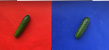
Simultaneous contrast refers to the way in which two different colors affect each other. The theory is that one color can change how we perceive the tone and hue of another when the two are placed side by side. The actual colors themselves don’t change, but we see them as altered.When two colors having different areas such as a background and a picture are directly in contact with each other, a complementary background image having a large area overlaps with a color having a small area, which is different from the actual color. For example, if you put the same pickle on the background of red and blue, a pickle on the red paper looks more darker than pickle on the blue paper.

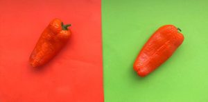
Hue contrast is a measure of how easily we distinguish between two adjacent colors (hues).Two areas with a high hue contrast will be easy to separate. An object which has a high hue contrast in comparison with its background will be easy to see. Areas with low hue contrast will blend together and be more difficult to visually separate.and this picture is an example of hue contrast. Paprika on green paper is more remarkable rather than paprika on orange paper. Because paprika’s color is an orange, it becomes more vividly remarkable when it’s on complementary color.

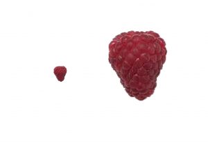
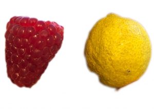
Area contrast is the phenomenon that the saturation and brightness vary according to the area even if they are the same color. The larger the area, the higher the brightness and saturation, and the smaller the contrast, the lower the brightness and saturation. There may be a difference depending on reflectance and absorption rate.  For instance, the bigger raspberry under the text looks brighter than the small raspberry.
 

ON STORY TELLING


Tuesday, April 1, 2014


Pedro Herrero Ferrran* and Marko Bakovic talking together about the subject of story telling


Each project that students initiate, makes them into temporary experts on given topics. Art & Design schools then become knowledge hubs where different expertise cross fertilize. By looking at what types of research students engage in, Designresearch and UnBornLab organized a 'workshop' to investigate design matters from a students' perspective.

Through a series of short video's students from both the Foundation Year and the DesignLab department share ideas, focusing on the temporary expertise gained as part of their projects, rather than the outcome. The workshop was articulated around one of their given assignments. Students were asked to develop a specific object or context to help focus or explain content.

The format is clear: two persons, discussions, filmed from above.
the space is : two stools and a table.

* Foundation Year


Uta Eisenreich


Saturday, May 7, 2011


PAY ATTENTION AT YOUR BACK !


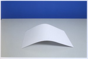
Uta Eisenreich is a Dutch photographer/artist, teaching at Gerrit Rietveld Academie. Looking at her works, especially at her last book “A not B”, I noticed the important role played by her background.

The book consisting of a series of still lives, inspired by non-verbal IQ tests for children. The images show changing combination’s of stereotypical domestic objects. The layout of these tableaux is determined by an underlying logic that the viewer is subconsciously triggered to discern..

She express herself through Photography, Performance, installations and Games. As I mentioned before I was captured by her ability in playing between subjects and backgrounds.  I found that book a clear example of balance and contrast between basic elements; all tricked out by “title-suggestion” that create a sort of curios  analogy.


Full colors and daily forms give me an idea of comfort.

Known.


While an esthetized light, an independent background create an idea of gravity absence, almost vacuum.

Unknown.


The almost absence of shadows and the extreme perspective, as in the Stenopeic Photography let disappear the deepness creating an optical ? illusion where is easy to get lost in focusing the main subject. Subject and background are on the same plan, they have the same value in the composition. From that originates my interest about the fact that ” a background is always present”. We can not have anything without any background.

Years ago I went to an exhibition of American Landscapes in the XIX century, damn it was boring. Nature, sky, horizon*….I couldn’t find a point to focus on.  What is the subject? The main interesting point?  It is a landscape, where is the background? Probably it is the landscape itself. Then Monet ‘s Waterlilies…subjects melted with other subjects in different plains ……

After I had the occasion to see a Rothko in person; the absence of conventional subjects led my sense to experience the paintings as a start point. Like a landscape, like a background. I still have to get the point.

Many times I heard discussion about landscape or background in architecture; how to integrate, to camouflage a structure in a determinate location/landscape/background.

In painting as in design as in architecture….. It can be monochrome, flat, floral, fizzy, silent….We can use it to amplify the main subject, or just to diminish it. Everything starts on something else. The Earth’s gravity has perhaps led us to a method of building based on addition;


X + Y


X + Y + K


X + Y + K + H + a canvas, a problem to solve, a rock, a dream, a need, a sheet of paper…


Again –just to remember–  isn’t how and where we present art the main important background?

Luckily it is an extremely versatile element. So versatile that we can even give it a determined value and meaning. However it can be an idea if we want.

*An expert mind pointed out to me that If we look at the horizon in Uta ‘s pictures, it is almost always not completely unbroken. As if she just did not crop it right and a little piece of the set-up shows. A corner or something else…… Like that the 2d effect is brocken as she shows a reference to the 3d set-up.


Log in
subscribe