Skip to Content Skip to Search Go to Top Navigation Go to Side Menu


"texture" Tag


Paper Senses


Friday, November 24, 2017


What                 about

         a     paper      experience    ?


Texture      //////////////   Size///////////////////

////  Shape//////////////////////////////////Smell


w.herwegh1_800

w.herwegh4


Reading is normally the first motivation for buying a book right? But it isn’t always the case, at least not for me. There are so many different things that can bring you to this mysterious and incredible object: the book. One of them is the paper experience and since ages it is a full and really particular sensorial one.


In fact, only for this reason,  I spend hours and hours in book shops searching for something attractive. But what does it  « something attractive » mean? After spending four years studying Graphic Design in Switzerland, I have learned how to understand layouts, how to make them attractive, and how to manage different information to make them more accessible. But Furthermore I’ve learned that the base of all the work of a graphic designer is sensibility. How to play with visual and tactile senses. How to make you curious on a subject that you don’t really care about just by the shape of a book. The content of it, is for certain the most important thing but some people can look at a book in a totally different way.  For instance, when I buy books, pay attention to the layout or the paper, more than to the content.


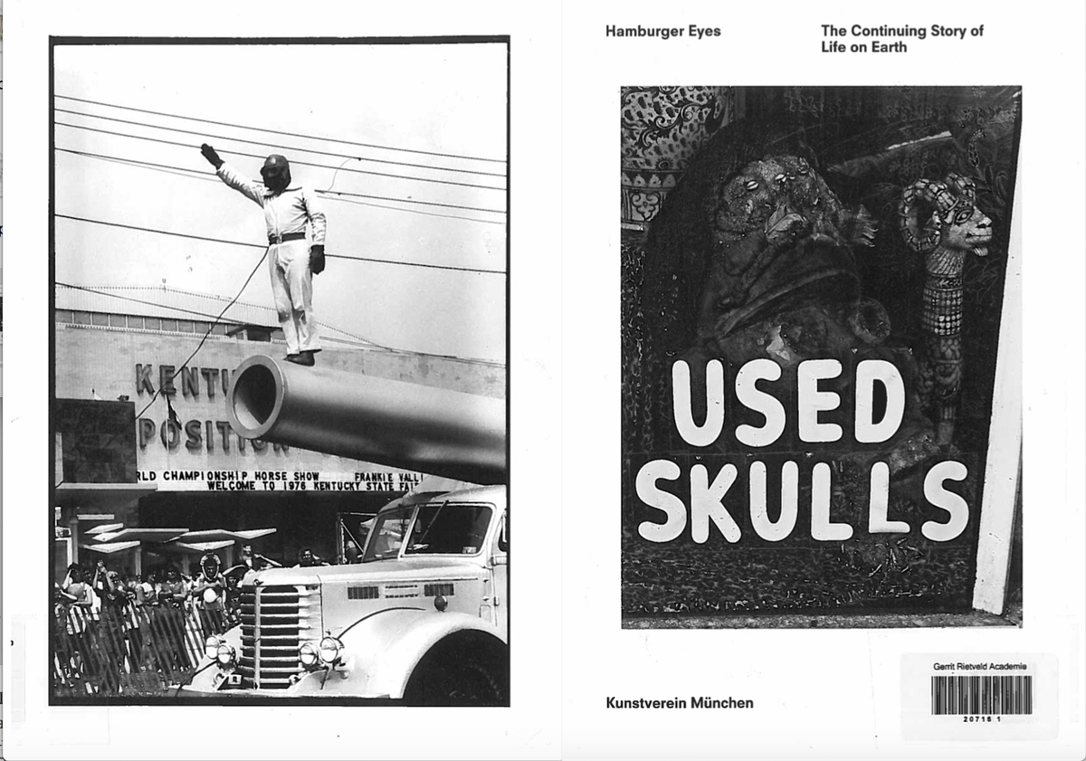
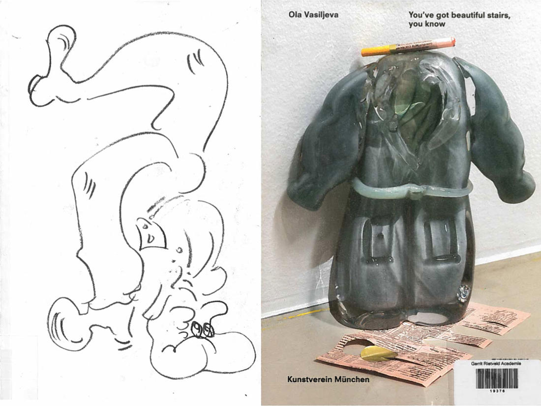
Through the broad variety of books available in the Rietveld unique library, my eyes fell on a small and independent  magazine called « The YellowPress ». It was created by the St Lucas School of Arts of Antwerpen. This magazine’s particularity is that for each one of their periodical they gives the opportunity to all students, alumni, researchers and professors of the school to share their on-going research and/or output / results. This enables a diversity and an open-minded perspective of the magazine and creates the possibility to reinvent the layout’s atmosphere and dynamic. This explains the reason why each periodical has a completely different shape, typography and layout design.
I chose to focus my work on the first number of the periodical made by the graphic designer Ward Heirwegh who teaches graphic design at the St Lucas School of Arts.


Cover


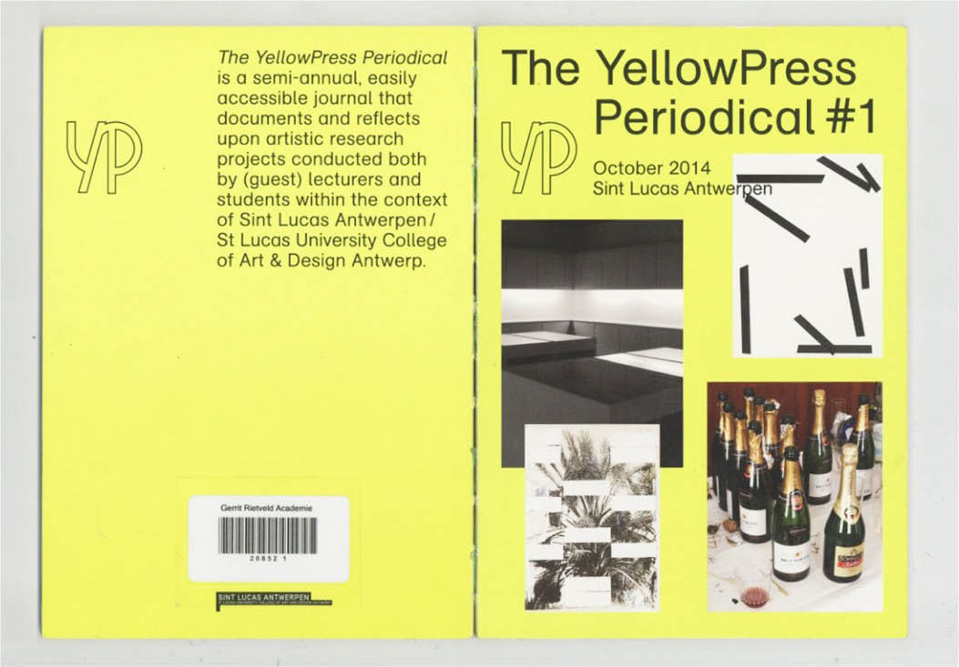
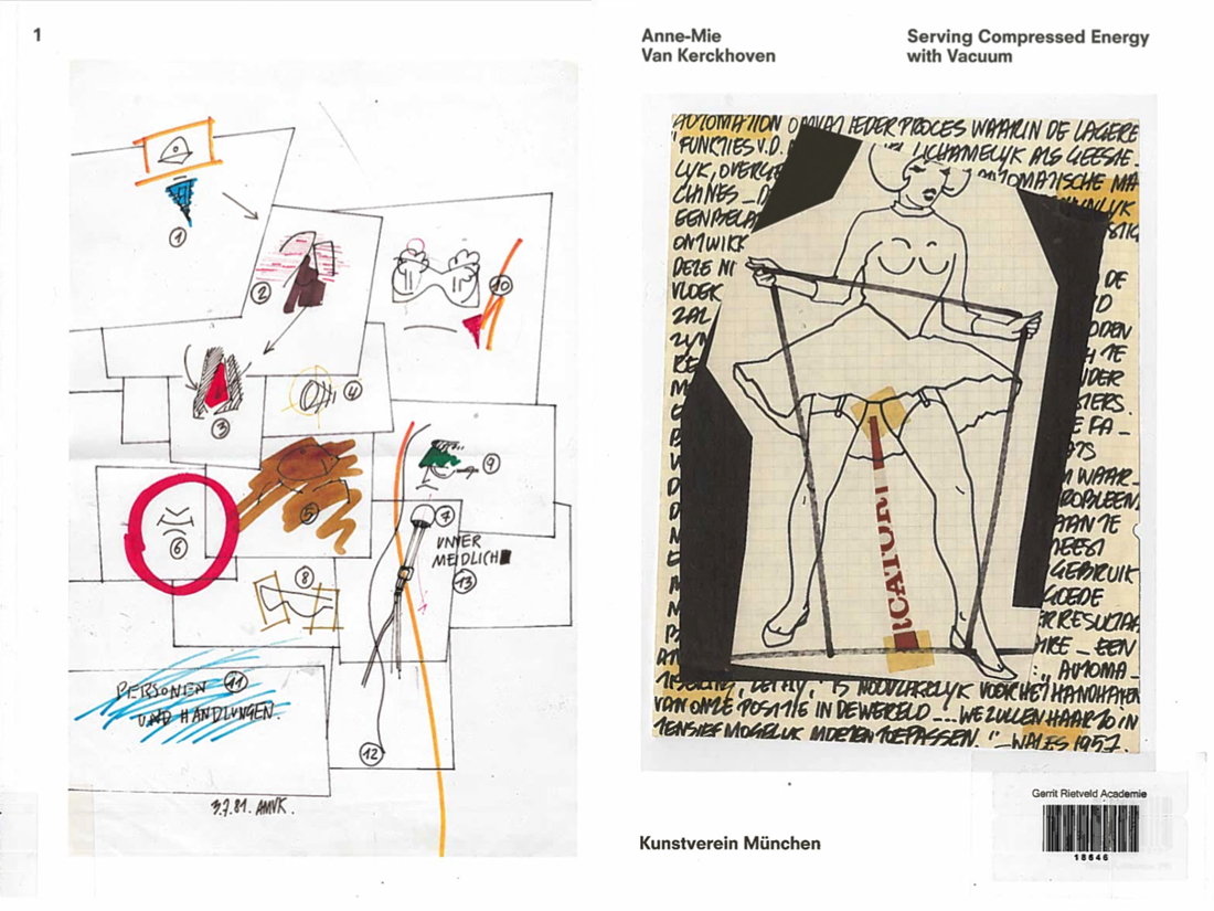
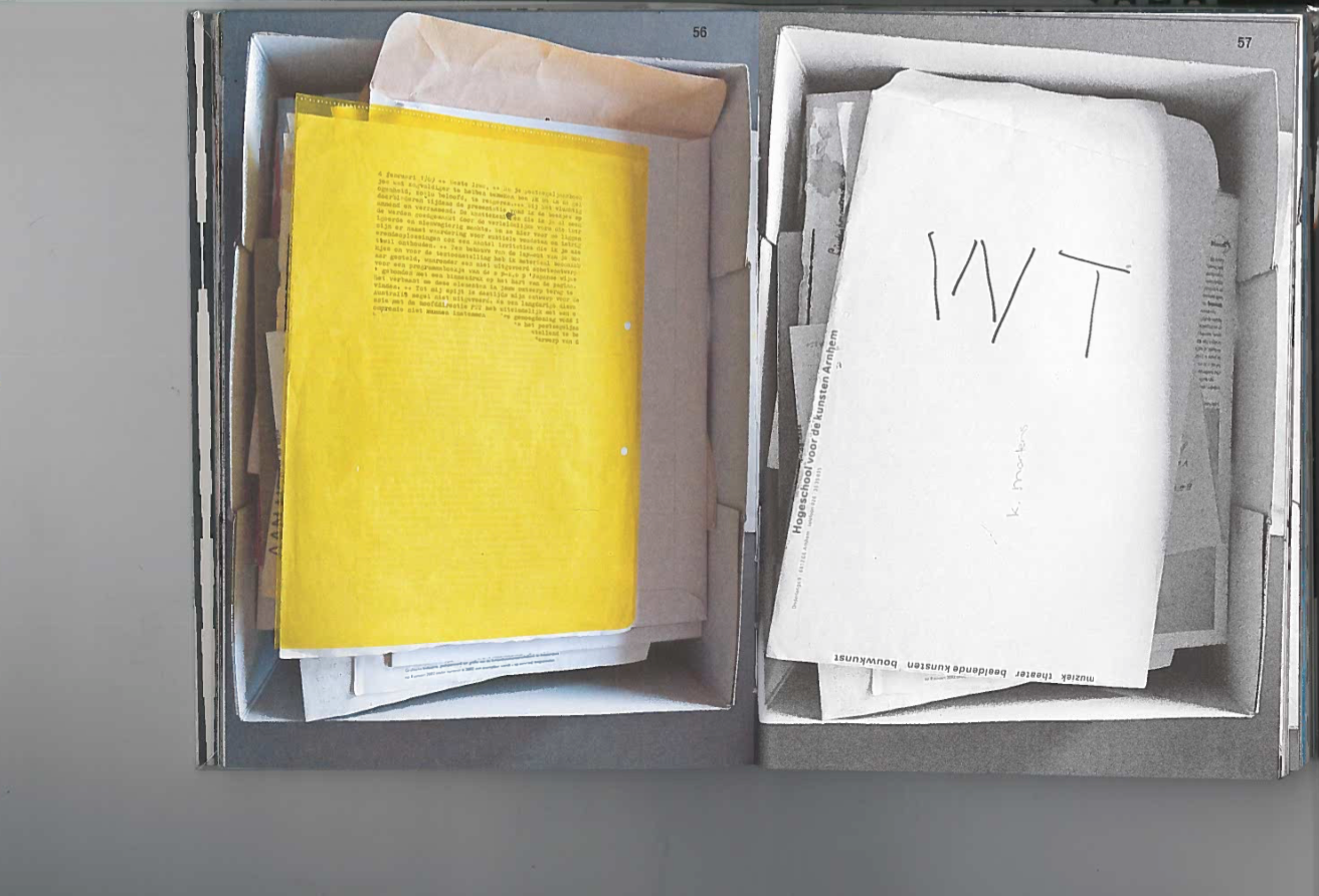
More precisely, I’ve chosen to work on the Periodical #1 because at first sight it was the design of the cover that I noticed. Therefore, I focused only on the design of the magazine, not on the content. First of all, we can see how images are articulated with the text in a way that they interact with each other and play with the space of the page. The fact that they are using a card board for the cover but also for the Editorial and Colophon was at first something that I’ve found really playful and unusual. The cover is normally more straight than the content but in this case, they played with the same paper inside of the book and bring an other dynamic.


image4


The back cover is also interesting because they played only with text elements and the size of the text, which gives a special interest to the pages because the integral empty space. That is one of the knowledge of a good designer to know how to manage the white space and make it interesting. As many Graphic Designers, they used only text and play with the idea that it can become an image.

The color of the cover has been something really intriguing because it is a fluorescent yellow. This choice gives a certain impact to the cover because it catches the reader’s eye. Among the four pictures on the cover, only one is in color and the others are only black and white. From my perspective,  this gives a tension to the way that it is framed because of the repartition of the space.


image1.1

image1

image2.1

image2.2

image3.2

  image3.1


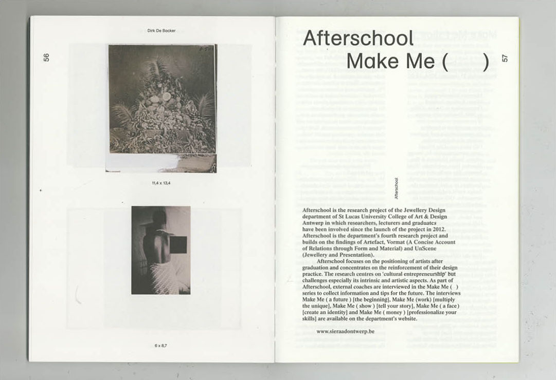
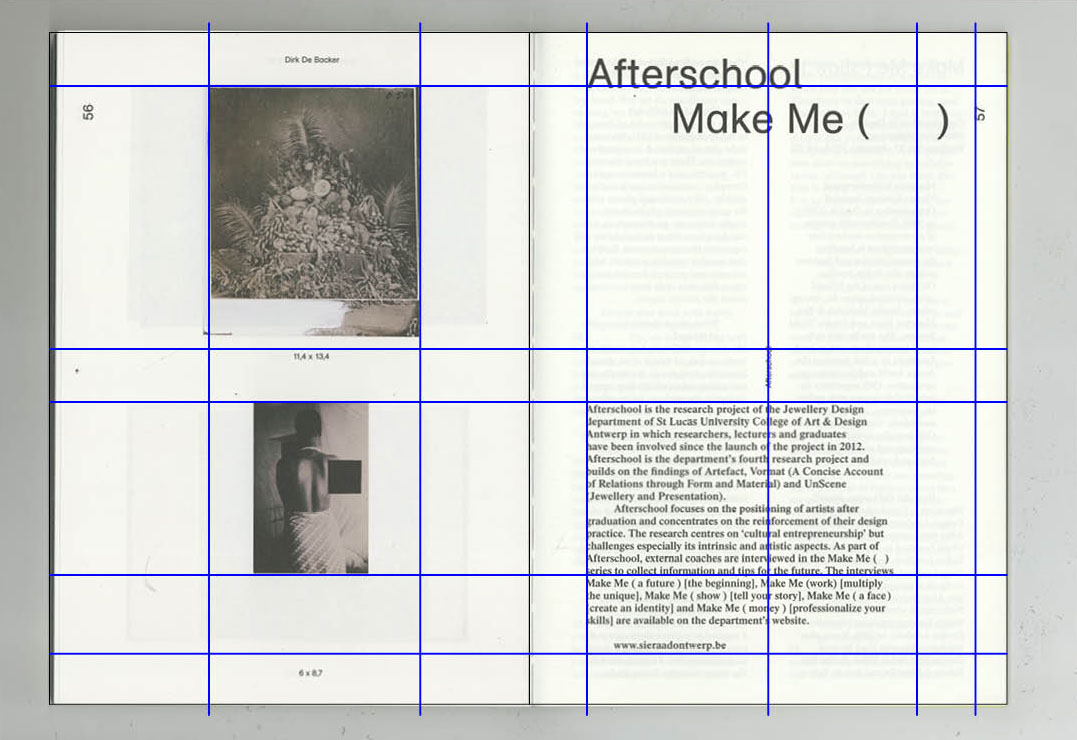
Moreover, the dynamic is followed by the utilization of all different kinds of paper for each edition. As I have mentioned previously the cover and the Editorial are printed on a card board and the four projects are presented on different papers. By this simple act, they created a different atmosphere for each periodical and gave another dynamic to the work. One of the first things that I usually like to look at when I’m discovering a book is the choice of paper. This simple fact allows you to give a whole sensibility to your object. Furthermore, what differentiates a printed book from a digital book is precisely the choice of the material and also the images can be really different depending on the paper and the quality of the printing. The paper is the real contact with the object and therefore a full sensorial experience. The magazine’s choice to change the paper for each project gives a different feeling to each work and invites the reader to discover/ experience something new every time . From my point of view, this is one of the most important characteristic.


image6


By conducting my research, I saw that The YellowPress is variable for each project. I liked the fact that they have found different dynamics, playing with the space and the different typographies. They have chosen to use different typographies for the different parts of the magazine and by this means, we can distinguish the different parts of the magazine: for example, the Editorial, the introduction to a work, the information of the pages, etc. The fact that they mix different kinds of typography shows that they care about each shape and dynamic of the typography and about what experience they could create on the ready. It is a subtle way to play with the content.


binding


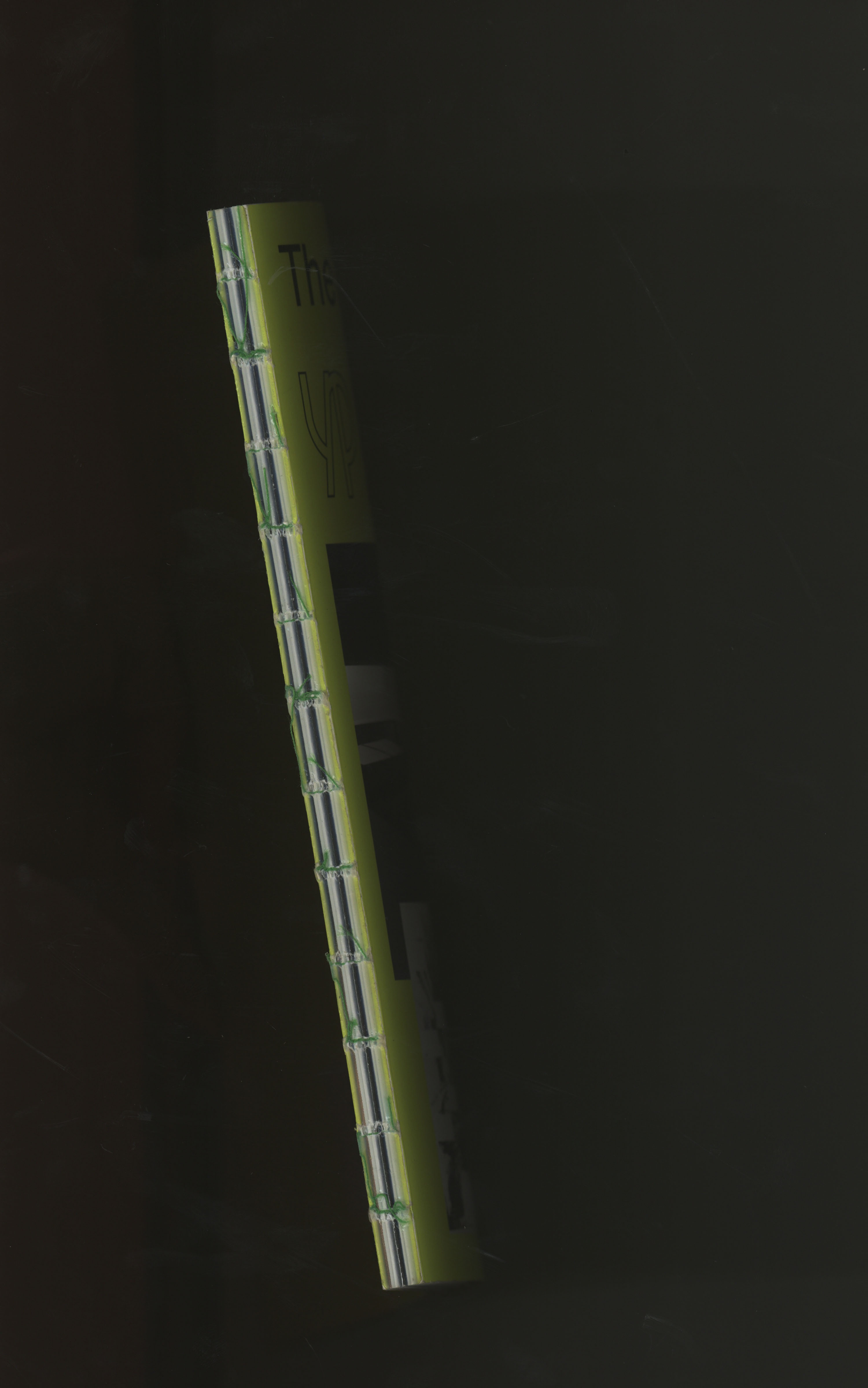
On this periodical, one of the things that I’ve really liked was the bookbinding. They have work with a sew and stick binding and it gives something really attractive to the object. By the fact that the layoutis really clean and nice and you have this industrial binding which brings another dimension to the project, more experimental and practical.

After my analysis about the layout of this magazine, I think that in the first place I was actually more attracted by the choice of the different papers than about the layout itself. I still like how they  have constructed and organized the magazine but I’m really interested by the texture. What I’ve also really enjoyed about this magazine is that they didn’t respect the common codes that magazines usually follow. A magazine is usually based on a specific grill and respect certain typography and system for each periodical. In the YellowPress, they adapt and change every time every thing.

 
We are at a time when the value of paper is being questioned and compared to digital. It is essential to see in this medium a real quality and sensory experience that I believe, can never be equaled by the digital. People crave for something real, a physical object that is unique and that you can hold in your hand and experience it.

The YellowPress Periodical #1, designer: Ward Heirwegh, Rietveld Library Cat. no: magazine

The Continuing Story of Life on Earth


Friday, November 24, 2017

Hamburger Eyes. The Continuing Story of Life on Earth… Bizarre title aside- hamburger eyes? life on earth continues!!- what attracted me the most was the cover, more specifically its texture. The pleasant sensation of its grainy, bulky surface on my fingertips reminded me of snowy twitches of bad TV signal, or, perhaps more curiously, the thick, shiny, rough surface of the corridor walls in my primary school in Russia (a serious throwback!). A visuo-tactile experience. A tactile eye (a Hamburger Eye?)

cover-backside_1200

The object-oriented appeal of this catalogue is emphasized by the cover’s minimal design: front- one black and white image, framed simply and straightforwardly, no text; back- modest typeface (and size) of the title, another black and white shot, Kunstverein München. The Continuing Story of Life on Earth is the sixth installment in Kunstverein München’s Companion series, produced in collaboration with Roma Publications since April 2015,  and was released on the occasion of the exhibition by Hamburger Eyes at Kunstverein München. I’m still not entirely sure what Companion series is all about, other than quietly beautiful, tactile books; book-objects. They are artist/exhibition books primarily, all clad in that leathery grain and defined by simple, sharp covers and minimalist layouts; images taking up full pages, and separated completely from text, which always has its own section. I have managed to get hold of two more publications from the series, You’ve got beautiful stairs, you know (artist book for/by la Vasiljeva), and Serving Compressed Energy with Vacuum (exhibition catalogue for Anne-Mie Van Kerckhoven). Both have the same multi-sensory appeal of a well-designed object; as publications, they are direct in their materiality but somewhat elusive in their origin and intention: where did they come from? Who made them?

design-theory-1_1100

design-theory-2_1100

Companion is conceptualized and designed by Julie Peeters , a Brussels-based graphic designer, editor and educator. For the sake of this brief research we are going to conflate the series with the person behind them; she is credited under ‘identity’ as well as under graphic design. Companion is Julie Peeters.

Peeters deals primarily with exhibition-related printed matter- booklets, posters, catalogues; on her website you can find examples of ‘anthologies of installations’, exhibition designs, as well as credits for the identity of Lithuanian and Cyprus Pavilion at the 55th Venice Biennial. Peeter’s signature minimalism, as seen in Companion, is consistent throughout her design practice: simple yet bold covers without titles (if possible), text relegated to its own section in the back, simple layouts that let images unfold, breath, softly assert themselves. A prime example of this is Julia’s design of Full Colour by Karel Martens, published on the occasion of an exhibition in Tokyo. Graphic, enigmatic cover; title humbly relegated to the spine ; images taking up the whole page, on every page. Never a literal representation, a book by Peeters is an autonomous object, which augments its origin (an exhibition, an artist’s practice), yet has a character of its own.

Full Colour OUTSIDE

Full Colour INSIDE

Upon closer inspection the book’s identity unfolds; The Continuing Story of Life on Earth is not just Peeters. Hamburger Eyes began as a small xeroxed zine, turned into a magazine, and has evolved into a publisher. Publishing since 2001, they have developed their own signature vision of photography-

‘Ray selects images for their almost unexplainable impact, for their ‘epic’ qualities that exceed understanding, that SURPASS LANGUAGE…’
very Peeters?…

and a self-assured design style-

‘the current format is black and white printing on matte stock, print run of 500 copies, 6 x 9 inches, 64 pages, with PERFECT bind

carcrash_1100

catalog pages1_1100

The exhibition

which spawned this curious book (‘facsimiles of spreads from the back issues of Hamburger Eyes’) points to the mutually informative relationship between the design and the content. Each image was exhibited unframed and face up on tables, ‘as if a zine were being collated’. Hamburger Eyes promise to focus on the quality of a given image, rather than on the quality of its framing or installation ~ ~ ~ ~ The Continuing Story of Life on Earth has a very simple yet occasionally claustrophobic (two images stuck to one another on one page, with one blown up on the other) layout that recalls the intimate space of a zine. The book also houses an essay, that weaves throughout the whole book and is punctuated with tiny images- who made the choice when it comes to this punctuation? The publication is authored by Chris Fitzpatrick (editor?…), who also initiated the exhibition; one has to always consider the relationship between the designer and the author. The Continuing Story of Life on Earth is a collaborative effort shared between the two. Here content informs design, but also design informs design: from a zine to a photography magazine to an exhibition and back again trough the catalogue to our book.

Hanburger Eyes /The continuing story of life on earth, designed by Julie Peeters, Rietveld Library Catalog no: hamb 1

Meeting with a shape explorer


Tuesday, December 6, 2016

Olivier van Herpt is young Dutch designer from Eindhoven, he graduated in 2014 form the Eindhoven design academy. We discovered his work at the “Dream Out Loud” exhibition in the Stedelijk. Both of us were strongly attracted by the 3D world and process in the show. Therefor van Herpt’s work seemed like the most instructing of all regarding his process but also due to the final objects themselves. The other aspect that catches our eye was the combination of brand new technology and crafts, (3D printing/ceramics, weaving). Van Herpt’s work consists in making ceramic shapes (vase looking shapes) with 3d printing machine that he engineered for it. We were therefor even more fascinated not only by the shapes but even more by how he got there. We had the opportunity of meeting him in his studio and ask him more about his work and work process.

The conversation immediately focused on his work process.
It all started when he was still a student at the academy, he was already interested in 3D printing and was taking ceramics as minor. He also mentioned that he had always been interested in the technical part. But was quickly limited by the technical possibilities of the machines at the academy, size wise, material wise and so on. This is when he started thinking about making his own. His approach was also mainly to combine different techniques. He therefor though about a machine that would combine man action and machine made. He wanted to have an interaction with the machine. That combination also takes place in the process of designing the object and making the object. Van Herpt had some help from student friends at the beginning but not from manufacturing industries. He started with a small machine and they got bigger with time. He designed and engineered the machines himself and learned the technical part while in the process of creating them. Also as a designer, unlike an engineer, he already had an idea about what the machine had to look like from the start. That give it a different approach but of course he had to adapt to technical issues and the machine had to adapt on what he wants to make. « It’s a parallel process between the object and the machine. »

3d-dripping

3d-printing-ceramics-1

After graduation he focused on experimenting with the machine with different techniques all about randomly approach « dripping » with different materials, such as wax, and bee wax. At the time he was experimenting with soft clay by softening it with water but had quickly explored all the possibilities with it so he then decided to focus on ceramics, dive deeper into it and use hard clay for which he had to build a new machine. Again we can see the close relation between the process of making the machine and the object, how one is to the other, and the constant need to develop a machine that is adapted to the material (hard clay).

IMG_8799

The second machine he made for the hard clay is basically like a pomp, he described it as an ‘extruder’, the innovative aspect to it is its openness and the possibility to interact with the machine that works with any kind of hard materials : « the machine is really like a tool » that he uses to make objects with. He explained that there were two ways of working with the machine. You can decided to interact with it or not. The most basic shapes are hand made. Some of the shapes are design then put into the computer and then when a machine prints it then it is machine made, or you can shape it yourself on to the machine because the machine is not closed.
This is it’s way of renewing an very old craft (ceramics). It is a human versus machine collaboration. The shapes of the products are all unique you cannot make one twice. Because of the use of clay it is also fast to make and always reusable until you cook it. It is then possible to make a lot of different try-outs and and shaped it until you are satisfied with it. Meaning that there are endless combination of shapes possible to explore. He also sees it only as the beginning and very much as an on going process of experimentation.
«It is only the beginning » as he said « it can be really random but also really controlled » which gives a bigger range of possibilities, also with the use of different colored clay, creating very different kind of shapes. He also told us that he recently started to experiment with new materials such as porcelain.

IMG_8795 IMG_8790

He is in process of creating a new machine, even bigger, to have the possibly of making bigger shapes and objects. Having the possibility now of collaborating with different fields, which was his idea in combining techniques, he is enthusiast in working not only with designers but also with artists, architects, interior designers and even industries. for example industries ordered his machines for other purposes.

This research project by Daria Nakov and Raphaelle Hugues is based on the "Dreaming Out Load" design exhibition curated by the Stedelijk Museum Amsterdam

The Discovery


Thursday, November 12, 2009

Browsing books is my  favorite thing in the world. But I am not looking for an interesting read, not this time. I try to let my sub consciousness guide me. Walking past a row of books at the end I stop, touch the spine of a big tome, glaringly yellow, black border, interesting typography. My touch reveals a strange texture of the yellow paper. Or fabric maybe? The sticker on the back annoys me, how dare it break the yellow/black/angular balance of the back?

I slide the book out of it’s resting place and take a peek at the front. The same typography as the front, the same thin black letters on yellow. This time I can feel that the letters were pressed on the yellow. Hard. They appear to lie just below the surface. Intrigued I slide the book out altogether and wake up out of my book trance only to realize I am holding my choice in my hands.

725.9

STRETCHED AND MELTED TEXTILE ART


Wednesday, November 4, 2009

The book that attracted my eye hold the promising title „The new textiles“ and can be found in the library „Textile“ section. Although the word „new“ is no longer valid as it refers to the 80’s and early 90’s, the book could still – through its vast range of images – nurture my curiosity about the possibilities of the textile and its value as the work of art. The traditional textures are treated as abstract objects, out from their usual use and the common field of associations. One can find the textures wrapped, stretched, broke into pieces, collaged, melted in the high temperature, or replaced by materials not considered as textiles in the traditional sense: papers, wires, needles, glass etc. All those actions broaden the sense of what textile can became, especially when it becomes an work of art.

'White Arc 3'  Akio Hamatani 1983

'White Arc 3' Akio Hamatani 1983

Catalogue Number: 779.0 col 1


Log in
subscribe