What about
a paper experience ?
Texture ////////////// Size///////////////////
//// Shape//////////////////////////////////Smell
—
Reading is normally the first motivation for buying a book right? But it isn’t always the case, at least not for me. There are so many different things that can bring you to this mysterious and incredible object: the book. One of them is the paper experience and since ages it is a full and really particular sensorial one.
In fact, only for this reason, I spend hours and hours in book shops searching for something attractive. But what does it « something attractive » mean? After spending four years studying Graphic Design in Switzerland, I have learned how to understand layouts, how to make them attractive, and how to manage different information to make them more accessible. But Furthermore I’ve learned that the base of all the work of a graphic designer is sensibility. How to play with visual and tactile senses. How to make you curious on a subject that you don’t really care about just by the shape of a book. The content of it, is for certain the most important thing but some people can look at a book in a totally different way. For instance, when I buy books, pay attention to the layout or the paper, more than to the content.
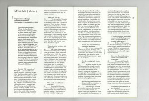
Through the broad variety of books available in the Rietveld unique library, my eyes fell on a small and independent magazine called « The YellowPress ». It was created by the St Lucas School of Arts of Antwerpen. This magazine’s particularity is that for each one of their periodical they gives the opportunity to all students, alumni, researchers and professors of the school to share their on-going research and/or output / results. This enables a diversity and an open-minded perspective of the magazine and creates the possibility to reinvent the layout’s atmosphere and dynamic. This explains the reason why each periodical has a completely different shape, typography and layout design.
I chose to focus my work on the first number of the periodical made by the graphic designer Ward Heirwegh who teaches graphic design at the St Lucas School of Arts.
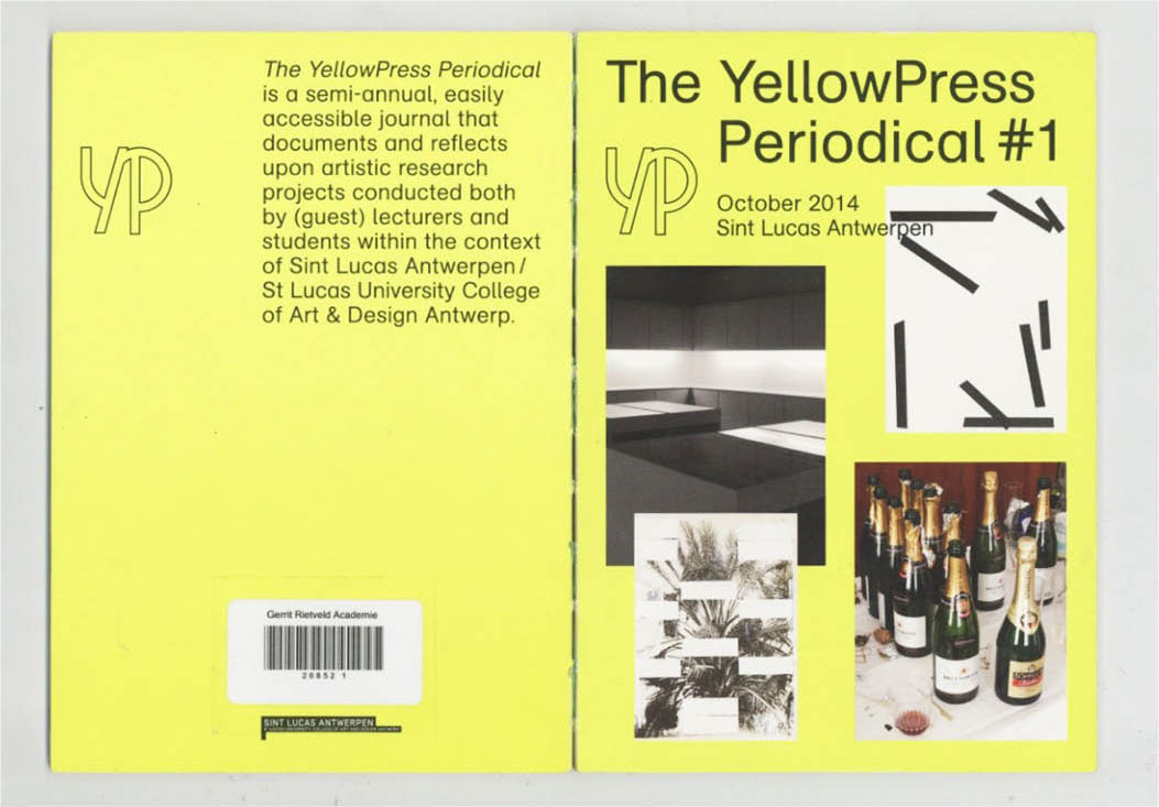
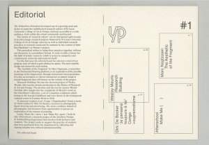
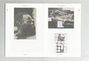
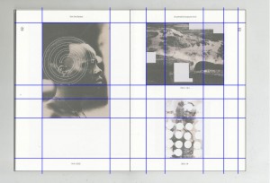
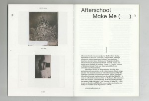
More precisely, I’ve chosen to work on the Periodical #1 because at first sight it was the design of the cover that I noticed. Therefore, I focused only on the design of the magazine, not on the content. First of all, we can see how images are articulated with the text in a way that they interact with each other and play with the space of the page. The fact that they are using a card board for the cover but also for the Editorial and Colophon was at first something that I’ve found really playful and unusual. The cover is normally more straight than the content but in this case, they played with the same paper inside of the book and bring an other dynamic.
The back cover is also interesting because they played only with text elements and the size of the text, which gives a special interest to the pages because the integral empty space. That is one of the knowledge of a good designer to know how to manage the white space and make it interesting. As many Graphic Designers, they used only text and play with the idea that it can become an image.
The color of the cover has been something really intriguing because it is a fluorescent yellow. This choice gives a certain impact to the cover because it catches the reader’s eye. Among the four pictures on the cover, only one is in color and the others are only black and white. From my perspective, this gives a tension to the way that it is framed because of the repartition of the space.
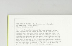
Moreover, the dynamic is followed by the utilization of all different kinds of paper for each edition. As I have mentioned previously the cover and the Editorial are printed on a card board and the four projects are presented on different papers. By this simple act, they created a different atmosphere for each periodical and gave another dynamic to the work. One of the first things that I usually like to look at when I’m discovering a book is the choice of paper. This simple fact allows you to give a whole sensibility to your object. Furthermore, what differentiates a printed book from a digital book is precisely the choice of the material and also the images can be really different depending on the paper and the quality of the printing. The paper is the real contact with the object and therefore a full sensorial experience. The magazine’s choice to change the paper for each project gives a different feeling to each work and invites the reader to discover/ experience something new every time . From my point of view, this is one of the most important characteristic.
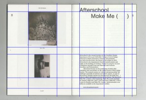
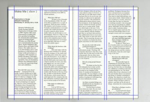
By conducting my research, I saw that The YellowPress is variable for each project. I liked the fact that they have found different dynamics, playing with the space and the different typographies. They have chosen to use different typographies for the different parts of the magazine and by this means, we can distinguish the different parts of the magazine: for example, the Editorial, the introduction to a work, the information of the pages, etc. The fact that they mix different kinds of typography shows that they care about each shape and dynamic of the typography and about what experience they could create on the ready. It is a subtle way to play with the content.
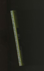
On this periodical, one of the things that I’ve really liked was the bookbinding. They have work with a sew and stick binding and it gives something really attractive to the object. By the fact that the layoutis really clean and nice and you have this industrial binding which brings another dimension to the project, more experimental and practical.
After my analysis about the layout of this magazine, I think that in the first place I was actually more attracted by the choice of the different papers than about the layout itself. I still like how they have constructed and organized the magazine but I’m really interested by the texture. What I’ve also really enjoyed about this magazine is that they didn’t respect the common codes that magazines usually follow. A magazine is usually based on a specific grill and respect certain typography and system for each periodical. In the YellowPress, they adapt and change every time every thing.
We are at a time when the value of paper is being questioned and compared to digital. It is essential to see in this medium a real quality and sensory experience that I believe, can never be equaled by the digital. People crave for something real, a physical object that is unique and that you can hold in your hand and experience it.
The YellowPress Periodical #1, designer: Ward Heirwegh, Rietveld Library Cat. no: magazine
