Skip to Content Skip to Search Go to Top Navigation Go to Side Menu


"theater" Tag


Imagining Bauhaus Poetry


Wednesday, April 24, 2019

Through the looking glass of Bauhaus principles, observing the elements of “poetry” and how that guides new possibilities in the making of a poem.

What inspires me to explore this idea is the incredible visuals of Bauhaus Theatre.


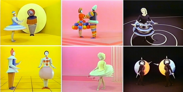
More spesifically HOW the concrete, minimalist and practical demeanors of Bauhaus (which in my mind have such an adult attitude!) created such extravagant, playful, toy-ish costumes that look like perhaps a child puked them out of their wild imagination! 

While “the Bauhaus element” in these costumes and general aesthetic* * * is undeniably present to me, there I observe something more, almost an added element… Having read that the thinking behind the designing of these costumes is in fact by observing the performers body with a calculating attention and following its relations to the space (the stage) through its motion*, I am tempted to think this “other element” I was looking for might just be the ballet itself.

Assumption…..         The designs of these costumes are just materialization of the visuals the dance draws in the viewers mind-eye. The dance is numerous invisible lines and shapes drawn in time with the tool of the body…       Perhaps!

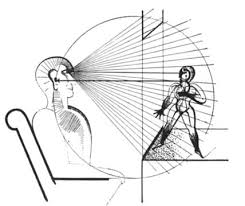
Hypothesis:————————————————

Bauhaus building within an existing art form alters its outcome.

So It makes me Wonder. How would it apply to poetry? With letters and words as form and rhythm and sound as dance, the paper as the stage. I found myself wondering this more so than other mediums mainly because I haven’t seen it attempted.

Starting… Concrete, anew.

A concrete definition: Poetry is a form of literature that uses aesthetic and rhythmic qualities of language to evoke a concentrated imaginative awareness of experience or a specific emotional response.

Here is a new world, with its new forms and movements, sensations and images, to build a new Bauhaus in and of it. I will attempt to look at some elements of poetry and seek new possibilities in its design, looking at it through the 5 characteristics of the Bauhaus design.

1=Form Follows Function

It means that in design, a form should always be applied because of its function instead of its aesthetic appeal. “Utility came first and excessive ornamentation was avoided.” The thing is that this principle seems to shift slightly when applied to an already existing art form like dance, or poetry, as the means of actions in these are the adornments themselves. So, thinking of function for aesthetic, rhythm, imagination and emotion (and so on…) is altogether a different approach. Function in this case, I imagine, would be to ease and support the already existing or suggested communication of forms and elements -in the case of poetry, for example,——: All aspects must serve to communicate/highlight the emotion/mental picture/phonesthetic situation. 

Letters (uppercase, capital;size;font;color;bold-italic…so on.), Words, Gaps, Marks, etc. + the plane the poem will be viewed on should be used for this, courageously.

2=True Materials

According to the teachers at Bauhaus, materials should reflect the true nature of objects and buildings.

This to me, follows up to the previous case. What are the true materials of text, literature and what are their functions? These are not meant to be hidden, but even highlighted to show their functions thus exaggerating and complementing the existing literary pleasure.

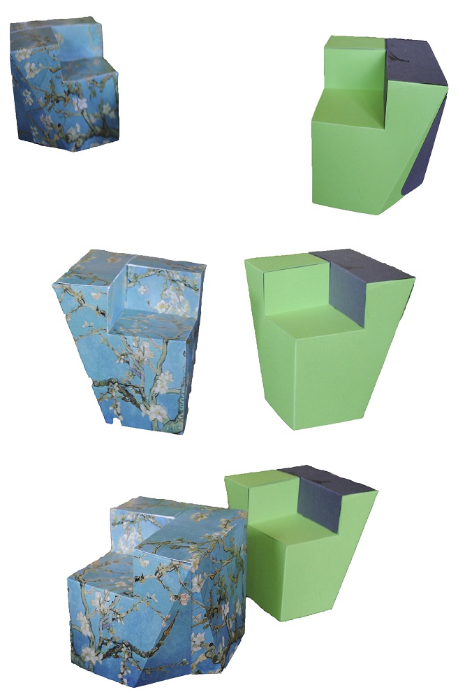
In Bauhaus Theater we see the stage too, is designed in such a way that it holds hands with the costumes designed to exist with it, so the form and its space exist as one self-complimentary relation. I believe this relation is somewhat weak in the current poetry. There is perhaps much to do to enrich our poems by putting more thought on the plane (usually the regular white paper) we present it on. I would advise seeking new possibilities on this, trying to create a more powerful relation between the elements of the poem and the presentation of it.

3=Minimalist Style

Bauhaus artists favored linear and geometrical forms, while floral or curvilinear shapes were avoided. Only line, shape and colors mattered. Anything else was unnecessary and could therefore be reduced. Therefore we should give the reader the necessary amount of words (and preferably words that are not too difficult or esoteric) and not more, as it risks tiring the emotional and phonesthical landscape. This approach also gives the poem a fresh, modern look, which is desired. It becomes open and approachable artistic experience, instead of possibly exclusionary one.

4=Gesamtkunstwerk*

Translated from German as “total work of art”,”ideal work of art”,”universal artwork”*, “synthesis of the arts”, “comprehensive artwork”, “all-embracing art form” or “total artwork”) is a work of art that makes use of all or many forms of craft and design, or strives to do so. 

The poem can draw a picture as a visual form, can be sang as a song or acted as a play and so on… all this is desired and should be attempted.

*The concept of language makes this difficult as many languages used for poetry cannot be called Universal, but I believe it is still quite possible to challenge this with the help of growing alternative languages, which I will go more in depth in the following.

5=Uniting art and technology

In 1923, Bauhaus organized an exhibition that shifted the Bauhaus ideology. This exhibition was called ‘Art & Technology: A New Unity’. From then on, there was a new emphasis on technology. The artists embraced the new possibilities of modern technologies, for example at the time, mass-productivity was keep in mind whilst designing a product.

In Bauhaus ballet, geometric shapes and a mathematical understanding of the dance is very apparent in the costume designs and choreography –*.

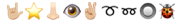
New technologies today, give us new languages for poetry to play and build with, of which I don’t see enough use. A prime example of this are the Emojisa small digital image or icon used to express an idea or emotion. It is, by definition, quite similar to the words that we use but with an advantage of their own, being capable of much more of a universal communication than any word of any language. They are being used so often in our daily texting and us new age kids have learned to communicate so much with them so easily, and with the help of an ever growing selection of emojis available to anyone with a smartphone, I am surprised why they are not being used more creatively. I believe through emojis a new, different and straightforward literary landscape is possible and I would like to attempt it, here…

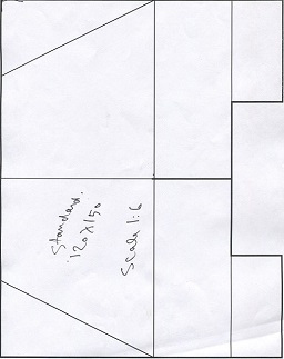
My (currently very incomplete) draft/attempt at Bauhaus Poetry::::::::::


Side-walk in the cold regular night,

I am sedated by 

the surrounding objects :

Moving amongst growth and shrinkage

To the pointed futurity which sits folded 

in Z00Ming horizon———. 

Moments pass themselves to remain 

over my shoulder, behind my last step 

to Reside as the Past. Behind the direction    of 

my opposing attention  

As we speak I am Approaching 

to : 

the ————. needle tip… 

Shapes emerge and grant me locality

The wind blows Regular 

and I start takinK 

The X Large stepsS 

of a clown. crawl

into an ever-descending point 

   the buzz of everything glimmers an easy happening  

   thingness of the smallest spot

                               WiNKs at me

Everywhere is filled with stars!

Except the calming darkness of the surrounding

Tree trunks 

descending...


A Spectacular Manifesto


Tuesday, April 23, 2019

The ultimate goal of all art is the spectacle! The ancient drama was once the main purpose of the visual arts, and it was institutionalized as an indispensable part of life. Today, it exists in complacent isolation, from which it can only be salvaged by the purposeful and cooperative endeavors of all artists. Architects, painters and sculptors, designers, writers and potters must learn a new way of seeing and understanding the composite character of the theater, both as a totality and in terms of its parts. Their work will then re-imbue itself with the spirit of the spectacle, which it lost being caged in a white cube.

The art schools of old were incapable of producing this unity—and how could they, for art may not be taught. They must return to the performative, to the spectacle, the theater. They must get back up on the stage. This world of mere conceptual products must at long last become a world of performers. When a young person who senses within them-self a love for creative endeavor begins their career, the context of the theater will give them unrestrained freedom to achieve excellence in their practice of art, as well on stage as behind the scenes.

Architects, sculptors, painters, photographers, weavers and dressmakers—we all must return to the collective spectacle! For there is no such thing as “art by profession”. There is no essential difference between an artist and an actor. The artist is an exalted performer. Merciful heaven, in rare moments of illumination beyond man’s will, may allow art to blossom from the work of his hand, but the foundations of proficiency are indispensable to every artist. This is the original source of creative design.
So let us therefore create a new ensemble of actors, free of the divisive class pretensions that endeavored to raise a prideful barrier between actors and artists! Let us strive for, conceive and create the new theater of the future that will unite every discipline, architecture and sculpture and painting, video and glassblowing and jewellery which will one day rise heavenwards from the million hands of artists as a clear symbol of a new spectacle to come.

If you know your Bauhaus well, you may recognize this text as it is a rewritten version of the Bauhaus Manifesto. When Walter Gropius wrote the original manifesto back in April 1919 he wanted to unify ”architects, painters and sculptors” by going back to the crafts and combine it with fine arts. When I’m rewriting it now, to the month exactly 100 years later, I’m also aiming to unify not only architects, painters and sculptors, but all artistic disciplines, through a revival of, and return to, the performative arts within the Gerrit Rietveld Academie.

We are always told to get out of our comfort zone, to aim for the impossible, the fantastic, to let us be carried away and explore our dreams. Where else better to do all that than in the context of the theater? It has room for, and it needs, everybody’s interests and practices! Apart from performers it needs just as many writers, sculptors, painters, musicians, designers, costume makers – you name it. Furthermore, there is nothing you can’t do on stage; if you want to fly, then you fly! This limitless space of imagination and exploration is something that should be available and encouraged for everyone, performer or not. With calling it ”theater” rather than ”performative arts” we can also emphasize on this collaboration and intertwining of knowledge and different practices which is absolutely essential.

”But you can already do this, you can do (almost) all you want at the academy!” some might say, and while that sure is true, the space and importance given to performative arts in this school is very limited compared to it’s precursor. Yes, there is a small group of teachers and students engaged with it within the academy (basically restricted to the Fine arts and VAV departments), and yes there used to be a theater department back in the days. But why isn’t it a natural part of the education for all of us, and not only for students in a certain department?

Reading Human – space – machine: stage experiments at the Bauhaus by Torsten Blume and Christian Hiller (Spector, Leipzig, 2014) it becomes clear that movement classes of different sorts were an important part of the Bauhaus’ Vorlehre – the equivalent of the Rietveld’s Basisjaar. During Johannes Itten’s years the focus was a “therapeutically motivated balance of body and soul” while later on, under Lászlo Moholy-Nagy’s and Josef Albers’ board, the physical exercise became more “businesslike and functional”. No matter the purpose, in both of the above mentioned cases the physical movement of the body was natural elements of the teaching that we are now missing but that could easily be brought back to life in the form of performative arts.

I say:

Let’s have theater class once a week in Basic Year!

Let’s build a proper stage with opportunities to experiment with light, sound, scenography and spatial design!

Let’s all and everyone, from our different practices and fields of interests, unite and collaborate in this machinery that is the Theater!

In the spirit of Oskar Schlemmer, I wish for us a rich and alive theater as the most central and unifying element of the Gerrit Rietveld Academie.

Let’s make a spectacle!

Here from ago


Friday, March 27, 2015

03/03/2015, 10:00 AM

Fresh morning, makes me want to fill it with coffee and smoke and a nice story. And so we begin this day in a spacious room which is separated from the rest of the studio by this black wall which looks as if it fell from somewhere above and its destination happened to be this studio. It is interesting but Ok, nevermind. Let us sip our coffee from tiny soup bowls and burn it with some smoky inhales of rolled tobacco, as we further dicuss about this centrally positioned chair which put us together in this time and space.

10153205_10152017634480998_129506274_n
Chris Junge in the monodrama ‘ons ons’.

I have first encountered this chair on 3rd of July 2014, during an exhibition and a theater play by Melle Hammer, who at the same time is the designer of this chair. Its cheap and grandiose look caught my attention and kept my eyes staring at it, although I never really bothered to further investigate or question its existence. It seemed cheap in terms of the material it was made of (corrugated cardboard), and grandiose for its physical characteristics and attitude.

10885450_10152527566920998_4811577043378295905_n

As I sit a few steps across from it now, this switch from past to present keeps bouncing back and forth, making me want to finalize my opinion about this chair.  But then again, I know almost nothing about it. Although it is now standing upside down, it seems as if it hasn’t changed much, if at all. Cardboard still has the same brown color, its weight still looks cheap. Only this time, there’s more to see from what its interior structure offers, which is interior support consisting of two more cardboards connecting to form a plus-shaped structure.

And it’s Melle showtime, baby, feed me with words. It’s time for some real storytelling. He starts by describing the very first click he had for this chair, which was a theater play written by him. A monologue, or a dialogue should I say, between the writer and himself and so on which doesn’t really matter, but you get the idea. Anyway, the main point is that the he was trying to design a chair for this stage set which would give enough richness to the play, as if holding the whole scene on its legs.

We have a click. Good. And we have a direction/some kind of a plan. Good. What is the the hint, an inspiration, research, anything to grasp and begin with? A CHESTERFIELD CHAIR [x]. Just some background information. Ok, now we are complete: a click, a direction and a sort of inspiration.

Let us continue with some starting points, you know, that time when you get your hands dirty and make some mess. Before Melle starts telling me how the chair came to existence, he wants to make sure I understand the term „problem-solving“ before anything else about this chair, which has its occurence before design and which was his method of designing this chair. As an example, he puts a fork and a lemon squeezer on the table explaining that both of them can be used towards the same goal, which is getting the juice, despite the fact that their functions differ. Lemon squeezer speaks for itself, while the function of a fork, in this situation, would be „problem-solving“. I couldn’t make a direct connection to the chair, but I could sense my subtle excitement for what the following information is about. And so he introduces me to the problem he encountered in the beginning of the process, that being the money. He could not afford buying one of them chesties only for a one night show, so how one dealt with the problem and tried to find a solution resulted in the making of this chair. Corrugated, brown board costs only 6 euros per sheet (inc.taxes). It’s nice, yes, sharp, but its lasting is not long. Let’s say one year long, which is still enough as it was meant to be used for a few hours. Inside, the board consists of fluted sheets which will eventually deform or collapse through longer usage. During this play, the point of the chair where most power is used is armrest. At the same time, that’s where a lot of the chair’s strength comes from and it is double-layered. This armrest gives the chair a possibility to be used as a chair. However, real power comes from the interior of the chair which consists of two centrally crossing cardboards in order to support the weight. At this point of the story, I felt the pieces of the puzzle falling into their place, but Melle concludes it by saying that it is not a design, but a matter of problem-solving.


So far the obstacles encountered in the process were solved. Theater stage had its chair, it survived the show, and it met the budget conditions. Everyone is happy. The story goes on, however. It continues with Melle’s decision to take his problem-solving design further, from which breaking and overcoming more barriers followed. The goal is different now, that being to keep the model design of the chair which is strong enough to hold its ground without the interior support. And to last longer. Pure design. What is the key? Stronger material, which is Falcon board. It consists of standing up hextagons and doesn’t need to be double-layered in order to be stronger. It costs 9-11 euros per sheet(inc.taxes). Of course, it comes with disadvantages. Falcon board cannot be cut with machine pressing and immeddiately cutting down because of its high strength, but it would be possible with a plutter which travels slowly and precisely through the board. That said, it needs time and the production costs. However, this production would allow the possibility to print on the board, which further allows customized prints. This makes it into a more industrial product; it gives a furniture-feel and you can have it made with print preferences.

Melle_kill-your-darlings Melle_kill-your-darlings-1

Scale model(corrugated board chair) • Scale model(falcon board chair)


Example of customized print

I go back to that summer evening when I first saw the chair. I try to recall my thoughts, but it seems like I hadn’t put any effort to study the chair. All I can remember is that it did trigger my amazement for it for the reasons of its cheapness and steadiness. And I wonder, if I were to gain this knowledge about the chair before seeing it on stage, would the amazement still be there, or at all? Would it change my focus on the play? At the end of the play, who would my applaud be forwarded to? I was never exposed to much information about the chairs and their existence but the information keeps being present all the time, either verbally or visually. It took two events to broaden my perspective and make me question what lies beneath their designs.

Through Melle’s story; the whole process of deciding about the material, way of production, and constant problem-solving, I have come to realize that designing chairs is one of the hardest tasks for its creator.

11103936_10152743092000998_1510648936_n

Verder dan Faust..


Thursday, November 24, 2011

Ik zit in het archief van de rijksacademie en blader door de Wendingen issues. Opeens stuit ik op een uitgave gewijd aan de internationale theatertentoonstelling in het Stedelijk Museum Amsterdam [x]. Mijn oog viel op een afbeelding van een decortekening van Goethe’s Faust ( domscene I) getekend door Kurt Gutzeit. Een architect afkomstig uit Duitsland, lid van de Deutsche Werkbund  Een groep van kunstenaars en architecten. die in 1907 in München werd opgericht. De oprichters van deze werkbund streefden naar verbetering van het kunstnijverheidsonderwijs en kwaliteitsverhoging van de gebruiksartikelen. Ook namen ze een hele open houding aan tegenover de machine. Ze wilden een hechtere band smeden tussen kunstenaars en industrie. Dit verklaard de connectie tussen Kurt Gutzeit en de Wendingen. Ik ben altijd geïnteresseerd geweest in theater,  het is een op zich zelfstaande kunstvorm. En hier wil ik uiteraard meer over weten.

complete research (more…)

Use Designblog TravelTags


Tuesday, November 23, 2010

.

Visit all “50TravelTags”

.

from the Designblog tag-list.

.

browse mapping by Maria Micheva

It is not easy to navigate in the design world, let alone Designblog.
The 979 postings and over 2000 keywords turn it into a subjective maze. How are you going to find an entrance to amazing stories and surprising opinions. In-depth interviews and downloadable theses and research papers.
Before you know it, you turn from user to participant of a universe that sucks you in or swings you out.


browse mapping by Severin Bunse

Students from A group decided to help you along by browsing the blog for you. Becoming your guides, in a manner of speaking. Creating new tags that can serve as “Travel Tags”. [invention, ice-cold, climate, crisis, fun, erudition, rules, gravity, convention, removable, purple, symbol, social-talk, audio-zine, similarities, mode, funny-story, flexibility, women, do-it-yourself, icon, sharing, interpretation, role, masterpiece, travel, imagination, slowMe, play, peaceful-living, mystery, sexuality, reflector, 0-dimension, no-comment, theater, ideology, dress, sharing, hidden, art-of propaganda, dependency, break-up, sign, young, pulling-pushing, conditional, breakfast, porcelain, Norwegian-mythology]-tt. You can look them up in Designblog’s tag-list, under [50-TravelTags].


browse mapping by Anouk Buntsma

Browsing surely illustrates that Designblog can become a true Pandora’s box. On the TravelTag poster, which was printed on this occasion, you can see a selection of their journeys in the form of ‘browse-maps’. Visualizations of their browsing history. These visual sketches show clearly that browsing through the blog leaves a clear individual trace. No person experiences it the same way. The blog creates –by design– a colored travel experience that synchronizes with your personal taste and ambition.

Nothing Is What It Seems


Sunday, May 10, 2009

Anton Beeke’s poster for the theatrical play “Bloed van de Hongerlijders” (Blood of the starving ones) is a complex, yet at the same time striking “in your face” like work. Attempting to create an image that contains a deeper psychological meaning, Beeke executed the work while making use of different techniques. First of all there is the photograph, depicting a man in probably his early fifties. Furthermore present are yet two other photos. Where the first photo seems ordinary in the way it is presented (one recognizes a portrait that is, consistent with the convention, merely showing the face of the person depicted and partially the neck), the two other photos are peculiar. They are both cut-outs from other photos, pasted on the first picture. All the more strange it seems that also these two photos differ from each other. Although they both fit on the man’s face (from which they seem to be copies), they physically don’t match. Whereas one might assume that the right picture is a genuine copy of the original, the left photo shows spots and irregularities that could be associated with sickness. What could be going on here? Are we dealing with a Janus-like figure, perhaps a schizophrenic madman? Or was Beeke only pointing out an ambiguity with which we would be confronted with while attending the play? Presumably the answer behind these questions lies hidden within the layers of this work. Until we see it, we can only speculate. And exactly this curiosity is what a poster should revoke!

WHEN THE FACE BECOMES A MASK

What has happened to this man? Are we dealing with a Janus-like figure, perhaps a schizophrenic madman? And what could the artist’s intention be? Might Beeke have been pointing out an ambiguity with which we would be confronted with while attending the play? Presumably the answer behind these questions lies hidden within the layers of this work….read more about his poster in the linked pdf


Log in
subscribe