Skip to Content Skip to Search Go to Top Navigation Go to Side Menu


"rebellious" Tag


William Klein’s City Portraits


Monday, May 21, 2018

The American-born French artist William Klein (1928) is a multifaceted photographer and filmmaker, known for an unconventional style of abstract photography and in the same media a revolutionary approach to fashion. This text, however, focuses on his series of photo books portraying the cities New York, Rome, and Moscow.
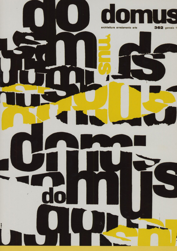
This research had its starting point in Klein’s posters for the magazine Domus; As elaborated later in the text, Klein experimented to a great extend with a sort of “trashy”, or maybe just honest, way of expressing “city life”. Domus began to publish Klein’s experimental graphics/photography as front covers for the magazine in 1952. Among the covers were a very rough way of handling photography and typography to be seen: William Klein would torn his own work apart and put the ripped parts back together in an uncouth order.  As a visual language this lack of perfection and polished finish seems to find its inspiration in the actual torn posters one sees on walls in the streets of big cities. Having this style of “torn” magazine covers in mind, this research dives deeper into Klein’s visual language [x] describing the life of a city.

domus-cover-William-Klein_950 Schermafbeelding 2018-05-31 om 12.48.21

Klein studied painting and never received formal training in photography. One can argue that this “lack of technical education” made his experimental approach to the media possible. He would have to find his own way. This experimental and playful way of working with a medium is also present in Klein’s graphic work, as for instance seen in various posters, where Klein mixes photography, painting, collage, and typography.


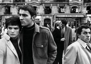
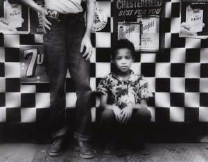
His lack of academic photography training also showed itself as a virtue in his genre-defining photo books portraying cities that Klein visited. The first one, “New York” started as a photographic diary. When Klein came back to his hometown after six years of studying in Paris, he found momentum in this medium, that he had never really used before, and executed the extensive series in just 3 months. It was also a reflection of him returning to the streets he walked growing up and seeing new representations of people and situations he experienced there. The blurry, close up, in the actual photographs where not popular at the publishing houses but eventually broke through and had a huge influence on what we know as street photography. The next book, “Rome”, was made shortly after Klein moved there to be an assistant to Fellini.

klein-11 hb_1989.1038.2

left: image from 'Rome'©59 / right: image from 'Life Is Good and Good For You In New York'©56

Having two very separate relationships to the two cities must have affected the way Klein approached the photographic investigation. With this background in mind, you can distinguish some differences in these portraits. “New York” contains more pictures of children, a way for him as the protagonist to relate back to his past experiences in the space. He even says in an interview that he sees many “self-portraits” in the series. While “Rome” has similar stylistic features, you can glimpse more of an outside view, even in the way people look back at the camera.

5734df6218267979e8f5e2bae92f128c

379_1_large

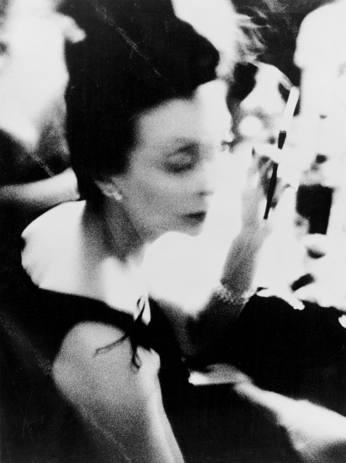
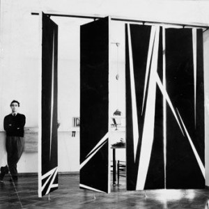
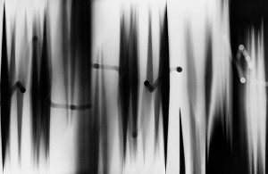
One strong characteristic that separated William Klein from the start and became one of his signatures, was the use of motion and blur causing blur. This expression was developed in Paris when he was trying to document a mural he had painted. The wall consisted of a row of rotating panels, that when captured on an image created geometrical shapes with obscure lines. This discovery would be very crucial to several of the branching that his practice took, but would not be well received initially by traditionalists.

When Klein originally tried to publish ”New York” it was perceived as being ”too ugly, too seedy, too one-sided”. The publishers were used to, and wanted to, see the city portrayed in a romantic light. The high class, the architecture, the richness. Klein’s approach was instead semi-aggressive, unpretentious, focused on the people, and had no interest in being a promotional tool. This, for the time, controversial viewpoint would, however, be very welcome when he made the ”Moscow” book, the third in the series. The western/American picture of Russia was (and still is, but maybe even more extreme back then) extremely alienating and one-sided. His book depicts a lively and multifaceted Moscow and is considered to be the book in the city series where he comes closest to the subjects.

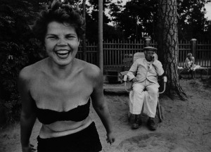
124532-1474570722-04Klein_William_bikini-xl

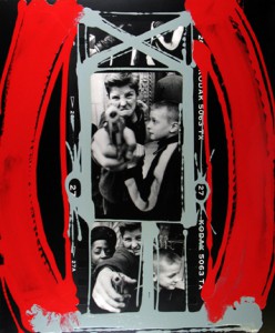
Sarah Boxer wrote a review in 2001 in New York Times [x] of two of his shows, where she brings up the notion that the authenticity in Klein’s pictures might be partially staged. Specifically, she talked about an exhibition where his contact sheets are being magnified and displayed. The contact sheets had notes in the shape of circles, arrows, and crosses, singling out the pictures that Klein had chosen to use when he originally developed the film. What made her questioning was the decoratively ”perfect” manner in which the lines were made. A lot can be said about this. Klein was originally a painter, so that could be an explanation for the way the motions of his hand could come of as decorative by default. Anyhow, it is interesting because much of his legacy, and the tradition of street photography in general, is built on the purity and honesty of the content. Though some of his works are known to be staged, it still has proved itself to be able to catch an essence in a community in a superior way.

Klein4

A general problem in culture is the inevitable tendency for rebellion to become stagnant. As a direct consequence of success and the finding of a language that comes with age, groundbreaking eventually becomes mannerisms. Klein has been lucky to keep a youthfulness about his work, often by sporadically changing lanes and looking for limits to cross in another niche. This quality has made him a prominent figure in a variety of photographic disciplines and testifies the importance of diversity that the market often overlooks.
csm_Lempertz-1058-130-Photographie-William-Klein-Candy-Store-New-York_f1d3875b82

Rebellious jewellery


Wednesday, March 1, 2017

Marble that looks like concrete, oxidized silver casts and penetrated diamonds – the jeweler and artist Karl Fritsch plays with the use of material and with the common perception of jewellery. By using different techniques, he challenges his profession’s tradition and the notion of value.
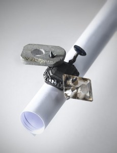
What makes a ring valuable? How does it need to look and feel to be wearable? Having these questions in mind, Karl Fritsch interprets jewellery-making in a new way through unusual combinations of different material. For example, in contrast to the process of marbleizing, where artists try to paint a surface that looks as close to real marble as possible and even go to special schools to learn the techniques of painting faux marble, Fritsch doesn’t want to achieve a look that is familiar to our eyes. Instead, he works with real marble and leaves it in its raw state.

fritsch1

Karl Fritsch, RING 2008 coll. Stedelijk Museum

The Stedelijk Museum in Amsterdam displays five rings and one brooch of Fritsch that perfectly illustrate his unconventional approach. One striking piece is a ring made out of silver, sapphire, quartz and marble. On first glance, the materials used seem crude; however, when you look closer, you notice the materials are actually real marble and precious stones. Fritsch plays with conventional ideas of what a material should be in the jewellery world. When we look at high end jewellery we tend to expect perfect finishes and nicely polished stones with smooth surfaces. However, the marble of the piece seems more like concrete and the silver doesn’t have a shiny but dark surface due to the oxidation.

fritsch111995.1.0228

Karl Fritsch, RING 2003 and BROOCH 1994 coll. Stedelijk Museum

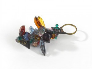
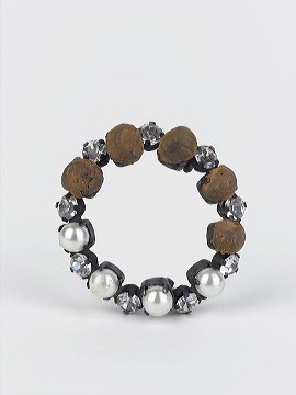
Karl Fritsch is known for his unique working methods and techniques, ignoring social conventions and traditional standards. Precious stones like diamonds are usually finished in a specific way. The treatment of the surface – the special cutting and sanding of the material give diamonds their value. Nobody would dare to ‘destroy’ the surface since the gemstone would instantly lose its value. However, Fritsch does exactly that – he penetrates diamonds, sapphires and other precious stones. By ‘destroying’ the value through damaging the surface Karl Fritsch is able to give the pieces another layer of value. His pieces are unique and blur the line between common conventions of jewellery-making and fine arts. His former professor Otto Künzli described his rebellious works “as if [he] repaired the broken ring[s] with a golden chewing gum”. His interpretation of jewellery turn rings and brooches into wearable pieces of art

The Rebellious Anti-Catalogue


Wednesday, February 8, 2017


Wie die Räume gefüllt werden müssen

How the space needs to be filled


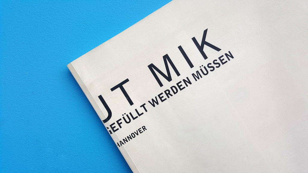
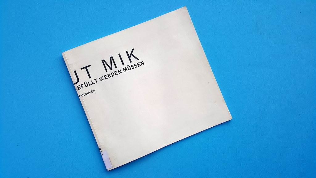
Front cover

This thin book with its soft flappy cover gave me a sense of preciousness.
It needed two hands to hold, it urged for my attention.
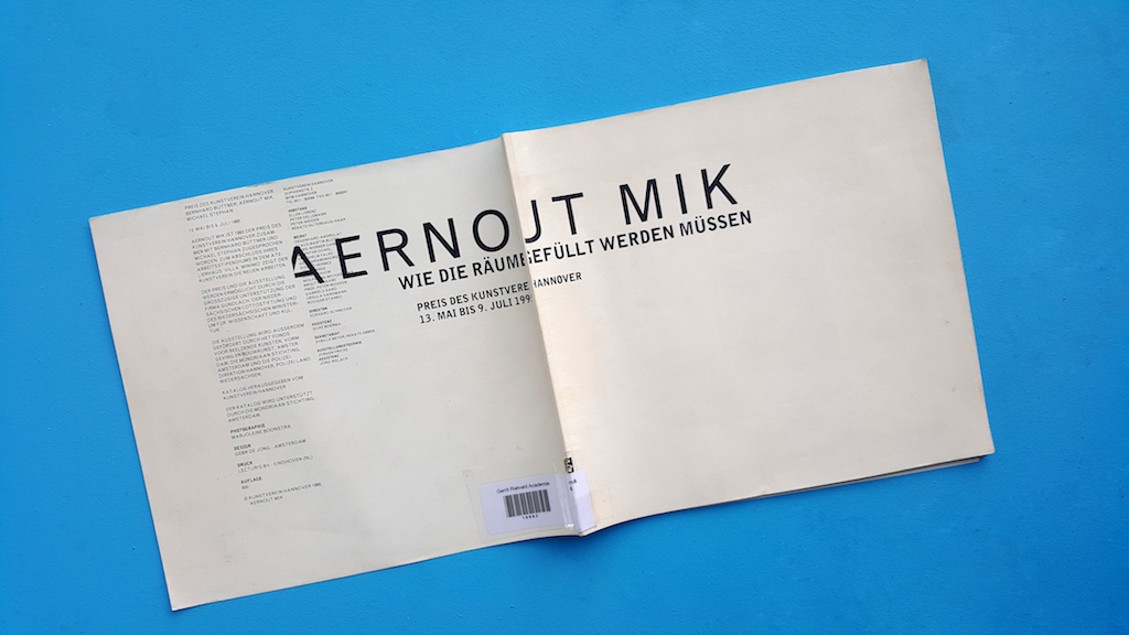
The white lp-size cover, its simple black typography yet incomplete
title made it mysterious. It sought more effort than a
quick look to discover the meaning.

LP-sized cover

Front and back cover

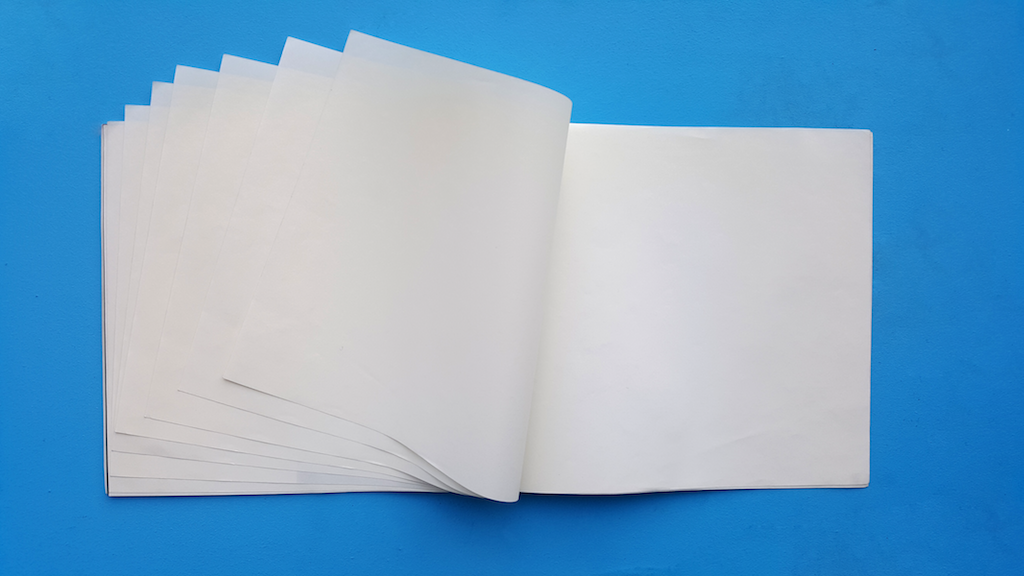
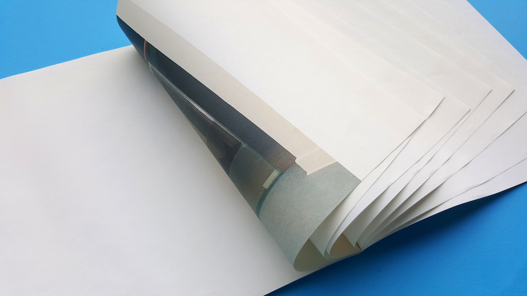
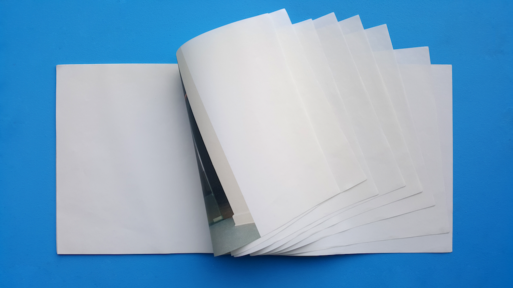
Flipping through the pages I was completely
surprised and somewhat confused as more and
more empty pages revealed themselves.

Beginning the book with white pages

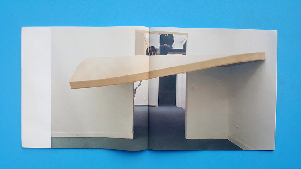
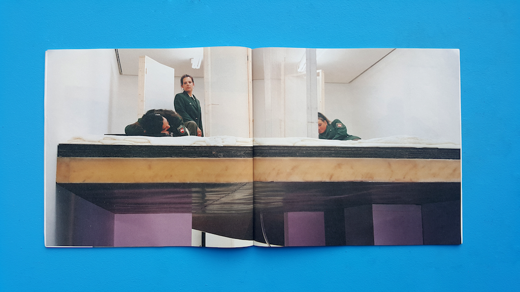
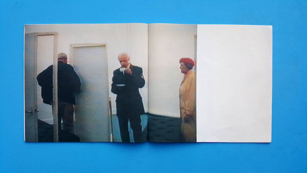
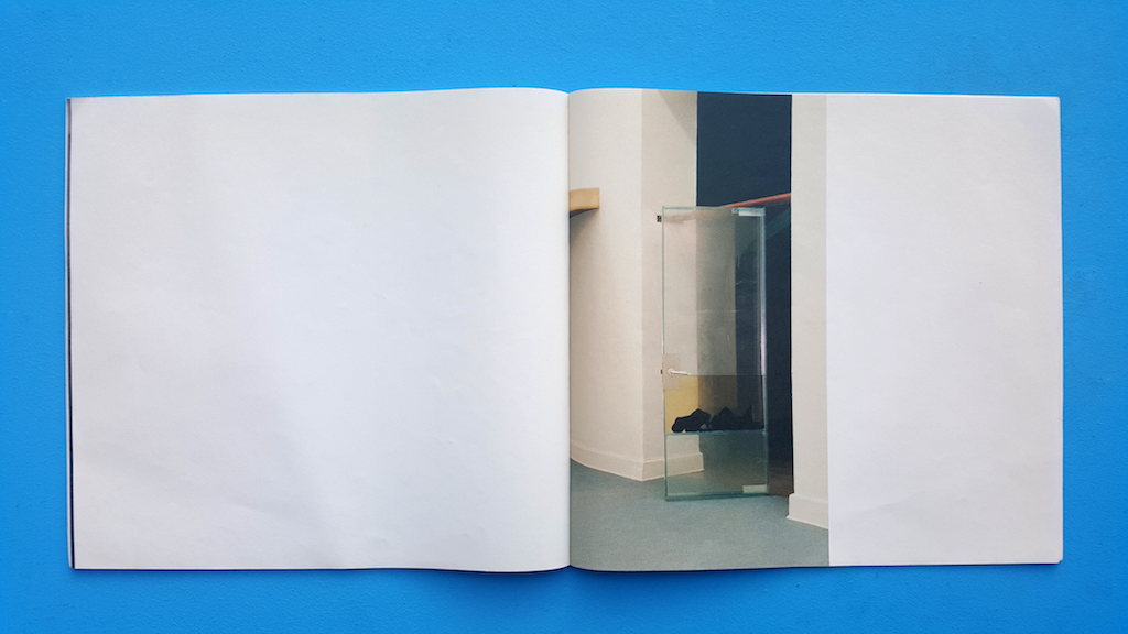
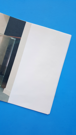
Then eventually three huge images of an installation appeared. I would probably not have looked at them with as much care and appreciation
as I did, if it was surrounded by visual or written information.
The silent white pages that led up to these images made them
more valuable. The emptiness was key to this aura of worthiness.

1st image installation Aernout Mik

2nd image installation Aernout Mik

3rd image installation Aernout Mik

A fourth smaller image appeared after a few empty pages.

4th image installation Aernout Mik

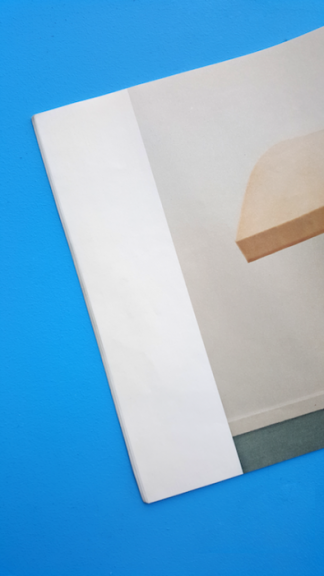
The series of images started and ended with a white bar, suggesting a
beginning and an end of the empty space.

Transition emptiness to 1st image

Transition 4th image to emptiness

Than the catalogue ends with emptiness.

The last image disappears in white emptiness

Ending the book with white pages

In The Elements of Graphic Design [x], Alex W. White explains the functionality of emptiness in graphic design:

”Emptiness is silence, an open field, a barren room, a blank canvas, an empty page. Emptiness is often taken for granted
and thought best used by filling in. It is generally ignored by all but the few who consciously manipulate it to establish
contrast, to create drama, or to provide a place of actual or visual rest.”

The emptiness creating visual rest and drama are actually
simultaneously existing in this book. One would think
drama and visual rest would not be ableto co-exist.
The impatient ongoing episode of flipping white pages,
the dramatic surprise of a sudden huge image and then
the visual rest to read the image with great care.

Pjotr de Jong, the designer [x] and a dear friend of Aernout Mik [x],
shed some light on the being of this book. It all started with an
exhibition in Hannover. Aernout Mik had won the Preis des
Kunstverein Hannover 1995 alongside two German artists,
Bernhard Büttner and Michael Stephan.

The three artists were given a space in which
they were able to show their art. The German
artists asked the director ‘how the space had to be filled’.
Aernout [x] was astonished by this question and made it
clear that no one but himself would decide on how his
space was going to be. He took this German question
and used it to title his work.

He [x] was asked to make a catalogue for this
exhibition and this book is the result of that.
He rebelliously decided to make
the ultimate anti-catalogue. Bare emptiness
was in a similar style to his exhibition space,
the dominant theme.

Pjotr and Aernout spent their whole budget on
the most expensive synthetic paper available.
They maximized the size of the images and printed
them on full pages. Pjotr stated that the images
were badly printed because of the synthetic paper.
In my opinion they added to the mystery of the book.

This probably is the least informative catalogue ever made,
yet it’s the most memorable one I ever came across.

Aernout Mik : Wie die Räume gefüllt werden müssen. /Rietveld library catalogue no : mik 6


Log in
subscribe