Skip to Content Skip to Search Go to Top Navigation Go to Side Menu


"relation" Tag


On the subject of people, speaking on the subject of furniture…


Thursday, October 19, 2017

Furniture has a specific relationship to the individuals it is used by and to the space in which it resides. The space in which we live is determined by the shapes which fill the negative space.

When put under a micro-lens it becomes clear that furniture is a response to the time in which it was created.

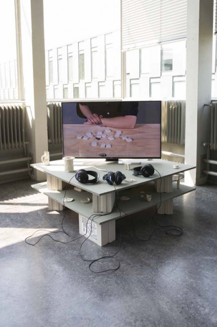
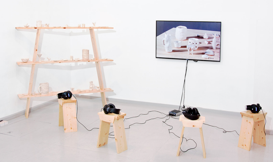
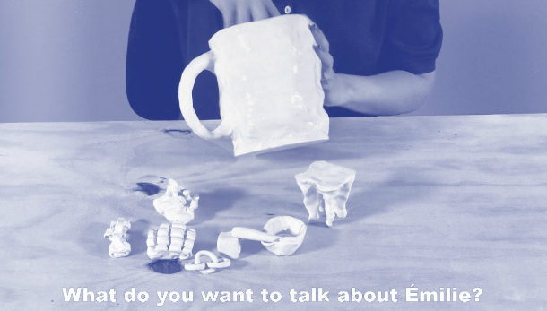
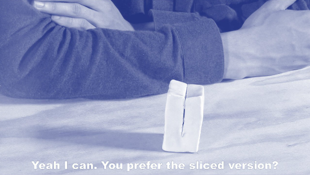
Understanding this concept allowed me to begin to understand Gerrit Rietveld’s furniture. I first saw them as purely aesthetic objects, created for a specific class of artists that could admire them as pieces of art, rather than functional pieces of furniture. After some research; I realized that his intentions were actually the opposite, he actually intended for his furniture to be reproduced and used. I realized in order to better understand Rietveld’s furniture I needed to understand his motivations and relationship to his own work. I did this by attempting to understand other people’s relationships to his work. I interviewed people who own Rietveld furniture and asked why they have it, where they got it from and the role it plays in their space…


Henk Groenendijjk

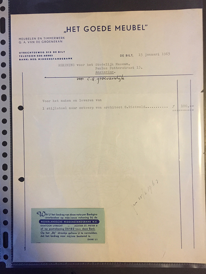
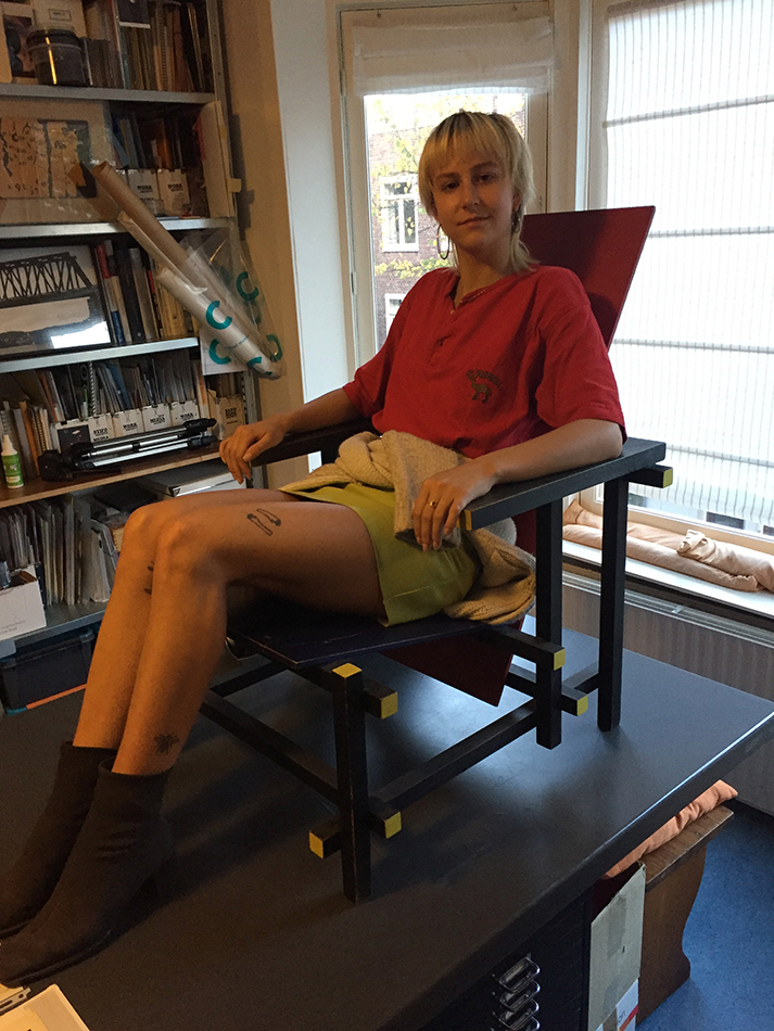
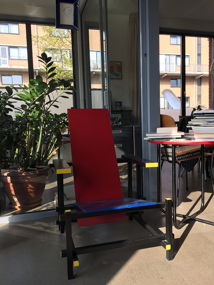
Henk: This red and blue chair came from my father, he bought it in 1963. He got this just in time to brand it an original Rietveld chair (Rietveld †1964). The models he made, you could say, were almost prototypes, he just tried out all sorts of things. He made a few for the houses in that time and these are considered very original (vintage) and are now very expensive, most of them are in museums.

Me: So, this exact chair could be in a museum?

Henk: Yes, because everything is considered real on it. It is his design, made by his carpenter.

Me: Do you know why your dad wanted to buy it?

Henk: Ja, because he was fascinated by it. He was a very good friend of the director of the Stedelijk at the time and they probably talked about it. He was a dentist and an art collector.

Me: But did he use it, as a chair?

Henk: Yes, he always sat it in it. He had it in the corner of his study and always sat in it when he was reading. You can see it it is used. He said it was very comfortable. But now I have it, and I hesitate. I’m just more careful with it.

Me: Maybe also because it comes from your father, and it is such a collectors’ item now.

Henk: Yes, I think so. I don’t know. I don’t really dare to sit in it. But maybe if I had a bigger house or more space, less children I would. But yes, that’s it. It’s nice no?

It’s really special to have something that’s so original.

label chair bill henk

me and redblue chair


Ben Zegers

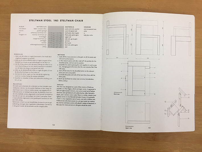
Ben: At home I have the so called Steltman chair. And it was made here (Gerrit Rietveld Acadmie) by Eve, and she also makes these zig-zag chairs…Rietveld of course, was very interested in simple constructions. But most of all he was interested, not so much in the object, but in the space, and how the material defines space. A chair is often symmetrical, this Steltman chair is not.

Me: Where do you have the chair in your home?

Ben: He draws a map, and points to a room… Sometimes I’ll put it in the middle of the room… Rietveld doesn’t care about sitting at all, if he did he would have done it completely differently I guess. But what’s important is the size, because that’s what relates to our body and it’s an easy way to deal with space in a limited site. But what is so interesting about this chair being nonsymmetrical is the way it connects to the floor. Like many of his other pieces, it’s all done from the same piece of wood as it were. Its cut up in different lengths and put together in a certain way. But it’s all describing space as it were; up, down, around, through, etc. Originally for Steltman Jeweler it was hollow, but I have a solid version.

Me: And do you ever sit on yours at home?

Ben: Yes, I do. Because it’s quite low, and it’s not a big chair. But it’s not very comfortable to sit in for long, it’s a good one to make a phone call. I can imagine it being next to a phone, an old-fashioned phone which no body has anymore.

What is most important in this Steltman chair, is the void, the space. There is a big difference between the chairs, the Crate chair is especially made so that everyone can make it. You don’t need anything, just a few screws.

crate and zig zag


Frans Oosterhof

Me: So, this is your red and blue Rietveld chair.

Frans: Yes, and it’s a perfect chair for reading a book. Because somehow if you’re reading here (on a sofa) you slip away, but on the Rietveld, you remain somehow a little bit more alert.

Me: Where did you get it from?

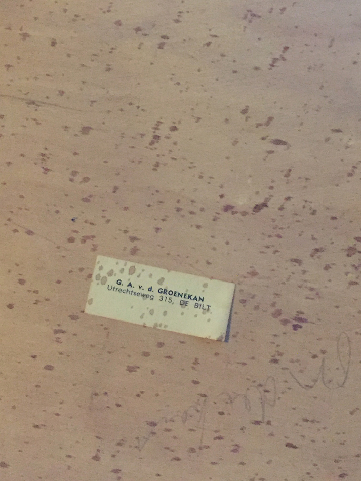
Frans: I knew Groenekan (†1994) the carpenter of Rietveld, and he gave me the drawings and then another carpenter made it.

Me: Why is it important for you to be surrounded by this style of furniture?

Frans: It is open, it is light, you can look through it. It’s not an obstacle. Its rather comfortable, but you still remain a little active. And for the eye. This is why I like the Rietveld chair, the construction is so visible. So, you see how it has been constructed… (The word) design to me has a little bit a bad connotation. All the design that you see now is all edelkitsch. And what to me is very important, and what to Rietveld was very important, is this visibility, openness, and that you can see the construction. Now design is very much decorative.

Me: It’s about the relationship between form and content.

Frans: Exactly, never divided.

red blue frans


Through these dialogues and conversations, I came to a critical understanding about Gerrit Rietveld; his furniture is a visual representation of his ideology. Space, light, and visible structures were meant to bring a working class of people into a better, brighter way of life. His forms reflected and supported his content; his ideals. And this relationship between form and content is the underlying support system in Rietveld’s work. The way his furniture is perceived today is an intrinsic paradox; a paradox anyone can see if they only ask the right questions.

RietveldFurniturechair info 2

chair info 1chair info 3

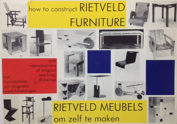
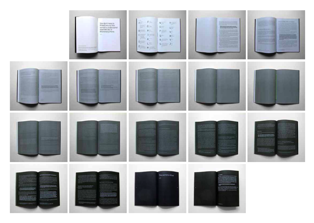
Excerpts from "How to Construct Rietveld Furniture", written by Peter Drijver and Johannes Niemeijer. To be found in the Rietveld Library Catalog no: rie 15d

Ceramics with Émilie / Ceramics with François


Tuesday, January 26, 2016

650-Emilie_Ferrat_and_Francois_Girard-Meunier_RV_lowres_1 Rietveld Graduation Show

Émilie Ferrat [x] and François Girard-Meunier [x] graduated from the Department of Graphic Design. As part of their graduation show they presented a collaborated project ‘Ceramics with Émilie / Ceramics with François.’ This project was chosen by an independent jury to be nominated for the Design Award and was for that reason part of the exhibition ‘Selected Gerrit Rietveld Academyie Awards 2015’ organized in Castrum Peregrini [x].

Screen shot Peregrini-show

Castrum Peregrini Presentation


Ceramics with Émilie / Ceramics with François

‘The medium is the message.’ These words of Canadian philosopher Marshall McLuhan still offer room for artistic exploration. Because how exactly the message changes when the medium, or the material, is changed remains shrouded in mystery. In their collaborative project, graphic designers Émilie Ferrat and François Girard-Meunier use a classic yet surprising approach: dialogue.
 
Screenshot_Selected-images1
 
    The installation consists of a video of the two designers conversing and a number of glazed clay models –a mobile telephone, for example, and shot glasses, jigsaw pieces and some undefinable models– with which Ferrat and Girard-Meunier stretch the boundaries between form, material and meaning. A new plain field is established. The video shows their fresh and resolute debate on their progress in working with ceramics – a new material for both of them. The dialogue is explicitly overacted, which stresses the artificiality of the form (a recorded conversation about models they made earlier). The overacting harmonizes nicely with the glaze on the clay models: a shiny layer upon robust content. The spoken and material form are one.
 
Screenshot_Selected-images2
 
    ‘Do you think it’s the ceramics that is giving meaning to our talks,’ one of them asks, ‘or rather that our talks are giving meaning to the ceramics?’ The relationship between words and things is a complex one. It is a relationship that has puzzled many philosophers, artists and linguists. By deliberately speaking as amateurs, ferret and Girard-Meunier open up a new perspective on this relationship.
    The material prompts conversations that lead beyond just ceramics: design in a broader sense, a philosophical ‘brain in a vat’ argument, personal insecurities and the history of art, these are all subjects that lay hidden in the material. The ceramics function as a conversation starter: the medium turns out to contain many messages.

text by Thomas van Huut [x]


for full length video [19 minutes 54 seconds] contact François Girard-Meunier


Parallel Landscape


Friday, November 21, 2014

In general the work of Aliki van der Kruijs explores the relationship (context) between colour, culture and environment with a specialization in textile. Nature is material and subject at the same time. During the master Applied Art at the Sandberg Institute (2012) Aliki juxtaposed her graphic- and fashion design background into a practice where textile as information-carrier plays a fundamental role.
Her thesis Parallel landscape is part of CONTEXTILE: a research into colour, context, text & textile. This thesis is not about what colours are but attempts to see what colours can do.
 

pl1
To read the full thesis you can click the image above or link to ISUU where it is published among her “Traveling concepts” like Made by Rain and others.

Aliki vd Kruijs at ISUU.com


BOOKParallellandscape1-2

Parallel Landscape, Sandberg Institute thesis by Aliki van der Kruijs 2012 : graphic design icw Lena Steinborn

quotes:

Colour is everywhere. Everything is coloured. Colour is always the characteristics of something. Colour is an ever-changing self. Can colour support itself? Where does colour become visible? How do we make use of colours? Can colour become an environment in itself?

The remarkable thing about colour is the way it takes place. Visible as well invisible. This thesis is not about what colours are but attempts to see what colours can do.

I tried to find out how colours are changing location and dimension. It’s a thesis on how colour takes place parallel to the landscape in which they emerge.


Untitled : September Issue


Tuesday, October 28, 2014

Untitled September Magazine, by Paul Allman


In the book Untitled September Magazine by Paul Elliman designed by Julie Peeters, you can find about 600 pages of glossy magazine, including scans from Vogue amongst other brands that make the book indefinable in the first place. You have to go inside and try and read another kind of ‘text’, that is not said in words, but images, textures, and relations.

Note: Whilst working on the research, I made a box to transport the book, as transporting this big soft book without damaging it is impossible, there is a picture below. The box is a case of wood with felt on the inside, and the quote from ‘A September magazine’ (seen below) was laser-cut on the inside of the lid, in case that someone loses the paper. Before I started researching the book, the first instinct I had was to build the box, as a way to get more attached to the book, before getting into the details. The laser cut was added later on, as I thought it would be a nice addition to the box.

Untitled-2 cufsa Untitled-2
Untitled-2cufsa

The book was published in 2013, inside you find a collection of scanned pictures from magazines, which is important for the perception of the details of the images themselves. With this you can also even sometimes feel the texture of the print. Paul Elliman collected the images for many years, roughly 10 years. However, according to colleague Julie Peteers, nobody is really sure of how long Paul has been collecting. In the end, Paul Elliman had this collection of photos, as he is a designer/typographer, and assembled them.
Before the book was published, the images were presented in a different perspective, namely an exhibition of 2 posters. For example, a poster designed by Paul Elliman called I can no longer drink Tea, seen below, published by Colophon and Casco, as a contribution to the exhibition Latent Stare at Casco, Utrecht (link).
The book itself was a part of an exhibition by Paul, hosted in the MOMA in 2012, and the book was presented as one of the objects.


He exhibited the Paul Elliman at MOMA book lying on the floor

lying next to a brick with the same measurements as the book. The effect of this is that the nature of the book is not a book anymore, but it has transformed into an object that is treated more like a sculpture of a book, with insides physically visible as details of a sculpture.

unnamed-7 pster unnamed-7

I can no longer drink tea, Paul Elliman for Casco


Paul Elliman joined with Julie Peeters to put all these images together. In the beginning there were a lot more images, but they had to select images one bye one, to determine which pictures would make the cut. The major work was that they put the images together one by one, and make decisions about what details, rhythms, forms, or psychological relationships would exist or were created. At the first glance, the book is very thick, which is also the reason for the name September Magazine, which comes from a concept belonging to Vogue. Vogue would always publish their thick winter issue in September, which resulted in Julie and Paul deciding to imitate this magazine structure. For example, you have foldout pages of certain images that are similar pages to that of the magazine in Vogue. Unlike a magazine, the structure is very different. There are no constrictions, descriptions, texts, or information anywhere on the pages, as the pages are exclusively close up shots of picture scans. However, uncharacteristic photos in the book are sometimes seen, like pornography, or ‘disgusting’ images. That gives a different tone to the book, totally different from a fashion magazine. And after a time, after seeing relationships in the pages, it is like seeing storyboards between pictures that create a rhythm from one picture to the next. Because the book is mostly about fashion, humans, and society, Paul and Julie managed to reshape the human form as it where, with strange oppositions.

IMG_2085 IMG_2086

IMG_2087 IMG_20881

After studying and ‘reading ‘the book many times, you see types of languages or feelings that you can interpret in your own way, each their own. There are parts of shapes and combinations of close-up parts and bodies, put together in a certain way, that create movement. It makes you want to flip the page, until you have seen all the images. The only piece of text that was found in the book was a small quote on a note between the first pages that supports this feeling:

It lives, it breathes, it gives off – fragrance?
I don’t know what it gives, a vibration that
we can not name because there is no name for it;
even when my patron said “name it”;
there is no name

–       HD, A September magazine

To conclude; Untitled September Magazine is a collection of images of magazine scans details that are put together in such a specific way, that you start to see relationships, patterns, and rhythms that together form a unique feeling of an exhibition, rather than a normal book.[x]


Rietveld library catalog no : ell 1

 
if you want to read more on paul Elliman [link]

We sense volume before we can articulate it


Friday, October 19, 2012


Marie De Bruyn makes monumental objects out of hand blown glass alongside video work and wooden constructions resulting in hybrid installations. Apart from the making process she is interested in integrating objects in a specific setting, creating atmospheres where the viewer can engage in a physical relation towards the objects and their surrounding space. Similar to Brancusi’s sculptural permutations – arranging and re-arranging the space in between his sculptures – the placing of an object is as important as the object itself.

Her work is about the relation between the perception of inner and outer. ‘How do we deal with our (surrounding) space? How do we position ourselves towards ourselves, the people around us, and the objects taking place in a given situation?’ The theses then discusses the function of the surrounding in the work of Dan Graham and those of body and space in the work of Richard Serra


Download thesis : We sence volume before we can articulate it [in dutch]

[images of Marie de Bruyn's graduation show


Formalistic relations


Tuesday, June 1, 2010

We are constantly surrounded by image, object and words.

Between them exist a relation. The table is picked in relation to the chairs, or painting in relation to your couch, if you are that type of person. But anyhow the relation between them are there, some more interesting than others. The type of relation I investigate is only based on the formalistic aspects. Not the symbolic meaning, morals, etc. Many questions then arise, in terms of relation. Such as: Is there a different relation between object and image, then between object and word?  The following, is a short research, investigation into these relations, which could help to understand our surroundings better.

Object in relation to image

In this example we clearly see that the image and object work together. But why do the do that? First of all, it has a lot to do with scale, the zoom, by this I mean the way we approach the image and object. And the scale between them, distance, you have to get close to see a small clip, and even closer to see the photograph. The clip is outside, and you look into or inside the photograph. The height of the photograph is almost same as the clip. The most visible shadow in the photo is similar to the clips shadow and
the vertical relief or outstanding line one the border of the clip is related to the out standing part of the cement in the photograph.
Also they both are related by text. The same type of visual text, giving information, date, product and name.

What is also interesting in the notion of object in relation to image is: the fact that when we look at something physical, which we have touched or been engaged with in our past. We have the memory how it feels to touch, its weight or surface. So by placing image of boxers in action wearing boxing gloves, with a pair of tomatos next to the image, we at once start to make a connection. Where boxing is about hitting flesh. The tomato in a way becomes both a relation to the flesh, (the inside and out side) and a connection to the red boxing gloves. So the tomatos and the image that is so far away from being connected subjectively, are strongly connected in a formalities way. Here the size also counts a great deal, I would say that the size of the gloves with inn the image, should match the size of the real size tomato’s. And another strong connection here is that the gloves and the tomato shine or reflect light in same way.

Word in relation to an image of an object

Here the word juice does not have any relation to the boat wreck in the meaning of subject. The distance in subject makes us more aware of the their formal relation, the way juice is written. By hand, not mechanical. The letters which do not have hard edges, resemble the form of a wooden boat. The repetition of the word clearly relates to the  way the boat is constructed, where the wood repeats it self, not as complete repetition, but according to the form of the boat. Which is also why the repetition of the words occurs. Not printed, but hand written.

Word in relation to object

In daily products, such as the milk carton we find the relation between the “typeface” that says milk, and the milk carton as an object. We find that some typefaces work better than others. The typeface we see here is chosen after the form of the carton. It has hard corners and ninety degree angels.

Entities with in a whole

With this example we must imagine all this lying on a table. The stone is the only thing that is not a flat representation. The connections that becomes relevant here are many.  The images to the left are pictures taken by rain at night, holding the camera straight at the sky, the flashlight lightens up the rain drops. This related to the stone which is standing out of the table and is an object that can be touched. The fact that there is two relates to time. The blackness of the images suggest an act of looking into. The breast of the beautiful woman packed in black, relate to all other entities. Such as weight of the stone. Related to the the x-ray of a foot through the stone, Woman flesh, bone, stone, x-ray, look into, etc..

Clearly we can read alot into the relations between these four entities. But this as an example, or this as an research, makes us, aware of the importance, the possibilities, and what a good combination of images could lead to.

Research will be continued.


‘ : ’


Tuesday, September 1, 2009


Titel van dit schrift_spread_conditions Screen-shot3

left edition 1 booklet • right edition 2 booklet

What kind of object is a book? How can it be used and how can its user relate to it? Co-auteurs of ‘Titel van dit Schrift:’ (translation ‘Title of this Notebook:’) marked traces in the publication, leaving layers of reactions and transforming the previous edition.

Screen-shot1

audio dialogue fragment edition 2 booklet

[audio:https://designblog.rietveldacademie.nl/wp-content/uploads/2013/07/dialogue-fragment-Use-of-this-notebook-1.mp3]

Screen shot 2011-11-29 at 4.34.23 PM 650-Janneke-van-der-Putten_003

left edition 1 booklet present at 'Acting the Script', Graduation Show Gerrit Rietveld Academie, Amsterdam 2009.

After writing my Bachelor thesis in 2009, I am now interested in how this material can be interpreted in speech and voice. This i have investigated through several dialogues and performances. From these events, quotes and words have been selected. With the residues of the booklet, i composed a musical performance for solo voice which will be presented live at Vondelbunker, Amsterdam, within a new setting during the ASCA exhibition 28 March to April 1st 2012. Listen to my interview


Pdf-icon Download this thesis: Titel van dit Schrift [dutch language]

more: www.jannekevanderputten.nl [link]

Dexter’s laboratory


Thursday, March 19, 2009

“How things don’t work”…I have to admit that title worked as cliché of love at the first sight. Coming into the section of strictly design based field and being obligated to choose one book as starting point of next one month of study didn’t completely contribute to the feeling of being excited about further choice but then this title appeared. For miracle to be even bigger it was in part of industrial design to which one I defenetly don’t feel interested in.
Passing through introduction and first paragraph gave me satisfaction of knowing that there is no possibility of wrong choice. It is about practical problems which modern technology that we are using for every day activities brings and opposite result of the image of comforts and easiness that we expect but it is not critically focused. They don’t directly attack industry for producing all this kind of gadgets… there is a solution and that is inventing, studying, understanding and improving things that are already made or left over. In first chapter discussion about convenience of bathrooms and bathtubs appears, which is quite funny on the first reading. As you think about it more closer it is actually truth. Also what might be interesting is comparison to situation of the same kind of environment that we are situated right now maybe 20-30 years after this book was written.There are some improvements but basic problems are still the same caused by politics of capitalism market…use less make more.
“Societies and the individuals making up social groups ,tend to respond in a number of different ways to each new problem.There is capitalist approach-make it bigger,the technocratic one –make it better,the “revolutionary”solution –portry the problem as an example of an exploitative system ,and pre-industrial romantic fallacy-don’t use it.maybe it will go away by itself.We propose a fifth alternative response-let’s invent a different answer.

cat. nr: 770.6 pap 2

keyword: invention


Log in
subscribe