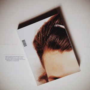
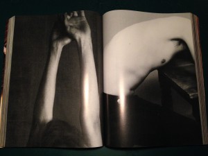
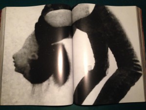
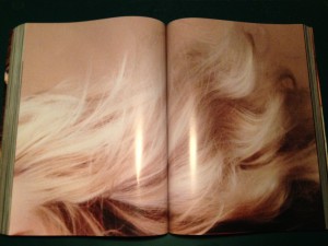
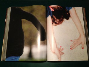
In the book Untitled September Magazine by Paul Elliman designed by Julie Peeters, you can find about 600 pages of glossy magazine, including scans from Vogue amongst other brands that make the book indefinable in the first place. You have to go inside and try and read another kind of ‘text’, that is not said in words, but images, textures, and relations.
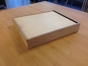
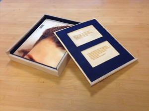
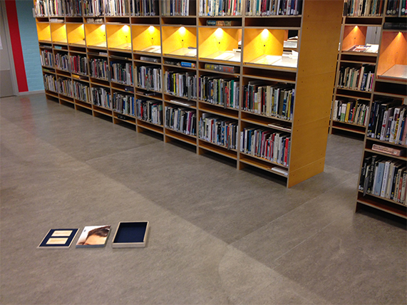
Note: Whilst working on the research, I made a box to transport the book, as transporting this big soft book without damaging it is impossible, there is a picture below. The box is a case of wood with felt on the inside, and the quote from ‘A September magazine’ (seen below) was laser-cut on the inside of the lid, in case that someone loses the paper. Before I started researching the book, the first instinct I had was to build the box, as a way to get more attached to the book, before getting into the details. The laser cut was added later on, as I thought it would be a nice addition to the box.
The book was published in 2013, inside you find a collection of scanned pictures from magazines, which is important for the perception of the details of the images themselves. With this you can also even sometimes feel the texture of the print. Paul Elliman collected the images for many years, roughly 10 years. However, according to colleague Julie Peteers, nobody is really sure of how long Paul has been collecting. In the end, Paul Elliman had this collection of photos, as he is a designer/typographer, and assembled them.
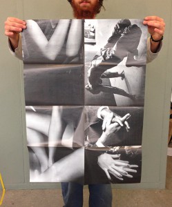
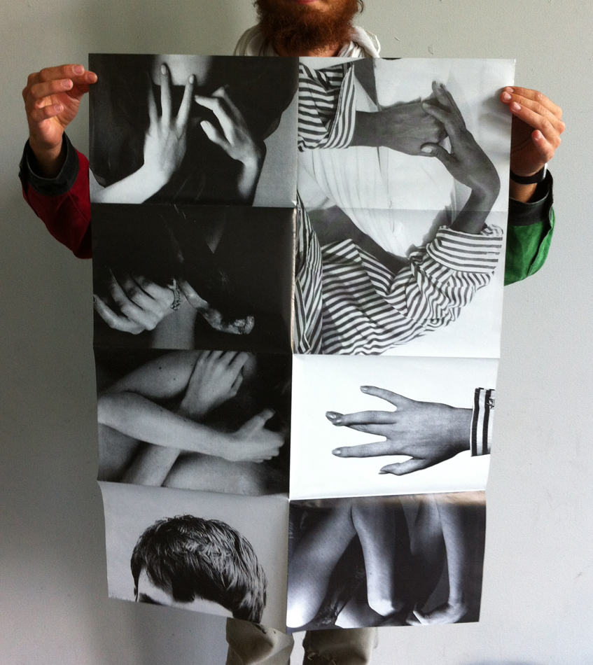
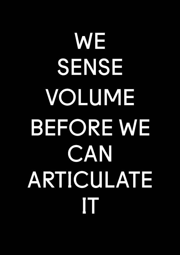
Before the book was published, the images were presented in a different perspective, namely an exhibition of 2 posters. For example, a poster designed by Paul Elliman called I can no longer drink Tea, seen below, published by Colophon and Casco, as a contribution to the exhibition Latent Stare at Casco, Utrecht (link).
The book itself was a part of an exhibition by Paul, hosted in the MOMA in 2012, and the book was presented as one of the objects.
He exhibited the 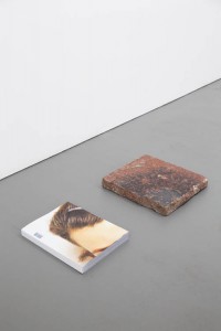 book lying on the floor
lying next to a brick with the same measurements as the book. The effect of this is that the nature of the book is not a book anymore, but it has transformed into an object that is treated more like a sculpture of a book, with insides physically visible as details of a sculpture.
I can no longer drink tea, Paul Elliman for Casco
Paul Elliman joined with Julie Peeters to put all these images together. In the beginning there were a lot more images, but they had to select images one bye one, to determine which pictures would make the cut. The major work was that they put the images together one by one, and make decisions about what details, rhythms, forms, or psychological relationships would exist or were created. At the first glance, the book is very thick, which is also the reason for the name September Magazine, which comes from a concept belonging to Vogue. Vogue would always publish their thick winter issue in September, which resulted in Julie and Paul deciding to imitate this magazine structure. For example, you have foldout pages of certain images that are similar pages to that of the magazine in Vogue. Unlike a magazine, the structure is very different. There are no constrictions, descriptions, texts, or information anywhere on the pages, as the pages are exclusively close up shots of picture scans. However, uncharacteristic photos in the book are sometimes seen, like pornography, or ‘disgusting’ images. That gives a different tone to the book, totally different from a fashion magazine. And after a time, after seeing relationships in the pages, it is like seeing storyboards between pictures that create a rhythm from one picture to the next. Because the book is mostly about fashion, humans, and society, Paul and Julie managed to reshape the human form as it where, with strange oppositions.
After studying and ‘reading ‘the book many times, you see types of languages or feelings that you can interpret in your own way, each their own. There are parts of shapes and combinations of close-up parts and bodies, put together in a certain way, that create movement. It makes you want to flip the page, until you have seen all the images. The only piece of text that was found in the book was a small quote on a note between the first pages that supports this feeling:
It lives, it breathes, it gives off – fragrance?
I don’t know what it gives, a vibration that
we can not name because there is no name for it;
even when my patron said “name it”;
there is no name
– HD, A September magazine
To conclude; Untitled September Magazine is a collection of images of magazine scans details that are put together in such a specific way, that you start to see relationships, patterns, and rhythms that together form a unique feeling of an exhibition, rather than a normal book.[x]
Rietveld library catalog no : ell 1
if you want to read more on paul Elliman [link]
