Skip to Content Skip to Search Go to Top Navigation Go to Side Menu


"theatre" Category


Another 21st Century Ballet


Friday, April 26, 2019

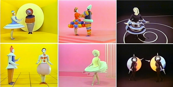
In Oscar Schlemmer’s ‘Triadic Ballet’ we are presented with a plethora of colours and shapes that touch the imagination as if being in another universe. The opening scene starts with two ‘living puppets’ standing in a yellow room. Their costumes resemble harnesses from some other age in another space with primary shapes that limits their movements incredulously. With a staccato walk they move around each other, surrendering to the costume that hides the true identity behind these puppets. As the performance proceeds, and yellow changes to pink and pink changes to black, the dancers appear in various costumes that share the same alien ‘harness’ look and all seem to be made to make movement impossible. With these minimalist movements, Schlemmer seems to be commenting on the position of the individual within the roaring Interbellum: the performers were reduced to puppets that were meant to blend into the colourful decorum.

The ‘Triadic Ballet’ is an important manifestation of the aim for interdisciplinarity that characterizes the legacy of the Bauhaus academy that was founded in 1919 in Weimar, Germany. Schlemmer, who was originally schooled as a painter, turned sculptor, turned decorist, turned choreographer, subsequently found himself at ease within several disciplines. And so did many of his colleagues: painters became designers and drawers became weavers. The true modernity of this Bauhausian aim for the integration of disciplines might have only become clear much later in the 20th century with the rise of Postmodernism. As to this day artists and scientists altogether seem to become increasingly convinced of the benefits that arise when two or more disciplines are being combined. [The appeal for interdisciplinary practice is also very apparent in the educational system of the Rietveld academy in the present day.] It is argued that, within the realm of an educational system it might be beneficial to learn through several disciplines in order to deepen the learning experience, to connect with your subject on many levels as opposed to just one. This also touches on the theory of constructivism, which suggests that people create their own understanding and knowledge of the world through experiences and reflection on those experiences. In other words: a plurality in narratives calls for a plurality in educational journeys (and results in a plurality of learning outcomes).

To me it seems that in my generation (y) a common awareness towards this plurality in narratives is manifested more clearly than ever as we have been exposed to so many through both mass media and personalised media. And yet again, just like in the Interbellum, the position of the individual within this digital era is being discussed. This made me wonder: what would a triadic ballet look like if it was recreated to-day?

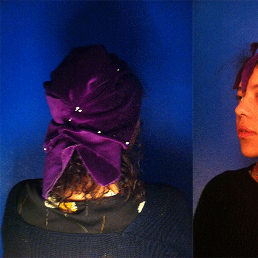
I therefore set out to research and create a choreography that would share a minimalist approach with Schlemmer’s ballet, but simultaneously touches on contemporary culture. Evidently enough there are many possible ways to represent the novelties of postmodern civilization within this historical context, so I made the choice to focus on the subjects of digitalisation and individuality. I discovered that these two themes are apparent in our lives not only through visual experiences, textual communication or metaphysical perception, but also through bodily adaptation. With this term I refer to the different adjustments modern humans allow their bodies to make in order to make use of digital devices and/or media. This bodily adaptation displays a process where an individual’s reality-identity somehow seems to have merged with their digital-identity. Inspired by Anne Teresa de Keersemaeker, who often attempts to create dance forms out of daily movements, I tried to work out different movements that I found to be exemplifying for these bodily adaptations: people crouching over their phones on trains, people shifting their view to and from their screen.


With these movements mimicking digitally-driven bodily adaptations I made a short movie showing a 21st century ballet in 21st century costume. Unlike in Schlemmer’s ballet music and sound has been left yet-to-compose in order to limit the scope of this research. A next step would definitely be to experiment with audio in order to create a complete experience. An important notion must be taken in the fact that this outcome is highly context specific (and therefore quite postmodern for that matter) as it is a result of my interpretation of what a 21st century ballet should look like carried out through my body.


Imagining Bauhaus Poetry


Wednesday, April 24, 2019

Through the looking glass of Bauhaus principles, observing the elements of “poetry” and how that guides new possibilities in the making of a poem.

What inspires me to explore this idea is the incredible visuals of Bauhaus Theatre.


More spesifically HOW the concrete, minimalist and practical demeanors of Bauhaus (which in my mind have such an adult attitude!) created such extravagant, playful, toy-ish costumes that look like perhaps a child puked them out of their wild imagination! 

While “the Bauhaus element” in these costumes and general aesthetic* * * is undeniably present to me, there I observe something more, almost an added element… Having read that the thinking behind the designing of these costumes is in fact by observing the performers body with a calculating attention and following its relations to the space (the stage) through its motion*, I am tempted to think this “other element” I was looking for might just be the ballet itself.

Assumption…..         The designs of these costumes are just materialization of the visuals the dance draws in the viewers mind-eye. The dance is numerous invisible lines and shapes drawn in time with the tool of the body…       Perhaps!

Hypothesis:————————————————

Bauhaus building within an existing art form alters its outcome.

So It makes me Wonder. How would it apply to poetry? With letters and words as form and rhythm and sound as dance, the paper as the stage. I found myself wondering this more so than other mediums mainly because I haven’t seen it attempted.

Starting… Concrete, anew.

A concrete definition: Poetry is a form of literature that uses aesthetic and rhythmic qualities of language to evoke a concentrated imaginative awareness of experience or a specific emotional response.

Here is a new world, with its new forms and movements, sensations and images, to build a new Bauhaus in and of it. I will attempt to look at some elements of poetry and seek new possibilities in its design, looking at it through the 5 characteristics of the Bauhaus design.

1=Form Follows Function

It means that in design, a form should always be applied because of its function instead of its aesthetic appeal. “Utility came first and excessive ornamentation was avoided.” The thing is that this principle seems to shift slightly when applied to an already existing art form like dance, or poetry, as the means of actions in these are the adornments themselves. So, thinking of function for aesthetic, rhythm, imagination and emotion (and so on…) is altogether a different approach. Function in this case, I imagine, would be to ease and support the already existing or suggested communication of forms and elements -in the case of poetry, for example,——: All aspects must serve to communicate/highlight the emotion/mental picture/phonesthetic situation. 

Letters (uppercase, capital;size;font;color;bold-italic…so on.), Words, Gaps, Marks, etc. + the plane the poem will be viewed on should be used for this, courageously.

2=True Materials

According to the teachers at Bauhaus, materials should reflect the true nature of objects and buildings.

This to me, follows up to the previous case. What are the true materials of text, literature and what are their functions? These are not meant to be hidden, but even highlighted to show their functions thus exaggerating and complementing the existing literary pleasure.

In Bauhaus Theater we see the stage too, is designed in such a way that it holds hands with the costumes designed to exist with it, so the form and its space exist as one self-complimentary relation. I believe this relation is somewhat weak in the current poetry. There is perhaps much to do to enrich our poems by putting more thought on the plane (usually the regular white paper) we present it on. I would advise seeking new possibilities on this, trying to create a more powerful relation between the elements of the poem and the presentation of it.

3=Minimalist Style

Bauhaus artists favored linear and geometrical forms, while floral or curvilinear shapes were avoided. Only line, shape and colors mattered. Anything else was unnecessary and could therefore be reduced. Therefore we should give the reader the necessary amount of words (and preferably words that are not too difficult or esoteric) and not more, as it risks tiring the emotional and phonesthical landscape. This approach also gives the poem a fresh, modern look, which is desired. It becomes open and approachable artistic experience, instead of possibly exclusionary one.

4=Gesamtkunstwerk*

Translated from German as “total work of art”,”ideal work of art”,”universal artwork”*, “synthesis of the arts”, “comprehensive artwork”, “all-embracing art form” or “total artwork”) is a work of art that makes use of all or many forms of craft and design, or strives to do so. 

The poem can draw a picture as a visual form, can be sang as a song or acted as a play and so on… all this is desired and should be attempted.

*The concept of language makes this difficult as many languages used for poetry cannot be called Universal, but I believe it is still quite possible to challenge this with the help of growing alternative languages, which I will go more in depth in the following.

5=Uniting art and technology

In 1923, Bauhaus organized an exhibition that shifted the Bauhaus ideology. This exhibition was called ‘Art & Technology: A New Unity’. From then on, there was a new emphasis on technology. The artists embraced the new possibilities of modern technologies, for example at the time, mass-productivity was keep in mind whilst designing a product.

In Bauhaus ballet, geometric shapes and a mathematical understanding of the dance is very apparent in the costume designs and choreography –*.

New technologies today, give us new languages for poetry to play and build with, of which I don’t see enough use. A prime example of this are the Emojisa small digital image or icon used to express an idea or emotion. It is, by definition, quite similar to the words that we use but with an advantage of their own, being capable of much more of a universal communication than any word of any language. They are being used so often in our daily texting and us new age kids have learned to communicate so much with them so easily, and with the help of an ever growing selection of emojis available to anyone with a smartphone, I am surprised why they are not being used more creatively. I believe through emojis a new, different and straightforward literary landscape is possible and I would like to attempt it, here…

My (currently very incomplete) draft/attempt at Bauhaus Poetry::::::::::


Side-walk in the cold regular night,

I am sedated by 

the surrounding objects :

Moving amongst growth and shrinkage

To the pointed futurity which sits folded 

in Z00Ming horizon———. 

Moments pass themselves to remain 

over my shoulder, behind my last step 

to Reside as the Past. Behind the direction    of 

my opposing attention  

As we speak I am Approaching 

to : 

the ————. needle tip… 

Shapes emerge and grant me locality

The wind blows Regular 

and I start takinK 

The X Large stepsS 

of a clown. crawl

into an ever-descending point 

   the buzz of everything glimmers an easy happening  

   thingness of the smallest spot

                               WiNKs at me

Everywhere is filled with stars!

Except the calming darkness of the surrounding

Tree trunks 

descending...


A Spectacular Manifesto


Tuesday, April 23, 2019

The ultimate goal of all art is the spectacle! The ancient drama was once the main purpose of the visual arts, and it was institutionalized as an indispensable part of life. Today, it exists in complacent isolation, from which it can only be salvaged by the purposeful and cooperative endeavors of all artists. Architects, painters and sculptors, designers, writers and potters must learn a new way of seeing and understanding the composite character of the theater, both as a totality and in terms of its parts. Their work will then re-imbue itself with the spirit of the spectacle, which it lost being caged in a white cube.

The art schools of old were incapable of producing this unity—and how could they, for art may not be taught. They must return to the performative, to the spectacle, the theater. They must get back up on the stage. This world of mere conceptual products must at long last become a world of performers. When a young person who senses within them-self a love for creative endeavor begins their career, the context of the theater will give them unrestrained freedom to achieve excellence in their practice of art, as well on stage as behind the scenes.

Architects, sculptors, painters, photographers, weavers and dressmakers—we all must return to the collective spectacle! For there is no such thing as “art by profession”. There is no essential difference between an artist and an actor. The artist is an exalted performer. Merciful heaven, in rare moments of illumination beyond man’s will, may allow art to blossom from the work of his hand, but the foundations of proficiency are indispensable to every artist. This is the original source of creative design.
So let us therefore create a new ensemble of actors, free of the divisive class pretensions that endeavored to raise a prideful barrier between actors and artists! Let us strive for, conceive and create the new theater of the future that will unite every discipline, architecture and sculpture and painting, video and glassblowing and jewellery which will one day rise heavenwards from the million hands of artists as a clear symbol of a new spectacle to come.

If you know your Bauhaus well, you may recognize this text as it is a rewritten version of the Bauhaus Manifesto. When Walter Gropius wrote the original manifesto back in April 1919 he wanted to unify ”architects, painters and sculptors” by going back to the crafts and combine it with fine arts. When I’m rewriting it now, to the month exactly 100 years later, I’m also aiming to unify not only architects, painters and sculptors, but all artistic disciplines, through a revival of, and return to, the performative arts within the Gerrit Rietveld Academie.

We are always told to get out of our comfort zone, to aim for the impossible, the fantastic, to let us be carried away and explore our dreams. Where else better to do all that than in the context of the theater? It has room for, and it needs, everybody’s interests and practices! Apart from performers it needs just as many writers, sculptors, painters, musicians, designers, costume makers – you name it. Furthermore, there is nothing you can’t do on stage; if you want to fly, then you fly! This limitless space of imagination and exploration is something that should be available and encouraged for everyone, performer or not. With calling it ”theater” rather than ”performative arts” we can also emphasize on this collaboration and intertwining of knowledge and different practices which is absolutely essential.

”But you can already do this, you can do (almost) all you want at the academy!” some might say, and while that sure is true, the space and importance given to performative arts in this school is very limited compared to it’s precursor. Yes, there is a small group of teachers and students engaged with it within the academy (basically restricted to the Fine arts and VAV departments), and yes there used to be a theater department back in the days. But why isn’t it a natural part of the education for all of us, and not only for students in a certain department?

Reading Human – space – machine: stage experiments at the Bauhaus by Torsten Blume and Christian Hiller (Spector, Leipzig, 2014) it becomes clear that movement classes of different sorts were an important part of the Bauhaus’ Vorlehre – the equivalent of the Rietveld’s Basisjaar. During Johannes Itten’s years the focus was a “therapeutically motivated balance of body and soul” while later on, under Lászlo Moholy-Nagy’s and Josef Albers’ board, the physical exercise became more “businesslike and functional”. No matter the purpose, in both of the above mentioned cases the physical movement of the body was natural elements of the teaching that we are now missing but that could easily be brought back to life in the form of performative arts.

I say:

Let’s have theater class once a week in Basic Year!

Let’s build a proper stage with opportunities to experiment with light, sound, scenography and spatial design!

Let’s all and everyone, from our different practices and fields of interests, unite and collaborate in this machinery that is the Theater!

In the spirit of Oskar Schlemmer, I wish for us a rich and alive theater as the most central and unifying element of the Gerrit Rietveld Academie.

Let’s make a spectacle!

Criteria of beauty


Saturday, April 22, 2017

Step 0 | Question: What is beauty?


What is beauty? How can it be defined?

It could be an obscure question which does not have a clear answer. A topic of my first art theory class of this semester was just about it. The first chapter in Cynthia Freeland’s book, Art Theory: A Very Short Introduction was used and it also referred to aesthetic judgement of Kant. It has never been a simple subject for me, since there would be an enormous space to argue.

But a couple of months later, I happened to think of what is called “style” might have its own clear answer.

This idea made me feel a little bit better.


Step 1 | Dutch style aquarium has appeared as unknown territory


Work by Takashi Amano, the founder of the style “Nature aquarium”


When I got an assignment named “exploring unknown territory” in design class, I never thought about such a thing. As I need to meet a professional who inspired me to go in his/her context, I was simply looking for someone who I can contact in the Netherlands. In my mind, a specific genre of aquarium, Dutch style aquarium, came earlier than an idea of who to choose.

It is because an aquarium making was my hobby which I got interested in, few years ago in Japan. This aquarium is specifically called “Nature aquarium” in which you can create an “aquascape” resembling nature landscape by putting growing aquatic plants, stones, wood and little creatures like tropical fishes or shrimps in your tank.

Unfortunately I had to leave mine in Japan when I moved to Amsterdam, but I still had a little expectation that I would see a different type of aquarium. I had already heard the word of “Dutch style aquarium” even in Japan. Now is it time to explore it here, in the Netherlands?


Step 2 | The Answer from Dutch style aquarium


A work from category of Dutch aquascape in AGA contest 2015


There are two kinds of major styles of aquascaping. One is called Nature aquarium in which I had been interested since before, and the other is called Dutch style aquarium, the oldest style becoming popular during the 1930s in the Netherlands. The former has become the global mainstream since being established in Japan in early 1990s, but actually it came after the latter.

To know more about the Dutch style I tried to meet one of judges for a category of Dutch aquascape of the international aquascaping contest. Unfortunately it was not realized. Instead, I still could get a lot of information on the internet.

Though the most simple feature of the Dutch style is nonuse of hardscape material like stones or wood, the most interesting finding for me was the very detailed rules. It is very much specific.


It requires;
– well grown and defined grouping plants
– a small space between the groups
– clearly different height between the groups
– more than 3 plant species per foot (foreground / middle / background)
– terracing to convey depth
– rich contrasts (made by color variation, leaf height, texture)
– a focal point (emphasized by a red or large plant / by the effective use of the “Rule of Thirds” / only one focal point in tanks 36” or less)
– more than 70% of the floor planted
– imaginary streets / pathways of plant
etc…


You would also find that contest’s judgments are always given from an objective viewpoint, if a work fulfills the criteria mentioned above or not.

In my mind, these were immediately connected to the question, how aesthetics can be judged, which was discussed in the theory class before. If the guidelines of aesthetic, could be applied to even other things?

Then, I decided to try to make “beautiful” compositions by appropriating these criteria for totally different things.


Step 3 | Then, what can the criteria fit?


The first cutout with images from “SimCity” app


It was not easy to choose the objects for the composition.

I think I was caught too much by the idea of choosing a specific motif, which needs arrangements as well as aquascapes do. What came in my mind, for example, was still life painting, architecture or city planning. I actually have tried to make some 3D collages with these motives.

After some struggle, my idea eventually reached autonomous graphic compositions without any motives. It would be interesting to use things without any restriction, than to focus on a specific objects, since it has more expandability. What is more, I could not imagine the result and it simply made me curious.

How much universal could this criteria become? I wanted to make some studies to examine it.


Step 4 | Interpretation of aquascape language


To go on with this experiment, I deliberately applied some points mentioned below to my practices, choosing from many.


– Contrast by colors
the use of color highlights
black and white, green and red, positive and negative…

– Contrast by textures
fluffy, flat, glossy, mat…
photo prints showing different textures

– Contrast by shapes
curvy and strait, circles and angles
same shapes but in different size and height

– Focal point
A focal point provided by the use of above techniques
Application of the rule of thirds

– Imaginary pathways
Emphasis of the perspective


In addition to these rules, I found that aquariums are something in-between of 3D and 2D. I mean, it is actually three dimensional but the layouts are always considered from a fixed viewpoint. Traditionally tanks show only the front side and the other sides are totally covered. Photography always had an important role in showing it also. I put a camera in a position where I started to make each layout.


Step 5 | A result


Get the Flash Player to see this content.


In this experiment, I had already found that the goal of this project would not be to make an finished image but to try a lot of compositions as studies. What kind of results can I get from this? Is it “beautiful”? These kinds of tryouts are not completed in short time but should be just a starting point of pursuits.

Will it still continue?

Between Proud and Amibitious


Saturday, April 16, 2016

by Marguerite Bonneil
who has been proposed to design a headpiece for someone of her own choice.

You want to know about my design process ?
How do you want me to explain it to you clearly ? It’s such a mess …

OH I LIKE IT //1// Bring your shits and sheets

First aim. Find a character. Find an universe. Find an aesthetic.
You didn’t ask me to create a headpiece.
No, no, no. You asked me to design it.
So, if I wanna be free in my design,
I should design my own character.
Let’s see what I want to work with,
let’s hang this stuff on my wall,
and see what comes out of it…

I WANT SOMETHING WHICH IS

INTRODUCTION

TELL A STORY //2// Colors, characters and desires

I want to tell a story, a story for grown-ups,
to remind them that we are never the same,
to remember that we never know what is going to happen.
I want to tell a story about materialities,
about this objects among us, in which we recognize ourselves so well.
I want to tell my fascination for objects, who are so human,
because they all reflect one human’s mind.

Here is the beginning of the story;

(this is a slow gif, be patient)

Georgy-I-

Gold, Clear Pink, Sand and soft.
Those are the materialistic translations of Young Georgy.

Georgy has a neighbor, a creepy neighbor …

The-Creepy-Guy

Slimy, Latex, Yellow, White, Creamy, Blury. Those are the materialistic translation of The Creepy Guy.
He looks at her through his window when she’s going to school.
And when she’s coming back.

Georgy met a new girl, Kristy, she became her friend.
Her BFFFE (Best Friend First Forever & Ever).

Kristy

Fluo, Shiny, Plastic, Too much. Those are the materialistic translations of Kristy.

As you may have understand Kristy is the one who is gonna free Georgy.
Adventurous, gorgeous, extrovert, insolent, our girls discover London’s night life. As usual, they went out on a Saturday.
Georgy is gonna tell you what happened.

This-Saturday

So now, we have a story with 3 characters.
At one point they were 4, including a man that Georgy would meet at this party.
As you will understand everything didn’t happened as it was supposed to.
And I wanted to show the Georgy Before (16 years old) and the Georgy later (20 years old).

Georgi-II-

Cool blue, dark, This is how Georgy would materialistically look at her 20-tieth.

4 HEAD PIECES, YOU WILL MAKE 4 HEADPIECES.

TRYING-OUT // 3 // Sounds Like Ready-made

And here comes the mess … In my time, in the productions and of course in my head.
Due to a loss of phone, and nothing else to take pictures, this part of the process suffers of a lack of documentation.

“Marguerite you’re really a magpie”
(It’s this bird who gathers all the shiny objects)

Short travel to Frankfurt, lucky to go to Ambiente.
This fair is what I would describe as the supermarket of the supermarkets, all kind of product design for your house, your kitchen, your garden … professionals come there from all around the world to select what they will sell in the shops of their various brands, in one, two or three years.
I’m really happy to see that it’s the first edition of the Jewellery section in there, and I go to look for some inspiration…

Messe.Frankurt

“As your work is more intuitive I would advice you to make a model you can work on.”

Let’s make a model in clay, try too put all my precious objects all around this head. Begun to make some pearls …

“Marguerite, I would love you, not to use pre-made pearls or elements, but to make your own materials.”

Here are some really bad pictures of some (really good ?) try-outs.
Enjoy the quality of the details !

Experimentations


Use materials / create your materials.
What is trying out ? When are you done ? When is it enough ?
How does your material constraints and lost your abilities ?

“Oh now I know what I wanna do ! I want to write a play !
So I need to find my comedians and then I’ll be able to make it on their heads, Georgy will be my roommate, The Creepy Guy will be a friend. And who will be Kristy ? I think I can be Kristy … ”

“Hey come here I need your head”
“Here I am, what is your problem ?”
“No… I don’t have any problem. Just need your head, sit here, please.”
“Ah… I thought I was smart…”

“I don’t want be the creepy guy, I wanna be the sexy one”

“Me, actress ?!? Your model ?” (biggest smile ever)

So. My process is in a mess.
I don’t know yet which try-out is for who, even it’s more or less define from the color… I begin to write some part of my play which doesn’t go anywhere, I prevent myself to tell my teacher about it. I want to work with materials I don’t have, and I don’t want to work with material I have. As usual, I’m more speaking about what “I’m busy with” than really being busy with it.

SHOWING CODES//4// how to make a choice ?

In this way I decide to make decision !
I decide to make first a “structure”, a fabric structure, and then the other elements will find their place, naturally (I hope).

FIRST STRUCTURE, GEORGY.

As Georgy is the main character, and that she has two mind steps, it’s the first headpiece I will focus on.
Young and then (a little bit) older, she shifts from clear pink, to strong blue (indigo or Klein), between this two colors is the violet.
The two structures will be violet. The two structures will be the same.

Folding-1

SECOND “STRUCTURE”, KRISTY.

Folding-3

SEWING PROCESS

Sewiing

Between Proud and Ambitious //last// Holidays, Prada and All-nighter.

When does your life melt with Georgy’s ?
Do you remember being the shy young Georgy ?
Are you now the seductive shiny ass Georgy ?
Have you ever been ?

Will you ever be ?

How did our filmsy rose Georgy lost herself ?
What really happened during this Bacon night,
How did Kristy disappear ?
Did she loose herself in some hairy arms ?

Final-Blue-Georgy

Final-Pink-Georgy

And here is our Creepy Guy.
THIRD STRUCTURE, THE CREEPY GUY.

Folfing-4

Living on the edge of a chair


Monday, June 1, 2015

desingart

CHAIRZ

Lie van der WerfGaetano Pesce Green Street Chair 1984

Gaetano Pesce (1939) was an Italian architect and product designer who reconciled his interests in the fine arts with design in the 1960’s. Pesce, like many of his fellow contemporaries associated with Radical Design, sought design solutions that did not conform to the standardized forms associated with mass manufacture and mass consumption. His works challenge the commonly known concept of a chair, playing with the border of sculpture and objects of daily life that belong to the design world. Pesce continued to play a prominent role in progressive design circles over the following decades, placing greater emphasis on architecture in the 1990s. His multi- and interdisciplinary work known for experimenting with new materials and resin, which has become his signature material, was celebrated in an exhibition at the Centre Georges Pompidou in Paris in 1996.

gateano-pesce

Lie van der Werff (1962) graduated in 1992 at the Royal Academy of Arts in Rotterdam and in 1994 at the Rijksacademie in Amsterdam. She was part of a group of sculptors that brought back the figurative in art and started using natural materials again. Recognizable shapes from animals and humans were reintroduced. This went against the sculptures made at that time, when sculptures mostly consisted from abstract and geometric forms made from industrial materials. Van der Werff makes use of the fictive story behind textile and applies her findings to her imaginary animals. Next to textile she also uses wood and clay to translate her ideas into reality. Looking at her work on her website, her work seems highly theatrical. She is a bit as an Alice in Wonderland, who wears dresses that are too small and hangs out with fictive animals.

lievanderwerff


Form

How often do we stop and think about the hook we hang our coat on, or the knife we use to butter our bread? Our daily life is a succession of assumptions and presuppositions. We are not always aware of the multitude of shapes and objects we surround ourselves with day in and day out.

Form and function are seamlessly linked in our minds: trousers belong on our legs and a door hinges vertically, not horizontally. By contrast, when an artist or designer alters the form of such an easily recognizable everyday object, takes something away or changes the context in which it functions, the ingrained meaning of the object is subverted.

description in Setting a Scene at the Boijmans van Beuningen


An artificial connection

We started our research based on the connection made by the Boijmans van Beuningen Museum. In the exhibition of Setting the Scene the following questions were asked: What are the differences between design and the visual arts? And how far apart are they?

When we walked into the theme room assigned to us at the museum, we quite quickly chose our subject of interest. In the room we saw a chair that looked like a sculpture and two chairs that looked exactly like chairs but weren’t meant to sit on. We were immediately interested in this combination between the work of Gaetano Pesce (designer) and Lie van der Werff (artist).

There was something interesting about the chair from Pesce, because although we clearly saw that it was a chair, it looked very sculptural. Nevertheless you could see that the user was taken into consideration, there was no doubt where to sit. But material wise the designer was working on the boundaries of design. The eight thin legs under the seat of the chair almost made it look mechanical, almost like it could walk. The fine arts approach of the material (metal, glass fiber and polyester) lifts the chair from being ‚just another designed chair’. This Green Street chair is a result of Pesce’s research of the chair-ness within the chair.

In this exhibition under this theme, the chair makes perfect sense. Pesce’s chair raises the question of how far can you go with the idea of a chair? When is something still recognizable as a chair?

Looking at the chairs of Van der Werff that caught our attention, on the contrary, there are no undefined shapes involved. She used the archetype of a chair and without obeying the rules of design, she transformed it into a dysfunctional object. By processing the wood in her own way she made the chairs unable to sit on, changing them into sculptures. Through the processing she changes the design object into personal sculptures, changing their history, giving them a story and (probably) makes the viewer wonder what happened and to whom they belonged to. Van der Werff’s chairs raise the question of how long can you chop before the chair collapses? How long can you chop until the chair is not a chair anymore? When does it lose its original identity? How can another form arise through transforming an object?  But looking at her work in general, these chairs are the only possible work of her oeuvre that would fit this theme.

The work of Pesce and Van der Werff are as far apart as can be, not only looking at the chairs they made. They are not from the same time, not from the same country, not from the same discipline and never use the same materials or even use a concept that is alike. She is a lover of natural materials and colors, lives in her imaginary world and uses herself as part of her art. He, with a love for bright colors, is always looking how far he can go with materials and shapes to disten himself and his work from reality, while keeping it playful. We have to conclude that she only fits this Form theme with these chairs she made in 1992, whereas he would fit the theme with more chairs of his hand, whilst the theme of the room is also the research in his work.

So when the function is taken away, we can apply only the idea of the contemplative concept of an object. Where does design become fine arts? And where does fine arts become design? Should the distinction still be made?
To keep the answer as applied to the now as possible, we can talk from our own position as art students. We are from a generation of designers and fine artists that graduate at the Gerrit Rietveld Academy with a diploma that doesn’t make a distinction between the two practices. So the fact that it is changing inside the art schools means that the distinction will disappear more and more in the future. So, let’s mingle.


Here from ago


Friday, March 27, 2015

03/03/2015, 10:00 AM

Fresh morning, makes me want to fill it with coffee and smoke and a nice story. And so we begin this day in a spacious room which is separated from the rest of the studio by this black wall which looks as if it fell from somewhere above and its destination happened to be this studio. It is interesting but Ok, nevermind. Let us sip our coffee from tiny soup bowls and burn it with some smoky inhales of rolled tobacco, as we further dicuss about this centrally positioned chair which put us together in this time and space.

10153205_10152017634480998_129506274_n
Chris Junge in the monodrama ‘ons ons’.

I have first encountered this chair on 3rd of July 2014, during an exhibition and a theater play by Melle Hammer, who at the same time is the designer of this chair. Its cheap and grandiose look caught my attention and kept my eyes staring at it, although I never really bothered to further investigate or question its existence. It seemed cheap in terms of the material it was made of (corrugated cardboard), and grandiose for its physical characteristics and attitude.

10885450_10152527566920998_4811577043378295905_n

As I sit a few steps across from it now, this switch from past to present keeps bouncing back and forth, making me want to finalize my opinion about this chair.  But then again, I know almost nothing about it. Although it is now standing upside down, it seems as if it hasn’t changed much, if at all. Cardboard still has the same brown color, its weight still looks cheap. Only this time, there’s more to see from what its interior structure offers, which is interior support consisting of two more cardboards connecting to form a plus-shaped structure.

And it’s Melle showtime, baby, feed me with words. It’s time for some real storytelling. He starts by describing the very first click he had for this chair, which was a theater play written by him. A monologue, or a dialogue should I say, between the writer and himself and so on which doesn’t really matter, but you get the idea. Anyway, the main point is that the he was trying to design a chair for this stage set which would give enough richness to the play, as if holding the whole scene on its legs.

We have a click. Good. And we have a direction/some kind of a plan. Good. What is the the hint, an inspiration, research, anything to grasp and begin with? A CHESTERFIELD CHAIR [x]. Just some background information. Ok, now we are complete: a click, a direction and a sort of inspiration.

Let us continue with some starting points, you know, that time when you get your hands dirty and make some mess. Before Melle starts telling me how the chair came to existence, he wants to make sure I understand the term „problem-solving“ before anything else about this chair, which has its occurence before design and which was his method of designing this chair. As an example, he puts a fork and a lemon squeezer on the table explaining that both of them can be used towards the same goal, which is getting the juice, despite the fact that their functions differ. Lemon squeezer speaks for itself, while the function of a fork, in this situation, would be „problem-solving“. I couldn’t make a direct connection to the chair, but I could sense my subtle excitement for what the following information is about. And so he introduces me to the problem he encountered in the beginning of the process, that being the money. He could not afford buying one of them chesties only for a one night show, so how one dealt with the problem and tried to find a solution resulted in the making of this chair. Corrugated, brown board costs only 6 euros per sheet (inc.taxes). It’s nice, yes, sharp, but its lasting is not long. Let’s say one year long, which is still enough as it was meant to be used for a few hours. Inside, the board consists of fluted sheets which will eventually deform or collapse through longer usage. During this play, the point of the chair where most power is used is armrest. At the same time, that’s where a lot of the chair’s strength comes from and it is double-layered. This armrest gives the chair a possibility to be used as a chair. However, real power comes from the interior of the chair which consists of two centrally crossing cardboards in order to support the weight. At this point of the story, I felt the pieces of the puzzle falling into their place, but Melle concludes it by saying that it is not a design, but a matter of problem-solving.


So far the obstacles encountered in the process were solved. Theater stage had its chair, it survived the show, and it met the budget conditions. Everyone is happy. The story goes on, however. It continues with Melle’s decision to take his problem-solving design further, from which breaking and overcoming more barriers followed. The goal is different now, that being to keep the model design of the chair which is strong enough to hold its ground without the interior support. And to last longer. Pure design. What is the key? Stronger material, which is Falcon board. It consists of standing up hextagons and doesn’t need to be double-layered in order to be stronger. It costs 9-11 euros per sheet(inc.taxes). Of course, it comes with disadvantages. Falcon board cannot be cut with machine pressing and immeddiately cutting down because of its high strength, but it would be possible with a plutter which travels slowly and precisely through the board. That said, it needs time and the production costs. However, this production would allow the possibility to print on the board, which further allows customized prints. This makes it into a more industrial product; it gives a furniture-feel and you can have it made with print preferences.

Melle_kill-your-darlings Melle_kill-your-darlings-1

Scale model(corrugated board chair) • Scale model(falcon board chair)


Example of customized print

I go back to that summer evening when I first saw the chair. I try to recall my thoughts, but it seems like I hadn’t put any effort to study the chair. All I can remember is that it did trigger my amazement for it for the reasons of its cheapness and steadiness. And I wonder, if I were to gain this knowledge about the chair before seeing it on stage, would the amazement still be there, or at all? Would it change my focus on the play? At the end of the play, who would my applaud be forwarded to? I was never exposed to much information about the chairs and their existence but the information keeps being present all the time, either verbally or visually. It took two events to broaden my perspective and make me question what lies beneath their designs.

Through Melle’s story; the whole process of deciding about the material, way of production, and constant problem-solving, I have come to realize that designing chairs is one of the hardest tasks for its creator.

11103936_10152743092000998_1510648936_n

Hey Hole!


Thursday, May 31, 2012


The project I singled out from the NAI treasure collection is called 15 MILES INTO THE EARTH by Hendrik Wijdeveld.

Wijdeveld situated his 1944 design for an international geological research centre in a shaft in the earth at a depth of 15 miles. Designed during the harsh winter of 1944 and 1945 at the tail end of the Second World War when food and supplies were scarce, this project is a plea for international collaboration and for putting science and technology to a peaceful use. At that point in time, little was known of the earth’s deeper strata. Wijdeveld foresaw new discoveries, an ‘uranium age’. At the same time, the project is a ‘world theater’. With a ritual scene taking place at the base of the shaft, he depicts the world coming into being as the primordial force of nature and man’s creative power collide in an explosive display of energy.

Hendricus Theodorus Wijdeveld (1885-1987) considers himself as director with the world as a total theatre, a stage for his designs: he is architect, editor-in-chief, and typographer of the journal ‘Wendingen’, as well as a designer of books, theatrical stage sets and costumes, furniture and utensils. The most famous example is the huge People’s Theatre in the Vondelpark in Amsterdam in the shape of an enormous vagina, the national park Amsterdam-Zandvoort, a number of enormous high-rise projects and “Plan the Impossible”, like this extraordinary proposal dating from 1944, involving boring a 25 kilometre deep shaft deep into the earth, and a plan to hem in the existing city with a ring of towers. The towers would not only act as dramatic landmarks but would set a resolute boundary to urban growth. He took advantage of his experience in theater design to stage a new landscape and evoke collective experiences.
Several architects such as Brandon Mosley, Rick Gooding and Douglas Darden have based their utopias in the underground. The novel Journey to the Centre of the Earth by Jules Verne digs into the depths of the prehistory of the globe. Furthermore many modern and contemporary artists worked with the concept of the hole, in primis Anish Kapoor seems to be almost obsessed by it.

hole (hõ?) noun 1. opening into or through a thing 2. hollow place, as a pit or cave (a deep place in a body of water; trout holes) 3. underground habitation, burrow 4. flaw, fault 5. the shallow cup into which the ball is played in golf; a part of a golf course from the tee to the putting green 6. shabby or dingy place 7. awkward position. [middle English, from old English hol (from neuter of hol, adjective, hollow) & holh; Old High German hol, adjective, hollow and perhaps to Old English helan, to conceal; first known use: before 12th century] 1. I have a hole in my sock 2. He fixed the hole in the roof 3. There is a mouse hole in the wall 4. The dog dug a deep hole 5. Her putt rolled right into the hole 6. She made a birdie on the seventh hole 7. The course has 18 hole synonims perforation; gap; flaw; weakness; burrow; aperture; orifice antonyms bulge, camber, convexity, jut, projection, protrusion, protuberance rhymes with hole bole, boll, bowl, coal, cole, dole, droll, foal, goal, knoll, Kohl, kohl, mole, ole, pole, poll, prole, role, roll, scroll […]

‘A hole?’ the rock chewer grunted. ‘No, not a hole,’ said the will-o’-the-wisp despairingly. ‘A hole, after all, is something. This is nothing at all’. (Ende)

Holes are an interesting case-study for ontologists and epistemologists. Naive, untutored descriptions of the world treat holes as objects of reference, on a par with ordinary material objects. Hole representations – no matter whether veridical – appear to be commonplace in human cognition. Not only do people have the impression of seeing holes; they also form a corresponding concept, which is normally lexicalised as a noun in ordinary languages. Some languages even discriminate different types of hole, distinguishing e.g. between inner cavities and see-through perforations. Moreover, data from developmental psychology confirm that infants are able to perceive, count, and track holes just as easily as they perceive, count, and track paradigm material objects such as cookies and tins. These facts do not prove that holes and material objects are on equal psychological footing, let alone on equal metaphysical footing. But they indicate that the concept of a hole is of significant salience in the common-sense picture of the world, specifically of the spatio-temporal world. If holes are entities of a kind, then, they appear to be spatio-temporal particulars, like cookies and tins and unlike numbers or moral values. They appear to have a determinate shape, a size, and a location. (‘These things have birthplaces and histories. They can change, and things can happen to them’, Hofstadter & Dennett) On the other hand, if holes are particulars, then they are sui generis particulars. For holes appear to be immaterial – they seem to be made of nothing, if anything is.
For example: 1. It is difficult to explain how holes can in fact be perceived. If perception is grounded on causation, as Locke urged, and if causality has to do with materiality, then immaterial bodies cannot be the source of any causal flow. So a causal theory of perception would not apply to holes. Our impression of perceiving holes would then be a sort of systematic illusion, on pain of rejecting causal accounts of perception. (On the other hand, if one accepts that absences can be causally efficacious, then a causal account could maintain that we truly perceive holes) 2. It is difficult to specify identity criteria for holes – more difficult than for ordinary material objects. Being immaterial, we cannot account for the identity of a hole via the identity of any constituting stuff. But neither can we rely on the identity conditions of its material “host” (the stuff around the hole), for we can imagine changing the host, partly or wholly, without affecting the hole. And we cannot rely on the identity conditions of its “guest” (the stuff inside it), for it would seem that we can empty a hole of whatever might partially or fully occupy it and leave the hole intact.3. It is difficult to assess the explanatory relevance of holes. Arguably, whenever a physical interaction can be explained by appeal to the concept of a hole, a matching explanation can be offered invoking only material objects and their properties. (That water flowed out of the bucket is explained by a number of facts about water fluidity, combined with an accurate account of the physical and geometric conditions of the bucket.) Aren’t these latter explanations enough? Further problems arise from the ambiguous status of holes in figure-ground displays. Thus, for example, though it appears that the shape of holes can be recognized by humans as accurately as the shape of ordinary objects, the area visually enclosed by a hole typically belongs to the background of the host, and there is evidence to the effect that background regions are not represented as having shapes. So what would the shape of a hole be, if any?

These difficulties – along with some form of horror vacui – may lead a philosopher to favor ontological parsimony over naive realism about holes.
A number of options are available: [A] One could hold that holes do not exist at all, arguing that all truths about holes boil down to truths about holed objects. This calls for a systematic way of paraphrasing every hole-committing sentence by means of a sentence that does not refer to or quantify over holes. For instance, the phrase ‘There is a hole in…’ can be treated as a mere grammatical variant of the shape predicate ‘… is holed’, or of the predicate ‘… has a hole-surrounding part’. (Challenge: Can a language be envisaged that contains all the necessary predicates? Can every hole-referring noun-phrase be de-nominalized? Compare: ‘The hole in the tooth was smaller than the dentist’s finest probe’) [B] One could hold that holes do exist, but they are not the immaterial entities they seem to be: they are, like anything else, material beings, which is to say qualified portions of space-time. There would be nothing peculiar about such portions as opposed to any others that we would not normally think of as being occupied by ordinary material objects, just as there would be nothing more problematic, in principle, in determining under what conditions a certain portion counts as a hole than there is in determining under what conditions it counts as a dog, a statue, or whatnot. (What if there were truly unqualified portions of space-time, in this or some other possible world? Would there be truly immaterial entities inhabiting such portions, and would holes be among them?) [C] One could also hold that holes are ordinary material beings: they are neither more nor less than superficial parts of what, on the naive view, are their material hosts. For every hole there is a hole-surround; for every hole-surround there is a hole. On this conception, the hole-surround is the hole. (Challenge: This calls for an account of the altered meaning of certain predicates or prepositions. What would ‘inside’ and ‘outside’ mean? What would it mean to ‘enlarge’ a hole?) [D] Alternatively, one could hold that holes are “negative” parts of their material hosts. On this account, a donut would be a sort of hybrid mereological aggregate – the mereological sum of a positive pie together with the negative bit in the middle. (Again, this calls for an account of the altered meaning of certain modes of speech. For instance, making a hole would amount to adding a part, and changing an object to get rid of a hole would mean to remove a part, contrary to ordinary usage.) [E] Yet another possibility is to treat holes as “disturbances” of some sort. On this view, a hole is to be found in some object (its “medium”) in the same sense in which a knot may be found in a rope or a wrinkle in a carpet. (The metaphysical status of such entities, however, calls for refinements.)
On the other hand, the possibility remains of taking holes at face value. Any such effort would have to account to the effect that holes are sui generis, immaterial particulars – but also for a number of additional peculiarities. Among others: [a] Holes are localized at – but not identical with – regions of space. (Holes can move, as happens anytime you move a piece of Emmenthal cheese; regions of space cannot.) [b] Holes are ontologically parasitic: they are always in something else and cannot exist in isolation. (‘There is no such thing as a hole by itself’) [c] Holes are fillable. (You don’t destroy a hole by filling it up. You don’t create a new hole by removing the filling.) [d] Holes are mereologically structured. (They have parts and can bear part-whole relations to one another, though not to their hosts.) [e] Holes are topologically assorted. (Superficial hollows are distinguished from internal cavities; straight perforations are distinguished from knotted tunnels.) Holes are puzzling creatures.
Black Holes appear to be the origin of the Universe, and vaginas the cradle of life.
 

Wayang van Oranje


Thursday, November 24, 2011

3 weken geleden hebben we een bezoek gebracht aan de Rijksacademie, hier mochten we oude Wendingen inzien. Al gauw vond ik een exemplaar wat mij gelijk aantrok, dit ging over Marionetten poppen. Het gedeelte dat mij het meest interesseerde gaat over de Wayang poppen. Ik ben zelf van Molukse komaf en ben opgegroeid in een familie met Molukse normen en waarden. Ik herinner me nog heel goed toen ik een jaar of 6 was dat mijn moeder thuis een Wayang pop had, het was een Wayang Kulit (Letterlijk leren wayang). Als kind was ik er bang voor. Hij rook vreemd en zag er eng uit, had hele dunne armen en een spitse neus en hij hing in de kamer van mijn broer. Na het inzien van deze Wendingen kwamen deze herinneringen weer boven. Ik was erg benieuwd wat de wajang poppen betekenen, waar ze vandaan komen en wat voor verhalen ze met zich meedragen.

(more…)

Verder dan Faust..


Thursday, November 24, 2011

Ik zit in het archief van de rijksacademie en blader door de Wendingen issues. Opeens stuit ik op een uitgave gewijd aan de internationale theatertentoonstelling in het Stedelijk Museum Amsterdam [x]. Mijn oog viel op een afbeelding van een decortekening van Goethe’s Faust ( domscene I) getekend door Kurt Gutzeit. Een architect afkomstig uit Duitsland, lid van de Deutsche Werkbund  Een groep van kunstenaars en architecten. die in 1907 in München werd opgericht. De oprichters van deze werkbund streefden naar verbetering van het kunstnijverheidsonderwijs en kwaliteitsverhoging van de gebruiksartikelen. Ook namen ze een hele open houding aan tegenover de machine. Ze wilden een hechtere band smeden tussen kunstenaars en industrie. Dit verklaard de connectie tussen Kurt Gutzeit en de Wendingen. Ik ben altijd geïnteresseerd geweest in theater,  het is een op zich zelfstaande kunstvorm. En hier wil ik uiteraard meer over weten.

complete research (more…)


Log in
subscribe