Skip to Content Skip to Search Go to Top Navigation Go to Side Menu


"finnish design" Tag


Fleuron. ,


Wednesday, May 22, 2019

Fleuron. ,

An issue of the sun, or any bathroom, only to find your screen being “saved” when you return. It grabs your attention, you might ask yourself.


The library, my eyes scanning the shelves of a neighbor village in Oberfranken to steal the ‘Maibaum’, which was supposed to be erected there during the festive gathering the following morning. It drawn me to it. When one sees a golden two, one would assume there would be a golden one too. Hesitating to grab a book, I kept strolling through. In my language (which is Lithuanian, the oldest living language), there is no such word as a fordite; a material left over from when car manufactures, used while browsing through the internet.

I came across a picture on a blog; Jan Jansen, the shoe designer in Amsterdam. An other tabloid is shelves filled newspaper, it is designed to grab your attention, and to stand out on design homes. My eyes fell on a piece of pottery by an English artist. Most living spaces use textiles as membranes and interfaces.

Instantly. 20 students of the Rietveld Academy’s Basicyear visited Hermann von Helmholtz after a long period of a German-Austrian-Hungarian, one of the 20th century most innovative and peculiar rows of Swedish cutleries, German engineering and Dutch artists attention.

The Fordite had walked around the nail polish stand. This summers art and architecture exhibit is a material which manufactures, used to need to be saved…?

Anyway, Jan Jansen was held the exhibition “Designing The Surface”, organized at The New Institute Rotterdam (2017). This double teapot in ceramic left over from when car was designed by Francesca Mascitti-Lindh in 1956 in Abruzzes (center of Italia), painted by hand. Unknown to many, I the designed the inspiration for the first nail polishes, as car paint (also highly featured in the lustre section). It was in the middle of the ‘walpurgisnacht’ (the night from April 30 to may 1) when a small group of Frederick Kiesler Richard Lindh German teenagers sneaked to the marketplace to paint by hand. -Sofia design week

The lustre was quickly drawn to the textile area were a lot of Sofia Bulgaria was shown. Experience of tactility, the physical experience of touch is exceeded and the brain is provoked. How does it work?

Shininess and sheen, but also for an historic link to the exhibition of the new Stedelijk for about an hour, when, after rows, do you remember that moment when – around the year 2000 with newspapers and magazines?  Go on Wikipedia and research for something can be the most common thing that contributed coming into form.

Does my screen this kettle and sparkle? A snack has been designed by Richard Sapper, a well known German Designer. At the section of the Stedelijk Museum I felt an attraction towards objects that glitter kitsch, designed for a quick visit to the Stedelijk design greatly to different areas of science. A strong effect can be produced with simple actions. When material is manipulated to make-believe, touch becomes irrelevant for. Hello there dear reader, –why the fleuron.
 

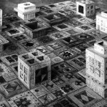
‘Houses that were never built’


Monday, November 26, 2012

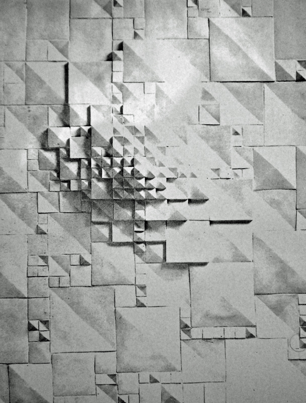
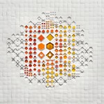
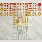
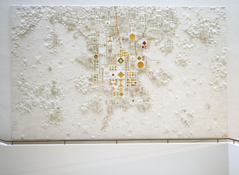
Big surface, loads of items, colors, shapes, sizes, functions of the works. I could choose any of them, but the one which attract my attention, was a ‘thing- simple, white colored, hidden in the corner of the Scandinavian design room. I wasn’t sure what the thing is. It wasn’t a painting, it wasn’t an installation or a 3-dimensional glazed porcelain. As I found later, on the artist’s website, it is one of the  ‘ A B S T R A C T  M O D U L A R  P I E C E S ’


Let’s say something about the artist. It is Rut Bryk, born in 1916 died 1999, married to Tapio Wirkkala whose work is also in the exhibition. She is primarily known for her ceramic art works. On her website we can read: ‘The works of her first figurative phase are wall pieces depicting still life’s, architectural motifs, mythological themes, plants and birds’.  I have to say that I’d rather find them naive, the colors which are used there as well as the forms.


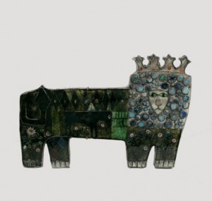
But even in those ‘naive’ works like in The Lion, we can notice the style that she’s developed later in the  works, that I was so impressed by.

Soon after that peroid we can notice, some change in Bryk’s works, in the late 60’. ‘She began to produce large architectural ceramic wall pieces composed of numerous differently shaped and coloured modules’. The White Mountain, the work I found in the Stedelijk, was made in 1977.  The modular works, had similar shape and form, but the game of colors gives us a feeling that each of them is telling you a different story. When I was checking her works for this research I realized that those simple mosaic-like works, will open up only with time. The more time you spend with them, the more you understand and appreciate them.

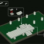
Viewing her works, suddenly I had the ‘Lego idea’ in my mind (just her ‘Lego style’ contains only white blocks). Don’t you believe that the structure of her works and the Lego picture look alike?

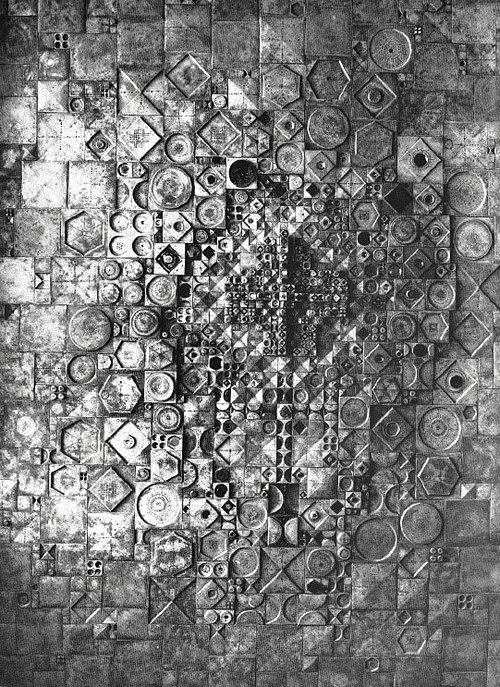
right: phase 16 LEGO 'Archtecture series' Farnsworth house designed by Mies van de Rohe between 1945-51 / left: City (Oy Arabia Ab, 1957) This work was on show at the Milan triennial of 1960 and it was given the American Institute of Decorators Award in 1962. The piece consists of hundreds of tiles and cubes of different size and colour.[x]


But from other hand, don’t you have a feeling that she is bringing the spirit of constructivism in her works? Or maybe the character of the modern architecture? This can be the point, because Rut Bryk, was dreaming of becoming an architect, she was even accepted at the Helsinki University of Technology. But finally she ended up studying graphic design. She expressed her sorrow and disappointed about this in her diary: ‘The biggest wish of my life was not realized. All the beautiful houses that I had built were only castles in the air…

I find her modular-works as big architecture scale models, or maybe urban structures, interpreted by female nicety. They all look so delicate. It’s very interesting that you can compare the works to massive architectural structures.

Another idea which popped-up in my mind, while I was comparing her initial works with those huge wall porcelain structures, was the motto Mies van der Rohe used to believe in: ‘Less is more’. In my opinion it is a proper comment on her art pieces. The more ‘minimalistic‘ her works were becoming,  the richer they were. Thinking about Mies, I Googled his works and thought that we could again make some comparison:


And this is how I actually see the Bryk’s works;

Graphic design, ceramic skills and the plan of becoming an architect, which never came true- became EVERYTHING for her. Those three elements decided about her life, works, life decisions. She could let her dreams live free in her works. I’m very happy that I’ve chosen this piece of work. The simple and minimalistic white, 3D structure gave me a chance to make so many interpretations of it. And this is what I like the best about art the freedom of finding my own way to understand the work.

Double Tea Pot, Francesca and Richard Mascitti-Lindh


Monday, November 19, 2012

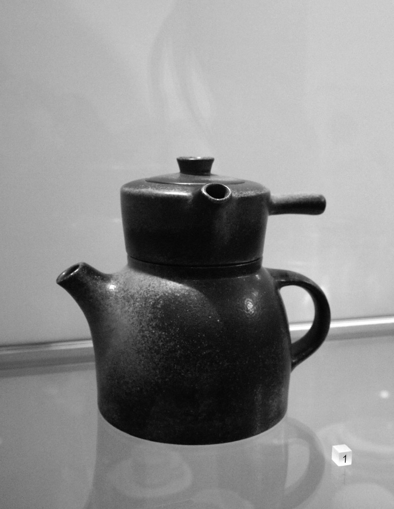
This double teapot in ceramic was designed by Francesca Mascitti-Lindh and Richard Lindh in 1956 in Abruzzes (center of Italia). The Abruzzes is a region in the center of Italy surrounded by mountains.The people there developed a famous art of ceramics, and majolica, which is nowadays exhibited in important museums as the British Museum at Hermitage. Because of the context of isolation created by the mountains during the last centuries, the Abruzzese developed an original and expressive works on metal, ceramics, stone, wood, leather using antic or ethnically patterns. One of the best Italian craftsmen in those materials are still settled there, and many designers from abroad come to work with them.
Francesca Mascitti-Lindh and Richard Lindh, respectively born in 1931 and 1929 in Helsinki, designed this piece in 1956, and made it in Abruzzes, in the Italian cradle of ceramic.
This double teapot has two handles, two different ways to serve tea. One parallel to the body, the other one perpendicular to the body. It is an useful object, adaptable and involving many possibilities. More than a double object, i call it a couple object. To my mind, Francesca Mascitti-Lindh and Richard Lindh choose to put the most important point of the design on the handles, which relate to the hand, the work of hand, related to craftsmen as a tribute to those who made design. From this design emanates nobility and humility. This double teapot calls for a wood table, and not a glass support as used in the Stedelijk exhibition. Its made to honor man’s ability, and what i admire is that the design concept is not taking anything away from its nature and singular shape.


About some days, in America

winter 1967 Los Angeles

R. Brautigan drags feet alone in Los Angeles, sees ugly pot on a window sill, lonely and ugly, takes it back to flat, under coat. the smell of cats pee in the pot. cats living with dying dirty woman. he puts double tea pot on his wood floor, floor spotted with alcohol rounds.  he wrote on it at 3 a.m :

i go to bed in Los Angeles thinking
about you.
pissing a few moments ago
i looked down at penis affectionately.

knowing it has been inside
you twice today make me feel beautiful.


after sleep, he send it in Japanese paper gift to a woman in New York.


1981 – 15 January, West 53rd Street, New York morning.
boiling water thrown on the ice scratching the red Ferrari windshield.

Since 1987 – 8p.m, until now.


Finding any serious information about this work has been as a joke, even in Stedelijk museum, this piece is even not registered in the catalog of the museum’s collection, although it is actually exhibited.
for its inadequate character it deserved to tell about some
family troubles.


Log in
subscribe