Skip to Content Skip to Search Go to Top Navigation Go to Side Menu


Archive for March, 2015


Birthday-Chair


Tuesday, March 31, 2015

Before my sister and I left the house of my parents there used to be a clear structure in chair-composition during the breakfasts and dinners.
A rectangular formed table surrounded by 6 chairs at the 2 long sides of the table. My parents sat in front of each other, and my sister in front of me in the middle of the table.


CHAIR HIERARCHY


Everyday this composition was the same (although we tried a few times to change), except of 4 days a year, the birthdays.


CHAIR COMPOSITION


The ritual of a birthday was that the lucky birthday person stayed in bed while the rest was preparing breakfast and the living room with as finishing touch the ‘birthday-chair’.
The ‘birthday-chair’ means that one of the chairs was covered in garlands and, very important, the chair was moved to the head of the table.
The chair, a simple and comfortable design by Gispen, inspired by the tube-construction of Marcel Breuer, used in a school, than sold to my parents for 5 guilders a piece, is quite hard to decorate because of the simplicity. 3 days a year it felt like my responsibility to decorate the chair in an artistic and surprising way.
The goal was of course to make the one who’s birthday it was feel important. It was his/her special day. By placing the chair at the head of the table he or she was the boss of the day. By making the chair look special I tried to make the person feel happy and loved.


BIRTHDAYCHAIR


What I realise now is that chairs can say a lot about hierarchy (throne). What I also think is very interesting is the contradiction between the super functional chair and the colourful (ugly) decoration what change the feeling of sitting totally. Can we consider this as a new ‘design’ chair?

Sitting in Red and Blue or Zigzag ?


Sunday, March 29, 2015

First time I encountered him, it was at theory class;

The second time I encountered him, was at a museum exhibition;

The last time I encounter him, was at a teacher house.


MoMa_RedBlue23

original Rietveld Red and Blue chair 1923 from MoMa collection • chair at seen at exhibition


Bright color surface, complex structuration. I was deeply attracted to him, the Red and Blue Chair, one of the most famous chair made by Gerrit Rietveld.


Red and Blue Chair is an important example of the three-dimensional works of De Stijl. One typically relates the chair to De Stijl, or concept of design in general, rather than to utility. The unstable outward appearance and the height of the chair raise questions about its comfort.


One can imagine the importance of comfort in the design of a chair. There are well-established criteria for the ergonomic evaluation of chairs to prevent user discomfort and injury. The main ergonomic considerations for chairs in the workplace are the following: comfort, safety, adaptability, practicality, durability, and suitability for the job. Luckily, I had a chance to sit in an original (1958 Groenekan) Red and Blue Chair at my teacher’s studio. Before I conclude the chair is actually comfortable, I would like to summarize a few points from my experience sitting in it.

1
at teachers home 

First of all, as an armchair, the sitting angle is relaxed. The chair has armrests at the appropriate height and of the suitable length. The most essential part of chair was the back. The back is long which gives support to the lumbar region and the shoulders. For people who aren’t too tall, they could relax their head against the back of the chair. What’s more? Since the production of materials is wood, cut boxy neither polished round. So sturdy texture reduces the comfort of the chair.  However, it creates a better sitting situation, combining the chair with cushion. The chair with its logical construction could easily be made much comfortable with the help of some cushions.


The most fundamental question is adaptability: the chair’s dimensions and control features cannot meet the ergonomic characteristics of at least 60% of the potential users, due to the low seat. In fact, present standards would not define it as a suitably ergonomic chair. However, it wasn’t Rietveld’s original intention to design a chair for people to sit on for hours on end. His famous words are sitting (in Dutch “zitten”) is a verb (verb in Dutch translates into “werkwoord” a combination of the words “werk”= work and “woord” = word), meaning ; “sitting is an active pastime“.
Compared to today’s concern about ergonomics, the culture of sitting has experienced a great change from the past, according to the Australian engineer and designer Albert Linschutz in 1928.


Chair comfort level and the user’s body position are inextricably linked. This network survey shows that most is known as a comfortable chair, the way the vast majority of the user’s apply are lying down, compared to sitting, lying down, of course is more comfortable.


chair-Ergonomics_1100


A Short Interview with André Klein.Foto-André1


Question:
What do you think of red & blue chair by Rietveld?
André:
" Hmmmm, it was never my favorites.
It seems uncomfortable but I must admitted when you sit, its not so bad. But after 20 minutes for me its maximum.
And I like Zig-Zag chair much more as a design."


The Zig-Zag Chair is another chair designed by Gerrit Rietveld from 1934. It is a minimalistic design without legs, made by four flat wooden tiles that are merged in a Z-shape using joints.
cassina-zig-zag-2822-5525_z1Rietveld_ZigZag

Zig-Zag chair by Cassiba • original copy 1934 from the MoMa collection

Besides the superior Z-shaped appearance, the flat seat and vertical backrest are joined by a system of dovetail joints. Coupled with the unique shape, the straight back of chair is perfectly matched with user’s back, which creates a better comfort situation. Sufficient height of the chair seat becomes much more practical and ergonomic for the user. One does not need to exert much energy or rely on an armrest to be able to stand easily, which is a feature the Red and Blue Chair cannot achieve due to its low seat.  What’s more? Since school still keeping the original zigzag chairs made by Rietveld, I also got chance to sit on it. For my own perspective, the specific design angle could correct user’s sitting position and it becomes much pleasant sitting experience due to the ergonomic principle.

zigzag

at school's student office


Zig-Zag Chair as a designer chair was one of Rietveld’s most economic designs. Cassina S.p.A, an Italian manufacturing company, is still producing the replicas of the Zig-Zag Chair up until this day.

The chair is in fact quite sturdy, yet comfortable. With or without the addition of cushions, the chairs have proved be very efficient and have served their owner over many years.


By comparing the two different styles of chairs made by Rietveld, the importance of user comfort within design is put into question. As design students, we must understand the concept of design within many parameters. For instance, when we design a chair, considering appearance and functionality, at the same time, we cannot avoid considering comfort. We take user’s sitting preference, or changing the material or shape as factors or direction to achieve the demanding of comfort. A good design will often require meeting several standards. I believe that this concept is applicable to all design.


Design is to change the life, so that people can enjoy and sustain life more.


Made Trough Material Research


Sunday, March 29, 2015

I was thinking, writing about a chair can be really interesting but for me it had to be more than only writing about a chair.

Waste, material, life, renovation, structure, experimenting, design.

A few of the words that were coming up in my mind when I saw and started to research this chair, so I thought this will be a perfect chair and designer to write about. To find out how deep this designer can go into material research, waste and renewable energy. Marjan Van Aubel is one of the designers who stimulates this.

table-17


Marjan van Aubel is a designer that makes everyday objects in new innovative ways. She is trying to make people aware of the fact that renewable energy is everywhere. Normally there will be a waste of 50/80% during normal manufacture.  Van Aubel and James Shaw found a way how to use and incorporate that wastage during the manufacture.

When I saw “the well-proven chair” for the first time it looked like a normal chair because of the simple legs of the chair but when you see the back it becomes a object. For me it was hard to understand the material. I didn’t know where the chair was made of. The nice structure camouflages the fact that it is actually made out of  shavings and sawdust.The sitting part is beautiful and smooth, making this chair nice to sit on and really nice to look at. It’s good that the legs are simple so the focus stays on the sit area. With her designs she try’s to combine design and technology. She strives for a more renewable life

Well-proven chairJamesShaw+MarjanvanAubel

For me this was a really interesting topic because i didn’t know a lot about this kind of experimenting with material. There are so designers working with this way of designing. They are busy with making new materials to make life more renewable. I think these new materials are needed because our resources are running out.

As an artist/designer Marjan van Aubel always was interested in how things are made, a reason why i feel related to her. I always want to figure out how ‘it’ is put together.

She was also intrigued by solar panels and why they are so ugly and why they can ruin the face of a building. Why are the panels not integrated in the tiles? I really agree with her. That is why she started at her collage time a research about energy. Now not only design was important also science. She graduated with “The Energy Collections” a set of solar glassware that discharges through a matching bookshelf, which serves as a rather large battery. This kind of thinking can make our life a lot more easy an conscious. Like I said we are running out of material so this kind of design thinking can improve this.

I have a lot of interest in nature.  For me that makes her work really interesting, because she interacts nature with design. I have a few works i made a few years a go which are also related to this.
I investigated how nature and mathematics have a lot of comparisons. Like the golden ratio and Fibonacci. You can see it in a lot of plants, a lot of leaves  grow in a spiral around the branch to get enough sunlight and rain. It is also in our human body. For me structure in  nature is an important way for making a work. It is really nice that nature can help us to make products. I think it’s also good that new young designers/artists also use this opportunity to invent new products and make use of our nature. Like her latest project  “The Current Table‘ which was also able to generate energy. This project she made in response to “the energy collection”.


Current-Table

The market for these well made products is getting bigger and bigger.  People are more concerned with a healthy and a conscious way of life and designers will react on that.

This movie from 2012 shows how a lot of designers are busy with the meaning of material.

https://www.youtube.com/watch?v=9-GofyAQK6Y


It’s fascinates me a lot how this young designer are making al these new innovative products. I found a movie on this page and it shows how scientists are combining non-living chemicals to create materials with the properties of living organisms.

Now you can see how new materials, new invented but also already existing materials but used in an other way will blow your mind. For me their is still a lot to discover about al this material researches and the meaning of material. This research showed me a lot new ways of seeing waste and make new material with it. So we al can be more conscious and re-use waste to make something new.


Links:

http://www.marjanvanaubel.com/

http://wellprovenchair.com/

http://www.dezeen.com/

http://www.rennyramakers.com/


Thread 53’’41’’43’’


Sunday, March 29, 2015

Like with a thread, it’s hard to find its top, it was hard to discover the beginning of this story.

A thread unravels itself on the ground
Its top is hard to find
Persistently strings are being pulled
Hooked on a state of mind
Fingers move on a virtuous trance
And yet no end is found


The thread starts to move around virtual spaces
Auctions and images
Prices and selling strategies
Long, thin and flexible form of material
Draws a series of messages
And sequence of connections


Flashes of images across my mind
From Hitchcock’s Rope dinner masterpiece
To Ernesto Neto’s suspended organisms
And Bjork’s Unravel portrait of decease
Besides, Garth Knight and Andrea Davies bondage motif


All these threads hold our existence together
Link memories to one another
Sprout canons of aesthetics
Create a language of composition
A fine line around the subject
Threads,
Filaments,
Fiber,
String,
Ropes
………..


Words like
Height 53’’
Width 41’’
Depth 43’’
Seat height 15.75’’
Starts to seem familiar


Slowly the string unravels into a ball of yarn
A triangular shape collects its pieces
Like a home for sailors ropes
A bow of Vikings boats
A tribute to a freezing place
And heroic seaman’s stories


Scandinavian blood runs through its veins
From 1935 to 2005
Award winning and acclaimed
Under the enchanting songs of the mermaids
Changed its powerful Viking name
To a meticulous fragile Harp sound


Depicted countless times
Spread out on different hands
Has long lost its original traces
Varies from site to site
Bleach, oak, ash, maple or walnut
As colours come and go
As the costumer pleases


Preserved under the sacred power of museums
Or kept among the noble houses
Once a piece of art
Now a  prototype


Yet far from being familiar
To a southern soul
Where wild oceans and fishing ropes
Scatter along the coast


Hammock nets, swing along the breeze
Fill the air with pine-wood trees
With Hollywood glamour mixed along
A slightly pear shaped frame is born


Taking the name of the place on the globe
Anonymously design,
Acapulco becomes
With its recycled PVC woven cords
Tropical colours and metal structures
Gain its place has percussionist
The southern orchestra member of the Northern Harp


Memories of gardens and beach
Come along……
White smooth sand, teaching you
How to sit in first hand


Or at the times you had
that white, blue, red, hand painted flowers
in the back of a tiny little chair
The size of half adult leg


With its straws and braided seat
Filled with the popular themes
Of a country of craftsman and traditions
Where you learn how to play hide and seek
At that moment you realize you can sit
Without anyone holding your seat
Unless you’re in a room filled with valuable chairs
And cameras everywhere


The Harp chants
Hypnotize my senses
That Viking treasure
That lays now among other chairs
In such a confined pointless room


I wonder how does it feel to sit on that chair
That same one that JØRGEN HØVELSKOV
Designed


Perhaps its transparency blends in
With my pale skinned shoulders
Perhaps my body will
Submerge into those strings
And stripes will be carved along my skin


Like that first chair
marked my silk buttocks
and drawn moving patterns
when I was a restless two years old child


I imagine how my back will melt
Into a flexible wave of relaxation
Like if I was made of clay
And my body shapes would assume the negative forms of that chair


Then those legs, spread out on the floor
like spiders using their glands to shape their web
Would invite me to cross my long legs
And play its imaginable pedals


The chair becomes wood
The ropes become thread
The thread becomes ………………………………………………………….
……………………………………………………………………………..unraveled


Harp Chair by JØRGEN HØVELSKOV
[x]


My associations with the Bird chair


Saturday, March 28, 2015


So many times I have seen chairs with an adjustable back; but I have never had any ideas where this design came from. To be honest, I was not so much interested in it, because I never liked it. However, when a previous tenant of my flat left a nice rush chair, which looks like a chair from the Van Gogh painting, I suddenly became more interested in it. I was wondering if I had this almost original Van Gogh chair, a chair of one of my favorite artists, or at least a copy of it.

a van gogh`s chair

Than I saw this rush chair at an chair exhibition and I was wondering again. I tried to get more information in the books and found out that this style was brought into fashion again by William Morris. I have never heard of his name before and became interested. I found amazing the way he looked at the world, how what he was making is directly connected to his perception of life.

Being under the strong influence of medievalism while studying Classics at Oxford University, William Morris became significant figure of revival of traditional British methods of production of the textile. He was also designing wallpaper, fabrics, the stained glass windows and so on. In 1861 William Morris and his friends from the the Pre-Raphalites have found  furnishings and decorative arts company Morris, Marshall, Faulkner & Co, which became later Morris & Co. Moreover, Morris was also known as a poet and novelist. In other words, he was a very versatile person and became a role model for me in some way.

Suddenly, reading some book about him, I found information that he was that person, who has created the first chair with an adjustable back, exactly such type of chairs which I did not like. I also found a picture of this chair ,which is called Bird, and was so amazed by it. How it is different from all the similar latest chairs I have seen!

a chair with an adjustable back william morris`s chair `bird` with an adjustable back

What I liked a lot is that feeling of coziness which this chair gives me. Of course it is very old fashioned and maybe too fancy and frilly, but to me it seems so comfortable and inviting. Usually, I prefer the use of minimalistic shapes and simple colours in art and design. But in case with this chair I feel like if I would have such chair somewhere in my old fashioned library, where I would have the same amount of books as Rijksmuseum does, for example, and where I could feel the specific smell of the books or somewhere on the attic, I would sit on it reading, thinking or just enjoying my sitting. It is making a special atmosphere for me because of the warm colors and a middle age pattern with a lot of small details. All its birds, fruit, flowers create a new world, when you look at it for a while. It reminds me myself at the age of 5-6, watching the illustrations by Russian artist Ivan Bilibin.

an illustration by Bilibin

They were also quite simple, but because of ornaments it was kind of imaginary traveling to the fantasy world for me. This chair gives me the feeling of infinite calmness. I think that only peaceful and calm person could create it.

While reading about William Morris, I realized that most of the times when I like some artist`s works a lot, I try not to read about this person and don’t see the pictures of his face, because sometimes his biography or facial expression ruins all my perception of his art and then I do not like it anymore. However, it did not happen in the case of Willam Morris and I still do not know why.

I found his art so organic and so suitable to his life, thoughts, home and even his face. I could not imagine another person doing such art. I also found him similar with one of my favorite Russian artist and writer of 19th century Konstantin Korovin, who was a good friend of Feodor Chaliapin.

a painting by Korovin

He is the second person of whom I was so happy to read, and who also, in my opinion, did not have any dissonance between his art and his point of view, which was quite similar to William Morris his ideas. Korovin liked the nature and he also was trying to make everything around him beautiful, thinking that natural beauty has a huge influence on people, their lives and behavior.

william morris konstantin-korovin

But continuing about Morris, I found his patterns for wall paper and  the book designs so elegant. Once he said: ‘I began printing books with the hope of producing some which would have a definite claim to beauty, while at the same time they should be easy to read and should not dazzle the eye……I found I had to consider chiefly the following things: the paper, the form of the type, the relative spacing of the letters, the words, and the lines; and lastly the position of the printed matter on the page‘.

a book design by William Morris

His book designs are so fairy and detailed, although not readable at all, at least to me. But it inspired me a lot and also reminded some of the old engravings depicting plants and animals. I felt like trying to do something similar, something really small and precise and I drew a silly painting depicting a beetle with a boy`s face. Of course it was not a serious work, but still after seeing William Morris`s works I had a lot of thoughts and ideas in my head, which I wanted to immediately realize.

a beetle with a boy`s face

I found out later (which was quite to be expected) that I am not the only person who was inspired by his book designs. So many people were trying to continue work in this style later. For example, such as the US artists Elbert Hubbard or W. A. Dwiggins, however some of them had not the best reputation. For instance, a daughter of William Morris called May believed that Hubbard was an obnoxious imitator of my dear father.

elbert hubbard`s book

It can be true, but I see Hubbard’s books more readable, although less decorative and precise. Anyway, I think it is not that bad, when one artist creates something inspiring for other artists, who start using or copying this style in their works. It just shows again the ingenuity of the inventor. Especially, talking about William Morris, who has definitely done a lot for arts and crafts in so many fields.

In this research it was very interesting for me not only to get to know more about some subject that was my starting point, but also to see how this subject brings you to something completely different. As I wrote, even if you have no desire of getting more information about something particular, this something can bring you to completely different field which can do affect you. It gives you this possibility to see the same not interesting from the beginning thing, but from the different angle, and then you are more into it.

I still do not know anything about the rush chair, but just because I started searching for information about it, it brought me to William Morris and now I know a lot about him and also about the adjustable chair, which did not had my interest before, but now.Now I know it’s story, I like it as a design product.

The Egg – Perfectly Laid


Saturday, March 28, 2015

 5695915-retro-arne-jacobsen

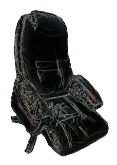
It’s always hard describing a well known person, a song, movie image, object, etc. In my case it’s a chair. Not only any chair, but Arne Jacobsen’s famous, or should I say infamous Egg chair. So, to get the formalities over with, I will start with some less elaborate reading about Jacobsen’s history.

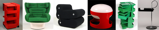
Arne Jacobsen (1902-1971), was a Danish architect and designer. Jacobsen graduated from the Danish Royal Academy of Architecture in 1927, where he later became professor in 1956. After graduating, Jacobsen quickly became a worldly name. He is internationally best known for his iconic chair design; Seven, the Ant, the Swan, and the Egg.

Jacobsen is one of the few who have enrolled in both design and architectural history. His breakthrough as an architect came in 1929, with the winning proposal for a competition, House of the Future. The proposal, which was realized temporarily in connection with a large housing exhibition represented the then 27- year-old Arne Jacobsen along with fellow student Flemming Lassen. As an architect, Arne Jacobsen was truly an interpreter of functionalism, with its rigid geometric lines, and white surfaces. Even though the rigidness and sharp lines remain in Jacobsen’s architecture, he breaks with it in his furniture design, especially with the Egg and the Swan. It is this integration of architecture and design, also known as Gesamtkunstwerk (total work of art, ideal work of art, universal artwork etc) that reveals Jacobsen’s best abilities.[x]


How can design say something about you?


fec458a966f1dbc9bf6f4772f4fa96e7
10 Crosby Fall 12 By Derek Lam

So what is it about that Egg, why has it won so many people over, what is so alluring, so irresistible that people are even willing to spend thousands of euros, or in other cases willing to buy fakes, just for the sake of owning a Jacobsen? Is there at all any difference between a fake and a real chair, does it even matter, and is it perhaps not about authenticity, but instead about the design, the look?

When someone says that the dog looks like its owner, is it because the owner chooses a dog that mirrors some of the owner’s properties. Here I guess we can transfer the example on our personal choices of design, because we often choose designed products from our own personality. Thus the objects we buy, become a kind of extension or doubling of ourselves. Often it happens unconsciously, but we can also choose to “brand” ourselves, that is, create a specific idea about ourselves to others, by choosing a particular clothing style, listen to a certain type of music and buy products that support the impression we want to give of ourselves.

If you invest in expensive design, and designer ”stuff”, it’s obvious you want to portray yourself in a certain way. But what about originality ? If someone chooses to invest in an original Egg chair, and bought it in good conscience, but it turns out it’s a fake, without the buyer knowing it. Would the value still remain the same because the conviction of belief still is intact ? Here I would argue that it is.

I recently read an article in the danish news paper Politiken, about a man, Henrik Buus Nielsen, who purchased two copy’s of Arne Jacobsen’s the Swan chair through the English dealer Voga.com.

I could well buy the classics in the ‘real’ issues, but ‘why pay 30,000 Kr, when you can make do with 7,000‘, he asks. And since the money still does not go to the designer, but the producers, he can not see a problem in buying replica furniture.

 I think Henrik Buus Nielsen makes a good point in the sense that the money doesn’t go to the designer, but to the producers. In this way he argues that the ”original” Egg or Swan chairs being produced today, in a way also are ”fake”!? So perhaps originality doesn’t play as big a role any more, and if so what is it about?


The Design


eggs

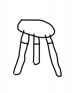
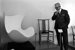
My first encounter with the Egg chair, was on an eighth grade school visit to the famous Royal SAS hotel [x] in Copenhagen. I remember starring at the chair, and feeling quite apprehensive about sitting in it, it was almost to ”valuable” in a way. It reminding me of the first time a saw a baby chicken hatch. The Idea of protection, and openness at the same time, was quite intriguing. The Egg is crafted as one piece, and in doing so, it gives the impressions of shelter, it kind of holds you, almost like a hug.The form of the chair is recognizable, you have seen it before. But there is something about the shape, the eye never becomes sated by, and you constantly see new lines and new forms. I Recently went to visit the SAS hotel again [x], and it’s quite remarkable that the Egg chairs in the lobby feel ever as contemporary as they did 10 years ago. Personally one could argue that the modernist building style and architecture, hugely inspired by the functionalists, in some cases doesn’t always work in the interior design, but in this case it really does. The round curves of the chairs, oppose the straight and linear constraints of the building, which together dance quite elegantly. While I was in the lobby I began to think about Henrik Buus Nielsen, and his fake chairs, and what if these chairs in the lobby indeed also were fakes. Firstly I don’t think anyone would noticed, or ever question their authenticity, after all they are in an original Arne Jacobsen building inside and out. And honestly I don’t think it would bother me that much if they were. In this case the design overshadows the fake, or real of it all. Stores have copied quality design for ages, but I think it’s first during the last couple of years, that it has become more accepted to own or buy fake designer goods. The tendency is all but increasing. People want good design, but for a cheaper price, and like Henrik Buus Nielsen said: ‘why pay 30,000 Kr, when you can make do with 7,000.’ Originality can always be discussed to a certain extent, and probably a question that is going to be asked more and more frequently, but good design can never be discarded. For me that is the main essence with the Egg, having a design that no matter how many years go by, and how many replicas there are produced, still prevails. And that is what Arne Jacobsen’s Egg represents. It embodies all aspects and criteria of good design, a universal design, and like the hatching of an egg, Arne Jacobsen’s chair will remain, it really is perfectly laid.

it looks great


Saturday, March 28, 2015


i say glasgow


Untitled-1

not the airport.

not the bin lorry crash.

not the coma scale.

not the distillery.

not the east midlands.

not the fishing mega-store.

not the grin (interesting, though).

not the herald.

not the irn-bru.

not the jigsaw puzzle.

not the kiss (again, interesting).

not the library.

not the mortality.

not the nino.

not the outcome scale.

not the prestwick.

not the qmu.

not the rangers FC.

not the smile.

not the tragedia 2014.

not the university.

not the vikings.

not the whisky.

not the zip.


it is a chair – a stool – a taburett.

glasgow


and it is not any famous one.


one of these pieces of furniture that catch your eye and (if you are a good listener of your inner instincts) you hear them scream get me, get me. you do not get it immediately, but time-to-time you stop by the store, to look at it, to walk around it, touch it and in this case – to sit on it – or not – rather be like – it looks great on this shelf. it looks great.

in the end you decide to get this perfect bargain for amazing 34,99 only, which could be easily the price for the materials you would use for making your own (and maybe even better).


open the box 

unwrap it

Untitled-2

to be honest, the very first sit was kind of problematic due to its construction – the three legs which you firstly have to screw in – oh what a mechanism i could really make it myself – do not really support the whole weight of a normal adult human being.


it looks great, though.


questioning


when getting such piece of design in a big and ordinary furniture store you should be less naive than when shopping at the other places. you should expect the lower price which goes hand-in-hand with the lower quality. but do you ever think of the company or the person who actually designed it? do you think of the people who manufactured it? do you think of the person who cut the wood for it? (not the case here, not the wood, lies) and do you ever think of the driver who delivered your piece to the store?


i tried to think about it. i tried. and I tried to search. and I got to the dead point at the very beginning – who actually created this chair?


no names

no dates

no places


it seems like this chair just appeared to be. and it looks great.


some blunt information about the material and the size, more color options and the list of the other places where to get it. but that is it.


another way around or a holy piece


the original is made by the American furniture design company called UM Project, founded in 2004 by Francois Chambard, who seems to be french living in the united states.

(the names of his wife and children in his bio)

UM stands for users and makers.

F.Ch. says –  interested in getting his hands dirty, but also by the recognition that the market was craving more personal, tangible products and experiences beyond the conceptual promise of brands.


their name for the chair is holy stoolwhy – and is not very different from my version – only the material is not the some pieces of wood&shit&stuff&glue but pure maple. dipped into the paint (or at least that is how i imagine it) from the bottom up – while my chair is the other way around.


the other potential users experience is same instability as i do with my cheaper version of this stool, while the studio claims that the legs are far apart, which makes the stool stable and perfect for everyday use in homes or offices.

they said – users and makers. 


i am not sure how to feel anymore.

it looks great

saturday morning, mess around me, me in bed.

it looks great

glasgow close to me.

it looks great


confession – i never sit on it. 


piles of clothes dirty clean tidy laptop pills projector bags and purses boyfriend book jacket not me but it looks great


consumer society? are we greedy? or do we just get stuff because it looks great?

it looks great, though.


another confession – i will probably never sit on it. 


however, this has been the first chair that i have ever bought. the first piece of furniture that i have bought for myself only not because i need it but because i wanted it. 


and another confession – yes, we are greedy. 


i need to think about it all over again. 


The chair as a subject of slow thought


Saturday, March 28, 2015

This is how I remember my grandfather’s chair. I remember how I used to watch him sit on it. Or, sit in it. The chair was big and my grandfather had then already begun to become tiny. It was as though this chair, with its plumpness, its doubtful green color and its leather cushions pushing into skin, offered him an escape.

Since then I’ve never seen anyone sit and disappear like him.
Maybe people don’t have the time.
Maybe people don’t have the space.
Maybe people don’t have the guts.

_________________________________________________________________________

Human beings are standing beings; our muscles are constantly at work to keep us up, while gravity is constantly pulling us down. Keeping this in mind, sitting seems to be merely a way to discharge these muscles, to compensate for the unnatural posture that is ours as a result of evolution.
It is compensation that shows that even though we’re trying (as we are developing new techniques and exploring new ways of enhancement every day) we have not reached the state of super human yet. We are still in some state where we possess human intelligence, but are trapped in our animal bodies.
To sit is to accept this animal body.

– or is it?

It is easy to speak of only physical aspects in regard to sitting. However, as both the brain and the rest of our body are part of the same nervous system, there is of course a connection between our mind and body; these two influence each other every second of every day.
Having the object ‘chair’ as a framework, I’m interested in how this chair can, being a  specific physical condition, extort or stimulate a specific mental condition. A desk-chair for instance has another mental state as a purpose than a dining chair; there is concentration on the one hand and relaxation on the other.


To explore this, I’ve been sketching chairs I come across lately. By doing so, I aimed to assemble a variety of chairs, carrying a variety of different appearances, to see what the similarities are.

mrs-fast-chairs

As it turns out, the designs of these chairs share quite some similarities (even though the chairs don’t all share the same purpose). You can see that none of them have armrests, for instance. Partly due to this, none of them seem to be ‘heavy’. All of them are quite small and all fitted in the place where I encountered them.

__________________________________________________________________________

I feel like these daily chairs, that I will refer to as fast-chairs, trigger two reactions in us;

Firstly, awareness of one’s surroundings: these chairs are in a way elongations of what is already there, instead of autonomous objects. This stimulates a way of living in which one is always cautiously aware of what is happening around him, and therefore less aware of what is happening within himself. Society tends to distract us from ourselves. As we are being placed in groups everywhere and also forced to function within these groups, we are reminded that it is these surroundings that matter; it is the society around you that you should play your part in.

Secondly, these fast-chairs stimulate fast-thinking: the lack of armrests, the light feel; all of these elements make that these chairs are only shortly used. As we rush through the day, we accept the world we live in and try to give the right answers to it. Who still dares to propose deliberate questions, though? Who still dares to sit alone, and be consumed by existential thoughts? Who still dares to disappear, like my grandfather would?

Considering the second thought, it is interesting to refer to Daniel Kahneman, a psychologist whose book ‘Thinking, fast and slow’, was published in 2011.
In his book, Kahneman distinguishes two systems of thought: “System 1” is fast, instinctive, stereotypical and emotional; “System 2” is slower, more deliberative, more calculating and more logical. System 1 is much more frequently used than System 2, explains Kahneman in the following interview:


As Kahneman distinguishes these models of thinking, you could also distinguish two types of chairs. Type 1 is the fast-chair I mentioned earlier and Type 2 is the slow-chair ; the type of which there are less and less to be seen in our daily routine. This I consider as a scary thing, since the level of critical, individual thinking might follow the way down.

__________________________________________________________________________

It’s in my grandfather’s living room where you can find the slow-chair. Sitting in his chair caused for him the seemingly paradoxical situation where while surrendering his physical control, he gained mental control. Because of its physicallities (pointing towards the plumpness I talked about before), this chair was something autonomous:

It didn’t need my grandfather to sit in it to exist, my grandfather needed this chair to exist.


(more…)

In Sync, Act I


Saturday, March 28, 2015

hap_capisco

hap_capisco2


‘The Mosquito’


Friday, March 27, 2015

I am sitting behind a table, in my parents house, on a familiar, comfortable chair. I am used to this seat and it has been around for as long as I can remember. My grandmother got a set of four teak wooden chairs with a matching table as a wedding gift in the late fifties.  I have seen them in two different states throughout my life. My mother was given the set when she was about twenty years old. Feeling that the natural teak wood colour was outdated and ugly she decided to paint the chairs red. The table was not present until recently.

About a year ago my mom started to regret her decision to paint the chairs, and had them brought back to their original state. After my parents moved to a new house the chairs and table were placed in their newly furnished home, where they stand in full glory. Ever since then I keep admiring them more


family-around-Jacobsen_900

two generations sitting at the dinner table


The Danish designer/architect Arne Jacobsen (1902-1971) introduced the munkegaard chair – also known as the mosquito – in 1955, in the Munkegaard school located in Gentofte, north of Copenhagen. The school is considered one of his most important architectural works, within which he designed everything from the light fixtures to the sinks [x]. The chair that belonged to it became an absolute classic. Because of the setting that the chairs were made for, the design is highly functional. They are very easy to stack, which is perfect in places where you have to deal with limited space. They are extremely durable and comfortable at the same time. The part on which your back rests follows the natural shape of your spine. The seat of the chair is made out of pressure moulded sliced veneer. The bases are made of chrome steel tubes. The thin wood is strong but flexible. If you lean backwards, the wood moves slightly with you. The chairs are more than just convenient though. The elegant objects have an inviting look. They are unique in their simplicity with an understated aesthetic quality, which makes them so brilliant. They will complement any decor or surrounding, and bring an edge to any interior. Having only been produced from 1955 until the late sixties (and for a short amount of time in the nineties), they are now back in production again. When you pay attention they appear everywhere. When I was on a holiday in Denmark, I noticed that the chair was used in many different places, from office spaces, to cafeterias, and from the fancy to the less fancy places. Everyone seems to appreciate them. See here a website made especially for the chair.


Munkegaard schoolThe mosquito chair

Munkegaard School                             The Mosquito Chair, Teakwood


Jacobsen plays an enormous part in the image we have of danish design, and maybe even design in general. Traces of his work are found worldwide, even now still, thirty years after his death. Jacobsen was a man of extraordinary vision, strong ideals and in his time was considered true avant-garde. He is not considered intellectual or analytical in a traditional sense. Jacobsen was a producer; even when he was not working he worked nonetheless. Relaxation for him meant a shift in the creative realm. His output therefore was enormous. As a designer he strongly believed in the ‘form follows function’ motto. Jacobsen was inspired by the works of Le Corbusier, Mies van der Rohe, and Walter Gropius, which is explicitly visible in his own early works. He was also inspired by the furniture of Ray and Charles Eames who worked a lot with bent plywood. Even though Jacobsen is most famous as a designer he never called himself as such, and it is said he had a strong dislike towards the word. A lot of his designs were created in the context of the architectural buildings that they would be placed in.

I see Jacobsen as a visionary, as he played a huge part in designing the environment we live our daily lives in. From architectural masterpieces to simple things we use everyday, Jacobsen surrounds us. He makes things exactly the way I like them. His designs are the perfect formula of functionality, durability, and aesthetics. They are modern simplicity: all that it needs to be and nothing more. His mosquito chair will remain a timeless object that people will appreciate for ever. As for the chairs in my parents house, they are probably not originals, since the design is one of the most copied in the world. Nonetheless I am happy that I have grown up acquainted with such a beautiful piece of design.

ARE WE STILL FUTURISTS?


Friday, March 27, 2015


h2_1987.98.1a-d

                                        Joe Colombo, Tube Chair, 1969-1970


This is my chair. The Tube chair designed by Joe Colombo in 1969-1970. First I will introduce the intentions of this designer as a representative architect of that period and shed some light on the ideals behind designs from this time. Colombo was mainly focused on the creation of living systems (Combi- Centre of 1963) that were made to become micro-living-worlds with dynamic, multifunctional living spaces. He was very interested in furniture systems (Additional Living System), as an example the Tube Chair that could be set up in several different ways depending on the users wish!


first impression

One of the things that caught my attention when looking at this chair is the shape. To me it is quite unusual and therefore appealing to think that a construction could be shaped by only using round cylinders. I also found quite interesting the fact that these shapes could be organized according to the position you want at the moment, which to me is fascinating. Also the color of this particular model is very present and strong, adding to the shiny material it is made from. All of these elements create a quiet eye-catching construction.

Intrigued, I decided to research more about the aesthetics of the sixties and early seventies and learn the meaning behind this particular aesthetic and philosophy behind this kind of design.


for whoever want to know Joe Colombo

shiny tubes

shiny

shiny shiny shiny shiny shiny shiny shiny shiny shiny shiny

perfect colliding cells of bodies, body parts inside parts of parts of bodies inside shiny parts of bodies, is this a body, is my body this, parts of colliding shiny cells colliding bodies?

or cold neglected manufactures of machines? Machinery taped forcefully by robotic aggression or casually naturally beloved shapes holding, sustaining, lovingly enclosing tender body parts?

this is my question when sitting in the tube-chair.

both.none.both and none at the same time

because time is the reaction after this action.

orange tube chair.

I saw lots of similarities between the interior design that is visible in furniture design, decoration and the architectural use of space used by  Joe Colombo during the late sixties/early seventies. here are some pictures to show some representative interiors designed by him in this period!


Manu 6

Manu 5

MANU 3


Joe Colombo, Visiona-Livingroom of the future, 1969, Total Furnishing Unit, 1972, Spring Lamp’s prototype, table lamp version, 1968,‘Plywood Chair’, 1963, Carrello Boby, 1970, Spiral chair, 1932, B-Line Colombo Modern Multi Chair, 1969


some history lessons:

The 70s represented a reaction against the sleek minimalism and simplicity of modernism and instead sought a  “playful embellishment and radical experimentation with form.” So this meant that functionality had a high importance yet still creating an exciting and almost utopian space. These spaces had unusual colors, shapes and functions as to move towards a successful future of living.Self-expression and individuality were defining for the time. Technology started gaining importance and spaces were used as organisms that were part of their surroundings.

The architecture of the time was also very innovative when it comes to light and space. In many ways, the 70s started the concept of “open plan living”. Many designers reacted to changes of how families were starting to be structured (women started working outside of the house thanks to  technological advances and overall economical growth f.e.) with double-height spaces, open planned living and grand entrances. Many homes had giant windows, spiral or “floating” staircases, interior and second-floor balconies. The kitchens were made to accommodate more cabinets and high spaces. Many kitchens had islands or breakfast spaces, bringing the family into a room that was once reserved only for women or staff. This was a symbol for the slight change in position women were starting to have during this period, that was to be seen in the way the living space was designed by the architects of the time.

During the seventies there was an enormous use of bright colors. Houses became very inviting and there was a lot of eclecticism when it came to the furniture designs and nearly every object had a bright color such as toilets, walls, furniture and decorations which came in several colors .

The 70s was a time of many advances in the design of chairs and office furniture. Designers began experimenting with ergonomic designs for the workplace and home offices. Many Italian Designers were at the forefront of radical and experimental furniture design, using high tech materials, tubular steel, bright colors, and polyurethane plastics.

1970s stuff

• Sleek plastics and high-tech materials
• Avocado green and gold
• Bold patterns and prints
• Stacked stone fireplace and stone walls
• Timbered ceiling beams
• Exposed brick walls
• Metal (chrome, polished steel)
• Geometric shapes and lines
• Thick and chunky masculine furniture
• Fiber optic lights
• Wood paneling
• Skylights
• Atriums
• Indoor gardens
• Fireplaces with elevated hearths
• Big windows and lots of glass
• Wall-to-wall carpeting
• Sunken living rooms
• Wicker furniture
• Shag rugs
• Earth tones
• Brightly colored furniture
• Orange

MANU2MANU


Joe Colombo, Additional System chair,

1967-1968, demonstration of positions


parallels to today:

IKEA

Reading about the sixties/seventies really got me thinking about how much of the ideals and aesthetics I recognize in our contemporary culture today. Some of the things such as experimentation with form, eclectic interiors, technological advances (that are employed within living spaces) and individualistic approach to the design and embellishment of a living space are elements I strongly recognize in our culture today. The first place that came to my mind was Ikea because of the presence it has amongst nearly all of us, as well as its attracting quality it has to people today. Here are some pictures that I thought were representative for the similarities!


Ikea_catalog1 copy
Ikea_catalog2 copy

Here from ago


Friday, March 27, 2015

03/03/2015, 10:00 AM

Fresh morning, makes me want to fill it with coffee and smoke and a nice story. And so we begin this day in a spacious room which is separated from the rest of the studio by this black wall which looks as if it fell from somewhere above and its destination happened to be this studio. It is interesting but Ok, nevermind. Let us sip our coffee from tiny soup bowls and burn it with some smoky inhales of rolled tobacco, as we further dicuss about this centrally positioned chair which put us together in this time and space.

10153205_10152017634480998_129506274_n
Chris Junge in the monodrama ‘ons ons’.

I have first encountered this chair on 3rd of July 2014, during an exhibition and a theater play by Melle Hammer, who at the same time is the designer of this chair. Its cheap and grandiose look caught my attention and kept my eyes staring at it, although I never really bothered to further investigate or question its existence. It seemed cheap in terms of the material it was made of (corrugated cardboard), and grandiose for its physical characteristics and attitude.

10885450_10152527566920998_4811577043378295905_n

As I sit a few steps across from it now, this switch from past to present keeps bouncing back and forth, making me want to finalize my opinion about this chair.  But then again, I know almost nothing about it. Although it is now standing upside down, it seems as if it hasn’t changed much, if at all. Cardboard still has the same brown color, its weight still looks cheap. Only this time, there’s more to see from what its interior structure offers, which is interior support consisting of two more cardboards connecting to form a plus-shaped structure.

And it’s Melle showtime, baby, feed me with words. It’s time for some real storytelling. He starts by describing the very first click he had for this chair, which was a theater play written by him. A monologue, or a dialogue should I say, between the writer and himself and so on which doesn’t really matter, but you get the idea. Anyway, the main point is that the he was trying to design a chair for this stage set which would give enough richness to the play, as if holding the whole scene on its legs.

We have a click. Good. And we have a direction/some kind of a plan. Good. What is the the hint, an inspiration, research, anything to grasp and begin with? A CHESTERFIELD CHAIR [x]. Just some background information. Ok, now we are complete: a click, a direction and a sort of inspiration.

Let us continue with some starting points, you know, that time when you get your hands dirty and make some mess. Before Melle starts telling me how the chair came to existence, he wants to make sure I understand the term „problem-solving“ before anything else about this chair, which has its occurence before design and which was his method of designing this chair. As an example, he puts a fork and a lemon squeezer on the table explaining that both of them can be used towards the same goal, which is getting the juice, despite the fact that their functions differ. Lemon squeezer speaks for itself, while the function of a fork, in this situation, would be „problem-solving“. I couldn’t make a direct connection to the chair, but I could sense my subtle excitement for what the following information is about. And so he introduces me to the problem he encountered in the beginning of the process, that being the money. He could not afford buying one of them chesties only for a one night show, so how one dealt with the problem and tried to find a solution resulted in the making of this chair. Corrugated, brown board costs only 6 euros per sheet (inc.taxes). It’s nice, yes, sharp, but its lasting is not long. Let’s say one year long, which is still enough as it was meant to be used for a few hours. Inside, the board consists of fluted sheets which will eventually deform or collapse through longer usage. During this play, the point of the chair where most power is used is armrest. At the same time, that’s where a lot of the chair’s strength comes from and it is double-layered. This armrest gives the chair a possibility to be used as a chair. However, real power comes from the interior of the chair which consists of two centrally crossing cardboards in order to support the weight. At this point of the story, I felt the pieces of the puzzle falling into their place, but Melle concludes it by saying that it is not a design, but a matter of problem-solving.


So far the obstacles encountered in the process were solved. Theater stage had its chair, it survived the show, and it met the budget conditions. Everyone is happy. The story goes on, however. It continues with Melle’s decision to take his problem-solving design further, from which breaking and overcoming more barriers followed. The goal is different now, that being to keep the model design of the chair which is strong enough to hold its ground without the interior support. And to last longer. Pure design. What is the key? Stronger material, which is Falcon board. It consists of standing up hextagons and doesn’t need to be double-layered in order to be stronger. It costs 9-11 euros per sheet(inc.taxes). Of course, it comes with disadvantages. Falcon board cannot be cut with machine pressing and immeddiately cutting down because of its high strength, but it would be possible with a plutter which travels slowly and precisely through the board. That said, it needs time and the production costs. However, this production would allow the possibility to print on the board, which further allows customized prints. This makes it into a more industrial product; it gives a furniture-feel and you can have it made with print preferences.

Melle_kill-your-darlings Melle_kill-your-darlings-1

Scale model(corrugated board chair) • Scale model(falcon board chair)


Example of customized print

I go back to that summer evening when I first saw the chair. I try to recall my thoughts, but it seems like I hadn’t put any effort to study the chair. All I can remember is that it did trigger my amazement for it for the reasons of its cheapness and steadiness. And I wonder, if I were to gain this knowledge about the chair before seeing it on stage, would the amazement still be there, or at all? Would it change my focus on the play? At the end of the play, who would my applaud be forwarded to? I was never exposed to much information about the chairs and their existence but the information keeps being present all the time, either verbally or visually. It took two events to broaden my perspective and make me question what lies beneath their designs.

Through Melle’s story; the whole process of deciding about the material, way of production, and constant problem-solving, I have come to realize that designing chairs is one of the hardest tasks for its creator.

11103936_10152743092000998_1510648936_n

Proving Prouvé


Friday, March 27, 2015

Starting our research trip through the endless material of chairs and endless amount of possibilities to wright a research about, we traveled to remote cities to attend group chair exhibitions. During this whole complicated ritual of coming up with a specific chair, I was always thinking of the simplest one. One that I could really describe because it would be just basic. And what is about basic that fascinates me is that anyone can imagine themselves on it. It might not be the most comfortable chair but for sure it will be one to spend some study hour on.
During these basic thoughts on basic chairs, my mind would travel to the chairs that I had been sitting on for 12 continuous years in my life, from the moment that I started primary school and finished high school.

13.thrania_metalika_gl

It is probably be the chair I have been sitting on the most. I have spend endless amounts of time getting bored on this chair, getting back pain on this chair and always trying to switch between positions as to find the right place for my feet. This would be in school, when I would bend my knees, place my legs under my butt so that I have a pillow on the basis of the chair with my feet coming out of the empty space, right under the piece of plywood supporting my back. Teachers would not allow non upright positions.
I remember I was then complaining to them on why they were using a comfortable chair with foam pillows for their desks in class, while us, a mass production of  students in a mass production education were sitting on mass production chairs.
This would be just four steel legs and two molded pieces of wood. Thin plywood.
On the group chair exhibition I found myself identifying with Jean Prouvé’s Standard Chair produced during the 1930’s-1950’s since it looked very similar to the school chair I was recalling at the moment.

jean prouve

Going through the background of Jean Prouvé and his architectural achievements I got informed about his fascination with mass production of machine-made furniture and his constant adaptation to the problems of his times through working in a collective union with fellow architects such as Le Corbusier, Eileen Gray and Sonia Delaunay. In 1930, Jean Prouvé  joined the French Union of Modern Artists(UAM), a groundbreaking movement who’s artists proclaimed ‘We must rise up against everything that looks rich, against whatever is well made, and against anything inherited from grandmother…”.  Apparently, through this collective way of working, simple and basic furniture for collective use were produced. Educational furniture was some of them.
This is when I realized that my visual connection of his chair to my school chair was not random.  The name of it gives it away: “Standard Chair”.
Unfortunately I never got to sit on one of the Standard Chairs but I am convinced that it feels more or less the same.

Both chairs I am comparing take the stress on the back legs where they bear the weight of the user’s upper body. Prouvé incorporated this simple insight in his design for the Standard Chair: while steel tubing suffices for the front legs, since they are subject to less stress, the back legs are made of voluminous hollow sections that transfer the primary weight to the floor.

Feels like it is a chair to keep you aware and well-postured. I remember sitting on ugly yellow cubular (rectangular) steel legs when new, clean and polished chairs arrived having tubular(round) steel legs. A small detail I remember since somehow I prefer the first ones. I can also recall the high pitch sound of these steel legs when you would boringly move the chair in the classroom by scrubbing it on the floor. It sounded like it is going to collapse, like all the rust-proof elements would finally get un-proofed. But they didn’t.
They survived through many years, through many students sitting awkwardly on them, vandalizing them, chipping off the layers of the plywood one by one on your front classmates’ chair, writing nonsense with blanco pen in the back of it or making graffiti on it.
There was also this plastic black cap used to block the empty space of the tubular steel at the edge of it. This cap that you could patiently remove during the boredom of the class, revealing the empty space, where you could dispose your chewing gum if the teacher would see you, where you could loose your pen or hide a cheating note.

I am mostly fascinated with Prouvé’s chair because it somehow summarizes all these memories in an official and prototype way. All these years of experiencing the school chair were brought to the foreground at my first encounter with this chair, proving to me that I was sitting on it without even realizing it. That it was Him behind it.
It seems like his industrialized Standard Chair was indeed used in schools at that time and that it did inspire even Chinese companies to copy it and send them to schools all over Europe by stacking them on each other just like a good mass production product would do.

A-001


La chaise vide – A research about a chair and design and art


Friday, March 27, 2015

lachaisechair

   It seems to be safe for me to say that if you don’t know Charles and Ray Eames you are not really a cultivated person. The super design couple have been a major influence in the design and the art world in general, making timeless designs as well as conceptual art works. In this research I wanted to analyze one of my favorite chairs which was designed by the Eames and try to get to a conclusion on why I like it as much as I say I do or if I have just chosen an object that I call my favorite to make me sound more cultivated. This is it.

   To begin with I want to make a little historical introduction to this chair with a name of double entendre. La Chaise was originally designed in the year 1948 by the couple Charles and Ray Eames for a competition held by The Museum of Modern Art in New York. The competition was entitled “Low-Cost Furniture Design” and was really connected with the atmosphere of the United States at post World War II times where a lot of immigrants were imigrating to the States and furniture had become a high priced luxury. So in a way to bring new horizons to inhabitants and introduce a new way of living the MoMA made that competition and invited world wide reknown designers to participate. The Eameses got second place but for a different chair called the “DAX” chair. Although the La Chaise chair didn’t win any of the awards at the competition it got some attention for elegant design in the free form. The Eameses were really interested in innovative designs and the plastic substance in general. They did a lot of experimenting with the shape of the new content in different but clever forms. Their rounded lines were easily transformed from the sketchbooks in to development and production. Ironically the chair was too expensive in production at the time so the chair was not manufactured again until the Swiss furniture company Vitra took over the production in the year 1998 with increasing interest from the public. The ‘La Chaise’ chair is “Two bonded fiberglass shells, chromed rod base  with natural oak cruciform foot”.

The 'La Chaise' chair by Charles and Ray Eames

The ‘La Chaise’ chair by Charles and Ray Eames


   The name of the chair has like I said before a double entendre (double meaning). In the French language the word la chaise means simply the chair, given that the La Chaise is a chair the first meaning speaks for itself but the other meaning connects with the artist Gaston Lachaise. In the year 1927 Gaston Lachaise made a sculpture by the name of Floating Figure which shows a figure which appears to be floating on water. It is a female figure with arms wide in a somehow formal but welcoming posture looking upwards, perhaps to the future while her feet are laying horizontal but crossed as if she would be sitting in a sofa.

'Floating Figure' by Gaston Lachaise

‘Floating Figure’ by Gaston Lachaise


   When looking closely at the chair by the Eames and the sculpture by Lachaise. You can well see that the sculpture was an inspiration to the chair which right now in the year 2015 is still a great object both as a designed object and as an eye pleasing artwork in itself.

   Two years ago I was studying at a technical school in Reykjavik where I took a course called Design history and I remember seeing a picture of the ‘La Chaise’ next to the ‘Floating Figure’. At that moment which, when I think of it now, was perhaps kind of stupid of me, not to have thought of before, being 21 years old, I saw for the first time how thin the line is between art and design. It really crossed me as a weird experience because for me the chair itself is as much of an artwork as the original sculpture by LaChaise only with more functions as it is supposed to be comfortable to sit in although I haven’t tried it myself.

Waterman


Tuesday, March 3, 2015

Waterman

Sportsfigures_240_WatermanBrooch

I have chosen the Waterman Brooch from the series, combining a postcard of a Bruce Weber image with the diamond ring of the commissioner. Bakker bought the image as a postcard from a secondhand store in New Orleans, then embellished it with white gold and diamonds that resemble water droplets flowing from the bucket down the model’s muscular back. The movement and elegance in the original image was heightened by the placement of the gemstones. Bakker eventually created two additional brooches using the same image; one is in the collection of the Stedelijk Museum ’s-Hertogenbosch, the other in a private collection.

Gijs Bakker (1942) is a Dutch jewerly and industrial-designer, educated at the Gerrit Rietveld Academie and the Konstfack Skolan in Stockholm. Over the years, he has taught at various European art academies and worked on numerous commercial collaborations, creating everything from furniture through jewelry to public spaces. In 1985, Bakker began to use easily available and recognizable images of popular figures for his Sports figure series.

Passing by these items in the museum has made me doubtful about if it’s serious or some sort of joke ending up in the kitschy result. I’ve found this contradictional impression interesting enough to deal with it a bit further.

But what is jewellery’s role in our modern and future lives?

In the late 1960s, Gijs Bakker and Emmy Van Leersum, created a furor with their avant-garde jewelry and clothing that fused fashion, design, and art. They were the first to make minimal jewelry out of unorthodox materials, such as aluminum and plexiglas. The pair set of a real revolution in jewelry design. Bakker and Van Leersum’s breakthrough came in 1967 when they presented their vision of a total concept of fashion and jewelry with a spectacular show at the Stedelijk Museum Amsterdam. It was a provocation after which jewelery totally changed,especially on the subject of the concept of beauty and functionality.


MS04foto_matthijs schrofer_lowres


The most famous item of jewelry featured in the show is undoubtedly Bakker’s Stovepipe Necklace (with matching bracelet), now an icon of Dutch design. Bakker was the first designer to create a piece of jewelry of such audacity and on such a scale. It was a provocation.


The-Gijs-and-Emmy-Spectacle-exhibition-at-the-Stedelijk-Museum_dezeen_3


3.1999-K80249(A-C)A


https://vimeo.com/89612291

Afterwards his role in dutch jewelry design became really important in Holland, it changed the view on jewelry.


In 1993 he founded Droog Design, a Dutch collective of designers, products and information, together with design critic and historian Renny Ramakers. Together with Ramakers, Bakker was the selector and art director of all products within Droog. Droog works with independent designers to design and realize products, projects, exhibitions and events. During the Milan Furniture Fair in 1993, the duo presented a selection of sober designs made of industrial materials and found objects. The presentation was titled ‘Droog Design’, because of the simplicity and dry humor of the objects. The Droog collection is curated by Renny Ramakers and consists of around 200 products by more than a hundred designers. New designs are often developed and presented in relation with exhibitions “Saved by Droog” is an element of Droog design that buys up stock and transforms it into something completely new with a distinct voice and purpose. It’s more than sustainable design; it’s a “reflection of the designer’s creativity.

image.php

droog design [x]

In current design projects Bakker investigates the relation between craft and design. Since 2009, he is exploring this theme in his role as creative director for HAN Gallery, formerly known as Yii in Taiwan.His new series ‘Go for Gold’ emphasizes the importance of gold in the competitive world of sports, business and politics. By laser-welding gold on titanium or by laser-cutting gold under titanium, the brooches literally go for gold.


 „I am watching football in the same way as I am watching ballet”


The Sport figures series used copies of images from various newspapers of athletes in track along with contrasting, valuable materials like gold for example – to emphasize and highlight a particular moment. The practice of this clash of substances ends up in a playful tension that comes from having precious gems combined with an everyday object, bringing focus (or questioning) the borderline between „cheap” and „expensive” materials.

Does the use of valuable material makes something a jewelry (as the commissioner ask for it) or does it become a design piece driven by the vision of the maker himself?

Since he was fluently shifting through content, character, and medium it makes it hard to categorize the Sports figure series. Visual references from sports, automotive, and history are imbued with a trademark postmodern stance: sarcastic, ironic, and unsubtly nonconforming.

All of the works demonstrate his unconventional relationship with his discipline, as Bakker once admitted, „I dislike jewelry. I dislike the behavior of jewelry buying ladies. I dislike ladies jewelry. jewelry shops depress me. if jewelry is only decorative, I lose interest. I like jewelry because it is absolutely superfluous. I like jewelry because it is never a prior functional. I like jewelry because like clothes, it is closest to our body and says something about the wearer. a painting is hung on the wall and can be ignored. a piece of jewelry is worn and creates an impression.”


timthumb.php


For the first look the Waterman seemed for me like objects what you find in shops selling useless stuff for tourist, ranging the weirdest combinations of taste and culture.  Yet Bakker’s main approach was driven by the concept over the final product. So instead of the craftmanship’s usual categories, he tried to focus on the driving thought behind the piece, which in this case was the clash of materials, a surprising marriage between the every dayness of the paper cut picture and the stones. For me, this piece is still about the beauty itself (like all jewellery), just inviting a rather unusual form of it, at least within this field. But picking athletes somehow still tells about the beauty, so this piece becomes a celebration of the natural born beauty, combined and emphasized by the diamonds, which becomes a secondary tool for this purpose rather then the main „attraction” or message of the work. Like if it would pass it’s shine to the photo itself.

Yet I think that next to all the importance of conceptual approach, the visual and applied design principle shouldn’t be left behind too much, especially in an originally and historically applied discipline like jewellery. I feel that it’s just not the right tool or way to mediate such a message. Let’s be honest, a jewel is made for wearing, but who would walk around in a piece like Waterman?


Log in
subscribe