Skip to Content Skip to Search Go to Top Navigation Go to Side Menu


Archive for March, 2009


Metal Balls


Tuesday, March 31, 2009

For this book, I need to cheat. I will add a tag to my previous entries. Maybe like every book, this one is also a time related book.
The images in this book are trying to give you a certain feeling of action and adventure in the 1970’s. You, standing in a bar, always playing with your metal balls. Sometimes you are a cowboy, killing Indians. Other times an astronaut looking for new worlds in outer space.
I didn’t read any text, but I think to people have really interesting stories to tell you about how it is in the pinball business.
You should read them.

Sharpe PINBALL! Hamilton
cat.no. hami 1

keyword: time

Penguin by Design


Monday, March 30, 2009

After first book with works of illustrators i tried to find some book which is focus more on describe the contents then on story telling. “Penguin by Design: A Cover Story 1935-2005” by Phil Baines is about that. Rich with stunning illustrations and filled with detail of individual titles, designers and even the changing size and shape of famous Penguin logo itself, this book shows how covers become design classics. That what i like the most is very simple, but in the same time very fitting covers design. Book filled with inspiring images, Penguin by Design demonstrates just how difficult it is not to judge a book by its cover.

cat.no. 758.1-bai-1

keyword: illustration

Elastic minds


Monday, March 30, 2009


The choice of projects, which are presented in this book is very various and reaches almost any kind of design. Many international designers are introduced with their latest works.
A lot of the projects are highly conceptual and touch the blurry spaces in between design and art.
I found the title “design and the elastic mind” very appealing in opposite to the cover, which is rather scary.
Therefore I posted a picture of Elio Caccavale’s project “Utility Pets”.
He is concerning himself with the various effects, that inter-species organ transplantation might have in our lives in the not-so-distant future.
The tools he invented, presented on the picture, are supposed to generate an intense contact/relationship in between the donor (in this case the pig) and the receiver.
From the upper left to the lower right:

– Smoke Eater- Toy Comunicator- Memento Service- Comforting Device

cat.no. 772.9-ant-

keyword: overview

Independent animal west coast gives : In desperate search of a method


Friday, March 27, 2009

Walking down the alleys in search of an appealing set of words proved itself being quite misleading, design-wise. Leaving me with the absurd yet strongly totemic ‘Independent animal west coast gives’.

I like to complain about the library’s limited scope. Tell about leaving the small glass room, heading to central Amsterdam’s libraries and bookshops, consciously neglecting a couple of very nice surprises, all of which I found sitting on the Z chair facing the catalogue computer.

When in doubt, turn to a search engine.

Independent, 2 entries: 705.8-cat-184 and 707.8-sie-1.
Animal, 6 entries: 702.4-jet-1, 593.0-muy-2b, 593.0-ell-2 (not to be found), 772.9-bra-1, -war-9 and 772.9-cat-59.
West Coast: No entries.
Give, 2 entries: 772.9-lam-1 and 777.6-cat-291.

Fitting within the given design field are two sober monograph-esque books: Lindfors: Rational animal: Selected projects from Stefan Lindfors’ first 15 years as an artist and Given: jewellery by Warwick Freeman, plus two more thematic publications: Domestic animals: The neoprimitive style and Perception and lightning as formgivers for architecture.

Of all the attempts to make these four books one—reference/number compilation, chance, arbitrary choice, sophistic attempts to relate one to textile design or sign language—the one I find most exciting on this Thursday night is graphic compilation. I’m humbly trying to keep in mind the cover of Wire’s On Returning, a clever mix-up of the band’s three first album covers Stuart Bailey coined as a rare artefact of valid graphic design (or something alike) in a semi-old (#11) Dot Dot Dot issue.

cat.nr: 772.9-bra-1 + 772.9-lam-1 + 772.9-cat-59 + 777.6-cat-291

keyword: independent

Wooden Looms


Friday, March 27, 2009

Building up a colourful construction with one piece of wire.

It looks like its done with a lot of patience, but is going really fast.

The act becomes automatic. Out of nothing a patch seems to appear

from one side of the wood constructed loom.

Patterns with different shapes and colours, like the map of Africa.

Every country has it’s own unique technique and style of weaving.

They have all found their own creative way of constructing looms

that help them in this seemingly tedious process.

To see those beautiful constructions

find this book of Venice Lamb at the Rietveld Library.

cat. no: 779.1

keyword: culture

Neon in Vegas vs Flaneurs in Paris


Thursday, March 26, 2009

In my previous post I talked about “City Signs and Lights”, about the design of a modern city landscape, attracting customers. City signs are in an ongoing competition for attention. In this post I want to focus on the interaction between the consumer (the flaneur) and the environment. I would like to shift between two cases: the architecture of The Strip in Las Vegas and the passages in Paris, in the first half of the 20th century.

The passage is a covered shopping gallery. The culture philosopher Walter Benjamin wrote about early consumer culture in Paris in his text “Passagen” (1930). He describes the citizen as a flaneur, not as someone who is exposing him/herself, but someone who is exposed to the attractive lights in the shopping gallery. The flaneur is a person who walks through the city without a specific goal. He/She gets into an ecstacy, going from one attraction to the other. The city unrolls as a landscape to the eye of the flaneur, but at the same time, locks him in. Benjamin calls this new city environment a “Fantasmagory”, the city becomes a dreamworld where different rules apply than in reality.

” If there is one place where colours are allowed to clash, it would be the Passage; a red-green comb is hardly noticed here ”

(W. Benjamin, Passagen, 1930)

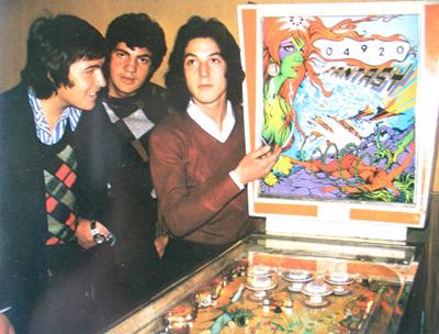
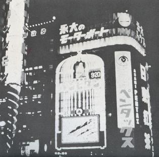
I believe that Las Vegas is a great example of a modern day Fantasmagory. The city is almost entirely made out of neon signs. After the second world war, Las Vegas was growing extraordinarily fast. The consequence was a speed-up of competition along the Strip (the central road through Vegas). The actual buildings are all more or less the same: low, but a large ground level surface. This has to do with the climate and economical reasons. The outside of the building needs to stand out, both during the day and night. The result is a total mash-up of different styles, quotes, hightened symbolism, eclecticism, all in neon lights.

In the end, the building itself becomes a sign.

Vegas references:

W. Benjamin, Passagen, 1930

R. Venturi, Learning from Las vegas, 1970

Cocteau Twins, Heaven or Las Vegas, 1990

05-heaven-or-las-vegas

cat. no. 700.6-benj2

keyword: neon

EXCAVATION (part 2)


Thursday, March 26, 2009

Excavating the library, looking for pyramids, lead me to a late 60´s representation of posters by the graphic design artist Milton Glaser. The choice for this book is solely based on the cover graphics and has no other connection to the first book selected, though it seems that the fascination for pyramids and their monumental quality are shared by many designers regardless of the time or design field.

The size of this book (A3) is  in my opinion very well adapted for displaying these incredible hand drawn posters. Every page is a poster and the more you look into them the more you see.

Bob Dylan poster by Milton Glaser 1966.

cat. nr: 754.1

keyword: pyramid

again and again and once more


Thursday, March 26, 2009

…While thinking about repetition and about the idea that practically anything could become a pattern by repeating it over and over again, I came to think of industrial design.

Where repetition in a pattern becomes this new image that, in a way, is stronger than the pieces apart. Repetition in products doesn’t really make it stronger. It makes the product less original en less valuable.
Unless you only plan on making a few of the same product, than the product suddenly becomes a collectors item or special edition.

Well, this second book was about industrial design…but also about language. Funny how these two subjects work together. Because through industrial design it becomes possible to have the same products all over the world. So for new products, new words have to be invented. A lot of products are called after their function, at least in Dutch they are. But wouldn’t it be an idea, to have international words for these international products? Ikea is already using this concept, so now people all over the world start having their own strange Swedish vocabulary of really silly words. Does that mean that in ten years every person, from Singapore to Munich would know that a LILLÅKER is the thing you rest your mattress on?

I think this book gives a better solution to this language problem, by just learning the different words.

cat.no. 772.9 cat 50

keyword: repetion

Shelters; the joy of self- sufficiency and freedom


Thursday, March 26, 2009

In the earlier times of human kind people built their own homes, grew their own food, made their own clothes and tools. They where self sufficient and the knowledge was passed on from generation to generation. With industrialization and increasing population, this knowledge has been put aside and most of it now lost.

It´s kind of impossible and pretty utopian idea to turn back to these old living habits, especially here in the west,  but maybe we could try to find a balance in our lives between what we can make with our own hands and what still must be done by machines. So before running out to the store we could think twice and see if we really need to buy this item that we need.

The more we can create for ourselves, the greater will our individual freedom and independence be.

cat. no: 710.9-kah-2

keyword: freedom

More is more is more


Thursday, March 26, 2009

My search for another fragile subject led me to the book “The Crystal Palace Exhibition, illustrated catalogue”. Again I choose by title. Crystal Palace, what a beautiful combination of something stable and something fragile almost a contradiction. The combination crystal palace is somehow a little impossible as if it would only exist in fairytales.

The book is an old paperback, it used to be brown but on the back it’s been bleached by time and sunlight and has turned into a fifties purple. The pages are yellowed and the book is full of beautiful etchings of art nouveau design, furniture, elegantly ornamented pistols, silverware, and luxurious flower-print fabrics.

Last week I wrote about the book Fragiles, a book about contemporary ceramics and I can see a lot of connections between the two books. The art nouveau designs, just like the contemporary works, has a kind of playfulness in it, the flower ornaments seems almost alive as they intertwine around the legs of the tables and when you look closer at the ornaments soon you will find creatures and fairy tale animals hiding in the patterns. Another thing that I connect to some of the contemporary ceramic is the “more is more motto”. Some of the furniture in the art nouveau book is crammed with decorations, ornaments, cherubs and flowers, just like some of the objects in Fragiles are over the top kitschy. But there is something quite beautiful about this unwillingness to stop when it is enough.

cat. no. 772.1 cat 2

keyword: fragile

8 reasons


Thursday, March 26, 2009

1. if you are searching for the best way to walk clumsily with a book, take this one.
2. if you want the best book for architecture of 21 century.
3. if you are searching for a book that is 4 kilos, this is the best choice in the library of the Rietveld Academie.
4. this is the best book if you want one that probably will not fit into your bag.
5. if you want to have a book that is larger than A3 format and if you open it, even larger that A2, then this is the book .
6. if you want to know everything about the architecture of 21st century, this is probably the best book for   it.
7. if you want to carry a book that makes everyone say ” wow, a big one” this is the best choice.
8. if you want to find out more about this book, the best way to do that is to go to the Rietveld library and search . .

cat. no. 715.9

keyword: best

Individuality


Thursday, March 26, 2009

This whole century fashion has been very influenced by the arts. This is because of co-operations from the fashion- and artscene which started already in the beginning of the 20th century.

In the 80’s fashion was brought to the next level, there was an economic growth which brought the attitude of the individualism. On the other hand this pushed the rhythm of change which meant the originality was less interesting because of the many copies and this ended the modernity. The post modern esthetics blew the galleries and museums away with its welfare.

Everything was said and done, from now on creations were nothing more then reproductions. The convervatism who denied the value of progress and ideology, focussed on the main values. This means they re-appreciated the art of painting now-a-days and from the crinoline.

Today again we are very much into individuality, which forces us to be more and more personal with ourselves. The will to keep your unique individual self is actually a statement which connects you to a certain group. You want to be seen for your specific, different individual personality and want to be recognised for this. And because you are not the only one you suit in a certain group that thinks in the same way as you do so you still fit in a box. Off course every person is different, but actually how unique and individual are we…..?

Catalog nr: 11297

keyword: individuality

Fascinatie


Thursday, March 26, 2009


Hij staat er niet bij, wel zijn er heel veel boeken over Japans Design. Ik keek in alle boeken. In alle verschillende boeken stonden goeie overzichten van wat er allemaal uit Japan komt. Het begon meestal bij traditionele Japanse kunst wat langzaam overloopt in design. Het is een overgang van mensen die eerst voor zichzelf iets maakte wat later veranderd in mensen die allemaal onder één naam product maken. In het boek Japans Design zie je deze overgang heel goed weergegeven. Het is super om te zien hoe veel er wel niet in Japan wordt geproduceerd. Japan is zover weg en we hebben hier zoveel uit dat land en dat is wat mij fascineert.

cat.no. 772.5-spa-1

keyword: beeld

psycho.path


Thursday, March 26, 2009

It expresses alternative .It is graphic design it does say many things but it’s a chaos .Other levels of thoughts ,the same point of discussion .No solution,just view to a protocol of becoming machinery that doesn’t want one.
From philosophy to corporate identity…Corporation is considered as a person in eyes of law. Lets use psychiatry to make simple conclusion based on analytic view of behavior of this already established individual in society.

High ambition.Although there are some basic rules of behavior that you have to embrace.
Smile means –fake
devastation-chance
offer – manipulation
improvement – tactic
wealth – private property
choice – marketing
necessity – money

770.6 vos 1

keyword: invention

Downtown Woah


Wednesday, March 25, 2009


There is a blatant connection between my first and second choice.

I started out with a book by Rem Koolhaas called Project On The City which is a collaboration with several students from the Harvard design academy where he holds the position of professor. This Project investigates the consequences of the unbridled urbanisation taking place all over the world. In this context the meaning of the word urbanisation go’s further than just the focus of human inhabitancy in city’s but also refers to the cancerous growth of commercial landscapes which are framed by concrete walls becoming the centre and at the same time the banks of a river of ongoing development. One of the problems stated in the book being that the design professions can not keep up and apply outdated methods to the urban landscape creating a chaotic and unpleasant maelstrom of overlapping visual and audio stimuli with which the citizen (caught up in this maelstrom) is forced to deal.

Then I found my second book. City Signs and Lights by Stephen Carr (almost completely) coincidentally dealing with the exact same problem but focusing it’s attention on the problem with -and the potential of (the name says it all) City Signs and Lights. Rarely have I seen two books that complement each other more (although not always in the most constructive manner) and the focus on the bewildering aspects but also the potential of urban public space is a connection that fascinates me deeply.

cat. nr: 754.5 carr

keyword: develope envelope

NATIONAL IDENTITY IN FILM POSTERS


Wednesday, March 25, 2009

This letter I want to attach to my last message about national identity present in a street signs in different cultures. For the second time I’m using this book, which you can also take in a library. This time I’ve made a selection of posters made in different countries, but for the same movies. My thought was about the possibility of existance of different schools of postering. This posters, that you can find below, were made in the time when there were no internet for sending files with information and a designer or an artist had to improvise making a new masterpiece for the public. But this problem had made movie presentation even more interesting in different countries. Each country had added something special, non cliche. So, enjoy!


cat. nr: 754.1-keh-1

keyword: identity

big, bigger, biggerest


Wednesday, March 25, 2009


It was big….impressively big. That’s why.

Maybe it wasn’t fair for the other books, because this book was also on a ‘special’ place. It had a place of its own as if it was more valuable than the others.
It’s not that I’m a shallow person, but it just caught my eye because of its physical appearance.
I think the pattern on the outside was disastrous by the way.

This book is about patterns. I became really fascinated about patterns, because it seems to bet hat everything becomes a pattern as long as you repeat the shape, form, act or colour over and over again. This is also how patterns become part of our life. Interesting

…At least I thought so

cat. nr. : 701.9-sch-1

keyword: repetition


Log in
subscribe