Everyone finds his or her own way of browsing through this blog. There are so many options to click on, which made me unsure where to start. I kept standing still on the blog, frozen on a single page, instead of moving through it. I wondered where do you start and where do I end? I almost got annoyed by the fact that the massive size of the blog was standing in my way, preventing me from looking at it. So I gave myself the assignment to browse through the blog randomly, within the time limit of ten minutes. After these ten minutes I asked myself: “what caught my eye the most?” What did really get stuck in my mind?
So there I went. I started at the base; clicking on the menu of the website. I kept clicking and clicking, without making a conscious decision about what I was clicking on. My most important goal was to make sure the page just kept reloading and changing. Slowly I begin to realize that I’m not even really reading the blog entries. Of course I don’t; I don’t even like reading… So I noticed that for me the most important thing is the visual appearance of the page. I’m interested in the way the shapes change and move when you click to go to the next page. I’m interested in the way the different colours are spread across the screen.
Time’s up. And I started reflecting on what I saw within these ten minutes. To be honest it was very comforting to just look at the constant changing of the page, which was the consequence of my constant clicking. There where two things that really caught my attention.
The first thing that grabbed me while looking at the blog where the colours.
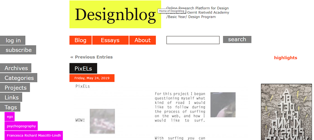
If you leave out the white and look at the colours that remain, you get a combination of bright yellow, pink and orange/red, together with black.

These are colours that I often use in my own work. Especially the combination of the bright colours with the black is something I really like.
The second thing that grabbed me was that I clicked on a broken link. I clicked ‘subscribe’ in the left menu bar and it took me to a page that said it didn’t exist:
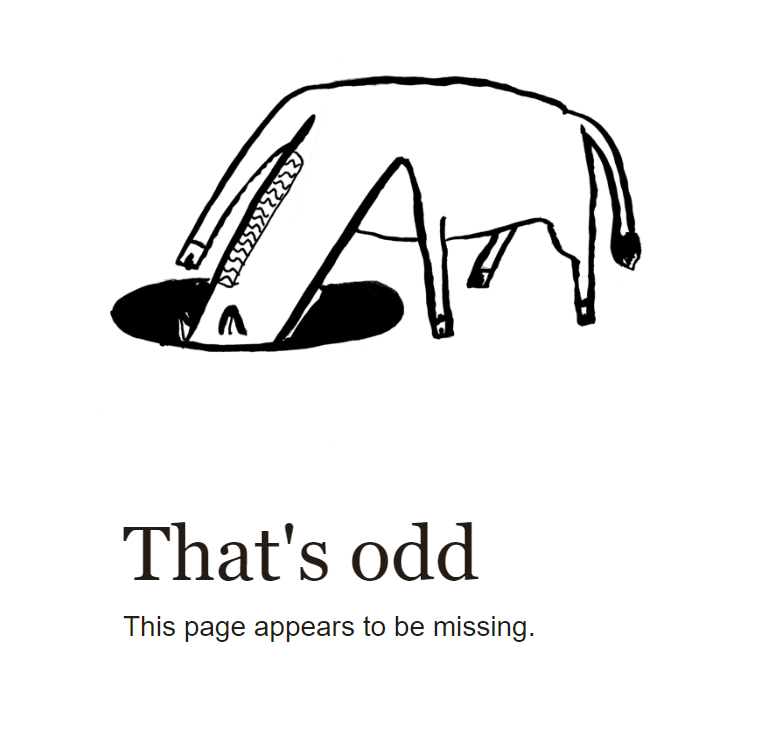
I felt like I found a little secret. This is in itself already nice, but it’s a secret that also pretends not to exist. I clicked a link and it took me to a page, but the page said the page does not exist. Which is of course a bit strange, how can I be on the page, if the page doesn’t exist?
These two things (the colours and the missing page) inspired me to create my own missing page. The one that is used now is funny, but does not really fit the style of the blog. I wanted to create a missing page that matches the blog. I tried to achieve this by using the colours from the blog. The image itself seems random, which it actually is. But this randomness fits in with the great diversity within the content that is present on the blog. The text that I added to the image is a reflection on the paradox that the page is there, but is also missing.
suscribe!