
The Most Beautiful Swiss Books is an annual contest of the most beautiful books in Swiss, which started in 1943 at the suggestion of graphic designer Jan Tschichold. Designing the catalogue itself has always been a desirable task and the job is handed to the most popular designer each year. For Brunner it was a big achievement to secure the catalogue for three years with his concept of ; -The Past Issue(2007), -The Present Issue(2008) & -The Future Issue(2009).
In the making of this catalogue Brunner positioned himself in the middle of the whole process. So he could influence what the content of the book would be, choose which people were interview and what other text and essays were chosen to be in the catalogue. Through this he could increase the value of his concept for each of the three catalogues. The three catalogues all have different perspectives on books and bookmaking in Switzerland, with his time based theme he creates a frame where the interviews and essay fit in.
Although the three catalogues share a format and you can clearly see that they are a series, they have such a different atmosphere. The first time I picked up the three I was immediately drawn to -The Present Issue, I think it was mostly the humorous approach it has.
The way he blends together infographics, photographs and adverts to create this strong theme.
The photographs have a really ironic approach to pop culture and modern cliches, my favorite spread of the issue is two photographs, the first one is a news photograph of miss universe being crowned and the second one is a portrait of a street sweeper with a man dressed in a Harry Potter book costume. The infographics are all connected to books, bookmaking and books in culture in a modern context, with a few random book connected instructional pictures in between the texts. The adverts in the catalogue are clearly carefully chosen, all book connected. All of them really straight forward, half of them are for contemporary books and the others are for book related technology, like the Amazon Kindle pocket reading computer.
Brunner used his typeface: Circular, that was under development at the time. A typeface that has spurred a lot of attention since its arrival with its fresh approach to the classic 20th century fonts. He achieved to make something new and modern by reworking the geometric sans, drawing from Futura, Neuzeit Grotesk and other classic builts. My favorite glyphs of this exciting font is the lowercase “t” and my native lowercase “ð”. He also made the font; Akkurat which was a big success in 2004. He has a true talent of reinventing the classics, with new perspective.
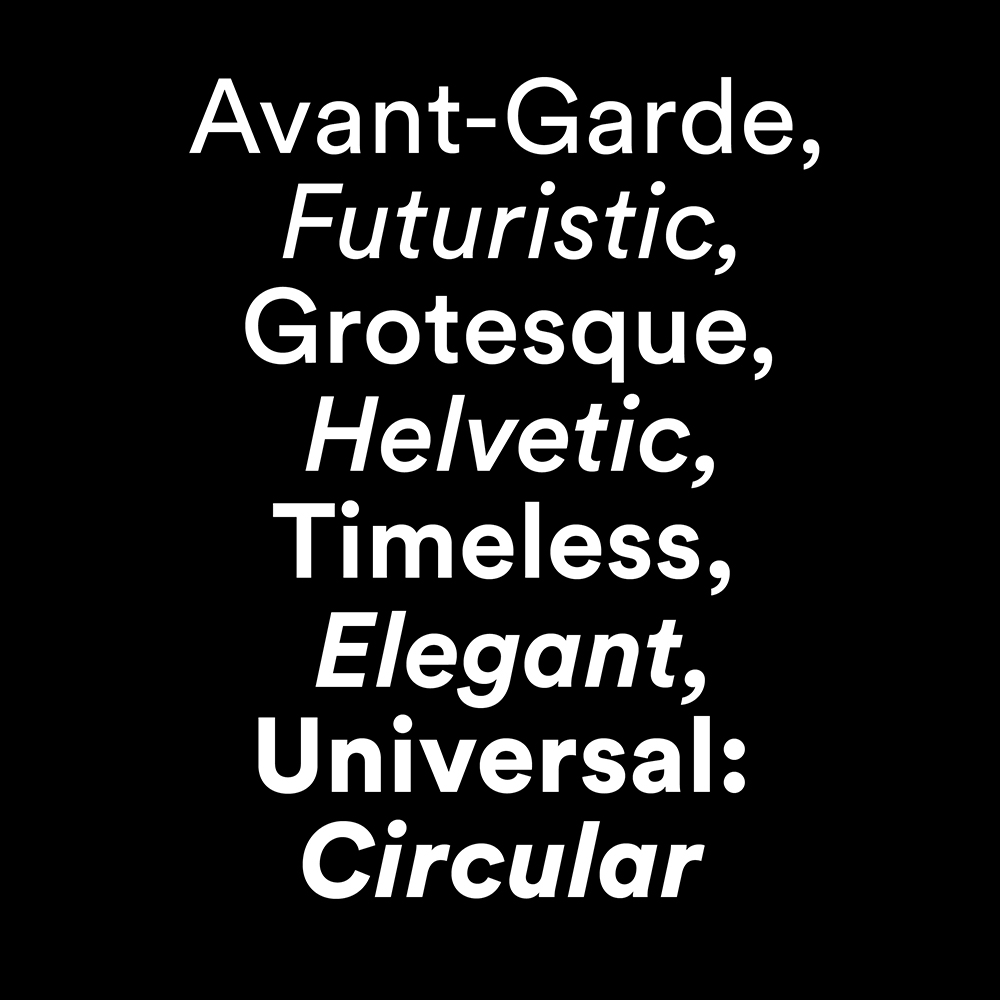
Circular Font sample
LL Circular is a new take on a classic genre, first explored by Paul Renner’s Futura (1927-28). In the process of developing the font, the purely geometric approach gave way to more complex formal conception, resulting in a geometric sans serif marrying purity with warmth. Striking a balance between functionality, conceptual rigor, skilled workmanship and measured idiosyncrasy, LL Circular is a friendly sans serif text font with unmistakable character yet universal appeal.” -Lineto
With his typography and his layout talents he makes each and every page really aesthetically pleasing, and he makes it really easy to read and functional even though it is in Italian, french, german and english. He made this 200 page catalogue really interesting even though you don’t read one word. All the elements work so well together and are really true to his concept for the catalogue.
Rietveld library catalog no : 758.3 brun 2


