Skip to Content Skip to Search Go to Top Navigation Go to Side Menu


"similarity" Tag


Exactitudes


Thursday, November 30, 2017

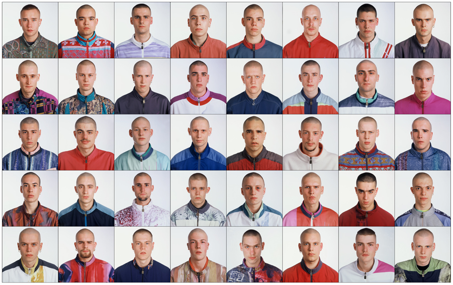
I chose this project because I find really interesting how every human in the world even the most peculiar looking ones can be catalogued in a group. It always intrigued me how much you can express with clothing and where are the borders between being unique or just following fashion. The photographer Ari Verluis and the stylist Ellie Uyttenbroek have been working in the project Exactitudes for more than twenty years, the name of this project is a fusion of “exact” and “attitudes”.

01--Gabbers-Rotterdam-1994

Vetements which was also in the exhibition Change Makers used Ari and Elli’s work as an inspiration for the autumn/winter 2017 collection. This underscores the critique of the fashion world. After the collection was online big chains started copying it. This open really important questions about actual fashion.

The presentation of the photos they take are always the same, a grid of three by four, making it almost a catalogue of types of persons where you could find your urban tribe.

Exactitudes started in Rotterdam but actually they work all over the world. It analyses how depending on your surroundings your style will be different. They say sense of style is something you’re born with, using as an example the kids who use school uniform, the ones that even wearing the same exact thing make a little difference like wearing a chain or rolling up his sleeves.

This project is not that much about fashion but more about people and it really has an anthropological quality that it’s admirable because slowly it’s documenting the changes in society thru the years and how some factors like social media.


To understand better and interpret my subject I decided to recreate Exactitudes but with a twist: doing it on Tinder. Tinder is a dating app where you swipe left or right if you like the profile of the person or not.


cat owners dog filter

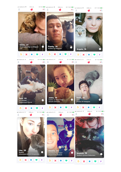
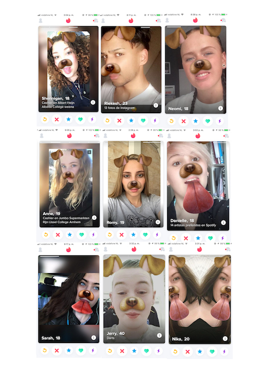
cat owners and dog filter


In the profile you create, you are able to post four photos where you have to sell yourself. You can also write about you, (but no one reads that). This dating app works visually. The pictures you post will make you have a match or a sad love life with no matches at all.

In the interview for the catalogue, Ari talks about the process of finding / collecting people and how they just sit in the street and wait for the right person to pass by. For me that process was more active, I first had to find which group I wanted to categorize. As soon as you start using the app, similitudes between the users pop up, and even though you can’t take photos of them with a white background and the same pose, when I arranged the screenshots in grids it was impressive to see how similar the photos were.


The research I made wasn’t that much about clothing, but there’s something in common with clothing and the images you post on Tinder to introduce yourself. They both are talking about you without words. You want to reflect your personality with them, it’s like a mute introduction of yourself.
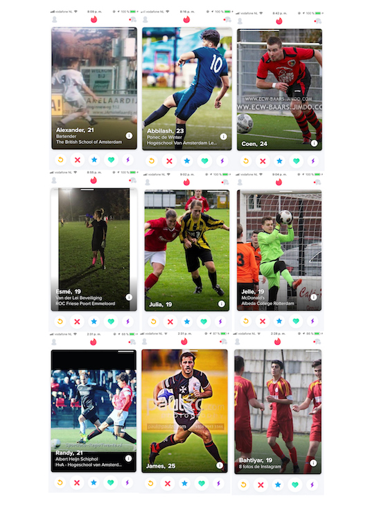
 

soccer players

soccer players


Probably the people I put together in some of the grids won’t think they belong to the same urban tribe. I focused more on the attitudes they reflect on their profiles more than on what they wear. For example the soccer players, by making the choice of introducing themselves with a photo of them playing this sport place them in an idea of the kind of person they can be. The same exact thing would happen if someone shaved his head and wore a bomber, these decisions reflect a statement of who they are or how they want to be seen.


world saviors barbies

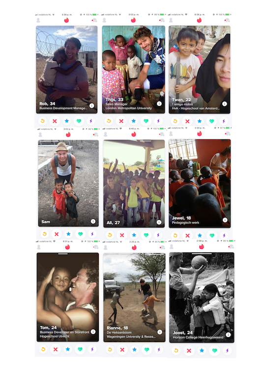
world saviors and barbies


World saviors is another example of how with a single image you can make a strong statement. They try to sell their person and reflect how merciful and helpful they are with the most needed ones. This could not be shown with clothing,


Now that Tinder and other social media platforms are opening opportunities for people to give the image they want to show of themselves is time for a new Exactitudes, but now in the virtual world.


Turbulant Times for Tubular Chairs


Monday, October 19, 2015

In the Boijmans Van Beuningen museum Design Derby exhibition there were two chairs that use a different main shape to catch your eyes and bring them to ‘ their side’ of the show. In both cases, the armrests follow this main shape; the rests of the Dutch chair are symmetrically shaped by an oval, while the rests of the Belgium chair are asymmetrical and sturdy angled.


Screen Shot 2015-11-23 at 20.28.27Screen Shot 2015-11-23 at 20.30.00

The Auping fauteuil, 1931 • The Chaise Lounge by Gaston Eysselinck, 1932


Despite this difference, the chairs are rather similar because of the chrome-coted construction parts, the use of wood in the armrests, the shared function, and the same exact period in witch these chairs were made (1930’s). Without any background information you could say that these chairs were made by the same enterprise or you can take it the other way around; these designs could have been competing with each other back in the day. This tension field spiked my interest to take a closer look in the history of both designs. Are they that different?

Examinating these chairs further I found that the same Dutch designer movements influenced the choices that were made in both of the designs. Designs meant for modern progressive consumers. These influences include Dudok [x], J.P.Oud [x], Gerrit Rietveld and De Stijl movement [x].

In the 1930’s Auping decided to broaden their horizon and manufacture a line of tubular living room furniture including the Auping fauteuil. At this time, this branch was not important. The designer of the fauteuil was not even linked to the chair itself. Later investigation concludes that the unknown interior designer Ben Reynsdorp is likely to be the designer of this magnificent chair. (jaarverslag 2014 Bojimans.nl [x])

At the same time, at the end of heroic period of the Avant Garde, the young architect Eysselink succeeded in assimilating these influences in a highly personal way. He went after Rietveld and designed his own home in Gent and manufactured fitting and unique furniture;

House_Eusselinck

“In 1932 he designed all the furniture for this house. It is tubular steel furniture [x], of which the stacking chairs and the large recliner are the most interesting. He hoped to manufacture the furniture at a later date, with the name FRATSTA (Fabriek voor RATioneelse STAalmeubelen – Factory for Rational Steel Furniture), an enterprise which in fact proved unsuccessful. Eysselinck is the only architect in Belgium from the period between the wars to produce a ‘collection’ of tubular furniture.”

The latter brings me by another less fortunate similarity found; both chairs were part of lines that initially were not well received in the market and this brought production to an end in both cases. As said, the enterprise of Eysenck went bankrupt after only two years. His unique “machine à habiter” was not mentioned by the media. Auping on the other hand, focused on the improvement of their bedding and the continuing of their existing production lines in the crisis. They did not continue the production of tubular living room furniture as it was not as popular as their beds.

Nowadays Eysselink is seen as one of the great in Modernism. The Chaise Lounge [x] even got a re-edition in the 70’s; a modern and luxurious implementation.


474199.jpg;jsessionid=9E51294DBFF433EB0AE8992185C93492

The re-edition of the Chaise Lounge by Gaston Eysselinck, 1970's


The Auping chair ultimately got the attention and the designer the credit he deserves. Both chairs flourish at the Holland – Belgium Design Derby Exhibit and defend the honor of their ‘native countries’.

But ‘What differs the Chaise Lounge from the Auping fauteuil?’ you might ask. These chairs can not possibly be from the same designer for one major reason: The Auping fauteuil is not designed by Eysselinck’s ‘Form Follows Function’ regime. The armrests of Auping are used in a more decorative way than Eysselinck would have wanted. This makes that, although these chairs may look very similar, my gut feeling was right and they can be categorized in a whole different way.


Similarity


Wednesday, April 2, 2014

When i first went trough the pile of Wendingen magazines something struck me when I saw the cover of the “techniek en kunst” edition. At that point i didn’t really know what it was about that edition, but when thinking more thoroughly about it I had the feeling that I had seen it before. Going through my archive of pictures I found a poster designed by Karl Gerstner that had a lot of similarities. It left me thinking how amazing it was that something that was designed an odd thirty years later had a lot of the same qualities. The cover of the Wendingen magazine was designed by Wim Gispen, one of my favorite Dutch industrial designers. Before this discovery I only knew Gispen for his famous chairs, lamps and interior architecture in general. Unaware of the fact that graphic design at that time was not really labeled a profession, designers also did graphic design on the side. Though you can see that the cover designed by Gispen is an early design and not really modern any more it still has some modern qualities.

TechniekKunstWendingen karl-gerstner2

The use of shapes, circles, overprints and probably a grid in my opinion is quite modern. I think it fits in the same style of work as the early Swiss style of graphic desgin. That is why it reminded me of the work of Karl Gerstner a Swiss graphic designer that was part of the Swiss style. A movement that I am a big fan of because of their simple use of shape and subliminal use of color. Because Gispen is more linked to “de Stijl” movement I would have never expected that he designed the cover for the Wendingen Magazine but overall I am quite happy that I picked this copy because of the insight it gave me in early graphic design and the progression it went through over the years.

Wendingen 9-2 1928 Rijksacademie Amsterdam

My grandmother and her weave


Friday, May 28, 2010

I want to tell you about my grandmother and needlework.

My grandmother had a big house and in one of the rooms she had a weave. On the weave she made tablecloths and carpets out of old sheets and fabrics. She ripped the fabric in to long thin strings and weaved them in to carpets. Some of the carpets she made where for her own house, some for the summerhouse and others to give away to family and friends.

My grandmother had an education as a nurse but after she married my grandfather she became a housewife. No busy work life for her but instead she had time to do different kinds of needlework an of course be a wife and mother. After her children moved out of the house she also developed new interest such as hunting to spend more time with my grandfather who was a keen hunter. But enough about her life story so far because this text is about the needlework she made and her as an example for a generation of woman and design.

The carpets she made are called kludetæpper in Danish, which directly translated means rag carpets in English. A better word for it in English would properly be patchwork carpets. The technique is that you ripe a bunch of old fabrics such as sheets or bed linen into long thin shreds about one centimetre wide. You then weave the shreds together again into rectangular carpets. The results is colour full thick carpets. When weaving you can also make patterns or motifs in the carpets by selecting the specific colours and then applying them in a pattern. The more traditional look of the carpets is a wide blend of colours without a specific pattern or motif.

A patchwork carpet my grandmother made

(more…)

The similarity in contrast


Thursday, December 3, 2009

Not one, but two books this time. I know that the assignment was to take one, but these two belong to each other. One is called “De geschiedenis van de schoonheid” (The history of beauty) the other one is called “ De geschiedenis van de lelijkheid” (The history of ugliness.) I took them because the contrast between those two seemed to be interesting to me. They also look really nice because they are really intended to be together. The really look like a couple. They are both the same size, same thickness, made of the same material, have the same typography and layout. Absolute contrast but still the same in some way. I also looked inside and it is funny that each book on itself is less interesting if you cannot compare it to the other one. They really need each other. And of course there is the old question “what is beauty and what is ugliness?”

700.6-eco-1 and 700.6-eco-2


Log in
subscribe