Skip to Content Skip to Search Go to Top Navigation Go to Side Menu


"mystery" Tag


I’m new here


Friday, May 24, 2019

.

*****

I don’t really know the way, but I want to. I have this habit to wander off randomly when I’m unknown with a place. Just to see where I’ll end up if I let go of control. “Let fate decide” says the romantic in me.

After a while I see patterns and I believe that I know where I am. Finding attractive by-streets in every corner. But that’s an illusion. By the next turn this pattern is shattered by reality.

I don’t know where I’m going, but I know I don’t want to stay. Just keep going, till this frame turns into bedlam. Borders can’t contain me anymore. Looking back I can’t trace back my origins. I’m not lost. I’m new here.

I am chaos.

.

Panasonic Toot-A-Loop R-72


Friday, October 26, 2018

z111z11
‘It’s an S it’s an O, it’s a crazy radio! Toot-A-Loop!’ that was the phrase of the famous transistor radio called the Toot-A-Loop. The Toot-A-Loop… We both got mesmerized by this yellow thing that was laying behind glass in the Stedelijk Base and we knew that this was the piece that we wanted to do research on. At first we thought it was a weird mobile device, later on we read that it was a transistor radio, a transistor radio where the designer was unknown from, something that made us even more curious.

Because of the fact we speak different languages, we decided at first to do our online research separate, Philipphine did it in french and Sena in English. We were curious about the fact if the results in the browser would be different because of the language. We soon saw that the information was almost identical so we decided to do the research in one language.

Our research began with first going on Google, we typed in Toot-A-Loop and Google gave us a lot of links and pictures of the radio, the first link that popped up was Wikipedia, of course.

wiki

This information about the Toot-A-Loop that Wikipedia gave us was comparable on almost every website, there was nothing more, nothing less.

After Wikipedia we went to the websites of different museums, almost every museum website was disappointing, because they didn’t had a lot of information about the object, they all got a picture of their own Toot-A-Loop with a short text (or no text!) about when it was made etc. but nothing more. The Metropolitan Museum of Art and the Stedelijk Museum of Amsterdam gave us some book references, something that we could definitely use later.


The many pictures on Google were linked to auction sites and even Marktplaats (the ‘Dutch Ebay’)  we saw that a lot of people were selling their old Toot-A-Loop or already sold them, so there is still a lot of interest in the radio, it hasn’t lost its popularity. The selling price of the radio was quite various,  for example on Marktplaats the radio would be sold for around 30 euros, but on the auction sites it would cost around 100 euros.

zzzzz

We also found youtube videos, videos where people were most the time trying to explain how the radio works, we noticed that the videos were quite recent and that the people who commented under the videos were most of the time talking about how they would (and still love) the radio, so a lot of people from earlier generations.

zzzzzz

After long clicking, link after link, (it must have been the last Google search page) one of us ended on this Italian radio website where we finally found some new information about the radio, they  mentioned the name of the designer, somebody called ‘J.M. Willmin’, after reading this we started to Google the name of this designer, the only information about the designer that Google gave us was linked to the Toot-A -Loop. Later on we found an antique website where they were also talking about J.M. Willmin as the designer of the Toot A Loop, we sent them an email with the question where they got there information from, this is what they answered

z1

We think that the name J.M. Willmin was made up by Panasonic so the radio would sell better abroad (in countries like the US and UK),  this is probably why we couldn’t find anything about this designer.

After our online research we went to the library of the Stedelijk Museum and the library of the Gerrit Rietveld Academy, thanks to the book references we found online we were able to find books that mentioned the Toot-A-Loop. The information we found per book was different, in the first book, Twentieth-century ornament by Jonathan Michael Woodham, the Toot-A-Loop was used as an example to show something about the Japanese design of the 1960s/1970s further then that there was no information about the Toot-A-Loop itself. In the second book we found, Radio Zeit by Isabel Brass, there was more information about the radio, but nothing we hadn’t read before.

That was something that surprised us, because books carry this magic trustworthiness with them, you should be able to find everything that you want to know in a book, at least that’s what we thought.

img020img0210001

It’s strange that there is only limited information about such a popular radio on the internet and in the books. Maybe we should use our imagination to answers the remaining questions.

With this in our minds we started to think about other purposes the Toot-A-Loop could have had, the Toot-A-Loop was designed to put around your wrist, so it could also be a kind of jewelry. We found out that Marc Jacobs probably got inspired by the Toot-A-Loop. Our imagination helped us already a bit, we are curious what you will find!

An unexpected journey


Wednesday, October 18, 2017

Where is Harderwijk? What is Harderwijk? I left the train station in Arnhem, not so ready for a two and a half hour travel to the museum of Harderwijk. There was an exhibition of Vilmos Huszar I wanted to visit, but I just couldn’t think of where Harderwijk is on the map. Is it a city or a village? And why would Vilmos Huszar want to live and work there?

Vilmos Huszar was born in Budapest in 1884. In 1904 he started studying arts in München where he met Anna Egter van Wissekerke. In 1905 they moved to the Hague, the city that would become the center of De Stijl. In the next few years he was travelling a lot and in 1908 he decided to build up a life in the Netherlands and he never went back to his home country. Anna’s parents would not accept a marriage which led to his marriage in 1909 with her best friend Jeanne van Teijlingen with which he also got a child.

After only half an hour in the train we stopped; For your own safety please leave the train at the next station, our apologies. I am very used to these situations with our Dutch train companies so I stayed calm. After waiting half an hour in the dutch cold and rainy weather the next train arrived. Off course this train had some delay which made me miss my next train.

Vilmos Huszar

Vilmos Huszar

Vilmos Huszar was experimenting with many different paint styles from 1906 to 1917. A few examples of these styles are divisionism, fauvism, symbolism, futurism, expressionism and synthetism. He referred to this period as the modern period. In 1912 he had his first painting exhibition in the Netherlands. After three years he started meeting artists that would influence the turning point in his art. These artists were Bart van der Leck, Theo van Doesburg, Jan Wils and Chris Beekman. In 1917 the first edition of the magazine of De Stijl was created of which Vilmos Huszar designed the famous logo.

de Stijl magazine

de Stijl magazine

New building materials like reinforced concrete and steel, and the principles of prefabricated construction helped change architecture in the late nineteenth century. Design tended to lag behind technology, however. The architects of De Stijl also designed in the traditional way at first. It was not until later that they began experimenting with new materials, using a new architectural form language, as evidenced by their square, geometric structural volumes, often with rendered walls and flat roofs. Huszar and Rietveld’s space-colour-composition can be regarded as one of the most successful of De Stijl’s interior designs. The radical example of total design can be read both as a plea for the integration of painting, furniture design and architecture and as a manifesto concerning the intimate relationship between colour and space.

Space is experience, spiritual experience. De Stijl sought to deliver a spiritual experience, albeit more universal. The designers of this generation tried to achieve this with huge, monumental spaces that nevertheless had clear architectural boundaries. To them, colour was an effective means of achieving a new spiritual living environment. The idea was to allow the new abstract style of painting to merge completely with architecture.

Eventually I arrived at Harderwijk, still not sure where I was. I went to the bus station and waited a while. After ten minutes I realized none of my busses had arrived yet. The bus station looked abandoned besides the few people in red and black working clothes. I realized they work at Walibi World, a luna park in Holland. A bus showed up, not the bus I had to take. It was going to Walibi World, just like the next three busses. I still didn’t know where Harderwijk was but I knew it was close to Walibi World.

abandoned bus station

Abandoned bus station

Developments in the industrial production of paint made the vibrant colours used by artists available for architectural interiors, too. The artists of De Stijl made colour ‘separate from the structure’ to ensure that the building was liberated from its conventional enclosed character.

Most art pieces Huszar made in the period he was working at De Stijl have been destroyed after his request. The few art pieces that remain untouched are now situated in big museums around the world.

Finally a lot of busses arrived, most of them going towards France and passing the city center of Harderwijk. Wait what, France is not close to Walibi World right? Or is it? Now I was completely disoriented. I thought my topographical skills were pretty good but after that day I gave up on them. I got in a bus, the woman behind the wheel looked at me, didn’t say a thing. She appeared to me as someone who is tired of living, she was driving like that as well.

In 1920 Vilmos Huszar left De Stijl, it is not totally clear why but some people state it was because of a fight with van Doesburg about the colour scheme Huszar designed. He had enough of the traditional way of painting, he stated it was just a easel painting to fill up museums. We think Huszar’s diversity in his artworks was also a big influence on his leaving of De Stijl. We take this letter he sent to his formal art teacher Bremmer as an example;

“I believe that I am too much of an artist to assimilate what I learned from you in my art works. I write you this so you don’t make any useless efforts. I cannot leave my path but maybe proceed, that means seeing my own way as a tool. I hope to stay in contact.”

Here are a few examples of Huszar’s diversity in artworks besides his paintings, of which one a video of a mechanical dancing figure made in 1920.

Mayors necklace - 1956 Boys bedroom family Bruynzeel

Mayors necklace - 1956 / Boys bedroom family Bruynzeel - 1920

When I got to the museum I still had half an hour until closing time. The two and a half hour travel turned out to be four and a half hours. Fortunately this was enough to see the exhibition about Vilmos Huszar and even get a private tour by a guide. The exhibition was divided in three rooms, all showing many different artworks of Vilmos Huszar. The exhibition focused especially on the works he made after he left de Stijl. Some of the artworks exhibited were never shown to a public before. Even though he stopped making artworks in the style of de Stijl, I could find small details in his paintings like a red straight line. 

A seated lady - 1932-1933

A seated lady - 1932-1933

When walking back to the station I realized Harderwijk was actually a very cozy city (yes it’s a city). It apparently has a beach and it was once a craft city, before 1955 it was a nice fisherman’s town at the open Zuider Zee. The people were very kind and helpful. I would recommend a small visit to Harderwijk to everyone. I suppose Vilmos Huszar lived near Harderwijk because it was a more peaceful place than The Hague, which might have inspired him. When I got in the train to go back to Arnhem I saw an old man waving to the train. Harderwijk is the city where Dutch children visit their grandparents for a few days and then wave each other goodbye at the train station. I was told Harderwijk was the end of the world, a place where you wouldn’t want to be found either dead or alive and that it had a great coffee shop. I believed it but now I know it’s not the end of the world.  

Harderwijk view

Harderwijk view

After Huszar left De Stijl he got many commercial art requests from C. Bruynzeel and Miss Blanche. He made many artworks in different styles, often with small details referring to De Stijl. He would for instance put a red line in a realistic painting. In December 1939 he and his wife Jeanne moved to Hierden, a small village near Harderwijk, because of the war danger. Here he had the chance to go on with making art. During the war he was active in the resistance Migchelsen. In 1945 Jeanne died and not even one month later he got together with his housemaid Anke van der Steen with who he got married in 1953. Jeanne’s parents were very rich, but after her death Huszar was left with only his atelier. Anke, Vilmos and his kid moved to the atelier. They were very poor so Huszar started trading art for basic needs. For instance the still life of a bottle of Hollandia Water to his housemaid.

still life with bottle of Hollandia water 1946-1947

Still life with bottle of Hollandia water - 1946-1947

In the last few years of his life he went back to painting like he did when he was still in De Stijl. On 8 September 1960 Vilmos Huszar passed away in Harderwijk.

a cooperative research by Athena Potamianos & Justine Wesselo

Odd or Even


Tuesday, February 7, 2017
mariana castillo deball, manuel raeder, et al; revolver publishing; i don't have permission to post this image.

Never Odd Or Even (2005), Mariana Castillo Deball, Revolver Publishing


Scanning through all the possible titles in the list, I landed on something I recognised: ‘Never Odd Or Even’, by Mariana Castillo Deball (M.C.D.) I found myself attracted to it, because it reminded me of an album I used to listen to a lot when I was younger. Initially, I really didn’t like the front cover’s typography, but when I flipped it open, I found myself very confused about the way the book was structured. When I inspected the other pages, I decided this would be my book of choice. I thought the back cover and inside looked very interesting and beautiful, but I didn’t understand why it looked the way it did, what purpose it served, if it even had any.

When I started looking online, I could only find  a lot of information about the second volume, but the first volume only gave me two not very detailed links, one to the art foundation’s website and one to the publisher’s website. It became clear to me that it was a ‘book’ made up out of dust covers. It was some kind of art publication. The fact that it was sheets of paper specifically designed to protect books, protected by a layer of plastic seemed absurd and quite funny to me. Even though my main attraction was the construction of it, there are a lot of different styles of graphic design found throughout, which I found to be quite interesting, both together and on their own.

First, I indexed all the individual pages of my copy as follows. By doing this, it became clear to me that there is a discrepancy between the number of covers that are contained in my copy and what the publisher advertises. My copy only accounts for as much as twenty-two covers, whereas it should have been twenty-three. This number includes the outer cover, following the counting system of the second volume. Otherwise, there are two pages missing. Also, none of the books in this list exist in reality. They seem to do what art is known to do: imitate life. The publication kind of looks like an exhibition in itself and it actually is almost some sort of catalogue of the actual exhibition it is part of. I can’t support this factoid with photographic evidence, as there are no accounts to be found on the web. The exhibition seems to have taken place before museums, artists, or audiences started to upload any documentation on the web, but based on what is available online for the second volume, the before mentioned seems highly probable.

Never Odd Or Even (2005)              Never Odd Or Even Vol. II (2011)

So there were two minor design mysteries: it is unclear why the publication is formatted the way it is, but it is also unknown what the content of 1/23 of its totality is.

Could this missing piece hold the key to unravelling this mystery? Highly unlikely, but it remains a point of curiosity nonetheless.

To understand Volume I (2005) with as little information as there is available, we must resort to looking at Volume II (2011). With six years separating the two, there are some differences, but integrally they appear to carry the same concept — it’s a series and not two separate works after all. Volume II has some colour prints and more ‘pages’. Although I admit that I don’t know the exact way the exhibition was held in 2005, I think it’s not unreasonable to assume it was very much similar to how it was handled with the second one. To get a better idea of how it would interact with space, here you can have a look at the press release and photo album for the exhibition at the Grimmuseum in 2011.

Never Odd Or Even at the Grimmuseum (2011)

Never Odd Or Even at the Grimmuseum (2011)

Never Odd Or Even is a collection of dust covers for non-existing books and in the exhibition, the contents of these non-existing books are explored and theorised about, in works and performances that use text as their primary medium..

In an interview, Manuel Raeder has made clear that the outer cover’s typography has been designed by the artist herself — based on Tangram puzzle shapes — and the pages were done by the artists she invited to participate in this collaborative work. The latter being pretty clear just by reading the flap of the outer cover. Finding out about the inspiration for the type made me appreciate it a bit more. The collaboration apparently also extended into the exhibition surrounding the publication, working together on shaping how the public experiences the work. The second volume was published through Raeder’s publishing house ‘Bom Dia Boa Tarde Boa Noite’.

I contacted Raeder, with regards to the missing page, who worked on Never Odd Or Even together with M.C.D. I was really happy to see that he was very quick to respond. However, he didn’t readily have the information on hand, so he told me he’d forward my question to some others.  I didn’t contact M.C.D., as she doesn’t seem to have any contact information freely available.

When I inspected some pictures from the Brno 2016 exhibition, I noticed that not only did they exhibit the first volume of the work, but that the missing cover was actually squarely visible.

mariana castillo deball, manuel raeder, et al. revolver publishing            61sqE1-vTPL._SX355_BO1,204,203,200_


After doing a bit of C.S.I.-style zooming and enhancing, the title of the page appears to be a comic-book cover, titled ‘Horny Biker Slut #11’. This quirky title and cartoon imagery could make sense of the reason why someone decided to steal it from my copy, however inexcusable it may be. But there is one thing a bit strange about this particular cover. When I googled it, it actually exists and you can purchase it from Amazon for $19.99 + shipping. The fact that this title actually exists in real life makes it different from all the other titles, creating a whole new question altogether.

By this time, Mrs Schryen (someone working for Studio Manuel Raeder) got back to me. She informed me that there were in fact two covers missing; the above mentioned Horny Biker Slut #11, as well as one titled ‘Manhole covers vanish in the night’, which looking back on the Brno pictures, was also squarely visible.

contacto         manholecovers

I previously stated the Horny Biker Slut #11 cover existed in real life, but in the full publication version you can see above, it looks to be collaged together with the 11th issue of ‘Contacto Sexual’ on the back and both flaps, and something called ‘Histoire Porno’ along the spine. The other cover appears to reference, word for word, an article from the Guardian, dating back to 2004.

The fact that there is a second cover missing from our library’s copy means that the two volumes seem to be inconsistent in their numbering. The first one doesn’t count the outside cover as a ‘page’ and the second one does.

Life is a competion

Never Odd Or Even at the Grimmuseum (2011)

The artists involved in this project don’t seem to be concerned with consistency, correctness, nor the concrete.


THE THRILL OF CONFUSION/ POINTY BEAUTY


Monday, September 30, 2013

One piece of the permanent exhibition at the Stedelijk that stimulated some form of internal reaction was ‘Cow Chair’ designed by Niels van Eijk in 1997 for his graduation project at the academy in Eindhoven.

At first glance it appears to be a thick legged kiddie chair with a cow hide pinned onto it, which is nice enough – I remember thinking how well it would go with my new old cowboy boots – however, much to my astonishment, as I drag my feet past the seat to check off the next object to admire that it was obstructing I sneak a peek into the chairs insides, where to my amazement was in fact no such chair supporting the skin! I began to pace from one side to the other, pushing my face as close as I could to the void within without drawing the attention of the eagerly hovering security, reassuring myself that it was truly self-supporting.

Curious, the way that it looks so flexibly drawn around a form, with bunched creases contrasting with the tautness in the extremities yet still feels that if you were to sit on the cloth would fall beneath you like a loose rag. When considering the properties of a hide I had no reason to consider that it was it’s own shape, rather than taking the form of a structure beneath it; after all, isn’t that what skin does? My perception of the design changed completely; a hollow, anorexic skin made rigid by the last moistness of life being drained from it, locked together by savage stitches pulling at the skin as both leathers shrink in opposition.


Rather morbid, really.

As oppose to being a complex object that requires calculated thought to attempt to understand, such as an optical illusion or some form of puzzle, this intense feeling of pure confusion is induced when a seemingly mundane, daily object or situation is not how you automatically assume it to be; so automatically  that you don’t even think about it, that’s what really puts you out of whack. This sensation is one that has fascinated me (or haunted, in some cases) since I can remember. One chair related experience almost brought me to tears, it was such bedlam. On a morning no different to any other I took my usual seat at my dining room table with my tea and toast, but as I slid my chair under the table the top of my thighs brushed against the underside of the wooden table; this never happens! I was simply overwhelmed, I just didn’t know why it had happened. I called to my mother to seek an answer, ‘oh, well it must be because one of the chairs is slightly lower than the others, they must have been switched’; what a cruel trick to play so early in the morning. It was such a minute change that upon reflection such a reaction could easily seem somewhat overdramatic, but in the heat of the moment it truly felt like the world was crumbling around me and the chair.

The experience with the cow chair was less of a painful confusion and more of an intriguing, encapsulating.. confusion.  An object to eradicate all other drifts of thought.  To be noticed above all other things, even if the intention of the design is to be discreet . To create an object capable of such engrossment is surely the target of all designs? I find it so refreshingly satisfying to experience such a concentrated distraction, allowing you to grant all focus to the subject at hand, being lost in thought for something that is really real. After all, how can you think in an unclouded manner when you’re constantly mentally multitasking?

Niels and Miriam, hangin’ out.

Mr. Van Eijk and Miriam van der Lubbe have been partners in design (and in [x] their personal lives) since they graduated from the Sandburg institute, leading them to found their design studio in 1998, which lead to their own label: Usuals. Whilst managing not to come close to making the same thing twice, these two capture Dutch design by collaborating humour with vast imagination and experimental works, ranging from spacial projects to product and furniture design; this creative combination attracted numerous museums and other collaborative design companies such as Droog, and many others.

‘Poodle Chair’ 2002, another example of humorous chairs by VEVDL.

The design was of pure inspirational birth. According to ‘Subjects’, one evening whilst Niels was admiring his shoes he was captured by the way the leather formed so beautifully around the point of the toe he thought ‘if this is possible, it must be possible to make a whole chair this way’. This notion developed my opinion on the design even more so; I like a good lump of leather around my feet and can absolutely empathize with the new found pointy beauty that the chair possesses. Why, I just want to wrap myself up in a crispy point of leather.

Although I am a great enthusiast in the field of pointy-leather-beauty, I can’t help but feel a mild disappointment towards the  lack of confusion in the way the design was conceived; it all seems a little too cosy. Alas, perhaps only few are subjected to the level of intense confusion that taunts me so heavily.

What matters is a matter of perception.


Monday, May 16, 2011

When I heard about the powers of ten I thought it was some highly complicated scientific theory that you had to read really carefully and with much mathematical understanding to comprehend.
But in fact the ”Powers of Ten” is a 1968 American documentary short film written and directed by Ray and Charles Eames, re-released in 1977.

The film depicts the relative scale of the Universe in factors of ten.
It illustrates the universe as an arena of both continuity and change, of everyday picnics and cosmic mystery.

It presents the profound idea of orders of magnitude, with the subtitle of the film being:A Film Dealing With the Relative Size of Things in the Universe and the Effect of Adding Another Zero.

I want to show you one of the many remakes that have come up since 1968.

A little bit more cheesy, Americanized than the original with Morgan Freeman’s voice.

It shows the part of space we (humans) can see.
it’s stupendously big!!

Cosmic voyage – the power of ten HQ on YouTube

The theory of powers of ten tries to comprehend our world in numbers.
It fits everything from the atoms in our cells to the outer universe into a simple scheme of multipliing by ten.

By depicting this scheme the film gives a portrait of the various perspectives we can have on our world.

Our brain is capable to perceive the world on so many levels.
We can think a lot further than of what we actually know or have experienced, like the universe for example.


But we can as well think about the ungraspable development of thought .
Our brain can think about itself thinking.

There are many different levels of perceiving the world we live in.
Starting from ourselves I could think of the following levels:

The material level (what we consist of)
The personal level
The closer social level
The cultural (society level)
The global level (political/environmental)
The universal level ( seeing the world as a spot in the universe/ a world of constant change)

What matters to us changes violently depending on in which level we are thinking about things.

(more…)

Use Designblog TravelTags


Tuesday, November 23, 2010

.

Visit all “50TravelTags”

.

from the Designblog tag-list.

.

browse mapping by Maria Micheva

It is not easy to navigate in the design world, let alone Designblog.
The 979 postings and over 2000 keywords turn it into a subjective maze. How are you going to find an entrance to amazing stories and surprising opinions. In-depth interviews and downloadable theses and research papers.
Before you know it, you turn from user to participant of a universe that sucks you in or swings you out.


browse mapping by Severin Bunse

Students from A group decided to help you along by browsing the blog for you. Becoming your guides, in a manner of speaking. Creating new tags that can serve as “Travel Tags”. [invention, ice-cold, climate, crisis, fun, erudition, rules, gravity, convention, removable, purple, symbol, social-talk, audio-zine, similarities, mode, funny-story, flexibility, women, do-it-yourself, icon, sharing, interpretation, role, masterpiece, travel, imagination, slowMe, play, peaceful-living, mystery, sexuality, reflector, 0-dimension, no-comment, theater, ideology, dress, sharing, hidden, art-of propaganda, dependency, break-up, sign, young, pulling-pushing, conditional, breakfast, porcelain, Norwegian-mythology]-tt. You can look them up in Designblog’s tag-list, under [50-TravelTags].


browse mapping by Anouk Buntsma

Browsing surely illustrates that Designblog can become a true Pandora’s box. On the TravelTag poster, which was printed on this occasion, you can see a selection of their journeys in the form of ‘browse-maps’. Visualizations of their browsing history. These visual sketches show clearly that browsing through the blog leaves a clear individual trace. No person experiences it the same way. The blog creates –by design– a colored travel experience that synchronizes with your personal taste and ambition.

OUTDATED OR ANTIQUE?


Sunday, October 3, 2010

Once every often when browsing between the many beautiful glossy covers in libraries I come across a tattered old book that I feel I need to save. Especially when held together by peaces of tape and covered in coffee stains of it’s previous users, I am convinced it needs my love and attention. This book ticks all the boxes.

Inexplicably immediately memories pop up of me hovering at my fathers desk while he is working. Looking up to him and his work which I don’t fully understand. Then again, my father was a graphic designer and my associating him and that specific memory with a book on typography might not be that strange after all.

The book “Drukletters hun ontstaan en gebruik” (Printing types their origin and use) by M.H. Groenendaal is filled with old mysterious languages I can’t read. Worlds of knowledge I can only imagine. Wonderful shapes I love looking at. Shapes that take me to exotic places, inhibited by people you now only find in books. Or maybe the way words used to look before I could read. Wasn’t it a fascinating thing? Adults staring at pages covered with weird lines that didn’t make any sense for hours at a time. You could only imagine what these lines told them. It was almost like a secret society to me, and I couldn’t wait until I was invited in. This is what intrigues me most still, something I cannot understand and therefore let’s my fantasy run wild.

When you start reading the dry factual text, however, all mystery of meaning evaporates. Fantasy disappears and is replaced by hard fact. Being a hopeless dreamer, naturally I was let down a bit.

But then I come across delightful sentences that have now regretfully almost disappeared from use, and instantly I am charmed again.

The book by Groenendaal is actually a very thorough reference work on the history of typography. Dealing from the earliest types of passing on information; such as cave paintings; and the development of the alphabet, up until the most contemporary typographers of the seventies.

As the book is written before the computer age when the phototypesetting was hardly introduced yet, it’s not completely unfair to say it is heavily outdated.

However I am glad to find that the book is still widely used and it is often referred to in new publication to date. Also, earliest copies of “Drukletters” are now sold as book antiquities. It is safe to say that it really has no need for me to save it.

Rietveld > lib. cat. no: 757.3 1F

the mystery of constructivism


Thursday, September 16, 2010

When we were at the Irma Boom: Biography in Books exhibit, my eyes caught this inconspicuous book. First I walked passed it, I did see the book but didn’t really noticed it. After a while I came back to see it and I found it really interesting. The book is really thin and also not big but not to small too. The book was opened so I couldn’t see the cover of it. I only saw it was an orange cover. It was opened at a page with a constructivistic drawing of a boat, on the other page you saw three lines of text and another drawing that is hard to describe. It looked really graphical, something I really liked!  It was so minimalistic and that was what got my attention. I didn’t really wanted to know what it was about. But I found out it is a poem book. Maybe that broke the mystery of the book a little bit. I’m still thinking about putting the poems in a translatormachine.

The book also has a really interesting index on the right side of the pages. Every page has it’s own little logo with some Russian word above it, it’s probably about the subject of the poem, but still I don’t get the little logo’s. All these little mysteries made the book so interesting to me

Mystery to Surrealism


Tuesday, December 8, 2009

The word in my mind was the tag which also linked to older posts, Mystery.

Beside that I also wanted to find some images that could show technical or absurd feelings, but I was not sure, just a kinds of feelings, because the first post was about a sort of unknown special skill.

I saw this book, Women Artists and the Surrealist Movement. Females are sensitive. Maybe I could find a link to mystery things there. And this book remind me a Chinese character “Yin”which from the word “Yin-Yang”,It is not only about gender, also many things unclear or unreal.So, I use Yin as a tag word.

The art works inside the book seemed dreams, subconscious, inner desire, myth and pagandom.

The image with one glove holding an other one, reminded me of the image with the feet from last post. It was not a bloody ritual, but the numbers under the gloves, and the dice hold by the white glove seemed to reveal something.

708.4 cha 1

Sculptures


Sunday, December 6, 2009

What happened?!


Thursday, November 26, 2009

I have these tags: mystery, old fashion and first sight with me when I went to library, I really had no idea what’s kind of book would be found?I felt so mystery….

The cover of this book from Desiree Dolron didn’t attract me so much; I was chatting with someone and picking books randomly, so I think the first sight on this book was not the cover but a photo inside, it shocked me.

It was a black white photo, seems a pair of kid’s feet were burning in the flaming fire. “What happened?! ”I shouted in my mind. And I looked up other imagines in the book quickly, and I didn’t find a clear answer. All people (some were corpses) in the images seem to be in some mystery rituals, madly and bloody. Then I had a look at cover, “Exaltation Images of Religion and Death”.

I can’t forget that pair of feet, I borrowed the book.

-dol-1

Subjective Library on Flickr


Monday, November 16, 2009

“subjective library” on Flickr

click on the images above to find some of the tags as we translated them into images for you. If you want to check them all out go to …… Flikcr.com /subjective library /click people link

selection made by Matthias Kreutzer and Henk Groenendijk

Het Boekbindboek


Thursday, November 5, 2009

I choose this book at the first sight of the cover. After a few minutes, I thought it was a must-borrow book.

1.It looks old,old fashion and serious. And the photo in the cover caught my eyes.It is diffrent from most of  books in shelves,the name of the book does not play main role in the cover, but the photo which with many interesting details.There is a old man treats a book with many sorts of tools on a workbench: a book is fixed on a strange wooden shelf by a clip,and the man is pulling a wire from that book very carefully. I am so curious that why he is punishing that poor book so seriously? It looks like doing a surgery for a book.

2.It is a dutch book,that means I tatolly can not understand the words in this book,even the meaning of the name,so I felt this a mystery book.And I like mystery things.

Rietveld Academie Library No: 757.7 kiel 1

reserved space


Tuesday, November 3, 2009

“subjective library” images and flickr tag-cloud

Read the reflections of A and C group’s journey into the Rietveld Library’s Design and Art section. This journey to investigate, made our fascinations, preconceptions and hidden desires manifest. How does a subjective book choice create a personal mirror and leaves traces of tags, connecting Design to Art, exposing autonomy in both.

Read about the subjective, open and intiutive first book choice from the Design section of our library. Wonder about the tags connected to those accounts. Follow the continuing story as a second book is selected based on those tags created. Witness the third posting in which those sets of tags lead us from Design to Art. A move that forces us to reflect upon the connection between them both.

Follow the continuing accounts of the three succeeding investigating postings by clicking on the yellow link. Experience the total list of tags created during this “Subjective Library” Project.

LIST OF TAGS:

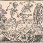
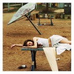
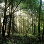
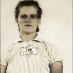
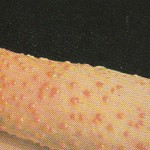
3289 days, A4, cover, funky colors, television, unatractive, film photography : fauna, flora, interesting, lines, strange, fluffy, simple, horrible, brainwork, complicated, proud, “to know” : disorder, game, grid, systematization, “One Minute Sculpture” : library, swindler, breaking news, library loser, extraordinary, talented : space, absence-presence, framework, surrounding, returning : abnormal, rediscover, choice, plain, others : 1000, 754., direction, signs, city, direction, traffic, political, posters : blue Pinocchio, screaming, spine of book, blue, Pinocchio, blue fairy, eyecandy, contemporary, folk, mentality : not getting there, unknown, judging by covers, content, connection, strangers, subject : supermarket, theft, housewife, tiny, midlife crisis, multilingual : logic, question, reason, consciousness, interest, remarks, impossible, mathematical, perspective : attraction, strange, swissfolk, art, death, life, love, Maurizio Cattelan : cover, old book, unique, obsession, miniature : Anita, eyes, portrait, dominant, name, color, film : Wiener Werkstätte, characteristic, hand work, mass fabrication, original, process, realization, detail, photography, the nude : cheap fashion, funny, random, tattoo, tribe, weird, mysterious, tribe : attraction, new texture, action, quick, warning, a priori, new, amusement, choices, eye-catching, eyes, random : escape reality, library, overflow of impulses, fruitless reality, jostling time, absorbing force, déjà-vu : arrange, industrial, library, architecture, museum, self-made, Andreas Gursky, index : city, nomadic, reality, funky, colors, interiors : contrast, fat, texture, typography, culture, nudity : conceptional, distance, no image, steps, thinking space, braille : cat, compulsive, font, chaos, subjective, illustration, objective, random, Tadao Ando : airplane, airport, choice, structure, worldmap, 756, 80’s, human, machines, unique, flying : dot, jewelry, shapes & forms, yellow, children, fun, paint, playful, all colors, blue, green, theory : extraordinary, life, normal, objects, absurd : 80’s, desire, fashion, party, techno, desire, fabrics, orgasmatic : alchemy, identical, methaphysics, mysticism, mythology, Arabic, identical, inaccurate, ladies, naked, orient, sculptures, stereotypes : Canada, Indian symbols, kitsch, raven, Indian art, Mexico, Jeff Koons, porn : attraction, gold, meeting an old lover, recognition, cheap, irresistibility, not psychology, wrong, beauty, compare, contrast, couple, same, similarity, together, two books, ugliness : connection, embroidery, hundred years, death, funerals, general terms, invisible, object, spirit, visible : color, feeling, personal story, feminism, graphic : first sight, mystery, old-fashioned, bloody, mad, rituals, revelatory, Yin : oblivion, automatic lives, bottom shelve, eat, mantra, story-making, colorful, dogs, double-take, eat sleep, vases, vegetables : attracted, nothing, black, disturbing.

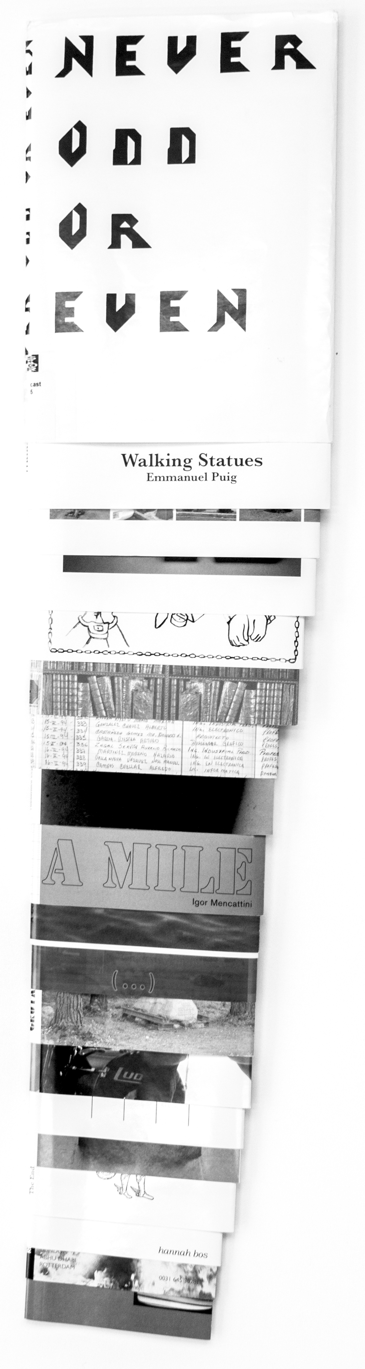
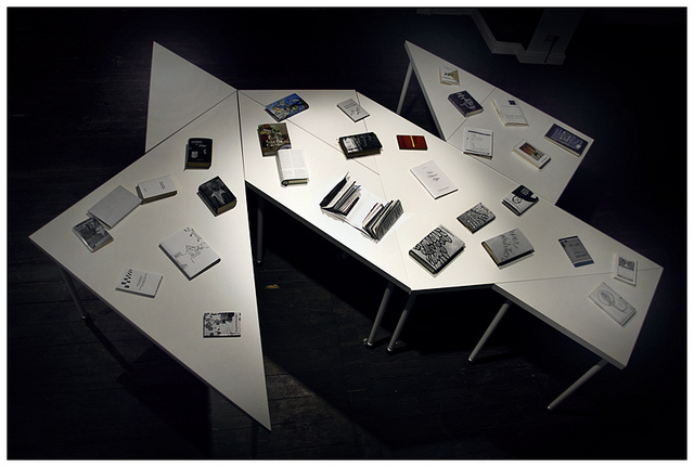
still curious read the books involved at the Gerrit Rietveld Library, (catalogue numbers are included).


Log in
subscribe