Skip to Content Skip to Search Go to Top Navigation Go to Side Menu


"fusion" Tag


Process: how to choose an apple?


Wednesday, December 2, 2015


apple


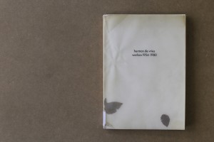
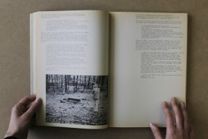
choosing a book without paying attention to the content is like picking an apple based on its skin and form. you never know if the consistence and the taste is reflected by its surface but still you choose it, thinking that the appearance echoes what you want to find inside. this intuitive and impulsive choosing process based on your assimilation faculty, knowledge and cultural education, needs to be done without concession. avoiding everything that incorporates elements which make you doubt is a way to find the precise object that fits your taste. this process can be long but it makes you swim fast through objects and, at the end, allows you to find the right fruit, in which the design and the content are reflecting each other, the materialisation of your desire. this search technique lead me to an old fashioned catalogue issued for an exhibition of herman de vries at the groninger museum in groningen, the netherlands. the book was published in 1980 by the museum itself and is entitled, like the exhibition, “herman de vries, werken 1954-1980”. the design of the book is made by “std suurling treffers designers”. they also came from gronigen and they were, at this time,  the graphic designers of the museum. alongside of working for the museum and being independent designers they were also working at the minerva art academy. nowadays the studio doesn’t exist anymore.


1 3


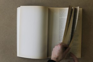
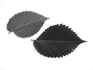
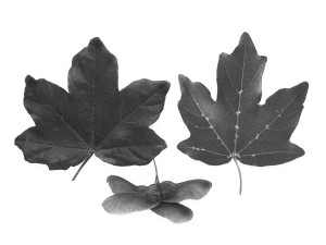
speaking about the design of the catalogue, the cover appears fragile and at the same time raw, ruff and powerful. the delicate aspect of the book comes from two different components. firstly, the paper used as a protection for the book itself is created by two layers of recycled transparent paper. the weight of times altered the colour of the paper into different shades of beige and adds an antique aesthetic to the object. secondly, in-between this two layers of tracing papers, two real leaves drift with the rhythm of the reader turning the pages. on the website of herman de vries it is said that they came from a western tree called acer campester. strangely the copy from the gerrit rietveld library contains different ones, looking like the leaves of an elm tree, which is really common in the netherlands. we will probably never know, if the artist himself puts different types or if someone lost the original ones and exchanged them. these natural elements encapsulated into the cover protection remind on the origin of paper, namely trees and leaves, and point out that these objects, made for human use, were, first off all, living matter.


Ulmus americana - American ElmAcer campestre - Hedge or Field Maple 5 4


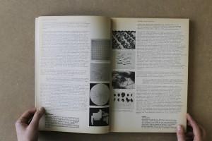
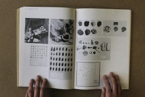
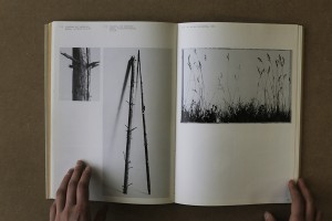
the cover reveals another radical choice: the absence of capital letters. this vacancy occurs in the whole book. most of the time, attributed to the bauhaus ideology of typography, this non-use of capitals could represent the honest approach of the artist herman de vries in his work and his aim to represent nature in it’s purest and simplest form. the first part of the the book, introduced by the director of the groninger museum, frank haks, is mostly composed of texts, essays and poetry by and about herman de vries. the designers chose to create the layout using the aesthetics of a type machine, therefore making use of the typography “courier”. looking at the work of herman de vries, this decision resonates his visual language. the paper being used is another example. it is brown, natural and rough. the second part of the book focuses on showing images of his art works. alongside to this change the paper changes as well. becoming more neutral, it gives the the work all the space needed for expressing itself.


8 10


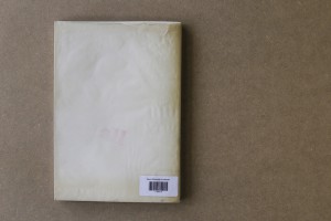
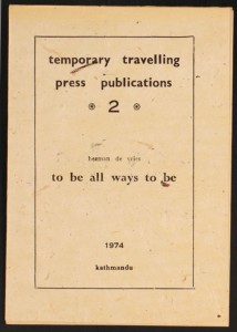
on the back cover, a curious detail pops up: a red stamp saying “all”. it is hard to understand its visual appearance for different reasons, mainly because it is the first time that we see colour. in addition, the size and the disposition are not fitting with the layout either, they are more strictly constructed. during the research about the artist i came across a video which fulfilled my curiositiy. presenting his exhibition for the biennial of venice, where he was representing the netherlands, herman de vries showed an old mantra printed on a booklet in 1974 in katmandu. the sentence “to be all ways to be” is written in big letters inside of it, the typography and the size are exactly the same as in the book.


11 1998.1.0006(1-36)02_v3


considering the design of this book, it makes a good example for a successful reflection and interaction between the graphic designers and the artist. in this case, herman de vries took part in the making process, adding some characteristics of his own work to the cover. the catalogue therefore got a handcrafted look and gives the impression to handle something rare and authentic. the aesthetic choice demonstrate the graphics designer’s respect for the artist and merge the book with the world of de vries. a bridge is created, giving the book the aura of an artwork.

Rietveld library catalog no : vri 7
 

The Landscape of Weaving Posters


Monday, March 11, 2013

Hendrikus Theodorus Wijdeveld is a well-known architect and artist. He started his independent architectural life from 1913. During that time, Wijdeveld was one of the members of  ‘Architecture et Amicitia’ which consisted of young architects. They played an important role in art, architecture and design in The Netherlands. H. Th. Wijdeveld was not only active in architecture, he was also engaged in interior design, typography and graphic design. Being inspired and influenced by architect Cuypers’s neo Gothic style, H. Th. Wijdeveld combined art-deco, typography and architecture into a publication, a stage for artists which I will introduce in following paragraph. He traveled to other countries and created an international network with other artists, therefore, the cultural movements in other countries significantly connected with his works. It made his creative life considerably various and versatile.


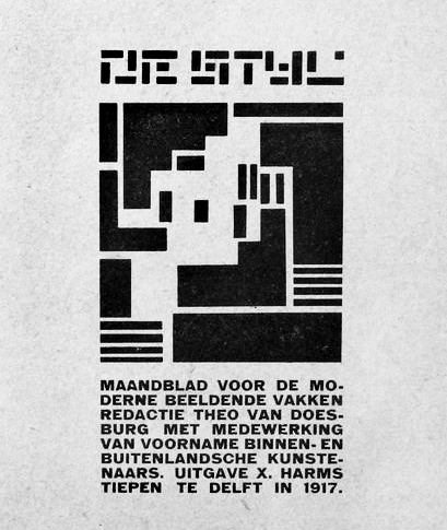
W.M. Dudok, Wendingen cover No.8, 1924 -•- De Stijl Magazine No.7, 1917

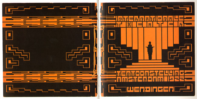
Between 1918 to 1932, this art group wanted to create a platform to discuss contemporary architecture and applied arts. They published the specific magazine named “Wendingen”. This poster is one of the covers of magazine. He combined the architecture, typography and decorative art on this cover. “Wendingen” also showed their adoration of decorative art. This magazine was an influential publication juxtaposed with the other one published by De Stijl.


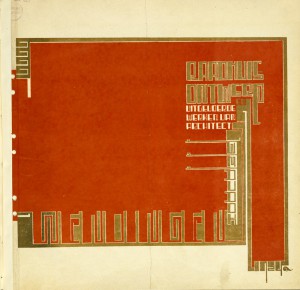
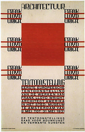
Poster for the first exhibit of works of Frank Lloyd Wright in The Stedelijk Museum Amsterdam 1931

I choose this item/poster because i was attracted by its “pattern”. It’s a little bit difficult for me to understand the information of poster. It doesn’t bother me at all. The decorative typesetting associated with architecture reminds me of textiles pattern. I would like to spend some time staring at this “painting” rather than searching information. However, i still can’t comprehend what has been shown on the poster. The combination of typography with architecture is a new language for me. It is the reason i chose this item.

What is the essential point that a poster should possess? Some posters carry only information that viewers can easily record, but viewers experience no more than the information itself. Some posters are shouting out in a visual way. They can attract people’s attention much more, even though the posters are false examples in terms of commercial strategy. The artists and poster designers have been searching for a wider range of possibilities between this objectives since poster art appeared.  This poster “Competition for the League of Nations building, 1927” achieves an interesting balance between sensitive art-deco and sans-serif capitals which are rational reading-friendly.

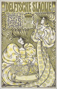
Tracing back the background of this poster, the development of poster art in the Netherlands was more independent and domestic comparing with other big cites, for example, Paris, Berlin and London. Because of the smaller scale of the society structure, the commerce posters were squeezed in the tiny shop windows on narrowly snaking streets, that viewers should catch at short distance. Jan Toorop’s lithograph below is a good example of that.


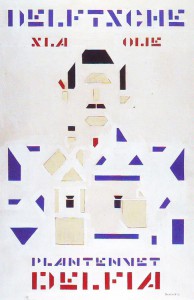
Jan Toorop /‘Delft Salad Oil’ 1893 -•- Bart van der Leck, Delfia Vegetable Oil 1919

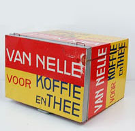
Comparing with other countries where commercial posters were flourishing and kept appearing, the advertising posters were trapped in the small scale and didn’t leave a significant impact. The artists didn’t regard the poster art as the main art form especially the commercial posters. One reason is because of the Calvinistic background. To some Dutch artists and designers, the art works connecting with ”money” were dirty and sinful. They insisted to stay uncompromising on capitalism and commerce. They opened the other battle field for discussing and made it an art of taken out every materialistic element, simple truly aesthetics. At the same time, because of the faster industrial development, mechanical techniques were created. Some artists and designers combined the simple form and mechanical repetitive words into making a stronger power more shouting. This movement did change some cultural and political posters that artists paid more attention.


Jac. Jongert /Van Nelle 1924

The debate continued when the WW1 started. The Netherlands was neutral and locked behind the front line. The debate became a place in which some artists hided as the safest position, including their works. Although they turned their face back from cruel war, WW1 left an enormous impact that no one in society and economy could escape from. One art group started to organize and wanted to bring a new realm of art to their modern world. The publication they published named “De Stijl”. They carried the part of purify spirit from the past and gave it a more mathematics functional meaning. They also connected with constructivism, creating the harmony of materialism spirit.


Wendingen, 1918

In the same time, 1917, another magazine, called “Wendingen”, was published by Architectura & Amicitia, representing a group of united architect designers and artists who took an important role in Dutch art at that time. They showed their love of Art-deco, combining architecture approach to typography. These two groups formed important movements in the society at that time. During that era, most artists and designers were trying to provide new modern approach to break the previous society pattern.

The “Wendingen-style” which drew part of the art-Deco tradition from the nineteen century seemed old fashion and alienated for public. Digging into the rule of “Wendingen style” that was built up by Hendrikus Theodorus Wijdeveld, we know it created an elaborate composition of angular type as architecture construction with some art nouveau manner called “the Amsterdam School”. Stern rectangle tittles jump out of the ornamental borders with sanserif letters in the rest of the text. Hand-drawn illustration is placed on the edge of the posters. The fusion of old aesthetic and modern innovation, rationality and sensibility, stern and poetry arranges an interesting composition on this one poster.

In my opinion, the influence from Wendingen is not just a “style”, is the open attitude about “fusion”. ‘Wendingen meaning “turns” or “change”, and Wijdeveld became the new review’s editor-in-chief and “art director”. Unlike De Stijl, publication which began almost simultaneously (one week earlier), Wendingen did not publish manifestos or polemics. Without precise manifesto or rule intervening like an army, it broadly contains various subjects, including paintings, sculpture, theater, commerce issue, cultural discussion and vice versa. It gradually became a platform for ‘young artists’. Although the “Wendingen-style” posters still have strict construction and specific gesture, the way they arranged the layout and the type combined, provided the innovative open manner which saved the “old good time” in the same time. No matter how the viewers interpret this typography, in the other way, the posters become a shout with the crunch of rectangle. It’s cultural-cross. For me, the poster shouldn’t only express rational information. It has to represent the clear gesture from artists and provide the flexible space for different interpretation from different audience. We aren’t forced to be filled with the emotion from creators.

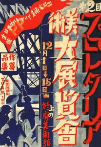
Take some Asian posters as example. This Japanese political poster (below) was born from the restless society in 30’s in Japan. They used the language in a way that we couldn’t entirely understand information. The typography becomes a pattern that shows the atmosphere itself. I can feel this shouting crossing the gap of culture.


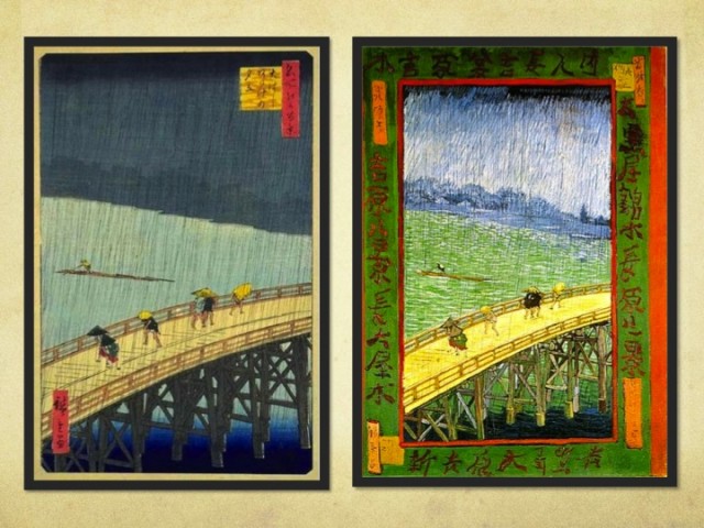
Japan Proletarian Artists Fed. 1929 -•- Hiroshige Utagawa, Shinohashi Bridge 1857

The painting above (right) is a famous landscape painting from 1857. the frame is a poem, becoming a decorative border.  Keeping us far with the frame make us more calm, as an outside observer, than left one. The poem works not just because of meaning, but because  its position.


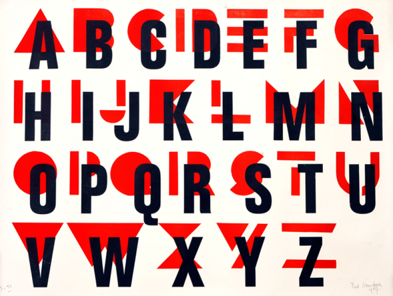
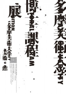
Alphabet from Paul Schuitema 1967 / Koichi Sato, Tama Art Universit 2007

another nice video of designer Paul Schuitema

Look at later eastern typographical poster and western typography above. I could see the influence from the era of Wendingen and De Stijl still has lots to do with it. The influence is not only shown in a visual way, but also in the manner. When a poster is entirely composed of words, the way they arrange the title has lots to do with the function and emotion. Words express the meaning themselves and feeling and the composition expresses feeling at the same time. It considerably provided “typing” with a chance to break the boundary. The posters above values the clear information and decorative element which give us a flexible space for interpretation. We know the event and can “feel” what they are thinking about at the same time.

In my opinion, it is also an important reason for why this poster from Hendrikus Wijdeveld becomes an annotation of Dutch poster art development and the significant step for transforming the meaning of the poster. It’s manner still influences later poster design till nowadays.


Log in
subscribe