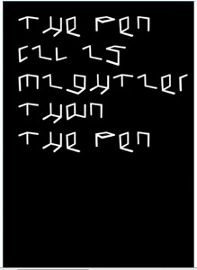
We tend to relate typography to alphabet, in fact, according to the definition of Wikipedia,
“typography is the art and technique of arranging type to make written language legible, readable, and appealing when displayed. The arrangement of type involves selecting typefaces, point sizes, line lengths, line-spacing, and letter-spacing, and adjusting the space between pairs of letters. The term typography is also applied to the style, arrangement, and appearance of the letters, numbers, and symbols created by the process.”
So typography can actually be more flexible than the letters we are used to.

Ghost(s) writer, 2013
This work is a work from Karl Nawrot, a French graphic designer who now works in Paris. He was inspired by three dimensional grids when he made Ghost(s) Writer, which is “an object dedicated to the act of sketching… It rejects the idea of a definitive form and its function is left to the user or the viewer and can be approached as a typewriter, a construction game or a sculpture.” The typographic work of Karl Nawrot expands past normative visions of what the alphabet is, into multi-dimensional visions of what it could be. Having trained as both an illustrator and a graphic designer, as well as having taught drawing at Gerrit Rieveld Academie, Nawrot is prolific in the way he combines narrative and storytelling, drawings, line, space and sculptural architectural forms with type design. The way he works with material is particularly innovative, often creating forms that resemble architectural models, which then become a basis for type. An example is a model that derived from Le Corbusier’s Domino House, where the staircase is translated into a cave-like form. Instead of looking at a lay-out, two-dimensional alphabet, static on a screen or paper, we are looking at a process, which is given much emphasis over outcome. Because for Nawrot, it is crucial he gives himself a physical narrative to work with, so that whatever the ‘final product’ is, it is linked to a fiction.
Similar to the Domino House model, Nawrot created the Breu for Marcel Breuer font by making plaster model interpretations of Breuers abandoned building, The Parador Ariston, where he saw the rooms as instead ‘nests and caves’, which forms were illustrated in the letters. This playful, almost childlike, but acutely refined, material approach to the alphabet is what makes Nawrot unprecedented in todays typographic realm.
The infinite potential of the tools and ways we use to communicate through words and letters is being pursued in a similar way by Guy Rombouts, who created the Azart programme.
Guy Rombouts’ work can be spoken about under the term of ‘visual arts’, however throughout the mid 20th century he worked as a graphic artist with an ongoing fascination for communication systems. He is principally known for his Azart alphabet, which questions the way we interact with letters by adding multiple dimensions to how we ‘read’ words and sentences. Perhaps this is what makes his sculpture work fascinating- Often Modern sculptures will be associated with ideas, feelings or explore pure materiality, yet Rombouts creates 3d forms which may appear abstract or indirect, but in fact according to Azart, directly communicate something. Also his ‘typographic’ sculptures have often been put into public spaces, for example the 9 foot and bike bridges on Java Island in Amsterdam. Just like language bridges the gap between people, Rombouts forms connect the land together. Language doesn’t just have to come from the mouth.
This new alphabet gives letters new and double meanings, related to objects and colour, which when strung together as words and then sentences, creates a loaded and complex shape of values and connotations. Like Nawrots process, Azart embeds narrative into characters, and new shape and more dimensions to letters. With this programme a user is put into a position of eradicating their memory of ‘normal’ character shapes, and take on a new vision where, like when we speak, each sounds from a letter is influenced by the one before and after it, thus the form of the word uses 3 dimensions to resemble this. We must question, is typing on an electronic document static or moveable, is it personal or objective? Just because we have fed a computer images into its memory does not mean it is fixed there. As important and useful as they are, in the age of computers, it is important to use creativity to expand and question what it means to communicate.
This leads us to discuss the work of Émilie Ferrat and François Girard-Meunier, who graduated from Graphic Design at the Rietveld academie with a collaborative ceramics project, ‘Ceramics with Émilie / Ceramics with François.’ They explored the way language can become material in an installation, in which there was a video where the two designers talked about some clay forms they had sculpted. In the videos, the idea of ‘meaning’ is broken down. They explore, in a new way, the on-going puzzling relationship between words and objects. How do they relate to each other? What do they mean? What is meaning? By translating the idea of a known object into another form and material, there are many questions to be asked, to which answers and messages can be found within the material. Hence, a form prompts a dialogue. You can find their work here https://designblog.rietveldacademie.nl/?p=47725
Suprisingly, we made a work which is closely connected to those ideas.
The work is inspired by the game kids use to play in order to learn alphabet. They have to associate a random letter with an object that begins with that letter.
Here’s an example with the letter C
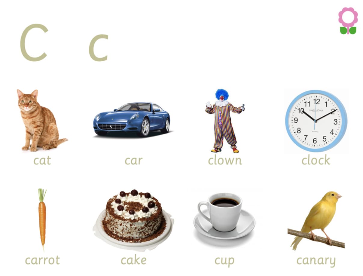
The fact that we have learnt our whole life to associate specific words to specific objects can be very limited, that’s why our work is meant to show the variety of forms and shapes and stories you can give to typography.

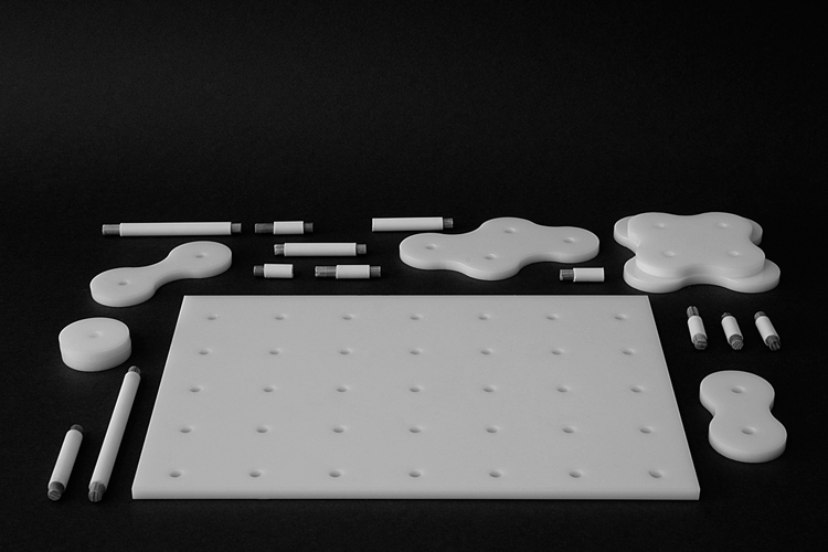
We followed the same concept as the game for kids, but instead of focusing on the words, we focused on the objects.
We made a list of random words following the letters of the alphabet, and then sculpted abstract shapes out of it.
A=apple N=nose
B=bed O=olive
C=candy P=pickle
D=diamond Q=queen
E=egg R=rainbow
F=fish S=shell
G=glasses T=tree
H=hairdryer U=umbrella
I=icecream V=violin
J=jar W=window
K=keyboard X=xylophon
L=locker Y=yellow
M=moon Z=zucchini
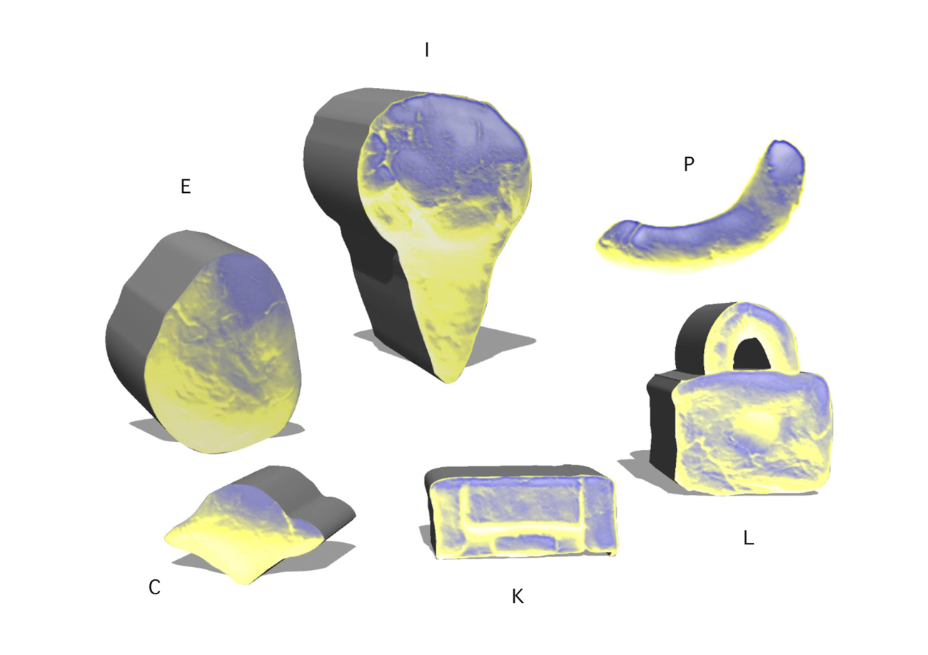
Pickle
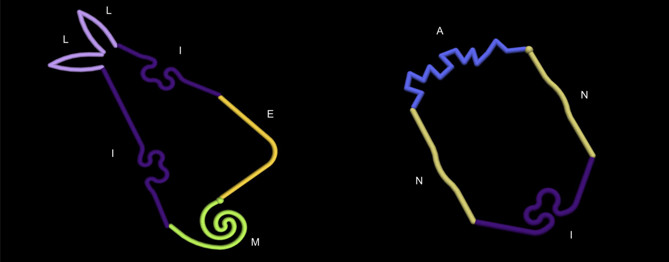
But of course you can go further with the idea and play with the words which surround us in our daily life. Here’s an example of how a character would look like with our system

With this system, you don’t visualize just one thing anymore. The first thing your brain wants you to think it is is a character, but by being more attentive you can see a whole set of signs, of objects within one object, words within one word. At the end it makes clear for us with this experience and Azart alphabet that typography can actually be seen from different perspectives. With the shapes that Guy Rombouts creates, he makes an assemblage which gives the word another way of seeing it. The shape Azart alphabet gave us with Millie’s name might look like a rabbit, and mine, well… It’s up to the viewer to decide what it can be. All those systems want us to think differently, there is still something hidden behind the shapes we see at first, there’s a meaning even if it might not be obvious. Another example of that can be calligrams, drawings made by handwriting. You can choose to relate the writing to the drawing, but it’s not a necessity. With our character, the idea was to see what else you can obtain by replacing the eyes by eggs, legs by lockers, arms by apples, etc. But maybe the clay objects could have communicate something ? As for the pickle example above. Maybe this system can be considered as a new way to communicate with your lover, while other people wouldn’t understand what you are trying to say.