Skip to Content Skip to Search Go to Top Navigation Go to Side Menu


"_ . ‘ ‘ . _/_) . ." Tag


The Endlessness of Designblog


Sunday, May 26, 2019

Exploring the endlessness of Designblog


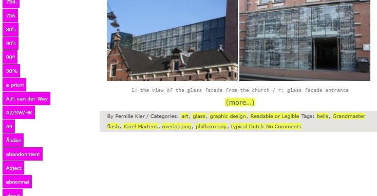
While browsing through design blog, the first thing I did was scrolling down to see how many tags there are.
The scrolling felt everlasting, at one point I thought maybe the tags will never stop. They did stop at a certain point when I realized that if there where an infinite number of tags, the Designblog would became infinite itself.
This infinity intrigued me, because I cannot and will never be able to fully understand it. The endlessness dawned on me even more when I noticed the clear edge between articles and emptiness, two different dimensions. For me these dimensions worked the same as Earth and Space.
Earth has limits and the Universe has not (as far as we humans know). The first dimension “Earth” begins at the top of the blog and seems organized, there Is a clear layout, the highlights have a limit of 10 and the articles have a limit of 25. After scrolling down these 25 articles “Space”, the other dimension, begins. This dimension is infinite and after you crossed the edge where the articles stop, the tags could go on forever…

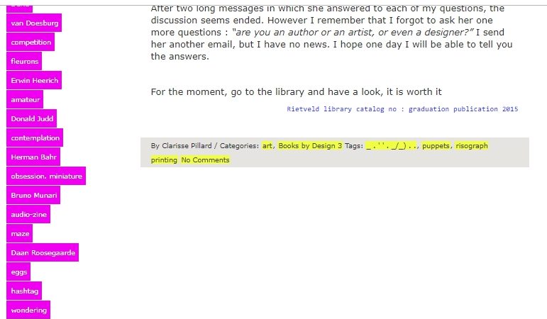
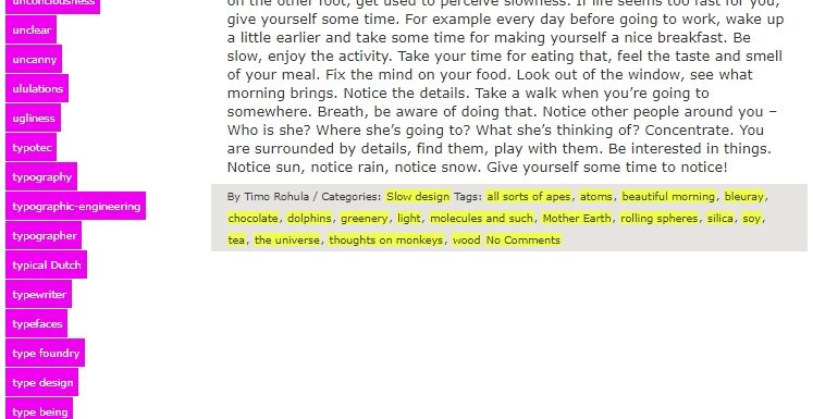
The “Space” dimension is also more chaotic because of the tag system that changes the order when the page gets refreshed. There are three outcomes, tags in order from A to Z, tags in order from Z to A and tags in a random order. Every time you go to another page or refresh the existing one, you don’t know how the tags will be ordered. Because of this I noticed a section of tags with numbers and symbols I wouldn’t have noticed otherwise. This section is separated from the alphabetized tag-list and unlike them these tags don’t seem to be arranged in a logical order. This makes them seem unimportant to me and some of the tags are not something logical you would use while searching. For example:

_ . ‘ ‘ . _/_) . .
?
.scr
”A”
???
0-dimension
0=?
21grams
45%
524
98%

The tag which made me question the most was:  _.’’._/_)..
The page this tag sends me to tells about a graduation book made by Marion Molle with has these symbols as a title. She told the writer of the article that while making the book she felt obliged to add text but she didn’t want to, so instead she used the symbols as title.

The core of the endlessness of this blog is for me the edge where the articles stop, and the tags continue infinitely. The tag  _.’’._/_).. became my starting point of visualizing this.


I scrolled down to the “edge” of the articles and noted the tag that comes after the grey block. Then I clicked on this tag and continued this way of collecting tags a couple of times.


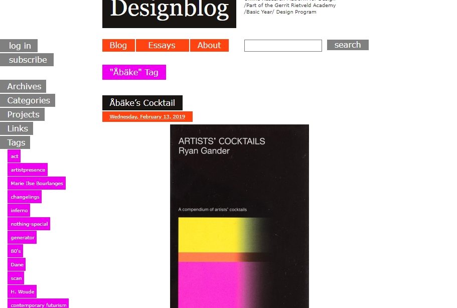
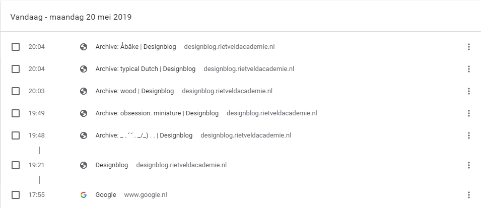
When I reached the tag Åbäke I stopped and checked my browse-history list.


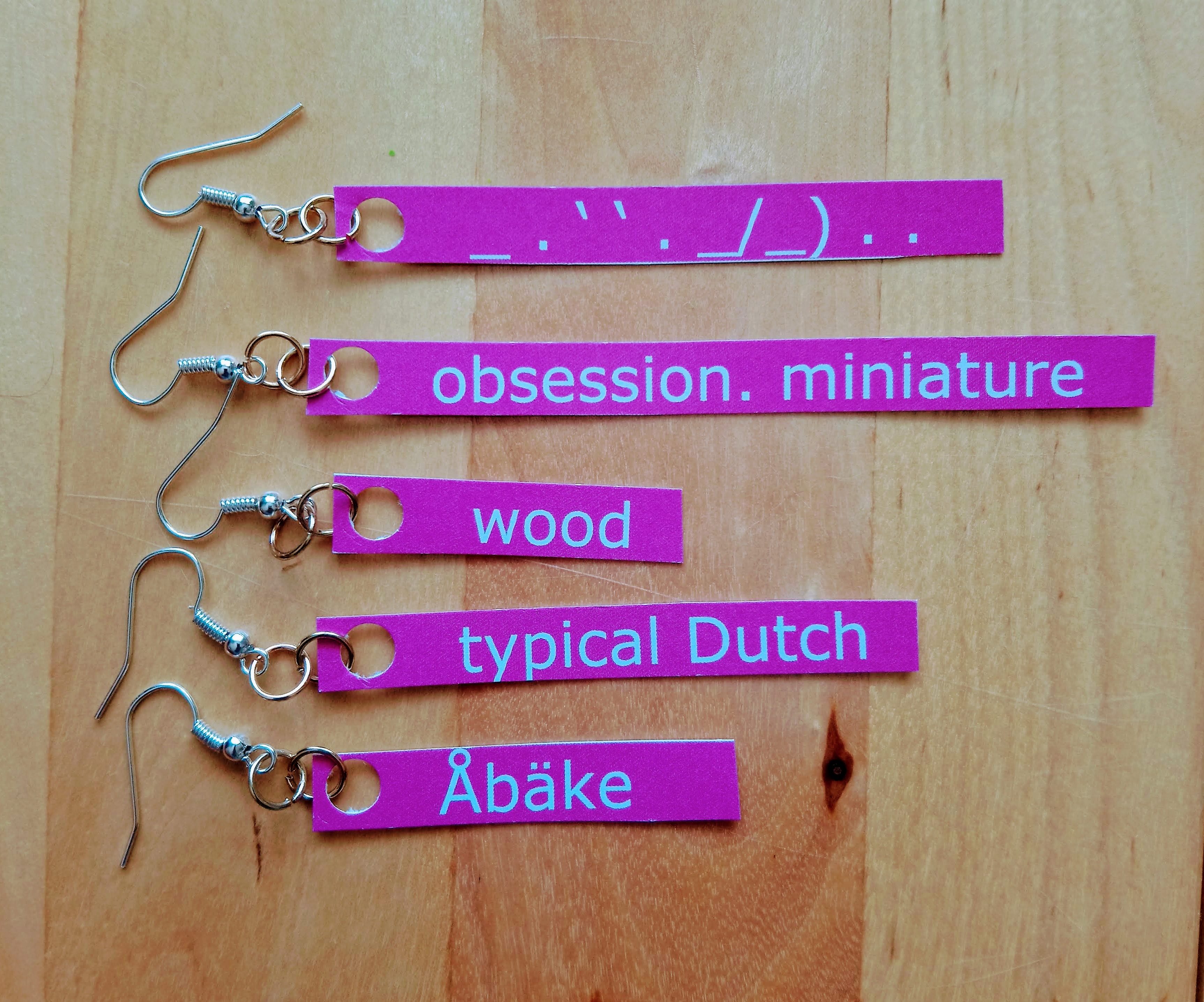
This ‘Åbake’ tag is the first word in the alphabetical list and felt like a good closure. The words I collected were in the following order:

_ . ‘ ‘ . _/_) . .

obsession. miniature

wood

typical Dutch

Åbäke

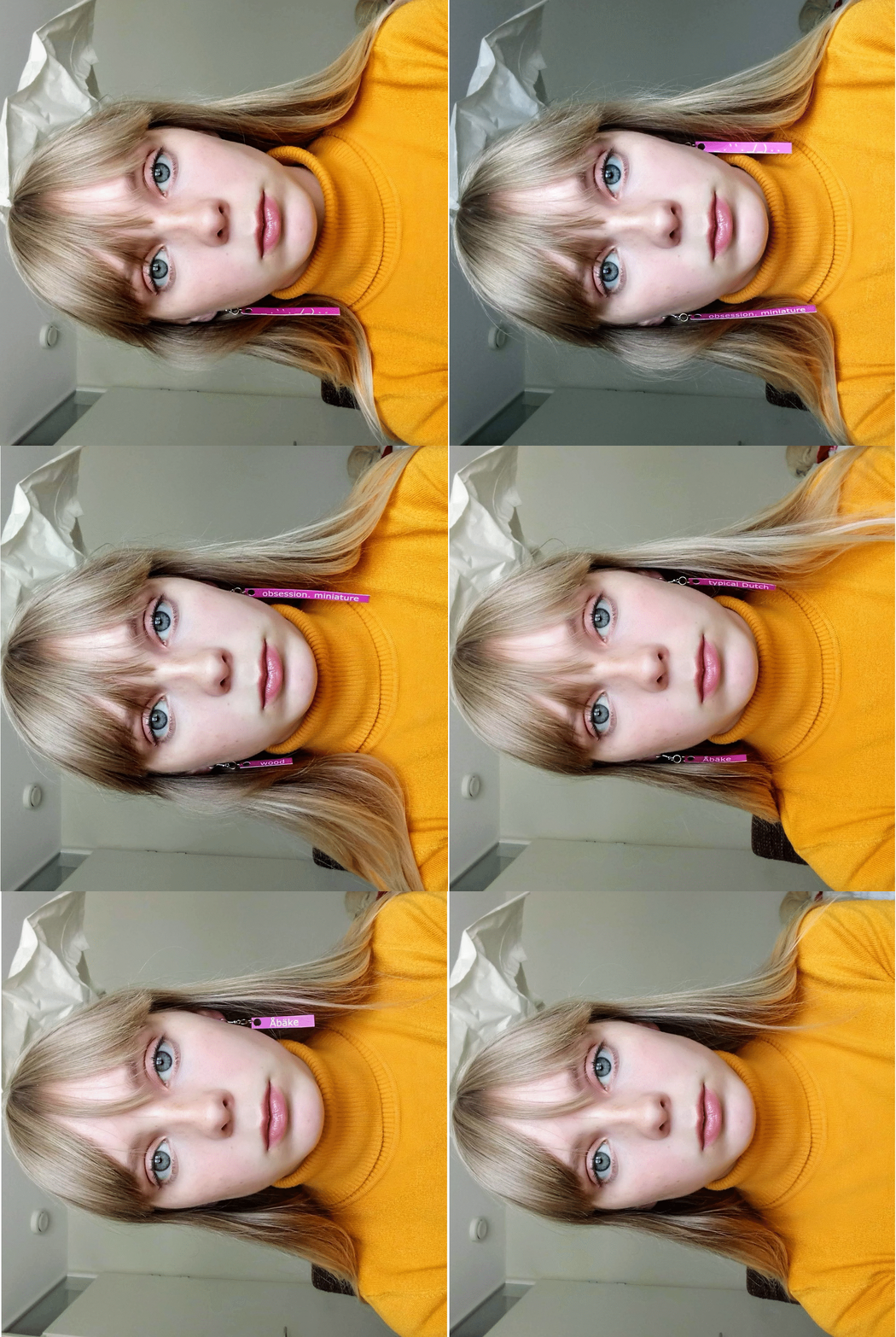
Because these tags only exist in the virtual world, i wanted to bring them into the real world by materializing them. I wanted to approach this with a personal view, so I chose to look at it from a Jewellery Department perspective because i would like to go there next year. I made earrings with the tag words in the same colour and typeface as Designblog. To show my path trough the tags and pages, I made a .gif of the tag word earrings going through my ears in the same order as my browse history. Like clicking on one tag and going to another, not knowing which tag comes next. The tag words I ended up with are not something I would normally click on, this made me see pages I otherwise would have never seen. Because of this research I now know that Åbäke is a London-based collective of four graphic designers.


It doesn’t make sense to end a post about endlessness right?
So this is not the end!
Try it yourself, click on Read the rest of this entry »  scroll down to the edge where the ‘space’ dimension starts, click on any tag you find there and see where it brings you.
_________________________________________________________________
(more…)
Marion Molle’s irresistible graduation book


Thursday, November 12, 2015

Saying if you like a book or not, is easy.
I am not talking about the content of a book, but the object itself.
When you hold it in your hands, you can feel it. Do you want to open it? Do you want to browse through it? Do you like the texture? Do you feel comfortable? Or do you simply like to hold it?
Most of the time you don’t need to ask yourself these questions.

I was in the library, only one book really appealed to me in this way.

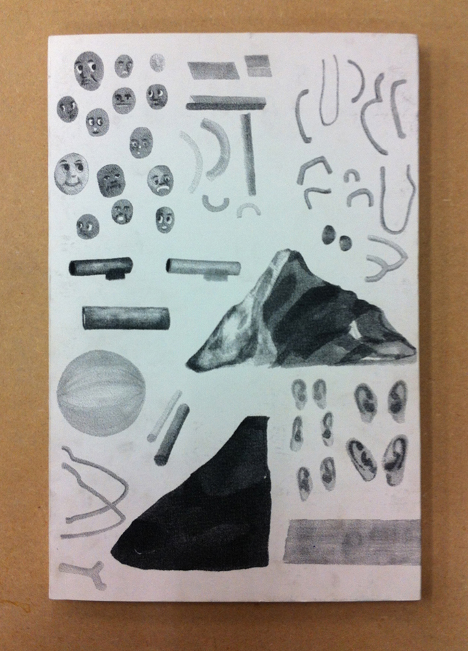
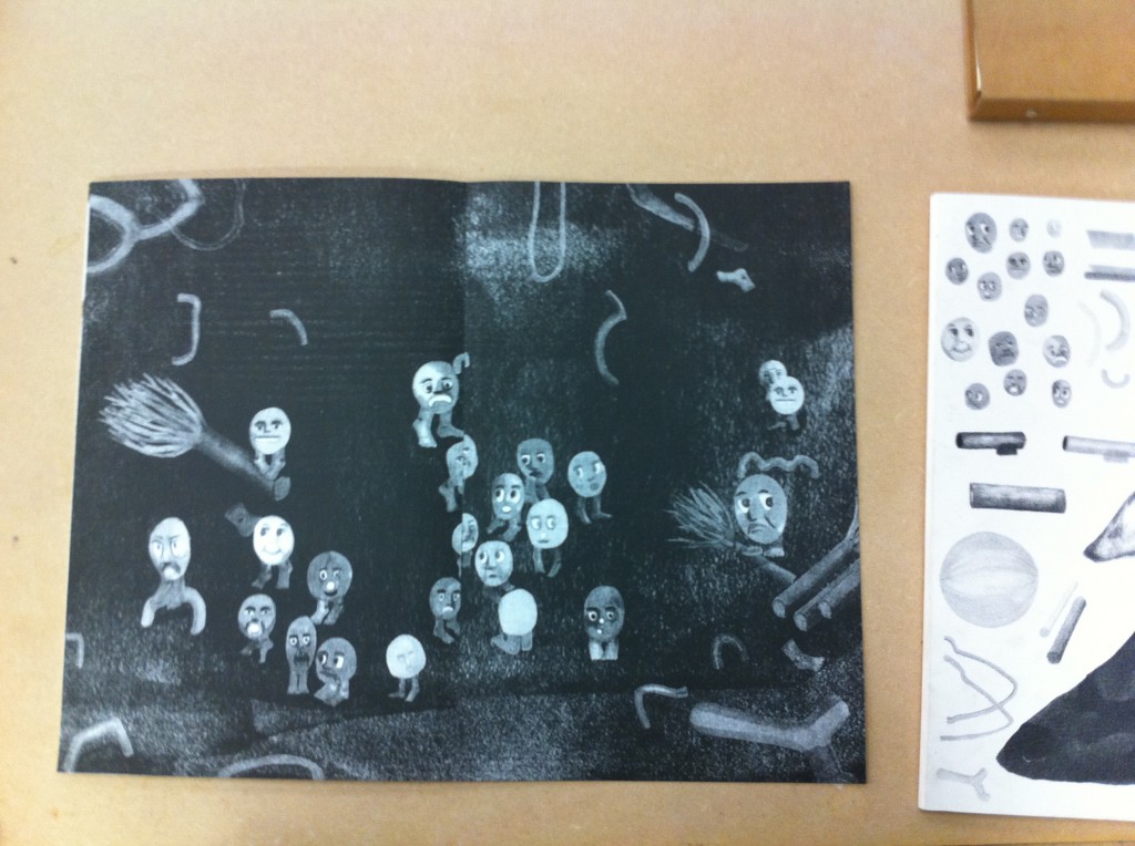
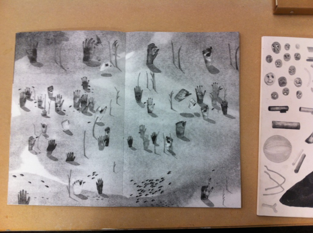
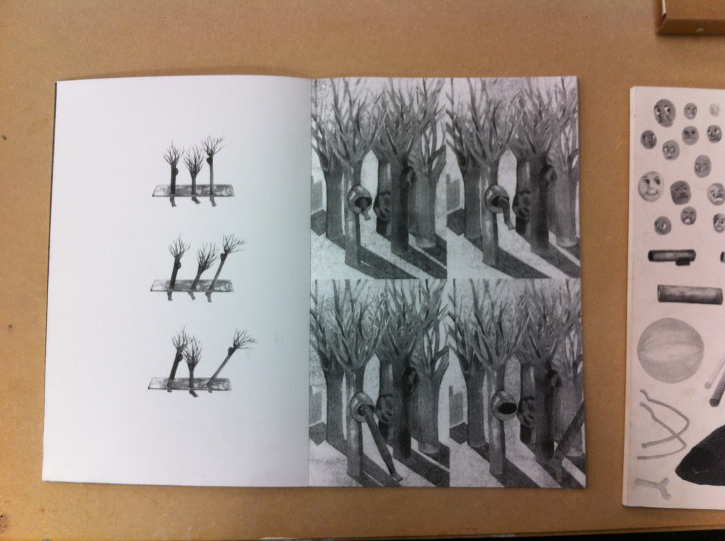
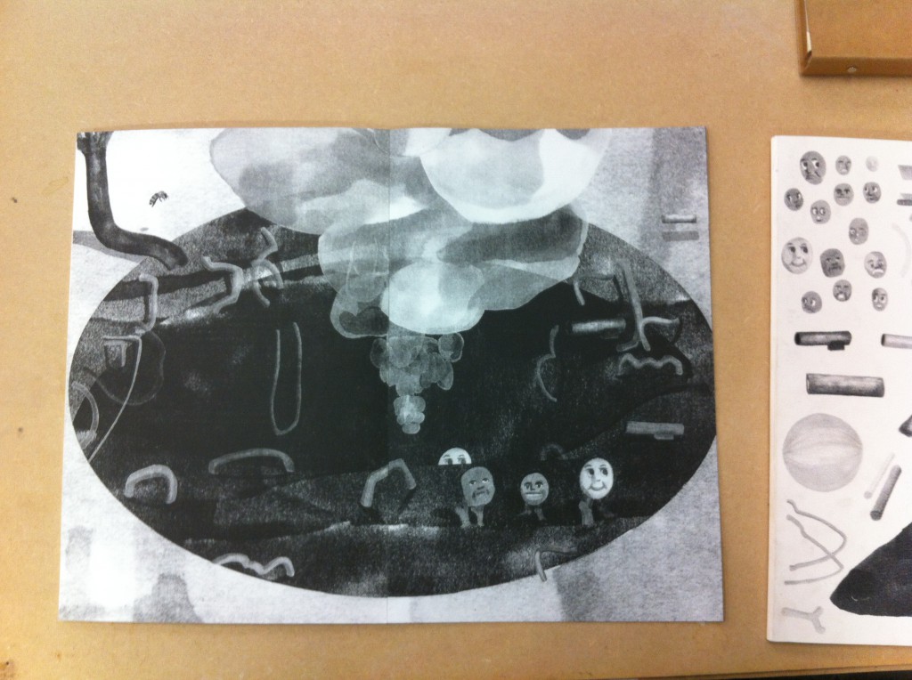
Imagine a big book, not thick; fine, approximately the size of A3. You can’t open it directly. You need to remove its white cardboard sleeve, printed with small drawings. Now touch the pages. They are made of a strong, mat and smooth paper. The binding is glued, and almost invisible. All your attention is directed to the black and white drawings. Moreover, you can see some gap between the pages. I like those imperfections, and its mysterious aspect. No text, no title. Only a story about hands, bees, mountains and animated trees going through 34 pages, full-bleed risograph printed. By the way, should we consider the front and back covers as pages of this book? I have no idea. I should just ask it to the author.
Author or artist?
After a long moment I found a discrete hand-written name in the left bottom of the back cover : Marion Molle. Marion told me she graduated from the VAV department last year 2015.
I should send her an email, after which i will tell you more.


IMG_cover_950


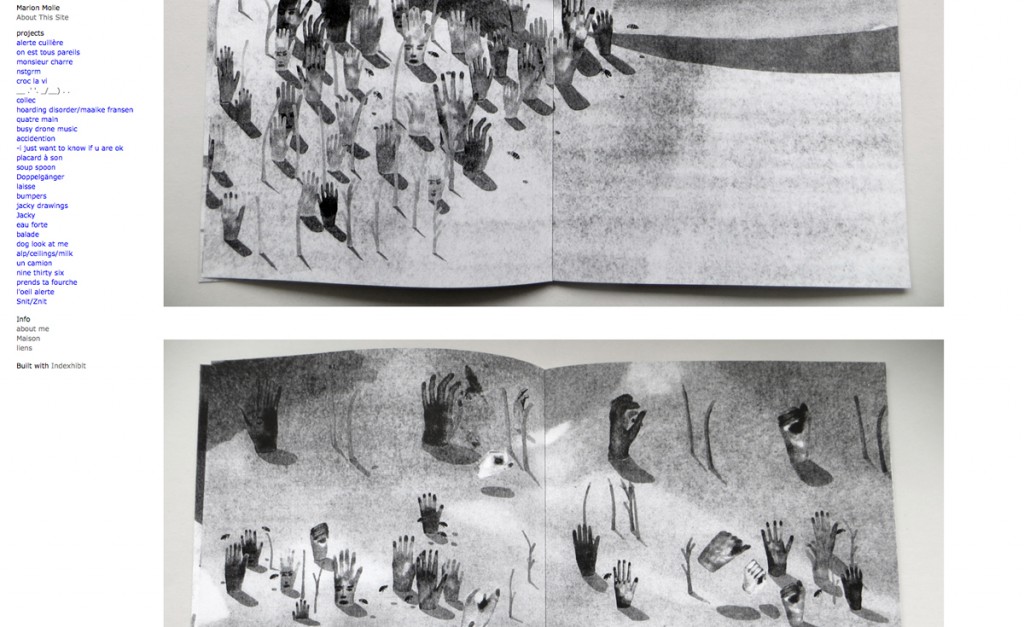
Before sending an email, I need her address. I search on google Marion Molle. the first link is her website, you should go and have a look :

ScreenWebsite_MarionMolle_1200

I thought maybe I will find some information about her project. After I scrolling over all her projects, I finally find her book. There is no caption, only photos. I look at the section info, and get her address. Email sent. I asked for further information about her work, with a catchy sentence « tell me more ».
2 days after, she told me a lot more.

Capture d’écran 2015-11-30 à 00.52.34

Her principe is quite unconventional and not that easy, but I will try to explain it to you as accurately as possible. To start with, here is the recipe she used to make this nice book you cannot resist opening when you are at the library.

At the really first beginning, she drew some separate elements with an alcohol-based ink marker on a white background. Then she scanned and associated them to make new compositions. She has some ideas about how they could interact, but she didn’t need to think about it before working on photoshop, which gave her new possibilities. Afterward, she printed the images and draw over again, to add shadows for instance. This way, she compares her small first drawings as ‘puppets’ that she combined to discover unexpected associations. To end up, she scanned them a second and last time, and print the news images with the risograph, which flattens the images and gives the sensation of an unique layer. In this printed technique, you can only work with one color layer at the time, and furthermore, the result is constituted of huge ammont of minuscule dots. That is one of the reason she chose risograph :
she was now able to give a new texture and appearance to her drawings (among other reasons of course, as the price, risograph printing is way more cheaper than laser printing method).

IMG_5217

IMG_5208

This way, her complete work has been guided by the technique of the risograph printing. For instance she wanted to have the biggest book as possible, but the risograph allows to print on a A3 maximum. This fact explain also the binding, as she couldn’t print two pages on a same format.

IMG_5213

IMG_5216

Moreover, she didn’t want to give up with those independent elements. She first thought about making another book. But she made up her mind and used them for the cover of the book. So that when you grab it, you have this collection of images appearing as a foretaste of the unknown story hidden inside, ‘enveloping the book with its ingredients’, (as you can see on the very first picture).

By the way, remember, this mysterious aspect comes from the fact the book doesn’t have a title. Actually, it has a title, but not a textual one.

__ .’ ‘. _/__) . .

This is the title. You may ask why, me too. In fact, she found weird to feel obliged to add some text to a book. Therefore this following of punctuation marks was the solution to her problem. But in case she needs to give it a title, she calls it ‘bee book’.

After that, I asked her some question about the meaning of the story. Her really first intention was to conceive a book for children about bees. The insects would have made absurdist ‘tasks’ in a world organized in a way as our human society but with a complete different logic. She would refer to this human aspect, using human body parts’ shapes (that what may explain the hands and the faces). But finally, she tried to make the narrative interpretation of the story, as free as possible, trying to activate the reader’s imagination. This way, she considers the end of the book likewise the beginning of the story.

After two long messages in which she answered to each of my questions, the discussion seems ended. However I remember that I forgot to ask her one more questions : “are you an author or an artist, or even a designer?” I send her another email, but I have no news. I hope one day I will be able to tell you the answers.


For the moment, go to the library and have a look, it is worth it

Rietveld library catalog no : graduation publication 2015


Log in
subscribe