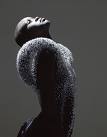
The work of Dutch artists can often be easily recognized among works of other artist. Dutch labels like Droog Design, Victor&Rolf, Orson+Bodil from Alexander van Slobbe, Inez van Lamswerde and also Wendelien Daan have this “Dutch signature.” According to different sources; photographers, magazines and models, the cause of this difference is the way Dutch artist work. Wendelien Daan fits in this thought about a “Dutch signature”. Her pictures of high fashion for big international magazines consist a lot of darkness, are high in contrast and minimalist. She lights her images as natural as possible. But what is this “Dutch signature” exactly? And how come most of us in the Netherlands seem to work this way? Is it something we’ve learned at school, are we raised this way or is it part of our folklore? We definitely have a different way of working than American artists. We have less taboos. However, the biggest international platform for artist is America. Why?