Skip to Content Skip to Search Go to Top Navigation Go to Side Menu


"material research" Category


Fulvio Bianconi Pezzato Vase


Saturday, October 27, 2018

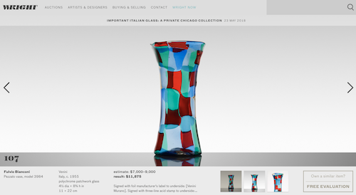
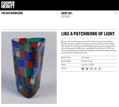
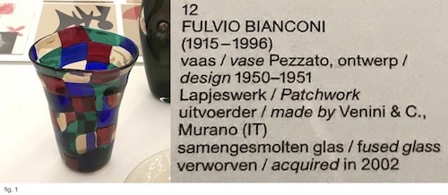
The starting point of my research was Fulvio Bianconi’s Pezzato Vase. The Vase that displayed in the Stedelijk Base (fig. 1) was designed in 1950-1951 and acquired by the Museum in 2002 from the artist Tomas Rajlich. The Pezzati series [Pezza (it.) – patch] was designed between 1950-1954 and produced by Venini & C., a Murano glass manufacturer.

Pezzato Vase at Stedelijk Base


I started my research by looking up books about Bianconi in “WorldCat”, an Internet-based books catalog that contains combined data from thousands of libraries around the world. Most of the relevant books about the artist that I could trace in Amsterdam were either in the Stedelijk Library or the OBA (Amsterdam public library). Besides, I searched in the Stedelijk library internet database, and with the help of its librarian, I could find a few more catalogs and books that did not come up in WorldCat. I also checked in the Rietveld library search engine, but unfortunately, no result came up. Most of these searches brought up relatively focused information about Bianconi and Venini & C.

Later I started to search about Bianconi by going through the glass and crystal books collections, both at the OBA and at the Rietveld Library. Those searches brought up less specific types of books, either about design in general or glassworks.

The physical materials I found can be divided into several categories:

Exhibition Brochures

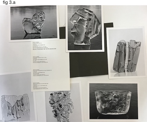
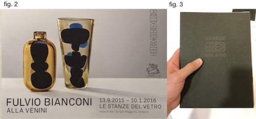
The Stedelijk library has two original Bianconi’s exhibition brochure: one from 2015 at Le Stanze del Vetro (fig.2), and the other from 1975 at Gallery Danese in Milano (fig. 3). The Danese’s brochure is the oldest physical material about Bianconi I could find in Amsterdam. It’s an envelope that contains six large postcards of the artist work and innovation to the opening in September 1975 (fig.3.a).

Exhibitions Br.

2a

Venini

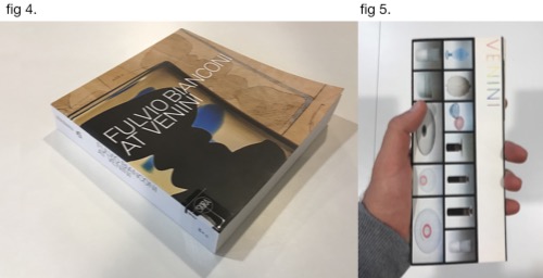
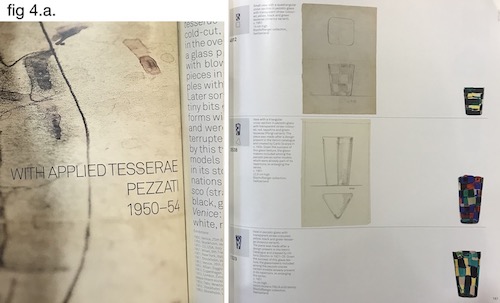
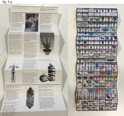
The book (fig. 4) and the Brochure (fig 5.) are both directly related to Bianconi’s work at Venini. The book consists of information about Bianconi’s life, but its central part presents Bianconi’s designs throughout several decades. The designs are divided by series of production (one of them , for example, is the “Pezzati”), and the objects displayed next to their drafts and numbered as in a catalog (fig. 4.a.). The Venini Brochure function both provide information about the company and service as a poster (fig. 5.a). Although it doesn’t revolve around Bianconi’s body of work, some of his designs can be identified on the poster (such as the Fazzoletto series).

3

3a

3b

Private Collectors

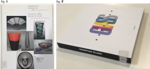
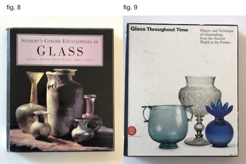
I also found information about Bianconi’s designs at private collectors book. The first one is Losch collection (fig. 6), a private collection that focuses on Italian and Finish Glass. The other book presents Nancy Olnick and Giorgio Spanu Venetian glass collection. Both books are not exclusively focused on Bianconi’s works and display an assortment of his designs alongside the designs of his Italian colleagues at Venini.

4

Glass

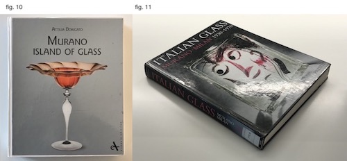
After going through all the books found with the help of the Libraries’ database, I checked if I could find information about Bianconi in books about glass in general. I searched in the OBA collection about Glass and Krystal, that are categorized on shelf number 775.6. Three of the books (fig. 8, 9 & 10) consists of very little data about Bianconi, while one of the consists a more in-depth look into his body of work (fig. 11).

5

6

Searching online brought up other results. Searching “Fulvio Bianconi” in Google provided around 90,000 results, and adding the word “Pezzato” narrowed the results to 12,500. The internet-based results concern mainly commercial aspects regarding the designer works and present rather little data about his life and body of work.

Many websites either sell Bianconi’s designs or providing data about future auctions and previous auctions results. The site varies from e-bay to Sotheby’s and online auction houses.

7


Other websites, more “institutional” ones, deliver basic information about the designer works and his life. First, the designer’s official site contains his biography and a small picture gallery of his glass and graphic works. In Venini & C., official website this information can also be found. Modern art and design museums such as the MoMA, Stedelijk Museum, Museum Boijmans, the Cooper Hewitt and the Metropolitan provide limited information about the designer works in each of the institutions own design collection.

8

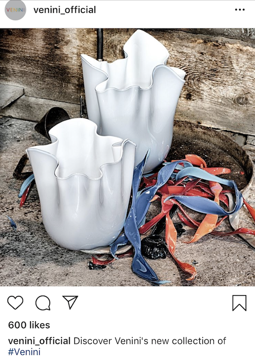
Limited data about the designer can also be found in social media. The designers have around 900 pictures that contain his name tag on Instagram. In addition, in Venini official instagram account some go his designs can be traced. The designer has a facebook fan page that is currently not active.

9

Compared to the information found in books, the one found online is not as thick and much more general. In books, we can see extensive data relating to historical contexts, manufacturing processes, and the designer’s biography and full body of work. The information that can be found online Is mainly revolving around the commercial aspects of the designer’s works, focusing on his popular and “more profitable” production series.
a plastic world


Sunday, February 18, 2018

When you look around in the modern world, the plastic materials by which it is formed are inevitable to the eye.
From everyday objects like the interior of households and infrastructural facilities to the sex industry and medical surgery, synthetics have become a big part of humans and the human/animal world.
But how did this came to be and what will the future be of this plastic world with its benefits and downsides.


alexander farkefarkesine

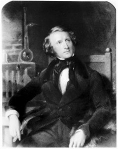
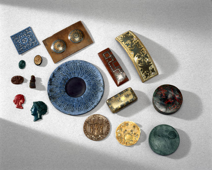
(left- Alexander Parkes, right- Parkesine objects ) 


Before plastic became fully synthetic in the way we know it nowadays, cellulose found in plants was the base material for the discovery of modern plastics.
This discovery was made in 1862 by Alexander Parkes who invented the material he named “Parkesine“.
Parkesine was made from in alcohol dissolved nitrocellulose mixed with oil or camphor wax which created a transparent, moldable material which maintained shape after cooling down.
Therefore it was used to make things like combs, stamps, and buttons.
The American brothers Hyatt picked-up this idea and created a variation of this Parkesine in 1869 they named celluloid by pulverizing camphor an nitrocellulose separately, adding pigments to the nitrocellulose, after mixing it was pressurized to remove water and then molded with extreme heat.
It was used as a replacement for ivory, specifically ivory billiard balls.
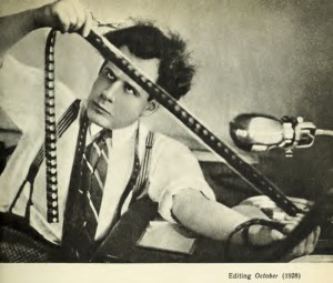
Celluloid became a great success and eventually made it possible for the film industry to be born.


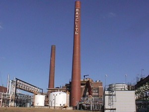
celluloid film   bakelite factory

(left-celluloid film, right-bakelite factory)


These two inventions can be seen as the ancestors of the modern plastic society, nevertheless, it only came to be because of the first fully synthetic plastic, meaning no molecules that can be found in nature are used.
This first fully synthetic plastic was called Bakelite.
Invented in 1907 in the USA by Leo Baekeland in the search for a synthetic insulator, he found a way to control the condensation reaction of a phenol-formaldehyde mixture and stop this reaction while remaining liquid.
This could be formed into different stages with stage A, the first stage, directly making it into usable plastic.
Stage B, making it into a solid state with the possibility to make it into powder and soften it with heat.
Stage C is where stage A or B are being heated under pressure and the result of this is what he called Bakelite.
Bakelite appeared to be a perfectly suited material for the purpose of insulation as it was heat resistant and could be manufactured in mass-production as it could be molded quickly.

This last fact and the fact that it was fully synthetic opened the doors to a world of mass-produced synthetics, the plastic world we live in.
Soon new materials followed this creation with the invention of polystyrene in 1929 (used for electronics like refrigerators, microwaves and tv, medical equipment and packaging), polyester in 1930 (used for clothing), polyvinylchloride (PVC) (used for pipes, electrical insulation and clothing) and nylon in 1935 (mostly used for clothing and parachutes).


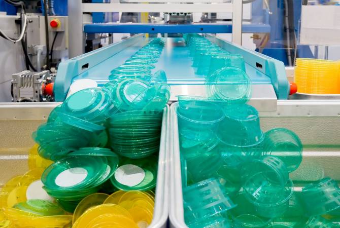
parachutes-255791 platsic fabriek

(left-nylon parachute, right-plastic mass-production)
During the 30’s of the 20th century, these synthetic products were seen as extremely glamorous and beautiful but still, all these materials did not completely infiltrate society during that time.
While used for a lot of military equipment during the second world war, synthetic products really became part of everyday life after the end of the war when the manufacturers of plastic products had to find a way to stay in the business and therefore aim at people and everyday life. Because of the low price, moldability and the way it could be mass-produced, it is not more than logical that plastic became such a big leading part of the capitalist consumer society.

Gueules cassees, Soldiers with severe facial injuries, First World War (photo)  brazil85

 (left- WW1 plastic surgery, right-plastic surgery movie brazil1985 )


Like the plastics, humans are moldable as well, changing along with new inventions. During the same period as the development of synthetics, doctors were forced to find a way to repair the extreme damage done to soldiers during the first world war.
Never before had there been so many heavily wounded soldiers whom all needed treatment for their facial wounds, burns and lost limbs and with the development of anesthetics, surgeons could develop new techniques without the patients experience pain during this operation.
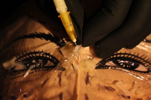
Yet the use of plastic surgery for the beauty industry really kicked off in the 1950’s when the first breast implants were used to enlarge the female breasts.
This was done by injecting it with the liquid, synthetic plastic called silicone and in the 60’s by implanting a bag-like version.
In the 70’s liposuction (removing fat) was developed and not long after that botox was tested on humans for the first time.
Botox temporarily relaxes and smoothes wrinkles by blocking signals from the nerve to the muscles, this gives the user a smooth, young and Barbie-like face.
With this slow infiltration of plastics into the human body, the birth of the plastic human became a fact.
Largely stimulated and promoted by the cosmetic glamour industry.


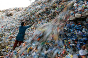
platsic waste plastic ocean

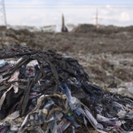
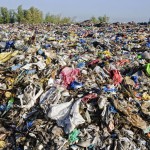
(left- plastic waste mountain, right- plastic ocean)

Due to this rise of plasticity, synthetics slowly took over the world.
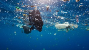
The waste created by the plastic consumer society has already created big islands in the ocean intervening with the animal and human world, fish-eating tiny plastic particles, humans eating fish.
Entering our body through food and cosmetic products, plastics are now even detectable in our blood influencing our hormones.
Humans becoming deformed from natural appearance due to cosmetic surgery in their striving for perfection, plastics infiltrating our body and system and the extreme use of plastic products in modern life could in my opinion only lead to the beginning of a more extreme, new plastic human being disbanded from its nature.

floris Voor

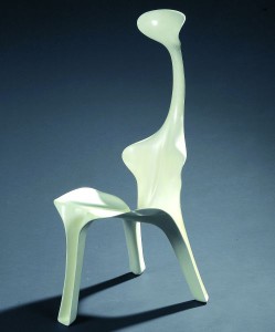
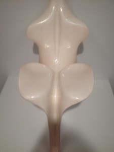
(left/right- Floris chair)

To me the in 1968 made Floris chair by Günter Beltzig, which was the starting point for this research, is the perfect example of what has happened and may come.
This chair is made out of fiber reinforced plastic and molded into an alienated human shape which could only have happened because of all the developments and inventions mentioned in the first paragraphs of this research.
The shape of the chair gives the impression that it is a plasticized human being or at least that it is made for such a human, as it seems to be made for a specific kind of person.
Like with the shoe of Cinderella, it should fit perfectly to be a match and not to lose all its comfort.
Is it not possible that it is the plastic ‘perfect’ human of the future who will fit perfectly in this piece of furniture, alienated from his natural self in its plastic world.


plastic man  perfect human


WEARABLE TECHNOLOGY


Sunday, December 10, 2017


WEARABLE TECHNOLOGY

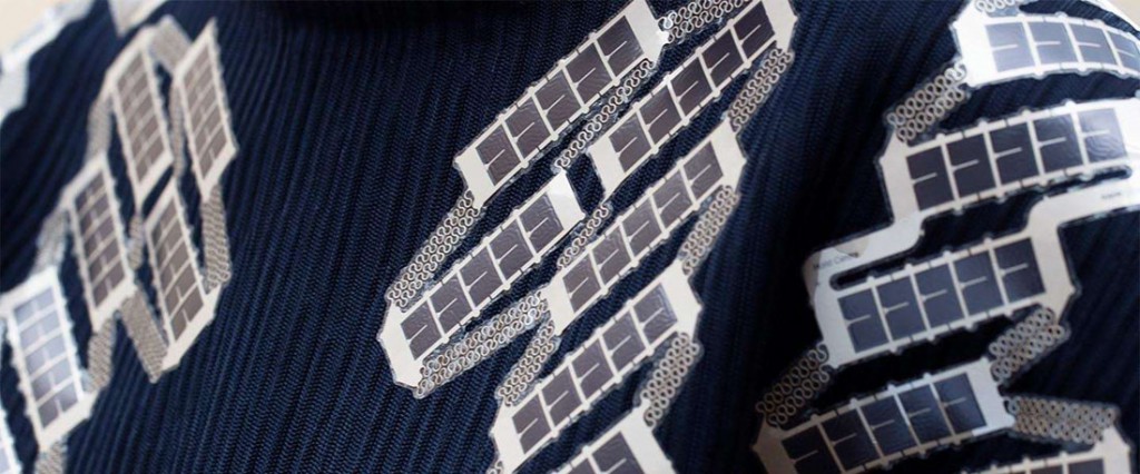
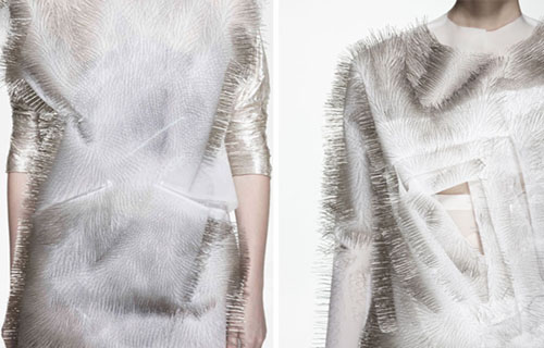
Our clothes are probably some of the most tactile and flexible objects surrounding us – touching our bodies at all times. This is probably also why it has been such a hard job for designers and researchers to combine it with the stiff mechanics of technology. The term used when these fields are combined is Wearable Technology. Something that fashion designer Pauline van Dongen has been known internationally for exploring. But while Pauline van Dongens works primarily exist in the span of the human body interacting with its physical surroundings, I find it more interesting to research how technology can elevate our identity through clothing.


solar-shirt


We use technology to perform our identities online.

We use fashion to perform our identities through garments.

Why not try to physically combine technology with clothes as a way of enhancing how we showcase our individuality and uniqueness.


For wearable technologies to become truly integrated with fashion we have to bridge the divide between aesthetics and how we understand technology’s usefulness.” – Pauline van Dongen


FASHIONABLE TECHNOLOGY

It is obvious that clothes functions as a protective extension of the skin, but it is just as important that they help us form our individual identities. Our identities are ‘wearable’ and changeable through fashion, and have been so for a long time now. The new aspect of adding technology to this equation will hopefully be able to offer alternative and new ways of transforming our identities.

At the moment, there is already a lot of researching going on and a lot of solutions being proposed as to how wearable technology can change our current view of fashion. This research does not only include experiments like Pauline van Dongen’s, regarding the practical usefulness of technology in fashion, but can also have a more conceptual or aesthetic focus point. These projects become interesting since this is where a lot of the ‘identity-making’ in fashion occurs.

Ying Gao is another fashion designer dealing with the concept of technology intertwining with her designs. But in comparison to Pauline van Dongen she uses technology primarily for conceptual and aesthetic reasons. However, this still interacts between the human body and its surroundings, but does not allow the wearer itself to manipulate his/her clothing. Something I think that would be a logical next step with wearable technology.


ying-gaos-kinetic-garments-move-with-sound-designboom-07


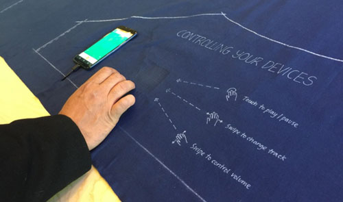
Other research exemplifies how this self-initiated interaction might become possible. Dr. Sabine Seymour, who is the director of the Fashionable Technology Lab at Parsons The New School for Design in New York, has even written a book with this exact title, Fashionable Technology, that researches the intersection of design, fashion, science and technology. On top of that, several companies are working on inventions involving textile – such as touch-screen fabric. I find this study interesting because it is the steppingstone for making fashion truly customizable at any time. And not only by the external domain of a phone or computer, but by actual interaction with the textiles you put on your body. This idea of technology leading to a more tactile and touchable communication with your clothes – instead of it being dematerialized in a device – also takes technology in a totally new direction.


Google+Levi+Strauss+Touchscreen+Clothing+Display+Alliance+Blog


INDIVIDUAL TECHNOLOGY

Of course there is plenty of ways to approach linking the gap between aesthetics and the functionality of technology. Personally, I am curious about a solution where that link would manifest new ways of projecting my personal identity. Combining the idea of a, supposedly soon-to-be, future where textiles can act as touch-screens, I have tried to conceptualize how technology can have an effect on fashion and its personal value.


Get the Flash Player to see this content.


There is no doubt that technological innovations will have a deep impact on the meaning and communication of fashion and thereby identity.

[…] we have now entered an age in which technology is not only a bodily extension, but also a physical improvement, enhancement and expression.”

Throughout your life your identity is constantly changing, so it seems only logical to design new types of clothing that can follow your personal development. As my video suggests, this would be possible if clothing became truly obedient to your personal wishes and could be customized with your own hands. You could then at any given moment change the appearance of your clothing – and your identity. A more analogue example of this is the Color-In Dress, made as a cooperation between Berber Soepboer (fashion designer) and Michiel Schuurman (graphic designer). Although my experiment is limited to colors and patterns, you could imagine that even shape or texture could be transformable too, with the rate technology is developing.

Indeed, this way of customizing your style is already possible, but at the expense of a fast, unsustainable and trend-driven industry. If my (suggestive) model of wearable technology [x] is realized, I believe that this would establish an intimate dialogue between body, mind and fabric – making fashion more valuable to the wearer. It is the relationship you have with your clothes and how it mirrors your personality and emotions, I find interesting to develop further with technology.

Pauline van Dongen’s vision is based on the belief that technology can add new value and meaning to fashion. She does this while focusing on the human body and an interactive relation to its surroundings. I believe, that it is just as important how wearable technology can add an interactive level to our projection of ourselves, and change our relationship with fashion on a very personal level.


A waste of fashion


Thursday, November 30, 2017

It was probably about a year ago that I passed by my friend while she was making a rug out of old clothes, when I asked her why, she explained to me that there is an overabundance of textiles in the world. She told me about how this is actually starting to become a problem, so she was trying to find a new purpose for left over textiles or old clothes. (Re-purposing textiles is an old technique but maybe growing into necessity.) The overabundance of textiles was an issue that never really occurred to me before but immediately caught my attention because it’s so obvious if you think about it. 

The attitude that people have towards clothing has changed, fashion trends move quick, every year there are new collections from every brand, stores are filled monthly, or even weekly and we all buy into it. The average person buys 60% more garments that last half a year compared to fifteen years ago. The way of production has changed as well, the materials are cheaper and made not to last very long. Next to that the production has inflated massively, according to Greenpeace the production has doubled from the year 2000 to 2014 and the number of garments exceeded 100 billion by 2014. A lot of clothes that are being made don’t even make it to the shops, they were made to have enough in stock even though the shops are often overstocked already. The clothes that don’t sell fast go into sale, but 4,2% stays behind after the sale. That doesn’t sound like much but we’re talking about 21,5 million new pieces of clothing, from which 12,3 million pieces get destroyed. They get burned in ovens or shredded because the clothing companies don’t want these clothes to be used or resold. 

Next to the overproduction of the fashion industry, we have our fair share of throwing away textiles as well, the average person throws away about thirty kilos of clothing per year, this is roughly eight trash bags a year, even though 95% of the clothes we chug away is still reusable. Not only the clothes that get thrown away cause problems but donation in some cases as well. The clothes that are donated to charity and can’t get sold in charity shops are shipped off to third world countries. In some of those countries, here it gets sold for so cheap that the local tailors can’t compete anymore and have to go out of business

The waste that the left over and thrown away textile produce is polluting the environment and is practically toxic waste. Since the clothes are produced so cheaply the fabrics are often synthetic and the dyes are toxic. The clothes that get burned release a lot of chemicals in the air. The clothes that get thrown away  often end up in landfills. Since they’re not biodegradable they just keep staggering up, causing an environmental hazard. The textiles chemicals and toxins get absorbed by the soil, polluting both the surface and the ground water. It also releases methane into the air which contributes to global warming.


design theory waste 3  design theory waste 2  design theory waste 1


So now what do we do? What can we do about this? There might be a few options. One of them is instead of throwing away the old clothes that we’re sick of, or never wear anymore, remake them into something new. This is what for example Viktor and Rolf did for the Boulevard of Broken Dreams collection of 2017. They used pieces and materials of left over material, pieces and damaged items of previous collections. Italian company Marchi & Fildi turns old fabrics, in this case pre-dyed cotton textile scraps that are left over in the fashion companies to make a new recycled yarn, Ecotech. But also the company Evrnu found a way to turn cotton waste into a new fiber, by first turning it into a pulp. With these approaches cotton waste is being saved and a new durable material is created for fashion designers to work with.

I noticed that after doing more research on how polluting the fashion industry actually is, it changed the way I look at certain things, I started experimenting with making new clothes out of the ones I didn’t want anymore and working with the small pieces that get leftover in the process (inspired by for example the Japanese Boro technique). It saves quite some money to buy less and think responsibly about the clothes you don’t want. Instead of just throwing it in the bin, bringing it to secondhand shops or even selling it is way more profitable for yourself and the environment. This problem is so severe and almost everyone contributes to it without even thinking. The fashion industry is now the second most polluting industry in the world, right after the oil industry. So I hope you will remember this information the next time you’re doubting whether or not to buy that shirt so we can all take small steps towards a solution for this waste of fashion.

The Aesthetic Green


Wednesday, November 29, 2017

Facing the future access to resources and the wish to preserve today’s climate, changes need to be made.
Looking at the world of design there has always been a tendency to broaden the horizon of consumers, buyers and users. Designers found ways to deal with daily life difficulties, which weren’t considered as a problem until there was a solution, as well as they made groundbreaking discoveries. Some designers are pioneers in developing and processing innovative materials into aesthetic products and others find solutions for social and psychological conflicts by approaching them from unusual angles.
In the last years the concept of sustainable design raised and increased, showing it’s today’s presence in plenty of remarkable projects with approaches diffusing across various disciplines as fashion, architecture, product design and even fiction.

grün3 grün4 grün5 grün7  

This is to be seen at exhibitions such as ‘Change The System’ in the Museum Boijmans Van Beuningen, where many projects were dedicated to sustainability.
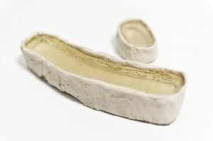
So Eric Klarenbeek, called the designer of the unusual, who developed a 3D printing material based on straw, water and Mycellium, the threadlike vegetative part of fungus. Printed into a thin layer of bio-plastic the material can gain stability through drying and – in Klarenbeek’s case – become a chair. He went even further and created possibilities to 3D print with only local materials as algae, potato etc.
Remarkable is the aesthetic presence of the final products. Cups, vases, bowls, which you simply want to hold in your hand but cannot as they are displayed in the showcases. This might be what makes a researcher become a designer: using the power of aesthetics to create a bridge leading from innovative development to the manifestation of the product in daily life.

Unfortunately many green designers are seen as criminals when it comes to aesthetics. Next to the pursuing of sustainability as something of moral value, aesthetics are sometimes seen as luxury and therefore a waist of energy.
People who are already familiar with sustainable values, seem to see the beauty in the ethics.
However, this understanding of beauty requires the motivation to consume with a small footprint. A motivation which wants to be spread.
Thus, the power of an object’s visual appearance shouldn’t be underestimated. It can communicate and celebrate ideals and make users value the object and what it stands for.
Experiments in interaction design even reveal that people consider objects they emotionally bond to, as more functional – and use them more likely.

In the end we conserve only what we love.”
Baba Dioum

Thus objects which don’t attract us on an emotional level, will simply not be used and kept.
If it’s not beautiful, it’s not sustainable. Aesthetic attraction is not a superficial concern – it’s an environmental imperative.” wrote Lance Horsey in his book The Shape of Green. He is the first to write and examine the relationship of sustainability and beauty. According to him “beauty could save the planet” as in the end people consume and use what they love. Horsey here uses the example of wolves and dogs to enhance his theory:

The fate of many things depends on whether they please people. Wolves might seem heartier than dogs, but there are 50 million dogs in the world and only ten thousand wolves. Which has adapted better? This view of nature may give you pause—should other species exist just to please us? But as a principle for design, it is essential. If you want something to last, make it as lovable as a Labrador.

grün7 grün4 grün5 grün3

We personalize things we use – and we use things which are personal.
Based on this theses, Jonathan Chapman helps to create an alternative consumer’s philosophy, than our present ‘throw away’ society has. He developed a new design strategy, called Emotionally Durable Design.
Through the conscious shaping and strengthening of the emotional bonding between consumer and object, one can endure the using period and thus reduce waste. According to him this can be achieved through the consideration of the following five elements:

How users share a unique personal history with the product: Narrative
How the product is perceived as autonomous and in possession of its own free will: Consciousness
Can a user be made to feel a strong emotional connection to a product? Attachment
The product inspires interactions and connections beyond just the physical relationship: Fiction
How the product ages and develops character through time and use: Surface

This results in products such as the Stain tea cup of Bethan Laura Wood – an object which gains character through being used. It builds up an individual pattern of tea stains, according to the personal ways of drinking tea.
To establish this design approach further, Lance Horsey asks the question:

What if we created a different approach to aesthetics, one based on intelligence and not intuition? Can we be as about how things look as we are about how they work?

Answers will lead to new aesthetics based on the complex connections of efficiency, sustainability, character, endurance, and the potential to develop with the users personal demand. An understanding of aesthetics which goes beyond an object’s physical presence.

Sand Is The New Oil


Wednesday, November 29, 2017

INTRODUCTION TO ATELIER NL

 
Atelier NL is run by two women Nadine Sterk and Lonny van Ryswyck. They are Design Academy Eindhoven graduates whose design studio is also based in an old church in Eindhoven. This year they were selected as the official Dutch Design week ambassadors, alongside architect Winy Maas of MVRDV and Dezeen founder Marcus Fairs.


IMG_6569

Since 2010, the women have been running their ground based practice of collecting samples of sand from dunes, beaches, rivers, mountains and quarries to melt it into glass. One of the aims of the project To See a World in a Grain of Sand is to “reveal the unique colors and textures of the world and share the origins and stories of both sand and people from all corners of the globe”. This is made possible by the submission contributed by the public in response to the open call for sand samples.

 
The project also draws attention to the massively underestimated resource sand and the fact that the worldwide stocks of white sand are running out. Personally I haven’t really given much thought to this issue before which is why I wanted to look further into it, even though Atelier NL’s work and research that takes a part in the exhibition Change the System in museum Boijmans in Rotterdam seems to be highlighting more of the social aspect as it perhaps makes it more approachable and appealing to a larger audience.

 
In the future local supplies of sand might become an important source for the industry that, unlike the small Dutch design studio, is not yet able to process this natural sand. Besides glass, sand is also vital for many other industries including the manufacturing of computer chips and construction of buildings.


SAND – A FINITE RESOURCE

 
To put it simply sand is one of the main ingredients of modern life. Besides water and air, sand is the most used natural resource. We need concrete and asphalt to build cities roads, and sand is used for both of them. Not to forget windows, glasses, plates, cellphone screens and filtration systems in water treatment facilities, septic systems and swimming pools.

 
So cities are basically made out of sand, and since 1950 the number of people living in the cities has grown from 746 million to almost 4 billion making the demand of sand so high that we are now starting to run out of this natural resource.


IMG_6757

 
Both legal and illegal trade have economic and ecological backlash. It is estimated that 70% of the world’s beaches are disappearing due to these practices. Mining sand in rivers, beaches or offshore will inexorably lead to the disappearance of our beaches.

 
In Indonesia around two dozen small islands have vanished since 2005 because of sand mining. The coral reefs in Kenya, hundreds of acres of forest in Vietnam, and the ecosystem of India’s rivers have suffered the damages of sand trade as well. People working in the industry are getting hurt too, and some of the activists and government official confronting the black market sand mining gangs end up killed.

 
Stronger regulations are able to prevent some of the damages. The downside of this is that sand is heavy and expensive to transport which could cause the price go up in many developed countries where the sand mining gets banned for environmental reasons. If the sand needs to be trucked from further away, the price will go up as well. This would eventually hit the economy hard and cause more pollution and extra truck traffic.

 
Despite the effort, the attempts to stop the illegal mining doesn’t always work. An example of this are the satellite images released in 2012 by an environmental organization called Global Witness that showed how Singapore had expanded its land area by 22% over the past 50 years. The sand used in the process came mostly from surrounding countries like Vietnam, Malaysia and Indonesia, and had in some cases been extracted illegally.

 
These countries then responded by banning sand mining. After the ban in other countries, Singapore’s demand for sand continued fueling the industry in Cambodia, even though the government official claim to even have ban the mining in some cases.

 
In a way sand could be called the new oil. There are not yet good alternatives as the desert sand, shaped more by wind rather than water, and the local supplies of sand are not suitable for the needs of the industry. To find a solution for the shortage of sand won’t be an easy task but in the meantime more focus should be put on how we are using the still remaining resources.

How deep can we go? – The conflicts about problematic issues


Wednesday, November 29, 2017

Who are Studio Wieki Somers and Thomas Eyck? During this research I posted myself the question what the relationship is between them and why they want to make a project about the problematic issues of our world society. I also got inspired by the specific work called ‘Deepwater’ which is related to the oil problem in the world. This motivated me to question and think of how to solve this problematic issue much further.

Back in 2000, Wieki Somers (Dutch designer, born in Sprang-Capelle, 1976) graduated from the Design Academy Eindhoven. After her graduating she settled with Dylan van den Berg, with whom she studied in Eindhoven. Together they started Studio Wieki Somers in Rotterdam. Wieki Somers and Dylan van den Berg are focusing on providing an enlightened reading of the everyday movement. Focusing and making sensitivity of materials, technological ingenuity and fantasy. They make objects that you as out-stander at first have to guess what it is and what they are doing. That is the whole point of what they want, making an art piece with a functional state in it. ‘‘Basically our work is one big quest, one big process. We look at things around us, what they can be and the associations people have. We study customs everyday situations, unleashing our own imagination on them. We make the uncommon common.’’ thus Wieki Somers

‘’As a designer it’s not my attention to make the world a better place, but I’m pleased if people look at the world differently because of my products.’’

People get ideas and inspirations from the work of Wieki Somers and that’s also how Thomas Eyck got involved. Thomas Eyck is a publisher and collector and he divide characteristic and exclusive design products from this time. He stimulate designers to come up with new objects for the daily life. Together they research for different kinds of materials and making new products out of it. This is how the Deepwater work was made when Thomas Eyck asked Studio Wieki Somers to worked together.

The Deepwater work is created in collaboration between Studio Wieki Somers and Thomas Eyck in 2016. It immediately caught my attention while I was walking through the exhibition of “Change the System’’ in Museum Boijmans Van Beuningen. The work is simple, yet very impressive. It has a strong design in contrast to the other works presented in the same room. Deepwater represents a vase which is a collection of the design “Still Waters’’. Thomas Eyck commissioned Studio Wieki Somers to design a series of objects with the theme “water”. These series are five glass vases and each form a poetic interpretation of the water cycle. The vases represent a topical theme regarding the problematic relationship between humans and nature.


LTVs_WiekiSomers_05_Deepwater, Labadie


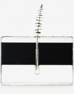
The Deepwater vase is made out of glass filled with oil floating on water. In the center of this vase a stem with leaves is represented. The oil refers to the disrupted human actions like the results of the eco-catastrophe “Deepwater Horizon’’, this was an industrial disaster that began on April 20, 2010 in the Gulf of Mexico. It was a big explosion of the drilling platform Deepwater Horizon. Studio Wieki Somers and Thomas Eyck wanted to show how conflicting the values are that ascribe our resources.


deepwaterhorizon


How can you stimulate more people when you think about this collection? And in my case about the oil problem. Because using oil is something we should take very seriously if we think about our precious world. Our nature is capable of breaking down oil itself, but this is going very slowly. The quantities of oil that enter the environment through human intervention are so great that nature has difficulties with it. Of course the place plays a role, normally it is safely stored under the ground but when it comes into the water or on land it is just a strange substance. Just what happened to the Deep Water Horizon catastrophe. How can we clean up this mess if we constantly spill so much oil?

Thankfully there are many ways to clean the oil out of the water. I found materials and information and tried these out:


REMOVE IT

oilimage

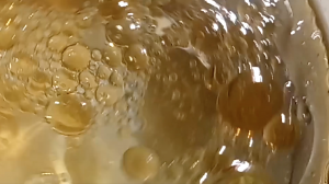
In this video I'll show you an impression about removing oil out of the water.
For this experiment I used a glass jar, water, oil, cotton balls and a sponge. First I used cotton balls to remove the oil.
The cotton ball soaks the oil out of the water each time you use one. Then I wanted to see if it also works by using a sponge.
The water will get more clear once you do this repeatedly and it works perfect.


Of course this is not enough for an entire ocean, but it’s clearly that we could discover more with materials just like Wieki Somer and Thomas Eyck are presenting. We have to dig deeper and come up with much bigger ideas to solve the oil problem. There are machines or boats with different kinds of techniques by getting out the oil out of the ocean, but still there will be leftovers and we discover that years later by accident. Of course we think of other different ways to solve this for the future, for example; using electricity. The using of oil are mostly for machines and vehicles and these will run in the future with electricity.

So yes, just like Wieki Somers I would feel the same way by not making attention to make the world a better place, but to encourage and to let people think about these kinds of topics. I think we discovered already so much about materials, technologies and objects to improve our environment. Who knows what further will be discovered in the future.


Reference work of the subconscious


Saturday, November 25, 2017

_MG_1108_1

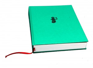
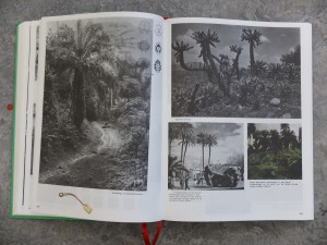
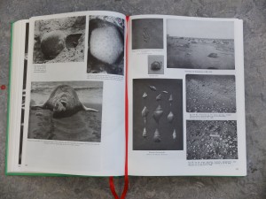
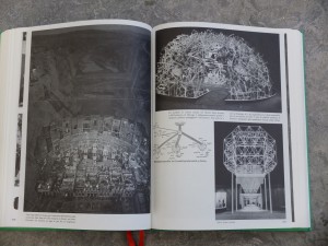
Parallel Encyclopedia #2: welcome in Batia Suter’s head and my interpretation of what that might be. She searched, she found and she took, and now she is giving it back. The book turned into an object that spikes my curiosity, and not only because of her collection of curiosities.
The green cover spoke to me. I picked it up and it spoke even louder. I decided to dig further and at one point it made me want to dress in rubber boots, a jacket with too many pockets and a bucket hat and go off to explore the world. And bring a camera.

2014-01-03 12.11.22

After Parallel Encyclopedia – an almost black-and-white compilation of her personal archive of seemingly random pictures – Batia Suter made a second volume. An artist’s book poured into an encyclopedia-shaped cast. Where Parallel Encyclopedia number 1 contained strictly black and white imagery, number two also allows specks of colours to seep through the pages.
2014-01-03 12.09.10

One might wonder, in a book like this: what did the designer do? It’s Batia Suter’s collection, and her intuition that ordered the pictures. Where did the designer – Roger Willems – drop in? Where did the designer left his mark. Did he had a say and what did he say? Where and if to use colour in this otherwise black and white universe? To use Biotop paper in 90 grams, to give it all a functional feel? To add two red bookmark ribbons?
On might wonder – hidden inside this volume is a parallel world of a parallel world of a parallel world.
One might wander – an encyclopedia of no practical information but visual information, a dreamy answer to an 2000-year old tradition of encyclopedia-making. Another possible answer to this tradition is Wikipedia. Wikipedia suffocates most encyclopedia, but not this one, not Parallel Encyclopedia. This one tells us what Wikipedia can never tell and thank God doesn’t and probably doesn’t even want to. This one is a reference work of the subconscious. Batia Suter’s thematic categories are her own: giving us the suggestion of a story, or not at all – we all make up our stories anyway. She leads us into a great grey and black and white world, different worlds within different worlds, from curiosity to curiosity, from dreams to wonder. She let’s us jump from trees to mountains to griendhout to wolzakverwering and the wall of Hadrianus; Britannia. From fields to Kirchner to winter to bacteria and giving us a neat visual experience whilst doing it.

2014-01-03 12.13.24

Flip.

Page 105.

Workman sprays carbolic powder on a 35-yd long rubbish pile during strike of garbage collectors in London in September 1969. A picture of stacked boats, a woman shopping on the Amsterdam flowermarket. No clue how this works together, but somehow, it works.

Flip.

Page 177.

Verschillende dwarsdoorsnedes van kringsporig hout (es), verspreidporig hout (esdoorn), halfkringsporig hout (kers), mergstralen (eik), mergstralen (tulpenboom), and so on.

Flip.

Page 236.

The moon.

Page 237.

Several spherical objects, mirroring the moon.

Flip.

Page 440.

The entire page is filled with a picture of flowers that remind me of orchids, but apparently are called Odontonia.

Page 441.

The entire page is filled with a picture of geisha girls of the early 1900s. Their kimonos and the plants in the pictures depict flowers that mirror the Odontonia.

Flip.

Page 438.

Several pictures of butterflies, and hands being spread open, resembling butterfly wings.

It’s design is imbedded in it’s content, made to serve this visual feast. Made to serve the hidden narrative. Or the none-existent narrative. It’s not organised in a seemingly logical way, but for Batia Suter, it probably is. She is pretty convincing.

One might wonder – the strays and wanderers, all nicely wrapped in shiny green.

What’s the hand of the artist and what’s the hand of the designer?
They probably used both.
 

Parallel Encyclopedia 2, designer: Batia Suter / Roger Willems, Rietveld Library Cat.no: sute 5

I see your true colours, that’s why I love you


Sunday, May 28, 2017

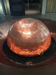
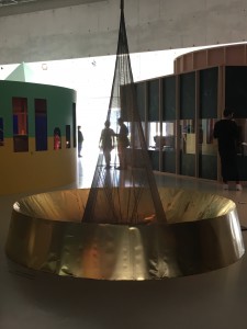
As soon as I walked to the exhibition, I was faced with two ‘fountains’ if you can call them so. Lex Pott [x], a Dutch designer, a graduate of the Design Academy Eindhoven, uses UV-light and acidic water to explore the “inner colour’ of materials. First fountain is made out of copper, an element that has a green colour when found in nature,however the colour that I saw was orange due to the outer catalysts that accelerate the change of color. Same thing was happening to the fountain on my left that was made out of brass.


True colour dome, 2017
The Preservationist

Although I was never a big fan of Chemistry, the project that dealt with exploration of inner, unseen colours really attracted my attention. The two objects themselves are a marvelous visual as well as inspiring method of working. His project has a very close and even straight-forward connection to the Subject – Patina. By oxidizing the metal, the designer creates a thin layer that variously forms on the surface.  Colouring different kinds of metals requires accurate recipes. Pott’s project demonstrates the results of a research on metals and their true colours. By doing such, he reduces the material to its very essence.


True colour
The Resplendent

While losing electrons, it seems that the material opens up to the artist and the viewer giving an impression of acquirement of ancient wisdom that was hidden underneath the green surface. I believe that the viewer and the artist have a similar feeling of control evoked by the impression of nature opening its secrets to the human kind.


Lex Pott, True colors Dome / True colors Cone. exh.cat.no.4A/B

Roots and Branches


Thursday, May 4, 2017

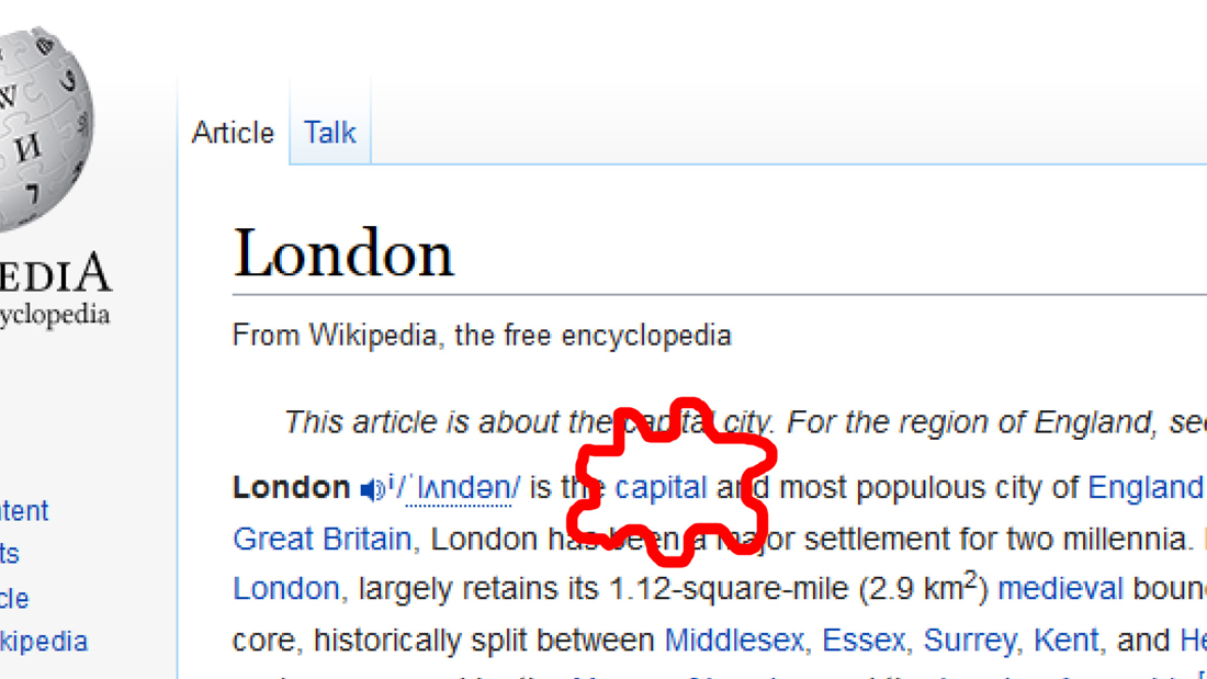
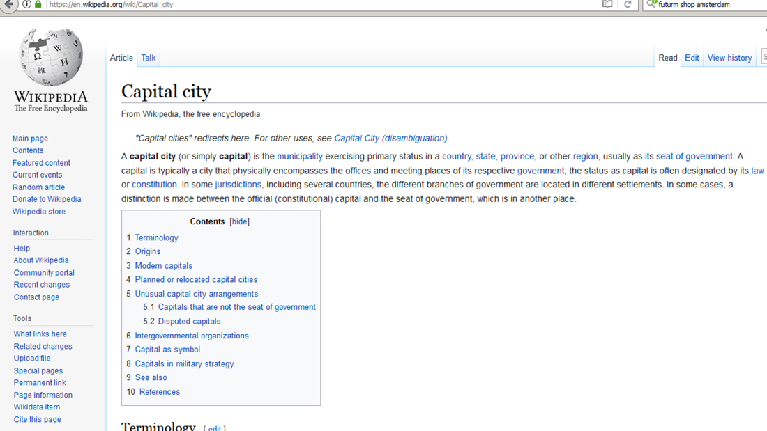
Go on Wikipedia and start a research for something, it can be the most common thing or notion you think about. Then, start clicking on the first link you see, in the sentence that defines what you are searching for. Again and again. If you arrive on a webpage where you have been before, just click on the next link, so not the first but the second one and see where you will end up. Here is my example :

London

london_1100

> capital city

capital_1100

> municipality
> urban area
> human settlement
> geography
> science
> knowledge
> awareness
> perception
> sensory nervous system
> nervous system
> eumatazoa
> clade
> organism
> biology
> natural science
> natural phenomena
> phenomenon
> experience
> philosophy

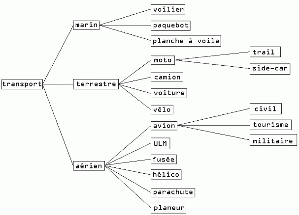
SQLtree1

So, this brings us to a crucial point. It shows how important arborescence (which means in French from the trunk to the branches) is in a research process. By starting from a very specific subject, you can end up on something you don’t expect to see, something really independent from your first research. By a system of hierarchy, websites choose for you what you should see, in order to make your research larger and more relevant. The concepts presented through the pages are of course connected, because terms are presented to define the notion you are looking for. That is by the way essential for every website : to give a hierarchy. But how? On what logic?

If you follow the previous example on Wikipedia, you can try how many times you want, you will normally end up on the Wikipedia page related to philosophy.

By placing some hyperlinks, you can give an orientation on an internet reasearch. In that sense, links are super efficient tools. Just have a look to what is offered on an everyday internet journey.

But more widely, from the easiest thing, you can always go to something larger in terms of meaning : groups of living species, geographical regions, etc. By defining something, you need an element with a bigger concept to categorize it. Then, is philosophy the final notion, the highest point to reach?

It is basically more than just a simple category in which we can put everything like a cellar where you come to take an old box once a year to remember your sweet childhood.


A dopamine delivery service

By spending time by scrolling down, letting my eyes wandering a bit on the DesignBlog, and repeating the same process previously experienced, I found that article by Olya Troitskaya about a concept that defines pretty well this process. It is called “cyberflânerie”. Have a look at it here.

flâneur (word which comes from the french verb flâner) is according to Baudelaire, quoted by Olya Troitskaya, “a person who walks the city in order to experience it”.

By experiencing a part of the internet content in a certain order, you expect something to get, a crucial information, or just an everyday surprise, your dopamine doses maybe. At least some satisfaction.

Play at this (not)serious game, make this fantastic tool a hijacked object, follow the lines, think about this endless journey, how you move through this digital space in terms of pictures and map, with a starting point and an unreachable end.

Alien Matter


Monday, May 1, 2017


images (15)
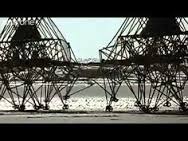
Strandbeest‘ by Theo Jansen

Large sculptures made out of plastic PVC tubes, able to move on their own. An animal like mechanisms that does not need food, but just the power of wind.
Theo Jansen, a genius that fusions art and engineering, is busy since 1990 with his project called Strandbeests (Beach animals): a new life form on earth, yet unknown for humankind.

cloud_1100

A life form looking at another form of life : What it means to be alive.
I always wonder why is it so exciting for me to watch the Strandbeests moving? Perhaps because I can not define at what I am looking at, is it real?
How to define it?
When I look up the word alive in the dictionary, I came across the meaning existing.

But wait, everything has an existence in space and time, so how can you recognize a life form? People may think, the fact that something is not animating is a reason of a non-life form, somehow no definition feels right to me. There is much more to living than having a heartbeat. There is much more to life than breathing and the blood flowing through your veins. You might be living, but are you alive?
What if matter has a life on its own, able to learn, teach and to stretch its ‘lifespan’ beyond humankind? An alien matter that absorbs intelligence and reaches capacities that go far beyond our own.

anigif2

Inspired, I went to Delft at Theo J. exhibition with the hope I could come across his path and there we go: I was able to talk to him. Unfortunately our meeting was so spontaneous,  that I just got a few minutes. Nevertheless it felt like a miracle, he ended our conversation with the sentence man should get rid of its ego, then he will be able to see the real qualities in life.

I got fascinated by his way of being, how modest and grounded he was when we met. He is not an artist but rather a happy victim of his work which is pure functional. The tubes are the ones making the process beautiful.

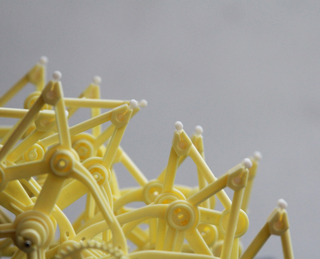
As miraculous life is, I decided to adopt a Strandbeest myself, the Animarus Ordis Parvus. First It needed to be born so I assembled 117 plastic pieces together. About an hour, the evolution was finished and I had my own beast at home.

During the process something weird happened to me, something I can not explain. It was like a virus in my head : the beast’s rubber feet.

model_1100

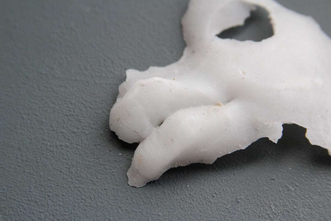
I got inspired to work with Silicone. Why Silicone and not something else? Something that remains a mystery. What happened to me, at this moment? Perhaps it started to communicate with humans, perhaps it chose me.

Silicone is a synthetic polymer made up of silicon, oxygen and other elements.It is generally liquid or flexible and the rubber like plastic has useful proprieties. From medicine to personal care items.

Sometimes there is a confusion between Silicon and Silicone. Silicon is a naturally occurring chemical, a key element in bricks, cement or glass. It is the second most abundant element in our earth crust, after oxygen. Whereas Silicone is a chemical substance that derives from Silicon.

anigif

Silicone often stands as a tool for the use of something else. Maybe it is living, maybe I should threat it as a oneself.

Exploring the matter

I started experimenting and researching on the structure, and I tried to find out some processing and proprieties of the material. I adapt myself to the matter, a constantly evolving process between human and material.

IMG_1734

There are different kinds of Silicone and they all have different proprieties from each other. From sticky to stinky.
The Silicone from the hardware shop has never a clear structure, it is really hard to manipulate while it’s liquid. Impossible to work without mask, it almost intoxicates you.

IMG_1761gray-matter_950

The splintered structure could almost be found in nature.

IMG_1768

Birth of Silicone

hart_1100IMG_1745

Silicone organ

color-absorbing_950

colour absorption
I experiment with different kinds of tools such as a pencil, a marker, watercolours , acrylic, ink.

paint_1100IMG_1801IMG_1779

One ting that was completely new for me is that, Silicone can print.
This technique just works with Silicone from the hardware shop, because it is so sticky.
It absorbs the ink while drying and the text or image will appear reflected.

black-white_1100IMG_1851

 At the end, it is hard to discover something mind blowing in such a small period of time. Theo Jansen is still researching on the same material since 1990 and he thinks that there is a long path to be done.

In a constant flow of doing and learning, there were plenty of disappointments on the way. But on the few occasions that things worked out, being connected to matter is such an enriching experience.


Composing Chaos


Wednesday, April 5, 2017

Composing the chaotic mind

  meeting Hendrik Kerstens


TKW-Crack1540WEB


Sound file: music: Dimitri Shostakovich Piano Concerto no.2, Andante

[audio:https://designblog.rietveldacademie.nl/wp-content/uploads/2017/04/Konzert-Schostakowitsch.mp3|titles=Dimitri Shostakovich Piano Concerto no.2, Andante]

Meeting people in an age of the internet and social media seems not romantic at all, which I can assure you it isn’t. When we got the assignment to meet a person we admired and make out of this experience a design object, I made a list of artists I considered as being interesting and admirable. Starting with the first name, I did not get any response and waited for a week. I tried another artist but also he gave me a radio silence. Choosing another artist seemed just as interesting and I send another email.
But having to present my progress in the project and having no responses yet, made me feel a little isolated from the world. ‘The inner monologue’ took its place in my mind.
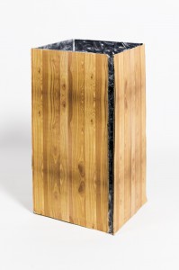
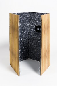
Thinking about this brought me to the feeling that I wanted to make an isolated space which resulted in a mock-up of a room, made out of four wooden walls isolated with foam. The idea was  that a person would be able to stand inside of the isolated space and was able to listen to my spoken inner monologue without the outside world being able to hear it. Of course for me this was not the best idea and I was far from content…


TKW-IsolatedSpace1552WEBTKW-IsolatedSpaceInside1547WEB

inside my box I got a vision….

Then something great happened. In my inbox appeared an email from the management of Hendrik Kerstens. I have been intrigued by Hendriks work from quite a young age. Interested by the pure combination of modern vision and classic interpretation of the composition of the portrets he has made.

He wanted to meet me. I got into a back and forth communication with his assistant by mail, which resulted after rescheduling and answering questions into a date. Hendrik invited me to his photo studio in Amsterdam.
When I came there at an afternoon he let me in. I was struck by his big black glasses with the kind eyes and the clean and sharp looking white studio with black furniture and equipment.
The room was filled with the sound of classical music which comforted me and everything was organized and clean. We started talking, I asked him questions and he told me a lot of inspiring things. When I asked him about his clean, organized studio, he told me that this was necessary for his chaotic mind to run free. So his surroundings would not interfere with the creative processes in his mind. He said that the process of making a picture was as composing a piece of music. This process he also addressed as sometimes hard to let go when it’s finished and ready to leave the studio. He quoted:

“Art is never finished, but only abandoned.” -Leonardo da Vinci

Hendrik Kerstens surprised me with his enormous power of persistence in his new ideas and projects. He spoke of his desire to bring sculpture and photography together, which he is currently experimenting with. And a future project where he wants to create a close connection between painting and photography. In his vision, one I would want to live by, everything you can imagine is possible.
Hendrik gave me advice in the end and I gave him a print of a pinhole picture that I had made which he accepted with a smile. When he let me out, I felt light and encouraged.

My conclusion after this meeting was that I had to rethink my idea of the isolated space in total, I had been to quick to give in and this good experience deserved a good outcome.
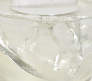
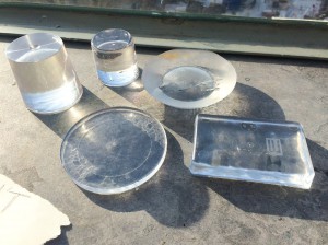
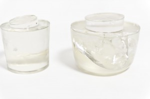
Thinking about my experience the subjects of ‘composing’ and the ‘chaotic mind’ kept running in my mind. Letting this be, I started developing an interest in the material epoxy and especially in its clearness after molding. I made several try outs by molding the epoxy in different plastic, glass or porcelain cups and Tupperwares. The idea was to take the chaotic aspect and function away from the object and create by molding a simplification of the shape.
After drying the objects, some were easy to come out and some I had to break out, some had air bubbles or even cracks which for me became interesting aspect in the idea of a ‘crack in the mind’.


image1kleinTKW-Shape1537WEB


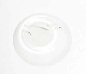
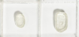
Interested by the molds of the epoxy as well I made molds of clay, to create a connection between the mold and the epoxy. The epoxy in the clay mold gave a watery effect, even after drying it seemed liquid and shiny but would not come out of the clay mold. I disposed two epoxy objects from their clay molds and this created a look which reminded me of the glass smoothened by the sea.


TKW-Above1525WEBkl

TKW-Mallen1535WEB


For my last experiment with my epoxy objects, my interest was captured by making an epoxy mold for an epoxy object. My expectations were by filling a bigger Tupperware with epoxy and hanging the already dried epoxy object in it, that after drying I was able to take the object out again and this would leave me with an epoxy mold. But it didn’t, the epoxy object and the fresh epoxy
into the Tupperware had melted together in one totally new object. The ‘melting together of ones thoughts’ created its own existence.


TKW-ShapeinForm1530WEB


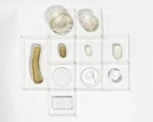
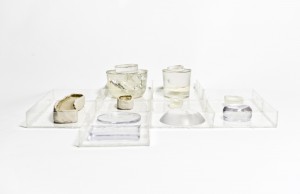
Looking at my experiments resulting in a collection of epoxy objects, a simplification of chaotic objects, the thought arose that I wanted to recompose or rearrange the different objects, creating ‘the recomposing of the chaotic mind’. Therefore creating a grid in which every space had the same measurements (except a special one) so the objects could be recomposed in any position.
My doubt was with the material of the grid: metal or plastic sheets. But fate took this decision from me when I was not able to work in the metal workshop for it was closed and so it became plastic.
The plastic sheets I glued together, creating a clear construction. In retrospect I was satisfied with my decision to use plastic, because of the subtlety, clearness and connection with the epoxy objects itself.


TKW-Above1525WEB


In the end, recomposing a chaotic mind is creating something clarifying. I’m not sure if I would address my final outcome of the design project as ‘clarifying’ rather than ‘clear’. In my opinion I made a composition, in which every object is a ‘clearer’ form of itself.


TKW-Upfront1504WEB


Log in
subscribe