Skip to Content Skip to Search Go to Top Navigation Go to Side Menu


"mapping" Tag


MVRDV Buildings


Tuesday, October 28, 2014

9789462080126_mvrdv_buildings_500

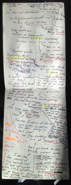
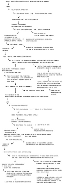
The reason why I chose this specific book was its colour and image placed next and on top of each other. It has caught my eye and wanted me to read and analyze its content. Page after page I began to realize there was a type of system that the designer, Joost Grootens carried out.

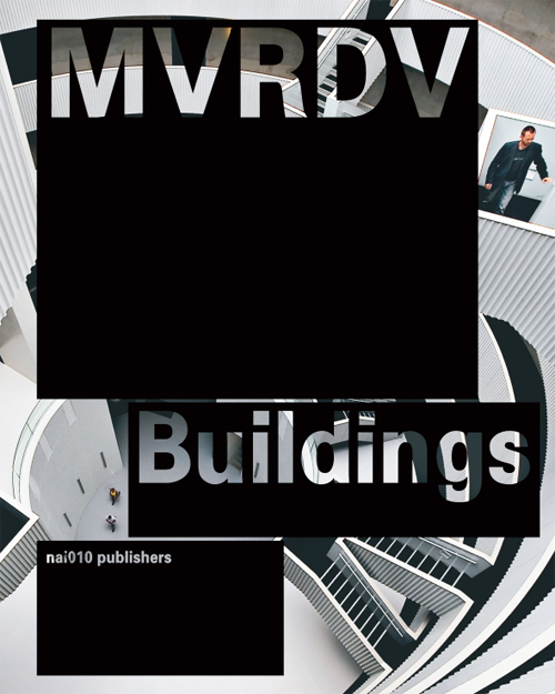
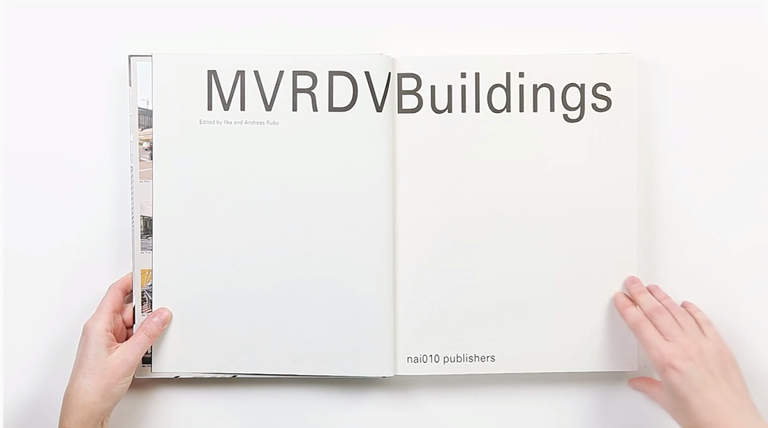
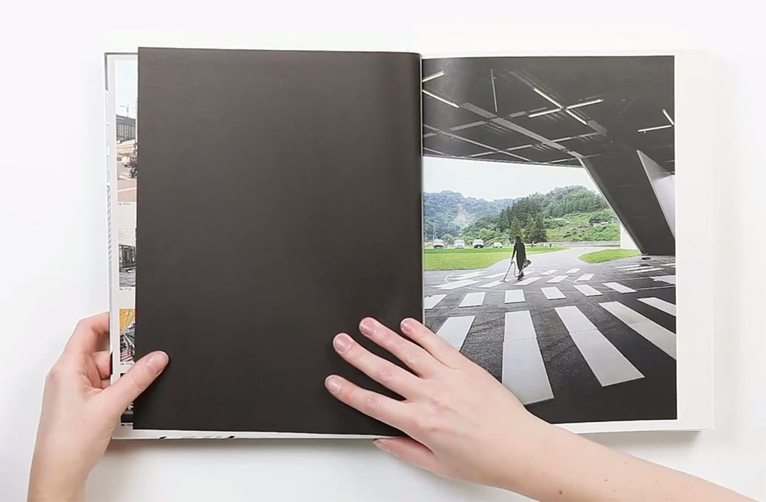
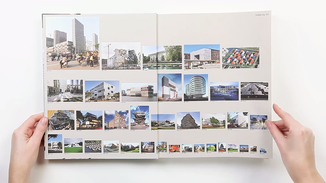
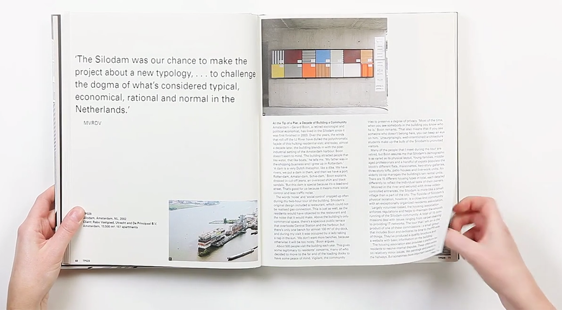
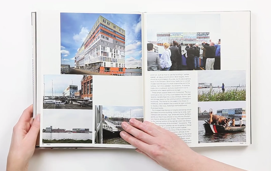
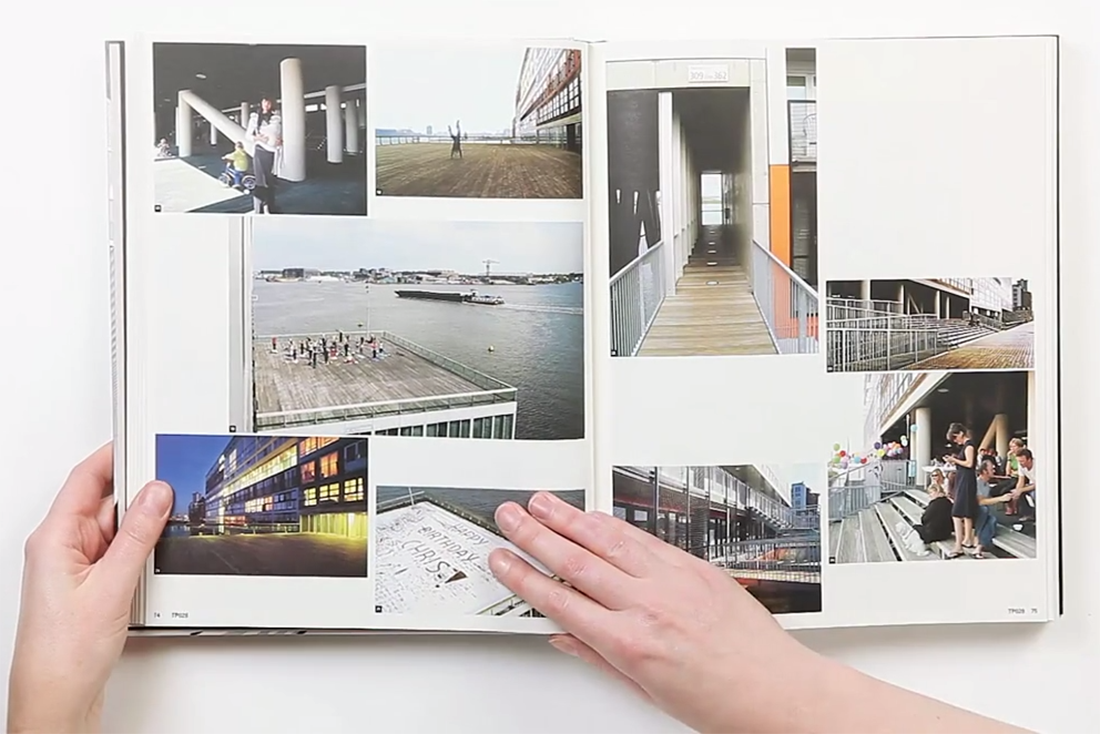
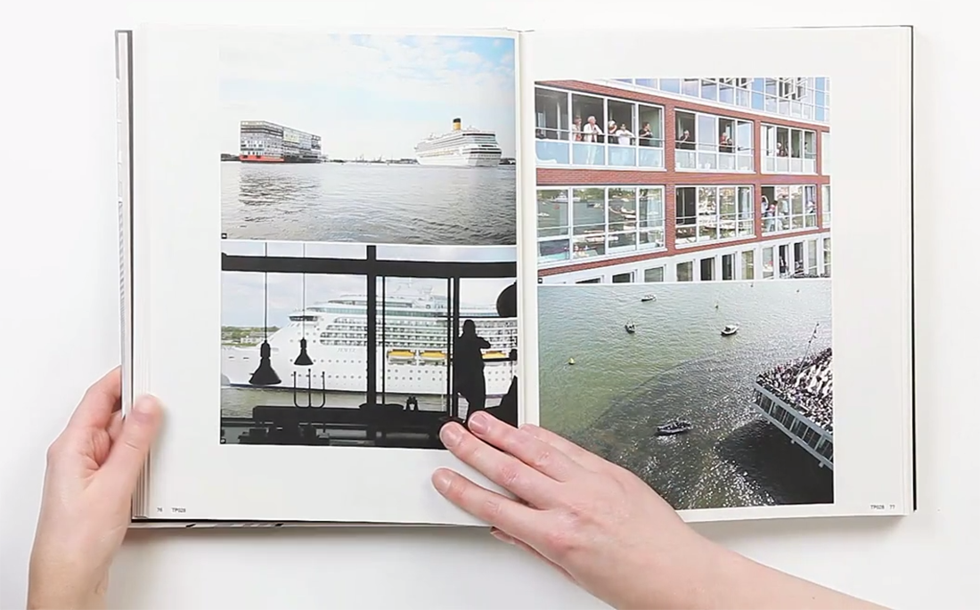
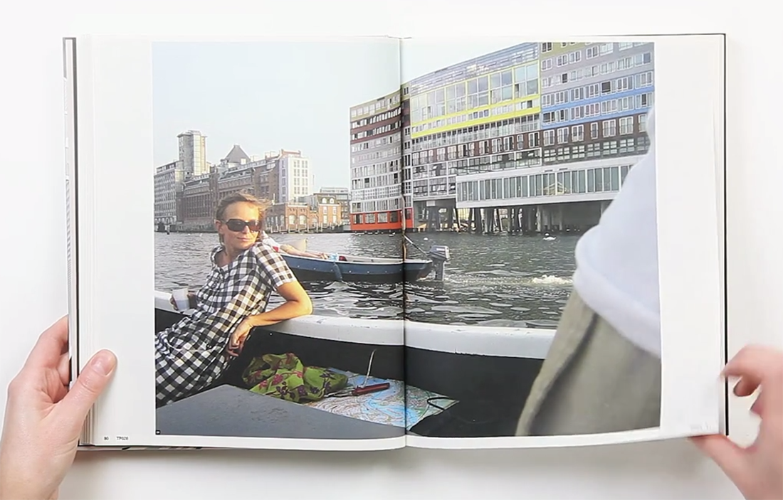
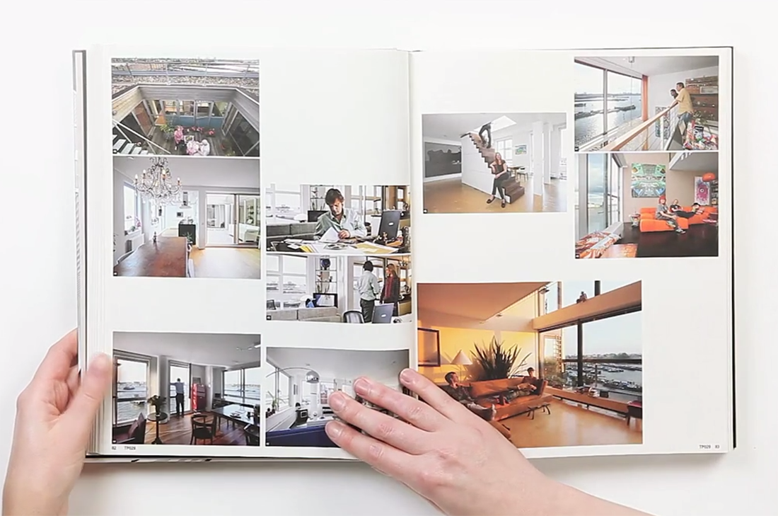
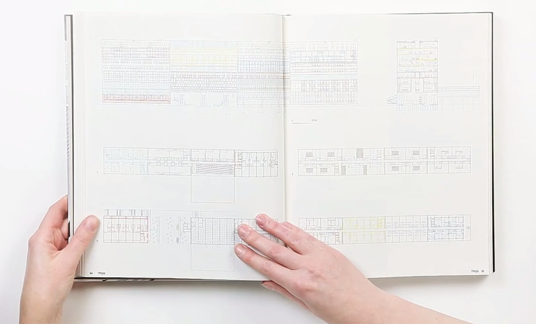
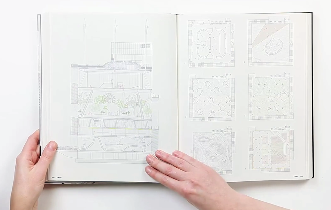
MVRDV Buildings, published by 010 Publishers, is a complete overview of MVRDV’s architectural practice over a total of 20 years. To me, this has been a positive discovery while analyzing the book. It was a very good surprise. I am very much interested in architecture. The way I have understood it was that the designer has deliberately chosen and created a way of method to display and present this portfolio of this architect firm. My impression was that this “method” is a way of telling a nice story or even a nice joke. A way to share important information with people. (click on the title page image and browse the 11 consecutive images)

Screen Shot 2014-10-06 at 21.51.42 Screen Shot 2014-10-06 at 21.51.33 MVRDV Buildings Screen Shot 2014-10-06 at 21.52.11 Screen Shot 2014-10-06 at 21.52.16 Screen Shot 2014-10-06 at 21.52.24 Screen Shot 2014-10-06 at 21.52.30 Screen Shot 2014-10-06 at 21.52.38 Screen Shot 2014-10-06 at 21.52.41 Screen Shot 2014-10-06 at 21.53.14 Screen Shot 2014-10-06 at 21.53.59  Screen Shot 2014-10-06 at 21.54.32


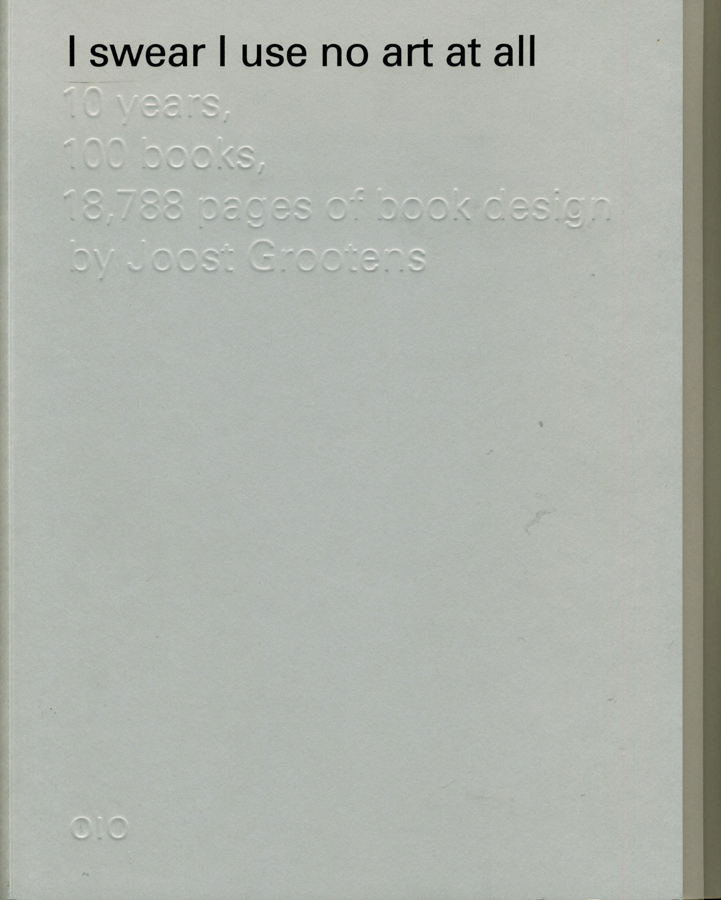
Another consequence was that I got to explore Joost Grootens own book. The book called I swear I use no art all, has been written by the designer and summarizes 100 books, 18788 pages of his book designs throughout 10 years in that field. The interesting part is to see how, the originally architectural-designer became a graphic information-designer. The book describes his relation to publishers, supporters, authors, collaborators, printers, workplaces and studios. A very personal way to present the changes and development that his own working field. It has made me realize how nice it is to make a summary of your own development. Even though I can not yet make a summary and create a descriptive portfolio of the last 10 years of my work-field I have already imagined creating the mapping of my family or origin.

(click on the cover and browse the 2 consecutive images)

I-Swear_bookcover

I-Swear_spread2 I-Swear_spread1

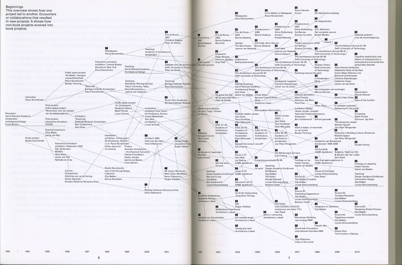
A part which describes the beginning in a overview, showing how one project led to another by encounters or collaborations and led into a new project, caught my interest. The designer has focused on presenting how non-book projects evolved into book projects. This made me think about my own encounters I had in my life that has influenced some decisions made later. Furthermore, allowed me to think in a non project based way. It also made me think of the origin and allow me to imagine the beginning.

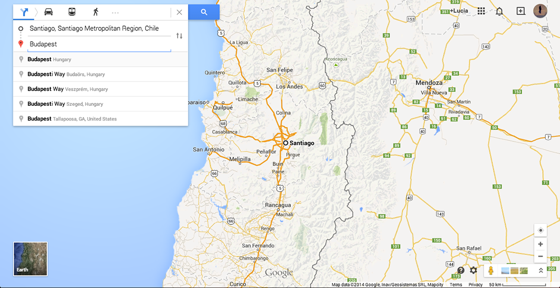
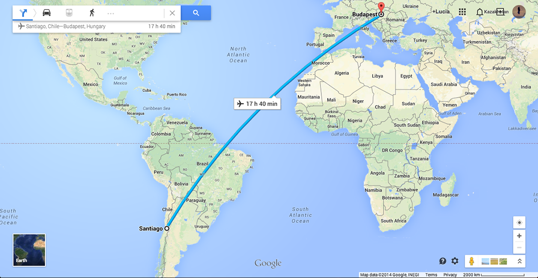
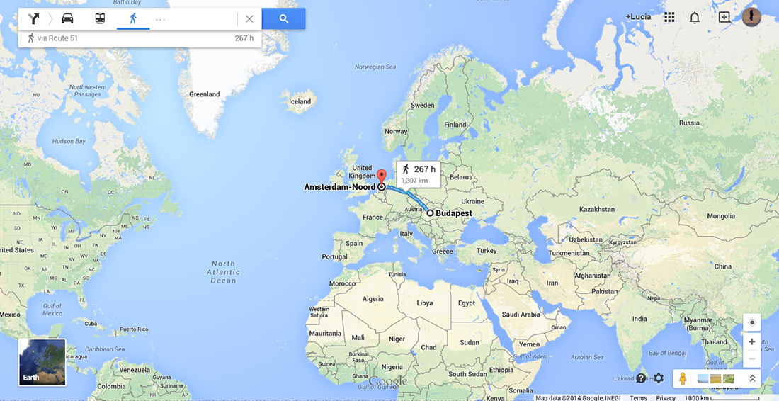
As a personal mapping I was first interested in looking online for my origin in order to see routes and possibilities to reach Santiago, the origin of my father, and Budapest, the origin of my mother. I have also looked for the distance between Amsterdam and Budapest. Nowadays, it is very easy to travel between my hometown and Amsterdam which is the city I have chosen and encountered on my own. I had first visited and met this country at the age of 16 and already new that one day it would be my home. Due to the fact that I can not connect to my origin nor to my parents because of their divorce I currently have to focus on the present and the decisions I have to make every day. Choosing to study but first of all choosing to apply to the Gerrit Rietveld Academie has happened by chance. Through the Academy I have also encountered the Design Academy in Eindhoven. These two Academies are important in this case because interestingly Joost Grootens who graduated from the Gerrit Rietveld Academie is now a teacher in the Design Academy.

At this point I have immediately remembered my past with both academy’s. At one point in the last two years I have met students in Eindhoven who have shared a lot about their work process and further information of their studies. This also made me consider to apply to that school. Although I have never succeeded to enter the Design Academy I have, as a result, got to know the Rietveld more.
Once again, choosing >MVRDV Buildings< still proves how interested I am in design, how fascinated I am about architecture.

I knew I had a good feeling about the book’s black cover.

(click on the map and browse the 2 consecutive images)

Screen Shot 2014-10-28 at 20.02.39

Screen Shot 2014-10-28 at 20.02.53 Screen Shot 2014-10-28 at 20.05.11

To conclude; black to me is a colour. It is a comfort zone and also a strong feeling I have towards it. Black to me is the house I wanted to have and the friends I wanted to play with as a child. Black is also the material I preferably wear during my daily life and it is the ink I like to draw with. Black will never leave me and will always be part of my decisions in the future.

Talks about Money: Rietveld library catalog no : 716.9 rub 1

the orthogonal allegory of browsing


Tuesday, May 6, 2014


BrowseMap-sketchIMG_3148-2


This is a search that started as a response to the 'Orthogonal Allegory Thesis' I found at the the essays page of Designblog. It shows the dynamic of my browsing, dealing with the facts I bumped into, as well as the associative impulses that coincides with it. I tried to translate my sketched browse history into a text version, to make it more readable ! If you click it, an interactive pdf. version will create that experience for you.

The Attraction of the Unknown


Monday, May 20, 2013


In my third research I wanted to be more concentrated on the tag “paradox” because the last two researches where more based on the focus on the object chair and the humoristic association of the presentation of a chair in those books. Anyways this research now was more extended which made it also harder to find only one book fitting to the tag “paradox” but I stumbled over one book which is besides its outer appearance, the cover work, also a really interesting book about photography. “Mapping sitting” caught my eye first of all because of the title, the word mapping sitting doesn’t make not really much sense to me, not even with the subtitle “on Portraiture and Photography”, which all start to make sense when you see the front cover, together with the back  and the back cover of the book. Under the written words you can see old photography’s probably of a square in a big city where, when you take a closer look, the ghost shapes of humans are recognizable, those are overlapped over each over and seem to first build a big and hard to identify mass, on the second and closer look the mass is building a crowd. On the Third look you are also recognizing that the square is also a overlapped collage of photos of different squares which seems to be build one big picture of a square. The impression of just these photo collages on the cover, for me, means documentation, a documentation of another time (all the pictures are in black and white and obviously from the early last century), a collection of photos which have been put together in a book, one page laying over another. Therefore the word mapping start to make more sense; the photos are documented and collected as the information’s of geographical facts on a map, which is my first association of a map.  Still the word sitting stays mysterious for me, at least as the title on the cover without knowing the content, because you see actually mostly portrait photos of people sitting, inside the book, but on the cover design I cannot really find a connection to the word sitting. All in all I would probably say that this is the reason why I have chosen the book, the paradox or the not understanding of the title, which makes the book to something exciting.

Rietveld Library cat.nr: 761-bas-1

mapping my browse history


Tuesday, November 23, 2010

Mapping_Anouk_bw2

slowMe: tagging slow design part 1


Monday, May 4, 2009

Wonder where all the tagging started?……….

It was the 5th of February when we started a project moderated by Carolyn F. Strauss, designer, curator and founding director of slowLab. Together with the students of the FoundationYear’s D group she lectured and set of an investigation into slowdesign and related designers and artists. True to the principle of personal connection we started with a quick mapping of ourselves and our working process as designers and artists in relation to “slow” as a subject. Mapping to find keywords for processes and experiences that make up our conditions and inspiration for behaving and performing, to visualize that flow and determine specific tags to describe it. How do these tags symbolize slowness in our work and working process.
Ask yourself the question “slowMe”?
The results became clear instantly through a series of “slowMe” postings

read also: tagging slowdesign part 2


Log in
subscribe