Skip to Content Skip to Search Go to Top Navigation Go to Side Menu


"language" Tag


I’m new here


Friday, May 24, 2019

.

*****

I don’t really know the way, but I want to. I have this habit to wander off randomly when I’m unknown with a place. Just to see where I’ll end up if I let go of control. “Let fate decide” says the romantic in me.

After a while I see patterns and I believe that I know where I am. Finding attractive by-streets in every corner. But that’s an illusion. By the next turn this pattern is shattered by reality.

I don’t know where I’m going, but I know I don’t want to stay. Just keep going, till this frame turns into bedlam. Borders can’t contain me anymore. Looking back I can’t trace back my origins. I’m not lost. I’m new here.

I am chaos.

.

Emoji and Hieroglyphs


Tuesday, May 22, 2018

When I see emoji I often think of hieroglyphs and wonder if and how there’s a connection. Why I make this connection is obviously not hard to imagine, since in both cases images are being used to communicate. But is this fact relevant, or is it a negligible similarity? In order to try to answer this question I will look at the most commonly known example of hieroglyphics: Egyptian hieroglyphs.

Egyptian hieroglyphs were the formal writing system used in Ancient Egypt. It combined logographic[1], syllabic[2] and alphabetic elements, with a total of around 1,000 distinct characters. Hieroglyphic characters can also have multiple meanings depending on how they are used. For example, the symbol for ‘house’, which was pronounced as pr, can also be used phonetically to represent the sound ‘pr’ in other words. Combinations of hieroglyphic characters could therefore be used to spell out larger words and composite phrases. Only a small percentage of Ancient Egyptians knew how to use hieroglyphs, such as priests, royals and civil officials.

Emoji however are ideograms[3] (or pictograms) and smileys[4] and can be used by anyone with a device that supports emoji. They are often used to signal a certain emotion or to shorten basic sentences by replacing text with image. Decorating and simple joy are in my opinion big reasons for its use as well. Once when I was at the airport to catch a flight, my mother send me a message saying: “Have a good flight! :airplane: ”. Here the airplane emoji really doesn’t add anything in terms of information, but it simply looks ‘nice’.

An important thing that distinguishes hieroglyphs from emoji, is that most emoji don’t have a clear meaning. A simple smiling smiley, for example, can be interpreted in a lot of differentways. This because of the context it is being used in, but also by everyone their personal association with that smiley. Some people believe it to be friendly, others get the idea the sender is being very sarcastic. It can even get so specific that the meaning of a certain emoji is only known by two individuals. Me and my best friend often use a specific emoji and we always know exactly what we mean by using it because we share a certain experience. This experience we share, created its meaning. If someone else sends me that same emoji I will never read the same meaning because it’s an entirely different context.

In essence, the use of emoji cannot be considered a language at all for there is no universal system that teaches us how to use them. One could attempt to write a very complex message with emoji, but it would simply turn into a riddle with a high probability of being misunderstood. This fact shows an interesting paradox, for the use of emoji can be considered very practical in certain situations, but its use quickly turns impractical when the amount of emoji used to communicate something increases.

With hieroglyphs, this is not the case. It allowed ancient Egyptians to compose a huge variety of texts from medical documents to poetry; texts that are significantly more advanced than what is possible to convey with emoji.

So, in the end the similarity mentioned in the introduction seems negligible, even barely existing. One could argue that emoji still holds potential for becoming a language, but it is nowhere near it now. And why should it? Looking at it from this perspective might be the wrong thing to do in the first place. Emoji much more seem to be about joy and intuition. It’s a way of communicating in a free and playful way, not designed to be eloquent at all.


[1] In written language, a logogram or logograph is a written character that represents a word or phrase.

[2] A syllabary is a set of written symbols that represent the syllables or (more frequently) moras which make up words.

[3] An ideogram is a graphic symbol that represents an idea or concept, independent of any particular language, and specific words or phrases.

[4] A smiley is a stylized representation of a (originally) smiling humanoid face that is a part of popular culture worldwide.

Performative communication


Monday, May 21, 2018

Hi Luna,

So let’s make a resume of what has been discussed and where did the direction go. 

We start by relating those two types of font for their quality of being created by one repetitive movement, one single infinite repeated shape.
In the thread type, it’s the circle that you make to go through the fabric, while in the second font, the shape of an 8 or infinity is repeated in different sizes in order to fill up all the empty spaces that the letters left. Here are the pictures, the second one is done by Daniël Maarleveld.
 
Font-Luna copy_950 Font Agathe copy

What does differentiate that from classic handwriting? Well, because in handwriting, the constant of the shape is not equal: the movement of the line needs to change for creating different symbols and letters. So let’s take this as a focus of research: what are other systems of one movement fonts? How do they work and why did the designers decide to create it. Why would it be attractive to create these type of font? And how this repetition implies the body – after all, these repetitions of movements for making a font with a thread come from a body movement.
I found this guy on the internet yesterday, his name is Kosuke Takahashi, have a look at his twitter.
It’s a bit different from our first trough but in a way, his work is still around our question of movement and repetitive font. He’s trying to make a font relating Braille alphabet and “visual” alphabet (the international one and the Japanese one).
Tell me what you think about!
Love xxx
———————————————————–
 
 
Hey Agathe, 
 
I think its super interesting topic, I feel it’s a deconstruction of writing into a smaller concept, somehow like if the letter was an atom, and then we go from there to the electrons, I feel the construction of the atom by the constant movement of electrons resonates on the construction of a letter based on one repetitive movement. Kosuke Takahashi looks very amazing, a new idea of integrating both alphabets, finding the common link between them.


Captura de pantalla 2018-05-21 a las 14.36.44 copy


I also thought about the performative movement for language and got into morse code as a performative alphabet. It all is based on repeating one movement, constantly. Found out two Spanish cyborg artists, Moon Ribas and Neil Harbisson have done a performance with morse code, just speaking by biting. Both of them had a Bluetooth tooth, which vibrated on the other’s mouth. I find it pretty interesting how morse code could be taken to other levels of language nowadays. Also here you can find more information about their other cyborg art.

MesaCyborg_Day5-2882

Not only with technologies but also in other artistic fields, I was investigating about graphic design and looks like there’s also a visual co-relation to the dashes and the dots of morse code when it comes to visual arts. There’s an alphabet that visually explains or adds morse to it, maybe it could be a way to represent morse code in a graphic design way.

52e788ef1d0346a1b73fd789a67bafa7
 
L, L.
———————————————————–


Hello Luna,

I really like your comparison between Takahashi’s work and the formation of an atom. It also completely relates to Morse code,
see this panel: from hither to thither

Screen Shot 2018-05-21 at 17.01.58 copy

So this tree explains the formation of the translation of a letter to morse code, constructed step by step from an element with another to articulate a sign, which will articulate a language with other signs. Like cells, let’s say? In the field of art, precisely in music, it reminds me of two things.
This first is a bit famous, Glenn Gould. He’s mostly known for his interpretations of J.S. Bach’s. Goldberg Variations. If some find his way to play piano extremely cold and mathematics, I actually found his play a clear way to “ear” a partition and understand the composition of the music. I don’t know so much about music, but he seems to me “cutting” the sound in different states that I can visualize better the written language the sounds come from.
For being honest, he’s the musician who made me understand music in general and appreciate contemporary electronic music. And probably not by accident : In contrary to most classic interpret at that time, he decided to work his play for the recording more than making concerts, implying on the fact that people who would listen to his music would need to manage their radio and sound at home, and in that way, his public would need to participate in the music to make it each time their own.
Another example is this partition for Jean-Philippe Rameau, La Poule (The Chicken). He’s a composer from the end of the 15th and beginning of the 16th century who made this research of repetition in music. As you can see the partition, the notes are constructed (as we said on the morse code and Braille alphabet) in a repetitive way while creating a system. Visually, it seems extremely repetitive, and quite modernist.
la poule
But the result is playful. Let’s say that creating an organized system of codification does not involve making something serious with it, haha. Here is a video of the performance by Grigory Sokolov, I really enjoy watching the movement of the body around this play.
Xx
———————————————————–
 Hey.
In general, all these elements that are summed up here have in common the fact that they are all performative, or better said, all the research comes to a common field which is the performance. Not only is it about reading or writing anymore, but also about acting. The movement becomes an essential part of all of the elements. The typography is not anymore about reading/writing communication but also about expressing it with other parts of the body, some of them not vocal, or even with external elements. 
 

So you like patterns?


Sunday, November 26, 2017

The book I choose to research is called ‘Biogea’ and was written by Michael Serres, and designed by Jason Wagner. Published in 2012 by Univocal Publishing, which Jason Wagner co-created with Drew Burk.
From the design of this book and from other books that Jason Wagner has designed I can see hints of his personality if not that then definitely his direction of interest. The way all the patterns are so precise and clean cut gives me the impression that he has a methodological nature and an obvious love of patterns both simple and complicated, while enjoying a subtle use of colour. As seen in another book designed by Jason Wagner ‘Variations on the Body’, which is also written by Michel Serres.

Variations -Cover

The fact that Jason Wagner is a part of the Univocal means that a critical look at the company can give an insight on the designer and ultimately the design itself.

Univocal Publishing was founded in 2011 as an independent publishing house specializing in small-scale editions and translations of texts spanning the areas of cultural theory, continental philosophy, aesthetics, anthropology and more. Univocal’s books including Biogea combine traditional printmaking techniques with the create evolutions of the digital age and feature letterpress covers designed by Jason Wagner, who demonstrates the technique in a video.

https://youtu.be/qwQSNhor1EQhttp://

Using techniques similar to this the publishing company oversaw the printing and binding of books from 2012 to May 2017, in which it ceased operations and merged with another company. This could seem to fall down to Jason Wagner who is stated to be moving on to pursue other projects.

But why did I choose this book? I decided on this book for a variety of reasons. I enjoyed its’ simple yet complex design containing a neat revolving spiral-like pattern which is placed in the middle of the book and looks pleasing to the eye. The pattern it self drew my gaze as I found it really intriguing as it resonated with my own interest in complex and unique patterns which I like to create.

The plain colours and easygoing layout of the book for me made it feel more approachable. The design it self didn’t take anything away from the content, for sometimes I feel that the cover of a book can sometimes give you false expectations of what it contains. Being misled into buying something based on its looks. This book however balances this nicely I think by not taking anything away from the content but instead relating and highlighting the themes within.

Biogea

The Typography is placed on top of the design and relates to and supports it nicely. Accentuating its colours and giving the book a clean and natural feel. The pattern initially drew my attention to the book, but as I took a closer look I found that the texture around the design on the cover felt good to the hand and gave it a thicker and more solid feel. This impacted on my decision as the pattern and texture subtly blend their delicate qualities together to create a book that i found aesthetically pleasing. While the design since imprinted on a thicker material felt noticeably different making it stand out from other designs and books.

The almost scientific complexity of the simple and delicate design also relates well to the content of the book for it’s a mixture of poetry and science. While also presenting a philosophy that merges the humanities with all creation. This has made Michel Serres “one of the most intriguing thinkers of his age”, and I believe is a reason why Univocal publishing has design and printed most of his books. Because of the authors philosophical and poetic inquiry sings praise of earth and life, and what Michel Serres names singularly as ‘Biogea’. The design relates well to the content as it mixes light fresh colours with an intricate pattern, which gives a natural clean aesthetic relating to some of the topics within the book. Some of the obvious examples being the use of blue in the typography which links with text within. “ Today we have other neighbours, constituents of the Biogea; the sea, my lover; our mother, the Earth, becomes our daughter; this beautiful breeze which inspires the spirit, a spiritual mistress; our light friends, the fresh and flowing waters.

Even though the design itself is quite precise it has a sense of movement to it and gives the book a poetic feel to it, this also relates to the content, as it’s a mixture of poetic statements revolving around natural themes. “In these times when species are disappearing, when catastrophic events such as earthquakes and tsunamis impale the earth” the author wonders if anyone “worries about the death pangs of the rivers”.

The author asks the same question of philosophy “as the humanities increasingly find themselves in need of defenders. Today, all living organisms discover themselves part of the Biogea”. Knowing the content of the book also ends up shaping my view on the design of the cover as the series of lines almost create a shield like swirl or sea creature, protected by the bold strong title Biogea.
 

Biogea, designer: Jason Wagner, Rietveld Library Cat. no: 157.3 ser 3

Wimble click crumblechaw beloo


Thursday, September 15, 2016

650-ANDREEA_PETERFI_ANNELAKEMAN

Umberto Eco in his Six Walks in The Fictional Woods is referring to the idea of an optical illusion, for explaining how we are perceiving the fictional novels. Throughout his essay we are being shown, several illustrations with which he is visualizing the concept behind his es- say. Although it is not a children’s book, he is adding the illustration for the means of having a common understanding on the topic he is referring to and the concepts he is presenting.
While in children’s books, unfortunately, the freedom of the child using his fantasy is taken away, by – and thus imposing the fantasy of – one or more grownups, directing them in what they must see and understand as to have a common memory. I will come back on this subject later.
In Eco’s book though it is necessary to have the same understanding of the concept he is proposing. He is pointing his finger, saying “this is what I mean and not other”. Being able to maintain a certain common understanding, while using words, either in speech or writing is very difficult, as De Certeau is pointing it out in The Practice of Everyday Life:

“The readable transforms itself into the memorable: Barthes reads Proust in Stendhal’s text; the viewer reads the landscape of his childhood in the evening news.”


650-ANDREEA_PETERFI_ANNELAKEMAN-2

Simply because we have agreed that, say: cup is a cup it does not mean that we are talking about the same subject/object. Each of us are having a specific memory of the word, being related to either the time we have learned it first, space, surrounding, atmosphere, mate- rial, color, size or form, are additions to the experience we are relating the word to.
When we say the word cup we refer to all the cups from everyone’s memory, and to the only one cup we relate to personally, all the cups we have happened to see, and even the ones we do not yet know about.
Here I will make a short parenthesis for coming back to what I have said above, about the common memory of the children, whom have shared the same book in the past. Clearly there are a few objects in each generation (related to time) or cultures (related to place) we can think of, that are bringing a sudden nostalgia. Referring to one of these objects from our common memory, has the power to affirm and acknowledge the ground where one that stands facing the others. Thus sharing a specific memory of a specific object can be decisive for taking or not part of the group.

650-ANDREEA_PETERFI_ANNELAKEMAN-3

Once this idea is settled there is no need for other words to explain ourselves. We now can trust each others understanding on a number of other discussions, that we do have similar experiences.
Let’s take the 90’s generation as example. We might have experienced objects as Tamaqotchi, Nokia Querty, Pokemon and Dexter’s laboratory even though we come from all different countries and cultures. Recently I have participated in a some similar talks in a few different settings about Tamaqochi. It seems that somehow the memory of this object, keeps reoccurring. There are exactly a few specific answers to the question: “Oh! And do you remember Tamagotchi?!” that represent the object at it’s best and everyone understand their meaning.With or without the additional –
annoyed : “Oooh! Noooo, please….(it was such a stupid game, it would always die during the class)” .
and the enthusiastic : “Yes Yes! (I actually had a few)!”.
Whether one remembers more the annoyance or the pleasure, in the end both sides know exactly what it all meant or felt like. Thus trough sharing a common reference point they are becoming ‘a group’. They can now feel closer by the fact that they have shared a common/similar experience. Trough sharing a common experience the ‘other’ becomes ‘we’. While the ones that did not share the experience have a harder time to relate to the word and the meaning it carries with it.
This of course is a simplistic example and as such I am here not discussing the importance of sharing the idea of the Tamagotchi persé as an object/name, or as an experience, but replace it with something of a bigger importance – and that is where we, although having developed language to be able to transmit thoughts, can not get over the struggles of truthfully understanding their meaning and in some cases we overlook their importance by not being able to relate to other people’s experiences only trough words.


Cover_shaded download this thesis by Andreea Peterfi
all rights to this thesis are property of the author © 2016


WHERE DID YOU HIDE THE GUN?


Wednesday, February 24, 2016

text by Celina Yavelow


Guilty_Screen Shot

She changes this thing in the house to annoy the other, and the other is annoyed and changes it back, and she changes this other thing in the house to annoy the other, and the other is annoyed and changes it back, and then she tells all this the way it happens to some others and they think it is funny, but the other hears it and does not think it is funny, but can’t change it back.

The Other, by Lydia Davis


Loaded Language


The fact that language can change a state being is pretty much wow to me. Say the word and there’s a chance something will change: your insides start hurting (“Cunt”), you’re suddenly single again (“I’m breaking up with you”), or forced into a guilty state (“You’re under arrest”). The load in this kind of language is taken literally here, considering the body not only as the agent for speech, but also as physically subject to the force and effect of loaded language — realizing you can actually do things with words, and realizing also, that its authority can be both threatening and empowering.

Complex_Screen Shot

This thesis is titled Where did you hide the gun? because it’s a famous example of a question deliberately loaded by its formulation. It does not ask if there is a gun, but ensues there is, and where did you hide it? According to the question you’re already guilty of the shot — regardless (“POW POW!”). I’ve connected this mechanism to a term in language philosophy and theater studies called performative speech utterance, which is quite a tough shoe to chew, so my theoretical framing is constantly interrupted by metaphoric associations and a fictional narrative, offering a melodramatic illustration of the concepts employed.

And_Screen Shot

Meanwhile, I became completely hooked to the thought that language can be so directive, that we are so easily affected, seduced or tricked by it. I continued my research in a sound piece called Hi, Mary, which was set out to be a subjective audio tour of a small part of the GRA graduation show of 2015, but was mostly exploring this reflex in our body to surrender to a voice and its language. Listen to it here!
Sound file: Hi-Mary

[audio:https://designblog.rietveldacademie.nl/wp-content/uploads/2016/01/Hi-Mary_Celina-Yavelow.mp3|titles=perfect fifth]

650-Celina_Yavelow_LS_05_low_res audiotour at Rietveld graduation show


the thesis
The subject –loaded language– is in itself interesting. But what makes the thesis original and engaging is the way in which she approaches the subject - a mix of various types of material (film, language philosophy, literature, current events, memories) and registers (short story, academic prose, interview, collaged/found text), all capably, impressively intertwined. Yavelow presents the reader with both basic and not-so-basic linguistic concepts, each of which she proceeds to explore through various perspectives.
The writing process is thus integral to the subject matter. The bluntness of certain images (for example guns) and juxtapositions (for example romance with guilt) is largely offset by the assured writing style. A range of literary devices are used to good effect: repetition, sentence fragments, double meanings, omission of conjunctions. An enjoyable, kaleidoscopic read.
[text by Louis Luthï]

Screen shot 2016-05-15 at 3.23.50 PM download this thesis by Celina Yavelow


follow my eyes


Saturday, April 5, 2014


Print

Print

Print

Print
Print

Follow my eyes through Designblog. Screen shot keywords. One image after another. In my collages each tag and image is connected. You can trace back the posts.


Khhhhhhh


Saturday, December 7, 2013

I was browsing through the list of books acquired this year at the Rietveld Library and I came across the title “Khhhhhhh” by Slavs and Tatars.

Interesting title that made no sense to me and therefore made me curios and furthermore choose the book for my exploration and design research.
Now I know that Slavs and Tatars (S&L) is an artist group and this book is a combination of research and study alongside giving a written lecture and investigation through the book which was published in connection with their exhibition on the topic which the book investigates [X].

Before starting the exploration of the book, to be clear about who S&L is, this gives a pretty good hint: “Slavs and Tatars is a faction of polemics and intimacies devoted to an area east of the former Berlin Wall and west of the Great Wall of China known as Eurasia. The collective’s work spans several media, disciplines, and a broad spectrum of cultural registers (high and low) focusing on an oft-forgotten sphere of influence between Slavs, Caucasians and Central Asians”.

Looking at the book the first thing one notice is of course the cover – afterwards turning the book around, feeling the weight in your hands and looking at the back.

Khhhhhhh, cover

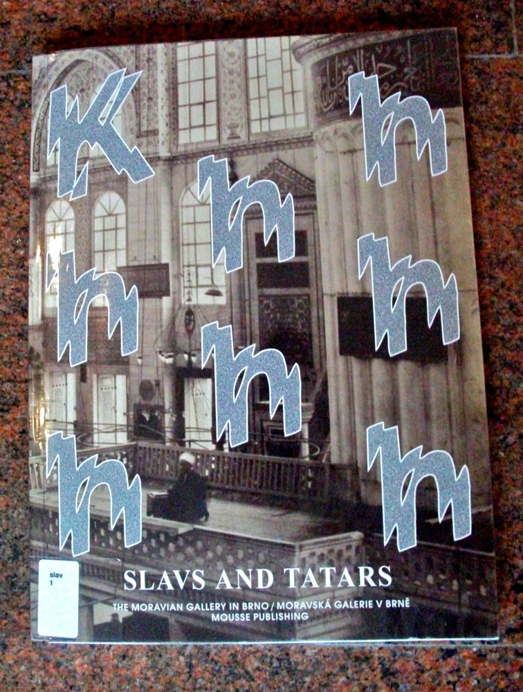
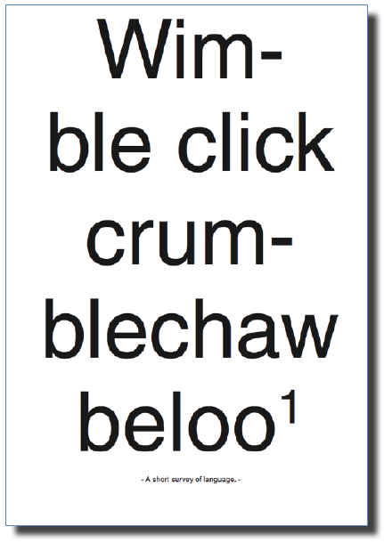
The cover consists of the K and the H’s from “Khhhhhhh” scattered over a picture of a room that looks like a mosque. The letters are in a sort of bad computer game-like font with a thick white border and a filling of grey/silver’ish screen noise. Strange combination which immediately intrigued me and invited me to open the book and look at the inside.The way the letters are scattered is of course a choice which have been made, like everything else in the book, and the way these letters are scattered is no different. They move up and down in a rhythm that divides the cover into sections. Also the effect of the font adds to the feeling of them moving.

The book is slightly bigger than A4, half a centimeter on each side and has a thicker cover but still not hard, which gives it the feeling of a catalog more than a book-book.

The back of the book is a continuation of the mosque room with a big white print on it of an open mouth with the two sentences:”Mothers Tongues” and “Father Tongues” written under it.

Khhhhhhh, cover and back

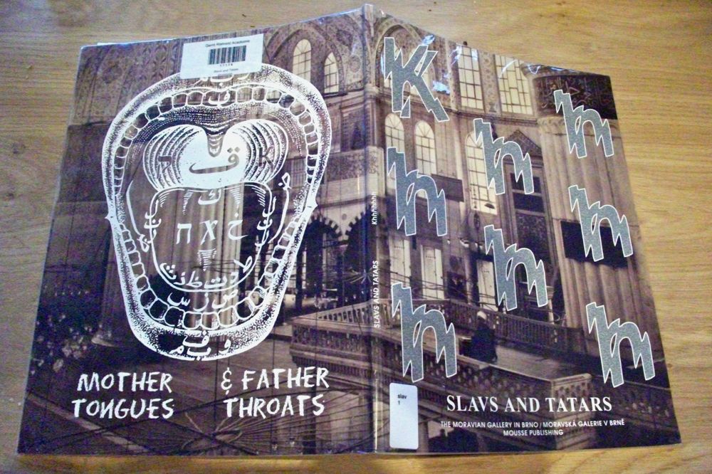
By looking at the cover and the back you already get a feeling of what the book might be about. Something with letters and a strange pronunciation of /sound from this “Khhhhhhh” + the mosque, the strange print of the open mouth which almost goes “AAAAAAHHHHH” at you, the inside of the mouth with foreign alphabet symbols and finally the Mother Tongues and Father Tongues indicating, again, language and inheritance of tongues/pronunciation.

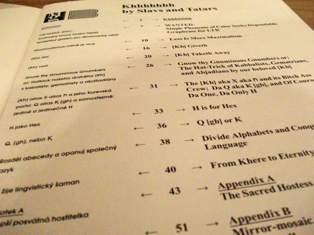
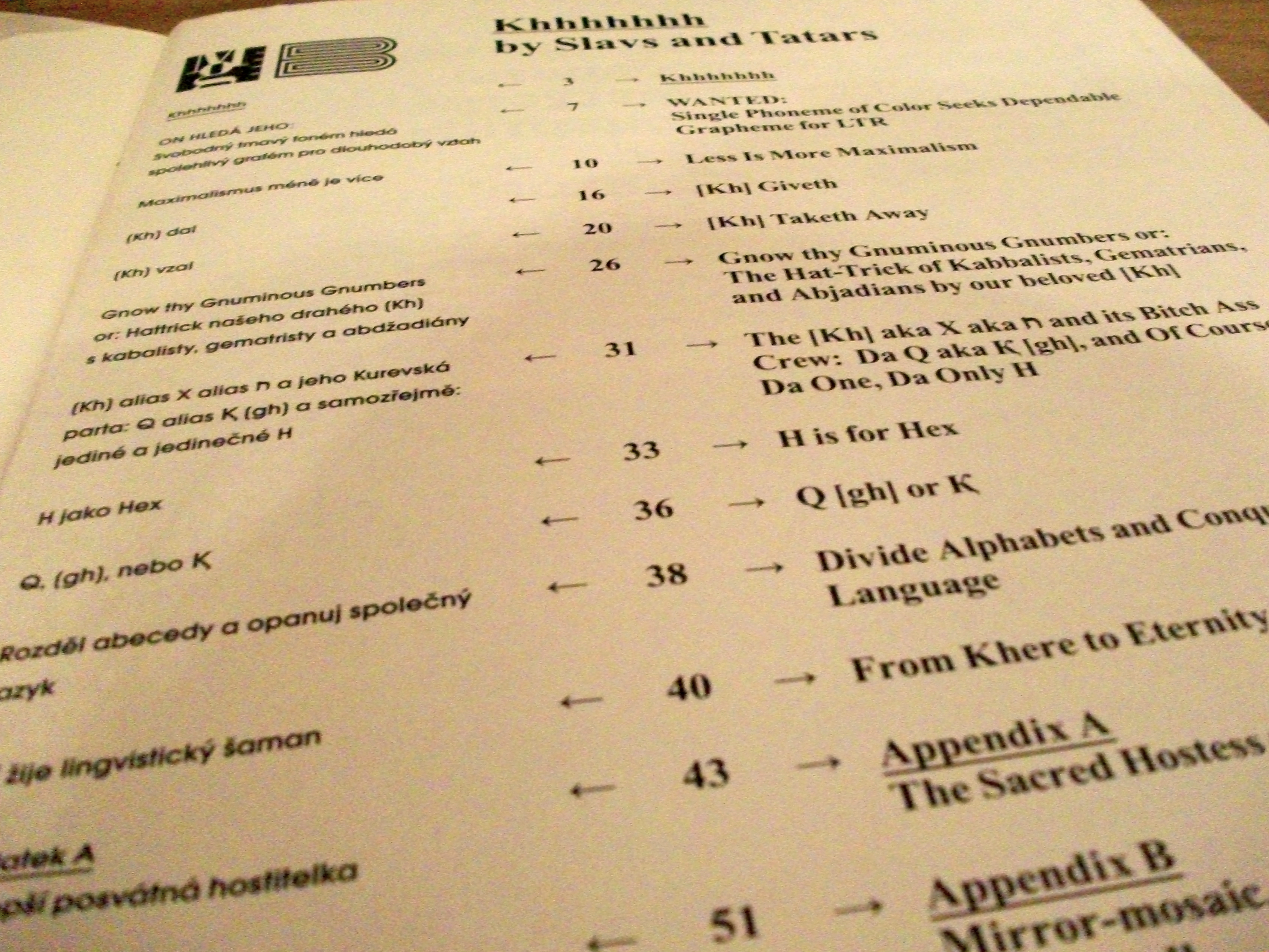
Opening the book there is no first page with information about the publisher, designer, year or anything, but on the opposite page there is the table of content written in Russian and English opposite of each other as if there was in a way some kind of comparison between the two languages. Maybe the book is about language? The paper is thicker (115 grams), a bit yellowish and has a really nice smell.

As you can see on the picture, the book has chapters and sub chapters.

Khhhhhhh, content


The following page is a Russian text in fat black lettering and two translations of the same text in English and I think Czech. The text says:” Genghis Khan, me you midnight plantation! Dark blue birch trees, sound in my ear! Zarathuse me, you twilight horizons! Mozarticulate me, dark blue sky!” – by Velimir Khlebnikov. I found it interesting that the two first letters in Velimirs second name are Kh. Also Genghis Khan was the leader of the Khan clan in Mongolia from 1175.
Before moving on to the rest of the book I would like to add a quote to give a shorter and probably more precise introduction to the book that might make more sense than what I’m able to explain: ” the book is;  A reconsideration of pedagogy, progress, and the sacred role of language via the perspective of a single pesky phoneme, [kh].Khhhhhhh explores the thorny issues of knowledge versus wisdom and the immediacy of the oral versus the remoteness of the written word thru a fireside chat around sacred hospitality, Velimir Khlebnikov, and numerology.”

After this starts a long investigation of the phenomenon Kh which I, before reading this book, had no idea was a phenomenon in language and how it undergoes different names and symbols in Semitic, Cyrillic, Turkic and Arabic alphabets. Because of the different languages each page consists of an English text, the translation in Russian, pictures from Slavs and Tatars exhibitions and beautiful drawings of the Kh in different languages and in which direction these symbols are to be drawn.

Khhhhhhh, alphabet Khhhhhhh, pages

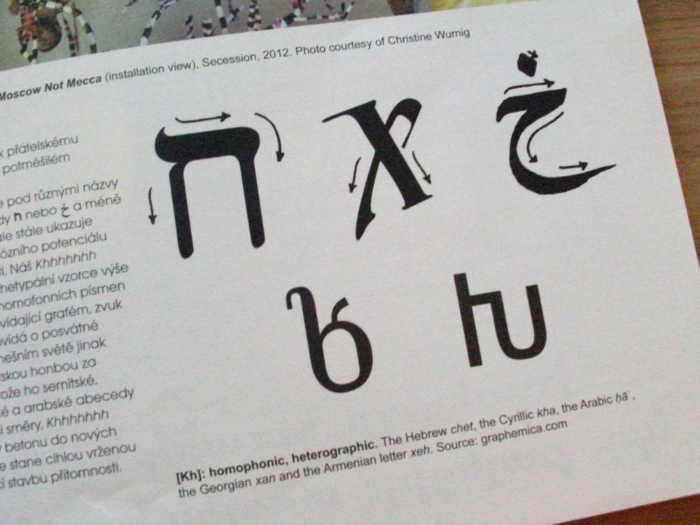
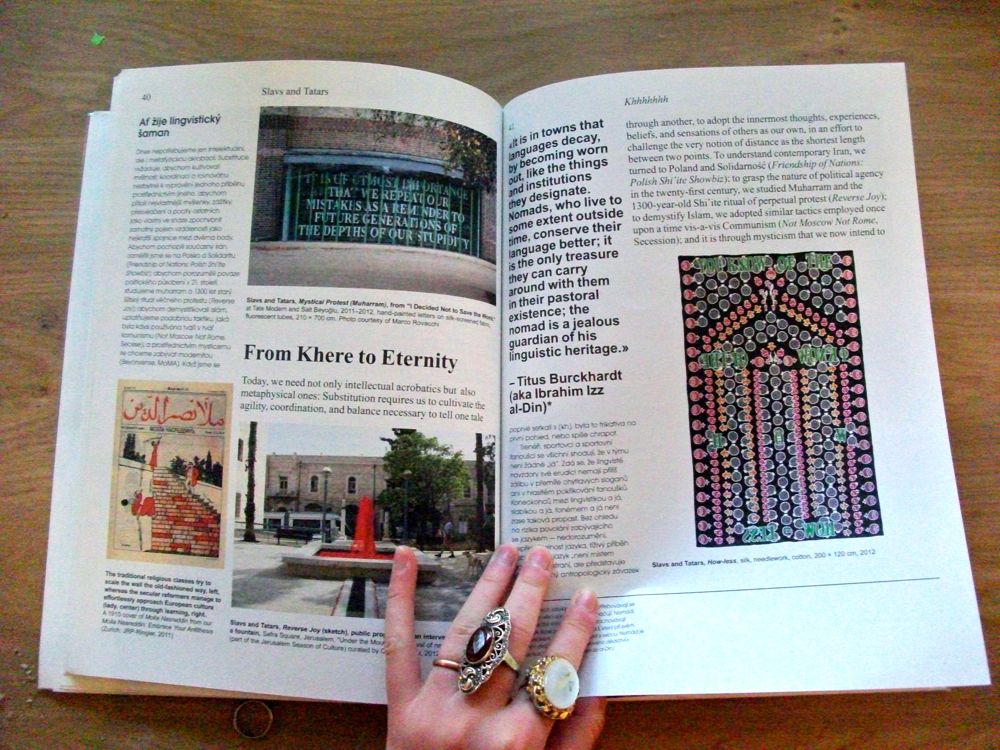
The choices which S&T has made for this book helps to pass on the investigation/research feeling and works almost like having a wall with a lot of sticky notes and pictures on it. They make this work without being confusing, which very easily could happen, by dividing the pages into sections. As in the table of content, the pages inside the book are divided so the left, slim column is for the Russian translation, most of the rest of the page has the English text and then you have pictures, illustrations and alphabets/symbols scattered over the rest of the page, with descriptions of each picture under each picture + footnotes. Busy, busy pages! The graphic of the lettering becomes more like a picture on the page than a text. Still everything is framed and kept inside a border of approximately 1,5 cm.

Khhhhhhh, pages

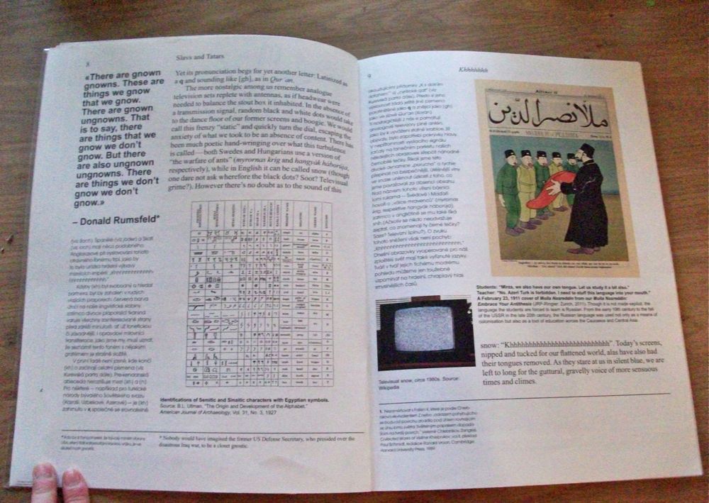
There is a lot of information on each page and the drawings, the texts, the translations and images are placed differently on each page so when you turn the page you have no idea what will come at you. As mentioned before this could give a very confusing experience with the book, but instead of being confusing it just keeps you really interested and curious.

S&L them self says in an interview that with their publications they: “Attempt to resuscitate the sacred character of language, from the devotional act of reading to the ritual of the printed word”, – which might be why the book design is how it is,  jumping up and down and moving on the pages as if it was the spoken language with it’s rhythm, different heights and lows and not the printed word.
It is almost impossible to describe the book with words, especially written words, which funny enough makes so much sense considering what the book is about.

Khhhhhh pageshift

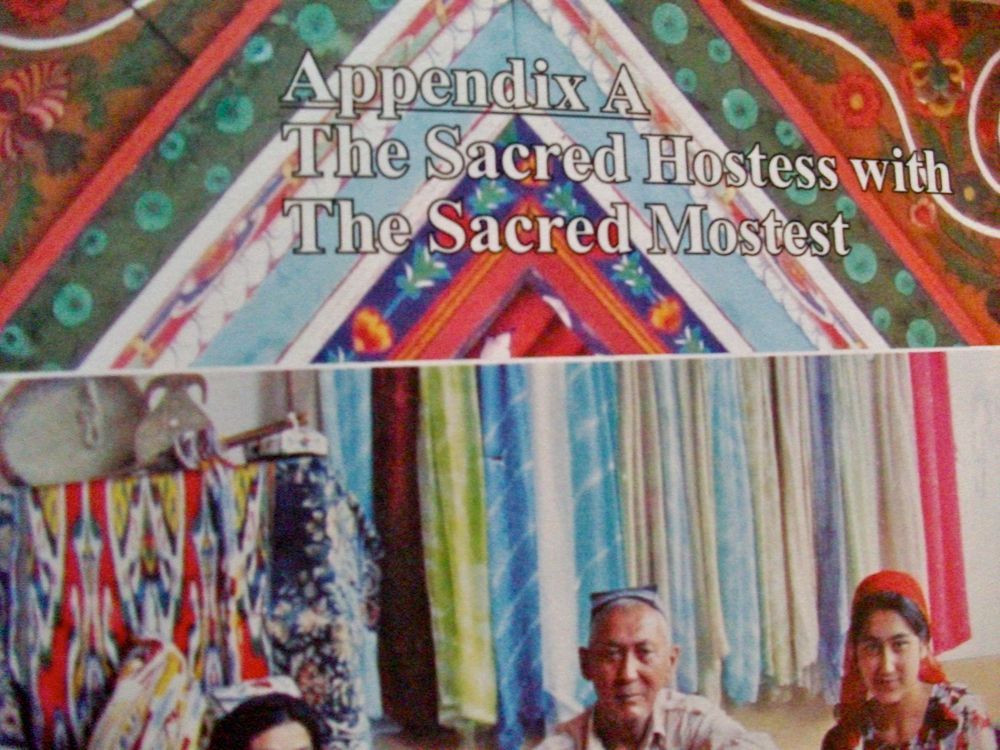
To indicate that the book moves into a different area in Appendix A, the pages changes completely and the background is a big photo.

Khhhhhhh, Appendix A

And the same goes for Appendix B, which is the last chapter.
I would really recommend you to have a look at this book and Hey! ….
It’s super easy because they even have a free pdf version uploaded online and on all their other publications www.slavsandtatars.com


Rietveld library catalog no: slav 1

You Name It!


Tuesday, November 27, 2012


ISCC-NBS-System is a color system that has given colors more efficient names. Inter-Society Color Council (ISCC) and National Bureau of Standards (NBS), an American government agency, first proposed the color system in 1932. Its initial purpose was to name the individual blocks of the Munsell Color System, which classifies colors by hue, value and chroma.


Moreover, just like how Munsell Color System (on which it is based) works, the colors of ISCC-NBS-System are determined under the condition of average daylight and normal viewing. However, instead of naming the colors by symbols, ISCC-NBS-System identifies the colors with the general and understandable terms so that everyone can use it without difficulties and confusion.

ISCC-NBS-System opens up a simpler way to name colors that does not confuse people with symbols and numbers. Actually, it is the most familiar way people name the colors and it is how we were taught to describe the colors. People simply name the colors by the basic colors that they are already familiar with and if more accuracy needed, they add adjectives in front to describe the darkness, brightness and etc. The system was close to what everyone has accustomed to name colors, except it organizes the language.


It's a good example of a diagram of ISCC-NBS-System, unfortunately only in Japanese, but you can still get an idea how it is structured

ISCC-NBS-System’s basic hues are red, orange, yellow, green, blue, violet, purple, pink, brown and olive. These colors have intermediate categories so that the names indicate the combination in colors, for instance, reddish orange and yellowish green. Finally, these categories are subdivided into 267 categories. Appropriate modifiers are added before the hue names: vivid, brilliant, strong, deep, light, dark and pale, although not all hue names have modifiers. As a result, the color should be called something like dark reddish gray.

According to ISCC-NBS-System, the name of the color is decided upon the viewer’s choice. It will be orange if the one sees it as orange even though it is red to the others. The names reflect how the viewers see the colors. The colors may be called differently depends on the viewer’s physical conditions, their educational or cultural backgrounds and any other facts that can limit their judgment. For instance, when I went to buy my school uniform in America, I first learned that khaki was not the color that I used to think of, which was close to dark green. My khaki uniform was light brown instead, what I used to call beige. South Korea and the US have given different names to the one color. The name of khaki was no longer important, what mattered was that I could describe the color.


My school uniform of Notre Dame Academy and its khaki skirt of which I had trouble describing the color

The given names under ISCC-NBS-System’s rules show the one’s characteristics. The decision on naming the color is made personally and objectively so it naturally shows one’s personality and background. I have a problem differentiating violet, purple and pink. They become even more uncertain when the adjectives are added. When the colors get darker or brighter, they lose their vividness and it is hard to decide to call them with specific names. To me, violet is close to dark pink and dark violet is hard to distinguish from dark purple.


Get the Flash Player to see this content.


The short movie that I made shows the color that confuses me the most, which is the mixture of violet, purple and pink, with different color names based on ISCC-NBS-System rules. It is 54 seconds long and shows 18 different names, one by one, every 3 seconds followed by the blinks. It is one loop so the names continuously change. The names describe one particular color, which is the color of the background. The viewers can come up with different colors for those names if the color is not shown because it was my personal decision to choose that color for those names. On the other hand, the color tricks the eyes as if they are different colors because of the blinks, but in fact, the only change in the movie is the text. The text contains all possible combinations among these three colors.


Left, the movie playing in loop, Right, the silk screened color. I have to say that the colors look completely different in picture, on computer screen and when you see them yourself

As a last step, the class, as a group, experienced the silk screen. I tried to print the color in the movie without looking at the color I already chose in the movie. However, the silk screened color turned out to be completely different than the one from the movie. It was much brighter and more vivid than the color on the screen. It was interesting to experience impossibility of duplicating the color and possibility of creating limitless colors with one name because it can be conceived differently depending on who names it.


[kh]


Wednesday, October 31, 2012

Slavs and Tatars

Slavs and Tatars was born in 2006, devoted to the polemics and intimacies between the east side of the Berlin wall  and the west side of the Great wall of China,  in easy words ‘’Eurasia’’. The  group explores time relations between  Slavs, Caucasians and Central Asians, groups that belong those lands.

The beforehand mentioned collective has mainly language , architecture, politics, mystical stuff, etc… as the main focuses of their researches, practices and magazines,  but is possibly through the multiplicity of languages  around  Eurasia by which  Slavs and Tatars build connections between disparate subjects as new ideologies ,old histories and  some  places, is by this way that some cultural affinities and geographical identities arise from unexpected  places and  never minded sources . Its is by their great interest in language by which their work take place in the public space, trough institutions or media, to the public sphere.

Slavs and Tatars interest in Eurasia  because its relevant role politically, culturally and spiritually , It  position belonging two continents make  languages there played a big role in a practical, historical and sometimes  sacred way, (they point to some old  an recent mystical protests which are reflected in the changes of affinities and differences until nowadays).

Khhhhhhhhhh

In this edition  Slavs and Tatars seeks for  the changes of language ,across Eurasia ,from a close and personal  perspective, but at the same time understanding it  from a discreet distance. Their phrase  ’’ Times are changing , consequently the scales we use change ‘’ takes a real meaning with the idea of substitution which examines, rethink and self-discover  the role of mysticism in social revolutions, metaphysics of protest. It is under the name of ‘’ Khhhhhhh’’ by which they try to show these changes.

x, ? , ?  or  ? ,  all these belong  [Kh]”  but with almost different graphemes, sounds, roots and roles. We can considerer [kh] as a linguistic totem  who plays different iterations in different  languages across Eurasia, To begin I think is important to understand the phonetics of [kh], it begins in the  vocal tract , in a rasp over the throat ,is at this friction  where [kh] ends and other letters begin.

It is remarkable the role that [Kh] has in different languages, I can describe like an example the Persian word for house— (khaneh)— begins with [kh],  while other persian words also related to ‘’shelter/house ‘’  has the the [kh] like a beginning or beside it, okhraniat (to protect), kholia (care), khibarka (hovel) … khlev (cowshed [Kh] followed by [l], produces an entirely different meaning to a [kh] followed by [r]. Changing the [l] of the Russian  (khlam, junk), into an p [r: junk is sublimated and becomes (khram, shrine).

In some historical points languages get richer. New words brought by foreigners, neologisms forged by common parlance, among many others, It is at this point that [Kh] suffer certain transformations and get the acquisition of new multiple meanings. Certainly some ideas and stories from foreign lands bring new symbols, whose with the time becomes in letters , those  will have an  inherent correspondence between the sound—or shape—of itself (the letter )and its meaning, One example could be the eight letter of the Hebrew ”?” (chet), which in other languages becomes in almost  different symbols and letters, as examplesi can show:   Syriac «, Arabic ?  and Berber ?,  Greek Eta H, Latin H, Cyrillic ?, the remarkable part of this is that these letters are always regarding at some point to their real background, Hebrew ?  (chet),  like in the Hebrew these are positioned in the 8th position of its respective  alphabet.

serpentine (click over serpentine)

At this last point I would like me to show 2 names of interesting importance in the changes of languages across Eurasia, especially in the early 20th century, Velimir Khlebnikov  whose work connects cultural roots and linguistic ramifications, he did experiments with consonants ,nouns, and definitions spelled out in a simplest form, there  are some of its 1920s essays who mark a clear line  between what we considerer old readers and new, his work was classified as hermetic, incomprehensible:

The sun’s rays in the dark eye
of an ox
and on the wing of a blue fly,
like a wedding’s line dance
that streaked past above him.

And Rudolph Steiner, who searched  for a language of thought. He was looking for the process ‘’from the figure to the thought/ form ‘’, and how our bodies will be able to make a real union with one or another kind of being, something similar to this last statement could be turning the reading normal book into a manual and lately into an artist book, according to him it will lead to a ‘’high level of spiritual insight’’.

“Style, however, requires continuity of thought. Anyone setting out to write an essay and to write in style ought already to have his last sentence within the first. He should in fact pay even more attention to the last than to the first. And while he is writing his second sentence, he should have in mind the last but one. Only when he comes to the middle of his essay can he allow himself to concentrate on one sentence alone. If an author has a true feeling for style in prose, he will have the whole essay before him as he writes.”

Grammatical System Investigation (GSI)


Thursday, May 20, 2010

What is perfect? Is it complete, non-existant, precisely accurate, pure, to improve, unattainable? What are these words such as ‘perfect’ about? When it comes to communication, can language in general explain what we are trying to say? What words are chosen to express this meaning? In the historical sense grammatical languages have been developed and evolved. Is there a constant factor to be found in these different languages?

Perfect is a word from the English language. It can be a verb, a noun or an adjective. These are devisions made in the dictionary, where you can trace back words. Some words in it equal other single words, others are described by several words. This is how ‘perfect’ is equaled by several words, but for example ‘couch’ can be equaled by one word, ‘sofa’ (a type of furniture). But by referring to a couch, also the frame of the type of furniture can be aimed. In the theoretical meaning of language, ‘grammar’ is a name for the study, description and explanation for everything that involves the system of a natural language or an artificial language.

Grammar is a term derived from
the Greek word:
(grammatik techn) which means “art of letters”,
(gramma) which means “letter”,
(graphein)which means, “to draw, to write”.

To study language a structure of words and sentences are used that are defined by a set of rules. These rules can function as a sort of pattern to relate to the meaning or the logic in language. This is how a description of the word perfect could have a totally different meaning for any person individually. When a baby is born into the world, it has not learned a specific language yet. It can communicate through sounds. By repeating sounds the baby could learn a grammatical language. Other people can teach it, by using this system of words, that they once learned in the same way. Grammar can also be a way to express the system of a specific language. This can be a formal-mathematical description, a way to describe the language itself or in another language, or a combination of these forms. To translate a formal-mathematical description a formal system can be used. In grammar these systems function as well as in math and logics. They consist of the following elements:

a finite sequence of symbols that help to formulate formulas
In grammatical sense an alphabet helps to create words. Each alphabet has its own sequence of symbols. In the word p e r f e c t i o n each letter is a symbol and a part of the word or sequence.

a grammar that prescribes how well formed formulas are formulated.
The words that are put together by the letters of an alphabet according to a defined set of rules. In the following example ‘pre’ has in every word (or formule) the same quality. The rule ‘pre’ is the pattern. It can be recognized like this:
prefix
previous
prepare
preview
prevent

a sequence of axioma’s or an axioma schedule
This is a proposition that is not proved or demonstrated but self-evident.
In the formal system new expressions are being abstracted from older ones. The older expressions that assumed are called axiom’s, the new expressions are called propositions.
‘pre’ is a Latin (or Greek) prefix that is used in the Latin language as well as in English. The word ‘pre’ is equivalent to the word ‘before’, although in this sense it cannot replace ‘pre’ in the words above.

a rule that abstracts a proposition from a number of propositions
These propositions are being called premises and the subtracted proposition is called the conclusion.
“Perfect is a word” is a true proposition
“Perfect is a sentence” is a false proposition
“Perfect is cute” is a contingent or random proposition
“Is this perfect?” Is a question, not a proposition

Conclusion: ‘Perfect’ is a word, it is not a sentence. ‘Perfect’ could be called ‘cute’, although it is a random proposition that cannot truly logically define it.

In logics proposition statements are either true or false. In this way it is right to say that ‘perfect’ is a word. This does not apply for, for instance questions, desires or exclamations. If the statements are true or false can be unknown, as long as the question: ‘Is it true?’ can be asked usefully. So is it useful to ask if the proposition ‘Perfect is cute’ is true? ‘Cute’ is a adjective that describes in this context, not an equal meaning, but a subjective meaning to ‘perfect’. Also in different languages this word may have various understandings, although the same type of word is used.

The English language is spoken as a primairy language in Australia, Belize, New-Seeland, Nigeria, The United Kingdom and The United States of America. As a secondary language it is spoken in a much wider range. Almost half of the grammatical English language is originally from Germanic and Roman languages. When Germans invaded Brittain 450 After Christ, they brought their language with them and so the Old English was formed. Then the history of English evolved when colonies were founded in North-America around 1600. The language developed within a different setting. Nowadays the American English changes under the influence of media such as television and the Internet. Emigration, invasions, mass media, and for example wars have caused the absorbtion of external words into existing languages. In this sense finding the origin of words could explain something about the history of the world.

The grammatical history of the word perfection lies in the Latin word ‘perficio’; in English the meaning is ‘to finish’, ‘to bring to an end’. The word perfect (io) in this sence means literally ‘a finishing’ and perfect(us) ‘finished’.

information:

http://home.hccnet.nl/am.siebers/woorden/framewoord.html

http://www.answers.com/topic/perfection

take care of myself


Thursday, April 2, 2009

And again repetition. It’s also ironic, to repeat a search for repetition. But this time it’s different:
this time it’s art;
this time it’s pink;
this time it’s really big;
this time it’s Sophie Calle.
But still it’s repetition

A letter, over and over again, but the same letter. 30 women from different ages, professions, layers read it, interpretate it into what they think is the content. Now suddenly it seems not to be about the same letter anymore, but it is!
Repetition in language apparently is different than repetition in forms and shapes.
Language has a personality to it that by the slightest (miss) interpretation or (miss) understanding, the content seems to change. So now it’s not a repetition of the same letter 30 times, it’s about 30 different letters.
I get confused now, because I seemed to think that our interpretation of forms, prints and products would be more alike for everybody. Because a form is a form and a product is a product. Because we learned a cup is to drink from, we see a cup to drink from.

We also learned the meaning of words, but somewhere through life these meanings seem to form itself into (slightly) different ones.
Our idea about forms and products are also changing through life, but it somehow seems to me that there is more of a conventional thing to it, or al least a less personal one. At least the function.

cat.no. -call-2

keyword: repetition

again and again and once more


Thursday, March 26, 2009

…While thinking about repetition and about the idea that practically anything could become a pattern by repeating it over and over again, I came to think of industrial design.

Where repetition in a pattern becomes this new image that, in a way, is stronger than the pieces apart. Repetition in products doesn’t really make it stronger. It makes the product less original en less valuable.
Unless you only plan on making a few of the same product, than the product suddenly becomes a collectors item or special edition.

Well, this second book was about industrial design…but also about language. Funny how these two subjects work together. Because through industrial design it becomes possible to have the same products all over the world. So for new products, new words have to be invented. A lot of products are called after their function, at least in Dutch they are. But wouldn’t it be an idea, to have international words for these international products? Ikea is already using this concept, so now people all over the world start having their own strange Swedish vocabulary of really silly words. Does that mean that in ten years every person, from Singapore to Munich would know that a LILLÅKER is the thing you rest your mattress on?

I think this book gives a better solution to this language problem, by just learning the different words.

cat.no. 772.9 cat 50

keyword: repetion

Silence?


Thursday, January 15, 2009

Inup and his class had to form a tribe for one of the design blocks. They had to create their own outfits, according to a social handicap, chosen from real life, exegerated or immagionairy. And then they had to make a costume, a dress, a mask or a body extension to make clear what is disfunctioning. Some people choose mental illnesses as chizophrenia. Some people locked their heads up in boxes. Some people wore peculiar transparent dresses with almost nothing under it. Then they had to write something about their handicap in a book that is going around all the classes where the design teacher comes to turn the group into a tribe. Inup, what was your handicap? I asked. But he finds it hard to talk about it. How did you work as a tribe? How did you communicate with each other? What did the costume made you feel like? He wants to answer. He understands me. His face moves. His eyes are focussed. The answer is so close, but the language is a punishment. His lips are sealed.

Link: Silence?


Log in
subscribe