
Since the start of our Design Theory/Research course about typedesign, graphic design, foundries, fonts , typefaces etc. we have had a look into a, for me unknown but, very interesting world.
This research will be about Lineto which is a foundry that these days sells there Lineto fonts, like replica, via their website and they have type-designers who publish their own fonts through Lineto. We will further explore the similarities between type design, graphic design and art.
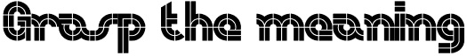
My research question will start us out with some history to get a grip on all the different terms that are used to find out what Lineto actually does. For me starting out as a rookie I’m trying to grasp the meaning of this all. This is an interesting step that can also help you in understanding this world on its own. After that we will dive further into the question what the similarities are between type design, graphic design and art.
A type-foundry is a company that designs typefaces. Typefoundries used to sell their typefaces made out of wood or metal and matrices that were used for line-casting machines like Linotype and Monotype. This is such a time consuming and expensive process that when the computer started to be used it was replaced by digital type which is mostly used today.
Now to first get some terms straightened out. The term typeface is often mistaken or used for font. The two terms had more clear meanings before the start of desktop publishing but faded. What the difference between font and typeface is is that a font points out a specific member of a type family like roman or boldface, while typeface shows a consistent visual style which can be a family.
Back to Lineto, Lineto sprung up into existence in 1993 right at the time when the computer started to get used extensively in people’s daily lives. The foundries in this computer age where called digital type foundries which accumulate and distribute typefaces as digitized fonts created by type-designers.
Typefoundries always had used catalogues that were updated every year but since the digital type came in to the scene it was almost impossible for a foundry to make a catalogue looking at the amount of types that were created and distributed.
This way of working was embraced by Lineto and five years after starting their business Cornel Windlin and Stephan Müller the founders of Lineto jointly set up Lineto.com to distribute their own typefaces through the internet. They also invited a number of other designers to publish their fonts alongside theirs.
If you look at the fonts on Lineto.com you start to wonder what the difference is between type design, graphic design and art. There are differences between the three but there is also a very strong cohering similarity which you can’t deny and this I find an interesting discovery.
Starting out with describing graphic design you see that it is a creative process which involves a client who provides the work and then there is a producer, printer, programmer or signmaker of some sort. At the end of the process the result is used to bring across a specific message to the viewer.
In art you see that it is also very much a creative process which brings across a specific message but usually addressing different issues but the principle is most definitely the same.
For a type designer it is the art of designing typefaces. Where the typeface is one or more fonts designed with a certain unity. The function that their end product is used for is also about getting a message across to an audience, a better description of it is that it is a tool for bringing across a message to the viewer.
So everyone of the professions that are described above is about visualizing an idea concept or bringing across an idea or thought or a tool for doing so. Type is so rooted in our system and culture that we cannot escape from its grip, there are always fundamental links rooted at the core of it all. Looking at it in this way I think can open up your mind to look at type in a new and different way as an artist.

