"science" Category
HERMANN EBBINGHAUS’ COLOUR SYSTEM
Friday, March 23, 2018
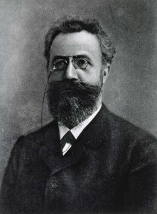
Hermann Ebbinghaus (1850-1909) was a German psychologist who pioneered the experimental psychology of memory. He is mostly known for his discovery of the forgetting curve (describes how the ability of the brain to retain information decreases in time), the learning curve (graphical representation of the rate at which you make progress learning new information) and the spacing effect (phenomenon whereby information is learned and retained more easily and effectively when its studying is spread out over time).
However, Hermann Ebbinghaus has also been known thanks to its colour system. Indeed, the concept of the double pyramid gained in popularity thanks to the latter.
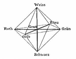
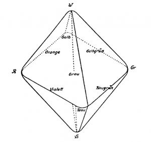
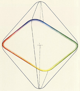
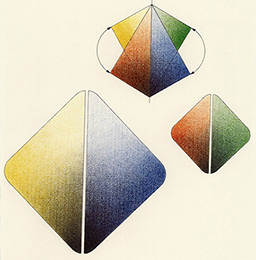
In 1902, he proposed a new version of Hofler’s double pyramid. Ebbinghaus constructed a colour system rest on this system of double pyramid but made few modifications: he put rounded corners and an inclined central plane.
He rounds off the corners of the solid as he considered the transition between colours as fluid and not sharply defined. The Hering-type fundamental opponent colours are located at the six corners (black, green, red, blue, yellow, white).
The resulting chromatic body, from the four primary colours, links Leonardo da Vinci’s idea that colours vary in brightness and can thus be differentiated. The idea was to separate and so distinguish those four colours due to the variation of brightness.
The base-square of the double solid is tilted in such a way that the best yellow hues, which are relatively bright, are nearer to white, and the best blue tones, which are relatively dark, are nearer to black. His system does not predict the mixtures of colours and the complementary pairs are not arranged opposite one another.
In 1893, Ebbinghaus published a «Theory of Colour Vision» in the Zeitschrift für Psychology (Journal of Psychology), in which he mentioned that humans perceive colours through higher mental processes. As a psychologist, he knew about the perception of the four elementary colour (yellow, red, green, blue) and thanks to physiologists knew there were only three photo-sensitive substances in the eye’s retina (rods, cones, photosensitive retinal ganglion cells) thanks to which the phenomenon of coloured vision and its anomalies could be explained.
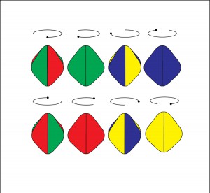
In addition, Ebbinghaus has discovered that two white hues produced by spinning either red and green or blue and yellow, appeared to be the same at certain levels of brightness, but appeared different when the illumination was reduced or the speed was reduced.
Maxwells Colour System
Saturday, March 3, 2018
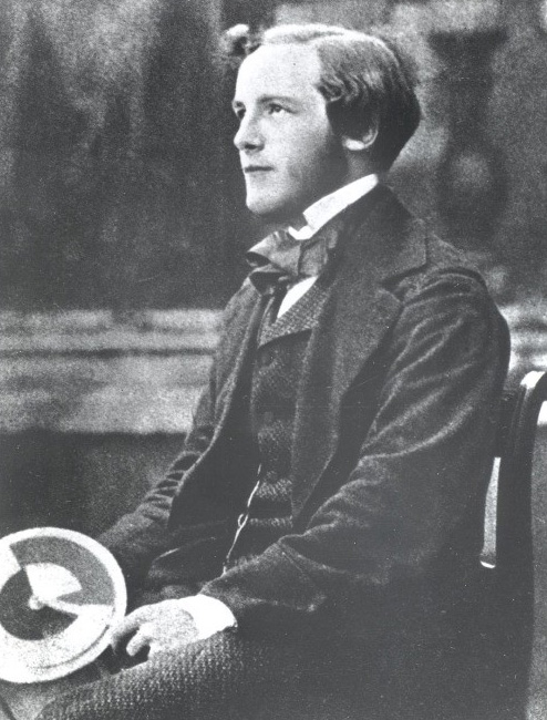
The scientist James Clerck Maxwell discovered the additive colour system and showed the first colour photography. He lived in the 19th Century, influenced by the Works of Isaac Newton and Thomas Young. He has impact on our knowledge of the Saturn Rings, Electromagnetic waves and the RGB colours.
Maxwell at Trinity College, Cambridge. He is holding one of his colour wheels.
In his student years at the Cambridge he was fascinated by the questions:
What are colours? Why do we perceive colour? And why are we so coloured?
At that time he read the studies of Thomas Young. Young thought that painters have a much better understanding of colours then scientist had at that time. They used the primary colours to get the full colour spectrum of a painting. He found that there’s a significance of these three primary colours and that biology has a role to play. He assumed there are three receptors for each of the primary colours in the human brain. By mixing these we receive our full colour view.
Maxwell read about this theory and wanted to prove it by mathematics. He developed a tool to trick the human brain. By spinning the right amounts of red, green and blue on a wheel, it seems like the colours are melting together to white. With this experiment he could prove that what we perceive as white is actually a mix of colours. And that there’s a difference of mixing colours in light and colours in pigments.
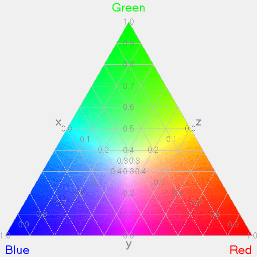
From this he developed a Red, Green and Blue colour pyramid. On each corner there is the absolute of one of the primary colours. Towards the middle you get different hues of the colour and the center is white. The Pyramid is built on a x/y Axe. Mapping out a point on the pyramid gives a value of each of the primary colours.
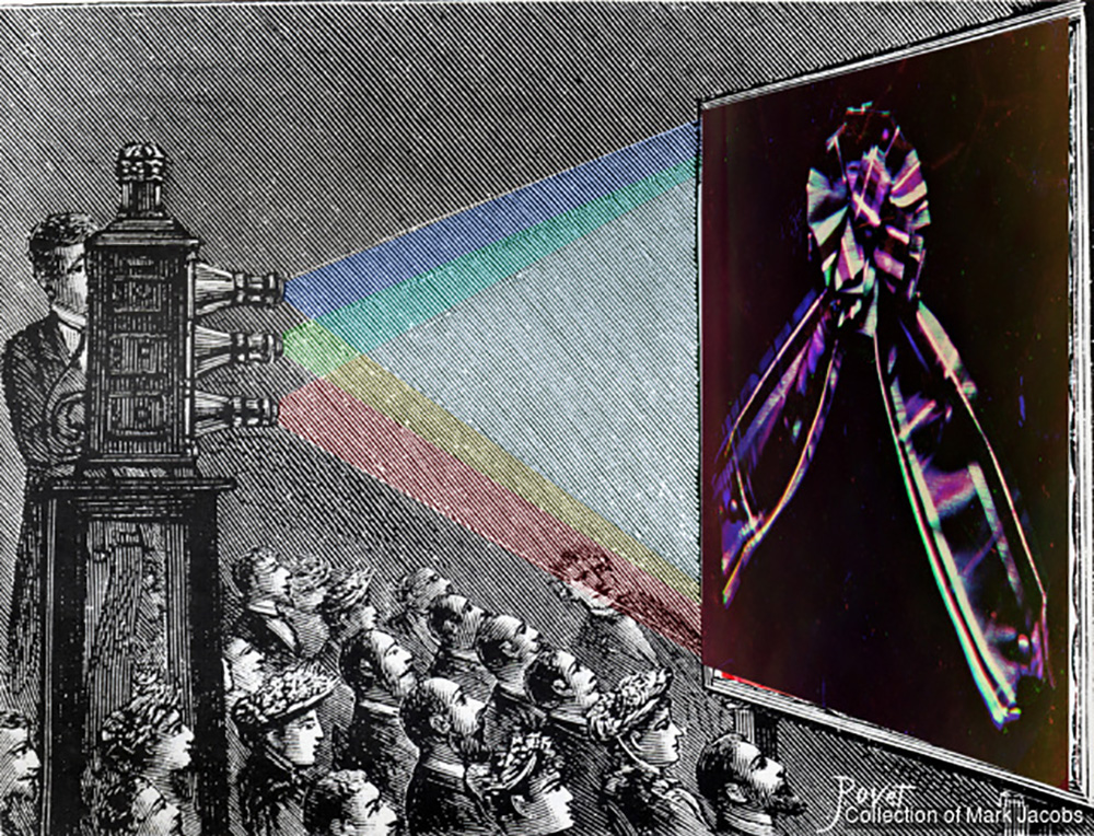
To display his finds, he was invited to give a lecture on colour vision. What he did was to screen the same photograph with a red then green and blue light on top of each other. Where the colours intersect, there is white.
At this time there was only black and white photography. With this experiment he made the world’s first colour photography. The additive colour system can be understood as the foundation of RGB colours and is used in the screens of most electronic devices today.
the wearable future
Monday, February 19, 2018
Looking at Gijs Bakker‘s neckpiece in the stedelijk BASE exhibition directed me to an intriguing subject: (neo-)futurism. Working together with Emmy van Leersum Gijs Bakker was aiming to make jewellery less frumpish. By making big statement pieces they made jewellery less of a status symbol and more of an accessory to fashion. This was a totally new approach. Jewellery and fashion had not been connected in such a manner before. They were also very futuristic in choice of materials. They chose materials like aluminum, again breaking with the crafty connotation jewellery had, and with the jewellery as a status symbol since the material was cheap and easily produced, making it available to the masses. Them revolutionizing jewellery made me wonder what a new form of futurism could be, in what ways we could reinvent jewellery nowadays. A huge amount of sub questions arose that I believe should all be looked into when trying to reinvent jewellery. Here I name a few. Could contemporary jewellery serve a social function? How could we reinvent the material (I believe this was vital in the futurism of Gijs Bakker’s jewellery)? How could we bring it to the masses? In this tiny research I only slightly touch the surface of these complicated matters.
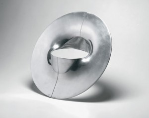
Material future
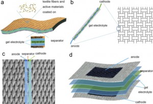
When it comes to innovating material a lot of exciting things are happening. We are living in a time of rapid development of technology. New findings could be integrated into contemporary jewellery design. Renewing the world and meaning of jewellery altogether. Structurally changing the current function of jewellery or enriching it by adding an interactive aspect. In contemporary jewellery many materials are being used. Such as fabrics, when we look at fabric a lot of exploration of means of energy storage is taking place. To get an interactive piece an energy storage is vital. Researchers are doing a lot of research in finding ways to make fabrics store energy without losing wearability. Think for instance of yarn batteries, sources of energy being 1D-yarns that are woven to construct the fabric. Imagine the possibilities! The technical aspect is quite intricate but if you are interested there are multiple articles available online. Overall there are still many problems with washability and there are safety issues but it seems to me like an inspiring look into the future.
in example b you can see the so-called 1D-yarn
Social participation
Can we start to discuss questions in modern day society through the medium of contemporary jewellery? I found some interesting insights in an essay written by Rebecka Huusko-Källman. Jewellery can be seen as very mobile as it is made to be carried by our bodies, therefore it can be considered a great medium for conveying a message in all kinds of environments. As you leave your house the jewellery does too. 'Moving around in social contexts, jewellery operates between the personal and public space, it has a unique ability to interact with the viewer.' (den Besten, 2012) However Liesbeth den Besten also states that contemporary jewellery -making statements or titillating to the point of discussion- often only moves around in small circles. The mass does not have the access and/or does not seem as interested in these kinds of contemporary wearable objects. Another issue is the fact that the contemporary jewellery being displayed in galleries can make it seem like merely a commodity and thus not a subject of reflection or discussion. Whereas on the other hand displaying the pieces in museums can separate the viewer from them, through its significant context it’s isolated. Lastly, the masses often fail to read the meaning of the works, the ‘language’ through material and form seems remote and inaccessible to people who have not been initiated into this specific field.
Economics
To get messages across or start a conversation one might consider the commercial side of it all. The jewellery industry is growing rapidly (according to ‘A multifaceted future: The jewelry industry in 2020’ written by Linda Dauriz, Nathalie Remy and Thomas Tochtermann) it is expected to grow 5 to 6 percent a year. They state that the trends that formed the apparel industry the last thirty years are starting to show in the jewellery industry. These trends being: internationalization and consolidation, the growth of branded products, a reconfigured channel landscape, ‘hybrid’ consumption, and fast fashion. From these findings we could conclude a couple of ways of getting into the public eye. First of all branding is on the rise so really strengthening a brand or producing via a brand can make reaching the public easier.Secondly using the online platform is important. The article says: 'According to a recent McKinsey survey, two-thirds of luxury shoppers say they engage in online research prior to an in-store purchase; one- to two-thirds say they frequently turn to social media for information and advice.' Thirdly there is a supposed ‘hybrid’ consumption which means consumers either buy more quality orientated ‘fine’ jewellery or the cheaper ‘fashion’ jewellery. The article recommends the following: ‘Fine jewellers might consider introducing new product lines at affordable prices to entice younger or less affluent consumers, giving them an entry point into the brand. Fine-jewellery players could decide to play exclusively in the high end and communicate that message strongly through its advertising, in-store experience, and customer service.'
Results of day-to-day technology and modern media.
Thursday, November 30, 2017
An introduction to: Forensic Architecture.
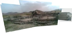
Forensic Architecture (FA) is a research based agency located at Goldsmith’s university, London. It undertakes advanced architectural and media research on behalf on international prosecutors, human rights organizations and political and environmental justice groups. It refers to the production and presentation of architectural evidence – buildings and larger environments and their media representations.
As contemporary conflicts increasingly occur in dense urbanized areas, homes and neighborhoods become targets. Casualties come to be in cities, buildings and the ‘safety’ of their own home. Nowadays, thanks to this multimedia era, urban battlegrounds are overflowing with information and data shared to social media platforms. Many violations, undertaken within cities and buildings, are now caught on camera and are made available almost instantly. The premise of FA is that analyzing IHL and HR violations must involve modelling dynamic events as they unfold in space and time and creating navigable 3D models of environments undergoing conflict, as well as the creation of filmic animations, and interactive cartographics on the urban or architectural scale.
These techniques allow FA to create precise, convincing and accessible information that could be crucial for the pursuit of accountability. Architectural analysis is also important because it enables new insights in context of urban conflicts.
The widespread possession of cheap digital recording equipment, the development of satellite communication, the public availability of remote sensing technology and the ability to communicate and diffuse information instantaneously through the internet have made urban conflict more complex, but also generate enormous amounts of data that can be used as potential resources for monitoring. However, these transformations also lead to secondary conflict about interpretation that takes place on news and social media websites. The establishment of new forums of international jurisdiction mean that also contemporary forums themselves become dense media environments. In them screen-to-screen interaction replaces face-to-face deliberation. The combined process of the urbanization and mediatization of war makes FA an urgent and indispensable practice for human rights investigations. FA seeks to respond to these challenges by developing new modes of media research and new modes of media presentation for urban and architectural environments.
Results of day-to-day technology and modern media.
Nowadays our lives are filled and dependent on electronic devices, and with that I don’t mean ‘the ones that keep you breathing in the hospital’. It is the smartphones, tablets, laptops, smart watches and what not, that makes that we can function in modern society. Because of it we can keep up with the ever-changing world on a speed that we have never seen before. Now it is a very contemporary debate if this is a positive development, many pointing out the negative. From a subjective and personal point of view I would have to place myself on negative end of the spectrum as well, seeing the unfavorable short and long term effects. Finding out about FA was because of that very thought-provoking.
I will open up a research project that compares positive and negative aspects of modern media and technology use in the present-day.
I will introduce this research through a series of set examples.
Generation Selfie
First of all, a negative side to the rise of social media is the deteriorating self image and esteem of essentially Generation Z and the Millennial’s. Quoting scientist Clarissa Silva:
“Social media has been linked to higher levels of loneliness, envy, anxiety, depression, narcissism and decreased social skills. As a Behavioral Scientist, I wonder what causes this paradox? The narratives we share and portray on social media are all positive and celebratory. It’s a hybridized digital version of “Keeping up with the Joneses”. Meaning for some, sometimes it appears everyone you know is in great relationships, taking 5-star vacations and living your dream life. However, what is shared across our social networks only broadcasts the positive aspects of our lives-the highlight reels.”
The idea of saving and sharing the highlights of our lives has been a long past introduced concept, think about the photography albums your parents made of you and themselves. But in this new form of doing so, we are constantly bombarded with other’s excitements and achievements in life as well. From the envy and hate- love relationships we hold with our online society grows a competition with a non-existent finish line. Seeing photos and videos of your ‘friend’s’ beautiful holiday destinations, their new set of clothing and perfect life is just a start. The image we have our own appearance decreases drastically, not only as an indirect result of the examples shown above, but also the obsessive behavior around beauty.
It has been part of mankind that the vision on beauty evolves over time and differs from culture to culture, but the coming of social networks has changed the game thoroughly. We can change our DNA online to look like what we see as perfect. Setting impossible goals for ourselves in real life, which makes it less interesting to ‘live’ there.


Panoptical Society
“He who is subjected to a field of visibility and who knows it, assumes responsibility for the constraints of power; he makes them play spontaneously upon himself; he inscribes in himself the power relation in which he simultaneously plays both roles; he becomes the principle of his own subjection”
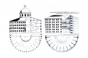
A quote from Michel Foucault about ‘Discipline and Punishment’ and his theory of the panopticon, referring to an experimental laboratory of power in which behavior could be modified, he viewed it as a symbol of the disciplinary society of surveillance. Jeremy Bentham proposed the panopticon as a circular building with an observation tower in the center of an open space surrounded by an outer wall. This wall would contain cells for occupants. This design would increase security by facilitating more effective surveillance. Residing within cells flooded with light, occupants would be readily distinguishable and visible to an official invisibly positioned in the central tower. Conversely, occupants would be invisible to each other, with concrete walls dividing their cells. Due to the bright lighting emitted from the watch tower, occupants would not be able to tell if and when they are being watched, making discipline a passive rather than an active action. Strangely, the cell-mates act in matters as if they are being watched, though they cannot be certain eyes are actually on them. There is a type of invisible discipline that reigns through the prison, for each prisoner self-regulates himself in fear that someone is watching their every move.
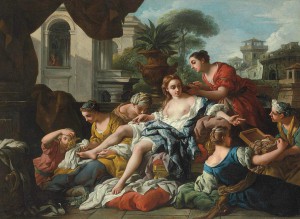
Nowadays we can question till what extent our privacy is legitimate. Especially in the western world where conspiracy theorists can not stop about ‘big brother’ and the never ending evolutionary steps in technology which make registering everyone’s smallest move and collecting this data easier. Still to be a fully functional in the society we shaped we require the illusion of privacy. It allows us to be fully human. This illusive quality of privacy is not something of the past decade, it goes back to the Hebrew bible. Consider beautiful Bathsheba, who strips for a bath in the second Book of Samuel, an ancient text, only to come under the lustful gaze of King David, pacing on his palace rooftop. Or Hamlet, whose private conversation with his mother is overheard by Polonius, hiding behind the drapes.
This enormous growth of ways to document humanities slightest movements with or without their full realization is not lacking a reason. Governments worldwide are gathering data about their civilians, justifying it by telling us it is for our protection. Like possible terror attack prevention. But why would they need your WhatsApp messages? A connection to your webcam? And access to private files? Princeton computer-science professor Edward Felten explained that simply because it’s cheaper and easier than trying to figure out what to take and what to ignore. “If storage is free but analysts’ time is costly, then the cost-minimizing strategy is to record everything and sort it out later,” Felten noted. Ofcourse this is questionable as well. And we have reason to be suspicious, we all know how classified and mysterious the higher working powers can be. Cases like Edward Snowden’s make us aware of the ambiguity of the top authorities. Snowden, a former contractor for the CIA, left the US in late May after leaking to the media details of extensive internet and phone surveillance by American intelligence. Mr Snowden, who has been granted temporary asylum in Russia, faces espionage charges over his actions.
This being a very contemporary topic, artists (as they tend to do) have taken a liking in the subject as well. At the Sonic Acts: The Noise Of Being exhibition in February 2017, I saw the work of Zack Blas called Facial Weaponization Suite. It showed several masks hanging on the wall and a video explaining the cause. He calls is a protest against biometric facial recognition and the inequalities these technologies propagate. This mask, the Fag Face Mask, generated from the biometric facial data of many queer men’s faces, is a response to scientific studies that link determining sexual orientation through rapid facial recognition techniques. With this work he makes us question ourselves how much autonomy, privilege, power and privacy we let them take away from us. Or have they taken it all already, and is what is left just an illusion?
Let’s Make Pipes Great Again
Thursday, November 30, 2017
“You need to create possibilities to store the water when there is a lot of rain and release it when there isn’t enough of it. “So why not incorporate this idea in our habitat in a visually attractive way?” Jolan van der Wiel
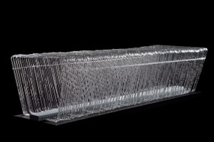
Designer Jolan van der Wiel made a bench that looks fragile, beautiful, put on display in the museum a meter above the ground. It took the visitors a while even to understand that it is meant for sitting. It’s far from practical, storing only a very small amount of water, has no cooling system and probably breaks/bends under pressure. This bench is really not made for sitting or storing water.
If Jolan’s goal is to bring people closer to useful resource management systems via introducing them in a visually attractive way, maybe it is more resul should start from the other end of the process. Start with what is already there in our daily urban lives but we never notice it as anything else but practically necessary objects or systems.
What if we could bring people closer to resource (gas, water, electricity) management systems. Rather than starting from the aesthetic point of view, we should start from the practical side, start from acknowledging these technical solutions that are very well-thought through, and show them as something aesthetic, show them as something that people can appreciate. As for now, our goal in building and city management is to hide all the arrangements that make our life comfortable, easier, cleaner. All the pipes are hidden underneath the streets or in our walls. We are almost always reaching to hide everything that is evidence of how things work. It’s almost as if we didn’t really want to understand how the water gets into the tap, how come I have light in my room even when it’s dark outside, or how I don’t freeze to death in the winter. It’s kind of a taboo, but I think it should be more approachable. We don’t have to be engineers to understand or realize that there is so much effort put into everything we take advantage of in our daily lives.
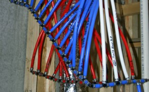
This is not a modern art sculpture. this is a circuit breaker panel for water, meant for managing the plumbing system in your house.
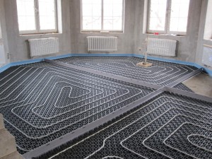
This is a floor heating system.
What is hidden in our houses, underneath and between the walls? Industrial engineers might seem the opposite of artists, but they have something surprising to offer. Just look at these cord routing systems. They could easily be contemporary sculptures, worth a substantial amount of money. It could also be done in different ways, allowing to be creativity and finding a point between industrial design and industrial engineering.
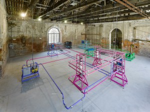
Here's a work from Ayse Erkmen, who made an installation from water purification units with extended pipes and cables. Her project transforms a room into a complex water purification unit where machines perform as sculptures, encompassing the audience inside of the filtration process which eventually provides clean, drinkable water back to the canal.
I would propose us to no longer hide these actually kind of beautiful construction systems. They are visually pleasing. We could allow an engineer to get closer to the regular user/person, to make us appreciate both art and the work that has been put into the basic amenities. I would love to see what’s in my walls or underneath my feet. I don’t think it’s ugly, or that it should be hidden.
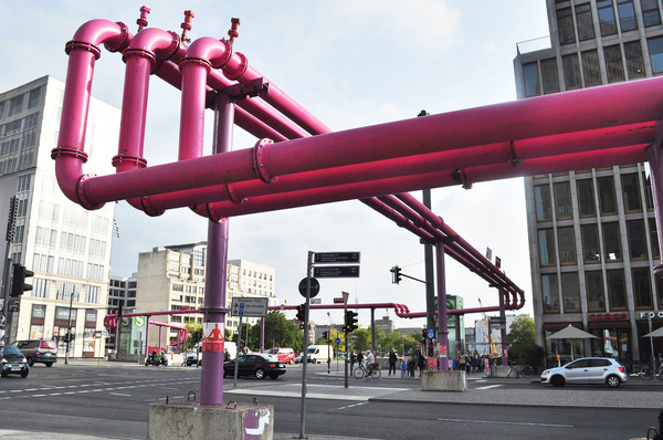
Since Berlin was founded in a very swampy area the ground-water level is actually quite high in Berlin, in the city center it often starts very close to the surface. Which means that whenever there is a new building being constructed in the center, the foundations reach into the water and the construction site is constantly flooded by the ground-water. Of course this water has to be pumped away constantly, which is done via those pink pipes! If you follow the pipes to one end you will always get to a construction site like this one here on Leipziger Platz. If you follow them to other end you will always get to a canal, the river or they’ll disappear into the canalization. These pink funky pipes are not an art piece, but used to pump water away from a building construction site.
The unimaginable is what keeps me exploring
Wednesday, November 29, 2017
CHANGE THE SYSTEM: IRIS VAN HERPEN
The first time I saw 3D Prints I was fascinated by the complexity it allows to generate, where your imagination is the only limit to create any shape. I wondered what the future of the way we make things would look like and how would that affect our lives. What kind of products will we produce?
I was intrigued by the shapes of the dresses exhibited at “Change the System”, and found out that Iris made an entire collection using mainly umbrellas sticks, and that she uses a lot of 3D Prints and laser cut fabrics in her collections. She spends a lot of time experimenting and researching new materials before start making, combining craftsmanship with the use of new technologies. She also collaborates with many people from other disciplines and incorporates new inputs, which I think is essential to develop new ways of making.
I question to myself what are the possibilities of fashion in between the arise of new technology and old craftsmanship. Materiality is changing as we develop new tools and materials, and so is the way we produce. If we change the way we produce then we will change our relationship with our possessions.
FAST FASHION
Fast fashion allows people to buy fashionable outfits inspired by the latest trends in the runway and get them for a very low price. Mainstream consumers are now able now to afford new things that will last for a very short time. Fast fashion is unsustainable (fast discard, waste of manufacture and after consumption), unethical and unoriginal.
Consumption has clearly a very deep influence in our society, and buying clothes now responds to a wish more than a need: we no longer buy because we really need it, but because we desire them. “(…) the consumption of symbolic meaning, particularly through the use of advertising as a cultural commodity, provides the individual with the opportunity to construct, maintain and communicate identity and social meanings” (Elliot, “Existential consumption and irrational desire”, 1997 [x]), and marketing plays a “key role in giving meaning to life through consumption” (van Raaij, 1993 [x]).
We are involved in a cycle where trends go faster than ever, and are hard to keep up: what matters is not the quality, but how fast it gets to the shop and how cheap it is.The process of obsolescence of the garments is already planned from the beginning: it’s meant to replace the old season and attract new purchases. We throw away and buy a new one.
Fast fashion becomes the opposite of creative and original pieces. In a way is about copying what is analysed as trendy, producing it as fast as possible to replace the previous trend. We don’t have any attachments to our possessions, no story behind them: we discard them once they are out of trend.
One of the biggest problems of fast fashion is that produces enormous amount of waste we don’t know how to deal with, as well of an increasingly overconsumption of low quality products that are made to be thrown away soon.
SWEATSHOPS
Retailers sell products that are being manufactured in undeveloped countries, where the labour cost is very low. The globalization of the free trade world market enables “race to the bottom” situations and sweatshops are the best example .
The catastrophe in Bangladesh, 2013 is the most horrible example: an eighth floor garment factory building collapses killing massive amounts of people. It was the deadliest garment-factory incident in history. The conditions under which they were working were so immensely deplorable that it had to get to this catastrophic point to raise awareness.
The large retailers but they are competing for lower production costs, and implementing unethical measures to keep the low prices at store.
SLOW FASHION ///
TECHNOLOGY AND SUSTAINABILITY
We are starting to become aware about what we are consuming. Where, how and by whom was produced is becoming more and more relevant. I strongly believe that is of mayor importance to ask that question and try to understand the mechanism of the chain production and global economy dynamics. I see an urge to create new, sustainable and better quality products.
Slow fashion is a movement that stands for long lasting high quality products, where the production process is transparent. They make garments reducing waste as much as possible, socially and environmentally ethical. They make sure the fabrics are Eco-conscious, the garments are produced locally and with less waste possible.
Changing the way people make their own garments and making accessible and easy to do, will also change the way they relate to their clothing. There will be more appreciation and another type of value to our possessions. It will also allow us to express our own identity through original and valuable pieces. We won’t look for images to buy, it will come from our imagination and more honest desires. It is also about generating an emotional and personal value with our possessions.
I think 3D print and other technologies will disrupt the production chain in a positive way. This way the consumer will be more involved with the idea and the production process of the piece that what she/he wants to wear, maybe even print our own garments at home or small objects.
Iris has an urge to change fashion industry. Innovation is also who to collaborate with to create a groundbreaking garment, avoiding waste and incorporating new technologies.
What if we could bring technologies and slow fashion together? Which materials and tools can we bring into fashion that would change the way we produce and consume? What will technology allow us? It is interesting to think how the future of fashion will look like, but fundamental to bring resources to local communities and development of conscious business, local development of ideas and conscious entrepreneurs.
So you like patterns?
Sunday, November 26, 2017
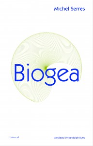
The book I choose to research is called ‘Biogea’ and was written by Michael Serres, and designed by Jason Wagner. Published in 2012 by Univocal Publishing, which Jason Wagner co-created with Drew Burk.
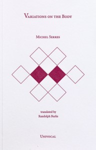
From the design of this book and from other books that Jason Wagner has designed I can see hints of his personality if not that then definitely his direction of interest. The way all the patterns are so precise and clean cut gives me the impression that he has a methodological nature and an obvious love of patterns both simple and complicated, while enjoying a subtle use of colour. As seen in another book designed by Jason Wagner ‘Variations on the Body’, which is also written by Michel Serres.
The fact that Jason Wagner is a part of the Univocal means that a critical look at the company can give an insight on the designer and ultimately the design itself.
Univocal Publishing was founded in 2011 as an independent publishing house specializing in small-scale editions and translations of texts spanning the areas of cultural theory, continental philosophy, aesthetics, anthropology and more. Univocal’s books including Biogea combine traditional printmaking techniques with the create evolutions of the digital age and feature letterpress covers designed by Jason Wagner, who demonstrates the technique in a video.
https://youtu.be/qwQSNhor1EQhttp://
Using techniques similar to this the publishing company oversaw the printing and binding of books from 2012 to May 2017, in which it ceased operations and merged with another company. This could seem to fall down to Jason Wagner who is stated to be moving on to pursue other projects.
But why did I choose this book? I decided on this book for a variety of reasons. I enjoyed its’ simple yet complex design containing a neat revolving spiral-like pattern which is placed in the middle of the book and looks pleasing to the eye. The pattern it self drew my gaze as I found it really intriguing as it resonated with my own interest in complex and unique patterns which I like to create.
The plain colours and easygoing layout of the book for me made it feel more approachable. The design it self didn’t take anything away from the content, for sometimes I feel that the cover of a book can sometimes give you false expectations of what it contains. Being misled into buying something based on its looks. This book however balances this nicely I think by not taking anything away from the content but instead relating and highlighting the themes within.
The Typography is placed on top of the design and relates to and supports it nicely. Accentuating its colours and giving the book a clean and natural feel. The pattern initially drew my attention to the book, but as I took a closer look I found that the texture around the design on the cover felt good to the hand and gave it a thicker and more solid feel. This impacted on my decision as the pattern and texture subtly blend their delicate qualities together to create a book that i found aesthetically pleasing. While the design since imprinted on a thicker material felt noticeably different making it stand out from other designs and books.
The almost scientific complexity of the simple and delicate design also relates well to the content of the book for it’s a mixture of poetry and science. While also presenting a philosophy that merges the humanities with all creation. This has made Michel Serres “one of the most intriguing thinkers of his age”, and I believe is a reason why Univocal publishing has design and printed most of his books. Because of the authors philosophical and poetic inquiry sings praise of earth and life, and what Michel Serres names singularly as ‘Biogea’. The design relates well to the content as it mixes light fresh colours with an intricate pattern, which gives a natural clean aesthetic relating to some of the topics within the book. Some of the obvious examples being the use of blue in the typography which links with text within. “ Today we have other neighbours, constituents of the Biogea; the sea, my lover; our mother, the Earth, becomes our daughter; this beautiful breeze which inspires the spirit, a spiritual mistress; our light friends, the fresh and flowing waters.
Even though the design itself is quite precise it has a sense of movement to it and gives the book a poetic feel to it, this also relates to the content, as it’s a mixture of poetic statements revolving around natural themes. “In these times when species are disappearing, when catastrophic events such as earthquakes and tsunamis impale the earth” the author wonders if anyone “worries about the death pangs of the rivers”.
The author asks the same question of philosophy “as the humanities increasingly find themselves in need of defenders. Today, all living organisms discover themselves part of the Biogea”. Knowing the content of the book also ends up shaping my view on the design of the cover as the series of lines almost create a shield like swirl or sea creature, protected by the bold strong title Biogea.
Biogea, designer: Jason Wagner, Rietveld Library Cat. no: 157.3 ser 3
Minus #000000
Saturday, May 27, 2017
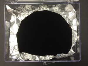
Vertically Aligned NanoTube Arrays – VANTABLACK, is the blackest matter known yet, with its capability to absorb 99.965% of the light projected on it in the visible spectrum. The vertical tubes that compose it trap the light inside instead of bouncing it around, until it dissipates into heat.
Patented by Surrey NanoSystems Limited, it is much easier to produce than its predecessors. A similar matter developed by NASA required 750 ° to be grown, whereas Vantablack needs only 400 °C. Still, it is very difficult to produce and thus quite a valuable material. Which is probably why it was shown in a glass case during the show “Designing the Surface” at the New Institute in Rotterdam.
The catalogue, that was published on the occasion of this project, was structured in acts of a theater piece, grouping designs and materials related to their common specialties or their physical or intellectual interactions. Vantablack was part of the Act VI, titled Slim; “In which the future is superficial”. The reason for that was probably that Vantablack is a human made, fascinating material that seems like it’s out of a science fiction movie or a fairytale; almost too strange to be real. What 21st century humans can achieve may be little in future perspective, but currently it can be quite fascinating. Laboratories are like alchemy labs of medieval sorcerers. Industries can make impossible a reality. Still, it all depends on the funding of course.
Vantablack proved very useful for various industries. Especially for astronomy and space sciences; since it can help the development of far better telescopes that can reach even further into the universe. It can potentially be used for the medical treatment for eyesight problems as well. Since it pushes the boundaries of the relationship between human, matter and light, it revolutionizes anything that has something to do with optics.
No wonder Vantablack is so fascinating for many. British-Indian artist Anish Kapoor licensed the use of its color and is currently the only artist who is allowed to use it. The RGB code for the black as we know it and are able to use freely is #000000. Although, with the further development of Vantablack, a slight change in the percentage of the absorbing power of the material can give it a different RGB code, making Kapoor’s license useless. Even though I am not sure if Kapoor would run out of money before purchasing the license of each step of Vantablack’s development, I certainly hope that this material with so many possibilities would become available to common folk so that I can also let my imagination run free with it.
Vantablack display sample Surrey NonoSystems. exh.cat.no.75
Plaster My Emotions to the Surface (faux)
Sunday, February 26, 2017
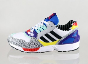
I like to own a piece of design from Memphis group design studio.
A piece of design from Memphis group is a shoe.
A shoe is from Adidas.
A shoe is covered in a Memphis group surface.
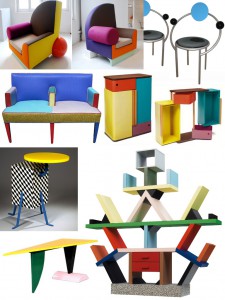
The many times I’ve been visiting the Stedelijk I always end up at the same part of the permanent exhibition. The Memphis group’s furniture and lamps. The reason for my interest is not the actual artwork but rather a particular colorway.
A couple of years ago I was in Berlin on the hunt for some new sneakers. I found myself caught in-between big names such as Adidas and Nike.
The question I would like to answer with this essay is, if Memphis group this day managed to tip the scales in favour for Adidas (ZX9000 Memphis Group) would it be just as a matter of style, or was it actually the essence of capitalism in the shape of a surface.
Is the shoe an imitation of an artwork or actually one by itself? If you plaster a stone with a Picasso painting is it then not still a Picasso painting?
This depends on your point of view, what did you lay your eyes on first? When I found interest in the shoe covered in the Memphis surface we have to keep two aspects in mind. First: I did not know that Memphis group was behind the design. Second: I did not know what Memphis group existed. All I had in my mind was a wildly designed Adidas shoe that was like something I had never seen before. Does my perception of the shoe change now as I do know these influencial factors. Do my impressions of the shoe change under the influence of these two qualities, as the changing colors of the object in my previous text change under the influence of heat [x]
I brought my piece of Memphis covered Adidas mock-ups back home with me. I like to view them as a piece of art, hence I have not been wearing them until this day. They are still in the same shoe box I bought them in, resting in the archive of my parents basement to be looked at but never worn.
I like to own a piece of design from Memphis group design studio.
A piece of design from Memphis group is a shoe
A shoe is a piece of art from Memphis group
I would not step on an artwork from Memphis group.
Programming language as a System of Thought
Wednesday, January 18, 2017
by Medeina Musteikyte
From a conventional viewpoint programming is a process of command execution that brings about a certain result; a problem-solving tool to produce a desired outcome. Aside from its practical usage, coding is expanding to a different sphere of interpretation where new meanings gained, outgrow its primary function.
My essay examines the role of non-function oriented programming, the artistic value of the concepts behind works of code and experimental programming languages. An overview of examples from Algorithmic Auction to ‘Esolangs’ — Esoteric Programming Languages is questioning the boundaries between programming and artistic practice and exploring the creative potential of such method.
bodyfuck – undo from nik hanselmann on Vimeo.
A work of code can acquire different forms and exist as an object, text or music piece gaining new definitions and material qualities.
[audio:https://designblog.rietveldacademie.nl/wp-content/uploads/2017/01/castleman_css_descramble-.mp3|titles=castleman_css_descramble] Likewise conceptual programming languages can be perceived and interpreted by their instructions alone, without executing a command or using a computer. Designed for experience of thinking through them, esolangs unfold the confrontation of computer logic and human thinking in the most rational or the most absurd processes [x].
Sound file: castleman_css_descramble
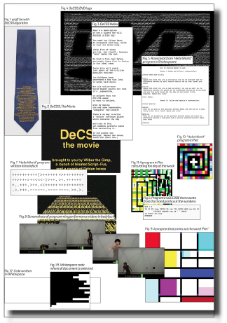
[click on image] to download thesis by Medeina Musteikyte
all rights to this thesis are property of the author © 2016 : http://medeina.xyz/
Bio Fashion Future Fashion
Tuesday, November 29, 2016
In ‘Dream Out Loud’ in Stedelijk Museum Amsterdam Bart Hess exhibited a range of wax molds, looking like dresses, that were made around a female model titled ‘Digital Artifacts’. His concept being that everyone can print their own reusable ‘second skin’, a garment fitted exactly to an individual body. If everyone would be able to print their own so called ‘personal uniform’ (a set of clothing that is to be worn daily) it would result in a decrease of the production process of garments in countries like China and Bangladesh, “saving” the people involved from their horrible working conditions. The problem here is that, for one, not many people own a 3D printer and that, in this time of resource scarceness, virgin material would still need to be used (for the making of 3D printers and for new printing material).
For an interview with Bart Hess about other works click here.

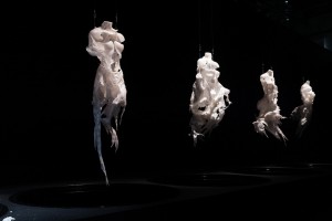
‘Digital Artifacts’ by Bart Hess for the ‘Dream Out Loud’ exhibition in het Stedelijk Museum Amsterdam.
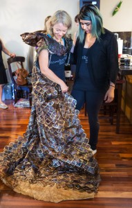
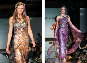
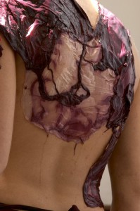
Although Bart Hess’ idea of the personal uniform is durable, the (re)printing of it is not. As a more eco-friendly alternative, new developments are arising in the world of textiles; bacterial fabric, which enables us to grow clothing from bacteria and fungi. Another name for it, founded by Sacha Laurin, is ‘Kombucha Couture‘, referring to the Kombucha fermented green tea that is used in the process. Kombucha mixed with sugar and SCOBY (Symbiotic Colony Of Bacteria and Yeast), left inside a container in a warm, dark room will feed the yeast and bacteria. This can be done by anyone from home (see the previous link). These will grow threads of cellulose, which will layer and eventually form a watery consistency which then needs to be dried out. What is left in the end is a fabric like structure and that can be sown into garments and jewellery. As shown below Sacha Laurin has mastered the element, making beautifully coloured, natural and durable garments.
For more information on biomaterial and a done home experiment see Jana’s blogpost titled Material Alchemy.
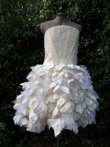
Pieces of ‘Kombucha Couture’ by Sacha Laurin.
Suzanne Lee of BioCouture is another fashion designer who is working with bacterial fabrics. In various TED-talks she she explains her process and further developments she has made regarding the colouring of the fabric. She for instance found out that due to the matter’s high level of water absorbancy the bacterial fabric does not need more than one dip in indigo to make it blue, whereas cotton needs several, making it much more durable. It can also be coloured with natural materials such fruit and vegetable pulp, turmeric and others like metal (which will turn it black). Another thing is that if the fabric is placed around an object or body while it is still wet it will dry conform to the corresponding forms and shapes, creating a second skin.

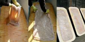
Left: Growth of cellulose with Kombucha.
Right: Wet Kombucha cellulose left to dry.
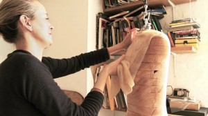
Left: Suzanne Lee draping the wet Kombucha cellulose onto a mannequin.
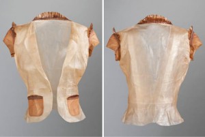
Right: The dried garment made out of bacterial cellulose.
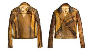
Biker jacket made out of Kombucha fabric and iron nails, which turns the material black naturally.
https://www.youtube.com/watch?v=UQBhwVD5rAE
Another way of using microbes to create fabric-like materials is the process of fermentation. This process is found in the making of wine and beer and it can be used to make biofabrics by letting the microbes grow a layer of cellulose on top of the wine or beer. This is part of the research that is being done for the ‘Bioalloy‘ project by of the University of Western Australia since 2005 until today.
Fermented dresses made out of beer (left); “The Beer Dress”, and wine (middle and right); “Micro’be“ by Donna Franklin and Gary Cass for Bioalloy.
The problem Bart Hess encountered in his search for a second skin can be solved with bio fabric. His problem being that none of the materials he tried (such as wax, latex and foam) would let the skin breathe enough for it to be bearable to wear for a long time. Coming from a breathing organism itself the bacterial fabric will let the skin breathe and will act in a more similar way than plastics and other synthetic materials will. This fact brings it closer to being a second skin. Besides, everyone growing their own clothes would be much more environmentally friendly than everyone printing their own clothes, which would mean that everyone would have to own a 3D printer. Firstly, because bacterial fabric is biodegradable waste material made by bacteria/fungi whereas plastics are not biodegradable. Secondly, because the 3D-printing would require the use of new materials and electricity, which bacterial fabric does not necessarily.
However, a big problem with bacterial fabric is that it is highly water absorbent. Once it comes in contact with rain or sweat the fabric will start to swell, making it unpleasantly slimy to carry on your body. More and more research is being done on the front of bacterial/fungal fabrics, by Stichting Mediamatic in Amsterdam for example (you can read their articles on fermented fashion and bio-couture). They have an aim to find consistencies that would be usable as textiles for fashion, it should not be too difficult or time-consuming to find a way to make bacterial fabric water resistant and/or repellent. All the research being done also means that the concept of everyone growing their own clothes is realizable in the not so distant future.
Patterns made out of Kombucha fabric.
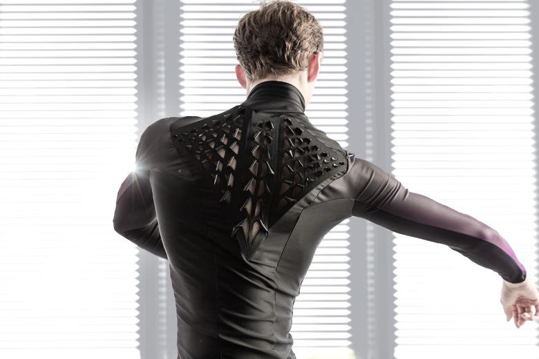
A different development by MIT (Massachusetts Institute of Technology) is the adaption of a Japanese cooking bacteria, the so called Baccilus Subtilis, to react in size to moisture and humidity levels. When they are sown into garments and strategically placed on the body in flaps they will open and close depending on the heat and amount of sweat the body radiates, allowing the skin to ventilate. This development comes one step closer to finding the second skin (and the personal uniform) that Bart Hess is looking for. It could provide us all with a personal uniform, starting a movement of slow fashion and fighting crises such as overproduction, environmental waste and resource scarceness.
The bacterial flaps by MIT sown into a garment.
So, in conclusion, I will state that bio fashion, more specifically; bacterial fashion, is the future of all fashion. The production level of garments is higher than ever due to the speed in which trends nowadays come and go. At the same time, the earth’s resources are being drained and it’s surfaces polluted, human population is rising and life expectancy is increasing. As you can hopefully see, this is not a durable combination and something has to change in the way we produce and consume. Thus, we have to slow down the unsustainable rhythm of fast fashion that we are in and we can do that with the help of microorganisms, now.
Material Alchemy
Monday, November 28, 2016
Living in a time where we turn our resources into waste in high speed makes me very much wonder about the time where our planet’s virgin materials will be depleted. Our constantly growing world population leads to a growing demand for materials. Since materials are fundamental to everything we engage with, new ways of manufacturing them are needed.
Is there a way to turn all our waste back into resources?
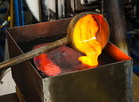
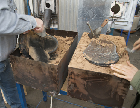
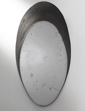
Diving back into the mystical secrets of twelfth-century Alchemy led the Amsterdam based designer duo Studio Drift to a way of transforming our chemical waste into something new. By processing initially considered intractable chemical residual material, Studio Drift explores an entirely new way of gaining a material resembling to the volcanic glass Obsidian [x].
After a particular heating process, the glowing mixture can be poured into molds and the obtained outcome is a material with its very own unique characteristics. It sounds like metal, looks like glass and is heavy as a stone.
When I look in the polished black surface of this synthetic obsidian, my own effigy gets reflected by the waste.
But do we even need all those resources to produce materials we can only hardly recycle later?
While many designers are intently trying to close the cycle of production and recycling to support a circular economy, alternative ways of producing material without any need of resources are considered.
The current generation of designers, alchemists and scientists are crossing the boundaries to explore the unexplored and reshape the future by growing living organisms as materials.
Dealing with a lot of various materials in my every-days study awakes huge interest in the process of replacing toxic materials with long-term, sustainable material solutions.
Following the steps of designers and scientists I started to research about approaching materials in unconventional ways. With the advancements of synthetic biology a palette of futuristic ways to grow material by itself are evolved.
To gain a better understanding of the process and potential of these materials, I started a project of exploring one of those self growing organisms myself.
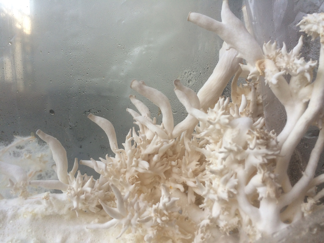
Inspired and fascinated by bio-materials that grow by themselves I decided to explore Mycelium, a material grown out of convenient Mushrooms such as Fungi.
A small research led me to Mediamatic, where I met Wouter Hass, the expert mycologist and owner of the Amsterdam-based Mycophilia. With a lot of enthusiasm he gave me a closer insight in his work. In a mostly self-built laboratory he searches for the unexplored potential of Fungi. Not only as regards taste he admires the mushroom, he also grows big blocks of Bio-Material out of it, which can be used as isolation and packaging material and later be composted.
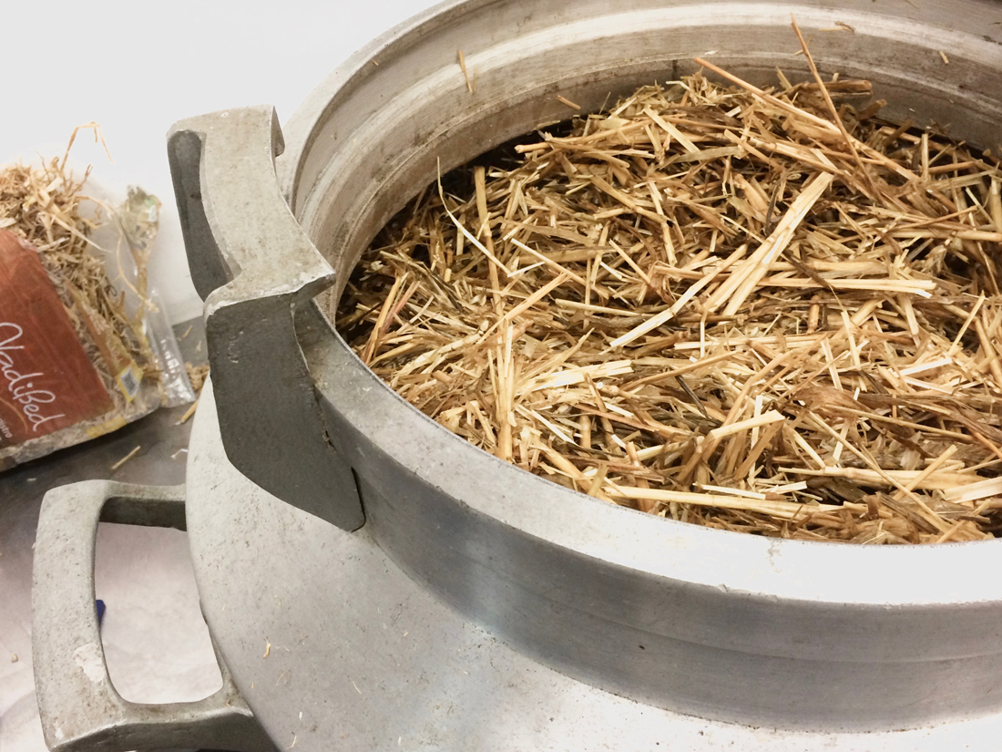
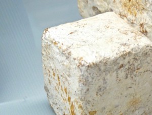
After our interesting conversation about the whole process, I could not wait to gave it a try myself. Following Wouters instructions, I sterilized straw by cooking and cultivated it with Fungi spores. Stored in a plastic bag in the dark, fruiting bodies constructed by white fungal network with reproductive structures are growing. These structures are called Mycelium. In the woods these strains transfer the nutrients, as well as they detoxificate dead plants.
After a few weeks it grew to a block which I now separated in pieces. These pieces I placed together with jute in a mold, made out of two buckets. Humidified and covered by a foil it is stored in the dark of my closet again. If everything works out well, the pieces will soon grow together and overgrow the jute.
After a process of fully drying the Bio-Material the potential of this organism seems to be endless. The Outcome is a light but strong material. Alternatively to letting Mycelium grow into its supposed shape, it can even be 3D printed. Its developments can be found in fields like fashion, design and architecture. It is used in form of a leather-like textile, furniture, packaging as well as construction material and many more as I saw at Dutch Design Week 2016. [x]
By further developments of Mycelium, many ecologically harmful materials could probably be replaced by a fully compostable product that merges science and nature.
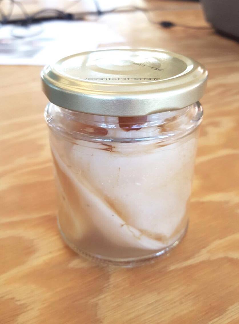
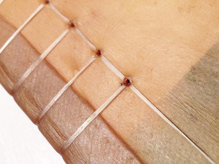
Another ongoing personal research of growing materials is about bacteria. By culturing the bacteria of Kombucha in sugared tea, a healthy drink is made.Further than that it grows a slightly transparent surface. As soon as this surface reaches the desired thickness, it can be removed and dried to a skin-like material. An inspiring conversation at the pop up Pet-Shop [x] from Waag society made me curious to give it a try myself.
Fashion designers such as Suzanne Lee [x] and Sacha Laurin [x] are important pioneers in growing clothes from bacteria. A closer look into the usage of grown textile is given in the very interesting blogpost ‘Bio Fashion Future Fashion‘ by Alba. Considering one kilogram of cotton requires 23.000 l water and mostly grows in developing countries, Kombucha couture seems like a fundamental step into a more economical future to me.
The palette of possibilities of synthetic materials gained without using the world’s last resources is literally growing in many directions. Other impressive designers such as Laura Lynn Jansen & Thomas Vailly even found a way of growing Stoneware which can be seen here.
Here comes the future. Circumventive organs, bioprinting and bioart
Monday, November 28, 2016
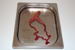
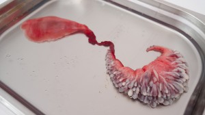
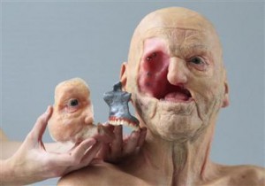
Some works initially aim to touch your feelings and to change your carefully complied seeing of life. They can cause a whole pattern of various emotions from the complete abhorrence to inexpressible delight. I walked through the halls of the “Dream out Load” exhibition and noticed a small group of people gathered around something that seemed to be very interesting. “That’s gross!” – Somebody exclaimed but continued starring at the subject of interest. I love gross and in a second I found myself looking at the “Circumventive organs” by Agi Haines and a short footage about implanting the organs inside the artificial (I hope so?) human body. From that moment I would start calling her “a mad scientist” of the design. What she designs is not posters, not buildings and even not that fancy clothing you are wearing. The subject of her focus is mainly a human body and organs.
Electrostabilis Cardium by Agi Haines on vimeo
With the introduction of bioprinting the possibility of new organs is becoming a reality. The ability to replicate and print cells in complex structures could mean different cells with various functions could be put together in new ways to create new organs we would take millions of years to evolve naturally. Frankenstein-esque hybrid organs could then be put together using cells from different body parts or even different species.
This short film envisions the surgical procedure designed for the fitting of Electrostabilis Cardium, a defibrillating organ using parts from an electric eel that can discharge to release an electric current to the heart when it recognizes it going into fibrillation (heart attack).
Alongside the film are other ‘Circumventive Organ’ designs including Tremomucosa Expulsum an organ that uses rattlesnake muscles to release mucus from the respiratory system of a person who suffers from cystic fibrosis and dispel it through the stomach, as well as Cerebrothrombal Dilutus which contains cells from the salivary gland of a leech and releases an anticoagulant when it feels the pressure of a potential blood clot in the brain as a way of avoiding a stroke.
Agi Haines’ mind-bending, hyper-real sculptures function in an epistemological limbo, existing somewhere between art & science, technology and ethics, and present and future. Haines creates pieces that are uncanny, transgressive, and sometimes conflicting, stunning in their insight and repulsive in their execution. Her near-future world is one in which rattlesnake muscles can be 3D-printed, inserted into the human body and used to combat cystic fibrosis.
I chose Agi’s work as a main topic of my research because bioprinting and bioart is something that intrigues me a lot. Though I was never familiar with bioprinting, I was always interested in this incredible and magical world of the body and it’s insides, how it lives, transformes, reacts and evolves. I am fascinated by the possibilities of 3D bioprinting and how it can affect the evolution process. My belief is that the future of design lays in more extensive work with human body as a material and If I will be given a chance to take part in the process of organ designing, I would be glad to create something useless and provocative. In the interview Agi explains how the organ printing works: living cells mixed into cell-friendly material, such as collagen, that will make a scaffolding for cells to grow on. Then the organ is being printed layer by layer, just the same as an ordinary 3D printer works.
The ability to replicate and print cells in complex structures could mean different cells with various functions could be put together in new ways to create new organs we would take millions of years to evolve naturally. Haines envisions what it would be like to not only replicate existing human organs, but also produce newly designed, improved organs for implantation as (curative) therapy for chronic diseases and defects. In the same way, animal cells with useful properties might even be employed to create organs with entirely new properties. An organ that incorporates eel cells could conceivably function as a natural defibrillator, delivering a resuscitating electric shock in case of cardiac arrest.
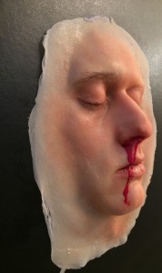
If you prick us do we not bleed" work by Agi Haines
… can we consider bioprinting as an art form?
I keep on asking myself this question, because the border between biology, genetic engineering and art rapidly disappears, or, more likely, has already disappeared. Tissues, organisms, organs and bacteria became a media to create works of art. They have been used in the same way as one artist would use the paintbrushes or the materials from the Rieveld’s trashcans.
Even before the bioprinting, American artist Eduardo Kac established the name “Bioart” for his works. Kac considers himself a “transgenic artist,” or “bio artist,” using biotechnology and genetics to create provocative works that concomitantly explore scientific techniques and critique them. In 1998 he comes up with his work “Genesis” that explores the intricate relationship between biology, belief systems, information technology, dialogical interaction, ethics, and the Internet. The key element of the work is an “artist’s gene”, i.e., a synthetic gene that he invented and that does not exist in nature.
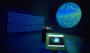
"Genesis" by Eduardo Kac
Another project of Eduardo Kac was famous glowing rabbit called Alba. By injection of green fluorescent protein (GFP) of a Pacific Northwest jellyfish into the fertilized egg of an albino rabbit he creates the bunny that can glow green when illuminated with the correct light.
“GFP Bunny” has raised many ethical questions and sparked an international controversy about whether Alba should be considered art at all. “Transgenic art brings out a debate on important social issues surrounding genetics that are affecting and will affect everyone’s lives decades to come,” Kac is quoted as saying.
'Alba' glowing in the dark bunny, by Eduardo Kac
Faced with some operations our aesthetic but also ethics sense is often put in a critical position. We are forced to redefine the border between animate and inanimate world and our definitions of subject and object. Indeed, when the symbolic and material boundaries of humans opened to technology, some considered it as hospitable, however many found it offensive or even dangerous. One of the main concerns about bioart is that people view it as an unnecessary use of living organisms. While the use of living organisms is often tolerated because they are used for research and thus improving the quality of peoples’ lives, bioart is often criticized as an uncalled-for practice because of the role of aesthetics in the artworks. In addition, bioart creates uncertainties among the public because bioart projects such as eugenics are undertaken by artists and not researchers. Nevertheless it is important to bear in mind that (bio)artists also need to do research prior to conducting their experiment or artwork.
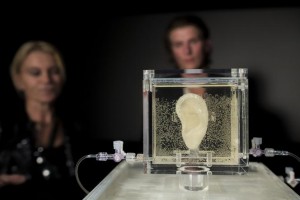
Coming back to bioprinting as an art form, I would also like to mention the Dutch artist Diemut Strebe and her 3D printed Van Gogh’s ear. She created the replica ear using living cells from van Gogh’s great-great-grandson. The ear itself is made from actual living tissue and was 3D printed into a shape resembling van Gogh’s left ear. The ear is currently being displayed in a German museum and is suspended in a clear display case full of a nourishing liquid that is expected to keep it viable for many years. The artist has also added a microphone to her installation so you can actually speak to the replica of Vincent van Gogh’s severed ear [x].
"Sugababe" by Diemut Strebe • "Body Modification for Love" by Michiko Nitta
Another artist, who is trying to make our life more interesting, bypassing the ethic issue, is Michiko Nitta and one of her works – Body Modification for Love. It is an idea which could be developed in the future – a technique for genetically growing selected parts of another person on another person’s skin. What Nitta is proposing is for example a nipple of ex-girlfriend or a mole of ex-boyfriend. Patch of living hair would be also possible to grow on somebody’s else arm. It is supposed to be a new form of tattoo as Nitta says. Parents are always upset when their kid makes his first tatoo. How upset they are going to be now, when their beloved one would come up with a nipples on his forearm?
The options are endless and there are a lot more projects, researches and artists I could also mentioned here. There are a lot of things to discover yet and who knows – maybe in the nearest future our bodies would be modified and consist of artificial organs? Not the best scenario, to be honest..
This research project is based on the "Dreaming Out Load" design exhibition curated by the Stedelijk Museum Amsterdam
Techno Beauty
Sunday, November 27, 2016
We humans have created technologies and machines to enhance our lives, we invented cars to liberate ourselves, built all kinds of factories to raise efficiency, but now these innovations are striking back, making the environment extremely polluted in high-density cities; some visible, while others may be invisible, but still left the real impact on our daily life and health. Think about donating 50 euro to get a Smog Free Ring[x], which contains smog filtered from 1000 m3 of air, in order to support the Smog Free Tower and Smog Free Project by Studio Roosegaarde.
Will this make a real contribution to solve the problem of pollution? By purchasing a Smog Free Cube, Ring, or Cufflink, are you purchasing a souvenir, a design or are you building your association with the Smog Free Project, the anti pollution movement?

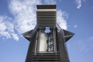
Daan Roosegaard’s Smog Free Ring • Smog filter in Bejing
Our technical interaction with artworks has only developed within the last decade at the level of using touch screen to improve the understanding of drawings, but now in the art and design world, both these two elements have been introduced to the real application domain.
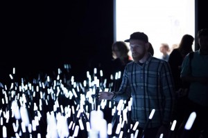
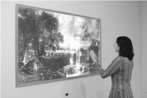
Daan Roosegaard’s public interactive landscape Dune (2006-2012) • John Constable: The Great Landscapes” 2006
To gain a better understanding of this change, we can look at Daan Roosegaard’s public interactive landscape Dune[x] (2006-2012) which interacts with human behavior, and the Tate Britain exhibition “John Constable: The Great Landscapes[x]” in 2006. The Great Landscape used X-Ray examination and Drawing screen to help the visitors to obtain an understanding of Constable’s working practice and techniques through body movements in front of the X-Ray projection and figure movements on the touch screen (Engaging Constable: Revealing Art with New Technology), while Dune served itself, stood for a hybrid of nature and technology, artwork and the way to present the artwork. It is composed of large amounts of fibers that brighten and made sounds according to the sound and motions of visitors. Both enhanced social interactions with the help of sense-based technologies and being recorded with cameras and microphones in order to study and analyze people’s interactions, Dune and The Great Landscape had quite different starting points.
The visual impact of the eyes decrease as the other senses are heightened due to the introduction of tactility and sound, thus the aesthetic value is no longer of primary importance and the design opens up a broader spectrum of uses and practicality. This also explains Daan Roosegaard’s later works, how he uses modern technology to deal with multiple subjects; such as the relationship between intimacy and body (high-tech fashion project Intimacy[x], 2010), the historical heritage and sustainable idea (Van Gogh Path[x] [x], 2014), the power and poetry of living with water in Netherlands (Waterlicht[x], 2015 and Icoon Afsuiltdijk[x]).
The modern presentations of art and design in museums and galleries provide personal and collaborative experiences as The Great Landscape did, but Roosegaarde’s tactile high-tech environments enable the viewer and space to become one, not only because it can encourage more people to interact with each other and the environment simultaneously, but also because the technology leads the viewers to become both users and performers, thus the art raises people’s awareness of public issues.
Concerning its unique background associated with environment protection and sustainable development, the Smog Free Ring distances itself completely from traditional souvenirs in a museum and the association created by purchasing it, just as putting yourself in the Dune and reacting with it stands apart from the traditional way to appreciate an artwork. But is this different to other design works which also aim to serve a better life?
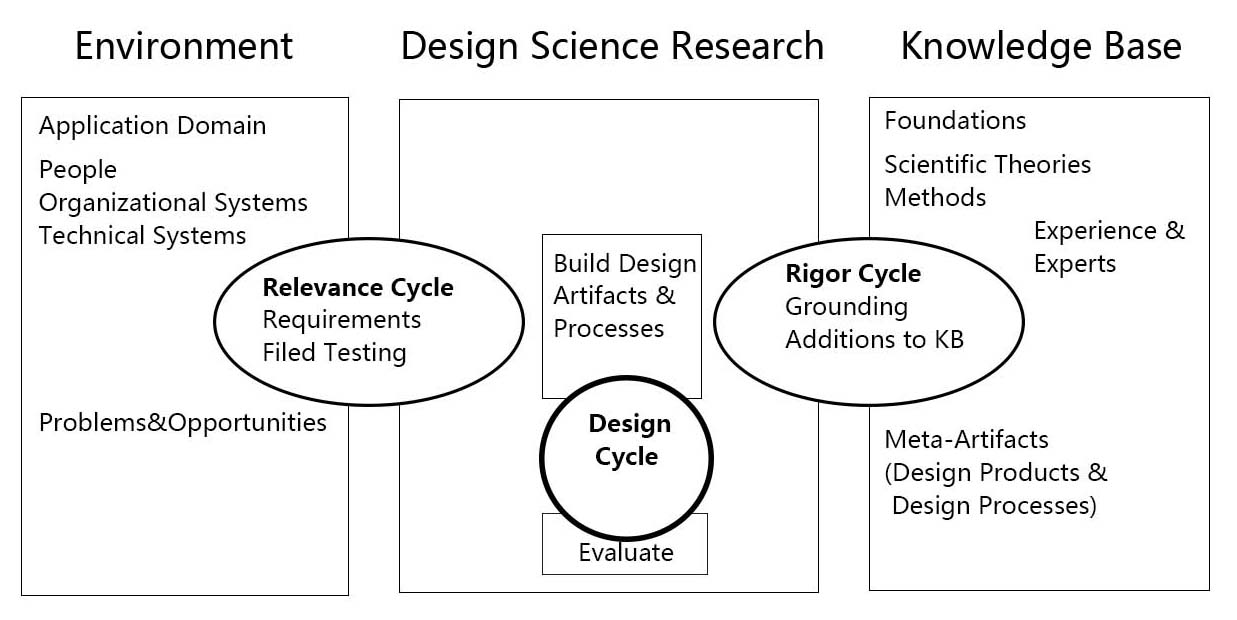
As science and technology are an essential part of his work, I want to introduce the Three Cycle Review of Design Science Research from Alan R.Hevner’s “A Three Cycle View of Design Science Research”.
A Three Cycle View of Design Science Research [download as pdf]
Design Science Research is motivated by the desire to improve the environment by introducing new and innovative artifacts and processes. The Three Cycle Review of Design Science Research consists of Relevance Cycle, Design Cycle and Rigor Cycle. Good Design Science Research often starts by identifying problems in an actual application environment or recognizing the potential to improve a practice before a new problem occurs. When applied to the Smog Free Tower, people’s neglect towards air pollution interested Daan to think about building the largest purifier in order to solve the problem. In the Relevance Cycle, the air-polluted environment is not only where the problem is found, but also a testing field in order to see if the design results meet the criteria. Then, they moved to Rigor Cycle and the knowledge base and found the existing air purification technology which is used in the hospital. Following the search for technology, they moved to the internal Design Cycle, and built the Smog Free Tower based on the original issue found in the environment and the technology found in the knowledge base. While the artifact is being built, field testings are input from the relevance Cycle and the design and evaluation methods to Relevance Cycle and Rigor Cycle. After several rounds of improvement, The Smog Free Tower and The Smog Free Ring, which contained both technology and beauty were born.
To give a brief conclusion, pragmatic science, interaction between human, responsibility for the living environment and beauty are core components in Daan Roosegaard’s works and in the future world of art and design. But not only the world of art and design, or let’s say, since art and design has gradually found their new position in 21th Century, they will no long serve aesthetics as the core matter. Techno Beauty, as how Daan Roosegaard described his own works, may becomes a direction in design to beautify and save the world.
The future that never arrived
Wednesday, October 26, 2016
Most major cities in Japan were left in ruins after the second world war, in particular, Nagasaki and Hiroshima. In the post-atomic bomb area, Japan was democratized and turned into a nation with a pro-American orientation. As a response to the human and environmental catastrophe, and as with the growth of the Japanese economy in the early 1950s, proposals for urban redevelopment began to appear. This is when the first concrete example of urban planning with ideas that would later come to define the metabolism movement appeared. You can argue that it started with the designing of the reconstruction of Hiroshima. The Japanese architect Kenzo Tange and his team of architects was commissioned to make this plan.
Hiroshima Peace Memorial Museum / Kenzo Tange. The initial plan was presented in 1949 and the building was made in 1955. source: "Hiroshima mon amour [1959]"
In the 50’s Kenzo Tange was very oriented towards the international architecture scene, note the resemblances between the memorial building and the work of Le Corbusier. He also met up with and found inspiration in an architect such as Aldo Van Eyck who was in many ways in opposition to the “functionalism” of Corbusier that was criticized of ignoring its inhabitants. Van Eyck created the orphanage next to our school, and took part in coining the architectural movement structuralism that Tange also defined himself within.
Orphanage / Aldo Van Eyck build in 1960. source
In short you can say that they shared some of the same ideas in creating spaces where the relationships between the elements are more important than the elements themselves – built structures corresponding to social structures. It wasn’t until 1960 that the movement was actually defined, by the architect Kiyonori Kikutake who created their first manifesto together with the architect Fumihiko Maki and Kisho Kurokawa:
“Metabolism 1960 : The proposals for a new urbanism ”.
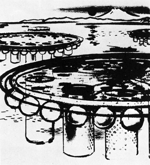
The name arrived to an other member of the movement, Kionory Kikutake, as he was working on a floating metropolis, his “Marine City” project.
Marine City / Kiyonori Kikutake 1958. source
The word “Metabolism” comes from Greek and translates to “change” but also refers to the life-sustaining transformations within the cells of living organisms. As the name might suggest? they pushed that buildings and cities should be designed in the same organic way that life grows and changes by repeating metabolism.
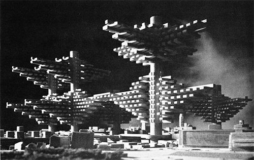
The “Marine City” is one of many projects that was never realized but played a central role in the works of the Metabolists. It was this vanguard idea of taking on new space whether it be the ocean or the sky that was the foundation of their way of shaping “the future”. At the same time it required developing and making use of new technology. None of the experiments and realizations were made by single individuals but drew on the big think-tank that the Metabolist movement was from artists and writers to scientists and industrial designers. The “marine city” was a proposal for a solution to the rapid population boom especially taking place in Tokyo in the years after the war till the brink of the 60s. Kikutake believed that the ocean was the only valid space to develop in times of an imbalance between population and agricultural productivity.
City in the air / Arata Isozaki 1961. Never realized.
As such sustainability was surely an integral part of this movement as well as resilience considering how the risk of earthquakes and tsunamis make for tough conditions in japan – especially for urban concentrations. Structure wise the Metabolist movement was characterized by taking certain architectural steps towards recognizing this. A main idea was to design architecture to be built around “spine-like” infrastructure on and around which pre-fabricated replaceable parts could be attached being almost cell-like. At the heart of this setup is also reorganization of the relationship between society and the individual.
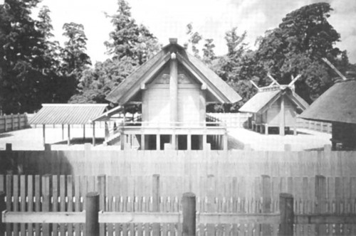
Another important inspirational source was found in old Japanese shinto religion and a specific Ise Grand Shrine that carries the ritual of being created anew every 20 years. This is an example of how the Metabolists as a movement was wearing multiple meanings, being both modernists and traditionalists at the same time.
Ise Shrine having been in continual existence since 690 C.E. source
The Metabolists respected environmentally-conscious boundaries and the material in which they worked. This gave them the pride, and also reluctance, to not be parted from their vision. To demonstrate and construct only that of ideas was monumental enough.
Festival Plaza / Kenzo Tange and the artist Taro Okamoto, Osaka Expo, 1970. source
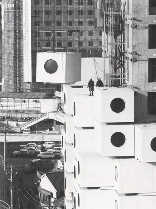
After 10 years of development and growth within the Metabolist Movement, the structure that was metabolism came to a climax, exhibiting some of their finest work, at Expo 70’ in Osaka, Japan. It was around this time that Kisho Kurokawa’s project, The Nakagin Capsule Tower, began construction. A process that took only 30 days to complete.
Nakagin Capsule Tower / Kisho Kurokawa 1972.
This building would serve as an “icon” to the movement. After the Expo 70’ took place in Osaka, individual architects from the movement began to take a step forward personally, focusing more on individualism and self-driven growth. Ideas about sustainable development within the 21st century are not new ideas; they have spread through a continuous evolution. An end sometimes not only existing as an end, but that of a new beginning.
text by Christian Stender and Ivan Fucich
Homo Ludens
Monday, October 24, 2016
The human being is qualified as « homo sapiens », the man who knows and « homo faber », the man who makes. « Homo ludens » is the man at play.
So i decided to find out more about Constant Nieuwenhuy’s « homo ludens » and the context.
We are in the period after the second world war, everything is destroyed and has to be rebuilt. Constant had an utopian vision of how we could re invent our world, and for him it was a real possibility. We had to forget how we did thing in the past (traditions, routines, processes, plans…) and create a new world from dust, that he called « New Babylon ».
The people of the « New Babylon » world are called the « homo ludens ». He insisted on the importance of play. Something joyful, pleasant and adventurous in our daily lives. People could transform, recreate our environment according to their new needs. Everyone could use his creativity as he wished. Art would exist as part of our day-to-day existence, everyone would be an artist. He puts the human in the centre of everything. Mobility is another key dimension because it was getting easier to travel across the world. Constant saw the new babylonians as a new race of nomads with unlimited freedom to decide about the appearance of their surroundings.
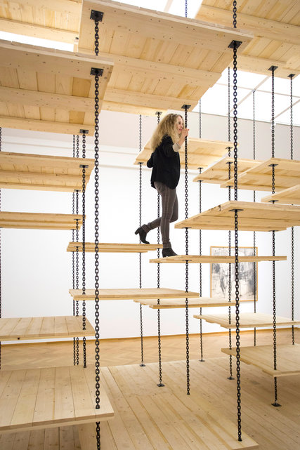
I think this staircase is the perfect representation of Constant’s idea of « homo ludens ». The stair’s principal function is no more the useful part of it, to go up and down. The amusement of going up and down is what it is about. It isn’t the most practical staircase but when you go up or down, you have fun.
The opposite of this new concept of a « ludic society » is the society we are in now, a « utilitarian society ». A society based on the exploitation of the human being’s capacity for work in any kind of domain. « Utility » is the principal criteria of a man for his activity. The creative man can only claim his right on rare occasions.
The « ludic society » on the contrary is freed from repetitive production work. It would be a « classless society » with no more hierarchy. A society were individuals developed and discovered their own creativity with others. Constantly at play, an uninterrupted process of creation and re creation.
How would « social justice » work in this new world ?
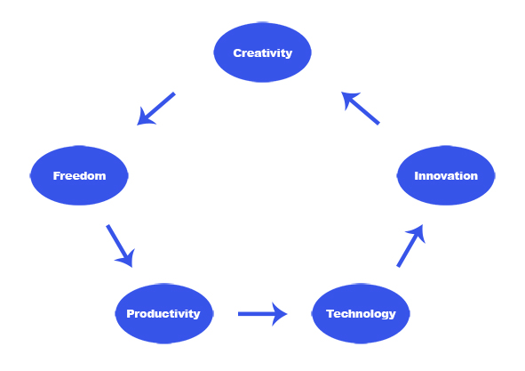
Equality and freedom between everyone is the principle of social justice. Freedom depends not only on the social structure but also on productivity. Supposing we are in a world where people create daily, if there is no production then this society doesn’t work. Productivity depends on technology. The new technologies we discover every year give us new ways of doing things, more possibilities, more freedom for the « homo ludens » to play with.
With theses new possibilities people innovate, make something new, re do, renew, rebuild, restore, transform, change… This is in effect the role of a designer but in this world there wouldn’t be any constraints.
These innovations can be used in all kinds of activities. For instance, Constant imagined that air conditioning in « New Babylon » does not only serve to recreate, as in a « utilitarian society » an « ideal » climate but also to make it possible to vary the ambiance to the greatest possible degree.
Technology and innovation enable creativity. For example, we can now bring to reality what was a simple 2D image on a computer. There are many kinds of innovations but I think that artificial intelligence (see also : 7 trends for artificial intelligence in 2016 ) is going to be the major innovation that will have an impact on our society and really affect our creativity in the future.
Imagine a world where « homo ludens » would be able to have artificial intelligence (AI) assistants. You could not really make the difference with a human. They would have all the data of the world in their system and would use « deep learning » .
« Deep learning » is different learning methods where the AI has advanced audio and visual analysis skills (facial recognition, voice recognition, computer vision…). They would be able to modify their attitude based on the past, they learn. If you are a bit curious about this subject I advise you to watch the tv series « Westworld ».
With all this data and advanced technology IA assistants could give to « homo ludens » a different perspective about their production and bring real technical and practical support instantly. It would be similar to the character « Jarvis » in Iron Man. What is interesting about this AI is that it is invisible.
Artificial intelligence and « homo ludens » could work well together but AI can be dangerous if it is not well controlled.
