My research is about a Czech graphic designer named Radim Pesko who, along with contributing to various magazines, is running an Amsterdam based type-foundry (RP; a digital type-foundry established by himself in 2009). Occasionally he does curatorial practise and teaches in the graphic design department at the Gerrit Rietveld Academy Amsterdam.
In this text, I will focus on a collaboration Pesko did along with French graphic designer colleague Karl Nawrot in 2010 and compare it to Wim Crouwel’s “New Alphabet” from 1967.
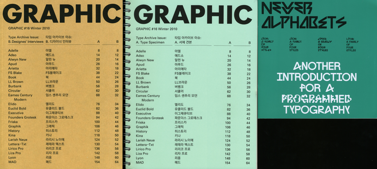
Pesko and Nawrot made a family of four rather unique and aesthetically compelling type-faces; The Lÿon Family. This family is named up after Nawrot’s hometown Lyon, and the designer himself claims that the umlauts in his and Pesko’s ÿ were added to make it appear more personal and playful. The Lÿon font family was introduced to the public as a booklet supplement called “Newer Alphabets” to the “Typefaces Issue” of GRAPHIC (16th edition); a design magazine created by another colleague and friend of theirs, S-Korean Na Kim.
At the launch of Na Kim’s 17th edition of GRAPHIC (“When Design Becomes Attitudes”), both Pesko and Nawrot were there in person to have a talk about their collaboration on the Lÿon project. Lucky for me, since I happened to be in the audience.
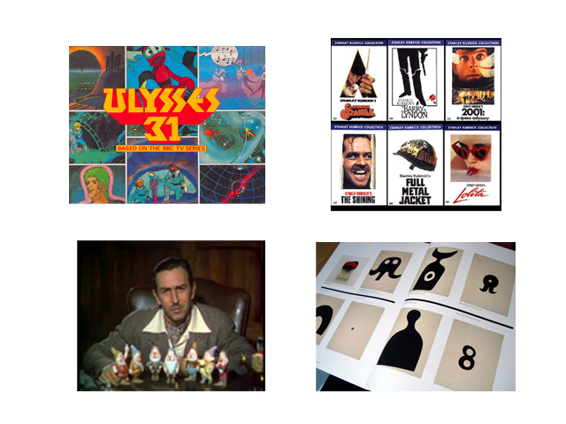
I must mention that prior to this, I had made an attempt to interview Pesko via e-mail, but I found the talk at the magazine launch to be more fruitful for my research; basically all my questions were answered without me even having to ask them. The (funny and to some extent rivaling) dynamic between the two collaborators was also obviously easier to catch, and it helped me develop a more wholesome image of both their process and final outcome. But first a little more about the members of the Lÿon family; the Lÿon’s are Jean (after artist Jean Arp), Stan (after director and photographer Stanley Kubrick), Ulys (after Franco-Japanese animation series Ulysses 31) and Walt (after founder of Disney Pictures Walt Disney).
These brother type-faces are creatively based on a feeling or the essence of the characters they’ve been named after, as well as the fact that they have formal approaches to their subject qualities. This is also stated shortly by James Langdon in the “Newer Aphabet” booklet “…they are open and various and their spirit is this: to resist normative tendencies and to reject the idea of definitive form”, but as the booklet basically focuses on presenting the different family members and suggests various juxtapositions of their letters, it was quite helpful to hear the designers explain their work furthermore. Amongst other details, they mentioned how the different “Lÿon brothers” are created with the intention of being able to mix with each other; a feature I personally appreciate a lot because it encourages their potential users to be creative and exploring by being allowed to play around with them.