Skip to Content Skip to Search Go to Top Navigation Go to Side Menu


"Fransje Killaars" Tag


Color in Relation to our Lives


Friday, March 29, 2013

A bright pink page of the book drew me to it. It was lying in a showcase in the Stedelijk Museum amongst many other objects and flyers, but the brightness of the opened page made the book stand out. On the left page you could see a picture of an Indian girl sitting behind a table. On the table in between her hands was a small heap of bright pink powder, almost the same color as the bindi on her forehead. The page on the right was a page of bright pink textile.

This book (put together by Nikki Gonnissen and Thomas Widdershoven) shows works and gives a feel of the work by Fransje Killaars, a dutch artist who graduated from the Rijksacadamie in 1984. In the beginning of her career she mainly made paintings, but it is her later work, her textiles, which attracts me most.

I read in an article about Fransje Killaars that she is fascinated by the power of color, the relationship between people and textiles and the way textiles are bound up in daily life. I was able to take a closer look at the book in the library of the Stedelijk Museum and I was surprised to see how much more attractive Fransje Killaar’s work is portrayed in that book than for example the images on Google search. It was then that I realized that like Fransje Killaars I was not only fascinated by the power of color, but especially the combination of colors in our daily lives. Seeing Fransje Killaars’ textiles transforming an old attic

space into a bohemian paradise,
or seeing her carpets thrown over a washing line hung amongst palms

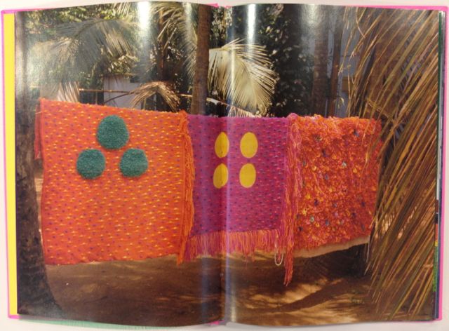
seems to play much more on the imagination rather than seeing the fabrics placed in the middle of a white clean gallery space.

In a gallery space the work is merely about colors; about the contrast between them and the brightness that a color can have. Yet for me the excitement comes when you find bright colors in someone’s kitchen, when colors pop up amongst plants, how sunlight can give a color different shades and all colors on the knit sweaters of the Rietveld students in the winter.


I caught myself playing around with this fascination on my guilty pleasure.

Instagram

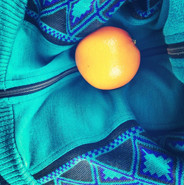
I try to eat an orange every day, but before I get to peeling it I like to take a picture of the bright orange against the clothing I am wearing that day. I have realized that by doing so I put a frame around a moment or literally make a snapshot of the moment. It may be only esthetics, but for me it is quite a luxury that you can find such esthetics in everyday life.
The combination of color and the sense of touch is another element, which I find rather appealing. Holding the skin of an orange against a green, wool knit sweater, running your hands over a an orange shag rug or a purple suede dress is often much more exciting than looking at the same colors on a 2d canvas. Do not get me wrong; I have nothing against the great color field painters, who can use colors in a fragile and moving way. These painters succeed in translating emotions into color, into paint, but when it comes to the exuberance of a color or the contrast between them I think this can be best portrayed in a more hands on manner.

The brightness and the vividness of the use in colors in Fransje Killaar’s textiles seem to be more about the celebration of life, about the joy that a blotch of color can add to every day scenery. The use of color in her work is about the beauty of variety. It is not without reason that a mixture of joyful and interesting people is referred to as colorful. The pink page in the book was what had grasped my attention, but the comparison made with the girl holding the same color pink in between her hands and a trace of the color left as a dot in between her eyes is what made me linger and look at it more carefully.

Studio Gonnissen en Widdershoven: Fransje Killaars (1997)


Monday, March 11, 2013

Fransje Killaars is a Dutch artist who graduated from the Rijksakademie in 1984. She started with a lot of paintings, but is now well known for her installations of brightly colored textiles. Both the paintings and textiles share the importance of use of color. She is fascinated by the power of color, the relationship between people and textiles and the way textiles are bound up with daily life. Her artwork is characterized by her use of fields of bright colors placed next to or on top of each other. The colors hardly ever blend together.
The book was put together by Nikki Gonnissen and Thomas Widdershoven. It is composed of pictures and different pieces of bright textile. When Fransje went to India and visited the different textile workplaces the bright colors inspired her and convinced her to work more with textile. Her trip there directly lead to this work, where she filled an attic space with bright hand woven carpets.


I picked this book because I was attracted by the bright colors. The format of the book brings out Fransje Killaars’ style very well. By adding a page of colored fabric in between pictures of her installations it gives the audience a sense of the touch and the brightness of the carpets in the room. The pictures in the book are also pictures of the textiles in more every day environments rather than a lot of the pictures which you see when you Google the artist. I find the pictures in a more natural environment far more interesting than in a gallery space, which I believe brings more justice to her work because she is interested in the way textiles are bound up in daily life.

I personally love the physical use of color for example in everyday objects, clothing or textiles, especially bright, hard colors more than pale or pastels. I am also very attracted to the contrast between the colors, which Fransje Killaars also uses in her work. As you can see the bright shades are placed next to each other, striped or polka dotted. This emphasizes the difference and variety of the colors, rather than blending them together. This in combination with texture is even more appealing to me. Being able to hold the color and attach the sense of touch to it, moving them around and placing them next to new colors I find very exciting and this is exactly what Fransje seems to be doing in her textile works.


E group : textile, medium or subject


Sunday, June 1, 2008

janineweefselJaninetatoo Janine Tielen presents herself and her projects in a special guest meeting with the students. (TXT department)

Textile can be used as a medium for direct communication. That was the basic theme for a cooperative project between the FoundationYears E-Group and the department of Textile TXT. A workshop at Platform 21 and a visite to the Vlisco exhibit at the “Volkenkundig Museum” in Leiden presented a rich and colorfull context for gathering insights and practise skills. more in …… (posting 127)

Boris-Bauhaus sketches Katherine Hamnett and Margaret Tatcher Vlisco fabric detail

Research subjects were related to the various subjects of this project and edited down to A4 sized guided tours into selected subjects. All subjects linked in this posting are also available as hard copy research prints at the ResearchFolders available at the Rietveld library.

On the subject of Text and Textile :Katharine Hamnet (fashion designer), Harmen Liemburg (designer illustrator), Roy Villevoye (artist), Janiene Tielen textile designer). On the subject of Platforms 21 “Cooking and Constructing” the participants; Frank Visser (stylist) from SAP: Daniera ter Haar (colorist), Christoph Brach (product designer), Shane Waltener and publicist Debra Solomon. Related to the Textile department; Erik Wong (graphic designer, Heleen Klopper (textile designer), Joke Robaard (artist), loop.ph (design & research)loop.ph, Petra Blaisse (designer), Fransje Killaars (artist), Scholten and Baijings (designers) and Vlisco (Holland), Batik (Indonesia), Bauhaus Textile, Sonia Delaunay (artist/designer) and Viktor Vaserely (Artist)

Nov 1st 2007 : Design Researches Available for all Foundation Year Students. > Hard Copy / Soft Copy


Saturday, November 10, 2007

Design Researches available for everybody.

Poeme2_web_final Hard copy prints of all researches from 2005 – 2009 are on file in the Library folders Vol#1-12. You can study them anytime during opening hours [Openingstijden: maandag t/m vrijdag van 11.00 tot 17.00 uur]. For example you could check out this beautiful research on Amedee Ozenfant in the context of “Le Corbusier Art and Architecture”. for more see X

Fransje Killaars Soft copies are available on line as jpeg’s or pdfs. You can download these pdfs and enjoy the content and its hyperlinked guided tour. Here is an example of such a tour into the work of “Fransje Killaars”. see for more X

Screen shot 2013-06-30 at 11.02.08 PM


Log in
subscribe