Publication: e-flux journal, Hito Steyerl – The Wretched of the Screen
Publisher: Sternberg Press
Designer: Kloepfer-Ramsey-Kwon
e-flux sprung out as an autonomous platform for art critique and comissioned art theoretical essays in 1998, eventually launching a monthly online publication consisting of a text heavy PDF in near A4 format, in 2008.
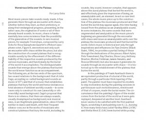
Jeff Ramsey (of design studio Kloepfer-Ramsey-Kwon) studied graphic design at Werkplaats Typografie in the Netherlands around the same time as e-flux was drafting their online publication. Through a local contact he was given the design assignment, containing few artistic restrictions. Working with a programmer he developed a tool that would operate according to a number of pre-determined rules (i.e. pictures should stand alone on pages, be placed as close as possible to their point of reference in the text, be sized according to importance; which in turn are factors assigned by the writer or editor, not the designer, when feeding the text into the template).
The first 5 issues of e-flux journal were supervised by the designer but have since been laid out solely by the editors of e-flux. The template tool is thus a wysiwyg-layout software custom made for this particular purpose.
As the number of web based journals grew e-flux aspired to publish a physical, printed paper reader; grouping new and previous essays by theme. Some of thus far 9 published readers are named/themed:
What Is Contemporary Art? / Are You Working Too Much? Post-Fordism, Precarity, and the Labor of Art / Moscow Syposium: Conceptualism Revisited / The Wretched of the Screen / Culture Class / Going Public
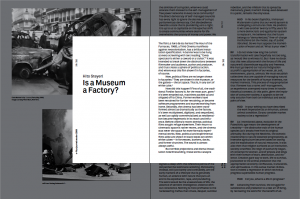
For consistency, the printed reader is almost an exact, but cropped, version of the online journal, fitting one column of text per page instead of two
(see below)

(PDF journal in grey, paper reader in white)
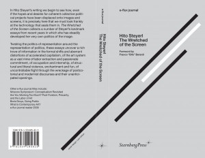
e-flux has gravitated towards simplistic and to-the-point design since the beginning.: ie helvetica was their web type. In order to connect the journals to the existing material Kloepfer-Ramsey-Kwon wanted to use a “quite-like-Helvetica-but-not-Helvetica” typeface for e-flux, hence purchasing Akkurat by Laurence Brunner from Lineto, arranging the text to reminisce of the original on-screen reading. Pages are filled edge to edge with a sans serif type. Short margins, vertically oriented notes (page numbers/titles/etc) clearly differentiate it from, for instance, the pocket sized novel, which would often be printed in a similar shape and format.
The design is intentionally simple in material as well as execution; highlighting the content without decoration or gloss. No waxed paper is featured (not even the soft and fairly fragile cover). Pages are deliberately matte, uniform and sobre. A dignified quality is communicated when the recipient holds a copy of the reader in their hand. The format is small, slightly below A5, fitting comfortably in one hand – yet thick enough not to be flimsy. This is a type of printed matter that lends itself to be carried, used and actually red without becoming tattered. It is also a book who’s look wouldn’t suffer if it did, since no ambition towards “pretty” is made.
Aside from e-flux Kloepfer-Ramsey-Kwon work with other large art clients such as MoMA, Carnegie, Whitney Museum and Guggenheim. Catering to art institutions as well as individual artists (for book and graphic design) has been a conscious strategy. The co-founders wished for greater freedom to execute their ideas – which they often get when working with artist – contrasting institutions, which tend to be more bureaucracy oriented and constricted by earlier graphic profile, printing methods, etc. K-R-K also believe that the art circuit allows for a greater intellectual challenge for them as design professionals, for instance: inviting the client to collaborate on an assignment might lead to ideas and solutions the designers alone wouldn’t have arrived at.
The actual design process varies, from luck/intuition with “first version is the best version” to long stretches of tedious pushing, tweaking for weeks until a direction which is ready to be presented to the client appears. Strategically, all while being able to produce large volumes of work (see Saddam Hussein covers) the designers prefer to present only one idea to the client.
“We are constantly going for higher quality work, so we keep on sketching – but once we arrive to something we believe in, we’ll present that and start re-working it with the client.” – Jeff Ramsey
Rietveld library catalog no : stey1

