Skip to Content Skip to Search Go to Top Navigation Go to Side Menu


Archive for December, 2018


my long lost error 404 (sad ballad)


Tuesday, December 18, 2018

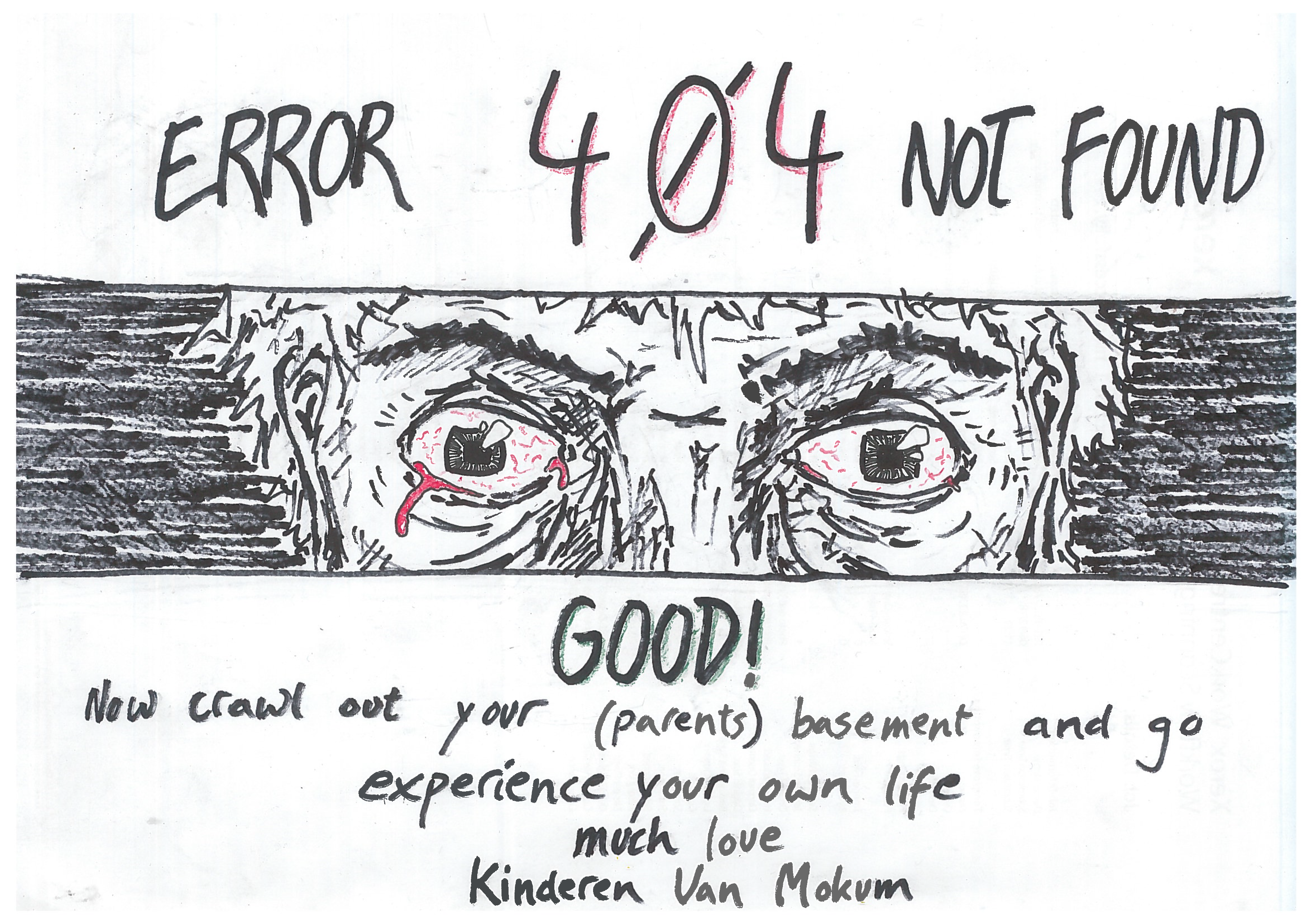
Searching for broken links on the world wide web.
The question is how to do that, when a broken link is not usually something you look for, but something you find when you need it the least.

We were looking for the parts of the internet, old and forgotten, where no IT-guy would ever come back to clean up old links. We used random keywords as “blogger” and “star” or “dogs” searching for old blogs from the late 90’s not a lot later than the new millennium.
With this method we came across a lot of content long lost in the www. We collected screenshots from these sites that had dead links, also allowing them to once again have a new life in another part of the internet.
Also we saved the search history to show the paths we walked towards the broken links.
At last, from all this digging for dead links, a song came to life.
In the lyrics of the song (which are included in this blogpost) we reflect on the broken links, how we found them and most importantly the content we never got to see.

Soon the actual song will be released..
..so stay awake and keep an eye out for your soundcloud feed.

…………………….

Hello old blogs
We are revisiting you
We are looking for you (Where AARE you)
The search is hard and difficult
The Road is long and bumpy (Uuhuhuhuhuh)

To find one piece of gold in the Wild Wild web
(I’m an internet cowboy in the Wild Wild web)
(Searching for broken links)
(Lost in the cybernet)

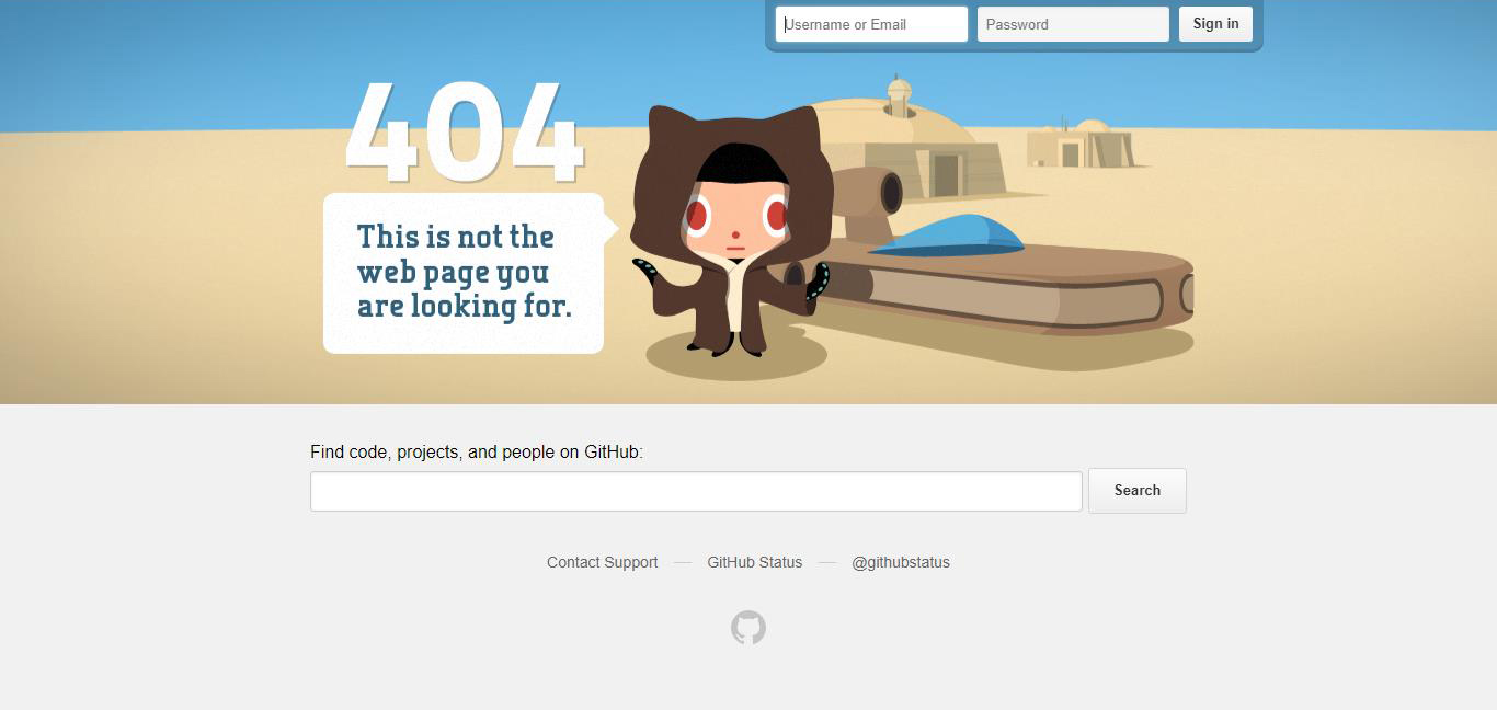
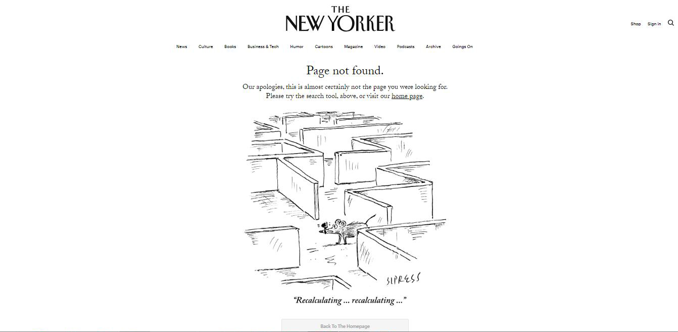
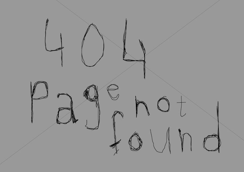
My long lost error 404

You caught me by surprise
And then i wanted to click on this link
But i can’t
It’s a broken link

I’m an internet cowboy lost in the wild wild web…. ….

Oooh broken link you caught me by surprise
The connection is lost what should I do?
Everything is lost

Lara, I found you by typing “blogger” and “psychic” in google
I chose the golden years of 1997 and 1998 for the search resultsss

Lara
What are thinking about
What are you’re thoughts
Why are you so sad
I’m a cowboy looking for you, My long lost link

One small star, I rise up softly for a new hunt
The poem 224 you did not work
You were lost in the void In the title of one small star
“Pardon me deserts that I don’t rush to you spearing a spoon full of”

I found you by typing blogger and star
I wrote/keyword “blogger” and “hotline” found this weird blog
Another broken link
Another lost story
The men wearing suits and pink letters of a tele company

Who are you
Where are you from
Where are you now

I need you!!!!

Under a one small star the cowboy hunts for a broken link
The day is done and the world of the wild wild web is lost

a comfy break


Monday, December 17, 2018

In the studying of links a peculiar feeling comes to mind

links are not that old yet, the internet isn’t that old yet. These portals have only existed for short periods of time. Still portals decay. Rot, rotting. Try and make a difference, it won’t happen.

The internet is not our own but rather a new dimension. As Decartes pleaded that the mind and body are on different planes of existence, the internet exist on a third plane functioning on its own. Or perhaps, the internet exists in the mind plane
settled within our own consciousness

instead of being connected by the Amygdala, it connects through the eyes. Receptors receive, Sensor sense, the mind connects it all and files it away.

As humans we demand connection.

We see faces in images and foggy streets even if there is no person,
this nature prevents us from tolerating link decay

We click, we ask, we want.

In the moment we stumble across a broken link the mind gets stuck,
it wants to jump the portal but falls in a black hole.
Through the chasing of perfection and wholeness in daily life the brain cuts off when it cannot complete the link. The chain ends. This is an unsatisfactory experience.


To change the stigma of broken links and erase their oppression by capitalist society we will introduce a comfortable link,

 a nice place, a home, time to take a break…

A comfy break.

In search for Anton Shebetko…..


Thursday, December 13, 2018

A google search trying to find a guy from a different class, that I had never met before, whom I was suppose to work together with. It is hard to use the internet to figure out what people look like and who they are through multiple false links, that doesn’t concern the specific person. It might just be another person with the same name, or people who are linked online. Coming to a dead end online in the forum where you usually can find answers to everything.

Who is Anton Shebetko?

Room 404


Thursday, December 13, 2018

This post is about the about the genocide of Native Americans, because, according to the story, the post was placed on a Native American burial server; and there is imagery throughout the post associated with the American West. For instance, cans of Calumet Baking Powder are linked in this post. Because a calumet is a ceremonial pipe, and the cans featured the image of a Native American, one analyst believed that American imperialism was the subtext of this post.

Another theorist believed that the author had directed the footage disseminated by NASA to publicize the Apollo 11 moon landing. He believed that there are telltale signs of the use of linkrot in NASA’s footage and that the author of this post was contracted to produce hoaxed footage of a fake moon landing. He points to the knitted Apollo 11 sweater that’s in the link wears and claims that “404” refers to the mean distance of the Earth to the moon. He also refers to the fact that a image resembles the Apollo launching pad as evidence that the post is an elaborate apology of sorts for the author’s involvement. In particular, the analyst feels that the tirade of the author to this website about how they do not understand the importance of motivation and offering interesting assignments to students, portrays the author’s own sense of isolation from making this post.

One analyst connects the Designblog maze-connection graphic with the mythic story of the Minotaur, believing that a link in this post is actually about a minotaur. She bolsters her theory by pointing out that there is no graphic showing the website’s maze in the post and that an earlier author’s post was made for Minotaur Productions.


The authors do not attempt to promote any of the particular claims made by their interview subjects.

But honestly, who are you?


Tuesday, December 11, 2018

About linkrot


Tuesday, December 11, 2018

Hello, this http://www.bombsite.com/issues/0/articles/3117h https://www.dn.se/DNet/jsp/polopoly.jsp?a=762376 https://rietveldacademie.nl/designblog/wp-content/uploads/2008/03/texttextile_kimono.jpg http://z.about.com/d/inventors/1/0/h/B/corkscrew4.gif broken links. 

Link death, link breaking, reference http://www.nest-rotterdam.nl/17-1.html, links https://annevet.home.xs4all.nl/onderzoek/right_to_copy/part-1_2.html nowhere. 

These are https://www.youtube.com/v/i-HVW-0eoe0&color1=0xb1b1b1&color2=0xcfcfcf&hl=en&feature=player_embedded&fs=1%5C%22%20type=%5C%22application/x-shockwave-flash%5C%22%20allowfullscreen=%5C%22true%5C%22%20width=%5C%22425%5C%22%20height=%5C%22344%5C%22%3E%3C/embed%3E%3C/object%3E different names http://www.dantedifranco.com/DragKingFunRoyalBrands.htm definitions for when hyperlinks https://postuyhironnblqck.com individual websites are moved, taken down http://z.about.com/d/inventors/1/0/h/B/corkscrew4.gif reorganized, resulting http://static.hugi.is/misc/movies/1984macintro.mov making links permanently http://www.designws.com/vormgeverpagina/wimrietveld.htm temporarily unavailable.  

http://www.pliink.com/mt/marxy/archives/2006/09/on-The-new-japa.html process http://images.google.nl/imgres?imgurl=http://charliebakker.com/wp-content/uploads/2008/11/s7002318.jpg&imgrefurl=http://charliebakker.com/%3Fp%3D270&usg=__OX-IiT3S1ny-VojnR1BVZVj-xuQ=&h=567&w=756&sz=76&hl=nl&start=8&um=1&tbnid=5UnmYQK7eYd5FM:&tbnh=107&tbnw=142&prev=/images%3Fq%3Dcharlie%2Bbakker%26um%3D1%26hl%3Dnl%26client%3Dfirefox-a%26rls%3Dorg.mozilla:en-GB:oficial%26sa%3DN rot http://www.designws.com/vormgeverpagina/wimrietveld.htm nature occurs after https://annevet.home.xs4all.nl/onderzoek/right_to_copy/part-1_2.htm living organisms die. http://www.nest-Rotterdam.nl/17-1.html http://www.picasaweb.google.com/veriyanta/MyWeddingandHoneymoon#5072923308189265890 decomposition http://static.hugi.is/misc/movies/1984macintro.mov https://rietveldacademie.nl/designblog/?m=200806 https://annevet.home.xs4all.nl/onderzoek/right_to_copy/part-1_2.htm http://images.google.nl/imgres?imgurl=http://charliebakker.com/wp-content/uploads/2008/11/s7002318.jpg&imgrefurl=http://charliebakker.com/%3Fp%3D270&usg=__OX-IiT3S1ny-VojnR1BVZVj-xuQ=&h=567&w=756&sz=76&hl=nl&start=8&um=1&tbnid=5UnmYQK7eYd5FM:&tbnh=107&tbnw=142&prev=/images%3Fq%3Dcharlie%2Bbakker%26um%3D1%26hl%3Dnl%26client%3Dfirefox-a%26rls%3Dorg.mozilla:en-GB:official%26sa%3DN http://www.theyellowdog.net/iam_bkp/ nitrogen http://www.terhitolvanen.com/html/woodland12.html carbon cycle https://slowlab.net/index.html nature.

Links break https://rietveldacademie.nl/designblog/wp-content/uploads/2009/02/blogspot_forweb.jpg different reasons. Http://www.designws.com/vormgeverpagina/wimrietveld.htm some ways its inevitable https://rietveldacademie.nl/designblog/wp-content/uploads/2008/04/andreasa_strangeattractors.pdf natural, just like http://www.topstad.amsterdam.nl/nieuws/rietveld_trekt_in nature. Old things die http://www.picasaweb.google.com/veriyanta/MyWeddingandHoneymoon#5072923308189265890 http://http//www.arcspace.com/gehry_new/ things occur.


Is it possible to create an ideal ‘404 not found’ page?


Sunday, December 9, 2018

‘404 Error’ pages are basically pages that either doesn’t exist or they are broken. Sometimes being in control of thousands of pages on a site is troublesome and errors can be inevitable. However you can create an excellent 404 page that could in fact help your user.

Even though it can act as an advantage people still tend to avoid altering their 404 pages. But what could be useful to include in a 404 error page?

Tips:
  1. Have a search engine so that people can search what they are looking for
  2. Have a link to the main page so that people can redirect
  3. Create contact forms so that people can inform you about the broken link/fill in their inquiries

https://github.com/404


https://www.orangecoat.com/lost


4. It’s always disappointing when you reach an 404 Error page. Therefore it is a good idea to prevent further frustration.


https://studiofables.com/404?fbclid=IwAR213GVHwe_Z8uTB841NB0b1inAtyidMJ0FkA1bMmvDjBUNuejlz49nCUc0 


5. Or you can have a really playful design such as


http://www.romainbrasier.fr/404.html


6. You can also have a funny design.


https://www.newyorker.com/404page?fbclid=IwAR2TPHPft9kTmYHZ8iJYRXNsCPvkSXEMs7G1tOA_bBn8facq0bnUWb3dx2k 


In conclusion, 404 error pages can be useful for your users if you care about making it into a helpful page.


404 Error


Sunday, December 9, 2018

404 error page not found. A standard HTTP error message code, meaning that the website you were trying to reach could not be found on the server. Perhaps the website was removed or perhaps its URL was not changed accordingly. The error pages almost always have a similar design. Plain and boring. Nothing more interesting to look at than a blank page with disappointing content.

Let’s change that. Hereby we present five exciting design suggestions.

Video by Quirine Kennedy

Image by Lucía Vives

Image by Ravi Blits

Image by Leonie

Image by Amanda Bellman

Lady´s in a car?


Thursday, December 6, 2018

I don´t know why I pick the book in the first place. Sometimes I just take a book without reading the title or the writher. It was standing somewhere in the middle, normal thickness and normal height. Nothing special on the spine, it was just black.

But when I took this book I saw that it was a good choose. There were two lady´s on the cover. I´m actually not sure if it are lady´s or man who are dress like lady´s. The make-up is so heavy that its looks they are covering something up. So they caught my attention. And the longer I looked the more questions came in my head. They are sitting in a car and it looks like a car from someone else. The weather is shitty and their makeup is not so perfect anymore. I think they are in a different country. They are looking a bit lost. But they don’t care so much. The cover of the book is also not so pretty as it used to be. in the corner it’s a bit ripped. At first, I thought that it was the print on the cover itself. In the inside you can see that someone repaired it with adhesive tape. It fits perfectly by the style of the book. Today I don’t feel perfect either. I can imagine that I have the same impression of the `girls´. I had a massage from my friend Nina who is also having a winter depression. But it always starts before the winter even begins. The picture is not filling the whole page. The rest is just black. Only the two people have colour. Outside of the car it is grey except for some yellow. The yellow reminds me of a taxi. It gives the impression of a big crowded city.

*15086*

Iuvenis


Thursday, December 6, 2018

It drawn me to it. The cobalt blue colour emphasised the youthfulness of the imagery. The face was almost life sized, as if it wanted me to adore it and venerate the look in the eyes that told an enigmatic, coming to age story. A portrait of a working class, white, young man was gazing at me with his presumably blue eyes, covering almost the entire cover of the magazine. The image was beautifully screen printed with a raster. In a very strong looking font ‘’WERKER’’ was written above the flat cap of the lad. Immediately my mind started working – adolescent, masculine, boyish, Adonis. It was a very obvious attraction for me, as if the cover invited the spectator to get this aroused feeling of the sexualisation of a worker class lad.
As I’m browsing through the pages, the the layout comes across very nineties. It has a playful way of displaying titles, articles, text and images. But above all, it is a very smart moves that lies immediately the focus of the context of the magazine: young man. The structural slogans that are prominently coming back in the magazine, combined with the grainy images of young men and their body parts it gives the layout a feel of protest, anarchy but also youthfulness that keeps coming back as a theme. This combination is of the archiving layout and the strong images that are yet quite sexually intended are making everything stronger. It captures the underlying beauty of vital lads back in the day. It also reminds the spectator, by pulling the archiving trick, that now we can see them as more than just the middle class. It let my mind fantasize about these adolescent boys in a non embarrassing way. The mystery and subtle beauty, packed in something strong and masculine, let my eyes legitimize the scanning and the browsing at the photos. I wish I had a worker class boy by my side.


Indulgence at the beach


Thursday, December 6, 2018

Keeping my keywords in mind I drifted around during two afternoons, allowed myself to get a bit more ’lost’ in the library.

This book was squeezed in tight between other books on the shelf, but that only made it stand out more. I noticed its crooked pages seen from the top, making an interesting pattern.

I recognize the look of those pages. I feel like I know them well.
It is clear that this book at some point have been soaked completely wet in the top. And after the drying the pages now take on this beautiful soft curve, reminding me instantly of rivers. Somehow once material have been soaked it always leave a trace of water.

Clear nostalgia, I have tried it myself. Being caught in the rain with school books, drying them in frantic desperation on radiators and in front of the fireplace.
By instinct I smelled the book. Not took bad for being drenched! I only got a fragile musky scent from its pages.

I almost laughed out loud when I finally saw the books cover in all its glory: A tilted shoot; blue skies over a crystal blue ocean, a wave spilling over perfect white sand. In the sand a heart is drawn, and the flamboyant bold letters “LIQUID LOVE” is plastered in the middle.
Incredibly kitsch and yet irresistibly charming. –I both love and hate it.
I mean – who came up with that idea? For what reason? Amazing, I was stunned in full five minutes taking in the glory of the scenery.
It is clearly a book with personality.

Scenes like this are quite ionic. The island ‘paradise’. Blue skies, ocean, alone on a welcoming beach. The heart is really what makes this over the top – a sign of silly, clumsy first love. Desperate to prove itself and has to take form as initials carved into trees and hearts traces in the sand. And then you can watch as the ocean swallows it.

Then title in itself is quite spectacular “LIQUID LOVE”. The ultimate seduction, dripping from the title with desire. A love that is liquid, able to sneak in anywhere, binding, making you captured in its grasp.

By making this third choice I reveal my own fascinations. When choosing a books; wear, fragility and imperfections intrigues my curiosity and help me create a personality in which I can indulge.


This book can be found at: 305.9 bau 1.

Reality Machine


Thursday, December 6, 2018

  When I saw Eliasson’s book in the library, I was really surprised by how emotional I still get just by looking at the name of him. The feeling of vomiting when I saw his exhibition last time in Beijing came back to me quietly yet so familiarly.
  And on the way back carrying this book to upstairs, I met a few friends smoking at the gate, they asked:“Oh, do you like his work?” I laughed and said “I kind of vomit last time at his exhibition, but yet I chose him to write an essay, I really can’t answer this question so frivolously now. 

  Maybe that’s exactly why I chose his book, I want to discuss this complicated emotion in the form of language. Yes, language, by creating another kind of “reality” on the base of concept to connect with the “reality” he tries to present in his work.

  What can I remember about his last work? I remember the crowded crowd in the orange light which made them look like pale zombie , and everyone was either taking picture or standing there for minutes without moving — taking selfies. Kids were jumping and shouting, having so much wild fun. And the air conditioner is working so good, maybe too good, maybe that’s part of reason I wanted to vomit, my stomach always react really strongly to cold air. 

  Why? I could’t stop asking myself at the exhibition, why I (and so many people) spent at least an hour on cars —it was a quite remote museum, to come here, to experience this kind of, what he called “Reality”. When we can see the real rain, the real sunset, is this kind of imitation “reality” of the nature, somehow touches us more than the real “reality”?

  It is very beautiful, I was thinking, it’s almost like the beauty like when I see the real rainbow, then I thought about isn’t the vulnerable and unpredictable character makes rainbow so strikingly impressive? Then what is this ? You drive an hour and paid something like 20 euros, to go into this huge artificial box, which is so cold that makes you wanna vomit in the hot summer, and in this totally dark space when outside is so sun shining , you saw the beauty of nature, and you praised, “Ah, what a sublime scene of this blue planet that we call home.”


Book Info ?Olafur Eliasson Reality Machine

eila 11

blank spaces


Thursday, December 6, 2018

At first, I wanted to find something by using the catalogue, but It wasn’t very long until I realized that it wasn’t relevant knowing that the tags were only subjective,

How could it work without generating something too literal?

At least, this process of research wasn’t the right one with the tags that I chose.

For this book, it took me less than one hour to pick it, as each time I wasn’t able to select a piece without already having a specific idea of what I wanted in my mind.

But still, I felt frustrated

Frustrated by the impossibility, or more precisely the struggle of being opened,

Being able to see, to take the time to observe the books that were surrounding me.

There were so many information and possibilities around that I wasn’t able to decide or to think about what I wanted or at least to consider those things.

I think that, in a way, that book happened to me because of this frustration.

I see this choice as the translation of my state of mind at this precise moment.

Fortunately, this book might have been what I was searching for, I just saw this thin white line between all those imposing and colorful editions.

I needed something simple, purified, that’s precisely, in my view, what I found.


All those blank spaces, accentuated by those vibrant black lines

Those micro architectures, in the form of sketches.

I was struck by a drawing when I opened this book, it is a drawing of the sun.

That reminds me of le Corbusier’s sketches concerning the housing units of Marseille and the principle of the sunshade.

I like this simplicity and this clarity

I also see those lines which I like a lot, thin, imperfect, instinctive.

Sun Bathing Serifs


Thursday, December 6, 2018

The boring becoming bold, the extravagant turning average. The library’s context has the power to change the appearance of each individual book. 

My last tag word ‘seduction’ resulted in the “The Pleasure of the Text”. A rather thin book, with the linking tag word as its main subject. And to admit, this is the most seducing copies I have seen during my Quest so far. Its beige cover contains the names of the author, title and translator. Each name centrally positioned and written in classical typeface. I remember talking about this daring design approach in Art Theory class; the rigorous use of classicism in an age of uncentered cacophony.

The title and author’s name are written on the spine, covering the top two thirds of its space. It looks like the book’s designer respectfully left enough space for a library-sticker to be added on its lower third part. The letters give a sense of monumentalism, probably because they’re all written in capital letters. This book is small, has only 67 pages, but seems to express importance and something all-compassing. Is if it contains words of the Bible, or the Tao Te Ching.

To me, the feeling of seduction grows out of its minimal means: the simple action of printing ink on paper, black on white. Simple rules created by human beings offering millions of possibilities and meanings. 

While in search for this book, I initially looked up its cover online before picking it up at the library. Just so I would maybe recognize it faster inside the library. It looked different online. The original title “Le Plaisir du Texte” was written in a smaller typeface. Also, the name of the translator was missing (because obsolete). This created a sense of generosity by the amount of extra empty space surrounding each word. They were given more focus and therefore value.

The letters of the current book I have in front of me are more frivolous, and seem to almost touch each other. The ‘h’s’, ’T’s and ‘l’s’ seem to tickle the lines above and below. The text pleasures itself.

Because of aging and exposure to light, the cover’s background color turned from white to beige. I imagine this book is left in the sun often by its temporary owners – I imagine them taking a break from the pleasure the words give them during their holidays on the beach. Absorbing the sun like they absorbed the text.


803.1 bar 1


The third book search…


Wednesday, December 5, 2018

The third week of searching… This week I was unable to attend class as I had to take my Tyler Durden of a cat to the vet to remove stitches from his head. I have become out of touch with the assignment (it was confusing to start with so I’m completely in limbo). This week I chose from my own library. The book had to be out of the parameters of “design”, it had to be something else. As someone who is predominantly invested in design this left me with little choice. I chose the book “tricks” by Bart Julius Peters. This book has given me many hours of entertainment as well as many inspirational moments. This book is comprised mainly of pictures with small texts, some I english, dutch and some in Italian. This book spoke to me as it has a non-binding, the pages are loose and can be taken out. I find this fascinating as from an early age I have been obsessed with organisation, I find it fascinating that is one desired they could simply let the pages fall out and thus be jumbled up and if the reader has not paid attention the original order could be lost forever. The book features pictures of details in wildlife but also classical sculpture. As a happy accident this book does match my original tree tags which where “spine, monochrome, pictures”.

“Essi offrivano lo spettacolo più che patetico ballano ai ogni insieme, aiuo, ciechi quen

di due giovanissimi innamorati ammonimenti del destino, illusi che ai difetti reciproci, sordi agli liscio come il pavimento del salone, tutto il cammino della vita sarà la parte di Giulietta e quella attori ignari cui un regista fa recitare di già previsti nel

di Romeo nascondendo la cripta e il veleno, calcoli, copione. Né l’uno né l’altra erano buoni, ciascuno cari e pieno commoventi di

gonfio di mire segrete; ma entrambi erano

mentre le loro non limpide ma ingenue ambizioni erano obliterate dalle parole di giocosa tenerezza che lui le mormorava all’orecchio, loro dal profumo dei capelli di lei, dalla reciproca stretta di quei

corpi destinati a morire.”

Giuseppe Tomasi di Lampedusa, Il Gattopardo,

Feltrinelli Editore, Milano 1958

The second search…


Wednesday, December 5, 2018

This week 3 words define our search. Mine are “spine, monochrome, image” A spine I find unusual and interesting, a book with only monochrome pictures and text, a book which is mostly comprised of images. As I search for the book which will meet all my categories I am struggling to find one which is convincing me. I find many books which apply to a single word, many books which apply to two of them but the real search for the ultimate match has just begun. As I notice how silent the library is I whisper to class mates who have made their decision and discuss their decision and the lack of mine. I travel back and forth deliberating and deciding. As I travel I think to myself that this is an impossible task and I will need to change my words. Alas I am stuck in the library again. As I look through the collection of books I start to notice how many of them look so similar both in regards to their spine but also layout. This task seems to be a tedious one. I travel upstairs in the hope that the perfect book will present itself. As i walk along the grid and glide through the books on the shelf an unsuspecting book presents itself to me. Like a beam of light in the darkness, like a light at the end of the tunnel, like a candle in the dark. This book is called “nobody suspected there would be much discussion about it”, quite appropriate in my opinion. the book has a cover which folds out to be a poster and the binding is satisfyingly odd. The entire book documents the works of designers working for Estoplast in the soviet union. The entire book is comprised of mostly pictures which are monochrome, three birds with one stone!

The first search…


Wednesday, December 5, 2018

Looking across the spines, looking for something that will excite my eyes and brain. looking for something I will like, that will make me feel something. So many titles of enticement. The search started with colour. What is the best scheme? The text doesn’t appeal but the colours do and vice versa. The high contrast of complementary colours creates a vibrant look especially when used at full saturation. The colour scheme must be managed well so it is not jarring. Many books later I start to think of harmonies, they usually match well and create serene and comfortable designs. Analogous colour schemes are often found in nature and are harmonious and pleasing to the eye. I have stumbled upon a trove of material. The search has been narrowed and now the idea of colour appeal does not suffice. The search then narrows to binding technique. The differences stand out. I try to purely focus on the physical aesthetics of the book. Focusing on what I like and what appeals to my eyes. As i blouse I seem to stumble upon more and more books which could be candidates. The diversity is wide and intimidating, many thousands of books stand in front of me, decisions need to be made. My choices have been narrowed down to mostly graphic design books. As I conduct the final steps of the test; browsing through the books. I judge purely on my own likes and dislikes. I am not satisfied with my final books so I go back to the search. Suddenly a book stands out to me, the binding is complex yet satisfyingly simple and minimalist. I pick up the book titled “restless typographer”.  I sit down at the table and start to flick through the  book and my mind is made up. This is the book I must choose. It spoke to me and I listened.


Log in
subscribe