What is Gothic? Gothic was the culminating artistic expression of the middle ages, occurring roughly from 1200—1500. The term Gothic originated with the Italians who used it to refer to rude or barbaric cultures north of the Italian Alps.
According to Christopher Wren’s Saracen Theory, Gothic style had nothing to do with the Goths, rather it was a style influenced by a number of factors including Saracenic art —an Islamic influence from the Crusades.
Blackletter type is often misleadingly referred to as either Old English or Gothic, two terms that are only partially accurate.Blackletter is an all encompassing term used to describe the scripts of the Middle Ages in which the darkness of the characters overpowers the whiteness of the page. From Type and National Identity by Peter Bain and Paul Shaw.
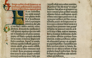
Blackletter also known as Gothic script, Gothic minuscule, or Textura, was a script used throughout Western Europe from approximately 1150 to well into the 17th century. Was used in the Gutenberg Bible, one of the first books printed in Europe. This style of typeface is recognizable by its dramatic thin and thick strokes, and in some fonts, the elaborate swirls on the serifs. Blackletter typefaces are based on early manuscript lettering.
Gutenberg Bible First page of the first volume
It continued to be used for the Danish language until 1875,and for German until the 20th century. Fraktur is a notable script of this type, and sometimes the entire group of blackletter faces is incorrectly referred to as Fraktur. Blackletter is sometimes referred to as Old English, but it is not to be confused with the Old English (or Anglo-Saxon) language.
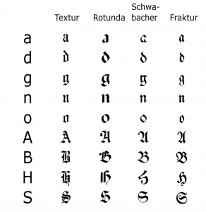
With Blackletter typeface’s has 4 important type of calligraphy can be identified as Textura , Rotunda , Schwabacher and Fraktur.
Gothic Fraktur typeface identified with “Latin alphabet” in northern european texts , which is called “ German alphabet “ part of typeface of “ Latin alphabet”.
The word “ Fraktur” or “Gothic” sometimes applied to all of the “Blackletter” typefaces.
The original word itself come from “Fractus” (broken) of Latin frangere ( to break ) the same root as the English word “ Fracture “.
Where Is It Coming From?
First appear of Fraktur typeface during 16th century , when Emperor Maximillian I commissioned the design of the “ Triumphal Arch” woodcut by Albert Dürer and a whole new typeface style created specifically for this purpose designed by Hieronymus Andreae.
Triumphal Arch, woodcut by Albrecht Durer in 1510
Fraktur typeface for printing matters created by the Augusburg publisher Johann Schönsperger at the series of Maximillian I’s works like prayer book or the illustrated Theuerdank poem (1517).
With time Fraktur become really popular and get used in German speaking world and areas under German influence (Scandinavia , The Baltic States , Central Europe) . In the 18th century the German Theuerdank Fraktur developed by Leipzig typographer Johann Gottlob Immanuel Breitkopf to create Breitkopf Fraktur.
Typeface Fraktur still in use German speaking areas and countries as well as Norway , Estonia , Latvia and small part of Sweden , Finland , Denmark.
In the late 18th century to the late 19th century, Fraktur was replaced by Antiqua as a way of showing the classicist age and emerging cosmopolitanism in most of the countries in Europe that had previously used Fraktur. This change was argued in Germany, where it was known as the Antiqua–Fraktur dispute. The shift affected mostly scientific writing in Germany, whereas literature and newspapers continued to be printed in broken fonts.
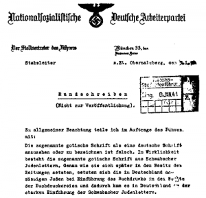
The Fraktur typefaces remained in use in Nazi Germany, when they were initially represented as true German script; official Nazi documents and letterheads employed the font, and the cover of Hitler’s Mein Kampf used a hand-drawn version of it.
However, more modernized typefaces of the “Gebrochene Grotesk” such as “Tannenberg” were actually the mainly popular typefaces in Nazi Germany, specially for running text as opposed to decorative uses such as in titles.
These typefaces were designed in the early 20th century, mostly the 1930s, for grotesque versions of blackletter typefaces. The Nazis mostly used these typefaces themselves, though the shift remained controversial and the press was at that times named for its frequent use of “Roman characters” under “Jewish influence” and German immigrants were urged to use only “German script”.
On January 3, 1941, the Nazi Party ended this argument in the modern day scripts including Antiqua. Martin Bormann issued a circular to all public offices which declared Fraktur (and its corollary, the Sütterlin-based handwriting) to be Judenlettern (Jewish letters) illegal for any way of using it. German historian Albert Kapr has said that the those times German Government had understood that Fraktur would inhibit communication in their lands occupied at World War II.
Fraktur or also known as Gothic script is a typeface that was and still is used in many different context. It starred around 1500 century the script is recognizable with his broken edges. Sometimes both terms are equated with each other; then all gothic letters are called “Fraktur”. The letters of the Fraktur seem broken, hence the name; in addition, they are high and narrow. the fraktur was dated in the frans gothic period first the hand writing scripts came and after that the print version. Besides the 26 of the modern Latin alphabet , Fraktur includes the B (Eszett) , vowels with umlauts and the ? (long s). Some fraktur typefaces also include a variant form of the letter “ r “ known as the “ r “ rotunda and many a variety of ligatures which are left over from cursive handwriting and have rules for their use. Make no distinction between the majuscules “ I “ and “ J” ( where the common shape is more suggestive of a “ J “ ) , even though the minuscules “ i “ and “ j “ are differentiated.
Use In Modern Age
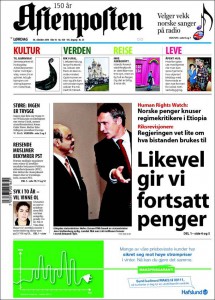
Fraktur is today used mainly for decorative reasons: as an example we can look some of old German newspapers such as the Frankfurter Allgemeine, also the Norwegian Aftenposten, still print their name in Fraktur (also some newspapers in European countries and the U.S.) and it’s also very common for bars and restaurants signs. In today’s decorative way of using it, the traditional rules of Fraktur about the use of long s and short s and of ligatures are often don’t comply anymore.

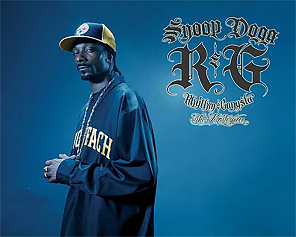
Now and days the type phase gets used for differed things as products, Music bands and clothing brands. It’s mostly see as with heavy metal bands and black hoodies. But now more high fashion brands use the fraktur lettertype for there new collections.
Album Covers of Snoop Dogg and Motorhead
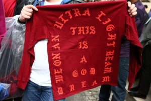
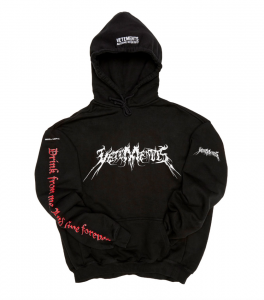
For example in 2016 Vetements made a collection and also Kanye West made a commercial products with in that year in conjunction with his new album release “The Life of Pablo”.
The Long Sleeves Kanye West designed for his album - Vetements 2016 collection
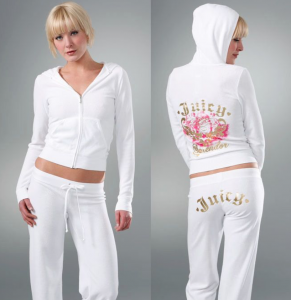
Today a lot of streetwear and other fashion brands use the gothic type phase different subcultures in the fashion industry pick up on the Fraktur font the street wear labels, Juicy haute couture for example this velour tracksuits it’s kind of girlish clothing brand and a particular group of people that wore that, but with this font on the back of the pant is pretty funny also the decorat with a lot of shiny things.
