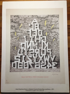
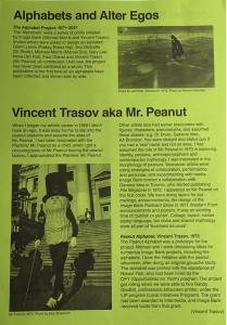
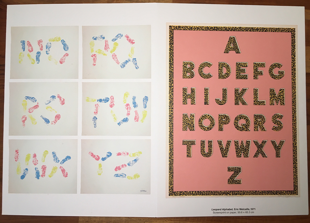
The Alphabet book seemed an interesting choice among other publications that the Rietveld Library had acquired last year (2018) because it is an odd book at first glance. It is very different from most books you might come across in a library. There are only eight pages, yet each of those pages is nearly 3mm thick and made of cardboard. The book is slightly larger than A4. Another thing that sets this book apart is that there is no title on the front of the book but rather on the bottom of the spine. You can also find the title on the Kunstverein website. What really strikes me about this book is that each page has one image of an alphabet. In total six different alphabets are shown. Each alphabet is from 1971 or 1972. The ‘Alphabets’ series was a project originally initiated by Vincent Trasov and Michael Morris. The artists who created these alphabets all seem to have an alter ego of sorts, the most prominent being ‘Mr Peanut’ which is an alias for Vincent Trasov. He dons a peanut suit inspired by ‘Mr. Peanut’ which is a logo and character made famous by ‘Planters’ a company which sells processed nuts, mainly peanuts. The reason Trasov’s alias Mr. Peanut is more prominent is because of his run for the 1974 Vancouver civic election, where he dressed up in his peanut costume. He ran on the platform of ‘PEANUT’. ;- “Trasov was persuaded to don the costume as a symbol for the collective aspirations of the art community and run for mayor in the 1974 Vancouver civic election on the art platform: P for Performance, E for Elegance, A for Art, N for Nonsense, U for Uniqueness and T for Talent.”. Trasov received 2685 votes accounting for 3.4% of the total vote. Trasov could not likely have really thought he was going to win but this would serve as a satire on the political climate of the time. Canada in that time went through a period of political unrest and economic difficulty. What made his candidacy even more interesting is that he did not utter a single word. Mr. Peanut became a kind of walking sculpture. The talking was left to his campaign manager John Mitchell.
In 1972 Trasov and Morris using their Imagebank (sort of collective) hired a silkscreen printer and printed the Peanut Alphabet. One of the people I spoke to at Kunstverrein speculated that the alphabet project was an exploration of visual language via the alphabet as a kind of study. At the time the hopes of Morris and Trasov was that this project would become larger than it really did. They invited some artists to create alphabets as representation of this language they where exploring. These alphabets also had a correlation to their alter egos in some way. At that time you would have been considered to be a part of the status quo if you did not have an alias for your work. So in some way to keep up a certain authenticity these artists felt they had to have an alter ego, and so it is only logical they would strive to create an alternative language that went against the status quo in the art community that they did not want to associate themselves with. At the same time artists in Canada Including Trasov and Morris, found themselves in a period of immense sharing of ideas with like-minded artists, this created systems and networks for artists to share these ideas even before the internet. Morris says that their survival as artists even depended on these networks.
‘The Alphabet Book’ was designed by Marc Hollenstein who does most of the design for Kunstverein publications. The Individuals I spoke with at Kunstverein are a student and Rietveld Academy alumni . For the most part I did not have to ask them any questions since they had allot to say about the book, but one thing that interested me about the publication was the thickness of the pages. They told me that this was a kind of suggestion of the volume the book could have been in regards to Morris and Trasov wanting this project to be larger than it ended up becoming.
In a way you could see ‘the alphabet project’ as a tragic comedy. There are these satirical elements, a strive to share ideas, and artistic work yet, a certain failure in the exact systems these artists tried to create in a pre-internet society that in reality faced a similar political and economic climate that we face today. The difference today maybe that satire is so relevant yet so irrelevant, we live in a society where the satire has potentially become reality, at least in political terms. This does not take away from the work and ideals behind the project, maybe it would have taken a different direction in a post internet society. The most ironic thing about this project is maybe the fact it never became so big is what makes it so interesting.
Also if anyone has a couch that isn’t straight apparently the designer of ‘The Alphabet book’ Marc Hollenstein is looking for one because he has a non square living room.
Vincent Trasov: The Alphabet Book. design by Marc Hollenstein, Rietveld library number: tras 1


