Monday, May 26, 2008
After visiting “deBazel”, a monumental building in the center of Amsterdam holding the new city archieves, we became intrigued by the architectonic philosophies behind the construction of this colossal building. Build around 1923 it was soon called “the Temple” a common reference to its general shape. In actual fact that name was not so far from the original theosophical philosophy architect de Bazel used for the total design concept of this building. He saw not just each house, but each room as a reflection of the cosmos, every part of which must be in harmony with every other.“ (K.P.C. de Bazel – designer to the elite, written by Yvonne Brentjens). This reflects in the buildings structure aswell as the interior and artifact he designed for it. De Bazel
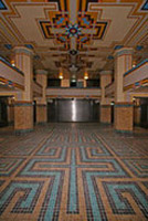

Enjoying a tour through the building, we started to become fascinated by the way this concept was connected to the original use as a bank office and the details in which the theosophic ideal –that everything grows from within (wall colors become lighter as they are farther from the center)– reflects the rigid bank’s hiearchy.
How does this reflects on our own living surroundings. What object represents a “centre” in our own house, who designed it and how do we reflect upon it. 21 students of the foundation Year’s F group try to answer these questions through the small postings you can read below:
more in ...... (posting 214)
Saturday, May 24, 2008
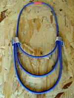
Tribal Asia.
In search for precious, body decorative objects in tribal villages of Asia.
Gesture language in communication with local craftsmen.
Looking for…,changing for…buying for…
Roughness/ Heaviness/ Roots.
Mountains.
And their hardly approachable slopes.
In need for strong ropes to keep you safe, to survive on your way of reaching peak.
The beauty of joining little threads into one strong rope.
Precision/ Color/ Pattern.
Electric store.
Materials research in building stores. Especially in electric field.
Rubber tubes, when heated connect cables and ropes.
Silver like,bendable material.
Connecting/ Material behavior/ New ways of use.
And then…
+++D.I.Y+++
The best contemporary jewellery gallery in town!
Ropes/Ropes/Ropes
Saturday, May 24, 2008
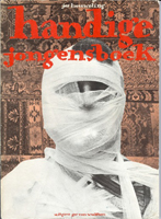 Halverwege de middelbare school begon mijn interesse voor boeken te groeien en daarbij ook mijn verzameling boeken. Eens in de twee weken ga ik even langs bij de hilversumse kringloop winkel. Waar de boeken collecties van de gooise bejaarden heen worden gebracht. Voor bijna geen geld vind je er hele mooie en speciale boeken.
Daar vond ik het Handige Jongens boek van Jos Houweling. Het is een geweldige satire op de bestaande manier om huishoudelijke tips weer te geven. De wekelijkheid en nonsens zijn een eenheid geworden in dit boek. Deze boeken met tips liggen nog steeds in de winkel. Het is en blijft dus een actueel onderwerp, drie en dertig jaar na de eerste druk van het boek. Het boek is voor mij een verademende kijk op het leven en de denkwijze van mensen.
http://handigejongens.weebly.com / http://beeldbank.amsterdam.nl/component / http://www.xs4all.nl/~annevet/onderzoek/right_to_copy/part-1_2.htm
Saturday, May 24, 2008
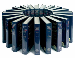 A simple search for the meaning of a word in a (oxford) dictionary might satisfy some with explanations, translations and also exemplary sentences using a specific word.
Looking back though, to the Oxford English Dictionary- its history reveals the origins of this collection.
Contribution was made by varied amateurs of the English language.
Starting from bright author to simple people and even one insane person who in a vicious attack on himself cut off his penis and lived with it (without it) for 18 years.
They have voluntarily collected words and gave them explanations proving them with sentences from books, newspapers, magazines etc.
Those people have influenced our understanding of words and their meanings, but the list is still open for more of us to interfere.
http://www.bbc.co.uk/legacies/myths_legends/england/berkshire/article_1.shtml / http://oed.com/readers / http://www.thecriticaltimes.net / http://www.amazon.com/Professor-Madman-Insanity-English-Dictionary/
Saturday, May 24, 2008
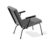 This chair came with my roommate. It is the object in my home upon which people compliment me the most and every time they do I have to tell them it is not mine. We call it the ‘Rietveld’ even though it is not designed by Gerrit, but by Wim Rietveld (1924-1985). For Dutch design company Gispen he designed furniture for ‘the ordinary interior’. The Nederland Architectuurinstituut (NAI) keeps the historic archive of Gispen.
The chair is named ‘fauteuil 1407’. In 1954, Wim Rietveld received a golden medal for this design at the 10th Trienalle in Milan. On designws.com, a designblog of Rotterdam Gallery VIVID, you can find more information on Wim Rietveld and Dutch design.
Saturday, May 24, 2008
 I present as an object from my daily life, this stupid ashtray shaped like lungs. Actually I don’t smoke and I never use this item but i’m really attached to it, even though I have it only for a short time. I got it as a part of my furnished accomodation when I moved in amsterdam, september 2007. It really reflects my state of mind about life and serious problems. Taking big matters with humour is definitely my behaviour in protecting myself from it and I think it is also typically a belgian thing to laugh about dramatic events and make them absurd. As I’m really attached to my country, this object helps me to stay “belgian” in daily life.
I would say! Amazing how a “stupid” design joke can tell that much…
http://www.humours.net/blague-belge/blague-belge.htm / http://www.notobacco.org/
Saturday, May 24, 2008
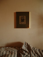 “Hij overhandigt mij een schilderijtje, met kitscherig goud lijstje, een donker groen kartonnen frame met daar in een zwart-wit prent van Hebe. Niet dat ik van goud hou, wel heb ik vroeger al erg veel interesse gehad in de Griekse mythologie. Hij vertelt mij over Hebe, de godin van de jeugd, en begint uit te leggen waar zij voor staat, als dochter van Zeus en Hera. Hebe had als betekenis de bloei van de natuur in de lente. Maar toen zij langzaam haar betrekking tot de natuur verloor als natuurgodin werd haar de taak opgedragen de goden nektar te schenken, die hun onsterfelijkheid en eeuwige jeugd verzorgde. Uiteindelijk trouwt ze met Herakles, wie zij twee zonen schonk.
Ik ben verwonderd en hang het lijstje boven ons bed, gecentreerd tussen onze hoofdkussens. Pas later, die week, vond het haar functie. Ons huis bestaat uit een grote ruimte, met gelijke muren en een oppervlakte van ruim 35 vierkante meter. Dit heeft tot gevolg dat de scheiding tussen de slaapkamer en de woonkamer moeilijk zichtbaar is. Nu, met Hebe boven ons bed, zijn er onzichtbare lijnen ontstaan, een ware metafoor, een onzichtbare muur. Het schilderijtje heeft onze woonkamer doen ontwaken.”
Saturday, May 24, 2008
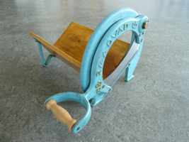 “Use me, use me!” The tool screamed at me, when I first saw it in the second hand shop. I thought it was a French device for cutting cheese or meat and, although I never missed a cheese or meat cutter before, I convinced myself that I couldn’t do without it. Later I found out that it’s a Danish bread cutter, designed by the royal Raadvad, which celebrates it’s 250th anniversary this year. The company holds three main pillars: functionality, quality and design, and they are all represented in my “brødskærere”.
Although I have never cut anything with it yet, it still holds the longing for being used. And it is this longing that I like so much.
For information about the history of Raadvad: (For people who don’t speak Danish, you can translate this site with the following website
For the logo’s of other royal brands
Friday, May 23, 2008
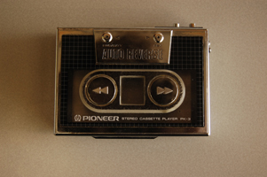 The object I’ve chosen to do research about is my pioneer stereo cassette player pk-3, or more clear, my old school 1984 Walkman. What drew my attention is that it has a chic design, but somehow also a retro 80’s look. Especially because of the silver colored straight framing combined with the raster. This raster has been used plenty of times for the cover artwork of 80’s records (For example Blondie’s Eat to the Beat). Basically I like this object because of the nostalgic value. If I would go on a long ride to somewhere with my dad, he would just give me this walkman and I would be quiet.
The slick design appeared to me when I was way older.
Friday, May 23, 2008
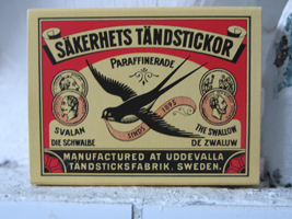 Since I have been inhabiting my new apartment, matches have become an indispensable product in my daily live. Without matches I would stand underneath a cold shower every morning, would not have warm dishwater, no heating and no possibility of cooking.
An incomplete combustion of my geyser, makes that I have to disable it when I don’t use hot water. Because of this, lighting a match has became my morning ritual. Not only my geyser is dependent on the use of matches, also my gas stove and heater refuse service without the use of this inflammable wood.
This typical Swedish product is been sold all over the world and the brand wich i have at home is more then one century old. Remarkably, the matchbox still wears it’s original design which gives a beautiful scene of it’s origin.
if you like to read more on this subject of matchbox labels do read this pdf on www.protimient.com/MatchBoxLabels.pdf [translation-site]
Thursday, May 22, 2008
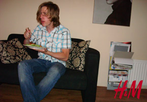 Here he sitting with a tasteless pasta with melted cheese and watching MTV’s Real World to fuel himself and prepare mentaly for his journey to pick up a fancy girl in the 100 decibel Paradisco. With a body full of fast energy he install friends from Hennes & Mauritz. Mobile supplies that protect him from outside world and give him a illusion of good confidence. Shells that is massproduced by the third world. Sweat, blood and low payment in third world and the furious western mainstreamer can ones again upgrade his closet.
The former friends has now become parasites that won’t let him free himself from vanity. Here is a view from one of the many consumers of Hennes & Mauritz, but he now starts to wonder how the view is from the designers and producers side to us?
Article by Sarah Raper Larennaudie, TIME Magazine (english)
Article by Pia Gripenberg, Dagen Nyheter (swedish) – [to translate]
Thursday, May 22, 2008
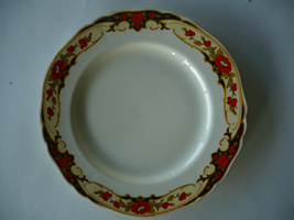 The Alfred Meakin plates I own, are like most of my belongings, second hand. I got these plates because the over organic and curly pattern looked beautiful and at the same time so fake and corny to me. I always enjoy this friction in things I own
These plates, like most Meakins are inspired, by nature not just in its patterns but also in the shape. They were not made anymore after 1937 and still, all modern Meakin plates, and also most porcelain, are in a nature theme. I find it interesting that throughout history one thing has not changed and that is the urge to recreate nature, even out of something as lifeless as porcelain, while at the same time bending real nature to our desires. Creating things that have a beauty like nature and that are at the same time cold and fake. This friction that works both ways is what really grabs me.
http://www.terhitolvanen.com/html/woodland12.html
http://nl.youtube.com/watch?v=XL1aCkKR0h4
Thursday, May 22, 2008
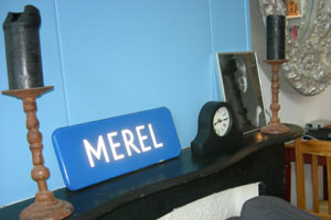 Acht jaar geleden kreeg ik van mijn toenmalige vriendje een straatnaambord met mijn naam erop gestolen uit Lunet, een wijk in Heemskerk, een gemeente in Noord-Holland. Sindsdien is mijn Merel straatnaambord overal met mij mee naar toe verhuisd en nog steeds neemt het een prominente plaats in binnen mijn huis. Niet vanwege de emotionele waarde, maar omdat het voor mij doet wat een straatnaambord hoort te doen. Het geeft aan waar men zich op het moment bevindt. Met het bord baken ik mijn territorium af, hier woon ik, dit is mijn huis. Mijn straatnaambord functioneert op deze manier als mobiel markeer object. Het kan een ruimte tijdelijk in mijn eigen domein doen veranderen.
Territoriumdrang / Nesteldrang / Claim je eigen domein
Thursday, May 22, 2008
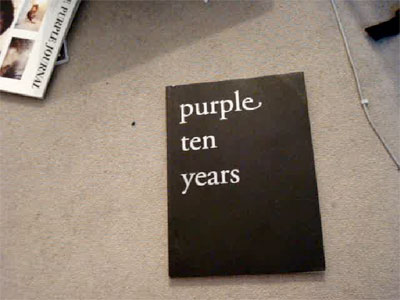
Since almost two years I have a copy of the ‘Purple ten years’ supplement that came with their fourteenth issue. I like it because of it’s rawness, sensibility and inconspicuous complexity.It doesn’t contain texts, only b/w photographs of ripped out pages of former issues of Purple. Issues that were published between my fourth and twelfth age. I’ve never seen the magazine to that time. But since then every page of ‘Purple ten years’ was flipped countless times. But still everytime I discover stomething new. Sometimes visual gags, connections between pages, people and their work or others. The page that attracted my attention while the research showed two pages three dimensional laying in space and seem to be from a photo series about Susan Cianciolo. An so far unknown name to be but her work looks highly interesting!
Thursday, May 22, 2008
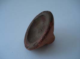
Toen ik dit aardewerken object van mijn ouders kreeg, wist ik niet wat het was en vond het daarom bijzonder. De handgemaakte, simpele vorm en het kleurverschil tussen de binnen- en buitenkant, spraken tot mijn verbeelding. Het voorwerp straalt geschiedenis en cultuur uit en suggereert een zeker gebruik, maar wat voor geschiedenis, cultuur en gebruik, was mij onbekend.
Dit soort mysterieuze aspecten vind ik altijd fascinerend, omdat het de ruimte geeft voor eigen interpretatie, terwijl het toch, zoals een puzzel, een ‘juist’ antwoord veronderstelt. Vanuit dezelfde gedachtegang heb ik eerder dit jaar een poster gemaakt over een voor mij onbekend object.
Het voorwerp dat ik voor deze opdracht heb gekozen, bleek overigens een traditionele Marokkaanse lipstick te zijn die was gekocht op een tijdelijke souk in het Tropenmuseum. Als de kleurstof aan de binnenkant vochtig wordt, geeft het een mooie roodbruine kleur af. Puzzel opgelost!
Thursday, May 22, 2008
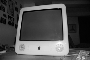 I grew up in a family where, coming to computers, Macintosh was the only option. When I moved to Amsterdam I bought my first computer, an eMac. It functioned, for at least four years, as the center of my house. In a more abstract way, because of all the things he allowed me to do, but also in a more literal sense, because of his enormous size.
When I started the Rietveld Academy I decided I needed a laptop. A Macbook entered the house, but I felt I couldn’t say goodbye to my old eMac. So despite his size, I decided to keep him as a sound system.
Sometimes I wonder how it is possible I grew so attached to my eMac. Is it his form? Is it the world of associations that can be found in the design of this computer made by Jonathan Ive From eggs and eyes to old timers and single-engine airplanes; From record players, hairdryers, pocket calculators and televisions from the sixties to Braun and Dieter Rams.
See a glimpse of the myth in this movie of the introduction of the first Macintosh in 1984
Thursday, May 22, 2008
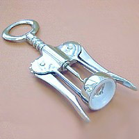 Possibly the first time I ever regarded an object as a piece of design was the first time I laid eyes upon my parent’s corkscrew. The object of this childhood admiration was – and still is – the classic double lever corkscrew. In fact it’s such a classic you probably have one laying in your kitchen as well. Though corkscrews have been around since the 18th century, it wasn’t until Italian designer Dominick Rosati patented his “cork extractor” that we would come to associate this object with the human figure, the object became pretty on itself and as a functional kitchen appliance more enjoyable and easy to use. An evergreen in design if ever there was one.
Rosati´s patent: http://z.about.com/d/inventors/1/0/h/B/corkscrew4.gif
History of the double lever corkscrew: http://www.bullworks.net/virtual/double/double.htm