Skip to Content Skip to Search Go to Top Navigation Go to Side Menu


"Charles & Ray Eames" Tag


What matters is a matter of perception.


Monday, May 16, 2011

When I heard about the powers of ten I thought it was some highly complicated scientific theory that you had to read really carefully and with much mathematical understanding to comprehend.
But in fact the ”Powers of Ten” is a 1968 American documentary short film written and directed by Ray and Charles Eames, re-released in 1977.

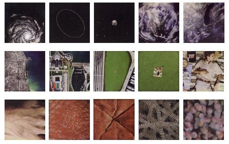
The film depicts the relative scale of the Universe in factors of ten.
It illustrates the universe as an arena of both continuity and change, of everyday picnics and cosmic mystery.

It presents the profound idea of orders of magnitude, with the subtitle of the film being:A Film Dealing With the Relative Size of Things in the Universe and the Effect of Adding Another Zero.

I want to show you one of the many remakes that have come up since 1968.

A little bit more cheesy, Americanized than the original with Morgan Freeman’s voice.

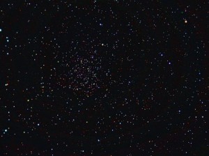
It shows the part of space we (humans) can see.
it’s stupendously big!!

Cosmic voyage – the power of ten HQ on YouTube

The theory of powers of ten tries to comprehend our world in numbers.
It fits everything from the atoms in our cells to the outer universe into a simple scheme of multipliing by ten.

By depicting this scheme the film gives a portrait of the various perspectives we can have on our world.

Our brain is capable to perceive the world on so many levels.
We can think a lot further than of what we actually know or have experienced, like the universe for example.


But we can as well think about the ungraspable development of thought .
Our brain can think about itself thinking.

There are many different levels of perceiving the world we live in.
Starting from ourselves I could think of the following levels:

The material level (what we consist of)
The personal level
The closer social level
The cultural (society level)
The global level (political/environmental)
The universal level ( seeing the world as a spot in the universe/ a world of constant change)

What matters to us changes violently depending on in which level we are thinking about things.

(more…)

Objectiefied Bits


Friday, January 30, 2009

Maybe you find it puzzling that this posting about Helvetica and Wim Crouwel starts with an image of Paul Elliman’s “Bits” Alphabet.

Extremes can sometimes meet when you least expect it, and this fascinates me. It became apparent again during the investigation by the FoundationYear C group, into Gary Hustwitt’s Movie “Helvetica” and our consequently visit to the Wim Crouwel exhibit last month at the “van Abbemuseum”.

left: Bits by Paul Elliman, right: Objectified by Build (click images for blog info)

“Bits” was developed by Paul Elliman in the mid 90ties and published in the 15th (Cities) issue of Fuse’s conceptual Font Box. quote: “Language moves between us and the world on patterns of repetition and variation, and a mimetic example of this might be something like an alphabet”
Later, in 2004, it was included in the Cooper-Hewitt Design Triennial N.Y. which made “concept type” part of the established design world.

Gary Hustwitt’s new documentary “Objectified” takes design, and as a matter of fact “Bits” too, one step further by making it popular in the same way as he did with “Helvetica”.

Modernist thinking, or even constructivist-, lays at the base of the “Helvetica” concept and the work of Wim Crouwel, as this first movie on typography has him stated. As a true Dutch graphic design icon Wim Crouwel illustrated this through work, presented at the library exhibition of the van Abbemuseum, celebrating his 70th birthday. A small but beautiful display of catalogues and posters made for both this and the Stedelijk Museum in Amsterdam.


pages by Crouwel versus pages by Jan van Toorn from publication “Het Debat”

Extremes met in person when Crouwel and Jan van Toorn celebrated their life long controversy with a recurrence of their famous 1970 debate. Functionalism versus engagement. Jan van Toorn succeeded Crouwel as a designer at this museum under the directorate of Jean Leering to manifest in an inspiring cooperation what that leads to in terms of exhibition concepts and graphic design (“Museum in Motion” at the library). Jean Leering also closely work together with Jan Slothouber (read part 1 of C group’s research) at the TU-Delft where the published several internal essay’s on the philosophical and social consequences of design.


80/20/100 © Nijhof&Lee booksellers – Laurenz Brunner, final exam poster

More research was conducted to explore related content or work approach of other designers like, Laurenz Brunner’s “Akkurat”, his successful contemporary remake of Helvetica, Experimental Jetset convicted users of Helvetica, the cooperation “8020100” between Vivid Gallery in Rotterdam and Nijhof&Lee Bookstore in Amsterdam. Context was created by turning the focus on Adriaan Frutiger, designer of Helvetica’s conscientious alternative “Univers”. To further explore the relation to language and image we further focused our investigating efforts on the visual legacy of Charles & Ray Eames, the “El Hema” exhibition/store and Massin‘s timeless publication “Letter and Image“.

With the inclusion of Belgian artist Guy Rombouts the full circle of our focus on type design was completed. The investigation into his visual language concept “AZart” will be presented soon in a separated part 3 C_group posting. This was part II of the C_group research
All researches linked in this posting can be downloaded in A4 format and are also available as hard copy research prints at the ResearchFolders available at the academy library

C group /Original, Copy or Look-Alike


Wednesday, March 26, 2008

Lloyd Hotel Lobby Gielijn poster Zitten

With this typical Gielijn Escher poster a wonderfull collection of 100 chairs was announced. As part of the Lloyd Hotel’s Cultural Embassy program a joint exhibitions was presented of several private chair-collections. This exhibit went beyond its boundries into the intimicy of the hotels floors, rooms and hallways, highlighting their own corporate furniture collection. Gerrit Oorthuys took the initiative of this exhibit and generously showed us around.

Coinciding with the Foundation Year’s January Project Theme “Dull”, we set out to research the origin of a few selected chairs to find out their relation to the motto: original, copy or look-alike. Erik Slothouber (participating in the exhibition with his own designs) lectured on the 2 Rietveld Academies in Amsterdam and Arnhem illustrating the complexity of the choosen motto.

Tejo Remy Rietveld PYR Ramin Visch

(l>r: Tejo Remy/reclaiming design, Willem Rietveld’s/PYR, Ramin Visch/Eli2006)

Research material was edited down to A4 sized guided tours into selected subjects. All subjects presented in this list are also available as hard copy research prints at the ResearchFolders available at the Rietveld library.

As the two collections represent old and modern classic chairs, it gave us the opportunity to carefully select an interesting designers scala spanning the whole of twentieth century furniture design. Starting with Thonet and architect/interiour designers Mackintosh and De Bazel. Bauhaus professor architect and artist Max Bill was highlighted next to Gerrit Rietveld and the renowned interier shop Metz&Co, through which his furniture icons were often first sold. Erik Slothouber’s lecture connected the early to the late Rietveld and simultaneously presented a link to the architect/designers duo Slothouber & Graatsma. Including the company Rietveld by Rietveld constructed the ideal moebius loop in the “original versus copy” motto.

Including Charles and Ray Eames felt like a must as is Vitra for its museum’s chair collection and chair manufacturing. Don’t forget we were talking about originals versus copies versus look-alikes. The Revolt chair –present in many classrooms of our academy– introduced dutch designer Friso Kramer. Lloyds furniture collection containes many modern designer from which we selected, Tejo Remy, Piet Hein Eek, Jasper Morrisson, Hella Jongerius and Ineke Hans. Finally we added some intriguing subject we coul not resist like: an African stool, poet and craftsman Frits Swart, the poster designer Gielijn Escher and a story about the “zitzak” van Audrey Lai Ng that never saw the daylight.


Log in
subscribe