The most intriguing aspect of ‘100 years graphic design in the Netherlands’, out of all the graphics, fonts, posters and publications I saw there, was in my opinion the contrast between two different forms of an Alphabet.
These alphabets, or better Font types, were created by the dutch Graphic Designers Wim Crouwel and Anthon Beeke.
The computerlike and clean structure of Crouwel’s ‘New Alphabet’ and the unconventional and quite controversial looking letter type, made out from naked girls, of Beeke on the other side.
For me Beeke’s style visualizes the spirit of the time when this font was created. It let me think of the sexual revolution, the feministic movement and a general break out of traditional and conventional norms of these times.
But also Crouwel, with his mathmatical looking font, hits for me a certain actuality of the late 60ties and 70ties, as that was the begin of the development of the computer age.
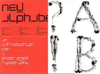
Wim Crouwel vs Anton Beeke
for more on functional versus engagé, read part 2