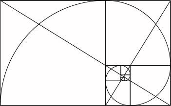
Presenting itself as the architecture of the future, the new ideals of De Stijl privileged man-made realities, and therefore they had to be detached as much as possible from anything that might recall elements we find in nature. But is it really the best solution for a human, which is to all extents a natural creature, to be living in an environment which denies such a big part of its essence?
Imposing
Theo Van Doesburg, one of the founders of De Stijl movement, believed that because you can’t imitate nature, and you therefore need to move as far away from it in your design. There should therefore be a clear separation between nature and culture. A building with clean geometry, primary colours and curated composition was in his opinion the best way of creating a holistic experience. Studying his theories, sketches and actual buildings it appears that the surroundings should fit into the atmosphere the building creates, rather than the building into its surrounding. Van Doesburg followed his theory mercilessly. And maybe this strict praxis is the reason that only a few of his architectural designs actually got build.
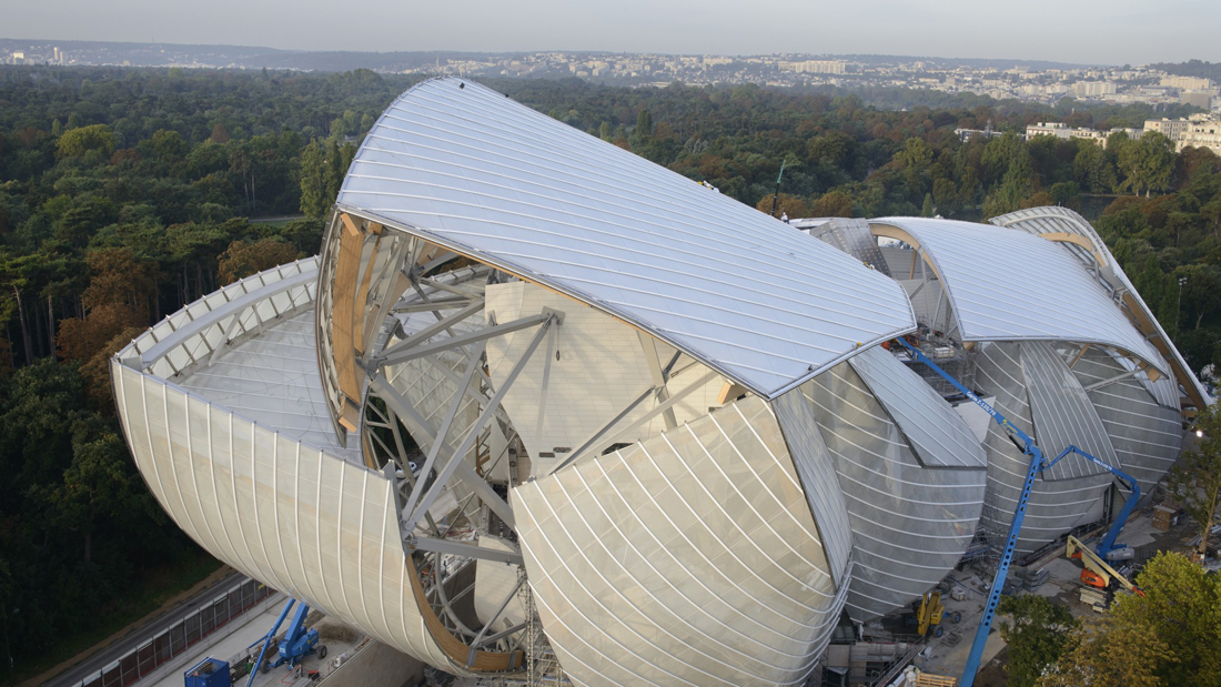
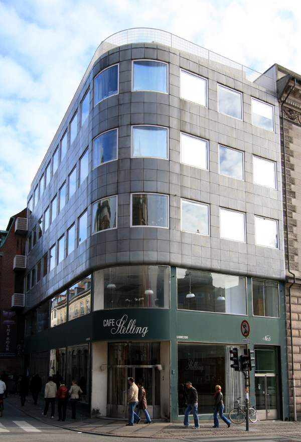
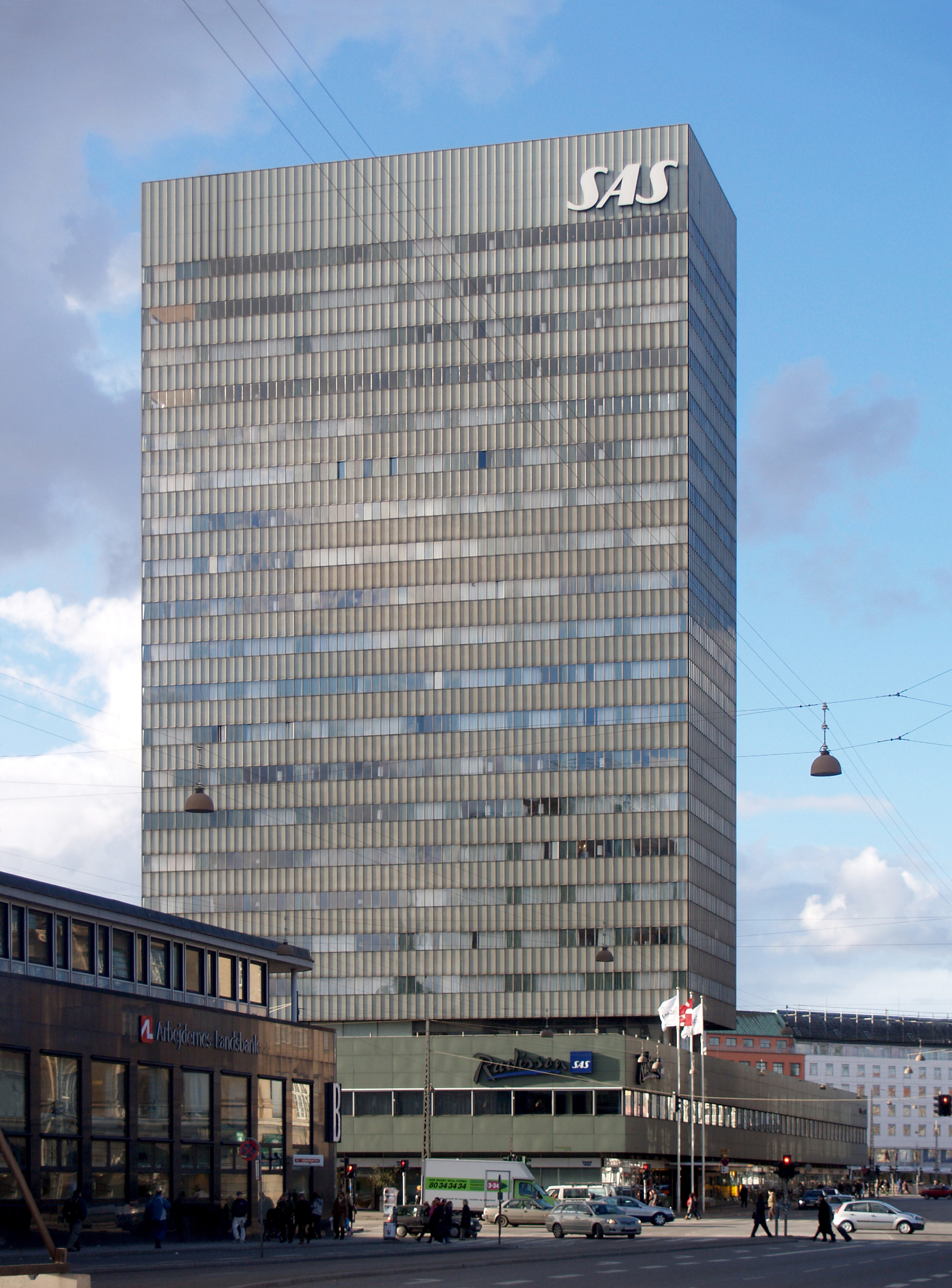
It makes sense that, considering the time frame in which De Stijl developed, artists promoted a radical new approach to design and art, disclaiming anything that might refer to the past. This is true for De Stijl but also for the futurist movement and many others. We are forced to recognize that any movement in any context has an influence on what follows. The idea that a space should be as impervious as possible to any organic shape or colour, advocates an understanding of the world where humans are placed diametrically opposed to nature, and justifies a sort of alienation from it. In a way this is still just a residue of the dialectic of the Enlightenment. Evolution in this mindset is seen as the process of placing humanity as superior to its surroundings, and as consequence, of marginalizing it to new self-made environments with no regard to the old ones. Examples can be seen in Van Doesburg’s works such as the Huis Van Zessen, the project for the Maison d’artiste, and in L’aubette Cafe. This multifunctional cinema and dancehall presented a minimalistic interior and bold decoration of diagonally squares in strong colours were not normally seen in public spaces. And even though the creation is considered a masterpiece today, customers did not feel comfortable when visiting the Café. The atmosphere of the place was not considered cozy. The L’aubette Café makes you wonder if Van Doesburg’s theory is simply too strict and fierce to execute in real life. This manner of not taking the surroundings and people into account, has without doubt stimulated a big development in the way we think about design today. But is this challenging style too distant from the user’s demands to actually work?
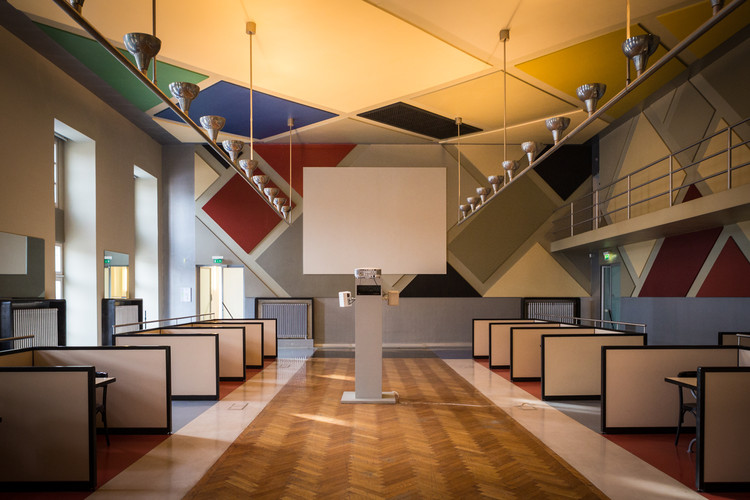
L’aubette Cafe
Combining
Even though De Stijl has become very influential, and we see elements that allude to it in many modern design and architectural works, the issue of the role of nature has been re-considered in different ways. For instance, Frank Lloyd Wright represents a more organic approach of doing this. His works mirror his belief that structures should reflect harmony between humans and nature. He achieved this by incorporating the present natural elements into the design of the structure. Each new design was carefully thought into the environment it should be in. The most famous example is the praised Falling Water House, built in Pennsylvania in 1935. The house is built on top of a cliff from which a waterfall originates. And although the modern house consists of inorganic geometrical rectangles, it seems perfectly in harmony with the surroundings. This is achieved by the use of rock-like bricks and the synergy between the position of the house and the waterfalls helps it to both stand out and to fit into its surroundings. This approach of placing minimalistic houses in the middle of wild nature has since become popular. For many it’s seen as the ideal way of achieving architectural serenity and a way to be in touch with nature, which is paradoxical considering the contrast between the unstructured wild nature and the inorganic shape of the these kind of houses.
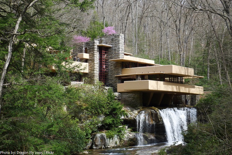
Falling Water House
Incorporating
Another compromise is to literally immerse the structure into nature, making the whole as homogeneous as possible. This is evidently the opposite of Van Doesburg’s philosophy. As an approach it dates back to primitive housing, when nature itself had to provide shelter. Turf- houses were used as dwellings for thousands of years. Because of the turf’s biodegradable properties, this tradition has been lost. Still in countries like Iceland it’s not difficult to encounter traditional turf houses that blend completely with the surroundings.
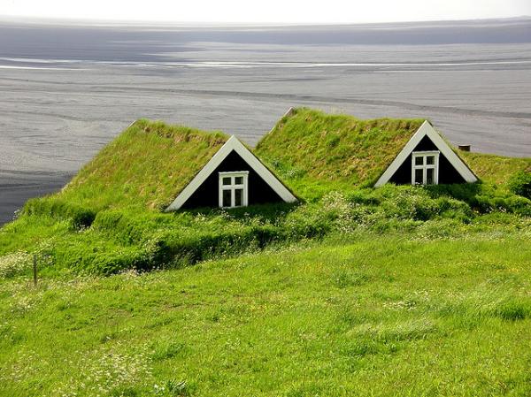
Icelandic Turf-House
In modern architecture these principles of integration have continued to develop. An example could be Malator Earth House in Druidston, Pembrokeshire, Wales, built in 1998 and designed by architects Future Systems for a former Member of Parliament; or Villa Vals in Switzerland, which was designed by Bjarne Mastenbroek and Christian Müller, respectively of the architectural offices SeARCH and CMA. Their design plan was to completely integrate the villa into the landscape to avoid disturbing the unspoiled nature.
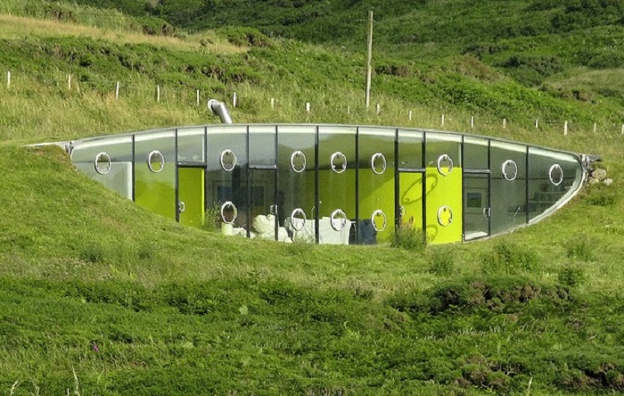
Malator Earth House
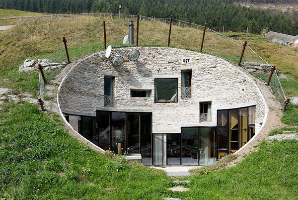
Villa Vals
Rethinking
Aside from the aesthetical differences between the architectural typologies we have analysed, what really is relevant is the interaction between the building and nature. The fact that nature determines the building’s survival, as well as ours, can’t be ignored, and now it’s clearer than ever. The sort of ideology promoted by movements like of De Stijl, that didn’t take into consideration nature and its resources, represents in a way the cause of all the major ecological issues we are facing today. Turf houses and eco-houses that merge totally with nature are not only an architectural achievement but also an ideological one as most of the resources aim to be sustainable. It’s necessary now to find a new way of incorporating sustainability in our lifestyles and as consequence in our architecture.
a cooperative research by Thea Knarberg & Emma Sardoni