Skip to Content Skip to Search Go to Top Navigation Go to Side Menu


"social behavior" Category


“YOU WON’T BELIVE THIS, RIETVELD TEACHER QUITS AFTER THIS CRAZY PREFORMANCE (WATCH VIDEO)”


Tuesday, May 28, 2019

According to a survey conducted by Brafton, the average session duration was 2 minutes, 17 seconds, but that varied depending on whether the site was B2B, B2C or a hybrid. And when it comes to blogs the nearly 8 out of 10 visitors are going to bounce after just viewing the first page. The average time spend on blogs are on only 1 minute, and 20 seconds, which is almost half the average time on sites. So it is very important to do everything in your power to make a strong impression and provide call to actions to keep them engaged. So how do we get people to stay a little longer on this blog.

We could make a fake “50 year celebration full scholarship” for the new students? Or Some kind of clickbait title? Something that would want you to stay, but also shows you what design blog is all about. Something that makes us able to pass the 1 minute, and 20 seconds average. Because this is not an average blog. This is a Designblog for the people. A visionary blog that inspire and moves young designers to greatness. So please don’t go! Just stay a little bit longer.

Try to go to categories. Here you find the different design fields. Or maybe search under “colour” there is a lot of great posts about colour and stuff. Please stay. Just a little bit longer. The design blog has a lot to offer. Don’t leave. There is also funny stuff in here too. Look at these monkeys. Hahaha.

PLEASE DON’T GO! A little longer. Please. Don’t go. Do you like books?

There is a lot of books to look at too. Is 1 minute, and 25 seconds too much to ask for? What more important things do you have to do? You are already here.

Go to the tag and look for something you like. There must be something! Porn? Or puppets? Please stay. Don’t leave.

Problematic relationship between humans and nature


Saturday, May 25, 2019

I browsed the design blog with a photographer’s eye: I looked through the posts for an internal voice that whispers me to capture this moment and make it mine — creating a folder of inspiration for my future self. I screenshotted words and images that spoke to my heart. I then collected them and zoomed even more inside each screenshot to seek for more visual information. By the end of the day, when my mind was still processing all the information, I understood I wanted to write about this specific screenshot.


I wanted to explore what it feels to be one of these little plants and live among humans. This topic became the focus of my post.


LIVING TOGETHER

Plants talked to humans.
Plants explored the consciousness before us;
The humans.
They breathe, and eat, and act, and love, and laugh in their own ways.
Sometimes they whisper to people passing by; with a voice that sounds like a laughing soul
and sometimes like a wave of freshness.
The moments I am unaware of my body, they act to bring me back.
They are in desperate need of my cooperation.
Roots.
I don’t have roots; I think,
my thoughts do the same thing.
They can be strong thoughts that keep me in a place forever.
A place could be a city, a country, a way of thinking, and much more.


ROOTS THAT KEEP US SAFE

A longing for safety and I can not remember why.
I feel like a tree.
Let my roots grow deep enough to the source and connect; then I will grow.
Opening my leaves and blooming to see the world, but to also move in it.
Trees. Wise, strong and safe.
Am I rooted in this land that I call mine?
A tree. A land. A root. A laugh.
Laughing makes me feel safe, makes me feel rooted, makes me feel like a tree,
but I can also move.


PLANTS AND PEOPLE — PLANTS WITH PEOPLE

There are so many plants I see daily outside; I used to notice only the big and beautiful trees and the blooming flowers. I was unaware of the little grass and the plants that seem to grow by themselves without human interaction. I have seen a lot of people being annoyed by these plants — they take them away, they break their roots, and throw them inside plastic bags. They call this “clear the space”. I saw the government hiring people to clean the streets from these plants. The images of these plants somehow are creating discomfort, they grow fast and they don’t need people to take care of them. This sounds scary for them. I try to understand how it all started and how we normalized it.


CLEARING THE SPACE

A city is not a forest. A city is a place for people, not plants. It is a place that only plants that people like can enter. The lucky ones; the ones made to be with people. The others are hiding in dark corners in the parks, where I have seen them grow up into beautiful green big leaves. They are unique and charming, and they are homes for little creatures that want to live in the cities — close to people that they love.


MAKE THE INVISIBLE, VISIBLE

Have you seen that nowadays people put plants in glasses with water, and they grow, and people can see their beautiful roots?
I wonder if it’s only me who sees the irony.
I hope we see their roots and reflect on them.
I want my roots back and I feel like I am flying.
I love the Earth. It’s okay to feel like you want to be in a different world when you are young.
It is a sign of awareness that grown-ups should remember.
I love the Earth so much.
I want to be like a tree who can be connected all the time with this planet.
But I am lucky to be a human that has roots in her fingers,
and can make stuff, can touch, and move.


MY MIND, EYES AND FEELINGS

I dreamt I was one of these plants.
I saw how it feels.
I can tell you one thing:
they love to laugh.
“Why?” I asked.
They looked at me with wonder.
They didn’t realize I was a human dreaming to be one of them;
I didn’t tell them.
They continued to look at me with wonder — and I got it.
I woke up laughing.


I’m new here


Friday, May 24, 2019

.

*****

I don’t really know the way, but I want to. I have this habit to wander off randomly when I’m unknown with a place. Just to see where I’ll end up if I let go of control. “Let fate decide” says the romantic in me.

After a while I see patterns and I believe that I know where I am. Finding attractive by-streets in every corner. But that’s an illusion. By the next turn this pattern is shattered by reality.

I don’t know where I’m going, but I know I don’t want to stay. Just keep going, till this frame turns into bedlam. Borders can’t contain me anymore. Looking back I can’t trace back my origins. I’m not lost. I’m new here.

I am chaos.

.

Sometimes, something leads to something else


Tuesday, May 21, 2019

I rely on science just like another person may rely on god like

a woman that cleans will not lose her morality 

Or Hamlet, whose private conversation with his mother is overheard by Polonius, hiding behind the drapes


Blue means “deep, inner, supernatural, peaceful “Sinking towards black, it has the overtone of a mourning that is not human.” “typical heavenly color”, not being able to direct the final outcome of a project


the outcome can sometimes become quite exciting, bringing together recordings that are time wise very far away form each other

Of showing the change through time, by pushing a big squared formed ice block through the streets  of …Mexico City


When is a sock a sock? a word is a room and a room is a word

We can always be slow in reference to something

which is faster. Get used to see the shoe on the other foot, get used to perceive slowness


Where did you hide the gun? It can be weeks before they are found, and by then, the bodies are in a state of decay


But sometimes you can find something that can be of use. But then I come across delightful sentences that have now regretfully almost disappeared from use, and instantly I am charmed again.


For me sound is something mysterious, because I’m deaf

I find myself in getting shallow answers and understanding of the material world around me..


Step six, keep it together


Some theories hold that cave paintings may have been a way of communicating with others

Some people prefer to wear black clothes while others feel them selfs most comfortable in white, empty spaces

…..It becomes a self-fulfilling prophecy


He tells that his girlfriend had a birthday party but didn’t had enough space to let all the guests sit, so in one day he made a table and extra chairs so all the guests had a place and a table to eat from

It gave the children the opportunity to explain themselves in a way, that haven’t been possible for the children before

Should we think about our plants and animals? 


A poem created by putting together sentences found amongst the many existing writings, while browsing the 3000 texts on the blog. The copyrights belong to the auteurs, and to me.


The sensations stays with you long after you have exited the work and you feel a connection with everyone who have ’felt’ the work

But sometimes he gets criticized that he did not had a relation to the real world


I was thinking, writing about a chair can be really interesting but for me it had to be more than only writing about a chair

it seems like this chair just appeared to be. and it looks great.

I wonder how does it feel to sit on that chair

That same one that JØRGEN HØVELSKOV

Designed


The book gives us back that brave imagination of a child

A thing given willingly to someone without payment; a present

the dimension of pure existence, of the goodliness, of eternal and perfect beauty Well, in this century grooms usually don’t give their brides gifts like this


Despite its abnormal appearance this book is like many others of its kind held together by tape


The noise from the boots that hit the cold wet floor, yelling men shouting and cursing, fork lift trucks and pallets that hit the floor with a loud bang But the jury was also impressed by the content of the thesis


Though there’s definitely a shadow hanging over this book and it’s called reality  However, the Mohawk tribe never actually wore the Mohawk hairstyle traditionally


If I was a nomad.. I would be a technomad

The golden thread gives me the feeling that it will hold forever…


as can be seen by the frequency it has been rented out in recent years by people with a similar curiousity and interest to mine

The exhibited artworks or the visitors walking carefully among them, observing them…

¡¡¡¡¡The naked truth!!!!!


Where does it come from, and how can we get it,

energy wise of course, I wasn’t talking about

 (love)


Am I experiencing life like a collage? 

Remembering that humans possess in a 98% the same DNA than gorillas

Like the plastics

Humans are moldable as well, changing along with new inventions

…In the end, I’m a person, not an algorithm, and I decided to embrace this…


The Neo Neo Romantics


Friday, April 26, 2019


“Safeplace”?


Tuesday, April 23, 2019

“Any person of good repute, without regard to age or sex, whose previous education is deamed adequate by the council of masters will be admitted as far as space permit.”
Is the last statement of Walter Gropius in his Bauhaus Manifesto in 1919. It shows how open minded the school is in this early 20th century, opening the door of the art school to everyone.  At this time when women were not admitted in academies, the gender parity was respected at the Bahaus Schule, at its begining. Over the years, the number of admitted women will be considerably reduce.

Later on according to Gropius “Men thougth in three dimension while women can only handle two.” Relagated to the backgroung, females students had to figth male hostility to go beyond the textile workshop. Add to that how machiste the legacy of the Bahaus is and I can define females as a minoritie regarding this school. They had to figth to get into the education, then during their study to open doors of different workshop and achieve their goals more then others. Then 100 years later we have to figth for their memory to be inscribed in the Bauhaus heritage. In the Bauhaus book about great figures of the Bauhaus that I borrow in the library, their was nothing about Annie Albers or Marianne Brandts, while both had leadership position in the school.  Female work were not respected and is still not. During the power point presentation in class at the Rietveld, still nothing about women’s work or figures. Why do we keep forgetting about them even tho it was such a big change that their were admitted in such studies and they achieved so many great things such as their male co-wokers?

From 2016 to 2018 I did a bachelor in textile in ENSAAMA school in Paris. Some design teachers use to call our departement “napkin scetion”. Not ‘safeplace’ or open minded attitude. I still had to fight for my work to be respected and all the textile department was feeling like a minority in the school.

I felt like in Rietveld I haven’t experience that or even had to think about my “female position” compare to the outside world, or just in Amsterdam for exemple. Why is that? Is Rietveld a ‘safeplace’? For everyone?
During the academical Studium General I noticed that the relation between Rietveld and minorities was an significant subject for the school. But I couldn’t really understand how they related to this. What minorities exactly? Why some ones and not others? Is their a real issue or do they create the issue ? Or maybe their will always be an issue and the ‘safeplace’ is an ideal. Is it possible to achieve to be the perfect open minded art school or will it always reject someone? How long does it takes for a rejected minoritie to feel safe in an art school? And outside? What about the minorities inside the school? Quickly a thousand of questions came into my mind. I felt like if I was diving into an ocean of non resolving problematics. Then i asked to Mirjam the student councillor some of the questions below but she couldn’t help me cause she simply didn’t had the informations for answering my questions. She directed me to another person, Annelies van Eenennaam (Head of the Board). Now almost one month after, I still didn’t had any answer.

So I decided to ask the point of view of students to maybe see more clearly. I randomly choose the students around me at this moment. Here are the questions. The answer of four different persons follow in my notebook. Some are quoted following the questions:

1.How would you describe minorities in Rietveld? 

“Plenty, accepted. Rietveld is a Safeplace for everyone to be in touch with each others.”

Do you recognize yourself as a minority?

“Yeah but not in Rietveld. In terms of general public, but not in Rietveld. Queer, middle eastern is less a challenge here than everywhere else.”

Do you see it as a problem?

“There are good an bad sides”

“No idea. It’s easy to be blind, and not even notice that maybe, problems exist.”

Is being a minority in the school different from being it outside?

“To some extant yes. It’s a very secure environment, difficult sometimes. If you are a female you feel safer than in the city. Sometimes you also feel that being a female influence the comportment of some teachers toward you. As a light skin, I don’t feel as much pressure because of my colour as if I was in a small city.”

According to you, is the school involved in these subjects?

” I have the impression that Rietveld want more black diversity in the school. But it should be just about people. you create so much problem for yourself if you force it.”

Are there some significant changes that the school could implement to improve the ‘safeplace’ in an effort to reject minorities in art schools?

” Making school more adaptable for disabled and mental ill people with health care issues”

“Communicate to people who don’t want to hear that, instead of repeating it to us”

“Give a better support to people with financial issues, make it really accessible”

“Talking about, opening up. If you want to do something you also have to take the lead in something and take the initiative: not leave it to student in general. If you think that it is not relevant, then there is definitely something you don’t see.”


Art School or Art Factory?


Tuesday, April 23, 2019

protest poster of rietveld students

The students and teachers of the Gerrit Rietveld Academie are outraged. Protest have broken out the talks of a strike are becoming harder and harder to deny. After a leaked email from the heads of the Rietveld Academie strongly suggesting what many student already suspected, the school is using the students as unpaid workers. There have been talks between students and some teachers for a couple of months about this development which by many is described as criminal and not from this time, anno 2019. The school is under investigation as we speak to see if the way the school has been treating the students is really unethical and it could result in a high fee for the school, the heads of the school are facing jail time and there are even talks about a complete shutdown of the school.

The Gerrit Rietveld Academie is known to be pretty closed off for the public. They don’t have to adhere to certain rules that other higher education institutes have to, like the fact that they don’t have work with a point system. Also does the school not work with professional educators, but with artist, although this is with common other art schools as well. This is so they say, art schools, to stimulate the student in there education in the arts. Being around real artist will help them think and work in ways educator could not. All this makes the school a hard institute to keep an eye on. Many question arise now if this way of educating should be allowed after the news broke.

I saw many of your new pottery yesterday. They’re almost all single pieces and it would be wrong if we wouldn’t find a way to make the really good work that is in the pieces not accessible for a bigger audience.”

“We need to find a way to reproduce some of the works with machines.”

These are some quotes that caused the outrage among the students and some teachers. The students are being used by the school as unpaid designers, if you ask the students themselves. ‘We pay the school a higher tuition fee than other school in the Netherlands and then your own school uses you and your hard work, to sell themselves and our designs to the public. Where is all this money going to. Why am I even in school. I could apparently just start for myself,’ says Maria Sløthja a graduate student for the DesignLab department. Second year ceramics student, Frank Trebull adds;’It is like we are student athletes, but then like student designers.’ Teachers are also not pleased hearing this news, basic-year sculpture teacher Laurie Nagette has this to say;’ We cannot forget that we’re an education institute, that should be our main focus, educating the students. We shouldn’t try to make money off on them, that’s wrong.’

How the email was leaked is unclear, but there is a conjecture that one of the heads of the academy leaked it. The mail in question was send to all the heads of the school. But the remarks were made by Stijn van Kleinheest, Chairman of board of Directors. The authorities are investigating him closely, and the school has put him on inactive indefinitely.

The academy is also facing a complete shutdown, which comes with an even bigger outrage from the students. Especially among the graduate student the outrage of the shutdown was the biggest. They are in danger of not being able to graduate in that state. The academy is trying to figure a way out to prevent this from happening. They also have a problem with accepting new students for the coming year. They are considering not accepting any new students at all next year, but the admission has already started. And what to do with the rest of the students that already are studying in the academy. These are real problems the school has to face and find a solution for. For now they do not seem to have any. The teachers are also in fear of losing their jobs, for many this job is something they do next to being an artist, however for others it is there only source of income. Working at the academy is a steady pay, with is hard to find when you are in the world of arts.

Everything is One: Building


Sunday, April 21, 2019

The Bauhaus manifesto published in 1919 outlines basic traits of the school. Headed with the Lyonel Feininger Cathedral (Kathedrale), the reader faces three stars shining above the turrets of the fictional basilica.

Lionel Feininger, Kathedrale, 1919, Cover of the Bauhaus Manifesto.
Programme of the Bauhaus. 

The three stars are said to represent the main three elements of painting, architecture and sculpture. All of which fall under the main concept of ‘building’. The Bauhaus was dreamt up upon a basis of creatives coming together, in alliance. To build work in an evolving space, a cathedral of mucky boldness, master among student, declaring craftsmanship and building as the basis of all learning.

Bauhaus itself is a blend of the word ‘to build’ and ‘house’. It takes semantic place as a ‘building house’. Now we can see the offspring of the school stretching from Berlin to Chicago, Pittsburgh and the Netherlands. Amsterdam is home to the Gerrit Rietveld Academie, which too was birthed from the wave of Bauhausian teachers and students left itching to scatter and inform after the original disbanded.

The school, mostly founded on modernist[1] design still has it’s reverberations. Is it just names that live on? Is the branding of Gerrit Rietveld, the only thing that links us to it’s educational model origins? Or is there still a cry of modernist education professing ‘building and making’ over all students?

It occurs that in the postmodern[2] world, the act of ‘building’ is seemingly scattered. Questioned theoretically. Few are painters, sculptors or architects now. Monogamous artists are perhaps becoming a thing of the past, steadily becoming toast along with craft in art. Perhaps we aren’t building physical practices anymore – emerging in the form of degree courses like ‘Autonomous Sculpture’ surfacing at the Rietveld, a subject so loose – almost transient. The focus here is on concept, as opposed to physicality.

The original Bauhaus manifesto is not something that presents a package of transience, but one of definitive action – “Architects, sculptors, painters—we must all turn to the crafts. … The artist is an exalted artisan.” The stress is on doing. Less on thinking.

The question I would like to pose is ‘what really happened during this rework?’ In the move from modernity to postmodernity, the focus has changed. Does this mean compromise? The change has happened in many forms, yet using the policy and attitudes towards ‘building’ in the two schools, we can evaluate them on a level playing field.

In my personal day to day experiences of the school, I have never been encouraged to ‘build something’. However, I have been encouraged to think reflectively, as if constructing something from thought. Within Itten’s original preliminary base course structure, the idea of elementarization[3] of basic artistic means plays a large part. I question wether this is still relevant with postmodernity. Elementarization was a method of finding the core of things. That could be related to shape, colour, and formal elements much better than thoughts, concept or theories. Deconstruction of colour, according to Itten’s book ‘The Elements of Colour’, allows you to provide “general rules and laws of colour, yet also relate it to subjective opinion”. Elementarization is a bid to find the root of something, the truth in which the experience lies. However, within a postmodern (Rietveld) structure, ‘truth’ itself is something shied away from. Instead of trying to find ‘the truth about colour (or making)’, we are left trying to find ‘the truth about thinking’, left ‘thinking about thinking’.

It is important to mention that even just through the existence of the Basic Year, and the formation of classes, teachers and subjects, it is apparent that the Rietveld does honour the idea of a ‘good education’, over a ‘bad one’. They have, after all  applied this structure to the course based on reason and pedagogy[4] study (or so I would assume). Thus, the structure must be based on certain means that deem it useful or good to us as students. This leads me to believe that there is indeed a right and a wrong way to educate young artists. In other words, there is a true art education to be obtained. In the Gropius manifesto of 1919, ‘What is Architecture’, this truth lies in “architecture, painting and sculpture”. But the world today demands a wider spectrum of conversation. I personally think that it is more than okay to dedicate oneself to finding a real trade, or becoming the master of something, as opposed to a jack of all trades.

I can see both sides of the story in so much that The Rietveld has to keep up to date with the process’ of the current art world, but coming from a somewhat dated model. When beginning this essay, I was under the impression that the school was undergoing some kind of identity crisis. Attempting to link themselves to their withering ancestral roots in Bauhaus. I would argue that the link is indeed withering. That can be seen in their policies on ‘making’. It is perhaps more of a historical connection now. In truth, if I wanted to become a master woodworker, I could. But it wouldn’t line up with the philosophy of the school. I have personally received criticism for dedicating myself towards attempting to become a kind of master in one material.

In conclusion, Gropius himself would suggest that the Rietveld needs a re-work if we are to base our education on a Bauhausian model. I think he would suggest that there are no ‘master craftspeople’ being raised up.

The Rietveld Academie has not explicitly chosen to follow the Bauhaus manifesto like some kind of Bible, so, from the perspective of a student studying here now, the school is allowed to deviate from the original blueprints due to societal changes. I personally think it’s great that we aren’t all sold into unpaid labour making zig-zag chairs. Yet, the school should probably analyse its withering links to the past. Just like inevitably a grandson will probably have different interests to his Grandfather. The Rietveld is not in an identity crisis, but slowly developing the ability to keep proud the family name, yet not live in the shadow of it’s ancestry. There will probably be a time, when the Rietveld’s education model will bear no similarity at all with that of the Bauhaus.


[1] Modernism(ism) – Modernism refers to a global movement in society and culture that from the early decades of the twentieth century sought a new alignment with the experience and values of modern industrial life. These were often utopian, and modernism was in general associated with ideal visions of human life and society and a belief in progress.

[2] Postmodern(ism) -Postmodernism was a reaction against modernism. While modernism was based on idealism and reason, postmodernism was born of scepticism and a suspicion of reason. It challenged the notion that there are universal certainties or truths.

[3] Elementarization – The reduction of artistic elements to their most basic or original form.

[4] Pedagogy – The method and practice of teaching, especially as an academic subject or theoretical concept.

  1. Johannes Itten, The Elements of Color, John Wiley and Sons Inc, Hoboken, 1970
  2. CityLab. (2019). Western Pennsylvania’s Bauhaus Town. [online] Available at: https://www.citylab.com/design/2019/03/bauhaus-pennsylvania-gropius-breuer-aluminum-city-terrace/584485/ [Accessed 20 May 2019].
  3. Moss, C. (2019). 100 years of Bauhaus: Berlin and beyond. [online] the Guardian. Available at: https://www.theguardian.com/travel/2019/mar/16/100-years-bauhaus-germany-berlin-weimar-dessau [Accessed 20 May 2019].
  4. The New Bauhaus. (2019). The New Bauhaus. [online] Available at: https://www.thenewbauhaus.com/ [Accessed 20 May 2019].
  5. Gropius, W. (1919). Walter Gropius, Bauhaus Manifesto (1919). [online] Adepratt.weebly.com. Available at: https://adepratt.weebly.com/uploads/3/7/7/1/37716215/bauhaus_-_manifesto__program_statement.pdf [Accessed 20 May 2019]
  6. Bauhaus-imaginista.org. (2019). The Bauhaus Manifesto – Articles – bauhaus imaginista. [online] Available at: http://www.bauhaus-imaginista.org/articles/1771/bauhaus-manifesto-re-cap [Accessed 21 Apr. 2019]
  7. Danchev, D., 2011. 100 Artists’ Manifestos: From the Futurists to the Stuckists. (s.n.). p159-p161 (M33 Walter Gropius – What is Architecture? 1919)
  8. Gerrit Rietveld Academie. (2019). Home. [online] Available at: https://rietveldacademie.nl/ [Accessed 20 May 2019]
Nicholas van Pelt

Can we control our Nature ?


Saturday, February 9, 2019

Front cover of the book Next nature

  Next Nature is a book designed by Mieke Gerritzen and edited by Koert van Mensvoort, Mieke and Michiel Schwarz. it was published in 2005. The design of this book is really interesting, not so much because of the paper chosen, the format of the pages or the functionality, but more because of the choices made on color, as well as the fonts and basically the whole visual identity, that is closely linked to the raised subject. The relation between text and image is really particular and intense with a lot of repetitions for example. This is not the only book by Mieke Gerritzen treated in this way. Her work as a designer and artist is a study of the image culture, in relation to technologies and all kinds of digital medias. She also designed other books such as mobile minded for example, “A booklet about the mobile world of quotes, essays, statistics and factoids, all reflecting the very young state of wireless thinking”, is said on the website, showing that there is still a relation to technologies.


<code.Front/back cover of the book mobile minded

Her website transcribes this idea quite well with a lot of of images, fonts and projects coming to your eyes as you open the page. It even gets you lost a little bit.

Koert Van Mensvoort, artist, philosoph and scientist, and one of the editors of  Next Nature, made a few conferences to talk about what is next nature. At a certain point, he draws a graphic comparing the things that were born and that we control (genetically modified fruits for example), those who were born but that we don’t control (the sun), and then does the same with the things we created : a car is controlled by us but a computer virus not for example.
In the end, he proposes that we think of nature as a nature caused by us : next nature.


4

Image taken from the facebook/instagram page virtual experience : https://www.facebook.com/virtualexperiences.net/

The idea of next nature and the designs, visuals that join it, are present a lot on the internet. On many pages you find a lot of content with a crazy amount of information, different elements mixed together, images repeated or put there without any explanation.  This is something that you find in the book, on the first pages already. When you open the book, the first two pages are heavy repetitions of photographs of dogs and of a font « next nature ».  This kind of designs came, in a way, with the explosion of internet , and of a new digital era, following different artistic domains. For example, codeine/purple trippy visuals or videoclips mostly came with new rapers such as yung lean for example, with his music « ginseng Strip 2002 » . The video came out in 2013, but contains a lot of references to things that were popular in 2002. A lot of music artists consider this video clip as a revolution because of the raping style that is slower, along with the instrumental, but also the visuals for the video clip, and the outfit he’s wearing. For a lot of people, this is at the origin of a whole fashion/music trend that has been really popular the past years. In his videoclip « Hurt », you find a lot of visuals that are old computer/digital styled, often absurd and colorful, really similar to the book’s visuals.


Screenshot from the video clip of Yung Lean - Hurt, on youtube.

The interesting thing is that this book next nature came out in 2005, but in 2005 only 9 % of the world population was using internet while now it’s 55.1 %, knowing that we are also more on earth. So, this kind of visuals were a lot less common in these days. The title next nature was actually more than accurate because it anticipated a lot of things.

As i said earlier, the content of the book is a lot about new technologies and medias, and so is  focused on modern society, in a way : « in this world it is perhaps fitting that we can now – thanks again to our technologies – also manipulate the images of nature ». Most of the images chosen in the book are symbols you find in big cities or famous logos remade with different colors, like the apple logo made as a pear for example. Even the use of pop culture images (Nike P.18 ; Coca cola P. 30) is recurrent.


Images from the book Next Nature

You can see that one of the main topic of the book is the consumer society, something also present on internet with  “memes”, on social medias for example. It is humor, of course, but often about technologies, politics or the actuality, so it’s still an analysis of the modern society, even most of the time a criticism, in it’s own way. In the book, they’re almost using these modern society symbols as a lifestyle, a way to use social medias, to wear clothes, to talk, to write, to listen to music. This kind of designs take the side of accepting and amplifying the fact that we are over exposed to a big quantity of information nowadays. It’s like if they were ironically trying to like this society. For example, P.113, the supermarket is compared to a neighborhood, because it has everything : theater, a club… « The supermarket […] as lifestyle ». This crazy quantity of information is translated by the fact that each page is really different : some fonts or colors come back in the book sometimes but the display of the elements, or backgrounds, is always changing.


front and back cover from Everyone is a designer in the age of social media

Mieke Gerritzen also published a book called : « everyone is a designer in the age of social media ». For me, this goes with the idea that us, the spectators, can now take a major role in the visual identity of objects, ideas and that by sharing it, liking it, we actively chose the way we treat the information we receive and have a role in what our designs look like. It also goes with the idea that nowadays, we, as humans, are designing our nature, the next nature.


https://miekegerritzen.com/books/

https://www.nextnature.net/2006/07/save-our-next-nature-buy-the-pocket/

https://miekegerritzen.com/vision/

https://miekegerritzen.com/exploding-the-world-of-graphic-design/

https://www.facebook.com/virtualexperiences.net/


Koert Mensvoort: Next Nature. design by Mieke Gerritzen, Rietveld library number: 754.2 nex 1

From Chair to Playground


Friday, October 26, 2018

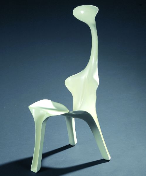
While viewing all the design objects in Stedelijk Museum I came to the end of the show. I thought its hopeless to find something that satisfies my eye. I finally saw the Floris chair in it’s beautiful white form. I thought it was such an extraordinary design, so feminine, so elegant, there must be something interesting on this chair, and so I began my research on Gunter Beltzig.


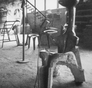
Gunter Beltzig is an industrial designer that designed plastic furniture in his youth. They are now exhibited as classics in museums of modern art. He designed many various pieces of chairs and tables. As I went on checking his website, facebook profile, and all the pages that Google gave me, I found more and more of Floris Table
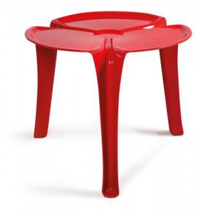
his furniture. Some were named by the same name, “Floris”, and some more playful names like Pegasus.


pegasus chair

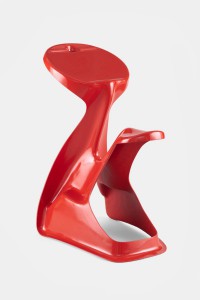
In 1968, Beltzig created the visionary FLORIS chair, which made him known overnight. I stumbled upon Gunter’s research and ideals about life, he seemed to get be inspired by the atmosphere of the 1960s. World events, such as America sending a man to the moon or withdrawal of American troops from Vietnam, made the possibilities seem endless. To him, the world seemed full of potential and Beltzig wanted to produce a chair that matched the great future ahead.

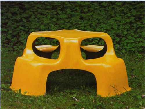
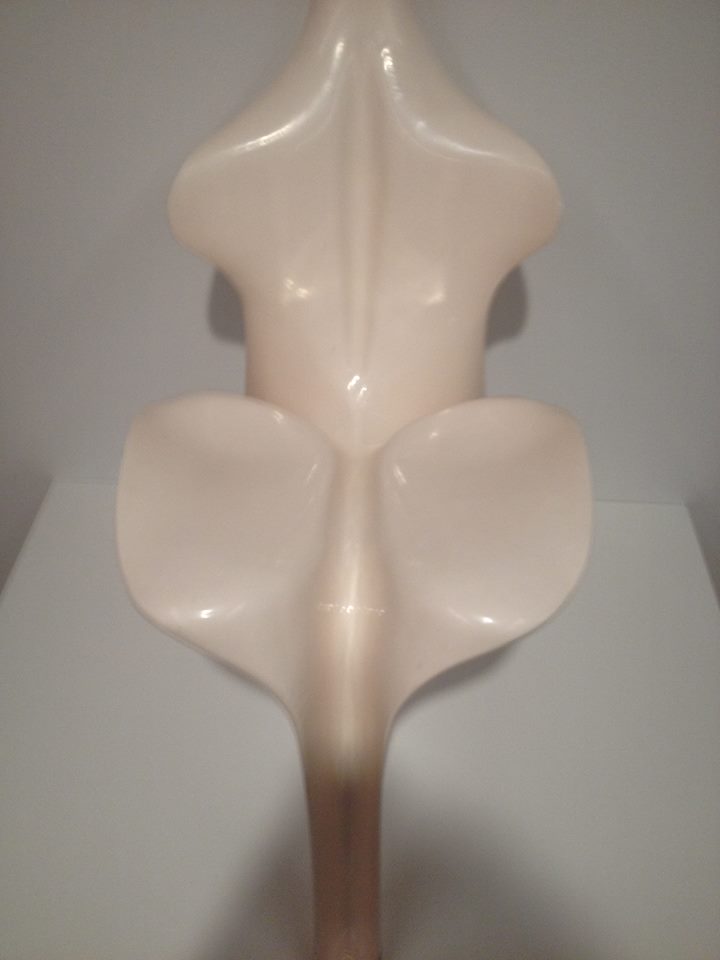
Beltzig’s Floris chair is an ergonomic form with three legs and designed to support the three points needed for seating: the neck, rear, and back. Further the chair is light, stackable and stable. Made of fiberglass, the biomorphic form captures the spirit of the material.

272 fiberglass-wave-slide-500x500


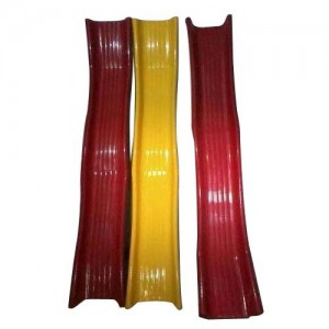
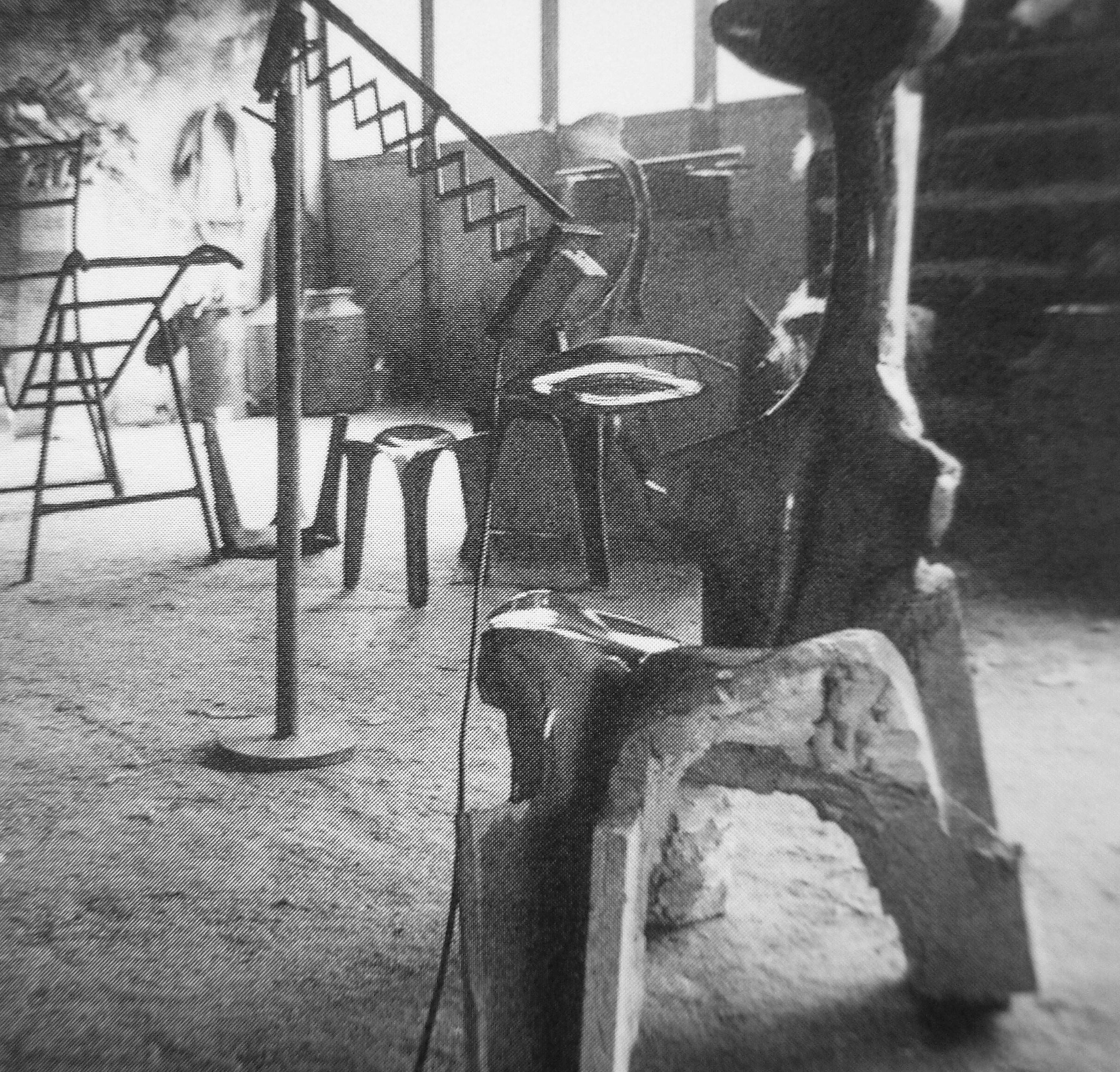
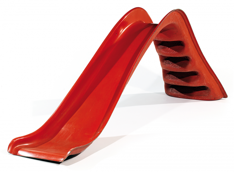
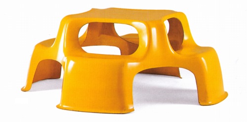
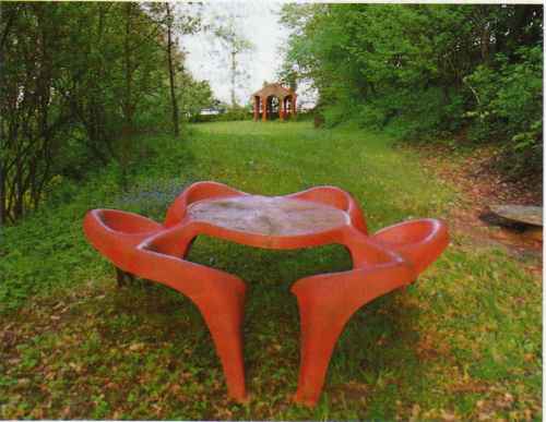
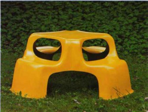
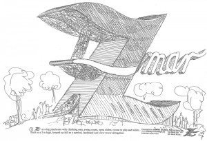
Soon enough I started to see Gunter’s designs to represent interesting forms, something that reminded me of children’s play. I noticed that his designs were morphing into samples of playground equipment.

1392651795442320beltzig_filius_bench_vitra

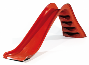
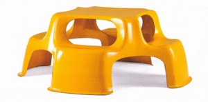
Also if you put them in an outdoor environment, they represent their true shape

and use: artikel_aus_sammeln_seite_07_bild_4 artikel_aus_sammeln_seite_08_bild_3

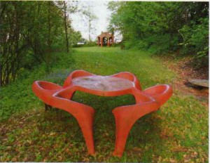
I found information that he worked for almost five years designing electrical equipment for Siemens AG in Munich until he decided to design playground equipment and outdoor areas for children, of course we can see by his fixation on minimal, plastic, childish designs.
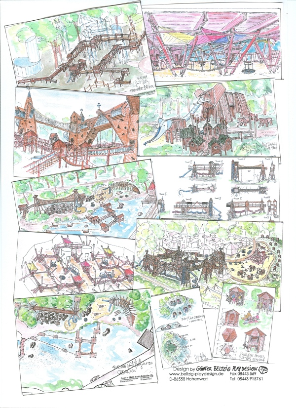
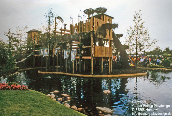
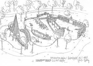
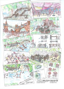
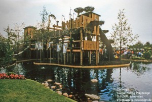
He has written a book on playground design, which has been translated into several languages, authored many publications on the subject of playgrounds catering for people with disabilities and children’s aesthetics and also worked collaboratively on the playground standards. He has held teaching positions at various technical universities. He has created very interesting play areas throughout Europe, also in sensitive nature and conservation areas, with high design demands, many play offers and high experience and learning effects.

  • The 6 golden rules for a perfect playground (TEXT)
    Children play! At any time! With everything! Everywhere! All over!


    Children play everywhere, at all times, with everything they can find; therefore children actually need no playgrounds. But because they are not allowed to play everywhere with everything at any time we need playgrounds to entice children away from dangers, disturbances and the wrong things.

Playing means: „activities of an individual to adjust to the environment“, with other words – playing means sampling all possibilities, go to the borders, sample experiences, search, learn – and it just does not mean children alone, but artists, researchers and many creative human beings play.

There is no defined „value of play“ but many particular play functions like climbing, balancing, coordinating, sliding, to train social conduct, to sustain oneself within the group, but also the experience of wind, rain, sun, these are only few of the possibilities in functional play.

They can overlap, can support one another; but also can block up, prevent play or lead to aggressive behavior.

Therefore it is of special importance to consciously select and search for and set in special play functions on playgrounds on special play equipment.

A playground is a highly complex sociologically functioning place.

The 6 golden rules for a perfect playground

A good playground should:
1. Offer atmosphere, impart sense of well-being, invite to abidance.
2. Have possibilities for discovery, provide only searcher with its full potentials.
3. Allow controllable risk, cognizable risk, manipulable risk.
4. Offer differing possibilities for different moods, interests, needs.
5. Supply wind-, sight- and sound-shelter.
6. Make „special“ bans dispensable.

A bad playground is:
1. A parcours for dressage.
2. A landscape decoration.
3. A use of residual areas.
4. A centralist mono-structure for only one specific user-group.
5. Not enough room, not enough choices, too uniform, not enough stability, too unkind.
6. Too safe, too similar to an enclosure, too regulated.

Gunter is a designer with a great imagination, I can almost say that he would fulfill all my dreams as a child, and give me the opportunity to enter a playground full of excitement.

skizze04 skizze01 skizze25  freizeitparks011

Some more information about projects, books, articles, text and magazine mentions:


Playconcepts and Projects of the recent past

– Playground without Play equipment, at the LAGA, Pforzheim, Germany 1992
– Apulia Robinson Club, Kinderbereich,  Italien 1993
– Expo Lissabon, Spielgelände,  Portugal 1997
– New York City Hall of Science, Play Area,  USA 1997
– Naturspielgelände,  Waging am See,  1997
– Playmobilpark,  Zirndorf  1998
– Castle Plays Cape,  Billund, Dänemark 1998
– Spielinsel, Thoiry-Park,  Frankreich 2000
– Spiel-Mal, Ornithopter,  Magdeburg 2000
– Play-Area in the Livingston Park,  Puerto Rico 2001
– Princess Diana Memorial Parc, Play Area,  Kensington, London 2001
– Spielburg, LAGA,  Oelde 2001
– Ouwehands Dieren Park, Spielhalle,  Holland 2002
– Wasserspiel im Kinderreich, Deutsches Museum, München 2002
– Fidenza Village, Play Area,  Italien 2003
– Spiel-Mal, Kiesspiel,  Dortmund 2003
– Wasserspiel LAGA, Trier 2004
– Play in the Tree Alnwick Garden,  England 2004
– Playmobil Spielen in der Halle,  Zirndorf 2004
– Blindeninstitutsstiftung,  Würzburg  2005
– Spiellabyrinth,  Wien 2005
– “Play the Wilderness” Concept,  Deimhausen since 1998


Gunter Beltzig  is mentioned in a few books and biographies mainly interested around design in the Stedelijk Museum library:

1. 

Experiment 70 : Designvisionen von Luigi Colani und Günter BeltzigGrunewald, Almut Hoffmann, Tobias (2002)

2. Sixties design: Garner, Philippe (2001)

3. Plastics : designs and materials: Katz, Sylvia (1978)

4. Van bakeliet tot composiet : design met nieuwe materialen = From bakelite to composite : design in new materialsBucquouye, Moniek E.Beukers, Adriaan (2002)


Books

„Kinderspielplätze“,  Bauverlag, 1987,  no longer available, revised as: „Das Spielplatzbuch“,  Spiel-Raum-Verlag 1998 translated into:  ukrainian 1991, polish 2001 „Ksiega Placow Zabaw“

„Spielgeräte…“,  G.Agde, G.Beltzig, J.Richter, D.Settelmeier, DIN Beuth-Verlag 2001 translated into:  french,  Verlag Afnor 2002

„Leitlinien für integrative Spielplätze“, Nürnberg 2003


Articles

“Child-like, Childish, Child-friendly: is there such a thing as children´s aesthetics?”, (Kid Size, Exhibition Catalogue, Vitra Museum 1997)

Meine „Sixties“  68 Design und Alltagskultur (Dumont, Ausst.-Katalog 1998)

Kindergarten Architecture (Gingko Press inc. Corte Madera  USA 2001)

Guarderias Diseno de Jardines de Infancia (Editorial G.Gill .S.A.,  Barcelona 2001)

Bauten für Kinder (Kohlhammer Verlag Stuttgart 2002)


Texts:

The 6 golden rules for a perfect playground 

Child-like, Childish, Child-friendly: is there such a thing as children’s aesthetics 

Play areas in schools 

Concept for A Councillor of Children needs 

Playgrounds and Playground Equipment for the Handicapped 

Checklist


 WEBSITE: http://www.beltzig-playdesign.de/indexe.html


The Code of Imagination


Tuesday, May 22, 2018

INTRO, OUR INTEREST

During 3 weeks of design theory, we came across many different font types, some of which were far from understandable. Some of these abstract types surpassed the intelligible and had a whole coding system for themselves, in which every letter of the alphabet had a symbol of its own, which should be able to be coded and decoded in order to write and read text.
In it’s own special realm of this font families, there is a book that navigates the imaginary, it’s the Codex Seraphinianus.


text in the codex

text in the codex

It’s creator, Luigi Serafini , was an architect, designer and painter, who published the book in 1981. It took him around 30 months, between 1976 and 1978, in a single room apartment in Rome to create the 360 pages of this curious “encyclopedia
The book describes almost scientifically a different and strange world, reminiscent of our own planet but equally strange and obscurely abstract and unfamiliar. It is composed by two parts, one which seems to be about human science and a second about general nature, society and ruling structures of this foreign world.
The piece stands for itself, it should be seen as an art book that does have an explanation; it is extremely fantastic and creative with wondrous drawings and ideas, which stimulate your fantasies, and invite you to dream along its colorful and psychedelic illustrations.


Codex-Seraphinianus-08

At a first glance you will be taken through constant confusion, where referencing what you see from what you know from the natural world leads nowhere. The feeling it creates could be described as the one of a child, scrolling through an encyclopedia, believing that what is written makes sense but is not able to verify if true or not. The pictures are all that is left to rely on and are the actual source of the story telling going on through our heads.
Ever since its publication, this book stayed as a mystery; intellectuals from all disciplines have tried to “understand” and “decode” it. Despite the familiar characteristics of language like rhythm, repetitiveness, paragraphs and even punctuation, there has been no success on making sense of this “text”. It simply can’t be figured out, but why should it? What would the decoding of this alternative encyclopedia bring and why are the efforts centered in doing so? Which interpretation would be the correct/truthful one?

COMPARING THE CODEX TO OTHER BOOKS

The Codex could be compared to the “Voynichmanuscript” (https://en.wikipedia.org/wiki/Voynich_manuscript), written around 1450-1520, which is also also written in a code impossible to decipher and is illustrated with bright colored images of a scientific nature, just as in the Codex Seraphinianus.

voynich-collage-pic905-895x505-95001

The feeling the codex creates could be compared to Aldous Huxleys  “Brave New World” (https://en.wikipedia.org/wiki/Brave_New_World);  a novel about an utopian or dystopian future where everything seems to be so great and neatly organized that it gets scary, and even though it is quite different from our world we see parallels that remind us on how easily our order can slip into the realms of suppression and absolute control, without us even noticing. The aesthetic of the world described in the Codex reminded me of this morbid perfection of the modern world.
In more general terms, the story of the interpretation, coding and decoding of the “Codex Seraphinianus” could maybe be compared as a more recent artistic Bible. “The Holy Book”, which sets a broad set of rules and explains stories through metaphors, could easily be compared since, for centuries, the scriptures have been read, analyzed, compared, re-written, interpreted and decoded by intellectuals and well as whole cultures and societies. But, which interpretation is the right one?

IN RELATION TO PHILOSOPHY

Interpretation is a key element to understanding, a fundamental capacity and force of the human essence. The reason for this need falls uncertain and as mysterious as the subject of this text, but somehow it’s force is so essential and true as any other basic necessity such as eating or reproducing, interpretation is key to learning, evolving, developing and creating, it is indeed inevitable and inescapable, nevertheless, when could we say an interpretation is true?
Plato, tried to explain the burdens/risks/nature of this issue, through what is probably the best known philosophical allegory. It’s the allegory of “The Cave”.

The Allegory of The Cave
People have always lived in a cave and haven’t seen the outside world. There is no natural light, and all the inhabitants can see are the shadows on the wall projected by the light of a fire. They are fascinated by the reflections, moreover they believe those shadows are real and if you concentrate, look and study them, you will understand and succeed in life. They don’t realize that they are looking at mere phantoms.
One day by chance, someone discovers a way out of the cave. At first he is simply overwhelmed and dazzled by the sunshine in which everything is for the fist time properly illuminated, and once his eyes adjust to the light, he encounters the true forms of the shadows he had been seeing on the cave. Previously he had been looking merely at phantoms, but now, he is nearer to the true nature of being.

allegory_cave

When the cave dweller crawls back into the cave, he is confused by the dark setting of his previously familiar space. Confused, he tries to explain his co-habitants about what he just saw and discovered, about the truth he had witnessed. At first, the other cave dwellers don’t understand his ideas, they believe he is being sarcastic and at some point, even plot to kill him.
This allegory is a symbolic explanation of philosophy and humanity; Cave dwellers are humans before philosophy, the sun the light of reason, and the messenger a philosopher (and what happens to the messenger, is what truth tellers can expect when they take their knowledge back to people).
This allegory is a warning as well as an explanation about the risks of pursuing the truth, of thinking and exploring, but, where does the force of wanting to understand, to think, to decode and understand come from? Science is maybe busy trying to find the truth of things, while art is maybe one of the fields looking to solve the bigger question, WHY?

MEANINGLESS ART, IS IT TRULY MEANINGLESS?

It is believed that the Codex Seraphinianus doesn’t have a purpose, but do purposeless things mean nothing? Is the same to make an incomprehensible statement than making no statement at all?
In art and out contemporary times this is a burning question looking for an answer. E.g. What is tho be expected from a stone carver artist today?
Stone Carver: I want people to see that I pushed the material as far as I can possibly go. I maybe want people to see themselves in it. Maybe that they wonder about my reasons for carving it. I want them to argue about why did I make it the way I did and maybe have different ideas of what the reason and its purpose is.

CONCLUSION

Philosophy as seen by Plato and many others, is a practice that will teach us to live and die well, some sort of therapy for the soul. Pieces like the Codex Seraphinianus, despite it’s attractive and superficial nonsense take a stand towards curiosity, imagination and discussion. It encourages doubt and reflection, study and analysis, key element to critical thinking and human/personal/intellectual development but most important, it encourages imagination.
The book gives us back that brave imagination of a child, that creates the story itself by looking at images and assuming what is written. The book is an invitation, to exercise our imagination again, another time, its another chance for the adult to go back to the golden age of childhood, before going to school.
Weather its real significance has, will or had ever existed shouldn’t be the main focus, instead, we should appreciate the process of adapting our eyes to the light and be courageous enough to be doubtful and think, go out of the cave even if what we see is confusing, truthful or not.


codex seraphinianus1


_____________

A Bipolar Wardrobe


Monday, April 2, 2018

For many people colours have stark connotations related to their moods. Think of sayings like “feeling blue”, “being green with envy”, “seeing red” or think about mood-rings that supposedly change colour every time your mood changes. Undoubtedly moods and colours are intertwined in one way or another.

Thinking of mood swings related to colour makes me think of my mother, who has bipolar disorder. Bipolar disorder causes swings in mood, energy, and the ability to function throughout the day. It is known for alternating periods of depression and mania that can last from days to months. Thus she has experienced extreme mood swings. How does she relate her moods to colour? She personally doesn’t clearly remember what happened during her manic episodes, I however do and noticed how her mania and depression greatly influence her way of dressing. She has a wardrobe filled with exotic clothes in all colours of the rainbow and lot’s of different prints and styles. When being manic she dresses herself as an artwork before going outside, making heads turn wherever she goes. When being depressed she doesn’t really dresses herself, but instead stays in her grey pajamas’s at home all day. I think that a lot of people might experience that they wear more colourful clothes when feeling happy and wearing more neutral toned clothes when feeling sad.  I decided to create a colour system based on my mothers way of dressing, and not on people’s way of dressing in general or on people with bipolar disorder’s way of dressing. I thought it would be generalizing people’s experiences too much and I think that especially dealing with people who have a condition like bipolar disorder one must avoid that to avoid stigmatizing the disorder. Not every person with bipolar disorder has the same behaviour towards their wardrobe, or the same experiences in general.

After having decided to make a colour system based on my mother’s way of dressing, I read a lot of general information about bipolar disorder, which didn’t bring me any further in the development of my project. I could also hardly ask my mother any questions about it, as she doesn’t remember how she was when being manic. I later found an interesting article written by someone who also has been diagnosed with bipolar disorder, about what having this disorder means for their gender identity. The writer of the article identifies as a non-binary person, and thus I shall refer to them as “their” and “they”. They experience that when being manic they feel more feminine, and when being depressed they feel more masculine. This shows itself in many ways, one of them being the way they dress. When feeling manic, they will wear a dress, when feeling depressed, they will wear baggy clothes. This made me realize how my mother’s way of dressing doesn’t only change in colour when her mood does, but also in how traditionally feminine versus masculine her clothes would be. When being manic it wouldn’t be a bright yellow sweatpants she would put on, but a bright yellow dress. When being depressed she wouldn’t put on a grey miniskirt, but grey oversized sweatpants instead. This was something to keep in mind in the development of my colour system.

After researching I figured it was time to start working hands on. I collected all the traditionally feminine colourful clothes and the traditionally masculine baggy neutral toned clothes from my own wardrobe. I realized that I order my clothes by colour in my wardrobe, in some way I was thus already working on this project of making a colour system before it even started. With the clothes I tried making a small installation without damaging the clothes, this was very frustrating. Somehow nothing I tried seemed to work for me and I soon decided to quit trying. I felt like the best ways of displaying clothes without damaging them already existed and happens all the time and everywhere, which is putting them on mannequins, on hangers or folding them neatly. I didn’t feel like playing clothing store, so this was not the way to go. I took a step back from the whole process, let some time pass to then later come with new insights again. I concluded that the colour system I was trying to create already existed and just needed to be documented. I decided to make a video with my mother, of her wearing two bipolar outfits.

dav

The filming went very smoothly, my mother and I enjoyed putting the outfits together and enjoyed spending time together, which to me makes the video feel genuine too. We tried to make the contrast between her two outfits/moods very clear, but still true to reality. This lead to us filming her depressed outfit inside on the couch, and her manic outfit outside in a field of flowers with more movement. I later also edited the video to be slowed down when her depressed outfit was shown, and sped up the video when her manic outfit was portrayed. When presenting the video, I went back to trying to make an installation using my own clothes but now including the video shown on a tablet. I felt like just showing the video on a big screen would not fit how personal and tangible someone’s clothes, and thus my colour system, are. To make it even more personal/intimate, the viewer of the work needs to wear headphones to hear the sound of the video.

Here are some stills from the video:

Fast walking in a flowery field

Comfy outfit

Colourfull outfit in a field of flowers

Reading glasses with tape

WHATISAWHILE’S COLOR SYSTEM


Monday, April 2, 2018

Aim: I need to combine two words which I found very different from one another: ‘system’ firstly appears to be very restricted while possibilities seem to be unlimited with ‘color’.


FIRST CONCEPT: Connect the situation in which you currently find yourself to music thanks to colors.

Process: You’re heartbroken and alone in the shower.
Find the key words: heartbroken, alone, shower.
Each key word is associated to one color: heartbroken = purple, alone = blue, shower = grey.
In the system, clic on the key words’ fitting colors « purple, blue, grey», it will send you a playlist matching your current needs.

Questions: How to realize the system? Do I use the computer or do I make it by hands? If computer, which site or application should I use? Need to select key words: how many, which ones and why? Do I use common key words or specific ones?

Issues: Want to use computer (better quality of colors, easier to extend the visibility and good way to classify data), I could find a specific application or website. I’ve been told by a classmate, who has studied computer science, that applications she knows are not for amateurs like me but professionals.

Conclusion: Because of a lack of knowledge and no skills in code I can’t bring this first concept to a successful end. I’m better to modify my system so I could create a new realizable one.
I still want to use the computer as my main tool.
However, I want to make this project more personal and subjective, meaning that I want the color system to depend on me. I will set my own rules.

Transition
I’ve asked to a friend of mine, a singer, if he was associating people with music, he answered he wasn’t and return me the question. Then I realize: I’m not associating music to people but colors. Indeed, when I paint someone the association of colors I choose come from what this latter inspires me, what he radiates out.
What if I would connect colors to something else than people? About me? (reminder: want to make this project more personal and subjective). I could write about my personal life? What occurred to me during the day? And connect this specific moment with a color?
From this developed the idea of my second concept: associate situations to colors.


SECOND CONCEPT: Connect a situation in which you have found yourself to colors.

Process: I’m going out of the cinema, touched by the movie I’m lost in my mind. Which color do I see at this current moment?
1) Visualize the color you’re seeing at the current moment
2) Find the color on internet
3) Save it on your phone
4) Give the color a name
5) Write a short sentence describing the situation linked to the color
6) Write the date and city

Questions: Want to use the computer but no code, what should I do? Where should I publish this system? Find a reachable application? Which application would fit the best?
 

 Answers: Instagram

+ Concept: share simultaneously what you’ve done with your followers.
+ Design: matching the concept (edit an image, description bellow, location, share…).
+ 1 Square 1 color: focus on the main theme ‘color’, interesting visual aspect (variety of colors).
+ # ‘hashtag’: to be seen and share data.
+ Follow or be followed by similar accounts


Ideas to complete:
1) Account’s name: ‘What i saw while’ = @whatisawhile
It refers to which color I’ve seen while a daily situation occured to me.
2) Profile picture: The color I identify myself with.
3) Short sentence to describe the account’s theme: ‘I associate everyday situations in which I find myself to colors’.

4) Description bellow image: for each image the description will start the same ‘What i saw while’ to give the account a rhythm and an identity and for the viewers to remember the account’s name.
Always the same plan for each publication: 1 color as an image – 1 title as color’s name – 1 sentence to contextualize – 1 date – 1 town – few hashtags.


FINAL PROJECT


WANT TO SEE MORE OF WHATISAWHILE‘S COLOR SYSTEM?

GO follow @whatisawhile on Instagram to discover other stories hiding behind the colors!! 🙂

Responsive Color System


Sunday, April 1, 2018

After researching information about different color systems, I realized that all the systems try to approach questions of color always in relation to something. Color in terms how we describe it in language, color as light, color as pigment, color as sound. As for the color in relation to human body there is a Chakras system. But it is all fixed, and doesn’t explain movements of the body. I see human body as a constantly changing system, it is changes every second, and I wanted to develop during this project I wanted to create color system which describes movements of the human body into the color, in the real time. I wanted it to be really interactive and visual.

illustration1_950                   illustration3_950

So I split whole process into two steps. First step was to find a sensor which will “read” movements of the body. There were several ideas possible, but after some try outs with heart rate monitors, ultrasonic motion sensors, I ended up using HC-SR501 Passive Infrared Motion Sensor (PIR) sensor. The module features adjustable sensitivity that allows for a motion detection range from 3 meters to 7 meters.  The device will detect motion inside a 110 degree cone with a range of 3 to 7 meters. I was using raspberry pi computer to program reactions of the sensor.

Second step was to find the way to represent the data from the motion sensor. I wanted to work with light. There were some ideas to use projectors. But in the end I was using Philips Hue lamps because they have open API and it is easy to program them.

There were some challenges with Philips hue lamps. They do not work by independently. If you want to communicate with lamps there is a physical device which called a bridge. . The Philips Hue bridge is the heart of the system. When you are programming, your are not communicating with lamps directly, you send commands to the bridge, and the bridge sends messages to lamps so they know, which hue and saturation apply to the lamp. Problem is that this bridge should be connected to wifi network. In school wifi network is secured, so you can not that easily add new device to it. This lamps are meant for use at home, and not really designed for the usage in the public locations.  So basically the solution to this problem was to create my own network. Raspberry pi computer became dhcp server and was assigning IP address to the bridge. It is very important to know IP adress, because than you know where to send your commands in program. So the whole system do not depend on the network connection and know can work on any location.

About the transformation of the movement to color. I built the whole system and tried it on the spot in the school. Originally it was working from the simple lamp. I installed the lamp in school and was observing people behavior how they react on the lamp. First setup was like this whenever someone pass by or approach the lamp it will switch on and start changing colors. This was clear, I noticed that once people realize how it works, they lose their interest in it. Like puzzle is solved. And usually it take 30 seconds for them to realize and they move forward. And also there were not so many people who will notice it in the first place. So I added blinking to get an attention of the passing by people. And once they approach lamp it will start changing colors, but with 5 seconds delay. After this changes there were more people discovering the work. And they spend way more time with it. Puzzled, and trying understand what action trigger lamp.

Next step was to put everything together in one container. So the whole system can work as portable device and can be shown in different locations.

As for the next steps I think it would be interesting to add more sensors. After some tests in library, I realized that people want to touch the object. It would be nice to add one more reaction to touch. And make more tests in different spots: Library, cafe, train station.


Back to intimacy


Monday, February 19, 2018

When visiting a museum, it is often hard for me to decide what to find more intriguing: The exhibited artworks or the visitors walking carefully among them, observing them. Hardly ever do they physically touch, or if it happens, then in shyly hidden ways. Especially when it comes to everyday design objects, there seems to be a big gap in between the visitors and the exhibited pieces, which are locked away from their original function: to be touched and used. During my last visit at the Stedelijk Museum there was for instance a person standing for quite a long while infront of a vitrine where, in between other objects, Kaj Francks „Kilta Services“ was being exhibited.

Franck was one of the designers who developed the „Iittala philosophy“: creating design that is both beautiful and functional, and lasts a lifetime. „Does not ‘beautiful’ ultimately mean necessary, functional, justified, right?“ (Kaj Franck, 1978)

In the center: service „Kilta“, glazed ceramics, production in 1953 – 1975, designed by Kaj Franck

In the center: service „Kilta“, glazed ceramics, production in 1953 – 1975, designed by Kaj Franck

The person looked at the plates and cups inside, slightly leaning against the glass that was separating him from the objects. Why was he so attentively watching them? The longer I observed the visitor observing the tableware and the distant space between them, the more I started to think the glass vitrine away and imagined him having a real physical experience with one of the cups instead: the two being naturally rejoined, exchanging what is deep inside.

‘He holds the cup that is filled with tea, leads it towards his mouth and drinks from it. The content flows in one direction which is his interior. Luxoriously he sucks the liquid inside and the cup seems to be very willing to feed him.

“The cup is the drone of the ceramics world, perhaps the hardest working of vessels and the least appreciated. In the grandest of tea or coffee services, the cup is usually the most underdesigned object, playing the role of subservient pawn to the teapot’s queen.“ (Garth Clark, „The Book of Cups, Abbeville Publishing Group, New York, 1990, p. 17)

He drinks everything of it until it is empty. But it still contains the warmth of the hot drink, as he inserts his finger he can feel it. For a short moment they contain the same warmth, the cup and him: he contains the warm tea and the cup the rest of warmth of the tea.

„Close space! Close the kangaroo’s pouch! It’s warm in there.“ (Le Temps de la poésie, G.L.M. July 1948, p.32)

cup, Service "Kilta", designed by Kaj Franck

Service “Kilta”, designed by Kaj Franck

He shouts into the cup and holds it close to his ear: he hears a distant echo. The echo vibrates a few times and is gone. He holds it close to his breast and feels that it is vibrating synchronously to his heartbeat.

„When we evaluate everyday objects, we should place more emphasis than we usually do on ergonomic quality and tactile sensibility“ (Kaj Franck, 1978)

He fills it with tea, looks at it and it is roundly opened as if it was calling him. He lifts it towards his mouth and his lips connect to the cup. They softly touch and his tongue reaches the wet content. Then the kiss becomes wild.

„Many a slip twixt cup and lip“ (Garth Clark, „The Book of Cups“, Abbeville Publishing Group, New York, 1990)

service „Kilta“, designed by Kaj Franck

Service „Kilta“, designed by Kaj Franck

After finishing he cleans the cup. The cup is very deep, so it is hard for him to reach the ground. He cleans and dries it with care and attention, outside and inside. That makes the cup shine and renews its promissing interior.

„A house that shines from the care it receives appears to have been rebuilt from the inside.“ (Gaston Bachelard, „The Poetics of Space“, Beacon Press, Boston, 1994, p.68)

Afterward him and the cup are cold and empty. He looks around and decides to continue drinking from it: what comes out is sweet. He feels a strange feeling that is increasing and expanding inside of him. It tickles him in an unknown place and he bursts into tears.

„Moreover the cup does not have any immediate sense of drama (…). But that does not mean the drama is absent, rather that we need to examine the cup a little more closely and consciously to discover its sense of domestic theater“ (The Book of Cups, Abbeville Publishing Group, New York, 1990 p. 19)

     "Venus von Willendorf", 1963, by Otto Piene, oil and soot on canvas

“Venus von Willendorf”, 1963, by Otto Piene, oil and soot on canvas

His tears keep on falling inside the cup. It takes more or less three seconds for the first teardrop to reach the ground, the noise sounds far. When the cup is filled with tears he is still crying. He looks inside and sees his face inbetween reflections of light.

„My cup runneth over“ („The Bible“, Psalm 23:, Ezekiel 34:11-24; John 10:1-21)

Suddenly he grabs the cup and throws it against the wall…’

service „Kilta"

service „Kilta”

„A kind of cosmic anguish precedes the storm. Then the wind starts to howl at the top of its lungs. Soon the entire menagerie of the hurricane lifts its voice.“ (Gaston Bachelard, „The Poetics of Space“, Beacon Press, Boston, 1994, p. 44)

As I awake from my daydream, the visitor of the Stedelijk Museum is gone, leaving no trace of evidence for what in different circumstances might have happened between him and Kaj Francks „Kilta Services“.


Het zijn net mensen


Monday, February 19, 2018

Ze lijken niet op sieraden. Ik had het ook niet geweten als ik het niet wist. [x]
Een blaadje met foto’s, die vrouwenlichamen afbeelden. Ze dragen een soort ringen, vormen, objecten, onder hun strakke kleding.
Links naast de afbeeldingen liggen metalen voorwerpen. Ze lijken op gebruiksvoorwerpen. Gemaakt vanglimmend metaal. Aluminium. Ze zijn breed, robuust. Ze zijn grof, niet sierlijk. Niet sieradelijk. Ze noemen het een hoofdsieraad, een armsieraad. Dan kijken we terug, naar onze vrouwen. Met hun ringen aan. En ik vind het intrigerend hoe zij daar staan. En wat ze aanhebben. En waarom je dit ooit zou dragen. Maar de boodschap is duidelijk. Sieraden te dragen onder de kleding. Waarom heb ik daar nooit aan gedacht. Het is zo simpel en daarmee mooi en klaar. ‘’Klaar’’, vind ik precies het goede woord. En ‘’gladgestreken’’ of ‘’rond’’, want dat is het voor mij. Zo voelt het voor mij als ik ernaar kijk. Ik zou het willen aanraken. De onbuigbare ringen. Zelfstandig zijn ze, onder het rekbare textiel. Ze beïnvloeden het textiel, de kleding, van binnenuit. In plaats van een toevoeging, een accessoir, veranderen ze het kledingstuk. Ze worden deel van het kledingstuk. Niets erbij, gewoon anders. Een verandering van binnenuit. Vanuit de kern, het hart.
Vijf kleine fotootjes achter glas. Je ziet niet meteen wat het is. Het valt niet op. Wat jammer is. Maar ook wel toepasselijk. Want als je het eenmaal ziet. En als je eenmaal weet waar je naar kijkt. Is het indrukwekkend. Art & Bulletin 25, 1970, staat er op het kaartje. Ik had het niet geweten als ik het niet wist.
93.Clothing-suggestions2.1970  93.Clothing-suggestions4.1970

Je zou de sieraden onder de kleding door Gijs Bakker en Emmy van Leersem als een niet-permanente vorm van bodymodificatie kunnen zien.
Als voorbeeld, een korset. Een korset wordt ook gedragen onder de kleding met als doel de natuurlijke vormen van het lichaam te vervormen. De meeste vrouwen die een korset dragen doen dit natuurlijk om hun taille slanker te laten lijken.
Net als in body modificatie heb je met een korset opeens controle over hetgeen waar je normaal gesproken geen controle over zou hebben.
Controle hebben over je lichaam is een bekend en terugkerend thema in de hedendaagse maatschappij. Op instagram kom je vaak bewerkte foto’s tegen. Meisjes die voor de buitenwereld mooier en slanker willen doen voorkomen dan ze er daadwerkelijk uitzien. In de modebladen zijn ook alle foto’s bewerkt. De onzuiverheden van het model worden weggewerkt. De opdrachtgever, modeontwerper, of instagram-influencer kan voortaan per keer kiezen hoe hij zichzelf presenteert aan de wereld. [x]

Controle hebben over je eigen lichaam is dan ook een belangrijk thema binnen de body modificatie. Sommigen worden in hun modificaties beïnvloed door een niet-westerse of een inheemse cultuur. Zij verlangen naar een meer pure vorm van het zijn. De ‘’moderne primitieven’’ romantiseren inheemse identiteit en cultuur als authentiek en spiritueel. Zij zien traditionele vormen van bodyart als een uitweg voor de hedendaagse maatschappij en de technologische ontwikkeling om het redden van het lichaam en het zelf. Anderen laten zich juist inspireren door de toekomst. De technologie. Hun houding naar het lichaam is postmodern en cyberpunk. Zij mixen tribal en high-tech toepassingen om een hybride stijl te creëren. Ze zien het lichaam als een grenzeloze exploratie en technologische ontwikkeling. Cyberpunt body modificeerders proberen hun lichaam zo te bewerken als hoe ze zich voorheen alleen konden inbeelden in science-fiction. Ze snijden de vraag aan wie medische technologie beheert en controleert, of richten zich meer op seksen georiënteerde politiek, gender ongelijkheid en culturele identiteit. Feministen binnen de bodymodificatiecultuur zien hun lichaam doorgaans als kunst en gebruiken het om te rebelleren tegen mannelijke dominantie en het voor terugwinnen van de macht over hun eigen lichaam.

Begin jaren 90 omarmde modificeerders in het westen vergeten rituelen van inheemse volkeren en dit was terug te zien in hun bodyart. Ze begonnen met insnijding, een gebruik overgenomen uit Afrika. [x] De huid werd ingesneden met een scherp mes om littekenweefsel te creëren. Ook brandden ze de huid met een stempel of speciaal verhit metaal om littekens te vormen. Mensen gingen experimenteren met onderhuidse implantaten, maakten 3D kunstwerken met littekenweefsel, rekten hun oorlellen uit, droegen grotere en meerdere gezichts-piercings. Bodyart werd ook steeds meer beïnvloed door opkomende SM en Fetisj-subculturen met erotica en seksuele vrijheid als uitgangspunt. Bodyart werd beschouwd als een tribaal ritueel, een statement of een erotisch optreden. Later, als een voorbeeld van technologische ontwikkeling. Cyberpunks gebruikten technologische ontwikkeling letterlijk, en als inspiratie voor bodymodificatie.

Het perfecte voorbeeld van een hedendaagse bodymodificeerder is kleurenblind geboren
Neil Harbisson. Screen Shot 2018-02-19 at 18.26.40

Neil Harbisson met zijn implantaat, voorbeeld van een hedendaagse cyborg

Hiermee is de cirkel rond. De sieraden van Gijs Bakker en  Emmy van Leersem kan je als een voorspelling zien voor de cyborgs van tegenwoordig. Met wat er om ons heen gebeurd, veranderd alles langzaam in technologie. Zelfs wij. Dit doet mij afvragen wat de toekomst ons zal brengen. Je kan al pinnen door middel van een chip in de arm. Dit zal zeker niet de laatste, maar zeker helemaal niet de meest invloedrijke verandering van de toekomst zijn.
De telefoon geldt al als een verlengde van de arm. Dat terwijl de armen gelden als een verlengde van het hart. [x]
TEDTALK  NEIL HARBINSSON

Show Gijs Bakker en Emmy van Leersem (filmpje)

a plastic world


Sunday, February 18, 2018

When you look around in the modern world, the plastic materials by which it is formed are inevitable to the eye.
From everyday objects like the interior of households and infrastructural facilities to the sex industry and medical surgery, synthetics have become a big part of humans and the human/animal world.
But how did this came to be and what will the future be of this plastic world with its benefits and downsides.


alexander farkefarkesine

(left- Alexander Parkes, right- Parkesine objects ) 


Before plastic became fully synthetic in the way we know it nowadays, cellulose found in plants was the base material for the discovery of modern plastics.
This discovery was made in 1862 by Alexander Parkes who invented the material he named “Parkesine“.
Parkesine was made from in alcohol dissolved nitrocellulose mixed with oil or camphor wax which created a transparent, moldable material which maintained shape after cooling down.
Therefore it was used to make things like combs, stamps, and buttons.
The American brothers Hyatt picked-up this idea and created a variation of this Parkesine in 1869 they named celluloid by pulverizing camphor an nitrocellulose separately, adding pigments to the nitrocellulose, after mixing it was pressurized to remove water and then molded with extreme heat.
It was used as a replacement for ivory, specifically ivory billiard balls.
Celluloid became a great success and eventually made it possible for the film industry to be born.


celluloid film   bakelite factory

(left-celluloid film, right-bakelite factory)


These two inventions can be seen as the ancestors of the modern plastic society, nevertheless, it only came to be because of the first fully synthetic plastic, meaning no molecules that can be found in nature are used.
This first fully synthetic plastic was called Bakelite.
Invented in 1907 in the USA by Leo Baekeland in the search for a synthetic insulator, he found a way to control the condensation reaction of a phenol-formaldehyde mixture and stop this reaction while remaining liquid.
This could be formed into different stages with stage A, the first stage, directly making it into usable plastic.
Stage B, making it into a solid state with the possibility to make it into powder and soften it with heat.
Stage C is where stage A or B are being heated under pressure and the result of this is what he called Bakelite.
Bakelite appeared to be a perfectly suited material for the purpose of insulation as it was heat resistant and could be manufactured in mass-production as it could be molded quickly.

This last fact and the fact that it was fully synthetic opened the doors to a world of mass-produced synthetics, the plastic world we live in.
Soon new materials followed this creation with the invention of polystyrene in 1929 (used for electronics like refrigerators, microwaves and tv, medical equipment and packaging), polyester in 1930 (used for clothing), polyvinylchloride (PVC) (used for pipes, electrical insulation and clothing) and nylon in 1935 (mostly used for clothing and parachutes).


parachutes-255791 platsic fabriek

(left-nylon parachute, right-plastic mass-production)
During the 30’s of the 20th century, these synthetic products were seen as extremely glamorous and beautiful but still, all these materials did not completely infiltrate society during that time.
While used for a lot of military equipment during the second world war, synthetic products really became part of everyday life after the end of the war when the manufacturers of plastic products had to find a way to stay in the business and therefore aim at people and everyday life. Because of the low price, moldability and the way it could be mass-produced, it is not more than logical that plastic became such a big leading part of the capitalist consumer society.

Gueules cassees, Soldiers with severe facial injuries, First World War (photo)  brazil85

 (left- WW1 plastic surgery, right-plastic surgery movie brazil1985 )


Like the plastics, humans are moldable as well, changing along with new inventions. During the same period as the development of synthetics, doctors were forced to find a way to repair the extreme damage done to soldiers during the first world war.
Never before had there been so many heavily wounded soldiers whom all needed treatment for their facial wounds, burns and lost limbs and with the development of anesthetics, surgeons could develop new techniques without the patients experience pain during this operation.
Yet the use of plastic surgery for the beauty industry really kicked off in the 1950’s when the first breast implants were used to enlarge the female breasts.
This was done by injecting it with the liquid, synthetic plastic called silicone and in the 60’s by implanting a bag-like version.
In the 70’s liposuction (removing fat) was developed and not long after that botox was tested on humans for the first time.
Botox temporarily relaxes and smoothes wrinkles by blocking signals from the nerve to the muscles, this gives the user a smooth, young and Barbie-like face.
With this slow infiltration of plastics into the human body, the birth of the plastic human became a fact.
Largely stimulated and promoted by the cosmetic glamour industry.


platsic waste plastic ocean

(left- plastic waste mountain, right- plastic ocean)

Due to this rise of plasticity, synthetics slowly took over the world.
The waste created by the plastic consumer society has already created big islands in the ocean intervening with the animal and human world, fish-eating tiny plastic particles, humans eating fish.
Entering our body through food and cosmetic products, plastics are now even detectable in our blood influencing our hormones.
Humans becoming deformed from natural appearance due to cosmetic surgery in their striving for perfection, plastics infiltrating our body and system and the extreme use of plastic products in modern life could in my opinion only lead to the beginning of a more extreme, new plastic human being disbanded from its nature.

floris Voor

(left/right- Floris chair)

To me the in 1968 made Floris chair by Günter Beltzig, which was the starting point for this research, is the perfect example of what has happened and may come.
This chair is made out of fiber reinforced plastic and molded into an alienated human shape which could only have happened because of all the developments and inventions mentioned in the first paragraphs of this research.
The shape of the chair gives the impression that it is a plasticized human being or at least that it is made for such a human, as it seems to be made for a specific kind of person.
Like with the shoe of Cinderella, it should fit perfectly to be a match and not to lose all its comfort.
Is it not possible that it is the plastic ‘perfect’ human of the future who will fit perfectly in this piece of furniture, alienated from his natural self in its plastic world.


plastic man  perfect human


Log in
subscribe