Skip to Content Skip to Search Go to Top Navigation Go to Side Menu


"relevance" Tag


Back to intimacy


Monday, February 19, 2018

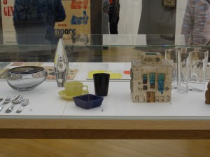
When visiting a museum, it is often hard for me to decide what to find more intriguing: The exhibited artworks or the visitors walking carefully among them, observing them. Hardly ever do they physically touch, or if it happens, then in shyly hidden ways. Especially when it comes to everyday design objects, there seems to be a big gap in between the visitors and the exhibited pieces, which are locked away from their original function: to be touched and used. During my last visit at the Stedelijk Museum there was for instance a person standing for quite a long while infront of a vitrine where, in between other objects, Kaj Francks „Kilta Services“ was being exhibited.

Franck was one of the designers who developed the „Iittala philosophy“: creating design that is both beautiful and functional, and lasts a lifetime. „Does not ‘beautiful’ ultimately mean necessary, functional, justified, right?“ (Kaj Franck, 1978)

In the center: service „Kilta“, glazed ceramics, production in 1953 – 1975, designed by Kaj Franck

In the center: service „Kilta“, glazed ceramics, production in 1953 – 1975, designed by Kaj Franck

The person looked at the plates and cups inside, slightly leaning against the glass that was separating him from the objects. Why was he so attentively watching them? The longer I observed the visitor observing the tableware and the distant space between them, the more I started to think the glass vitrine away and imagined him having a real physical experience with one of the cups instead: the two being naturally rejoined, exchanging what is deep inside.

‘He holds the cup that is filled with tea, leads it towards his mouth and drinks from it. The content flows in one direction which is his interior. Luxoriously he sucks the liquid inside and the cup seems to be very willing to feed him.

“The cup is the drone of the ceramics world, perhaps the hardest working of vessels and the least appreciated. In the grandest of tea or coffee services, the cup is usually the most underdesigned object, playing the role of subservient pawn to the teapot’s queen.“ (Garth Clark, „The Book of Cups, Abbeville Publishing Group, New York, 1990, p. 17)

He drinks everything of it until it is empty. But it still contains the warmth of the hot drink, as he inserts his finger he can feel it. For a short moment they contain the same warmth, the cup and him: he contains the warm tea and the cup the rest of warmth of the tea.

„Close space! Close the kangaroo’s pouch! It’s warm in there.“ (Le Temps de la poésie, G.L.M. July 1948, p.32)

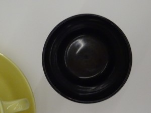
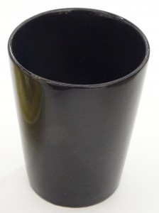
cup, Service "Kilta", designed by Kaj Franck

Service “Kilta”, designed by Kaj Franck

He shouts into the cup and holds it close to his ear: he hears a distant echo. The echo vibrates a few times and is gone. He holds it close to his breast and feels that it is vibrating synchronously to his heartbeat.

„When we evaluate everyday objects, we should place more emphasis than we usually do on ergonomic quality and tactile sensibility“ (Kaj Franck, 1978)

He fills it with tea, looks at it and it is roundly opened as if it was calling him. He lifts it towards his mouth and his lips connect to the cup. They softly touch and his tongue reaches the wet content. Then the kiss becomes wild.

„Many a slip twixt cup and lip“ (Garth Clark, „The Book of Cups“, Abbeville Publishing Group, New York, 1990)

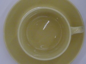
service „Kilta“, designed by Kaj Franck

Service „Kilta“, designed by Kaj Franck

After finishing he cleans the cup. The cup is very deep, so it is hard for him to reach the ground. He cleans and dries it with care and attention, outside and inside. That makes the cup shine and renews its promissing interior.

„A house that shines from the care it receives appears to have been rebuilt from the inside.“ (Gaston Bachelard, „The Poetics of Space“, Beacon Press, Boston, 1994, p.68)

Afterward him and the cup are cold and empty. He looks around and decides to continue drinking from it: what comes out is sweet. He feels a strange feeling that is increasing and expanding inside of him. It tickles him in an unknown place and he bursts into tears.

„Moreover the cup does not have any immediate sense of drama (…). But that does not mean the drama is absent, rather that we need to examine the cup a little more closely and consciously to discover its sense of domestic theater“ (The Book of Cups, Abbeville Publishing Group, New York, 1990 p. 19)

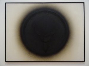
     "Venus von Willendorf", 1963, by Otto Piene, oil and soot on canvas

“Venus von Willendorf”, 1963, by Otto Piene, oil and soot on canvas

His tears keep on falling inside the cup. It takes more or less three seconds for the first teardrop to reach the ground, the noise sounds far. When the cup is filled with tears he is still crying. He looks inside and sees his face inbetween reflections of light.

„My cup runneth over“ („The Bible“, Psalm 23:, Ezekiel 34:11-24; John 10:1-21)

Suddenly he grabs the cup and throws it against the wall…’

service „Kilta"

service „Kilta”

„A kind of cosmic anguish precedes the storm. Then the wind starts to howl at the top of its lungs. Soon the entire menagerie of the hurricane lifts its voice.“ (Gaston Bachelard, „The Poetics of Space“, Beacon Press, Boston, 1994, p. 44)

As I awake from my daydream, the visitor of the Stedelijk Museum is gone, leaving no trace of evidence for what in different circumstances might have happened between him and Kaj Francks „Kilta Services“.
 

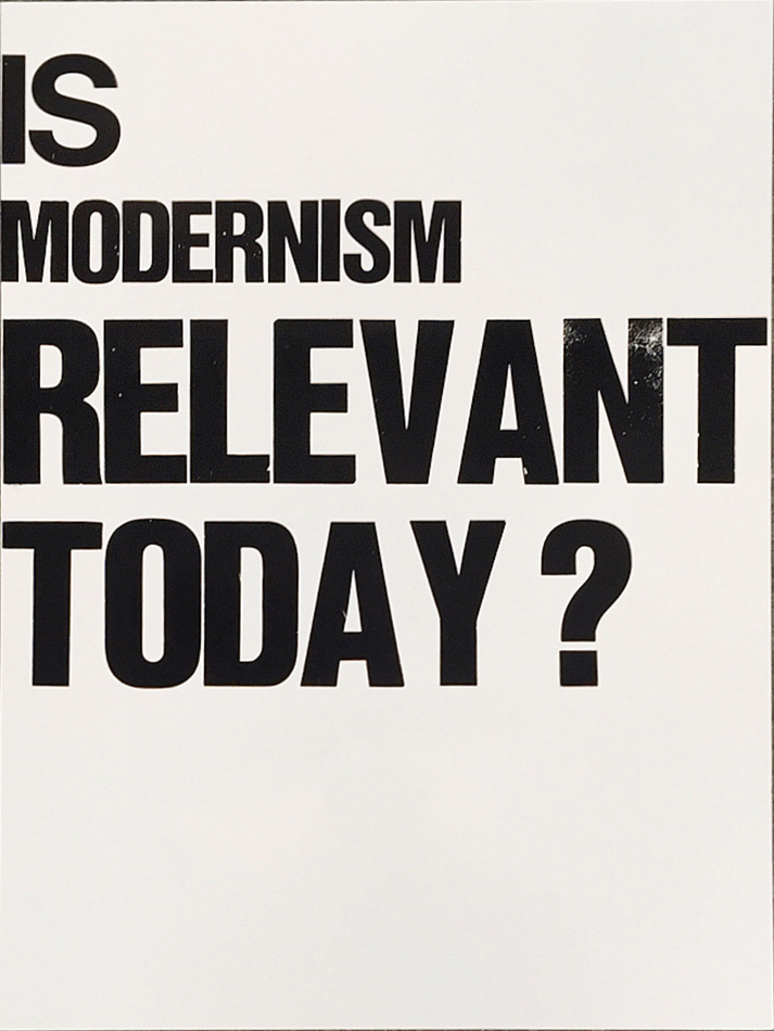
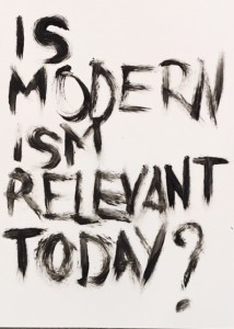
Is modernism still relevant today?


Thursday, October 19, 2017

poster-modernism

In the late 19th century, artists and craft-people in Europe already had a will of rupture with all the previous, too classics works. They saw in industrial revolution means of creating more accessible and more efficient productions.
This craving for newness emerged in Europe as new currents, such as Arts and Crafts, and later on, Art Nouveau, Jugendstil, Neue Kunst. 
On the same time, artists experimented new ways of expressing emotions and feelings. Abstraction developed in art slowly in western Europe, inspired by the recent opening of Japan to the world, but also by all the feedback from the arts and traditions of French, dutch, German and  English colonies.

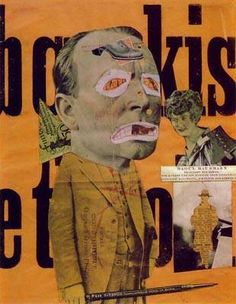
Fauvists tried collages and works with simple shapes and colors, but still in a slightly figurative way. Also, we can see in Dada and Cubism a new approach in composition,  use of shapes and colors, and, in the case of Dada, photomontage.


dada collage


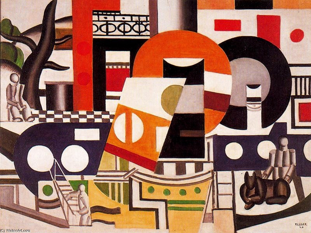
We can notice in Fernand Leger’s work some approaches of the principle of modernist graphic design. Illustrations, at the edge of abstraction, and a game with the letters, where it becomes an entire part of the composition, using stencil characters and foundry typefaces. The imprint  of the man’s work is now less visible, as the use of the machine and standardization of shapes and characters are now a solid part of the artistic production.


fernand leger


At this point graphic design, and, of course, being a graphic designer isn’t a status in itself. It consists of experiments by artists in western Europe, and artists alongside with architects and designers in the central and eastern part of the continent.

The early 20ties century in Europe has been the theater of a lot of revolutions and wars. Seeking refuge and peace, or simply trying spread new theories, architects and artists moved around in Europe. Starting from the 1918’s, The Netherlands, Germany and Switzerland become places where the intellectual Avant-Garde starts to develop, not in private, but as groups.

This results in the creation of collectives of artists, architects and designers, all teaching, and rethinking the place of design, art and architecture in this modern, industrialized society. They fully embrace that industrialization and the new means of production brought by it to create new, peculiar designs. Modernism is born.

We can isolate several groups working on the raise of modernism alongside Europe, inspired by new theories on fine arts (constructivism, Suprematism) from Russia and Italian futurism. Almost each central European country had its own movement: De Stijl for the Netherlands, the Deutscher Werkbund and later on the Bauhaus school in Germany, the Wiener Werkstatte for Austria, and Der Schweizer Werkbund for Switzerland.

They all had the same goal of one philosophy, that binds architecture, art, product design, and later, graphic design. To sum it up, we can quote Henry Van de Velde’s lecture to the Swiss Werkbund in 1947 :
“That chain, which has extended across the centuries, which in the end shows just one family, one single family of pure form and pure decoration, a unique style: one that is rationally conceived, consisting of pure forms determined by their function”.


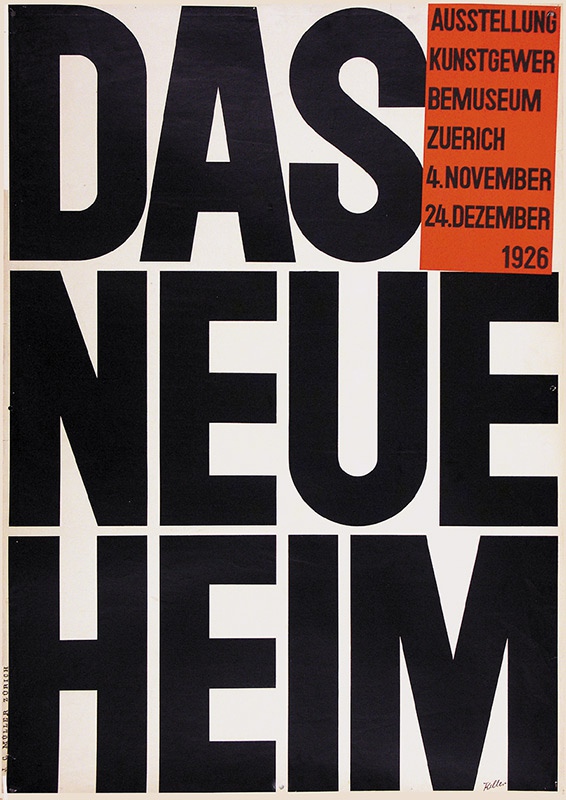
das neue heim


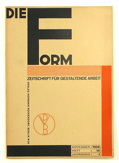
Of course, these groups had to communicate, on exhibitions, but also monthly, to keep the Europe informed of their progress. They started using magazines and posters to spread their words. This is how graphic design entered and embraced modernism. Of course, it was a new mean of expression, and architects of the modernism, to remain within the modernist unity, applied modernist architecture principles to it. These magazines (De Stijl, Die Form, Das Werk, Bauhaus), even if their main subject was not graphic design, expressed the group’s beliefs on type and composition through their formal construction.


Die Form cover


Out went symmetry, ornament and drawn illustration; in came white space, plain letter forms  and photographs. 
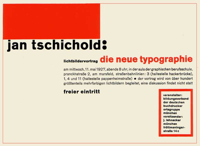
But even after all those works, Europe had to wait until 1928 for someone to actually theorize graphic design, with Jan Tschihold’s “Die neue Typografie”. This book is the starting point of the idea of graphic design to be a separate kind of design, with its own principles. And as you can guess by its title, it explains the rules and ways of using the self-proclaimed new typography : lineal characters, absence of symmetry, purpose of the white space, hierarchy of the information.


Die Neue Typografie


With all those interventions, modernist graphic design became what we know today: sober, using photographs, collage, geometrical shapes and a small range of colours to illustrate, with simple, lineal fonts for the text.

But as the fascism rises in the 30’s in Europe, many intellectuals had to flee from Nazi Germany, and went to Switzerland, to other neutral countries, or to the USA.

Overall, to understand modernist graphic design and its aesthetic, we need to understand that it was created in a mean of efficiency, by people who were not graphic designers, and who experimented for a long time before finding something that would suit their beliefs. It is born out of architectural principles, and as a part of the modernist’s formal aesthetics. And it was so radical, and such a brutal change, that all along the 20th century and still today, we can feel its influence. Just look at you computer. The font you’re reading right now is probably Helvetica.

Thus, we may ask ourselves « is it still relevant to use modernist principles in graphic design ». That is, in our opinion, a legitimate question. It is true that, in a contemporary creative process, using 1930’s ideas might be perceived as some kind of stagnation, our even a regression in the thinking of graphic design. That is not our opinion. But as some ideas, or principles; for instance the universal grid, are killing the thinking and creative process in the long term, it is important to go further than that, and keep investigating what those developments of ideas has permitted us, and what is the next step, in this constant research of efficiency, and simplicity.

.poster neue

a cooperative research by Souheila Chalabi and Antoine Dauvergne


Log in
subscribe