In the late 19th century, artists and craft-people in Europe already had a will of rupture with all the previous, too classics works. They saw in industrial revolution means of creating more accessible and more efficient productions.
This craving for newness emerged in Europe as new currents, such as Arts and Crafts, and later on, Art Nouveau, Jugendstil, Neue Kunst.
On the same time, artists experimented new ways of expressing emotions and feelings. Abstraction developed in art slowly in western Europe, inspired by the recent opening of Japan to the world, but also by all the feedback from the arts and traditions of French, dutch, German and English colonies.
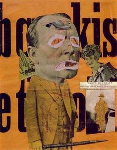
Fauvists tried collages and works with simple shapes and colors, but still in a slightly figurative way. Also, we can see in Dada and Cubism a new approach in composition, use of shapes and colors, and, in the case of Dada, photomontage.
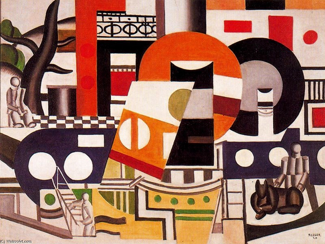
We can notice in Fernand Leger’s work some approaches of the principle of modernist graphic design. Illustrations, at the edge of abstraction, and a game with the letters, where it becomes an entire part of the composition, using stencil characters and foundry typefaces. The imprint of the man’s work is now less visible, as the use of the machine and standardization of shapes and characters are now a solid part of the artistic production.
At this point graphic design, and, of course, being a graphic designer isn’t a status in itself. It consists of experiments by artists in western Europe, and artists alongside with architects and designers in the central and eastern part of the continent.
The early 20ties century in Europe has been the theater of a lot of revolutions and wars. Seeking refuge and peace, or simply trying spread new theories, architects and artists moved around in Europe. Starting from the 1918’s, The Netherlands, Germany and Switzerland become places where the intellectual Avant-Garde starts to develop, not in private, but as groups.
This results in the creation of collectives of artists, architects and designers, all teaching, and rethinking the place of design, art and architecture in this modern, industrialized society. They fully embrace that industrialization and the new means of production brought by it to create new, peculiar designs. Modernism is born.
We can isolate several groups working on the raise of modernism alongside Europe, inspired by new theories on fine arts (constructivism, Suprematism) from Russia and Italian futurism. Almost each central European country had its own movement: De Stijl for the Netherlands, the Deutscher Werkbund and later on the Bauhaus school in Germany, the Wiener Werkstatte for Austria, and Der Schweizer Werkbund for Switzerland.
They all had the same goal of one philosophy, that binds architecture, art, product design, and later, graphic design. To sum it up, we can quote Henry Van de Velde’s lecture to the Swiss Werkbund in 1947 :
“That chain, which has extended across the centuries, which in the end shows just one family, one single family of pure form and pure decoration, a unique style: one that is rationally conceived, consisting of pure forms determined by their function”.
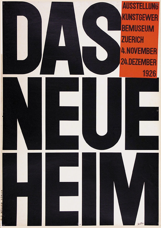
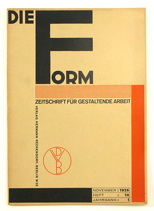
Of course, these groups had to communicate, on exhibitions, but also monthly, to keep the Europe informed of their progress. They started using magazines and posters to spread their words. This is how graphic design entered and embraced modernism. Of course, it was a new mean of expression, and architects of the modernism, to remain within the modernist unity, applied modernist architecture principles to it. These magazines (De Stijl, Die Form, Das Werk, Bauhaus), even if their main subject was not graphic design, expressed the group’s beliefs on type and composition through their formal construction.
Out went symmetry, ornament and drawn illustration; in came white space, plain letter forms and photographs.
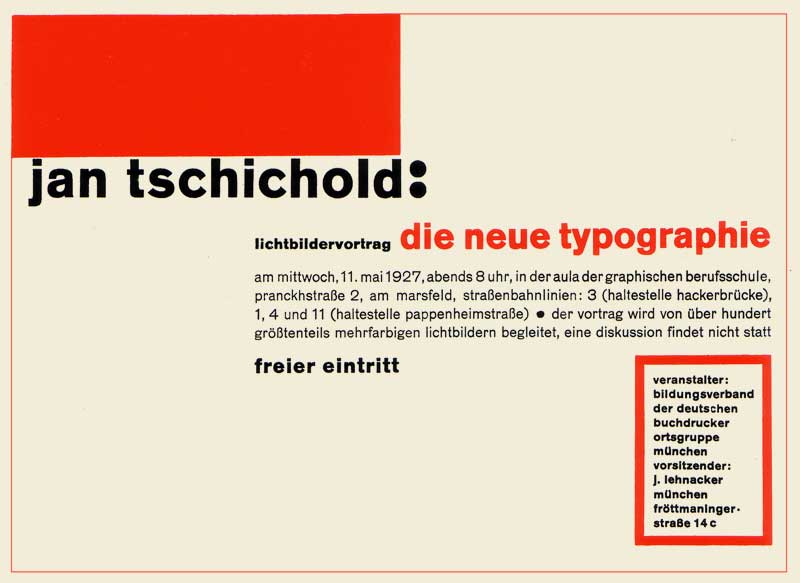
But even after all those works, Europe had to wait until 1928 for someone to actually theorize graphic design, with Jan Tschihold’s “Die neue Typografie”. This book is the starting point of the idea of graphic design to be a separate kind of design, with its own principles. And as you can guess by its title, it explains the rules and ways of using the self-proclaimed new typography : lineal characters, absence of symmetry, purpose of the white space, hierarchy of the information.
With all those interventions, modernist graphic design became what we know today: sober, using photographs, collage, geometrical shapes and a small range of colours to illustrate, with simple, lineal fonts for the text.
But as the fascism rises in the 30’s in Europe, many intellectuals had to flee from Nazi Germany, and went to Switzerland, to other neutral countries, or to the USA.
Overall, to understand modernist graphic design and its aesthetic, we need to understand that it was created in a mean of efficiency, by people who were not graphic designers, and who experimented for a long time before finding something that would suit their beliefs. It is born out of architectural principles, and as a part of the modernist’s formal aesthetics. And it was so radical, and such a brutal change, that all along the 20th century and still today, we can feel its influence. Just look at you computer. The font you’re reading right now is probably Helvetica.
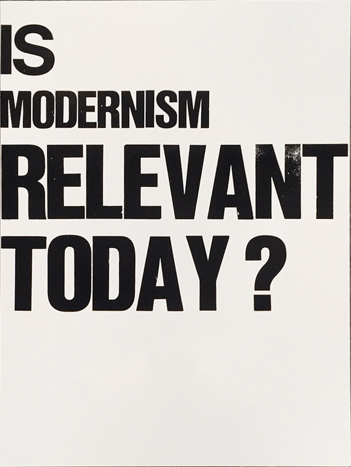
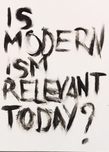
Thus, we may ask ourselves « is it still relevant to use modernist principles in graphic design ». That is, in our opinion, a legitimate question. It is true that, in a contemporary creative process, using 1930’s ideas might be perceived as some kind of stagnation, our even a regression in the thinking of graphic design. That is not our opinion. But as some ideas, or principles; for instance the universal grid, are killing the thinking and creative process in the long term, it is important to go further than that, and keep investigating what those developments of ideas has permitted us, and what is the next step, in this constant research of efficiency, and simplicity.
.
a cooperative research by Souheila Chalabi and Antoine Dauvergne
