Skip to Content Skip to Search Go to Top Navigation Go to Side Menu


Archive for June, 2010


Victory Over The Sun


Thursday, June 10, 2010

"Visual interpretation of Victory Over The Sun [click image for movie]

“Victory over the Sun” is a Russian Futurist opera premiered in 1913 at the Luna Park in Saint Petersburg.

The libretto written in zaum language was contributed by Aleksei Kruchonykh, the music was written by Mikhail Matyushin, the prologue was added by Velimir Khlebnikov, and the stage designer was Kasimir Malevich. The performance was organized by the artistic group Soyuz Molodyozhi.

The opera has become famous as the event where Malevich made his first “Black Square” painting.

The opera was intended to underline parallels between literary text, musical score, and the art of painting, and featured a cast of such extravagant characters as Nero and Caligula in the Same Person, Traveller through All the Ages, Telephone Talker, The New Ones, etc.

The audience reacted negatively and even violently to the performance, as have some subsequent critics and historians.”

Growing Chairs* footnote


Monday, June 7, 2010

In addition to my former post about Growing Chairs, here’s a small footnote – a project more close to home.

A fellow student in the Rietveld Foundation Year is Ana Oosting,who is working on her ‘free project’.  In this project, she works with growing materials. The essay she wrote about this subject  is relating to science,  focusing on bio art and art in a more general way. In her essay, she also talks about the more simply forms of this, in both nature and art, not specifically to be executed in a lab.

In relation to this essay, she made some pieces in which she experimented with growth – combining nature with art. In one of her works she let two doves build a nest on a pair of slippers (picture below). This changes the shape of the sandals as well as the way the nest is build.

Another work consists of growing different things on crystals. You see a scorpion in crystals (picture above).
Within her ‘free project’, Ana also worked with citrons (she tried to make them grow in different shapes) and she made an attempt to make graffiti out of moss.

In the same way as the designers – mentioned in Growing Chairs – are working, Ana is working together with nature to make interesting new art-pieces.

a small conversation between a Man and a Woman, starting from the workshop “Rules” by Ayumi Higuchi; rules in nature vs. rules in human beings


Saturday, June 5, 2010


To get to this conversation, I asked people around me to question something about the other gender, something the person questions the most (and if they didn’t know, just sOmething)

Visual associations starting from Munari’s “how to draw a tree”


Wednesday, June 2, 2010

Mighty Market


Wednesday, June 2, 2010

Super Mighty Market

– Same rules but BIG difference ? Not all supermarkets must be created equal.

‘There is no other material a designer can work with that is so close to the human body and soul as the material of food’

Marije Vogelzang

Welcome to a new generation of spaces dedicated to food culture, where ? Located inside my very own head.  Please cross over to my ideal dreamworld as this space does not yet exist anywhere else. Over here I design a supermarket  – only it is not really just a supermarket – it is more of a space where design, art and food can meet – becoming more like a Mighty Market.

The dream begins with a beautiful architectural form screaming in need for a revival. The structure of what was once a beautiful spacious building whose glory has passed, now sits ghostly waiting in suspension like those christmas ornaments in storage that wait all year for december to arrive. In order to orchestrate the “revival” of my dream food space – it must not only have that “feel good quality” that makes you want to hang out there all day, but also allowing it to be inspiring and stimulating in a way that makes you think about how we relate to each other, our social food culture, how it’s context affects our behavior and choices.  Naturally, being a food lover – wannabe- healthy- eater myself as well as an art and design enthusiast, I became interested in finding a “glue” for all these to exist under one context of food culture and how its role affects our senses and perception.
In order to create my dream SUPERmarket THE MIGHTY MARKET I had to think about its social, psychological, chemical, technical and ethical core values. No employees but team members for starters. Environmentally friendly and with a fun attitude. I also didn’t want my supermarket to have the same old shoe box boring construction as most supermarkets do. I mean have you noticed how boring grocery shopping can be? So it definitely can’t have an uninviting interior like the cold, dark, dull, crowded interior in most grocery shops. My Dream Mightymarket has to be part renovation and part innovation – not just to refurbish and old existing iconic building such as one of ‘BEST’ old buildings but

a combination of both, bringing also new ideas of design into one unique place.

Small things make things big and even little changes to an approach can make a big difference. With this in mind,  I dream of the inside – it will be subdivided into areas such as a gallery for instance, where food exhibitions and lectures are given maybe  by someone like Daniel Spoerri who’s been an icon of the food art movement since the 60’s. A space in which I dream of bringing in people to host events like Marije Volgezand or Droog,  some nutrition specialists and chefs as well as artists and designers such as Ayako Suwa who’s emotional food art won her international acclaim in 2008 .

‘Designed by Marije Volgezand for a meal for Droog design, she hung the table cloth to the ceiling as a means to conceal signs of status like clothing. The meals were served on plates that had to be shared as she supplied the guests with unusual eating utensils for this purpose.’

Back to my dream. Incorporated but not occupying the same space you can find an area for home appliances that follow the same motto for innovative conscious design.  Everything in this alter- space-s is meant to make you feel something, and actually the whole supermarket is designed to make you feel something – in other words, it is designed to make you become aware of your senses. The rails for the stairs are cold to the touch to wake you up. Similarly all the senses are thought of in every detail of the stores design and even the lay out of the products is carefully thought through. From the lighting to the sound, even the sense of smell is incorporated to bring different sensorial experiences.  Some of the products you would see in this supermarket wouldn’t be the ideal healthiest, although its main focus IS the organic and healthy, and the selection of others redefined. Some of the products you can find at the Mighty market are for instance “EYE CANDY” by the Play coalition for Beta Tank who use something called sensory substitution to allow you to see images contained within the candy.

The packaging of products can’t stay behind and would have to be considered – it must aim to avoid sacrificing freshness amongst other factors in favor of warehouse storage as well as its reusability . Playing an important role as an example leader is ‘ Grown in transit’ by Design Academy Eindhoven graduate Agata Jaworska whose concept is simple: the food grows in the package as it is in transit to reach you changing the label from ‘best before’ to ‘ready by’.

At the eating area you would find ‘tasteful design’ and edible design pieces such as cutlery made out of food etc.. maybe since it is my dream, Nosigner would design the interior which would feature for instance his light unit “Spring rain” made out of bean starch vermicelli, which is edible when boiled (meaning no trash- zero!), or sell things like the ‘Unsustainable’ necklace by Greetje van Helmond for whom choosing food as material is a comment on the impermanence of fashion.

But the dream doesn’t end there. At the Mighty Market you can use books as currency which will eventually create the mighty market interactive library.

Wel bekome !

Hobo symbols and Rastafari language construct our fantasy similar to Cinema


Wednesday, June 2, 2010

Slavoj Zizek argues in his “Perverts guide to the cinema“, that each individual lives in a fantasy, fed by cinema. The role we play in society and the values we place on certain people, objects and situations are constructed by cinema. “If you are looking for what is in reality more real than reality itself, look into the cinematic fiction”(Zizek)

What is cinema actually? 24 frames a second. 24 images that visualize a story.  Usually accompanied by sound and dialogue to further visualize the story. So cinema tells us stories. And the stories create fantasies in the viewer.

However, we have not only started living our lives in accordance to fantasy stories since cinema. Story telling has been part of every culture. Through visual or literal means. It may seem like cinema is the most extreme way of story telling, as it can depict scenes in the most realistic way. However, as Zizek argues, cinema does not depict realistic scenes. It plays on the viewers fantasy. An example he gives is that porn depicts sex realistically. Cinema on the other hand, by hiding the obscenity, increases the erotic fantasy of the viewer even more. In cinema, the viewer is aroused through mere suggestions and everything around sex, not the act itself.


Jane changes clothes in silhouette,” from Tarzan and His Mate (1934) / “Percy changes his clothes” for The Dirty Weekender

The reason I bring this in, is that I want to investigate visual and literal symbols that similarly arouse the viewers fantasy through implying a story or some sort of meaning. Cinema is actually just a more complex alignment of symbols and construction of literary narrative. Therefore, Zizeks claim should also apply to more basic symbols and also language itself.

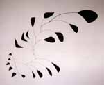
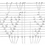
These images belong to a set of symbols used by gypsies and hobos. They would draw them on houses, street crossings etc. to warn and help each other.

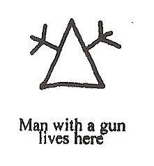
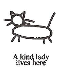
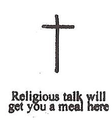
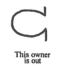
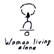
What I found most intriguing is the hidden implications these symbols hold. The symbol meaning “woman living alone” holds a very dark implication. Even the shape of the symbol could suggest something sexual. Or the vulnerability of the woman, as this house can easily be entered.

A simple symbol like this can already visualize stories about rape, robbery or abuse.

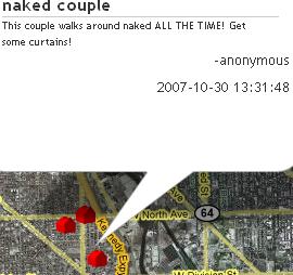
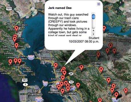
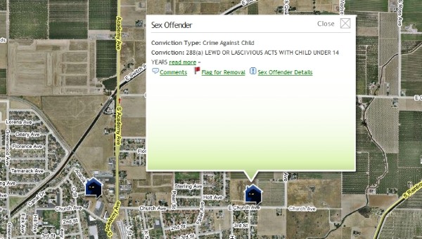
This is what struck me when I came across these symbols, flipping through a book in one of our design workshops. However it is not only an insight into the brutal reality of hobo life. It also relates to far more recent developments. The recently censored site Rottenneighbor.com was a website launched in 2007, by Brant Walker. It allowed users to anonymously mark the houses of neighbours on google maps.


The concept of marking these houses has similarities to that of the hobo symbols.

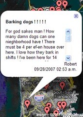
Hobo sign for barking dog

The intensions and therefore the implications of these marks are different. The hobo sign is meant as a warning for when intruding into the property. The rottenneighbor entry seems to be more a way of letting out anger, a way of revenge.

In their function they are very similar though. The purpose of Rottenneighbor.com is to serve as advice for people choosing a new neighborhood to live in. This is very similar to the function of the hobo signs, although hobos would not look to buy or rent property, their signs also advise them about the safety of staying in certain neighborhoods.

On Rottenneighbor.com some entries also held similar implications to the hobo sign “woman living alone”.  There have been entries posted such as “Hier wohnt eine Schlampe, leicht zu haben und lässt die Tür immer offen.” a German post implying that the woman living in this apartment is easy to have and leaves the door unlocked. This post is an example for not going with the actual function of the website, of recommending neighborhoods. Instead it informs that there is something to get in this apartment. This makes its function even more similar to that of the hobo symbols.

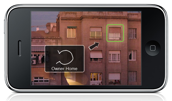
This idea for an iphone application also plays on the idea of marking places to allow some sort of interaction with them. So the user would be able to search for, say, “a ‘safe camp’ or a ‘Kindhearted Lady’ (a picture of a cat) and then have the iPhone show him the location.”

However it is not only visual symbols, that hold implications. Also language unconsciously creates and upholds values and stories.

To become aware of this in English language, it can be interesting to look at the language of the Rastafari. A culture that has been very conscious of their use of words and grammar.

The  language spoken by the Rastafari is based on Jamaican English. Its a creole language, which formed when African slaves were brought to Jamaica and had to adapt to the English of the slave masters. In their “reasoning sessions”, language was a big point for discussion and the Rastafari consciously changed it to rid it of any unwanted implications and meanings. “If you Really want to know how Rasta’s think, “Listen to them Talk” (Nicholas, Tracy. Rastafari A Way of Life pg.37)

There are three main purposes for which these changes in the language have been made

1) To be aware of the subjectivity of each individual and the unity of man

“I” replaces “me”

“Me” is felt to turn the person into an object whereas “I” emphasises the subjectivity of an individual.

“I and I” replaces the pronouns “him” she” “we” “you” and “me”

This change of grammar refuses the “objective case”, that which is acted upon.

It aims at seeing the subjective-self in each individual.

And showing the unity of man.

Inity replaces unity

Demonstrates a general pattern of replacing “you” and similar sounds with “I”. U is consideres negative as it sounds like “you”

Itinually replaces continually

It has the everlasting/everliving sense of I existing continuously.

2) To not hide true meaning, implications of words

Underpression replaces Opression.

Polytricks replaces Politics

Politicians as tricksters

Outvention replaces Invention

Mechanical devices are seen as outdated, and because it is the inner experience of being a Rastafarian that is invention.

3) To give words the positive implications they should have

Rising together replaces Falling in love

Everliving replaces Everlasting

Overstanding replaces Understanding

Referring to enlightenment that raises one’s consciousness.

Know replaces Believe

Rastas do not believe Haile Selassie is God and that they the Rastas are the chosen people. They claim to know these things, and would never admit to believing them.

Reasoning replaces Conversation

Any lengthy talk should not consist of conversing back and forth, but reasoning. Putting minds together to discuss anything from politics to sports or everyday life.

Sign In or Sign Up?

We should pay more attention to the values that are created around us. The art of story telling is constantly affecting our fantasy. Not only in cinema. Im not saying that language or images should be changed to give them more positive implications. But like the Rastafari, we could become more aware of their importance.

EVOLUTION = CREATION = BLIND POWER


Tuesday, June 1, 2010

In my case rules always bring a lot of variations. I observe it a long time because my way of working usually include one or more rules. Sometimes because I pick the rule but most of the time they are visible when work is finished. They reflect my present situation and feeling but for that certain amount of time they become rules and then variation of creating is visible.

It is not random that I found how this rules are already involved in me and I have no problem with it because rule is just a strong word- meaning most of the time something destructive but there is theory in biology which can very easily prove how rules are from the beginning a part of life and that they provide never ending variations of everything we are surrounded by.

Charles Darwin introduced us to his theory of evolution in 1859 with his book On the Origin of Species.

This theory is based on several rules which explain that it is working :

1, In nature of biological species exists variability and is partly hereditary

2, In this variation there must exist some species which are more and some which are less adapted to the condition of environment where they live

3, Species which are more adapted have bigger possibility to create descendants. And when this process is repeated for a longer time then certain type in certain environment will spread and this is called = blind power

4, Everything alive has last universal common ancestor

Example for a blind power is very simple:

Imagine that you are walking some field and you come across a stone, what do you think of is that ok is a stone and it was here or somewhere around from the begun, but now imagine you found a watch.Probably you take it and observe it, you check if it works, you find out that is a machine which measures a time, you see from which kind of parts it is made so it is sure for you that there had to be someone who designed it someone we call watch-maker. Existence of watch prove an existence of watch-maker. But this is the thing which Darwin challenged.He is tried to say that watch can exist without watch-maker.

The choice of nature can be called something like a blind watch-maker – he get some parts of watches separately and one by one he makes a watch from it.The thing is that he doesn’t know that he is making a watch.

Darwin was a very big observant and had a big possibility to travel around the world what makes him very rich of the materials he could used for his theory.

Another example of his theory which nicely explain also how rules of environment included food,weather… influence variability in this planet is his observing of birds- finches in the islands where he found out that they differ depending on what surround them and especially what differ is their beak – tool for eating. The reason is that finches split all over the different islands and by evolution they adapted themselves to the world around them and its rules.

Evolution begins with the first life in this planet and thats for me also where the creation begins and where the rules are always present and there is nothing wrong with it. The word freedom would never exist and would never have such a powerful meaning without the word restriction = laws.

To finish I choose the last part of Darwin’s book On the Origin of Species:

“It is interesting to contemplate a tangled bank, clothed with many plants

of many kinds, with birds singing on the bushes, with various insects

flitting about, and with worms crawling through the damp earth, and to

reflect that these elaborately constructed forms, so different from each

other, and dependent upon each other in so complex a manner, have all been

produced by laws acting around us.  These laws, taken in the largest sense,

being Growth with reproduction; Inheritance which is almost implied by

reproduction; Variability from the indirect and direct action of the

conditions of life, and from use and disuse; a Ratio of Increase so high as

to lead to a Struggle for Life, and as a consequence to Natural Selection,

entailing Divergence of Character and the Extinction of less improved

forms.  Thus, from the war of nature, from famine and death, the most

exalted object which we are capable of conceiving, namely, the production

of the higher animals, directly follows.  There is grandeur in this view of

life, with its several powers, having been originally breathed by the

Creator into a few forms or into one; and that, whilst this planet has gone

circling on according to the fixed law of gravity, from so simple a

beginning endless forms most beautiful and most wonderful have been, and

are being evolved.”


Italian Music for Movies


Tuesday, June 1, 2010

- click on image to download this research pdf -


- also read 'There are rules behind complex and organic circumstances [x] -


The Design of Our Reality


Tuesday, June 1, 2010

Perceiving Reality. Every experience that can be had is a probability within our consciousness. Our experience is created in the Mind and is always 1/10 of a second delayed from reality. This delay is attributed to the processing time frame that occurs in the brain. When we visually perceive our environment, the photoreceptor neurons in the retina collect the light (frequencies) and send signals to a network of neurons that then generate electrical impulses that go to the brain. The brain then processes those impulses and gives information about what we are seeing to the self-aware experiencer, the conscious Mind.

"Visual pathway through the Eye" / "Visual pathways in the human brain" (more…)

Formalistic relations


Tuesday, June 1, 2010

We are constantly surrounded by image, object and words.

Between them exist a relation. The table is picked in relation to the chairs, or painting in relation to your couch, if you are that type of person. But anyhow the relation between them are there, some more interesting than others. The type of relation I investigate is only based on the formalistic aspects. Not the symbolic meaning, morals, etc. Many questions then arise, in terms of relation. Such as: Is there a different relation between object and image, then between object and word?  The following, is a short research, investigation into these relations, which could help to understand our surroundings better.

Object in relation to image

In this example we clearly see that the image and object work together. But why do the do that? First of all, it has a lot to do with scale, the zoom, by this I mean the way we approach the image and object. And the scale between them, distance, you have to get close to see a small clip, and even closer to see the photograph. The clip is outside, and you look into or inside the photograph. The height of the photograph is almost same as the clip. The most visible shadow in the photo is similar to the clips shadow and
the vertical relief or outstanding line one the border of the clip is related to the out standing part of the cement in the photograph.
Also they both are related by text. The same type of visual text, giving information, date, product and name.

What is also interesting in the notion of object in relation to image is: the fact that when we look at something physical, which we have touched or been engaged with in our past. We have the memory how it feels to touch, its weight or surface. So by placing image of boxers in action wearing boxing gloves, with a pair of tomatos next to the image, we at once start to make a connection. Where boxing is about hitting flesh. The tomato in a way becomes both a relation to the flesh, (the inside and out side) and a connection to the red boxing gloves. So the tomatos and the image that is so far away from being connected subjectively, are strongly connected in a formalities way. Here the size also counts a great deal, I would say that the size of the gloves with inn the image, should match the size of the real size tomato’s. And another strong connection here is that the gloves and the tomato shine or reflect light in same way.

Word in relation to an image of an object

Here the word juice does not have any relation to the boat wreck in the meaning of subject. The distance in subject makes us more aware of the their formal relation, the way juice is written. By hand, not mechanical. The letters which do not have hard edges, resemble the form of a wooden boat. The repetition of the word clearly relates to the  way the boat is constructed, where the wood repeats it self, not as complete repetition, but according to the form of the boat. Which is also why the repetition of the words occurs. Not printed, but hand written.

Word in relation to object

In daily products, such as the milk carton we find the relation between the “typeface” that says milk, and the milk carton as an object. We find that some typefaces work better than others. The typeface we see here is chosen after the form of the carton. It has hard corners and ninety degree angels.

Entities with in a whole

With this example we must imagine all this lying on a table. The stone is the only thing that is not a flat representation. The connections that becomes relevant here are many.  The images to the left are pictures taken by rain at night, holding the camera straight at the sky, the flashlight lightens up the rain drops. This related to the stone which is standing out of the table and is an object that can be touched. The fact that there is two relates to time. The blackness of the images suggest an act of looking into. The breast of the beautiful woman packed in black, relate to all other entities. Such as weight of the stone. Related to the the x-ray of a foot through the stone, Woman flesh, bone, stone, x-ray, look into, etc..

Clearly we can read alot into the relations between these four entities. But this as an example, or this as an research, makes us, aware of the importance, the possibilities, and what a good combination of images could lead to.

Research will be continued.


Duct-tape


Tuesday, June 1, 2010

In April we had a lecture from Ayumi Higuchi. The lecture was about her essay in which she investigates the impact rules have or can have on the process of cause and effect in the creative process.

To give us a visual example how the rules work, Ayumi let us make trees out of duct-tape.

Although it was not the goal of the workshop, it was really nice to see how quickly you could make a beautifull installation with tape. This inspired me to search more about tape and the artist who work with it.

Quick history

Duct-tape was developed during World War II in 1942. It’s a water resistant sealing tape with a standard width of 48 mm. It was used to repair military equipment quickly, including jeeps, firearms and aircrafts, because of it’s strength and it’s water resistand quality.

The original name is duct-tape but the soldiers in World War II changed it into duck-tape because the word duct-tape was to simular to the name for the cotton fabric they used for tents and rain clothing.

After the war soldiers returned home and took the duct-tape with them, to use it around the house. Since then it serves all kinds of perpuses. In the 1970’s duct-tape even made it’s introduction into spaceflights. When the square carbon dioxide filters from Apollo 13 failed, they used duct-tape to fix it.

This saved the lives of the three astrounauts on board.

Over the years duct-tape became a very popular product. People are making items out of duct-tape or decorate objects with it. You even have a lot of websites with information about how to make stuff out of duct-tape, and movies on youtube with instructions how to make it. Like this movie, that shows how to make youre one wallet out of duct-tape.

Increased interest in creating these novelty and fashion pieces has given rise to designer duct-tape handbags, wallets, belts etc.

Not only designers are interested in duct-tape. Also a lot of artist use it.

Click here for more of these installations.


Aaksh Nihilani

Also a lot of graphic designers use duct-tape. Within typography it even got a new name: Tapography. (also used for typography made out ofcasette tapes )

Artist Aaksh Nihilani is one of the artist who works a lot with tape. For the Arario Gallery in New-York he made three installations with duct-tape.

His explanation about the works:

“Since the show was titled Paraphrase, I took the opportunity to get into some tekst, tapography. I did ubiquitous words that we all encounter in our daily travels, especially as a New Yorker, but I wanted my paraphrase of the words to be aesthetically ‘better ‘than their original. So the words pull, push, and exit are all written out in tape, as well as simultaneously being shown acted out, or about to be (as in the exit piece). They were all a little bigger then human scale so as to more objectify their viewer rather than the usual other way around. I think these installations were particularly succesful because they stayed true to the site specific nature of the wordk that got me the show in the first place (i.e. Using the gallery’s door hinge to complete some of my lines), but also took on new levels of content in the figuration of the letters, and new concepts/processes of using the tape to express qualities like peeling and falling”


Autobahn

An other example of a tapografic experiment is tapewriter bu Autobahn. It is developed during a seminar by Richard van der Laken and Eric Wie, and later developed until a type specimin.

Tapewriter is a typeface that gets it’s form from the fence of a soccer-cage. The width of a role duct-tape is exactly the same as the room between two bars of the fences from thes cages. The thought behind this font is that any one who ones a role of ducttape can share their thoughts with the rest of the world.

Tapewriter showes that you can write with anything and that any surface can become your paper.

More information and the total typefase you can find on the website of autobahn.


Experiments with Duct-tape

Inspired by this all I started to experiment with duct-tape myself.  My first experiment was just to write something on the wall with tape.

After that I wanted to create a 3-d effect into space, wich I achieved to tape tekst to my window an fotograph it with the outside landscape:

In my last experiment I really wanted to go 3-d. So I made lines with yellow tape in the air and made letters with black tape in it. It creates

a very interesting effect because it looks different from each side. As you can see on the picture below and the title picture.


Log in
subscribe