Neutrality. Growing up in Sweden, the term has been a part of me since I was born, and a part of my country since before any of the world wars. It is defined by Merriam-Webster as “the quality or state of not supporting either side in an argument”. It is used throughout society in everything from neutral tasting yoghurt to neutral states in politics. But what does it mean? And is it even possible? I chose to explore and discuss a part of this which is dear to me as an art student, image making.
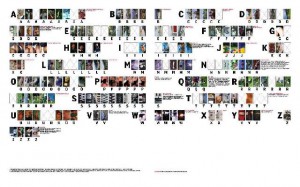
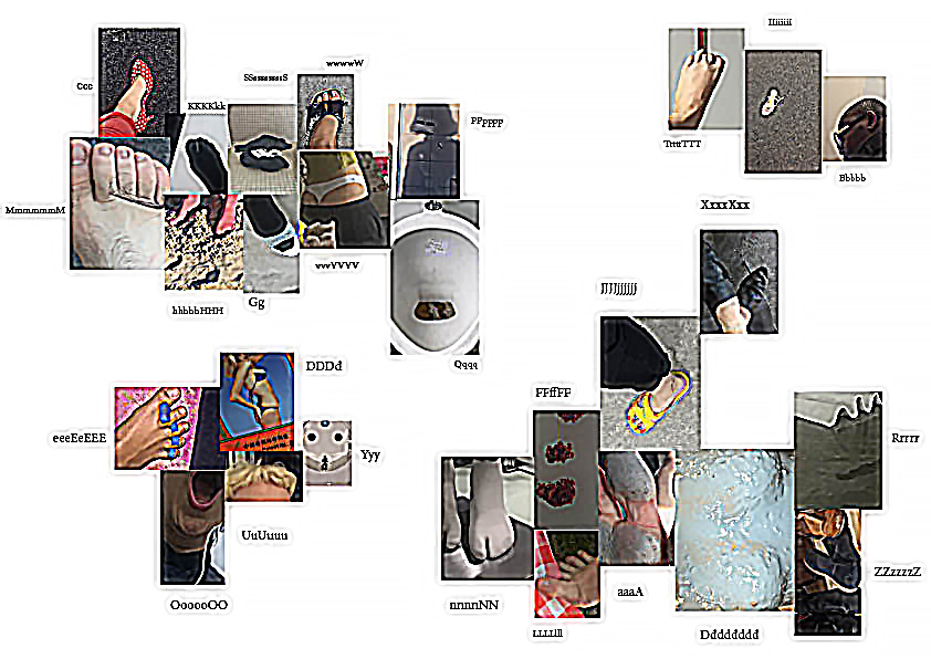
I started exploring neutrality through a work of Swiss designers Müller + Hess called The Impossibility of Neutrality, which is a commission by the English graphic design magazine Eye. It is an attempt to create an alphabet consisting of imagery instead of typography. Each letter in the alphabet has been replaced by multiple images. They chose multiple images because different people have different perceptions of what an image could represent. So to make this more precise, the viewer can look at multiple images to understand which letter the sender is trying to convey. The work deals with typography, text and photography, and how it is impossible to be neutral in imagery.
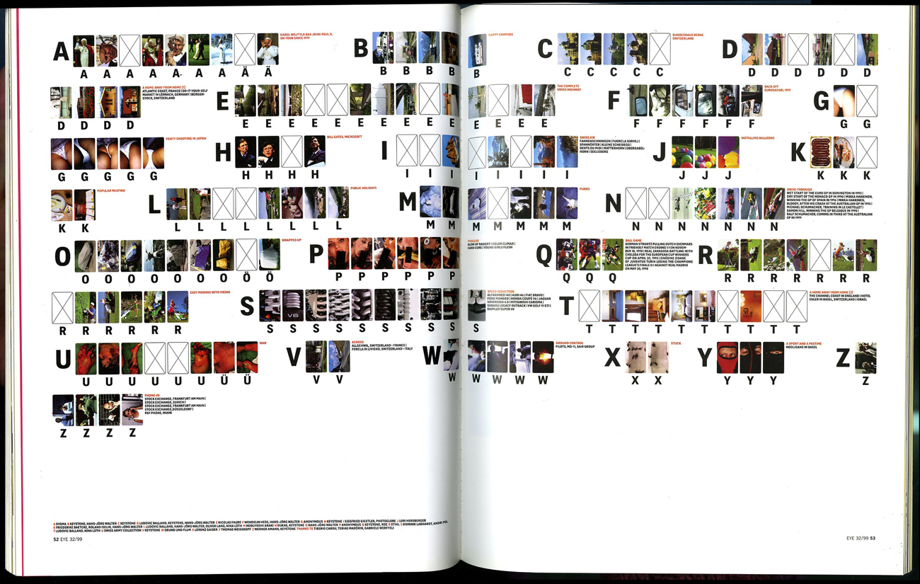
The Impossibility of Neutrality ©1999 by Müller + Hess, first published as Max Bruinsma's article Reduced to the Max in Eye-mag #32
From this work I went onward to The Photographic Dictionary by Lindley Warren. The Photographic Dictionary is a website with photographs representing words. Each word in the dictionary is represented by a photograph. The word that is represented by the photograph below is the word embrace. What happens in this work, just as in Müller + Hess’s work, is that the impossibility of neutrality becomes very apparent. The representation of the word becomes very personal, and in every image there are many messages that the viewer can read into, and every image can be interpreted in many different ways. An image can not show something neutral, as text can. Or can it?
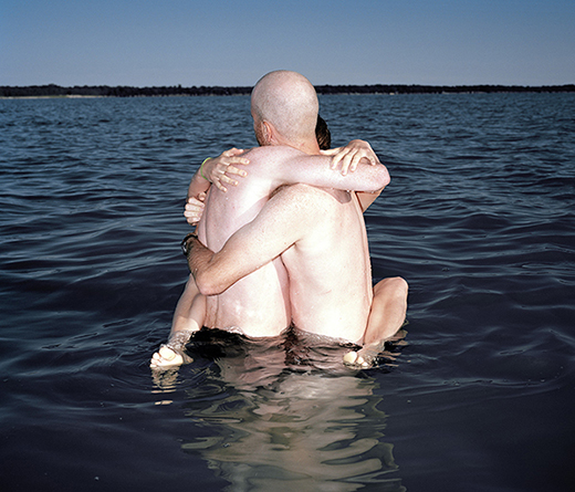
Embrace by Brendan George Ko through The Photographic Dictionary
Stock photography is often used as an image that can just be interpreted in one way. It is a photograph showing something in a very non-personal and mostly objective way. It is used widely by, for example businesses, who in this way can acquire quality imagery for their business at a lower cost. When using a stock photography service, the user searches for a word or a phrase, and the matching photograph appears. For this to work, the image has to be non-personal and work for a specific use within many different contexts. Does this mean that the image is neutral? And does it apply to all types of images? Images showing people can hardly be neutral I think. Most of them show an accepted norm for the human being which they send as a message. But let’s take something else as an example. Let’s take this image of U.S. dollar bills. I believe it is more or less neutral. It portrays the dollar bills as they are, no more and no less. I feel it is not carrying any messages more than the concept of U.S. dollar bills. But then again the concept of U.S. dollar bills holds a lot of messages in itself, within everything from geography to economy and politics. And also, the bills are stacked irregularly and have creases on them, which makes me think of money that is earned in illegal ways, passed on in duffel bags.

Dollar bills by iStock
Another type of neutrality which I think is interesting is when an image or a message has been used so many times and in so many different contexts that it has lost its original meaning and doesn’t really say anything anymore. An example is the art sold at IKEA. It has been bought, sold and shown so many times in so many different contexts that the original context or message is completely lost, and it now doesn’t really represent much at all. Maybe this isn’t neutrality, but more some kind of visual confusion or loss of context. But just like the stock imagery, these images are often just used to replace one word, which in this case is decoration and/or art. This makes these images neutral in the way that most people don’t really experience or see anything when looking at these images, but instead just see a materialization of the word decoration or art.
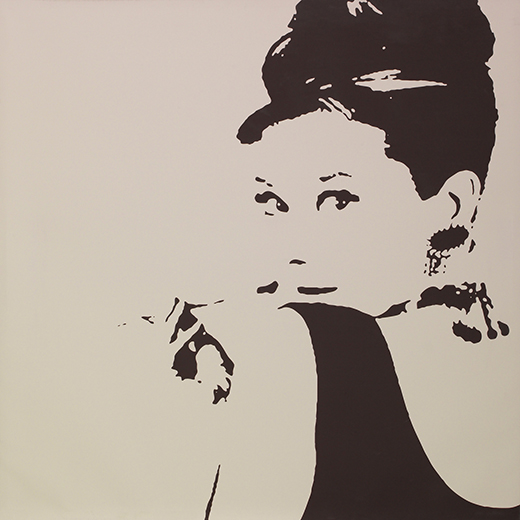
Audrey Hepburn from Breakfast at Tiffany's by IKEA
Something that I think fits very well into this discussion is the word perception. Perception is defined by Merriam-Webster as “the way you think about or understand someone or something”. People will always have different ways of perceiving things, and when looking at an image, the image is always interpreted regarding to the perception of the viewer. Perception connects to what the viewer has seen, heard and experienced before. This is why the portrait of Audrey Hepburn from IKEA has lost it’s original context. Because it has been seen more often at IKEA or as a decorative art piece, than in its original context. This is also why we are able to find different messages and meanings in what at first glance appears to be a neutral image of dollar bills shown above. If the bills would have no marks and stacked in a perfect order, then the assumptions and the messages we are able to read into the image would still be there, just that they would be other messages and meanings. And because of perception, my conclusion in this essay is that it is impossible to be neutral. Whatever image is presented, the viewer or user will always be able to see one meaning or another in an image, and an image will always be able to be connected to something in the life of the viewer and therefore be interpreted through this experience.
On a side note I also believe it is a bit funny that Müller + Hess are Swiss, from the viewpoint that Switzerland is supposedly the oldest neutral country in the world. I wonder if any of their government officials read that issue of Eye Magazine.