When i first went trough the pile of Wendingen magazines something struck me when I saw the cover of the “techniek en kunst” edition. At that point i didn’t really know what it was about that edition, but when thinking more thoroughly about it I had the feeling that I had seen it before. Going through my archive of pictures I found a poster designed by Karl Gerstner that had a lot of similarities. It left me thinking how amazing it was that something that was designed an odd thirty years later had a lot of the same qualities. The cover of the Wendingen magazine was designed by Wim Gispen, one of my favorite Dutch industrial designers. Before this discovery I only knew Gispen for his famous chairs, lamps and interior architecture in general. Unaware of the fact that graphic design at that time was not really labeled a profession, designers also did graphic design on the side. Though you can see that the cover designed by Gispen is an early design and not really modern any more it still has some modern qualities.
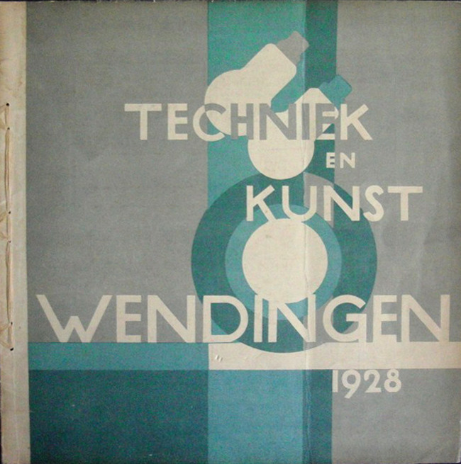
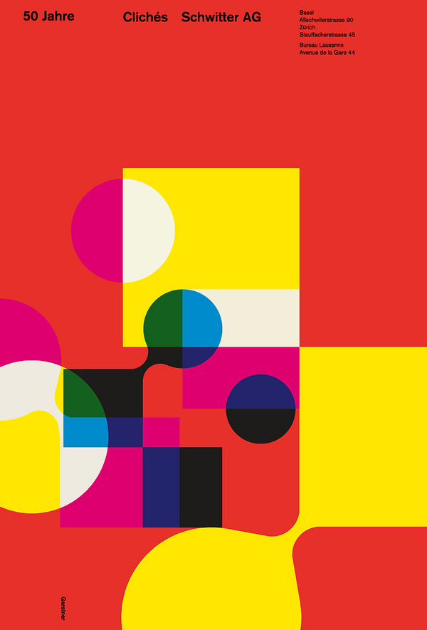
The use of shapes, circles, overprints and probably a grid in my opinion is quite modern. I think it fits in the same style of work as the early Swiss style of graphic desgin. That is why it reminded me of the work of Karl Gerstner a Swiss graphic designer that was part of the Swiss style. A movement that I am a big fan of because of their simple use of shape and subliminal use of color. Because Gispen is more linked to “de Stijl” movement I would have never expected that he designed the cover for the Wendingen Magazine but overall I am quite happy that I picked this copy because of the insight it gave me in early graphic design and the progression it went through over the years.
Wendingen 9-2 1928 Rijksacademie Amsterdam