What I understand about Ewald Hering is not a vast amount, it’s pretty narrow. I’m no Physiologist as he was but I will try to elaborate on his theory of Color Opponency, which is the idea that the receptors in our eye that make seeing colors possible are capable of taking in two colors at a time and that to each color there is a reaction. When looking at the two colors at the same time, or next to each other, it has contradictory experiences. This creates a kind of optical illusion where the colors seem to glow. Just like when you look at a black dot on a white background then look away you keep seeing the glow of the dot you stared at. This is that same glow. There are many optical illusions that use this formula.
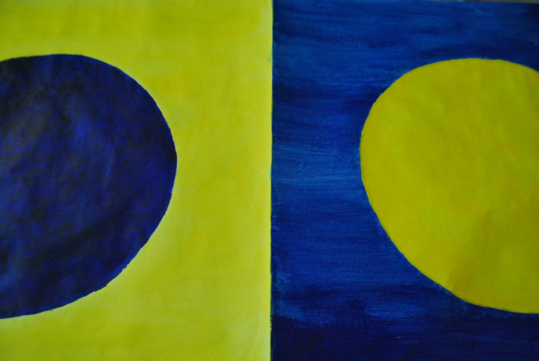
The opposing colors he was talking about were Blue to Yellow (and vice versa), Green to Red and Black to White.
Anytime these colors are put up next to each other, without any intervening colors, it becomes difficult to look precisely at the border between them.
I understood why this combination of two opposing colors creates this illusion.
So my plan was to combine the colors and create an illusion that had its effect within the colors.
First I started with little prototypes with examples of existing optical illusions, but with the opposing colors, since I had discovered that Hering himself had created an optical illusion, namely the Hering Illusion.

Goodness gracious, is there anything Mr. Hering didn't do?
I found two other optical illusions that were of almost the same design as that of Hering’s and combined the colors with the design of the illusions.
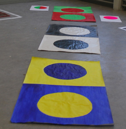
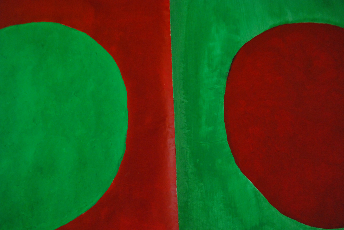
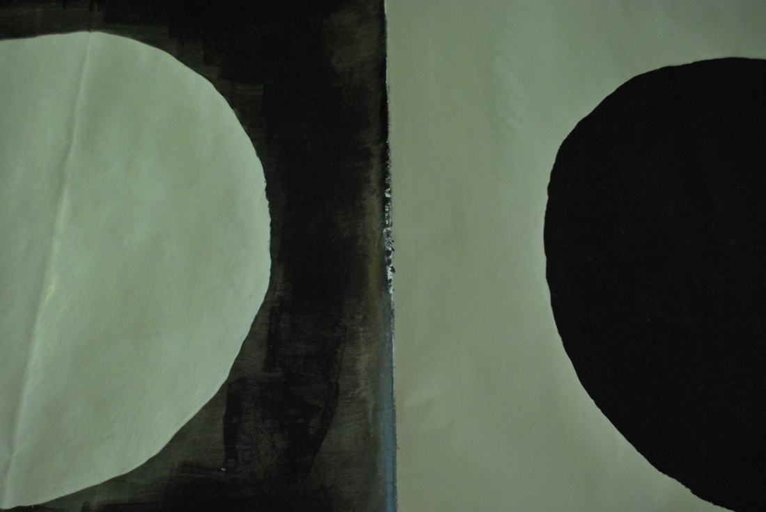
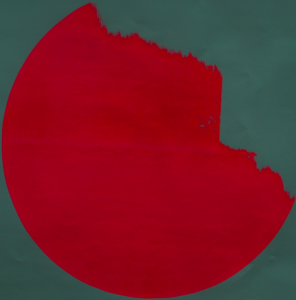
It was too distracting, the optical illusions, so I removed these and tried a simple design; a red square within a green background and the opposite of that; a red background with a green square in the middle.
It felt more honest to the colors, rather than taking something that was already meant as an optical illusion and decorating it, so to say.
I liked the prototypes but they were, after all, prototypes.
So I set off to make three big paintings with a color combination of two each just like the ones I had made before.
The optical illusion worked, halfway through the second one, blue and yellow, I had to wear my sunglasses because I started to get a massive headache.
It was funny how the color scheme, blue & yellow, green & blue and white & black are usually set up together. I finally understood why; it was this subliminal optic effect which makes you either love it or hate it.
Not only that, this might be the very reason some people hate Christmas. Eureka!
I had to pat myself on the back for that one.
What I’m interested in researching further after this project is to see which secondary colors have this same effect with each other.
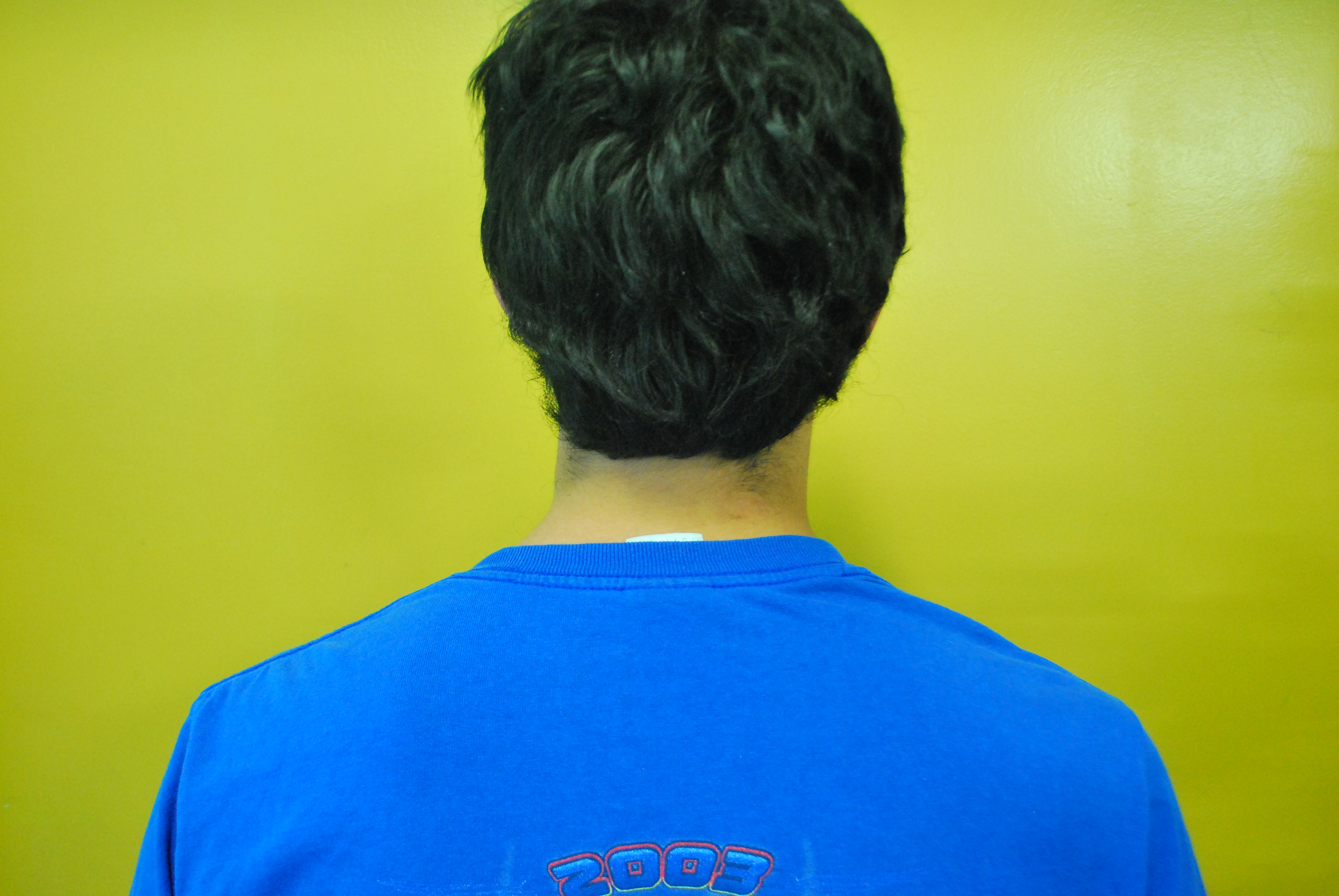
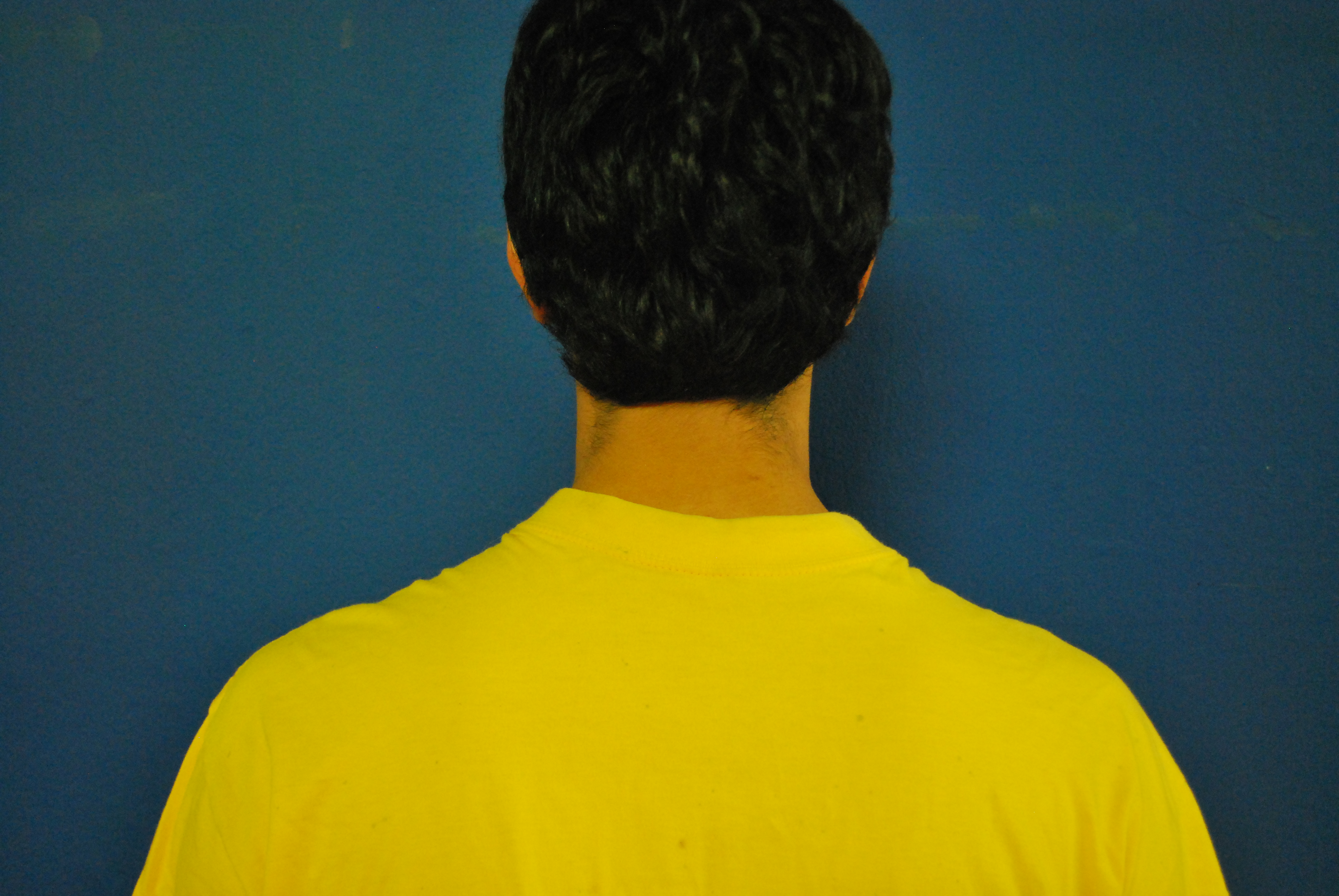
However I don’t want to limit my research to painting, I want to check if the same rule applies with objects in backgrounds with opposing colors.
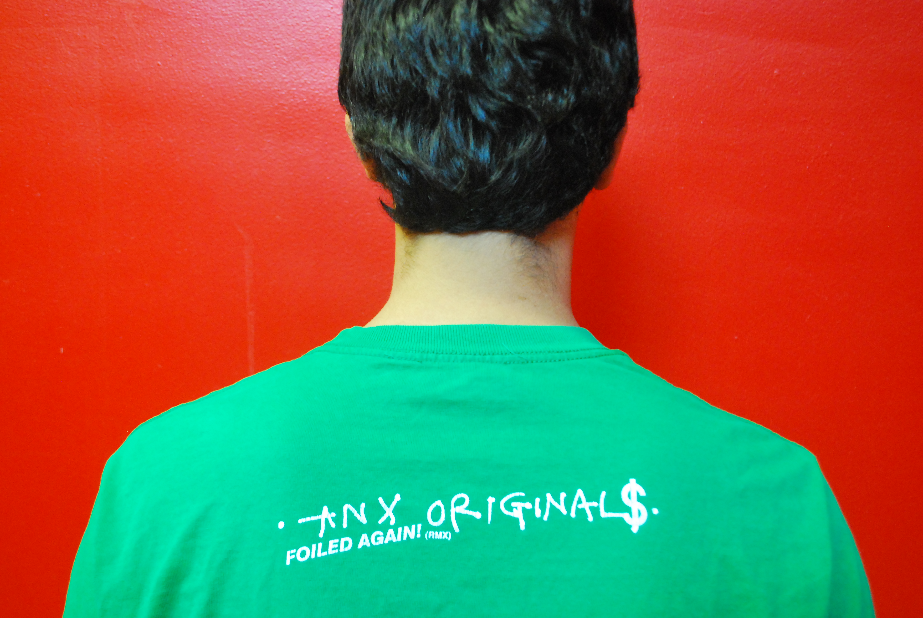
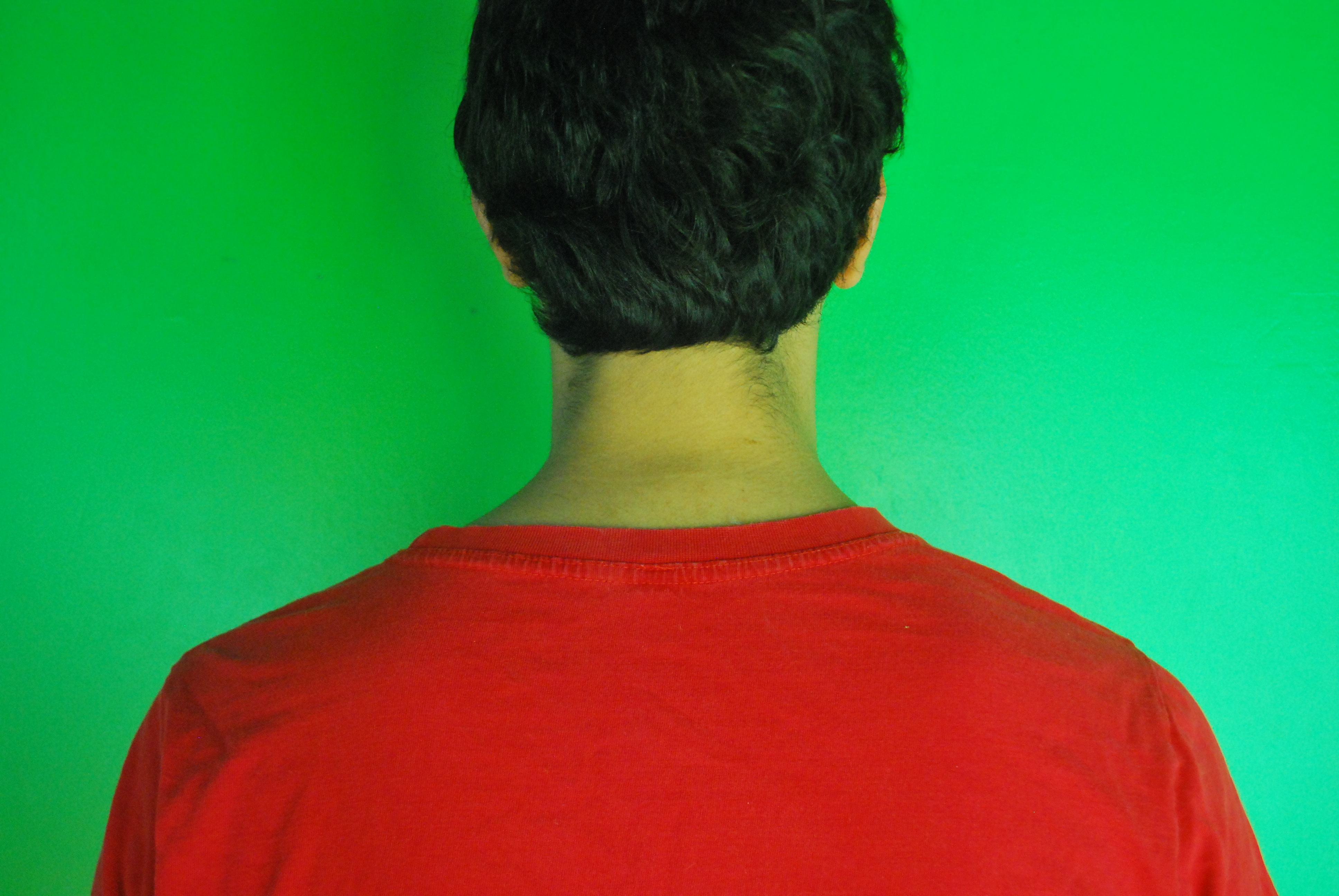
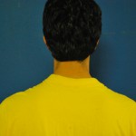
I’ll try this with myself wearing a red t-shirt and standing in front of a green wall. The opposite as well, green shirt to a red wall. This I’ll do with all the color combinations and if my calculations are correct I should be able to blind you when you see me.


I started noticing that this same optical illusion not only works with these colors, but that it happens with other ones as well. Colors like purple in combination to green, for example, has a similar effect. However I don’t have the specific formulas to the secondary colors, so I won’t elaborate.
As an ending to the Ewald Hering project we silk screened one color each in reflection to our color theory. I chose the brightest neon pink I could find

(Thank God for Magenta, am I right?)