Skip to Content Skip to Search Go to Top Navigation Go to Side Menu


"meaning" Tag


Wimble click crumblechaw beloo


Thursday, September 15, 2016

650-ANDREEA_PETERFI_ANNELAKEMAN

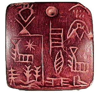
Umberto Eco in his Six Walks in The Fictional Woods is referring to the idea of an optical illusion, for explaining how we are perceiving the fictional novels. Throughout his essay we are being shown, several illustrations with which he is visualizing the concept behind his es- say. Although it is not a children’s book, he is adding the illustration for the means of having a common understanding on the topic he is referring to and the concepts he is presenting.
While in children’s books, unfortunately, the freedom of the child using his fantasy is taken away, by – and thus imposing the fantasy of – one or more grownups, directing them in what they must see and understand as to have a common memory. I will come back on this subject later.
In Eco’s book though it is necessary to have the same understanding of the concept he is proposing. He is pointing his finger, saying “this is what I mean and not other”. Being able to maintain a certain common understanding, while using words, either in speech or writing is very difficult, as De Certeau is pointing it out in The Practice of Everyday Life:

“The readable transforms itself into the memorable: Barthes reads Proust in Stendhal’s text; the viewer reads the landscape of his childhood in the evening news.”


650-ANDREEA_PETERFI_ANNELAKEMAN-2

Simply because we have agreed that, say: cup is a cup it does not mean that we are talking about the same subject/object. Each of us are having a specific memory of the word, being related to either the time we have learned it first, space, surrounding, atmosphere, mate- rial, color, size or form, are additions to the experience we are relating the word to.
When we say the word cup we refer to all the cups from everyone’s memory, and to the only one cup we relate to personally, all the cups we have happened to see, and even the ones we do not yet know about.
Here I will make a short parenthesis for coming back to what I have said above, about the common memory of the children, whom have shared the same book in the past. Clearly there are a few objects in each generation (related to time) or cultures (related to place) we can think of, that are bringing a sudden nostalgia. Referring to one of these objects from our common memory, has the power to affirm and acknowledge the ground where one that stands facing the others. Thus sharing a specific memory of a specific object can be decisive for taking or not part of the group.

650-ANDREEA_PETERFI_ANNELAKEMAN-3

Once this idea is settled there is no need for other words to explain ourselves. We now can trust each others understanding on a number of other discussions, that we do have similar experiences.
Let’s take the 90’s generation as example. We might have experienced objects as Tamaqotchi, Nokia Querty, Pokemon and Dexter’s laboratory even though we come from all different countries and cultures. Recently I have participated in a some similar talks in a few different settings about Tamaqochi. It seems that somehow the memory of this object, keeps reoccurring. There are exactly a few specific answers to the question: “Oh! And do you remember Tamagotchi?!” that represent the object at it’s best and everyone understand their meaning.With or without the additional –
annoyed : “Oooh! Noooo, please….(it was such a stupid game, it would always die during the class)” .
and the enthusiastic : “Yes Yes! (I actually had a few)!”.
Whether one remembers more the annoyance or the pleasure, in the end both sides know exactly what it all meant or felt like. Thus trough sharing a common reference point they are becoming ‘a group’. They can now feel closer by the fact that they have shared a common/similar experience. Trough sharing a common experience the ‘other’ becomes ‘we’. While the ones that did not share the experience have a harder time to relate to the word and the meaning it carries with it.
This of course is a simplistic example and as such I am here not discussing the importance of sharing the idea of the Tamagotchi persé as an object/name, or as an experience, but replace it with something of a bigger importance – and that is where we, although having developed language to be able to transmit thoughts, can not get over the struggles of truthfully understanding their meaning and in some cases we overlook their importance by not being able to relate to other people’s experiences only trough words.


Cover_shaded download this thesis by Andreea Peterfi
all rights to this thesis are property of the author © 2016


BE VISUAL


Sunday, February 21, 2016


To share and receive, to express an idea or a feeling; that is what communication is to me. It can be transferred in various ways; through verbal and nonverbal communication. In the Arts, communication can be interpreted in a different way.  On this essay the main focus is image and communication. How images are understood as means of communication? As a starting point, the ‘visual essay’ of Beat Müller and Wendelin Hess called ‘The Impossibility of Neutrality” gives a view on the perception of communication. The impact globalization has in culture and economy, questioning how “neutral” a design could be? This ‘visual essay’ consists of images from various sources; from the Swiss Alps, from sports, the pope on tour to hooligans in Basel. From the founder of the Microsoft software Bill Gates to luxurious chalets, contrasting with pornography, war and violence. A visual combination arranged in a certain way, each image elaborating harmonious with one another forming a pictorial alphabet and text.


Impossibility-Neutrality_2_1300

Müller & Hess, The Impossibility of Neutrality, Eye #32, 1999


A similar approach as Müller and Hess has the London based artist and designer Paul Elliman with the “Untitled” (September magazine) 2013. The publication consists of an enormous private collection by the artists himself, of found images, reaching around 500 pages, a compilation of different sources from the world of fashion and photography to pornography. Paul Elliman modified every image by adjusting and cropping; by “zooming” into details. as a focus on the human body, emphasizing in such a way, physical gestures, such as the human hands for instance. A publication of powerful figures creating a variety of shapes and patterns. Without any further explanation of a written text; only the act of hands; a distinctively particular way of communication, in contrast of vivid colours. A synthesis of dynamic images capturing semi-nude and nude areas of the ergogenic parts, such as the chest and limbs of the human body. Gestures can be powerful, they are a form of information; a message that has been made by the sender towards the receiver.


elliman

Paul Elliman – “Untitled” 2013


Another project called by Elliman is called “The Alphabet” ’92 [x] in collaboration with 26 students of the London University. New ways and possibilities of opening up a communication were created. The result was an interactive piece or work that denies any stereotypes of the spoken language by making a new kind of alphabet by using objects and the human body to create letters. Image is the main element of it, structured by the human body. A unity of photographs decoding the language by giving it literal form and/or subjective expression. Shot inside a photo booth, students were deliberated to be themselves and interpret each letter of the alphabet by using only themselves.  By using only a few “ingredients” for instance; movement and the human body. The result is exciting and highly creative; could be a proposal which suggests to be open and think different regarding the process of ; reading and understanding.
 

“Language moves between us and the world on patterns of repetition and variation, and a mimetic example of this might be something like an alphabet” – Paul Elliman


As mentioned above the artist Paul Elliman and his projects “Untitled” 2013 and the “Alphabet” 1992, suggested a new way of communication which I would like to follow up to with an interesting example that can be found in the book of Hans Ulrich Obrist and Hans-Peter Feldmann  called “Interview” 2009.  They use a cryptic way of communicating, consisting of questions that have been posed by Obrist, to which Feldmann gives an image as the answer. A game between words and visual language, projecting social issues in combination with humor. The reader is allowed to make his own “translation” on every image as the possibilities of an answer are endless.


VT2A3857

Hans Ulrich Obrist and Hans-Peter Feldmann – “Interview” 2009


Moving on to one of the founders of the New Realism movement [x], Daniel Spoerri and his book “Coincidence as a Master” 2003. The Romanian-born, Swiss artist and writer have been collecting actual items such as; plates and cutlery for years. Creating himself the term “Tableau Piège” (snare-pictures) around 1960, which stands for; “objects, which are found in randomly orderly or disorderly situations, are mounted on whatever they are found on (table, box, drawer, etc.) in the exact constellation they are found in(…). By declaring the result to be a tableau, the horizontal becomes vertical”. What can be seen in this publication is a synthesis of found objects which each one has a story to tell. Taken from a “bird’s eye” point of view, of tables, frozen in time, captured in a certain moment. Remains of meals fixed on the table, an attempt of reviving a particular event. His own approach of expressing a story through fixed scenery of objects; a momentary need.


variant-spoerri

Daniel Spoerri  – “Coincidence as a Master” 2003


A similar approach as Daniel Spoerri has Uta Eisenreich as seen in her “A Not B” 2010 book designed by Julia Born. A mixture of colourful and playful photos, consisting still life images of objects like matches, balls, fruits and scissors. Rearranged in such an order which creates an optical illusion and language, where you might also come across with “spot-the-difference” mind game; experimenting between the thin line of common and uncommon sense. Eisenreich was inspired by scientific experiments, nursery rhyme poems and the “non-verbal IQ tests” for children,. The work contains of a variety of domestic objects directly connected with our everyday lifestyle. Questioning the possibility of placing in order items that has no function together although create a serene atmosphere. An exploration of structures between objects and space; “A Not B” takes us along into a playground of constructions of forms, the power of symbolism and youthful tendencies.


uta_346

Uta Eisenreich – “A Not B” 2010


Objects surrounds us, usually designed to fulfill every human need. Although, from another perspective objects can be used for another purpose. Through them we can create a whole new reality, new experiences which opens up possibilities. It is all about perception, how we see the world around us, how do you see it?  Eventually, everything is changing and new things are born. For instance, the collaboration between the “creative agency Forsman & Bodenfors, stylist Evelina Bratell and photographer Carl Kleiner” publishing the “Homemade is Best” 2010 cookbook for Ikea.  It consists of one hundred and forty pages of ingredients placed in such order of creating geometrical patterns.  A wide range of baking recipes motivating the reader to take action. Suggesting an alternative approach of reading a recipe; by looking the images of the ingredients, guides you to the recipe instead of reading a text of each step that has to be made. As a result focusing only on the ingredients that are needed. While you turn the page you can as well see the result of each recipe.


Language is not dependent on writing” – Ferdinand de Saussure


In conclusion as the examples of the artists mentioned above, communication can be understood without the use of words; the power of the image can be stronger. In depth, photographs can express an emotion and interact with its audience. Words can be unnecessary; the use of the body or an object can create another medium of communication.
 

Typographic Matchmaking in the City and how it gave me an interest in the meaning of type design.


Sunday, November 4, 2012


First I would like to start with an introduction of the project. The typographic matchmaking in the city project, launched by the Khatt Foundation, focuses on typography’s use(d) in place-making within an urban context. It will investigate the way that typography can fuse with urban design to create public spaces with an unique sense of place. Places that attract people because they are pleasurable, involve social encounters and immersion in the sights, sounds and atmosphere of the space.

Trying to bring back the traditional use of typography in the city, five teams of fifteen Arab and fifteen Dutch designers collaborated on creating new bilingual typefaces formed for 3-dimensional/architectural applications. The end results of the projects are five new bilingual typefaces, inspired by both Latin and Arabic script traditions. These typefaces will be applied as poetic narratives in the form of participatory public art, into the public spaces of two cities: Dubai and Amsterdam.

Each team took their inspiration for their typefaces from different sources. Their inspiration, process, brainstorming sessions, early sketches and prototypes are carefully documented [x]. It gives an insight into the thought behind typeface design. A big and complicated challenge in this project –of course– was to create the same visual language and aesthetically corresponding letters (type/font) for two scripts that are structurally very different. One of the five projects is the Kashida. In this project for example, they took inspiration for their typeface from broken pieces of tagliatelle. Kashida became a completely 3-D font, that is, in its result still noticeably coming from the tagliatelle. Here is a program to use Kahshida for your own personal text.
These typefaces are meant to stand out, in contrast to street signs for example, that affect us unconsciously. Eventually, the main goal is to have these typefaces to become part of public space and perhaps even to help create or improve public space.

So far about “matchmaking in the city”. What was more interesting for me, was the fact that for some people typography is a serious and genuine interest, even a passion. For me that is hard to understand. I think typography is something you either love or hate, or to be more subtle, like or don’t like. I can’t “kind of like” the subject, however I can try to get interested, but I will never fall in love with the amazing world of helvetica, verdana and Kashida.

Where did it come from? The urge to design something that has already been designed and been used in currentform for ages; our alphabet, simply how we now it, and once was decided how to write it.
Our alphabet, as we know it know developed from pictographs, that are dated before the 27th century BC, to hieroglyphs, known as the Egyptian writing, to the Phoenicians alphabet (1050 BC), which is first to be composed exclusively of letters and is the earliest alphabet that is directly related to our alphabet now. From this alphabet, the Greek alphabet derived, which in its turn evaluated to the alphabet we use nowadays.

So to make a distinction between the alphabet and typography: An alphabet is a standard set of  letters (basic written symbols or graphemes) which is used to write one or more languages based on the general principle that the letters represent phonemes (basic significant sounds) of the spoken language.”  and “Typography is the art and technique of arranging type in order to make language visible”

There actually is a great distinction to make, and that is, that typography is something that is supposed to be designed, it is design. The alphabet is like the entity of typography.
Typography is about arrangement and appearance. This arrangement involves the combination of point size, line length, line spacing, defining the spaces between groups and pairs of letters.

Why do we feel so eager to arrange and to come back to my previous question; why do we want to design something that is, in itself already a design? What can there be designed out of something that already has specific rules to be followed, in order to be understood? Well, apparently, quite a lot. In fact typography is a way to say something in a text that is already saying something.
Typography gives a text a double meaning and can create awareness on itself. With a type font you can force someone to read, or experience a text in a specific way.

With this conclusion I would like to look back at the Typographic Matchmaking in the City project. A project based on trying to design an experience, rather than a type font. By reading a text in Kashida in the context of, for example, an urban environment, could give you, in a way, a certain experience of the space. A harmony or connection between languages and their role in society creates a consciousness of a multicultural space where everyone can feel welcome.

Because of doing this research I was forced to create an interest, not only for the subject I was given, but also for typography in general. I couldn’t have imagined how important a good designed type font can be and what it can evoke. How much time and energy it takes to design one and most important how it connects to way more than only just “saying something” with letters.
Still typography is something I was not made for, as well as typing with Kashida can only interest me for not more than the sentence: Hi, this is a type font.” surprisingly, over all, that was what I enjoyed the most.


Log in
subscribe