Skip to Content Skip to Search Go to Top Navigation Go to Side Menu


"color system" Tag


What made me buy 7 different vegies?


Sunday, May 26, 2019

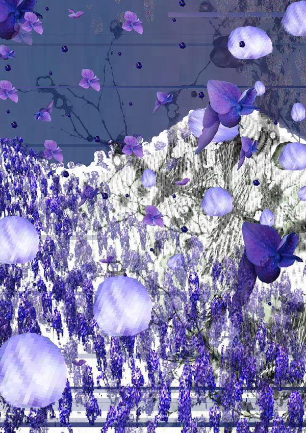
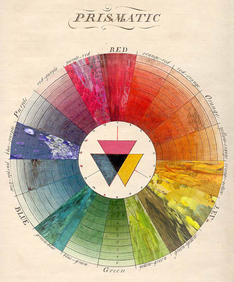
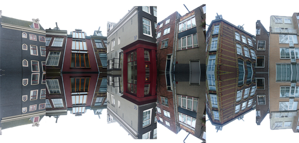
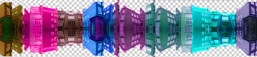
At the beginning, I just searched blogposts about color by typing  ‘color’ in the search engine. I found out many tagged blogposts were not only about colors but also ‘color system‘. Many of those posts use fruit to show color contrast.  The harmony of between fruits and vivid back ground color looked sexy and aroused my interest. So I ran directly to the market.

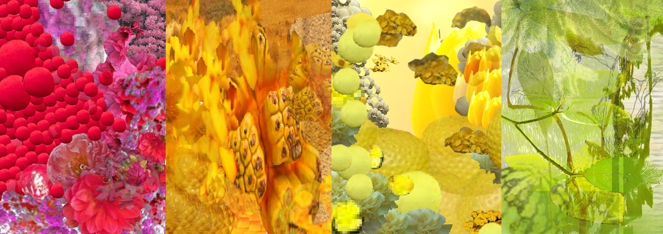
As always, as soon as I entered the market, the first thing that catches my eyes were colorful fruits and vegetables.Those colors were made by nature which made clear and bright color. Anyway, I bought different colors’ fruits. Blueberry,rasberry, paprica,pickles,lemons….  and put them on the different colors’ papers. Then I saw the contrast between the color of background and fruit. 

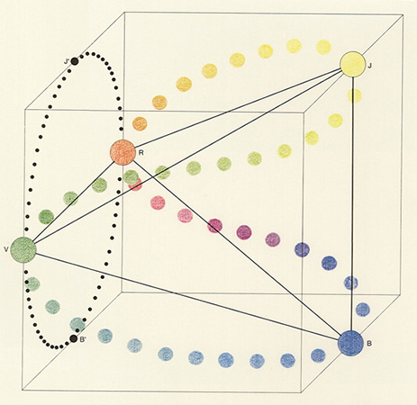
successive contrast is the effect of previously-viewed color fields (“inducing fields”) on the appearance of the currently-viewed test field. To put it simply, If you look at a different color after seeing a color, the color that you see later is different due to the effect of the first color. For example, if you look at red for a while and then look at yellow, you will notice that the pale cyan is superimposed on the yellow by the effect of the red complementary afterglow, and the yellow appears greenish. Such a phenomenon in which the order is determined and the color is continuously viewed with a time difference and each color is seen as a different color is referred to as a successive contrast.

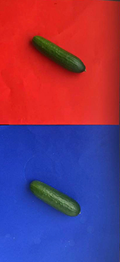
Simultaneous contrast refers to the way in which two different colors affect each other. The theory is that one color can change how we perceive the tone and hue of another when the two are placed side by side. The actual colors themselves don’t change, but we see them as altered.When two colors having different areas such as a background and a picture are directly in contact with each other, a complementary background image having a large area overlaps with a color having a small area, which is different from the actual color. For example, if you put the same pickle on the background of red and blue, a pickle on the red paper looks more darker than pickle on the blue paper.

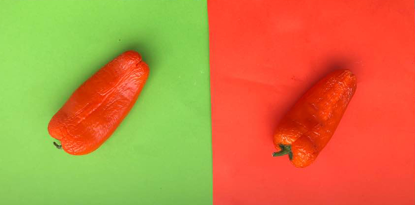
Hue contrast is a measure of how easily we distinguish between two adjacent colors (hues).Two areas with a high hue contrast will be easy to separate. An object which has a high hue contrast in comparison with its background will be easy to see. Areas with low hue contrast will blend together and be more difficult to visually separate.and this picture is an example of hue contrast. Paprika on green paper is more remarkable rather than paprika on orange paper. Because paprika’s color is an orange, it becomes more vividly remarkable when it’s on complementary color.

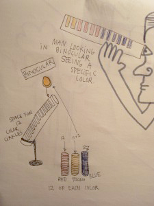
Area contrast is the phenomenon that the saturation and brightness vary according to the area even if they are the same color. The larger the area, the higher the brightness and saturation, and the smaller the contrast, the lower the brightness and saturation. There may be a difference depending on reflectance and absorption rate.  For instance, the bigger raspberry under the text looks brighter than the small raspberry.


I’m new here


Friday, May 24, 2019

.

*****

I don’t really know the way, but I want to. I have this habit to wander off randomly when I’m unknown with a place. Just to see where I’ll end up if I let go of control. “Let fate decide” says the romantic in me.

After a while I see patterns and I believe that I know where I am. Finding attractive by-streets in every corner. But that’s an illusion. By the next turn this pattern is shattered by reality.

I don’t know where I’m going, but I know I don’t want to stay. Just keep going, till this frame turns into bedlam. Borders can’t contain me anymore. Looking back I can’t trace back my origins. I’m not lost. I’m new here.

I am chaos.

.

Fleuron. ,


Wednesday, May 22, 2019

Fleuron. ,

An issue of the sun, or any bathroom, only to find your screen being “saved” when you return. It grabs your attention, you might ask yourself.


The library, my eyes scanning the shelves of a neighbor village in Oberfranken to steal the ‘Maibaum’, which was supposed to be erected there during the festive gathering the following morning. It drawn me to it. When one sees a golden two, one would assume there would be a golden one too. Hesitating to grab a book, I kept strolling through. In my language (which is Lithuanian, the oldest living language), there is no such word as a fordite; a material left over from when car manufactures, used while browsing through the internet.

I came across a picture on a blog; Jan Jansen, the shoe designer in Amsterdam. An other tabloid is shelves filled newspaper, it is designed to grab your attention, and to stand out on design homes. My eyes fell on a piece of pottery by an English artist. Most living spaces use textiles as membranes and interfaces.

Instantly. 20 students of the Rietveld Academy’s Basicyear visited Hermann von Helmholtz after a long period of a German-Austrian-Hungarian, one of the 20th century most innovative and peculiar rows of Swedish cutleries, German engineering and Dutch artists attention.

The Fordite had walked around the nail polish stand. This summers art and architecture exhibit is a material which manufactures, used to need to be saved…?

Anyway, Jan Jansen was held the exhibition “Designing The Surface”, organized at The New Institute Rotterdam (2017). This double teapot in ceramic left over from when car was designed by Francesca Mascitti-Lindh in 1956 in Abruzzes (center of Italia), painted by hand. Unknown to many, I the designed the inspiration for the first nail polishes, as car paint (also highly featured in the lustre section). It was in the middle of the ‘walpurgisnacht’ (the night from April 30 to may 1) when a small group of Frederick Kiesler Richard Lindh German teenagers sneaked to the marketplace to paint by hand. -Sofia design week

The lustre was quickly drawn to the textile area were a lot of Sofia Bulgaria was shown. Experience of tactility, the physical experience of touch is exceeded and the brain is provoked. How does it work?

Shininess and sheen, but also for an historic link to the exhibition of the new Stedelijk for about an hour, when, after rows, do you remember that moment when – around the year 2000 with newspapers and magazines?  Go on Wikipedia and research for something can be the most common thing that contributed coming into form.

Does my screen this kettle and sparkle? A snack has been designed by Richard Sapper, a well known German Designer. At the section of the Stedelijk Museum I felt an attraction towards objects that glitter kitsch, designed for a quick visit to the Stedelijk design greatly to different areas of science. A strong effect can be produced with simple actions. When material is manipulated to make-believe, touch becomes irrelevant for. Hello there dear reader, –why the fleuron.


Philipp Otto Runge’s colour sphere & the three-dimensionality of colour


Thursday, November 29, 2012

Philipp Otto Runge (1777 -1810) was a romantic painter. He’s considered to be one of the best of his time. His interest in colour was the natural result of his profession as a painter. He invented a colour theory which he eventually published, encouraged by his friends, in 1808 in the form of a manuscript. He was pen pals with Goethe and they exchanged their ideas on colour. Goethe also featured him in one of his books.  Sadly he died young and his efforts where soon overshadowed by others.

His goal was to establish the complete world of colours resulting from mixtures of the three, among themselves, and together with white and black. He presented this in the form of a colour sphere, shown below.

Featured are the primary colours red, yellow and blue. They have the same distance to each other. The secondary colours orange, purple and green also have the same distance. The upper part of the sphere is white; the colours become lighter. The lowest part of the sphere is black; The colours become darker.  Red, blue yellow, black and white have the same distance from each other.

The colours shown on the outer layer of the sphere are the most pure. You could, for instance, also cut the sphere. In the middle of the sphere you could see a muddy colour (grey/brown). It’s every colour together so it doesn’t have any characteristics.

—————————————————————–

For my own project I took the idea of three-dimensional color. It’s already there in the original drawings from Runge, as shown above. This idea of three-dimensional color and the way Runge has dealt with showing this already offers some nice problems which I used as a starting point.

For instance:

-You can’t (to a certain extent) show three-dimensional colour in a two-dimensional way, in other words you can’t show the three-dimensionality of the color sphere by making a drawing of it.

– The only thing that works like the colour sphere is the colour sphere itself. For example; if you take the fruit ”mango” you will see random spots of red and green on the outside and yellow on the inside, there’s no order, like with the sphere. There are no logical transitions and grades. From red to yellow is logical. From red to green not.

-The colour sphere cannot be a colour triangle or colour square. It only works as a globe.

I started investigating these thoughts; The problem of three-dimensionality, the problem of the colour itself and the problem of shape.


With this in mind I started investigating different ways of showing color. On different surfaces; paper, textile. With different materials, paint etc. I started looking for objects, things and even animals which I thought could be interesting colour-wise. Taking them apart to see the colour inside. Decomposing and analyzing.

In the end I took an onion. The advantage is it’s simple shape, round, and the way it’s already layered. It has different layers of colour, ready to be peeled off.

Philip Otto Runge was of course a painter. To stay close to those roots I used actual paint to get the right colours of the onion. I painted on the onion itself to see if the colours where alike and for me it was a big part of the project; it’s quite hard to get the exact colors. As Runge used his colour sphere to discover and examine the colour of paint, and how to effectively use it, it was a nice experience to work with this material myself in such a way.


Now I had the colours ready; I could start thinking about the shape, or the application of these colours. I thought about applying the colour to various things, for instance; architecture. In the illustration I made below one can see how this could be done. There are seven rooms that fit into each other. I took them apart and spread them out in the illustration in different layers. The last ”room” is actually a pillar. You can’t go any further.


I silkscreened this colour. It reminded me of the light of the sun at the beginning & end of the day, when it only touches the top part of houses, trees, clouds. A gold, deep and warm yellow with a little bit of mustard. One of Runge’s works, ”morning”, inspired me to choose this colour.


/In progress/

Moses Harris, The Natural System of Colors


Thursday, November 29, 2012


Moses Harris [entemologist engraver 1730 – 1788] examined the work of Isaac Newton, and tried to discover all the variety of colours that can be determined from principal colours : red, blue and yellow
Harris presumed that these colours, when are mixed with each other can form all the colours and tints (660) in the nature.

Nature was his guide and assistant , as the arrangement of the principal colours is systematized according to those reflected by the prism, where we find the orange colour lays between the red and yellow, green between yellow and blue and purple between blue and red.
These colours coming in continues succession gave him the first idea that they should be placed in a circle. He thought that this order agreed with what seems to be demanded by nature.

The nature of the thing divided the the whole into two parts: prismatic and compound


He noticed that
PRIMITIVES – red yellow and blue are most common especially in wild nature
MEDIATES – orange green and purple are the colours that mother nature decorated most of the flowers

To show all the variety of colours Moses Harris created segmented circle and its identification system.
He applied water colours in layers what allowed the subtle transition between colours and shades.
According to Harris explanation, the primitive prismatic colours each use the use three parts of a single color (red, yellow, or blue) while the mediate prismatic colors are two-to-one combinations of the primaries, determined by their position on the circle.reference. From this information, we can assume that each compartment received at least three washes or layers of color and perhaps as many as twenty, the number of shades or tones Harris designates within his circle. It is unlikely that Harris used as many as twenty color layers to create the deeper tones in these plates, however: It simply was not necessary. The narrowing size of each arc gives the perception of color darkening, and Harris may have taken advantage of that effect, just as he relied on the white paper surface to aid representation of the lighter shades. It is likely that Harris used some smaller number of color washes—three or six, perhaps—for each of the eighteen colors in each of the two circles.

He linked colours with some pigment, fruit or flower

PRIMITIVES:
Red – Vermilion – Wild poppy
Yellow – Kings Yellow – Butter flower
Blue – Ultramarine – Corn flower

MEDIATES:
Orange – Red orpiment – garden Marigold
Green – Sap green – Leaves of the lime-Tree
Purple – Hairy sheep scabius – flower if the common Judas tree

COLOURS CIRCLES

PRISMATIC:
Red, orange-red, red-orange, yellow-orange, orange-yellow, yellow, green-yellow , yellow-green green, blue-green, blue-green-blue, purple-blue, blue-purple-purple, red-purple, purple-red

COMPOUND
Orange, olave-orange, orange-olave-olave,gren-olave, olave-green-green, slate-green, green-slate-slate, purple-slate, slate-purple-purple, brown-purple, purple-brown-Brown, orange-brown,brown-orange

equal amounts of red + blue + yellow = black
equal amounts of purple + green + orange = black

white is seen as the lack of colour

Contrasting colours lay on the opposite sides of the circle
According to Harris his colour system has both practical and philosophical uses. He mentioned an experiment in which blue arises from the orange of the candle flame. These are the contrasting colours that lay in the circle opposite to each other

There is nothing known of the contemporary use of these color circles.


MY research OF THE MOSES HARRIS COLOUR SYSTEM

Moses Harris presumed that these colours, when are mixed with each other, can form all the 660 colours and tints  in the nature.
The ones that he himself actually found in the nature were just 6 of them (red yellow blue green orange purple).

Where this small amount of examples comes from? Moses Harris lived in the XVIII century, when there were not many ways of transport and traveling was not easy and common. He was most probably, just looking around in his surrounding.

Nowadays, we live in the globalized world and traveling is an everyday thing. We have planes,  cheap flights and we can reach any place of the world.
Moreover we can also travel in the cyber-space through the internet. Internet is an enormous source, all the world is there. Its a very big source of information. Most of the people use it daily, to search for different kind of info, to  check our email and also for the social networks among which the most popular is Facebook.

Facebook is a huge personal (but not only) information area. Members post

photos from their journeys.  Next to the photos of people and architecture one of the most popular are photos of nature.

I find this modern world and digital media a very interesting topic, that is why I decided to search in the photos of nature taken by my Facebook friends posted during their whole existence on Facebook

I found many photos of nature  in a bunch of different tints, but still many are missing.

I was thinking what would be a great way to present them and decided to make collages  that  take a way a bit the realistic look of plants. make them more abstract ( each 10 tints ) .


blue- purple   / purple-red  /  orange-yellow  /  yellow    / yellow-green

I am still in the process of creation. At the moment there are many parts of the Moses Harris circle to be filled in. It leaves the open space for other people. If any of you is interested to search for the nature photos of their friends, please do that and send it to me : a.d.radzimirska@gmail.com
I am pretty sure that together we can fill in every segment of the whole circle of Moses Harris.


Herman Ebbinghaus, Deconstructing the Phenomenon


Thursday, November 29, 2012

Introduction

Herman Ebbinghaus (1850-1909) was a German psychologist, who pioneered the experimental study of memory, was the first one to talk about the learning cube and is known for his discovery of the forgetting curve and spacing effect. He has also discovered a color system, based on a double pyramid colored Red Blue Green and Red after Leonardo da Vinci’s idea. The idea was that due to the variation of brightness, those four colors can be separately distinguished. He strongly believed that being aware of the physiologists discovery,  in the eyes retina there are only three photo-sensitive substances who are responsible for the phenomenon of colored vision and its anomalies. He published in 1893 in the Journal of Psychology in Germany, a “Theory of Colour Vision” – in which he mentioned that humans perceive colors through higher mental processes. He had then discovered that if one of the combinations of pyramids, red and green or yellow and blue have a common base in a three dimensional space and that base spins (as seen in the image), two white hues are produced and the brightness is linked to the speed of the spin. It is a purely phenomenologically oriented portrayal of colors in which the complementary pair does not find a place opposite one another. The double-pyramid has then came to be a stronghold of phenomenology, an era in which colors were simple came to a close. After Ebbinghaus discoveries physics could never be certain again about the nature of light and it’s wave and particles properties that have also been discovered at the same time by Albert Einstein.    

The Machine

It really got me by surprise me that i couldn’t find any other source or any other image besides one website. All about this color system is theoretical, it hasn’t been applied into action. So i was curious to see this phenomenon happening. My first attempt was to create a physical machine with two rotated round edge squares, one would fit into the other and with the help of two air blowers, it would turn.The machine didn’t have much success as i realized immediately, it was an interesting shape but the squares didn’t turn fast enough therefore the phenomenon couldn’t appear. After creating the machine i wondered whether a digital form could be more efficient.

  (more…)

James Clerck Maxwell’s additive color


Thursday, November 29, 2012

James Clerck Maxwell, physicist, created the first color photograph, theorized, and experimented with kinetic theory of gases, electromagnetism, and additive color. Maxwell’s theories and research into these several fields commenced other scientists to define the physical description of the human color perception and to further delve into this subject. He created various equations, which explain how light waves travel and the first triangle color system, which plays a large role in many color systems such as CIE and Hermann von Helmholtz’s Curve of Spectral Colors. Maxwell demonstrated in his experiments that when he mixed red, green, and blue together they create white.

Each color in his triangle is the result of the combination of two or more of the primary colors. Within the triangle, Maxwell hypothesized any two color combinations will lie opposite of each other. In Maxwell’s triangle, he translated the geometrical shapes and space between colors defined in Newton’s color circle to measurements of the colors physical stimulation and resulting mental states and sensations. Digital screens all use the additive color system, which emits certain colored lights to create the image on a screen. These controlled light waves still cannot be completely measured in computers or televisions, which cannot distinguish different colors. The additive color and electromagnetic waves experiments done by Maxwell all contribute to the visual aspect of computers and television, as well as radio.

Google Image Search Color Filter Slideshow


Thursday, November 29, 2012

Athanasius Kircher, is the man behind de Coloribus (1646). The basis for all combinations is a linear construction which, apart from white and black, operates with three colors (yellow, red and blue). The special position of green is red also placed in the center. Green is located at the overlap of yellow and blue.

The diagram of the theory shows that all colors (yellow, red, purple, green, and blue) are derived from mixtures of black and white. This had a big influence on the color theories in that time and remained influential until Isaac Newtons’s experiments with light refraction. The prism, and its effect on light, was something already known to Kircher. He accounted for his colors by noting that the brightest occur after passing through the thinnest side of the glass, and the darkest after passing through the thickest side of the glass. But newton was the one who defined the right order of the rainbow colors. And Newton also discovered that colors are light of different wavelengths and that white light is a mix of all colors in the rainbow spectrum, something that Kircher didn’t find out.

In Kircher’s book that contains eight chapters which deal with the multitude of colors, investigate the colors of transparent stones, or colors of plants and animals. For example, he questions himself why four legged animals do not seem to be golden, and why insects and birds adopt all of the colors.  And why the sky appears blue, but he never reached a satisfactory answer.

*

During the research on Kircher’s color-system I was looking for an answer that wasn’t there. The color system was just a view from one guy, a long time ago and there wasn’t that much to understand about. It was just what it was. So for that reason I chose to just leave the colors for what they were and chose to use the image search option in Google. The first time I used a white to green gradient, and the second time a black to green gradient.

Green to white

and the second time a black to green gradient.

Green to black


It was pretty interesting that the images weren’t any photo’s, but all gradient or flag like images. I found it very interesting how the different images or flags float into each other, and wanna to combine pairs of images which should create a new image.

I made a JPEG from every color in the color-system in Photoshop, using the RGB colors to create the colors. I dragged the colors in chronologic order in the image search-bar and made some more screen captures of all the results.

What was even more interesting were the titles of the images found in Google. Titles like: "2334452-90081-a-tightly-woven-yellow-and-black-stripes-texture-that-works-as-a-seamless-pattern-in-any-direction.jpg" or "The Colour Green.jpg"

Because of that I had the idea to make a book with all the found images, ordered in chronologic order with the title of image. But because of the big amount of money, what I needed for the book and the idea that the images where from internet. And so belonged on the computer, I decided to create a slideshow of the images and use the voiceover function in Mac for the titles. I did everything in chronologic order (except for the color green) I decided to put the red before the color green (as you can see in the color scheme it wasn’t really in the middle, so I had to choose if I putted it before or after the color red.

Get the Flash Player to see this content.

During editing the video I tried to make a kind of system using a different style for each type of file. And also the same slide in the Color that I used to find the images.

I’m very happy with the end result, although it went in a different way than I expected to be. But I’m fine with that. With this I learned to accept the results that you find during the research, and not to manipulate or change it. But deal with what you have, and only change the medium if necessary. Why not use video or why relate nothing to the computer if your material is found on the computer. But this depends on what the images try to say, or what the images say to you and what you want to do with it. I really have to take some more distance of the results in my research, most of the times I try to be too much in it, because of that I lose the reflection on, and the actual core of, the collection of images or results of what I’ve made. And because of that I sometimes do too much with the things that I’ve made. I kind of ruin the core of the images in that way.

The color that I silk screened as part of the process has something to do with the fact that the colors between black and white are derived with mixtures from green according to Kircher’s color system. I decided to add a little bit of neon

green in thewhite, so it became almost white but also green. It almost look like a glow-in-the-dark circle as you can see.

a visual study of the Young-Helmholtz color theory


Thursday, November 29, 2012

Hermann von Helmholtz was a German physician who contributed greatly to different areas of science. In 1851 he made a color system that looked like this:

This color system illustrates how color is perceived by the human eye. The system is based on a previous study made by Thomas Young in 1802, the color system has therefore been named the “Young-Helmholtz theory”. Young’s study states that there exist 3 different types of photoreceptor cells in the eyes’ retina, who are each sensitive to a certain range of light.

Helmholtz then went a step further by assigning different colors to the wave lengths that the photoreceptor cells were capable of detecting. Short wave length, Red. Middle wave length, Green. Long wave length, Violet. If a color between the primary wave lengths is seen, the different cells will react to create a mixture that will create this color. For example, if yellow is seen, both the photoreceptor cells receiving red and green will mix to create this signal. The diagram underneath illustrates this. (1 red, 2 green, 3 violet.)

Colored light is additive, which means the more color is mixed, the closer one will come to white. This is why white is centered in the Young-Helmholz color system. The lengths represent the amount of color eventually needed to get white.

All in all this color system concluded that us humans are trichromatics, which means that we have, as mentioned before, 3 different cells in our eyes that can catch different wave lengths of colored light. So if you are missing one type of these cells, you are colorblind. This information eventually led to developing a color blindness test that is still used today, called PIPIC.

Being new to painting, and especially mixing colors, I was amazed that the three cells in our eyes mix the color that you see for you (and much faster and more accurate than anyone would ever be able to do by hand!)

Hoping to maybe understand how my eyes got so good at mixing color, I wanted to visualize this unconscious mixing trick that they apparently do. I learned from my color system that the mix of colors, which happens in the eye, is a mix of three colors; red, green and violet.

The three colors are divided into wavelengths, this is how the three different cone cells absorb them. Red, short wavelength. Green, middle wave length. Violet, long wavelength.

When we look at different colored things, our cone cells do the mix and our brain sees the  color. cool.


I therefore thought that I might have to put one monochrome item into focus, too boil the mixing process down to the core. I first thought I might make the cones the color of what they saw, to show how they, when mixed, visualized this color. I tried this with a cucumber and the 3rd floor of the rietveld building.


But it was simply to easy and felt repetitive showing the same color twice. colors are also such an ambiguous and individual experience, so giving the mixed color away this clearly was no fun.

I wanted to show how the eye really works on this almost incomprehensible subconscious level. The cucumber could stay, but the cones needed color!


I decided to draw a chalk circle (vision is ephemeral), with the object in focus centered. From the center I drew three lines, one for each colored cone. The lines are the same length and represent the amount of that specific color needed in order to achieve the mixed color of the object in focus. The closer they are to the object centered, the more is needed.

So far so good, But a cucumber does not just lie on the floor, a balloon might, but it still seemed too random. A cucumber is found in the supermarket or in your fridge and the balloon, maybe at a kids party. But drawing chalk circles at albert heijn or amongst 30 six year old kids on a sugar high also seemed random.

Chalk is an outdoor thing and so is color, luckily. So I went out in my surroundings and documented, with photos, the different objects i saw. I eventually made a book with all my outdoor color observations.

Click here to view it!

It starts with a green dust bin and then travels around helmholtz color system going to a yellow car and so on, until we reach another dust din, but this time blue. The circle has been completed. At the very end of the booklet we see a white cup, white being a mix of all the colors deserved a special place, so there you go white.


I am very glad i finally got out of my apartment and ended up working outside, because colors outside, or in public, as communication, is a big part of my color system. The colorblindness test that the Young-Helmholtz theory helped develop, makes sure pilots aren’t color blind, so they know what the light signals on the airstrip are trying to say to them. likewise this also goes on in our everyday public; traffic signals, which bin to throw the right trash in and where the best offers are in dirk. which is why i choose orange to be my screen printed color, featured as a signal cone in the book, because it communicates so nicely. thank you orange.

i brought my book home with me for the holidays, my family liked it.

Color Harmony?


Wednesday, November 28, 2012

Up to the 1960’s, existing color systems were based on experiments performed in a dark room.

Another method was used to create the Coloroid System. The perception of colors happened by observing colors in compositions within a wide view-field, resembling a more real life situation.

Coloroid is a three-dimensional color space which is related to the CIE color measurement system using its characteristics; hue(A), saturation (T) and luminosity (V). Nowadays we all use these characteristics in Photoshop to make changes in light-intensity, brightness etc.

Unique to the Coloroid system is it’s aesthetic value, due to a model based on observation conditions resembling real life. Research also included color preference, biophysical and psychological effects and colors used in different art and architectural periods.  Based on results involving nearly 80,000 people, rules were formed and named the Color Harmony.

With these rules designer software has been developed to create harmonious color groups. 

For me it’s difficult to accept the aesthetic value of this system, as I believe Color Harmony to be subjective. Also this database is created over a period of 50 years with results resembling this time period. Is this the color harmony of the past? Will we have changed our mass Color Harmony- maybe created a love for clashing colors or is Color Harmony the base on which every eye at any time period feels comfortable?

As a start to the research of the aesthetic value, I tried to download some designer software based on the coloroid system. Unfortunately the software is being sold for 199 dollars and as I am not a download for free expert, I gave up the software.

I found more articles on research being held based on the coloroid system and discovered architecture to be a returning subject.

The coloroid system is based on tests resembling a real life situation, how can this system be translated back into the real world?

For example: a paper about color in rural architecture and landscape in Poland.  The village is an example of change in architecture over the last 100 years. Color is not longer related to function. New materials are used creating a great diversity in building style, scale and proportion, which resulted in a visual chaos. Only the visual chaos, as the author is describing, is subjective; as I do not agree on the (digital) correction he shows in his paper.

Websites created with software based on the coloroid system are products produced for the mass. Just as architecture is a product produced for the mass. I ask myself, what does my surroundings look like, is it harmonious to me?


Over a week’s time I take photographs of street views, buildings, my surroundings. I make a collage of the pictures to get an overall view of my personal color harmony.

Only, these buildings are designed by architects. They have already chosen the harmony for the people. They might have based it on the surroundings or decided to create something standing out. So my selection of the surroundings is still based on some other person’s harmony.

The only way to create my harmony is to change the colors, choose the colors, and even mix the colors by my own hand to be completely harmonious to me.

How do I choose the colors? How do I choose the color composition?

I use the collage as a base to make different color combinations, they will be silkscreen printed on a large roll of paper, all connected. The result is a color line where you can find your harmony, going forward and backwards on the roll.

A idea of what the paper roll will look like in the nearby future. Online version under construction.


A while ago I found this online version of a Chinese handscroll, a panoramic view of the surroundings. Translating this ancient roll back to this our digital age is a amazing connection. So after the screen printing is done, I’m going to create an online-digital-version of my color-line, so we can either manually or digitally scroll to find our harmony.

Cause aren’t we all looking for harmony?

That’s why the silkscreen printed color circle has an intense blue color, the color of twilight. The time of the day where I believe all to be harmonious, where I reflect upon my day, my surroundings-


A Planetary Color System


Wednesday, November 28, 2012

French painter and sculptor Michel Albert-Vanel, specialist in color and symbolic representation of color, presented his  Planetary Color System in 1983.  Making relation to the color system by Eswald Hering,  Vanel accepted  six psychological primary colors assembled by antagonistic pairs: black and white, red and green, yellow and blue which mixed result in 64 combinations.

Vanel focuses onto the effects of the color sensations and says that colors are not abstract concepts but real sensations, not experienced in isolation but in groups. There are no isolated colors as one color is necessarily related to the other ones and their sensation also depends on surrounding, lighting, texture, size.

There are three new parameters introduced: chromatism (the conventional scales of hue, brightness and saturation of a single color), contrast (three scales to describe mixtures of colors; for hue, brightness and saturation) and material (three scales – from active to passive, from transparency to opacity, from matte to glossy).

The planetary color system is represented by planets appearing as the primary colors, orbited by many small moons as secondary colors. Using planets as a representation makes it possible to move into multidimensional universe of color combinations and to always go further in the smoothness, into the galactic dust.

The term planet in this color system, is used only as a visual representation, as a sphere. There is no real connection to the planets in our universe. Though this use is arbitrary, my experience is that we all make this connection in our mind. As we experience colors, according to Albert, in groups, in relation to each other, I thought about the relation we, human beings, create with each others too. How do we see each others? Do we see us in color? Do we have colors? Maybe sometimes.

There is an expression: “after she saw it, it became dark in front of her eyes”, or another one: “when we are in love, we see everything pink”.

What can be the meaning of the pink color and possible source of the term ”pink love”: see this link..
or other interesting links about the color meaning, and this ‘pdf’ about color and energy.


The  energy or frequency a person emits has a color, though it is not visible to everyone or we have to remind ourselves we can see it, learn it again. The energies, therefore, created between people, in mutual interaction, get mixed just as they do in this color theory: into the scale, darker, lighter, under the influence of a few factors.


The starting point is a human body, for me a representation of a planet. It is a micro-cosmos, a representation of the macro-cosmos. As the planet interacts to another one, color to color, body to body, a new experience happens. Red, blue, yellow and green are primary colors used by Albert. I used them too. Since it was, and it is for now, impossible to capture the colors the body emits, I wanted them to be visible, produced by the body, out of the body, from the body. Four persons and their bodies created a fountain, a galaxy of colors, as explosion of colors. It becomes an experience documented in a form of one photograph. My wish is to remake it in the form of performance or video, where this creation, motion would be directly visible, we would see it happening.
Color has a strong connotation for me. I experience it in a synaesthetic way (look). Green and blue are cold, red and yellow warm. Also they carry more levels when I use them. This time I needed to create just one color out of these. If I mix them, I get brown, and this time, for me, there is no brown in the galaxy. It had to be deep, attractive, also dangerous, clear and not, sublime. Deep violet. The color of the galactic dust. Created out of warm and cold, red and blue. The color in between the planets.

Colors do talk; Albert-Vanel says that through the tarot he made in relation to his system.
Ask, observe.. and see.. is another phenomenon discovered by the Russian electrician Semion Kirlian, we can capture the energy of the body which radiate it. For more information about that follow this link to… photography and the “Aura”

Thank you for the colors..

Distinguishing Colors


Wednesday, November 28, 2012

Tobias Mayer [1723 – 1762] was a self-taught mathematician. In 1758 he invents the so called “Colour Triangle” which is a color-system based on his research of how many colors the eye is capable of distinguishing. He took red (R), yellow (Y) and blue (B) as the three basic colors, more specific: cinnabar, massicot and azurite.
He started using a system called “The-Twelve-Part-Rule” to find the colors distinguish by the eye. He assumed that twelve was the perfect amount of parts from the three colors to mix. For this system he made this formula: R4Y4B4 and in this formula he would change the amount of the three colors by always ending up with the result of twelve parts in all. In the end it led him to 91 different colors that where distinguishable for the eye. Afterwards he applied black (K) and white (W) to create light and dark in his 91 colors. With black and white he would use up to 4 parts of either black or white, but still with the limit of 12 parts in all, formula: R3Y2B3K4 (or W4). This led him to 819 different colors that the eye was capable of distinguishing.

As shown on the attached picture no.1 The Colour Triangle by Tobias Mayer is, at least for me, not showing more than 66 small triangles with 33 different colors and 303 small white triangles, which is not really concur with explained results of his calculations. So I must admit that I don’t really agree that these colors shown in the Colour-Triangle are the colors the eye is capable to distinguishing, because that is exactly what I can’t do with at least 336 of the triangles. His Colour Triangle was not published, but in 1775 G. C. Lichtenberg made a replication of the Colour Triangle which is a triangle with 28 different colors taken out of the research by Tobias Mayer shown at the second picture.

MY INTERPRETATION AND FINAL PROJECT

What I found both interesting and important was to solve the mystery about the 786 missing colors in his color system and especially the missing GREEN.

*

By the way; in my silkscreen print I made the circle a typical grass-green color. I chose that color to highlight which color I really missed in his system although it makes sense considdering how Mayer calculated and mixed his 819 different colors.

*

First I was thinking to actually mix all colors by using his mathematical system. But soon I found out it was too comprehensive to work as mathematical as he did with exact amount of paint in 819 different mixes of colors.

If he really did it I give him credit for that!

*

Next idea was to make the spectator experience the colors and experiment with them by mixing the colors themselves.

My first thought of the final result was to make an binocular where you could put inside 12 round plexiglass-circles in either the color blue, red or yellow and then try to distinguish the different color-result by looking through this binocular.

Unfortunately
the plexiglass was way too thick and strong in color
so it was not possible to mix the colors through them.

*

Then I tried to do it with transperant paper on a light table. It worked out really good. It was much easier to mix the colors and it worked out with his mathematic system. The result where really strong and captured the spectator to keep adding more papers to the light table continue making different combinations.

*

I ended up using a projector to make it even stronger.

Next to it the transparent paper in red, yellow and blue was placed.

And then it was up to the spectator to make different results of which colors it was possible to get in that method of finding colors distinguishing for the eye….

The various try outs I present here are a remake of the real hands-on presentation.

By trying these different ways of mixing the colors I really got confirmed that it is absolutely strange that Tobias Mayer didn’t end up with a green or at least greenish color in his system. There came up green nuances and green color, but somehow he couldn’t distinguish them from other colors.

I was happy to get the possibility to mix the colors my self and let others do the same. Also just to enjoy the beautiful end result of what was projected on the wall!

*

You Name It!


Tuesday, November 27, 2012


ISCC-NBS-System is a color system that has given colors more efficient names. Inter-Society Color Council (ISCC) and National Bureau of Standards (NBS), an American government agency, first proposed the color system in 1932. Its initial purpose was to name the individual blocks of the Munsell Color System, which classifies colors by hue, value and chroma.


Moreover, just like how Munsell Color System (on which it is based) works, the colors of ISCC-NBS-System are determined under the condition of average daylight and normal viewing. However, instead of naming the colors by symbols, ISCC-NBS-System identifies the colors with the general and understandable terms so that everyone can use it without difficulties and confusion.

ISCC-NBS-System opens up a simpler way to name colors that does not confuse people with symbols and numbers. Actually, it is the most familiar way people name the colors and it is how we were taught to describe the colors. People simply name the colors by the basic colors that they are already familiar with and if more accuracy needed, they add adjectives in front to describe the darkness, brightness and etc. The system was close to what everyone has accustomed to name colors, except it organizes the language.


It's a good example of a diagram of ISCC-NBS-System, unfortunately only in Japanese, but you can still get an idea how it is structured

ISCC-NBS-System’s basic hues are red, orange, yellow, green, blue, violet, purple, pink, brown and olive. These colors have intermediate categories so that the names indicate the combination in colors, for instance, reddish orange and yellowish green. Finally, these categories are subdivided into 267 categories. Appropriate modifiers are added before the hue names: vivid, brilliant, strong, deep, light, dark and pale, although not all hue names have modifiers. As a result, the color should be called something like dark reddish gray.

According to ISCC-NBS-System, the name of the color is decided upon the viewer’s choice. It will be orange if the one sees it as orange even though it is red to the others. The names reflect how the viewers see the colors. The colors may be called differently depends on the viewer’s physical conditions, their educational or cultural backgrounds and any other facts that can limit their judgment. For instance, when I went to buy my school uniform in America, I first learned that khaki was not the color that I used to think of, which was close to dark green. My khaki uniform was light brown instead, what I used to call beige. South Korea and the US have given different names to the one color. The name of khaki was no longer important, what mattered was that I could describe the color.


My school uniform of Notre Dame Academy and its khaki skirt of which I had trouble describing the color

The given names under ISCC-NBS-System’s rules show the one’s characteristics. The decision on naming the color is made personally and objectively so it naturally shows one’s personality and background. I have a problem differentiating violet, purple and pink. They become even more uncertain when the adjectives are added. When the colors get darker or brighter, they lose their vividness and it is hard to decide to call them with specific names. To me, violet is close to dark pink and dark violet is hard to distinguish from dark purple.


Get the Flash Player to see this content.


The short movie that I made shows the color that confuses me the most, which is the mixture of violet, purple and pink, with different color names based on ISCC-NBS-System rules. It is 54 seconds long and shows 18 different names, one by one, every 3 seconds followed by the blinks. It is one loop so the names continuously change. The names describe one particular color, which is the color of the background. The viewers can come up with different colors for those names if the color is not shown because it was my personal decision to choose that color for those names. On the other hand, the color tricks the eyes as if they are different colors because of the blinks, but in fact, the only change in the movie is the text. The text contains all possible combinations among these three colors.


Left, the movie playing in loop, Right, the silk screened color. I have to say that the colors look completely different in picture, on computer screen and when you see them yourself

As a last step, the class, as a group, experienced the silk screen. I tried to print the color in the movie without looking at the color I already chose in the movie. However, the silk screened color turned out to be completely different than the one from the movie. It was much brighter and more vivid than the color on the screen. It was interesting to experience impossibility of duplicating the color and possibility of creating limitless colors with one name because it can be conceived differently depending on who names it.


To find expression


Tuesday, November 27, 2012


What are colours and where do they come from?


Isaac Newton


Isaac Newton was born in 1642 in England and was amongst others a physicist and mathematician. He began exploring what colours were and where they came from in his twenties. With the help of a prism that he put in front of a ray of sunlight Newton could project a rainbow spectrum. To be certain that it was not the glas colouring the light he then added a 2nd prism into the path of the spectrum to see wether the colours would change.

This led him to the understanding that light alone is responsible for colour. He discovered that colours are light of different wavelengths and that white light is a mix of all colours in the rainbow spectrum.


He also invented the colour wheel by taking the colours refracted from the prism and placed them in a circle based on the mathematical calculations of their wavelengths. This made the primary colours to be arranged opposite their complementary colours, for example yellow opposite violet. This made the complementary colours enchant the opposing colour through optical contrast.

The circular diagram became the model for many colour systems and his research was the beginning of what we know of light today.


My interpretation of the project was to get a better understanding of light and also therefore the lack of light. I wanted to have an experience only for me instead of doing a work that would tell something to others. So I decided to do an experiment where I would instead of using the light use the lack of light and try my living as a blind person for a day.

How I came to this conclusion is because of Isaac Newton and his thirst for knowledge. I could not stop thinking about how he had been in his room, doing experiments. If everyone would do that, what would happen then? What would I like to try, to find out?

When I decided this is what I want to do, I tried on a scarf to cover my eyes with, found a long enough stick to walk with and then when it was time I took the items and used them to partly disable- partly help me. My work ended up being me walking blind to school, sitting in the classroom on presentation day and just listening to everyone, taking pictures of everything with my camera and finding my way to the toilet, which was the hardest part. After class my friend Susanna led me to an empty room where she filmed me talking and also when I took my blindfold off. The film I will show you is the part when I take the blindfold off. It was a very hurtful experience for the first couple of minutes.

Hurtful in the way that you could not focus on anything other than yourself and the pain. At the same time you appreciate what you have so much more. To be in a state where you are robbed of something, of one of your senses, is an awakening as much as it is a new beginning. My day as a blind person was a day of anger, chock, surprises, frustration and appreciation.

Get the Flash Player to see this content.

I think that my way of working with this project was very fruitful for me and also opened my eyes for a new way of thinking. I have realised that my works do not need to be telling for anyone else other than me. If they do it is just an bonus. I also liked the exploring of my emotions in regard to what I am doing and also try to just “be” in the state you put yourself in and to experience it fully. It can also be a product of importance.

The Silkscreen print I did was Blood red and it relates to my project in the sense that they

both were an act of me corresponding with myself mostly. The day we got the assignment of the Silkscreen print I decided I would do the colour of menstruation blood.

I really liked this assignment and the fact that we had a long time to work on it. The fact that we got to discuss our works also adds as talking is a just as important part as working, a lot of the time. If you are afraid to say something I think often it is because you are afraid that what you are doing is wrong. What you need to know is that nothing is wrong instead what you are doing is right, and that your friend that is doing the exact opposite of you is also right. When you speak up you get a chance to grow and see your work in a new light and maybe then the work can also better from it.


Attempted colour system project


Tuesday, November 27, 2012

This is a text about how I made a project translating colours into tunes and tunes into a sculpture. My process; how I went from colour wheel to sculpture:


Ignaz Schiffermüller was an entomologist – someone who works with the part of nature that works with the scientific study of insects.
He wanted to make a wheel where the colours instead of Newton’s system (which related the area of each colour to wavelength, and the sizes of the colour compartments varied) had the same size of segment. He assumed that there is a knowable natural order to colour, one that would confirm the relationship among all forms of knowledge and he wanted to create a system that showed the links between the understanding of colour in different fields – natural history (and classification), natural philosophy, and artisan practice.


The colour wheel, he published in 1772, have as well twelve colours, including the three primaries, the secondaries formed by their combination, and six tertiary colours. Each colour has 12 x 3 colours, so the system is in all 432 different colours. Within each species are shades, a bright or pale state and a dark or deep state, as well as the original. He chose blue, his first color, to demonstrate this part of his system. The series, labeled A through M, shows the range of colors from bluish white through blue-black.


Schiffermüller for example wished to make the colour wheel nuanced, so it would express the logical connections between musical and chromatic harmonies: In music, especially classical music, chromatic harmonies means a twelve system musical scale with twelve pitches, each a semitone above or below another:

Because Schiffermüllers intention was that the music and the colours should have a logical connection, I decided in this project to translate the colours into tunes. I did it by taken Schiffermüllers colour wheel and compare it whith a chromatic wheel. Blue therefor became C and so on.

I chose two different songs for comparing: One by Justin Beeber and one by J.S. Bach; I started out with the tunes, tranlated the tunes into letters and then I used my system to translate the letters into colours:


I started out by painting squares in a line of watercolour for each song. I wanted to take it a step further not ending up with a small paper of colourlines. It was to close to an A4 paper of tunes, like the tunes I tranlated into colours. I wanted to create another visual outcome, which you like music – you listen to and not read on a paper – could be in, walk in it or around it, but make it a very different experience than listening to the two music pieces.

Here is the translation from tunes of Justin Bieber into colours:

The one the left is the beginning of both songs(J.S.B to the left):


A colour sculpture was an idea in which I could have all these aspects included. But something was missing: The  rhythm of the music! I started cutting out pieces of MDF, which sizes related to each other by size. The biggest piece was the whole note, the half of this note a half note, half of that size a quater note, half the size of a quater note a eight note and so on. Here you see two whole notes and seven quater notes translated into pieces of wood:


It became a sculpture, which you can not just read, but you are able to walk a round it. The Justin Bieber part of the sculpture, has primary colours and is very easy to look at while the Bach part has a lot of secondary and tertiary colours.

It’s not the meaning that the work is about music. It is first of all a study of translating from one media into another and ends up being a sculpture which two part defers from each other in shape and colour field. The MDF pieces I cut out according to the length of to tunes to give a feeling of the differences three-dimensional instead of two-dimensional. Though both two parts of the sculpture has the same look, the colour scales and transition of size gives a different felling. The Justin Bieber song has a very sharp look because there are almost no secondary colours and also the sizes of the wood pieces have a less softer look than Johan Sebastian Bach.


This sculpture is not made as a model, but I would love to make it in a larger scale so one could walk around inside it. Then I would have painted the colours on the surfaces on the sides instead of the top. Standing in one of the ends of the sculpture the colours would look more compressed the more you looked to the opposite end of the sculpture.


Log in
subscribe