This is a text about how I made a project translating colours into tunes and tunes into a sculpture. My process; how I went from colour wheel to sculpture:
![]()
Ignaz Schiffermüller was an entomologist – someone who works with the part of nature that works with the scientific study of insects.
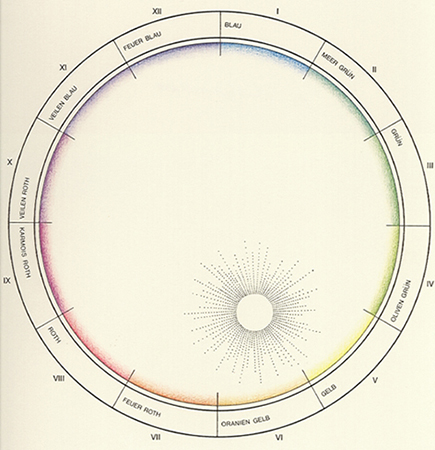
He wanted to make a wheel where the colours instead of Newton’s system (which related the area of each colour to wavelength, and the sizes of the colour compartments varied) had the same size of segment. He assumed that there is a knowable natural order to colour, one that would confirm the relationship among all forms of knowledge and he wanted to create a system that showed the links between the understanding of colour in different fields – natural history (and classification), natural philosophy, and artisan practice.
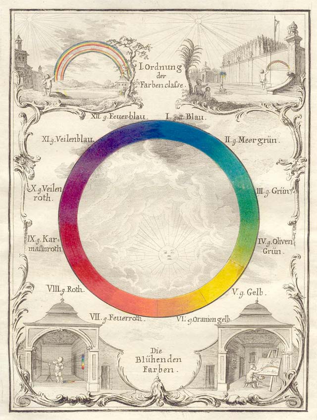
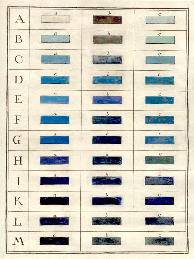
The colour wheel, he published in 1772, have as well twelve colours, including the three primaries, the secondaries formed by their combination, and six tertiary colours. Each colour has 12 x 3 colours, so the system is in all 432 different colours. Within each species are shades, a bright or pale state and a dark or deep state, as well as the original. He chose blue, his first color, to demonstrate this part of his system. The series, labeled A through M, shows the range of colors from bluish white through blue-black.
Schiffermüller for example wished to make the colour wheel nuanced, so it would express the logical connections between musical and chromatic harmonies: In music, especially classical music, chromatic harmonies means a twelve system musical scale with twelve pitches, each a semitone above or below another:
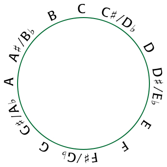
Because Schiffermüllers intention was that the music and the colours should have a logical connection, I decided in this project to translate the colours into tunes. I did it by taken Schiffermüllers colour wheel and compare it whith a chromatic wheel. Blue therefor became C and so on.
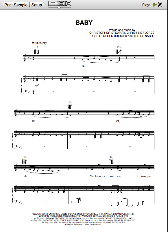
I chose two different songs for comparing: One by Justin Beeber and one by J.S. Bach; I started out with the tunes, tranlated the tunes into letters and then I used my system to translate the letters into colours:


I started out by painting squares in a line of watercolour for each song. I wanted to take it a step further not ending up with a small paper of colourlines. It was to close to an A4 paper of tunes, like the tunes I tranlated into colours. I wanted to create another visual outcome, which you like music – you listen to and not read on a paper – could be in, walk in it or around it, but make it a very different experience than listening to the two music pieces.
Here is the translation from tunes of Justin Bieber into colours:

The one the left is the beginning of both songs(J.S.B to the left):

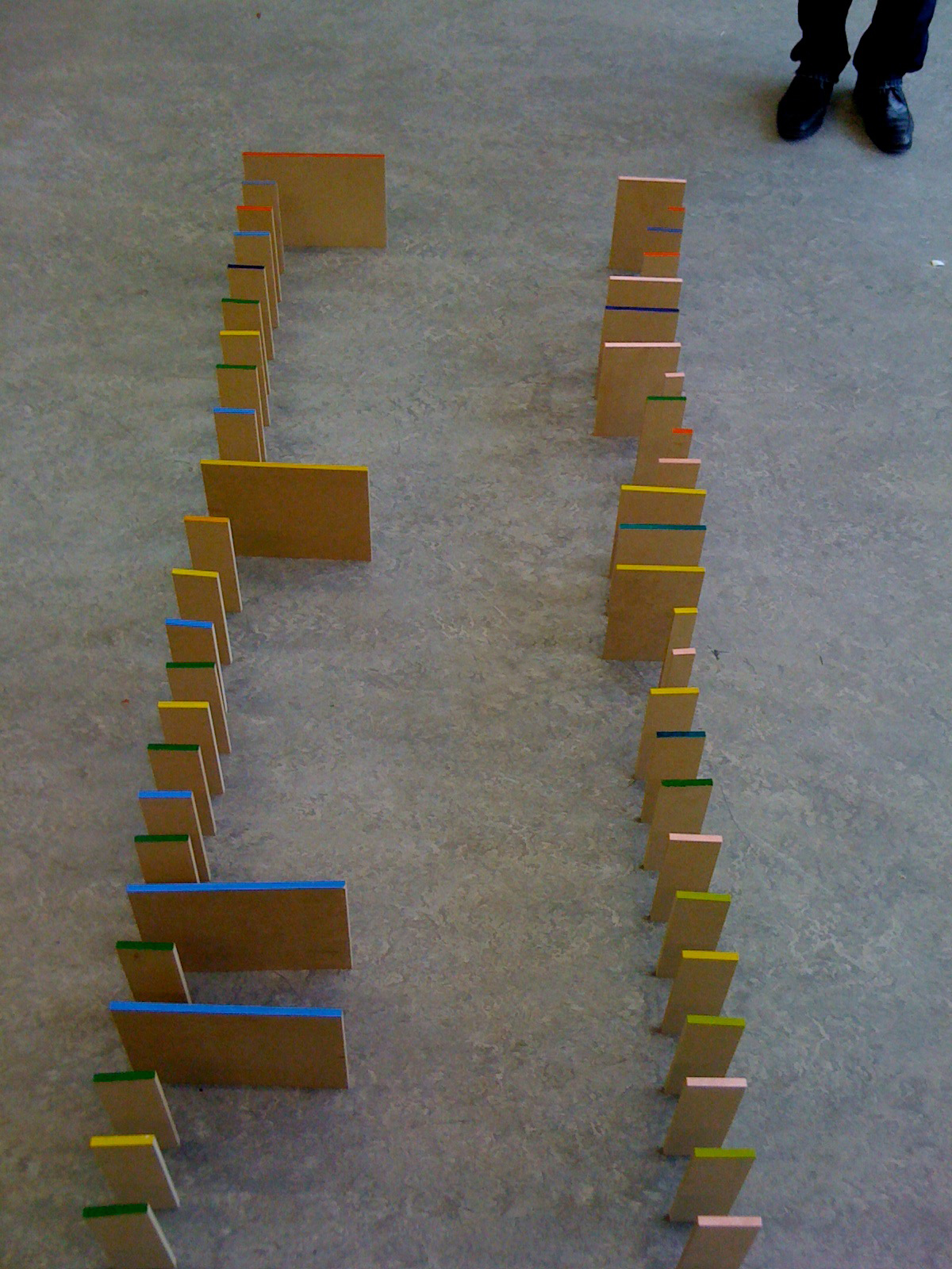
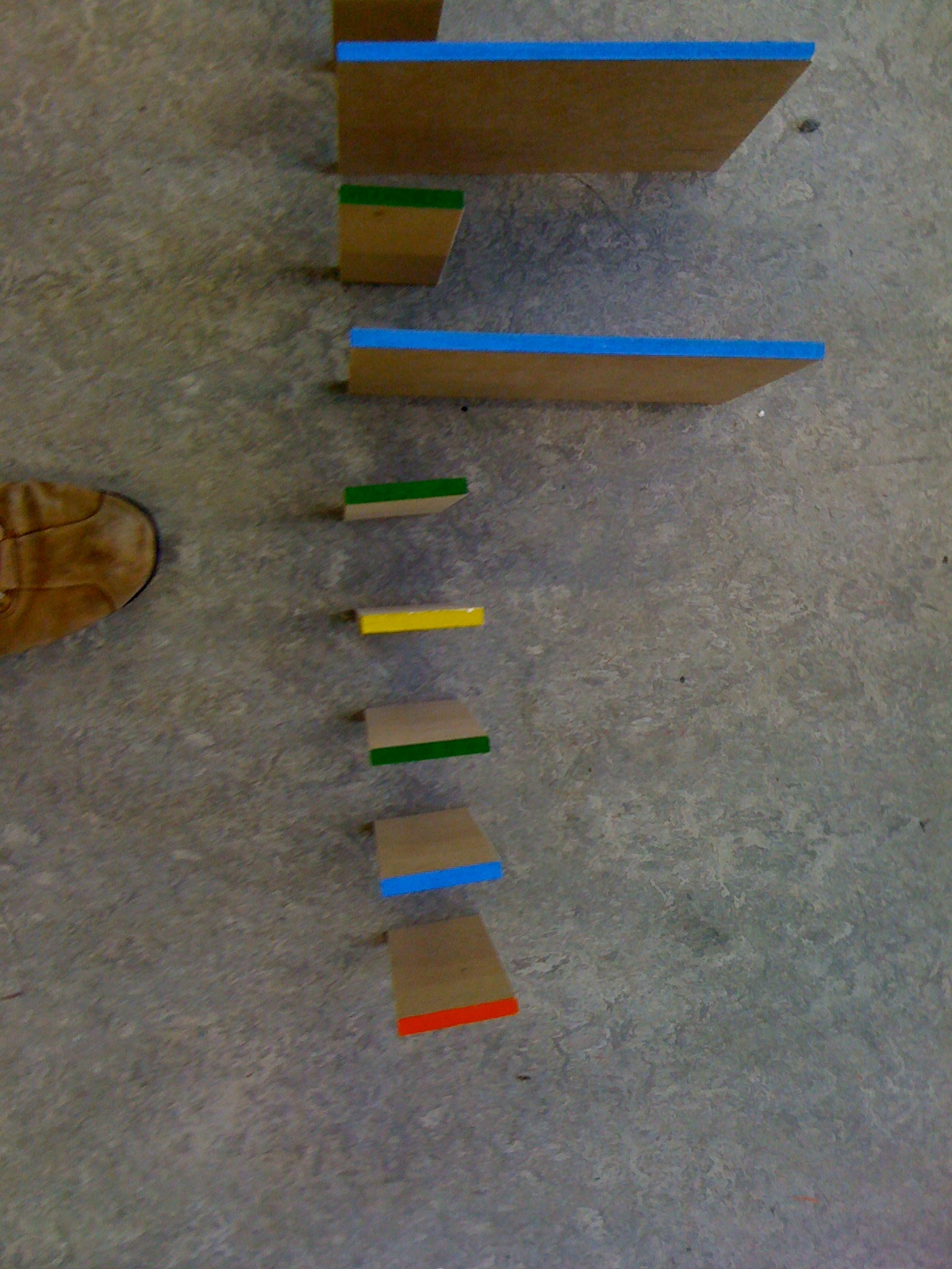
A colour sculpture was an idea in which I could have all these aspects included. But something was missing: The rhythm of the music! I started cutting out pieces of MDF, which sizes related to each other by size. The biggest piece was the whole note, the half of this note a half note, half of that size a quater note, half the size of a quater note a eight note and so on. Here you see two whole notes and seven quater notes translated into pieces of wood:

It became a sculpture, which you can not just read, but you are able to walk a round it. The Justin Bieber part of the sculpture, has primary colours and is very easy to look at while the Bach part has a lot of secondary and tertiary colours.
It’s not the meaning that the work is about music. It is first of all a study of translating from one media into another and ends up being a sculpture which two part defers from each other in shape and colour field. The MDF pieces I cut out according to the length of to tunes to give a feeling of the differences three-dimensional instead of two-dimensional. Though both two parts of the sculpture has the same look, the colour scales and transition of size gives a different felling. The Justin Bieber song has a very sharp look because there are almost no secondary colours and also the sizes of the wood pieces have a less softer look than Johan Sebastian Bach.
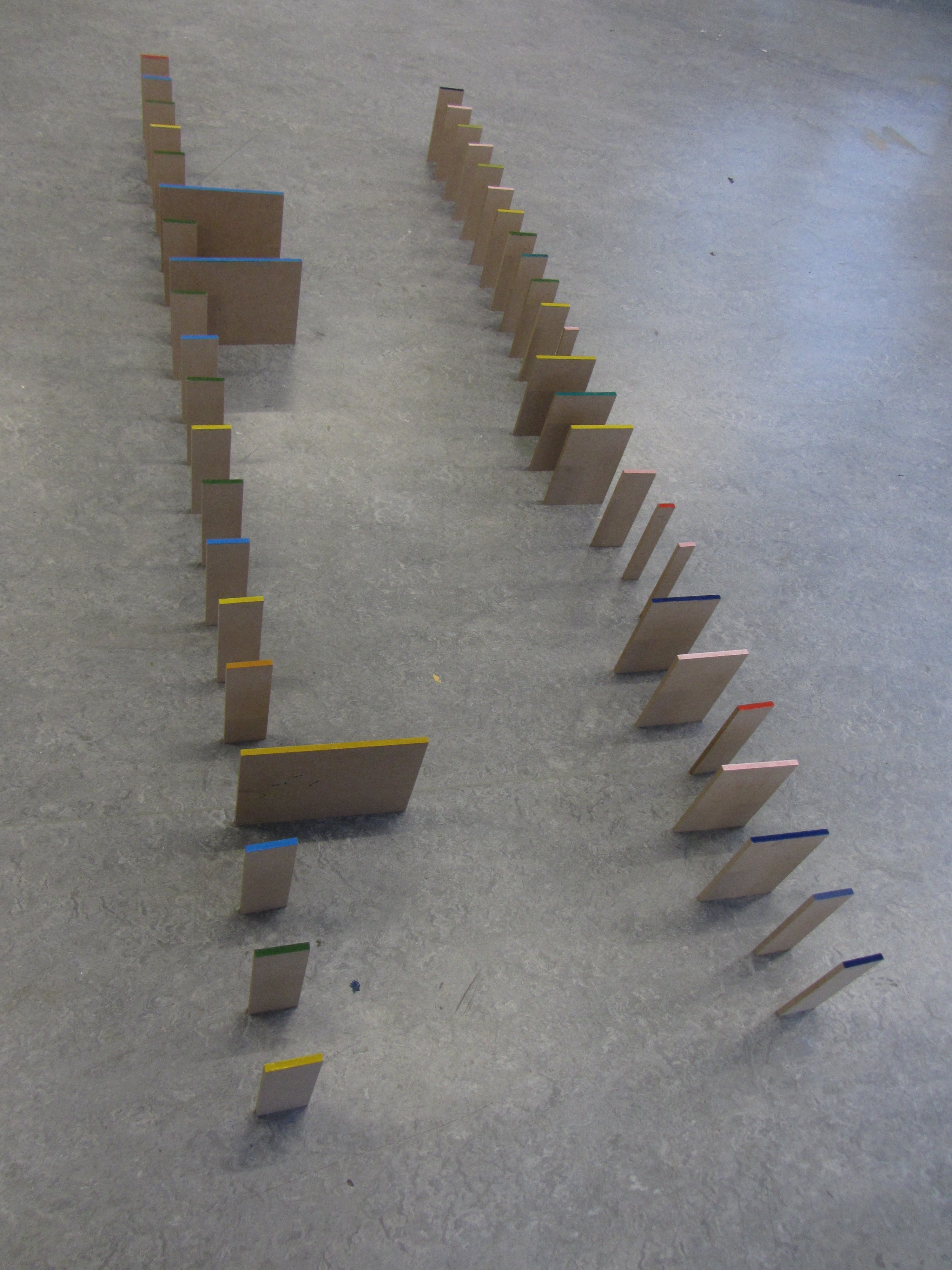
This sculpture is not made as a model, but I would love to make it in a larger scale so one could walk around inside it. Then I would have painted the colours on the surfaces on the sides instead of the top. Standing in one of the ends of the sculpture the colours would look more compressed the more you looked to the opposite end of the sculpture.