Skip to Content Skip to Search Go to Top Navigation Go to Side Menu


Archive for November, 2010


Use Designblog TravelTags


Tuesday, November 23, 2010

.

Visit all “50TravelTags”

.

from the Designblog tag-list.

.

browse mapping by Maria Micheva

It is not easy to navigate in the design world, let alone Designblog.
The 979 postings and over 2000 keywords turn it into a subjective maze. How are you going to find an entrance to amazing stories and surprising opinions. In-depth interviews and downloadable theses and research papers.
Before you know it, you turn from user to participant of a universe that sucks you in or swings you out.


browse mapping by Severin Bunse

Students from A group decided to help you along by browsing the blog for you. Becoming your guides, in a manner of speaking. Creating new tags that can serve as “Travel Tags”. [invention, ice-cold, climate, crisis, fun, erudition, rules, gravity, convention, removable, purple, symbol, social-talk, audio-zine, similarities, mode, funny-story, flexibility, women, do-it-yourself, icon, sharing, interpretation, role, masterpiece, travel, imagination, slowMe, play, peaceful-living, mystery, sexuality, reflector, 0-dimension, no-comment, theater, ideology, dress, sharing, hidden, art-of propaganda, dependency, break-up, sign, young, pulling-pushing, conditional, breakfast, porcelain, Norwegian-mythology]-tt. You can look them up in Designblog’s tag-list, under [50-TravelTags].

browse mapping by Anouk Buntsma

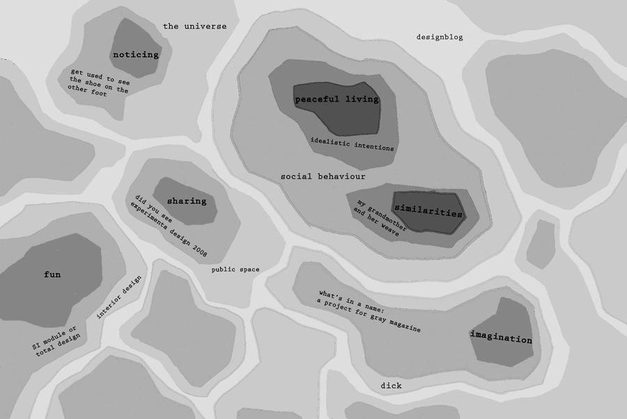
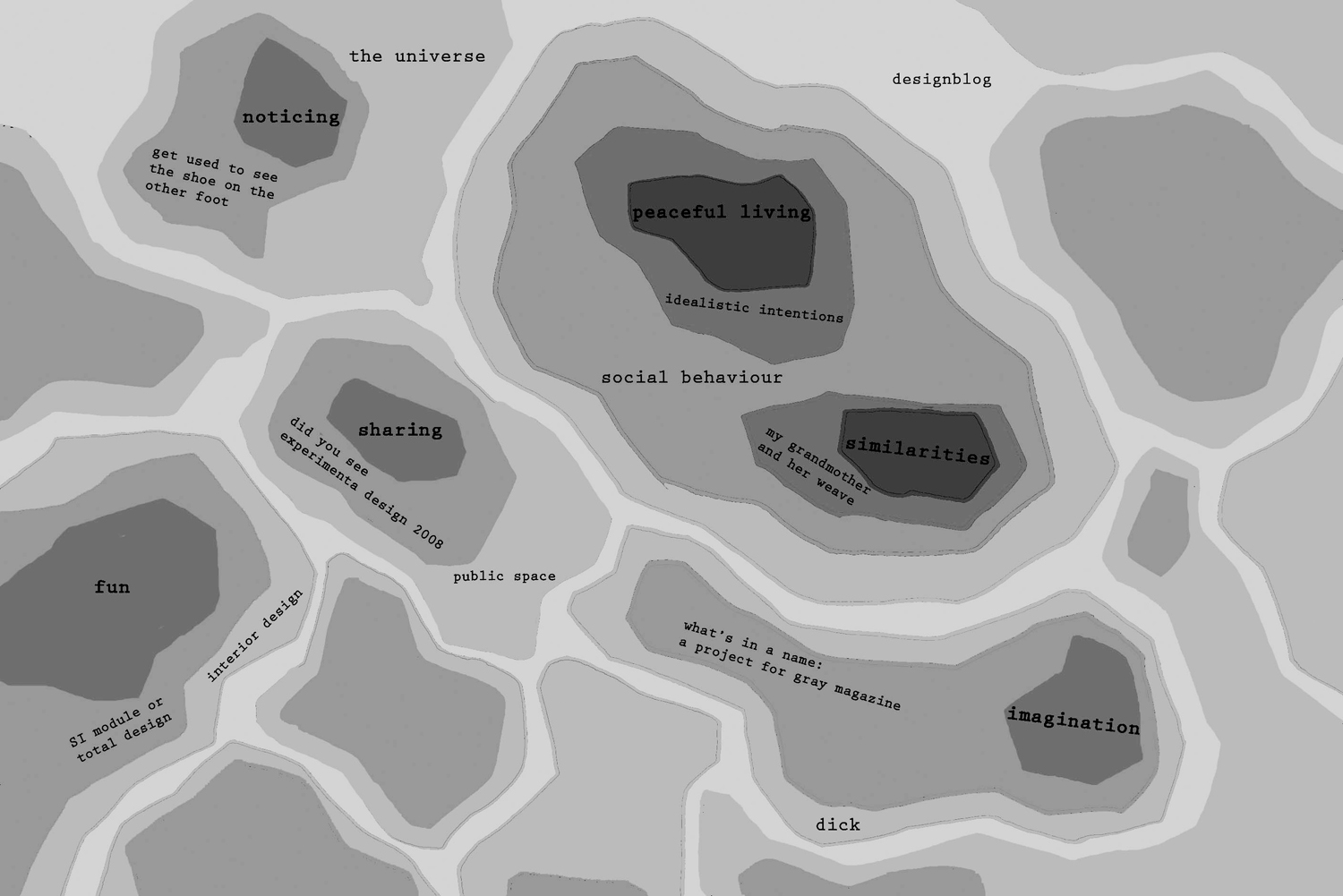
Browsing surely illustrates that Designblog can become a true Pandora’s box. On the TravelTag poster, which was printed on this occasion, you can see a selection of their journeys in the form of ‘browse-maps’. Visualizations of their browsing history. These visual sketches show clearly that browsing through the blog leaves a clear individual trace. No person experiences it the same way. The blog creates –by design– a colored travel experience that synchronizes with your personal taste and ambition.
mapping my browse history


Tuesday, November 23, 2010

Mapping_Anouk_bw2

Dutch Design Profiles


Tuesday, November 23, 2010

Designblog made a new link; to DUTCH DFA (Dutch Design Fashion and Architecture) “video profiles”. Presented at the latest 2010 DDW (Dutch Design Week) these profiles are part of DFA’s 4 years program that aims to strengthen the international position of these design sectors. Do enjoy the short video’s. Check out also Premsela Institute the much more interesting Dutch Platform for Design and Fashion. Have a look at their program of lectures and exhibits and their “pioneers of Industrial Culture Podcast series“.

To celebrate the exhibit Misfit of Hella Jongerius at the Rotterdam Boymans van Beuningen Museum –which we visited with E-group last week– and the kick-off of DesignTheory’s latest focus “The Designer as Artist.….”, based on an article in the 2010 5th issue of Metropolis M

we present . . .

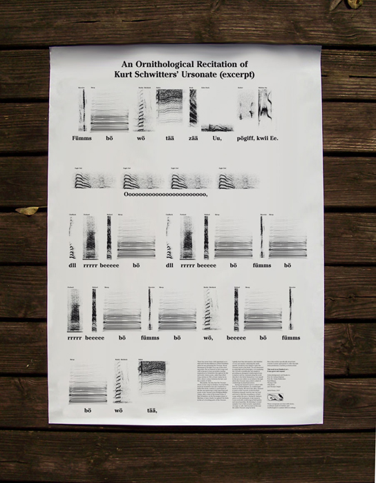
An Ornithological Recitation of Kurt Schwitters’ Ursonate


Tuesday, November 23, 2010

An Ornithological Recitation of Kurt Schwitters’Ursonate excerpt:

Get the Flash Player to see this content.

There has never been a full agreement as to what were the key influences on Kurt Schwitters when he was preparing the Ursonate. An interest in bird songs and calls is known to have provided a lasting inspiration for Schwitters. A later poem, called Super-Bird-Song, written in 1946, at least claims by its title a direct contact between the lyric and the sounds of birds. I gladly trust in this.

Whether or not I am merely continuing the myth myself, I would like to give the Ursonate back to the birds.

During my research I got in contact with Prof. Dr. Gerhard
Spitzer, an ornithologist based in Vienna. We met in his office, listened to parts of the Ursonate recited by Kurt Schwitters himself, read the text out loud and tried to find the resemblance of bird songs within the piece. Having Dr. Spitzers advice as the fundament of my research,
I now work with ornithological field guides and encyclopaedias. And try to recreate in this way the entire Ursonate sung by birds.

This work is not finished yet —
it may grow and expand.

Astrid Seme [x] graduated from the "Werkplaats Typography" (WT) master program of ArtEZ Institute of the Arts.[x]

for more information about a preliminary excerpt [2'55"] on CD

go to: www.markpezinger.de

Hompje klei


Monday, November 22, 2010

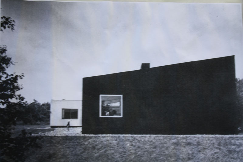
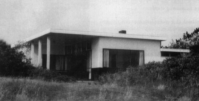
Het startpunt van dit architectuur project was een zelf uitgekozen gebouw van Rietveld, dat interessant was op basis van de relatie tussen binnen en buiten. Mijn oog was gevallen op twee surrealistische gebouwen, die in hun omgeving lijken te zweven.

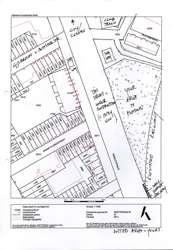
Naar aanleiding van deze gebouwen moesten we een publieke ruimte ontwerpen voor een groen stuk op de Wibautstraat.
Tijdens het bekijken van de plek viel het me op dat de gebouwen op de Wibautstraat totaal niet in relatie staan met elkaar. Het is een onsamenhangend gesloten geheel en de gebouwen dragen niets uit.

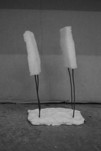
Ik kreeg daardoor een beter beeld van welke aspecten ik in mijn gebouw zou willen hebben. Het gebouw moest iets gaan uitdragen, open zijn en surrealistische aspecten hebben. Met deze gedachtes ben ik begonnen aan een reeks kleine sculpturen, al zoekend naar interessante vormen. Uiteindelijk heb ik er daarvan twee gekozen.

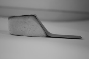
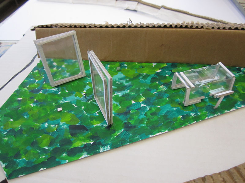
De een is speels, verticaal en open. De ander meer  organisch, horizontaal en compact. Ik heb de tweede sculptuur verder meegenomen in mijn proces. Vooral omdat ik de openheid en de speelsheid van deze vorm erg goed vond passen bij mijn doelstellingen en bij hetgeen waar de wibautstraat aan te kort schiet. Maar zodra ik die keuze gemaakt had, liep ik vast en veranderde ik mijn plan in twee krampachtige kubussen op poten, die schuin voorovergebogen waren en die als twee kijkers op de wibautstraat keken. Beide kubussen gaven via de achterzijde een ander uitzicht op de stad. Ik vond de kubussen op zichzelf mooie ontwerpen geworden. Maar het was te statisch en kwam niet overeen met wat ik wilde.

Uiteindelijk heb ik mijn plan omgegooid en ben ik verder gegaan met de organische sculptuur die voor mij veel meer mogelijkheden bood. Misschien paste deze minder bij mijn doelstellingen, maar hij stond dichter bij mij. Ook kon ik met deze vorm naar mijn idee het surrealistische aspect beter verwezenlijken.
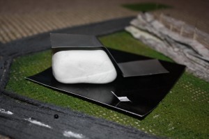
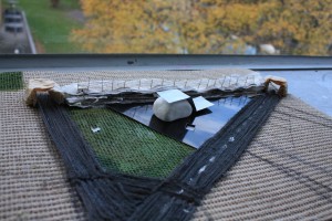
Voor mijn gevoel was ik nu op het moeilijkste punt van het project aangekomen. Het gedetailleerd bekijken en onderzoeken van de vorm. Moest er ruimte zijn tussen de twee materialen en de grond, waar zou de opening komen, moest de organische vorm ronder zijn of hoekiger enzovoort? Na veel uitproberen van verschillende mogelijkheden heb ik gekozen voor een iets rondere vorm en besloten om ruimte tussen de twee materialen te creëren en ook tussen de ijzeren plaat en de ondergrond. Hierdoor ontstonden schaduwvlakken om het gebouw heen die de vorm versterkten en de scherpte van het ijzeren vlak benadrukte.

Om dit aspect beter naar voren te laten komen heb ik een glimmende zwarte plaat onder het gebouw gemaakt waardoor het blok lijkt te zweven omdat er nu schijnbaar ook een schaduwvlak onder het gebouw is en het gebouw daarmee als het ware opgetild wordt.
De vorm van het gebouw wilde ik niet laten beïnvloeden door de opening. Daarom heb ik gekozen voor een ondergrondse ingang. De ingang is even groot als het blok dat als ondersteuning tussen de zwarte ondergrond en de ijzeren plaat zit.

Geniaal002


Monday, November 22, 2010

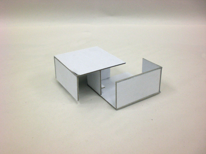
Open is not open. Closed is not closed. It can only exist next to each other.

Relativity was my starting point for this project. I wanted to create a space or building that existed out of an open and a closed area. By doing this it would be a building for everybody and every moment. It would be a contrast between introvert and extrovert. A place where you can be alone and with people. Where you can play and think.

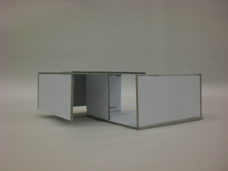
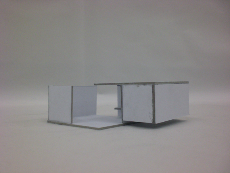
A very nice thought but how to do this? I started with making 3D sketches out of cardboard. While doing that I tried not to plan to much. I had relativity in the back of my head and just started to make things that interested me or forms that I thought were strong. I did this till I had enough sketches and ideas. Then I put al the good ideas together and made a very complex building that was on one site a sort of bunker and on the other side an very open place. There where to much forms in it, so the starting point of relativity was far away. One of the sketches (witch I didn't used) was a very simple form of two squares who overlapped in the middle, by doing this I had created two rooms. Because the squares where turned, the one room had no roof and the other did. This was a very simple way of making use of an open and a closed area.

There where still some problems,  The closed area was open on two sides so people can walk trough, this would create to much dynamics for a room witch suppose to be an closed room. The open area had still two walls so you didn't have a view witch is very important for an open area. There was a very simple solution for this, I just cut one of the walls of the open area in half and put it on one of the exits of the closed area. Because I started to work with squares this fitted precisely.In the open area you can look at the sky and in the closed area you can look at the grass. There was only one problem, because I closed one of the exits in the closed room there was no light in there and I couldn't make windows because the room would be to open. So I cut the lower part of the two outer walls away. Now there comes light from underneath. The focus lies now on the grass and there is light but not to much.

There still have to be a bench in every room. I decided to place the bench of the open area in front of the open space so you have a view from there. The bench of the closed area I decided to put on the wall witch I closed of the area with, so that it is in the corner where it is the most quit. By putting the benches this way it also supports the symmetric form of the building.

Now I created a building made out of two parts: an open and a closed one. In the open one you can can see the sky and people can walk trough so there is a lot of dynamic there. The closed one haves only one entrance and exit so you can't walk trough. Your walking on grass and there is not much light.  I have made a contrast between an introvert an a extrovert area. The building shows the relativity between the two.

Boxes in the air


Sunday, November 21, 2010

I want to create something that is appealing to me both visually and intellectually. Something that will seem easy but yet complex without feeling pressured and stiff. Something that will breathe Rietveld but not be overtaken by it. Something that is made by me.

Our starting point is Rietveld, and our other starting point is a place in Amsterdam, at Wibautstraat.

Without exactly knowing what I wanted to do I started with taking pictures of the trees there, the motorway and the small bridge at the entrance to the triangle.

Scale is not my best friend and I decided to work mainly thinking about the surrounding and the visual view. My first idea was to create something inspired by the Rietveld zomerhuis. A house which would be standing free in the air. Of course lifted with the help of panels. I wanted to create a place where on one side, the one looking to the road, it would seem that there was just a wall and once you go behind it you would find an oasis looking to the tree. I was inspired by the uplifting feeling of the zomerhuis like it was floating in the air. Something spacious and airy.

photo by Malin Nordin

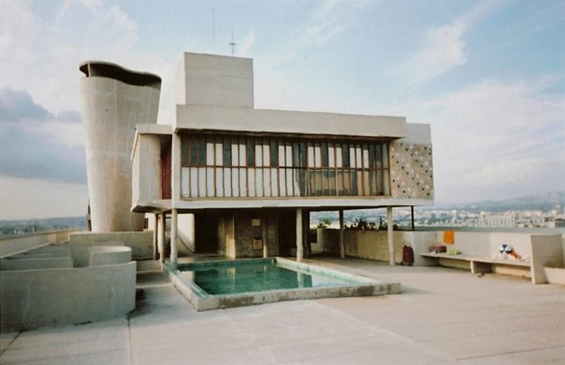
Gerrit Rietveld "Zomerhuis" en La Corbusier "La Cité Radieuse"

Once I started building it I found another picture that pushed me to the direction where I ended up. A house in Marseilles, built by Le Corbusier.
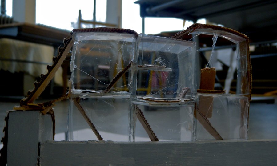
Transparency and greys would be the vital parts in this ”building”

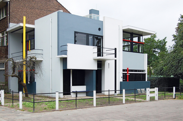
I want to create a view for the person sitting in the box, I want to choose where the person should look, a little bit like Rietveld did at the Schröderhouse, before the bridge, motorway and new building was made. The boxes are placed in different levels, connected to each other by staircases.


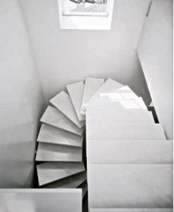
It is a sort of labyrinth that can be seen as difficult to get around in. But it is an open obstacle that I think makes one more intrigued to visit. When you stand on the side were the grey wall is you still can see the transparent boxes, which is made with the intention to be seen. Just a little bit, so that you feel forced to go around and see what is hiding there. They are all connected with stairs and bridges. Like a playground and a relax area.

(more…)

The square is our cross


Sunday, November 21, 2010

With the first design lesson we started to take inspiration from the Rietveld building. I feel quite overwhelmed by the infinite possibilities that it offers, rich in detail and at the same time simple forms.

Now almost a half year has passed but I still feel like I have only just touched the surface. I could go on for years getting inspired by him, he may have already become one of my idols.

THE GARMENT

We were asked to design a garment, inspired by the building, but also a practical piece of clothing for students or/and employees of the Academy.

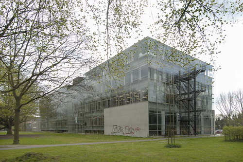
I thought about the transparency of the building, which Rietveld used so that the students can spread freely in the premises to work non distracted. To connect the inside with the outside was his clear intention.

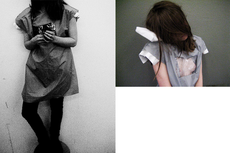
So I started with a pinafore with coated fabric from which the water or paint of the working students can drip off. In the front I placed a mood-board, like a display out of transparent fabric which you can use to demonstrate your current interest (connecting inside and outside). You can put a picture inside or you show your naked body, if you`re proud off it.

A detail that I wanted to use were the white brick walls at the front of the building, which protrude 15cm from the glass. Rietvelds intended each material to have its own space. So I made two padded retangles out of a white fabric. They can be used as a pad and at the same time as a pillow on which you can rest in the meantime.

I made a second piece because I also wanted to work just with an all-optical process without any useful effect.
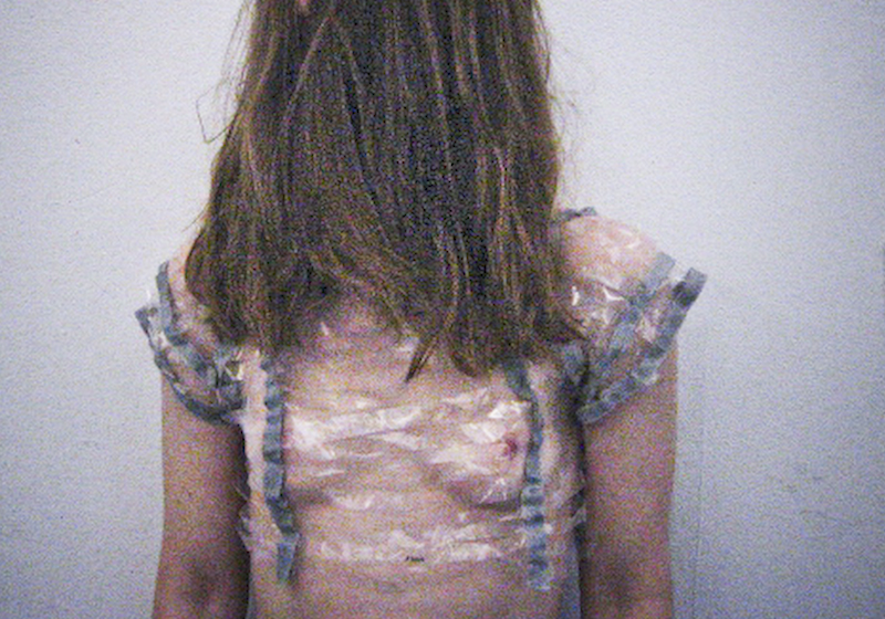
I took the gray vertical bars that crossed with horizontal rows of far reaching windows. I tried to create something that respects the human body with the delicateness of transparent and thin lines. Translating the skeleton of the building in a second skin.

(more…)

As the cube became a Box


Sunday, November 21, 2010

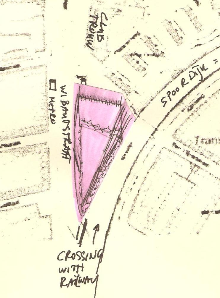
Park at Wibautstraat, near Amstel station together with Rietveld architecture, become a starting point for the creation model of new building.

map and inspiration

The Rietveld Schröder House in Utrecht was built in 1924 by Dutch architect Gerrit Rietveld for Mrs. Truus Schröder-Schräder and her three children. Inside there is no static accumulation of rooms, but a dynamic, changeable open zone.

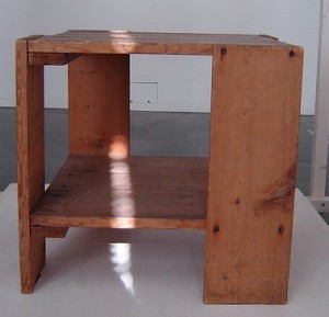
The functionality and rationality of the Rietveld-Schröder house inspired me to create something useful. When I started to think about it and tried to get more information about Rietveld architecture I found a table which gave me the idea to create a box for homeless and students.

Box & environment

Park at Wibautstraat is a perfect place for “Boxes for the homeless and students”. Trees in the park hide “shelter” under their crowns, but the bright colors of boxes make their way through the green “ceiling”. Boxes can be placed anywhere in the park, because they are mobile and each box is attached to a bench. Main functions of the benches are the storage place of cardboard. Yellow bench – for the new cardboard (which serves as a mattress inside the box). Black bench – for used cardboard (which can be used to fuel the fire in fireplace). I chose cardboard because every day in Amsterdam a huge amount of cardboard is released, so that it can be delivered to the place from the special services or concerned public.

(more…)

Stairway-Bridge


Sunday, November 21, 2010

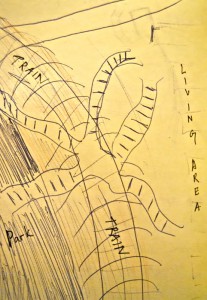
The space that we were to make suggestions for had a feeling of both uneasy turbulence and mediocrity. The way a small triangle shaped area of grass and trees is placed on Wibautstraat next to the train tracks, and the entrance to the metro by a big road makes it useless as it is now. The slope that leads up to the train track and the many trees also increases to the dark and uninventive atmosphere. It doesn’t look, fell or act usable, appealing nor enjoyable. I do believe this location needs a green resting point, but the present one has

hollowness to it

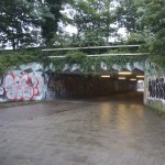
My first feeling being there was that I got distracting by the noises from the cars and especially the train passing on a little hill next to it. Also the passage to the living area on the other side of the train tracks is just a dark and uninviting tunnel, one that I wouldn’t enter happily at nighttime.

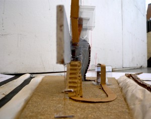
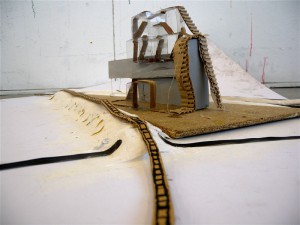
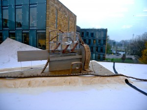
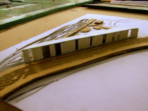
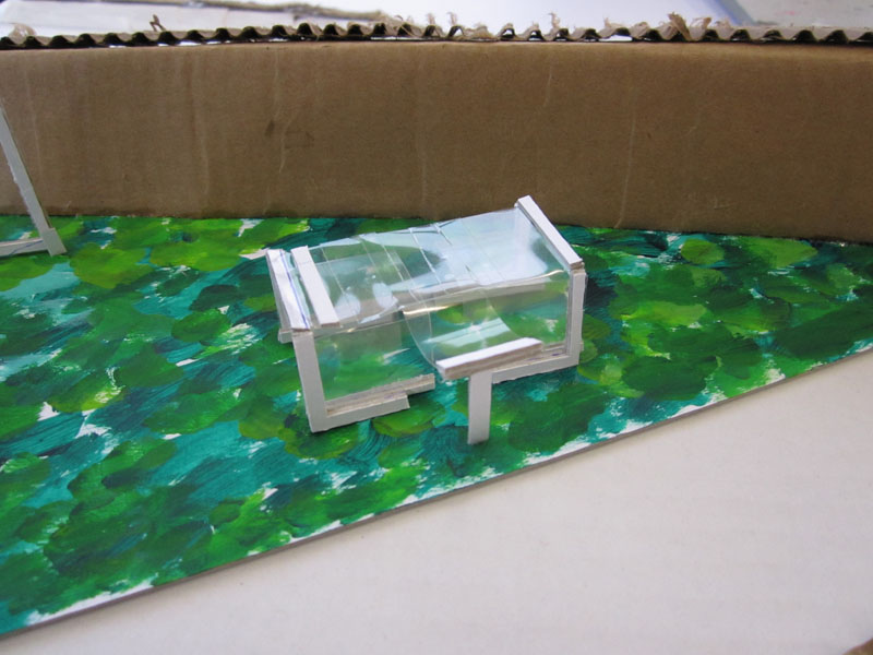
My idea with the model is to cover the train tracks with a soft waved tunnel with stairs on top and different level of balconies. Creating a space over the train tracks, and also presenting an alternative of fast passage, which is now only directed to the tunnel under the train.

Connecting the triangle park with the living area by adding the stair-bridge the whole place will be more whole since you can walk on top it and have a broader view. I think that removing one of the disturbing sounds (that of the trains) would also make the areas next to it more appealing because of the new harmony. And you also have a usable area on the top with the the different level balconies. It will be a lighter both physically and mentally


(more…)

Thinking out of the white cube


Sunday, November 21, 2010

The Parooldriehoek is a triangular piece of land, somewhere in Amsterdam-Oost. A piece of land with little character, between the busy Wibautstraat and the train tracks. I hadn’t really ever noticed this plot, and I started to wonder why. It’s not that I never pass through that part of the city; I visit the adjacent club Trouw regularly. Maybe that’s the problem.

Every time I’m there, it’s night. And there’s not very much to see there during the day, let alone during the night. It’s a very dark and uninviting piece of land. Some even say they feel uneasy walking in the area after dark and that is where I could change something.

I was going to give the city something to be proud of, and I was going to make this little triangle memorable and comforting. I wanted not only to make the outside a part of the interior (much like Gerrit Rietveld himself used transparency whilst designing buildings) but I also wanted the surroundings to be affected positively by the presence of a new building. I wanted to make this a place people wanted to visit instead of wanting to avoid it.

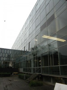
With this in mind, I designed a glass library, a place that hides nothing in the dark, but shows everything. Just like the inspiring architecture of Rietveld’s academies. Two fine examples (one in Amsterdam and the other in Arnhem) of how a construction of steel and glass can give a large building a very light aesthetic. Two buildings from which the outside and inside are of great influence on each other.

(more…)

Old church Amsterdam


Saturday, November 20, 2010

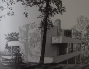
Because Rietveld’s architectonical designs don’t inspire me that much. I don’t like the straight shapes he uses most of the time and the sober way of designing his buildings. So it was quite a task to pick one. So eventually I picked ‘van Slobbe House’ because it was build in a hill halfway. And because most of Rietveld’s buildings are build on flat ground I found that part interesting. And Rietveld used the fact that it was built on a hill in a very smart way as you can see on this picture. On the left image below you can almost see the building ‘float’ of the hill.

With this as a starting point, I continued with a certain aspect of Rietveld’s way of thinking; the placing of a window. This was a very important to him. He never placed a window out of the blue. He considered the surroundings sincerely and looked for the best view. And there he placed the window and considered the size of the window depending on the view. This thought interested me. So I went on with it. My first try was some sort of bus stop with different sizes of windows as you can see on the image above.

During an academical trip to Valencia Spain, I found out that I don’t have much affinity with modern architecture [x]. ‘Old’ architecture drew my attention much more. I had more affinity with that kind of architecture. And especially churches interested me because of their unique atmosphere. It felt to me that older buildings had much more of a soul. But where does that soul come from? The answer I from the windows and the old material they we’re made of. The way light falls through the stained-glass windows. Where churches are famous for of course.

(more…)

The hole in Wibautstraat


Saturday, November 20, 2010

Our assignment was to get inspired by a Rietveld building or Rietveld concept, and make a scale model for a new building in the the small triangular park at Wibautstraat, near Amstel station.
At first I and my classmates went to the spot at Wibautstraat to measure the whole area and be familiar with the surroundings.
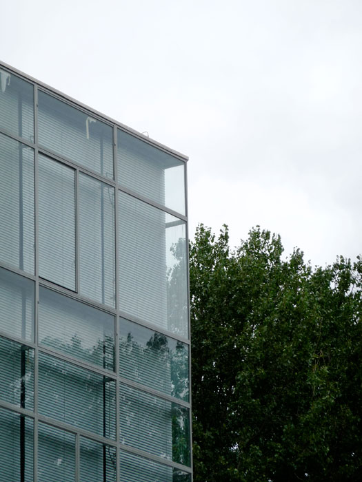
In the beginning I was looking at the Rietveld Academy’s corners. I guess a lot of people do that, because they are quite fantastic.
I went outside looking at the academy in rainy weather, and I took some pictures of the corners of the academy.

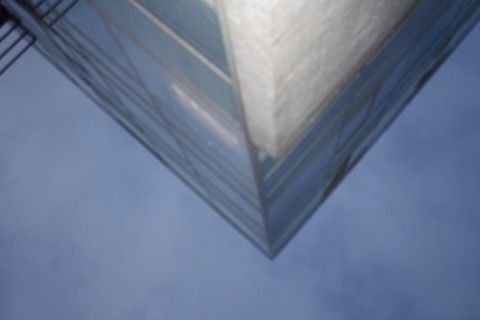
Then I imagined that it would be dirt that surrounded the high corners of the academy building instead of the sky.
So then I got this idea, to put the whole glass building upside down, and then down in the ground, or a big triangular hole at Wibautstaat.

The corner of Rietveld Academy upside down:

Then you would still be close to nature (as Rietveld wanted it), not the same light nature, but a much more dark and deep nature. I liked that idea.
So this was my starting point.
(more…)

Wand


Saturday, November 20, 2010

We hebben de ‘Parooldriehoek’ in Amsterdam bezocht. Voor Design hadden we namelijk de opdracht gekregen de plek te verkennen om er vervolgens zelf iets voor te maken, wat wel voldoet aan de eis dat de huidige functie behouden blijft en het geïnspireerd is door één van Gerrit Rietveld’s ontwerpen. Dit hoeft niet persé één van zijn gebouwen te zijn. Wat ook belangrijk is dat de keuze van het Rietveld gebouw gebaseerd is op de manier waarop hij een relatie legt tussen het ontwerp en de omgeving.
Om de Parooldriehoek en de omgeving te verkennen hebben we bepaalde elementen, zoals de brug, opgemeten om een idee te krijgen van hoe groot het is en om de verhoudingen te kunnen begrijpen. Tevens foto’s en snelle schetsjes gemaakt.

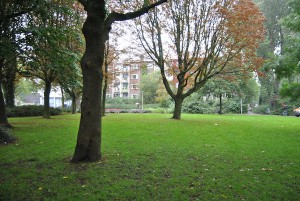
De Parooldriehoek wordt omgeven door twee tunnels, een fietspad en een spoorbrug. Er zijn daarom uiteraard veel mensen en veel verkeerslawaai. De plek zelf ziet er, simpel omschreven, uit als een stuk gras met wat bomen. Het is fijn om er zelf heen te gaan, omdat je dan behalve de visuele omschrijving ook een bepaald gevoel bij kan krijgen.

Ik vond het mooi dat het is alsof je in een geheim, verlaten parkje terecht komt, dat omgeven is door zoveel drukte en lawaai. Dit is dan ook wat ik wilde behouden en versterken, door middel van het bouwen van een wand, maar wel één zodat de plek nog steeds toegankelijk is voor mensen (en dieren..). Om van buitenaf naar te kijken of om er ook daadwerkelijk “binnen te dringen”.
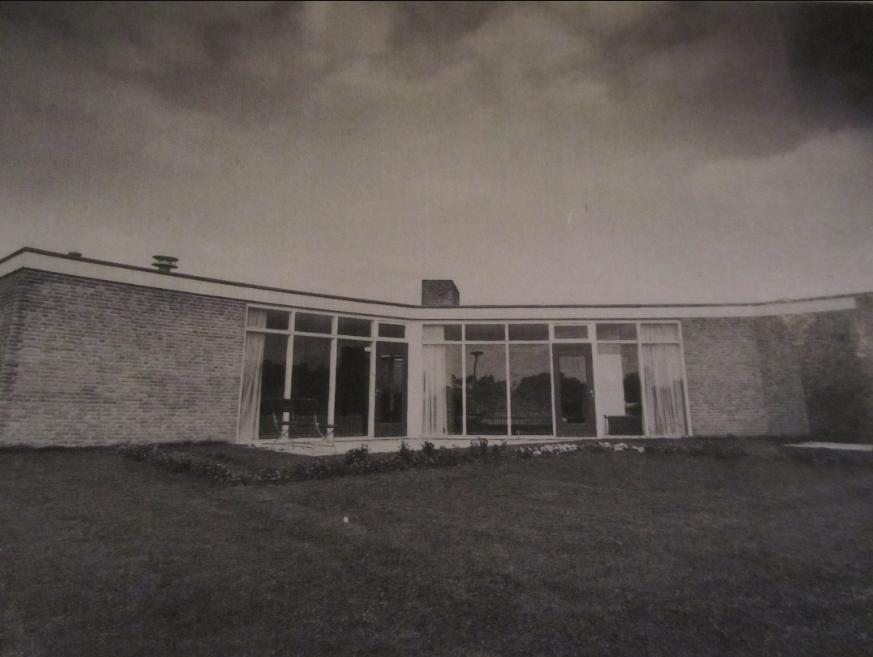
Mijn inspiratiebron is het Huis Rietveld uit 1966. Wat me hier aan op viel is de richting. Op de foto zie je dat het een soort van halve cirkel is die wijst naar het stuk open grond. Het heeft iets krachtigs en groots.

(more…)

The least construction


Saturday, November 20, 2010

The most amusing thing in Rietveld’s construction is the combination of the large window, horizontal and vertical lines.

The important factor of Rietveld, which is linking the inside and outside of large window gives not only physical visual effect, but also the feeling that it is as if the space is being expanded in the mind. That is why I thought that the space he made is not fixed, and is flexible in terms of mental and physical condition.
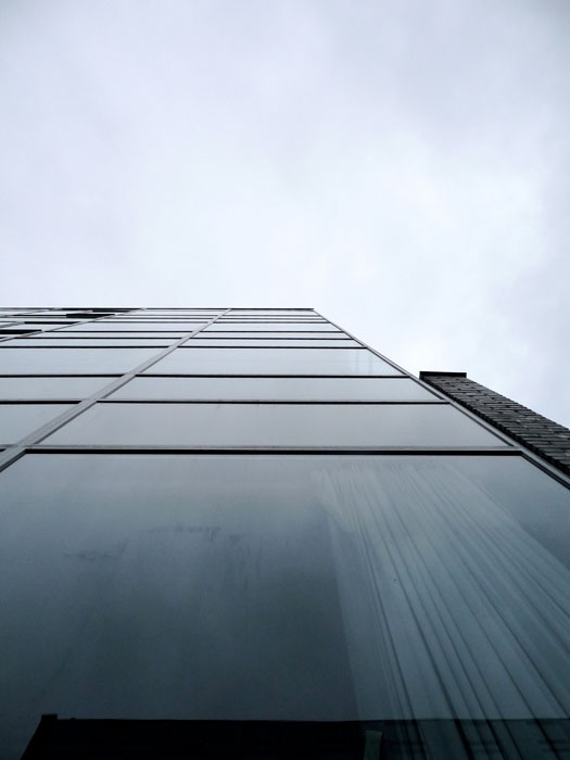
Therefore, the point of my work is expansion and communication of space, and minimization of boundary.

The forest (small park or also called Parool-driehoek) is the only empty space in the area and the only nature.

That is why if people make something artificial there, it should be at the least, and that it should have synergy effect to people who enjoy the only small nature and give the least damage.

That is why I have thought about de architecture. It is construction, but it is a construction with the most open form and it can have form at the least level whenever desired, and if necessary, it can have different size, which was what I wanted. It is because I have always thought that construction makes much break off.

I wanted to make a building with only windows with the most maximized form. It can be glass wall or also a frame without glass. I want to attempt a building which exists as part of the great nature, and not a building with external environment drawn inside. So, a building which exists for nature, and which exists for the people who enjoy the nature, and which has only the least function,

(more…)

Wibaustraat a place to relax


Saturday, November 20, 2010

for my Rietveld inspiration I choose for the transparency that Rietveld used in a few of his buildings. The primary reason for choosing “transparency” was because of the sunlight that is entering. The model that I made is of a structure that mostly is made out of glass and also the opposite of the forms of his buildings. Instead of the square form I gave most part of  my building a round form, because I didn’t like the square form. For me these forms are a little bit stiff.

To know what to build , I did a little bit of research by interviewing people in that neighbourhood. It turned out that people had this sort of negative tough on this area. For that I wanted to changes that sort of thinking. I want to put something that would give you a save and at the same time a relaxing feeling. Also because the places there are very crowded, I want to make it as cozy as it possible can be.

there for I made this “art park”

not just a park but something out of the

ordinary like a big sculpture. A sculpture in which you can walk. A place for family and friends also a place that will attract tourist. There is also a space where artist can exhibit and where students can demonstrate their work.

Reasons why I have chosen for this is because more should be invested in art and that this is just as important as anything else. What is also important that people will get a different picture of the area itself and that it will make you feel safe and comfortable. Everybody else can see that art is not about what an artist does, but what he wants to achieve.

In each room there will be different activities. In the round tube people can walk and have a conversation. In this round tube there will be places like a long sofa were you can just relax. A certain music will be played while laying there. In the second space you will see a blue sofa, here you can have a relaxing and romantic moment with your partner and because of the transparency of the building you have this great view of the whole area surrounding you. In the square space different exhibitions can be hold off artist and students
Because I was inspired by Rietveld there will be a statue placed of him at the front of the park. Written on a big board: ART PARK INSPIRED BY GERRIT RIETVELD.

Weightlessness


Friday, November 19, 2010

The location was given: it was a triangle shaped empty area at the Wibautstraat in Amsterdam where now only grass and trees can be found. The area is bordered by the railway, a bridge and a tunnel. They are important as the main parts of the surrounding which we had to take into consideration as well.
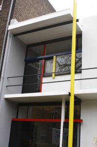
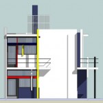
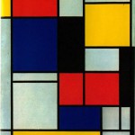
I chose the Rietveld-Schroder house as the starting point of my idea. The facade of the building consists of different basic geometrical elements, which seem to float freely on the surface of the building. The street side of the house has much in common with the minimalist, so-called Neo-plasticist paintings of Piet Mondrian, although the relation of the two, who influenced who, is not clear and it is very much likely that they developed their works independently.

This free variation of elements gives us the feeling that the house could be turned on any side and still remains an autonomous object.
Inspired by these characteristics I set out to develop my own construction made up by hovering elements, more sort of an installation of different objects than a habitable architectural building. The structure is supposed to give us the feeling of interchangeability rather than solidity.
(more…)


Log in
subscribe