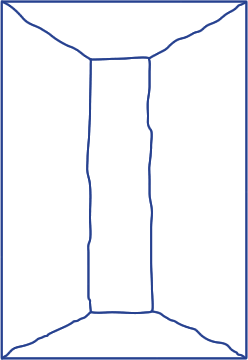
The location was given: it was a triangle shaped empty area at the Wibautstraat in Amsterdam where now only grass and trees can be found. The area is bordered by the railway, a bridge and a tunnel. They are important as the main parts of the surrounding which we had to take into consideration as well.
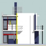
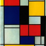
I chose the Rietveld-Schroder house as the starting point of my idea. The facade of the building consists of different basic geometrical elements, which seem to float freely on the surface of the building. The street side of the house has much in common with the minimalist, so-called Neo-plasticist paintings of Piet Mondrian, although the relation of the two, who influenced who, is not clear and it is very much likely that they developed their works independently.
This free variation of elements gives us the feeling that the house could be turned on any side and still remains an autonomous object.
Inspired by these characteristics I set out to develop my own construction made up by hovering elements, more sort of an installation of different objects than a habitable architectural building. The structure is supposed to give us the feeling of interchangeability rather than solidity.
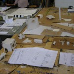
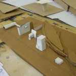
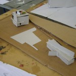
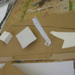
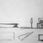
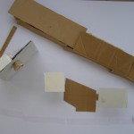
My first step was to understand the “trick” of the Rietveld-Schroder house to a certain extent. Understanding it entirely would have been way too ambitious but I was able to get some main ideas about basic geometrical elements (squares and lines) and their positioning. I did so through drawings, two smaller scale-model-sketches and some smaller models.
These smaller tryouts helped me to experiment with different forms and finding their proper place on the spot. The focus was on producing a lot of these tryouts in a fast manner.
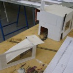
In the second step I made more tryouts but in bigger scale with more details. While at first I decided about the main forms of the buildings the more detailed work allowed me to think about features such as windows and doors.
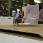
At this moment I felt the urge to conclude the different versions into one solution. However, I was not completely happy with the things I had so far therefore I went on experimenting with other forms, meanwhile, using the already discovered elements. I made more sketches in drawing and also in scale-models, this time bigger, and with more materials. (I had used only cardboards so far).
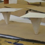
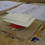
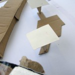
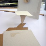
At this point I discovered a possible solution to give an object the feeling of floating. The key was to realize that the horizontal floating of the elements on a facade could be turned into vertical floating by placing big flat squared panels on thin columns or walls.
This also matched a motive I had found earlier namely the flat geometrical form that can be placed on the ground determining a space without walls. (a “square”). The look from above gives us the sensation of flat surfaces floating above the ground. With the “square” it also has the unity of elements. In this manner I changed the point of view from which the site should be observed. While the Rietveld-Schroder house façade could be appreciated from the side (street-view) mine is rather interesting from the bird’s-eye view. The side view has a different effect on the spectator.
With this concept it became necessary to introduce a high building in order to provide the bird’s eye view to visitors. Therefore I added a building, which I developed from an earlier model. This object is higher than the panels placed on columns giving the possibility of a view from above.
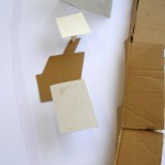
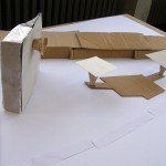
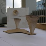
6 photos of the final version
On one side of the building there is a sculptural element, which seems to float on the big homogeneous surface. This can be seen from the ground giving the first hovering effect for the spectator who approaches the area. One then can climb up to the top and look down to experience another sensation of “floating elements”.
A possible development of the project is to refine the position and size of the columns and panels thus creating bigger or smaller spaces for the audience.
