Hereby I introduce you to my proposal for the ‘Parooldriehoek’ at the Wibautstraat in Amsterdam. It is the result for our latest design project at the Gerrit Rietveld Academy. For this project, we had to choose a building from architect Gerrit Rietveld as our inspiration before thinking about a new construction for de Parooldriehoek.
Below, you can read about my inspiration, starting points, development process and important factors in the translation process. I will also explain how my starting points eventually converted into the final design. Hopefully you get inspired by this proposal.
starting points and inspiration
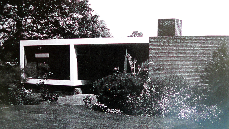
Earlier on this designblog, I had already referred to the ‘Huis Singelenberg’ of Gerrit Rietveld that I specifically admire because of it’s simplicity, and the perfect balance between open and closed. I allowed myself to get inspired by this design for my proposal.
Gerrit Rietveld is widely admired for his timeless thoughts on viewpoints and placing windows. The choice of specific viewpoints was one of my starting points for this project.
The Parooldriehoek is situated at the ‘entrance’ of Amsterdam. Therefore, this place definitely needs a construction that welcomes the visitors of Amsterdam.
I tried to focus on the view from the road that comes out of the tunnel.
The goal was that the building is the first thing you see when entering the city. A landmark that can be used as a reference point.
developments
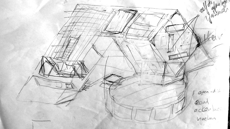
In my initial designs I experimented with open and closed square forms, trying to put them together in a way that seemed logical. But somehow this approach did not work for me.
To understand how to work with the views, I had to recreate the surroundings of where the building would be placed first.
Then I visited the Rietveld Schröder House in Utrecht and an exhibition on Rietveld’s designs. Here, I learned that Rietveld preferred constructions in which most parts of the building can be developed in a factory. I liked this idea.
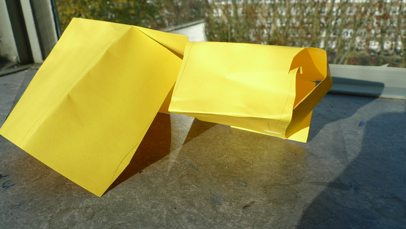
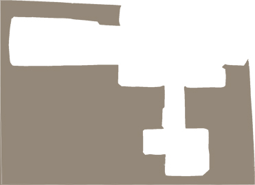
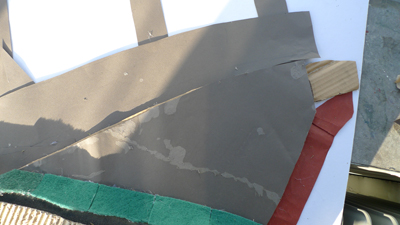
Therefore, I decided to make something that could be made entirely from one piece. This forced me to simplify my design: no longer did I have to puzzle and try to fit different shapes together. I started with the sketch, then made a 2-dimensional form that could be folded into the eventual shape. The balance between open and closed would be found by choosing where and – also important – where not to place windows.
how starting points were converted into the final result:
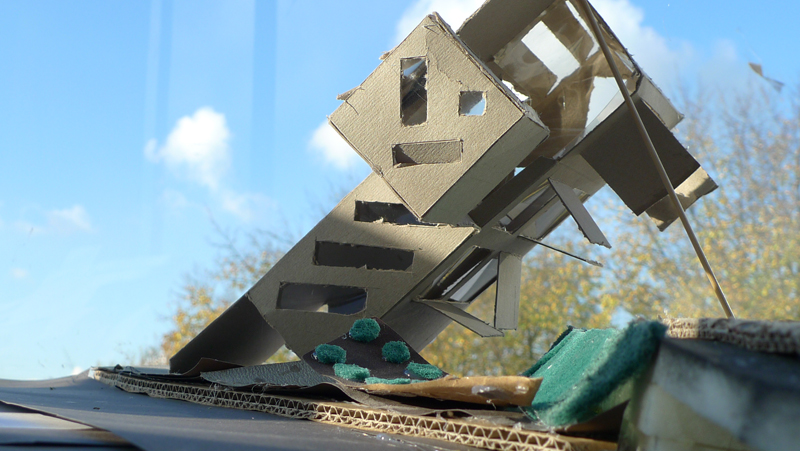
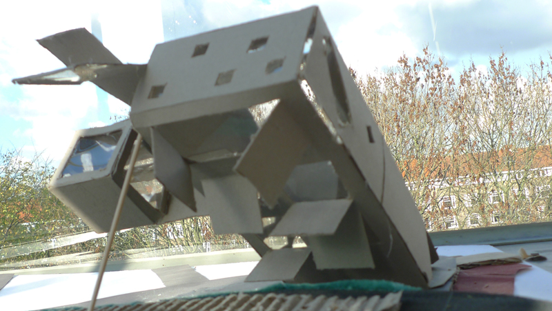
When I had my shape, I started to place the building in its surroundings . Tipping over a building 45 degrees ma seem silly, but this way I could create different viewpoints.
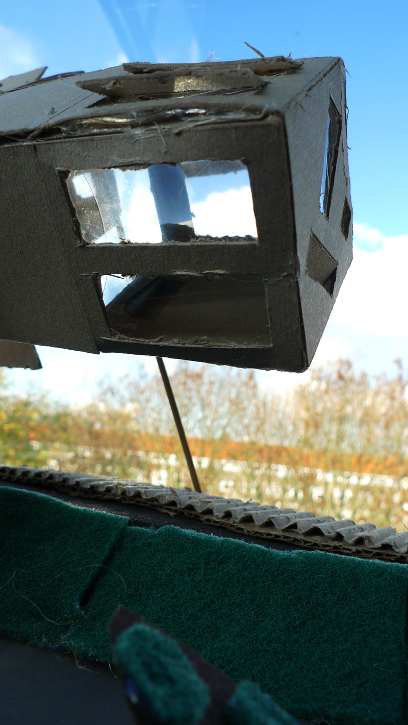
For example, from the ‘floating cube’, there are windows from which you can only see the cars entering the city through the tunnel. The visitors of Amsterdam and the inhabitants of the building are now meeting each other in a unforced manner. This contributes to a cosmopolitan feel for both the visitors as the people in the building. The windows placed on this side of the cube could be interpreted as a smiling welcoming face, although this was not the primary intention. On the top sides of the cube and in the main entrance the inhabitants are exposed the endless blue sky – nothing else.

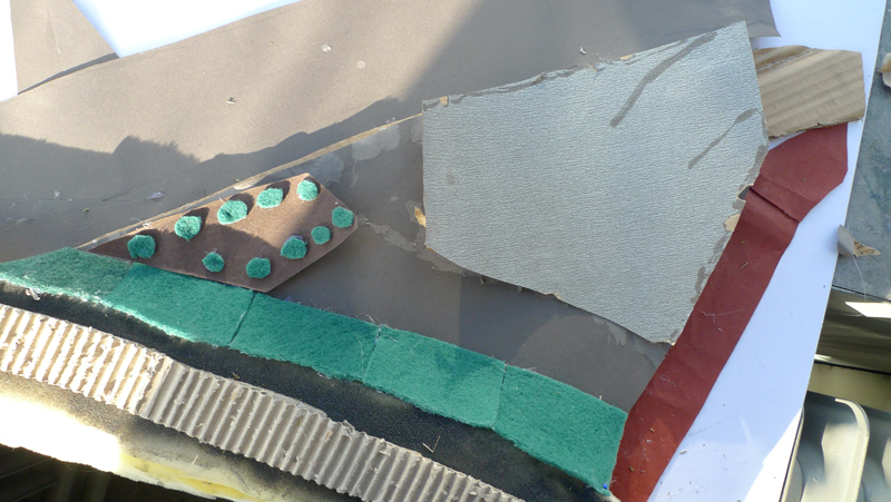
The diagonal windows give a greater sense of wideness; the landscape is extended even more. This idea is particularly used on the back side of the building, facing the railway.
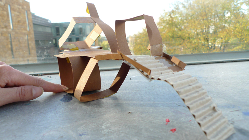
Also, the stairs on the front of the building somehow refer to divine ancient temples. Just think of ancient Maya temples or even the Pyramids. The stairs are facing the East, as this is where the sun comes up. It is just a general reference to these ancient temples, which adds to a cosmopolitan landmark feel.

learning points
At first I had created a special sidewalk and a path that leads to the entrance of the building. Then I learned that this actually limits the building and in fact insults the visitors: they do not need help to find the entrance, especially not a grand entrance like this. So I placed the building on the same underground as the concrete road.
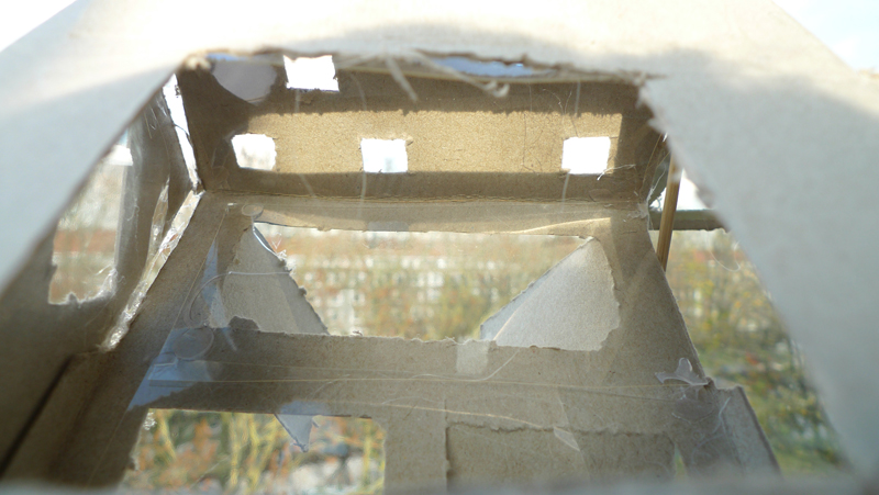
My initial design could still be improved on the shutters at the back of the building. Facing the train railway, the windows open in separate directions. I made these decisions very carefully but had to cut out the windows and make the calculations when the model was still two-dimensional. I am still contemplating on removing some of the shutters entirely. Also, I learned that placing the windows parallel to the earth is enough to make a ‘tipped over’ building interesting. The combination of parallel windows with different shutters could be to much.
final result
The building is simple; it’s just two rectangles that can be cut from one piece. However, it is placed in an angle of 45 degrees and the windows are carefully cut out to accentuate the specific viewpoints. This gives the construction a special aura. The Wibautstraat needs a landmark building, because currently it is on of Amsterdam’s very few wide streets with cosmopolitan potential. Just look at the Karl Marx Allee in Berlin. I believe Amsterdam could always use some more flair like this.
